
Vitamin Package Design
| Country | Korea |
|---|---|
| Year | 2020 |
| Award | WINNER |
| Affiliation | Daewoong Pharmaceutical |
| Designer | Jayoung |
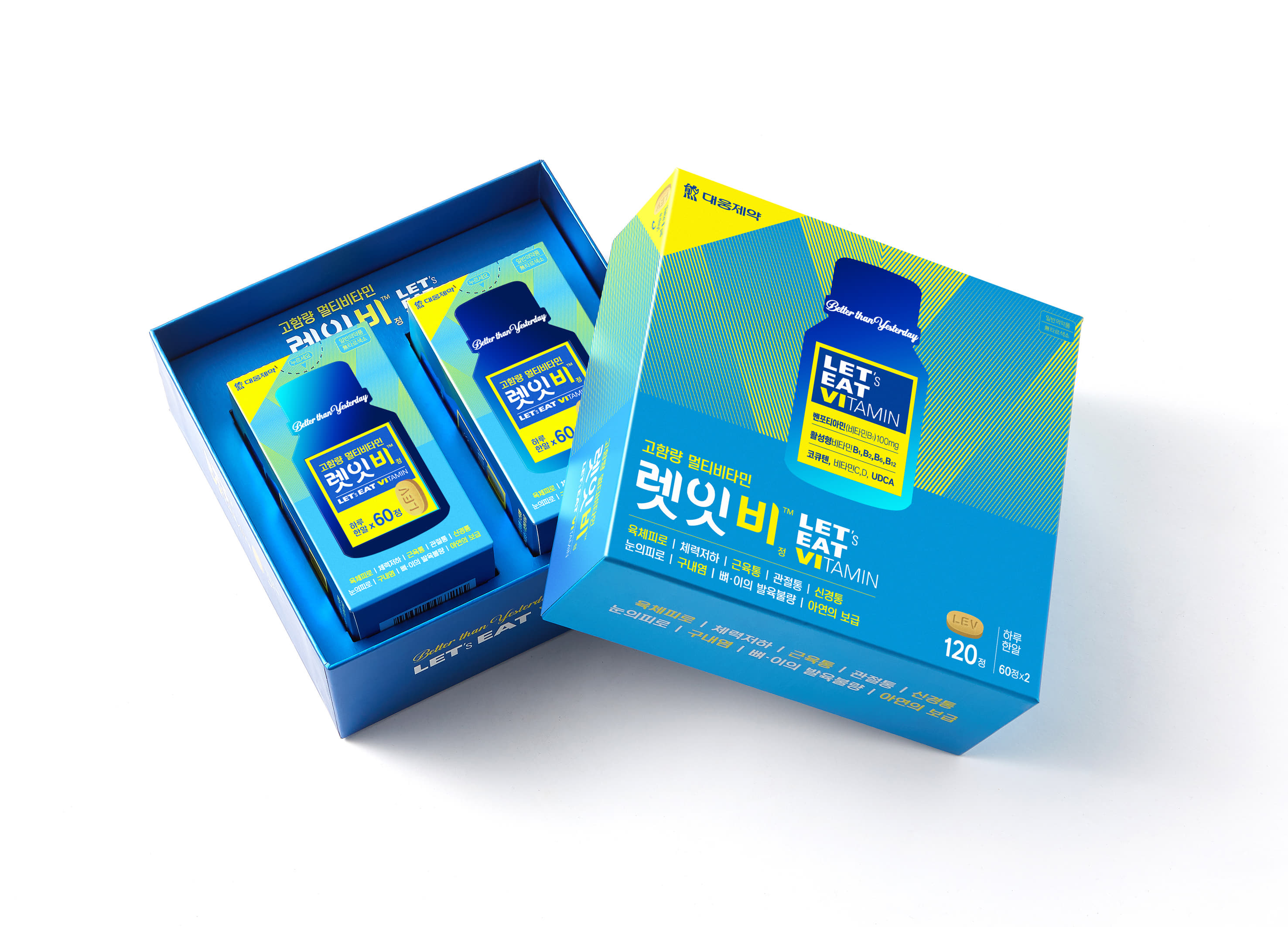
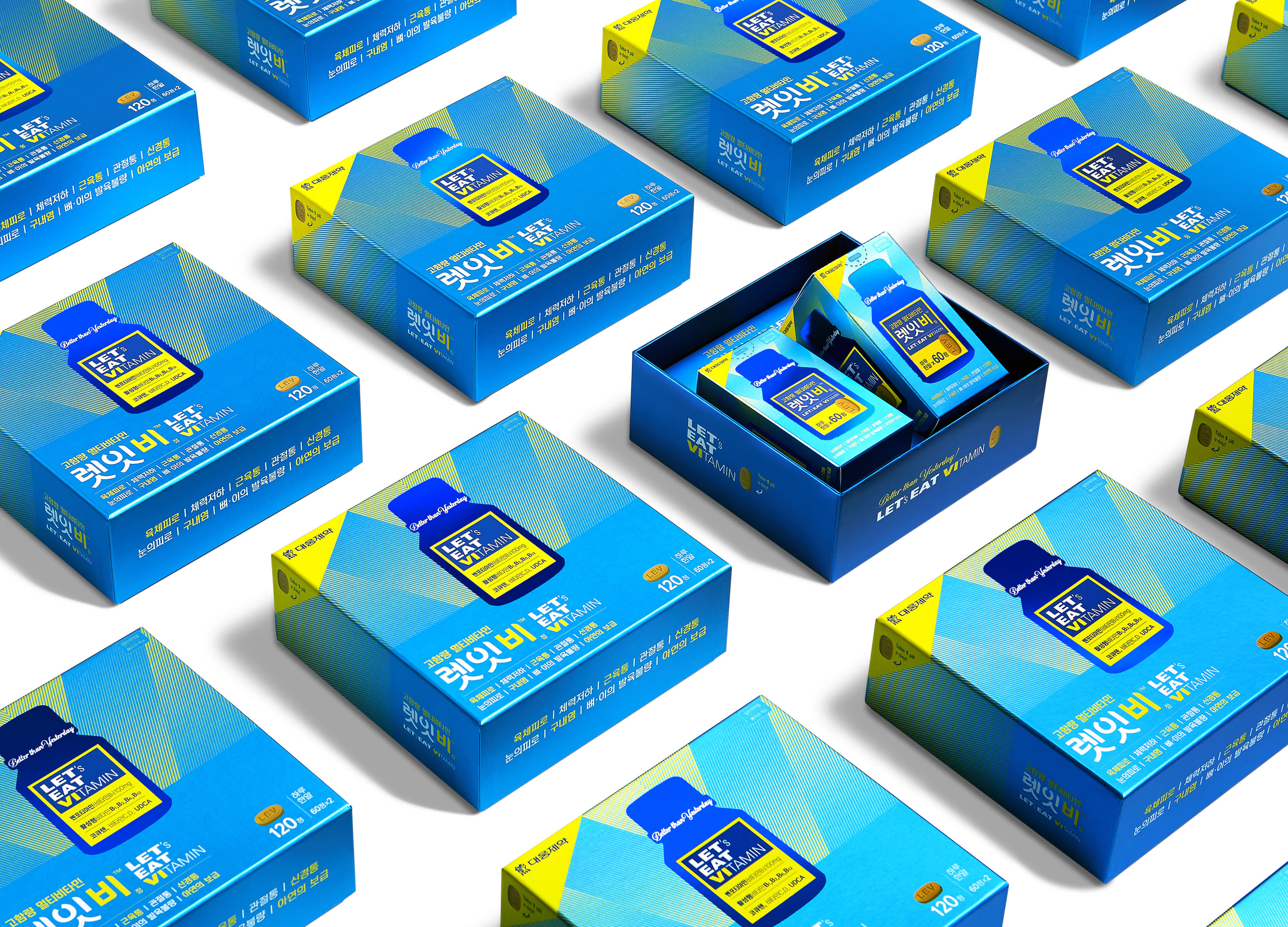
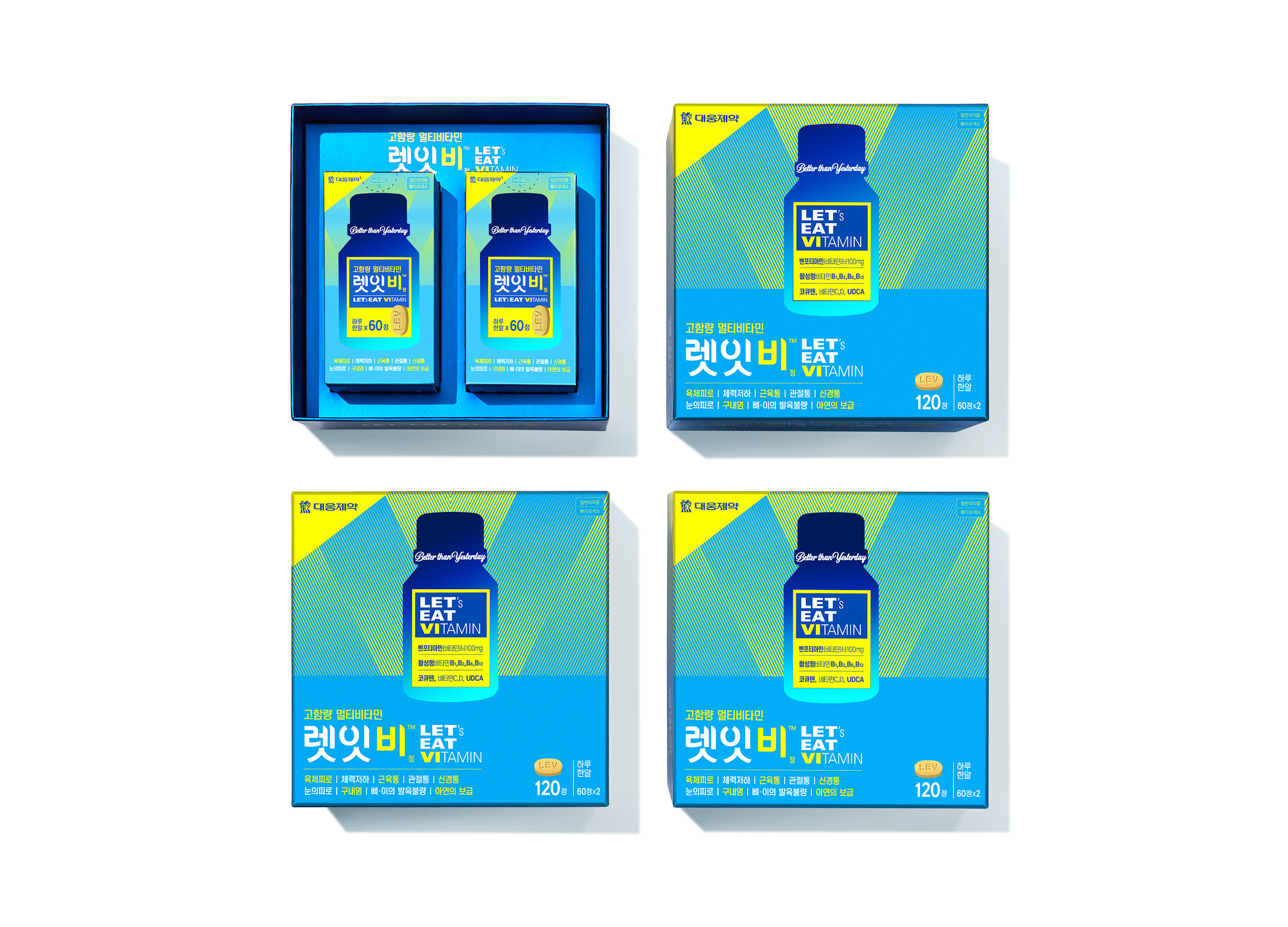
| English | LET EAT VI, which means ‘Let's Eat Vitamin for our body’, is a multi-vitamin brand containing high content active vitamin for fatigue recovery & nutrition supplement. The package design emphasizes effects of the product with harmony of light, color, and shape. The B.I. is designed with a special serif typeface for polished image. The names of the key ingredients are listed in the bottle-shaped graphic placed on the center of the package. The bottle graphic is marked with blue foil increasing attention of the customers. In the background, a V-line geometric pattern symbolizing vitamin creates 3-dimensional effect in a planar surface. |
| Native | 렛잇비는 우리 몸에 필요한 필수비타민&미네랄 19종이 함유된 종합영양제 브랜드다. 브랜드 네이밍은 '다같이 우리 몸에 필요한 비타민을 먹자(Let's Eat Vitamin)' 라는 제품의 캐치프레이즈를 소비자에게 직접 전달하기 위해 대중들에게 익숙한 비틀즈의 노래 'Let it be'의 발음을 언어유희적으로 표현한 것이며, 브랜드 네이밍만으로도 화제성과 대중성을 동시에 갖출수 있도록 고안되었다. 렛잇비의 패키지는 ‘피로회복과 영양보충을 위한 고함량·활성형 비타민'이라는 제품 컨셉을 모든 요소에 통일감 있게 담아내었는데 ‘빛·색·형태’의 조화를 통해 제품의 효과를 강조하였다. 메인 컬러는 활력을 나타내는 스카이블루로 하였고 옐로우를 서브컬러로 적용하여 고함량 비타민의 생동감을 나타냈다. BI의 활자는 간결하게 하여 브랜드에 세련된 이미지를 부여했고, 모음의 부리 부분에 포인트를 주어 글자간의 주목성을 높이며 네이밍의 경쾌한 인상을 강조했다. 패키지 중앙의 비타민 용기 모양에는 ‘청색 박’을 적용하여 주목도를 높였으며, 중요 성분명을 용기 그래픽 내에 기재하여 어떤 성분을 함유했는지 직관적으로 알 수 있도록 하였다. 배경에는 비타민을 상징하는 ‘V’를 기하학적 라인 패턴으로 디자인하여 평면적 그림에서 다이나믹한 입체적 효과를 추구하였다. |
| Website | www.daewoong.co.kr |
-
GAOBU BOOK HOUSE
-
transient matter
-
Lushan Yunwu Tea
-
Top Tea House
-
Roku
-
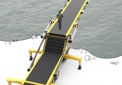
Car Bridge
-
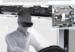
Electric Maintenance Training
-
OXYGENE
-
D.BLOCK
-
Mixx
-
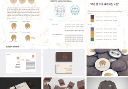
보문 볼수록 매력있는 보문동
-
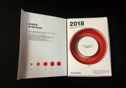
A HOLE in the Ozone
-
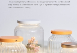
Sweet Lamp
-
The Museum Of Space
-
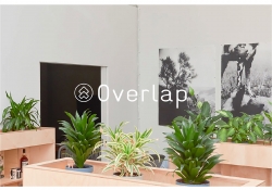
Overlap strorage
-
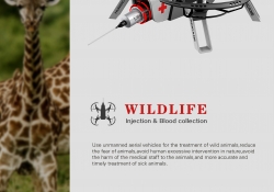
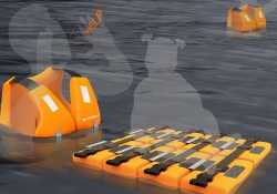
WILDLIFE
-
Warm And Warm
-
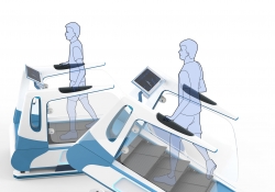
Gait assistant
-
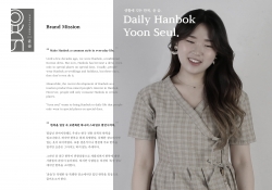
HanbokStore Branding
-
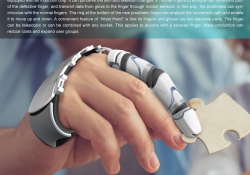
Intact Hand
-
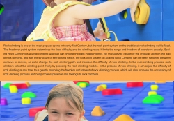
Scaling RockClimbing
-
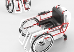
Own Wheelchair
-
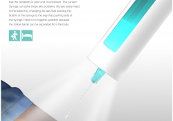
Lantern Syringe
-
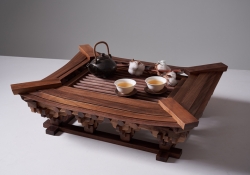
Hanok Tea Table
-
CONNECT
-
Proto - headquarter
-
Zhenshui Town Sales Center
-
Out of Frame
-
瀞謐 Concealment
-
Woodboard Sterilizer
-
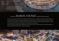
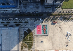
LAVENICHE MARCH AVENUE
-
Art Basketball Court
-
Exhibition for Movie Detention
-
Space stack
-
Casa Cabana
-
Tasted Flight _ Art Playground
-
Newker Logo
-
THE H Green Art Plaza
-
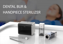
DENTAL BURHANDPIECE STERILIZER
-
LIBERAL REALMS 自由國度
-
CONNECTION 串聯
-
A World of Whiteness
-
Huang Residency
-
Spark
-
Lakeside Villa
-
Tastes Paradise
-
Gathering of Talents
-
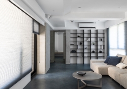
Simple Refined
-
Creativity•New Realm
-
The Object of Serenity
-
The Name of Sewing
-
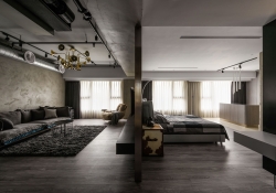
Elegant Clean White Residence
-
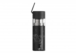
Unibott Himalayan Tea Cup
-
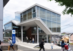
Kanagawa Univ. Bldg. No.30
-
YOLAND-CITY SALES CENTER
-
HUAZHU SALES CENTER
-
Splash Ink
-
TAISI
-
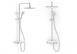
EasySET Exposed Shower System
-
SchoolFullOfDreams


Designed by sketchbooks.co.kr / sketchbook5 board skin