WINNER
COCO SENSE
| Country | China |
|---|---|
| Year | 2021 |
| Award | BRONZE WINNER |
| Affiliation | SHENZHEN YOUBAIZHIHEI DESIGN Co., Ltd. |
| Designer | Bingna Xu, Qiaolong Huang |
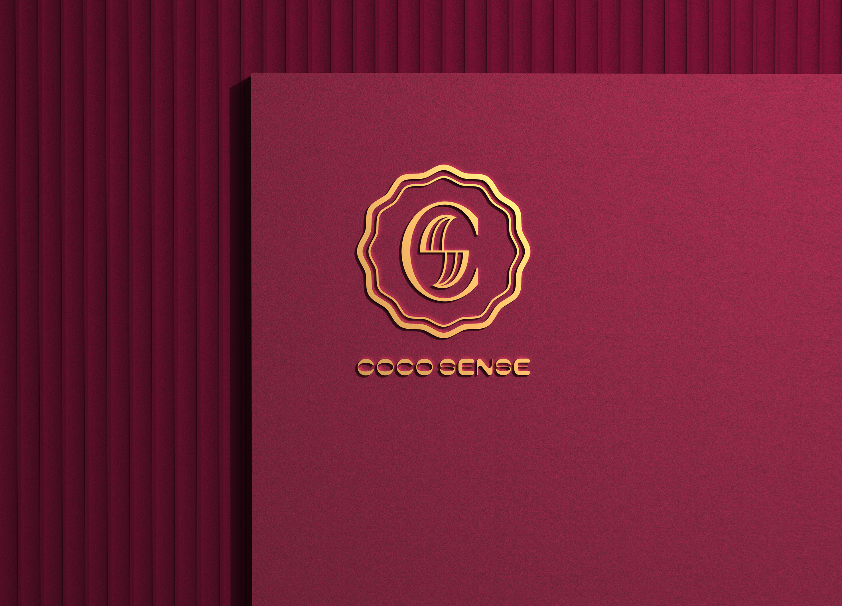
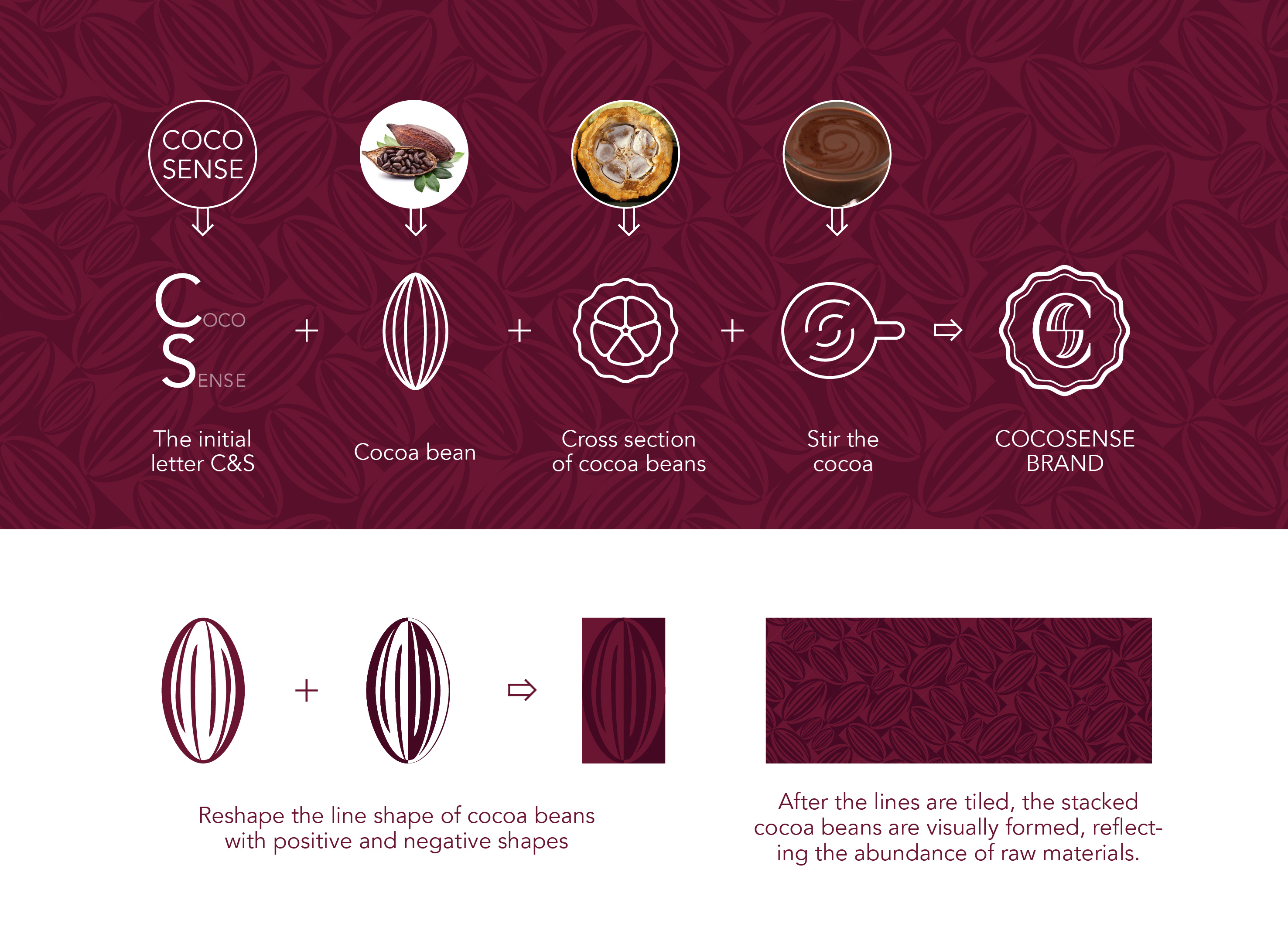
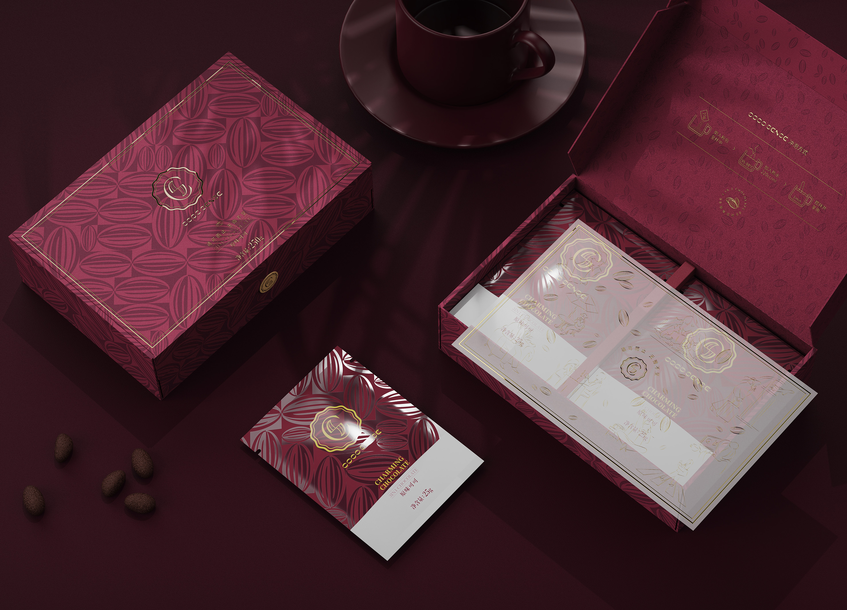
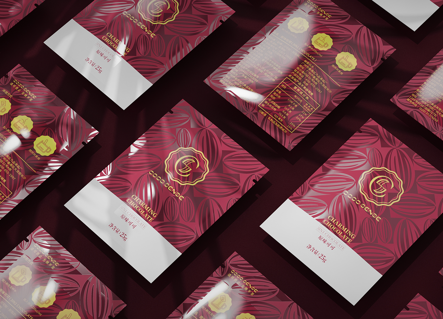
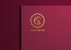
| English | COCO SENSE is a brand of instant cocoa solid beverage.We have designed COCO SENSE brand logo and new product packaging for our customer Guangzhou Qiaoming chocolate food Co., Ltd. The creative source of the main visual logo is based on the initial letter C&S of COCO SENSE, combined with the texture of cocoa shell, which simplifies the texture and combines with the letter s. It is also like looking down at the cocoa brewed in a cup, resulting in the blending and collision of white steam and cocoa. The outer part is treated with the cross section of cocoa beans as the contour. It gives people a feeling of being brewing cocoa powder, being able to taste the fresh cocoa, enjoying the present moment immediately, and expressing the absolute truth of cocoa raw materials and sufficient ingredients. The overall style of logo is elegant and comfortable. The packaging illustration uses positive and negative shapes to reshape the lines of cocoa beans. After the lines are tiled, the stacked cocoa beans are visually formed, reflecting the abundance of raw materials and presenting the delicious. Quantitative bags can better control the amount of brewing, it is convenient to enjoy a cup of good cocoa. Use natural Indonesian cocoa beans carefully ground into powder, and set low sugar and low calorie for young people. Just right dosage, just right sweetness. “be just perfect, meticulously” is this product hope to bring users everything is just right. In line with the low sugar and low calorie food and drink heat favored by young users, it brings healthy and young taste experience to users. |
| Native | “COCO SENSE”是一款即时冲泡可可粉的固体饮料品牌。我们为客户广州乔名巧克力食品有限公司设计了COCO SENSE品牌Logo,以及新产品的包装。 主视觉logo的创意来源是以COCO SENSE首字母C&S作为设计基础,结合可可豆外壳肌理纹路,简化纹理且与S字母结合,又像俯视看着杯子中冲泡的可可,产生的白汽与可可交融碰撞的形态。外围则是以可可豆横切面作为轮廓处理。 给人一种正在冲泡可可粉,能新鲜品尝到可可的感受,即刻享受当下美好时刻,以及可可豆原材料的绝对真实及充足用料的表达。logo整体风格气质优雅,且不失温馨舒适的感觉。 包装的插画使用正负型重新塑造可可豆线条造型,纹路平铺后,视觉上形成堆叠在一起的可可豆,体现原材料的丰盛,将美味呈现。 定量的袋装能更好的控制冲泡用量,很方便就能享受到一杯好的可可。使用纯天然的印尼可可豆精心研磨成粉,并且为年轻群体设定的低糖低卡。刚刚好的用量,刚刚好的甜度。“适可而止,无微不至”是这款可可希望带给用户的一切都是那么的刚刚好。 符合年轻用户青睐的低糖低卡食饮热度,给用户带来健康且年轻的口感体验。 COCO SENSE is a brand of instant cocoa solid beverage.We have designed COCO SENSE brand logo and new product packaging for our customer.The creative source of the main visual logo is based on the initial letter C&S of COCO SENSE, combined with the texture of cocoa shell, and combines with the letter S. Also like looking down at the cup of cocoa, the white steam and cocoa blend form. The outer part is treated with the cross section of cocoa beans as the contour. The packaging illustration uses positive and negative shapes to reshape the lines of cocoa beans. After the lines are tiled, the stacked cocoa beans are visually formed. |
| Website | www.bhdesigncn.com |
-
Kan Matsubara and NiCHIGEI100th
-
90MM poster
-
The Iron Ball Visual Branding
-
Xun Mi Honey Packaging Design
-
MIL
-
ZERO LAND
-
foss
-
MONEY HEIST KOREA NETFLIX
-
Functional system for wound care
-
8Nests Bird's Nest
-
SEOUL CITY BICYCLE
-
KOREA GOHEUNG YUZA WINE limited edition
-
DAEJEON ECO-EDUCATION COOPERATIVE Branding
-
COCO SENSE
-
Dong-A is 100 Visual Branding
-
398 TRIO Lounge
-
Hugrug
-
RNMS
-
POLO CAFE
-
24 Solar Terms
Designed by sketchbooks.co.kr / sketchbook5 board skin

