poppy lounge
| Country | Japan |
|---|---|
| Year | 2024 |
| Award | GOLD WINNER |
| Client | BEANS BITOU Inc. |
| Affiliation | shirokuma and company LLC |
| Designer | Takuro Nakaya |
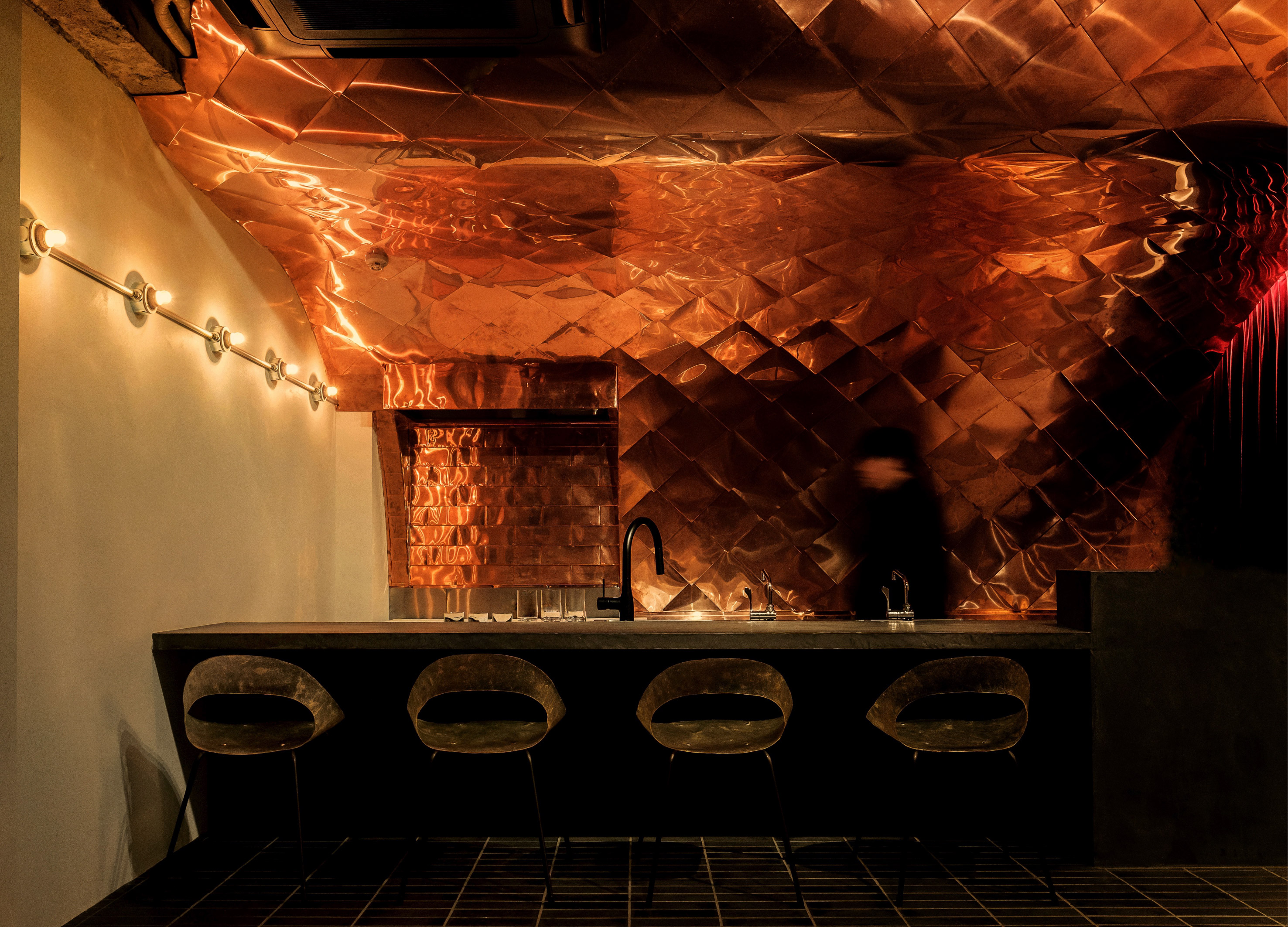
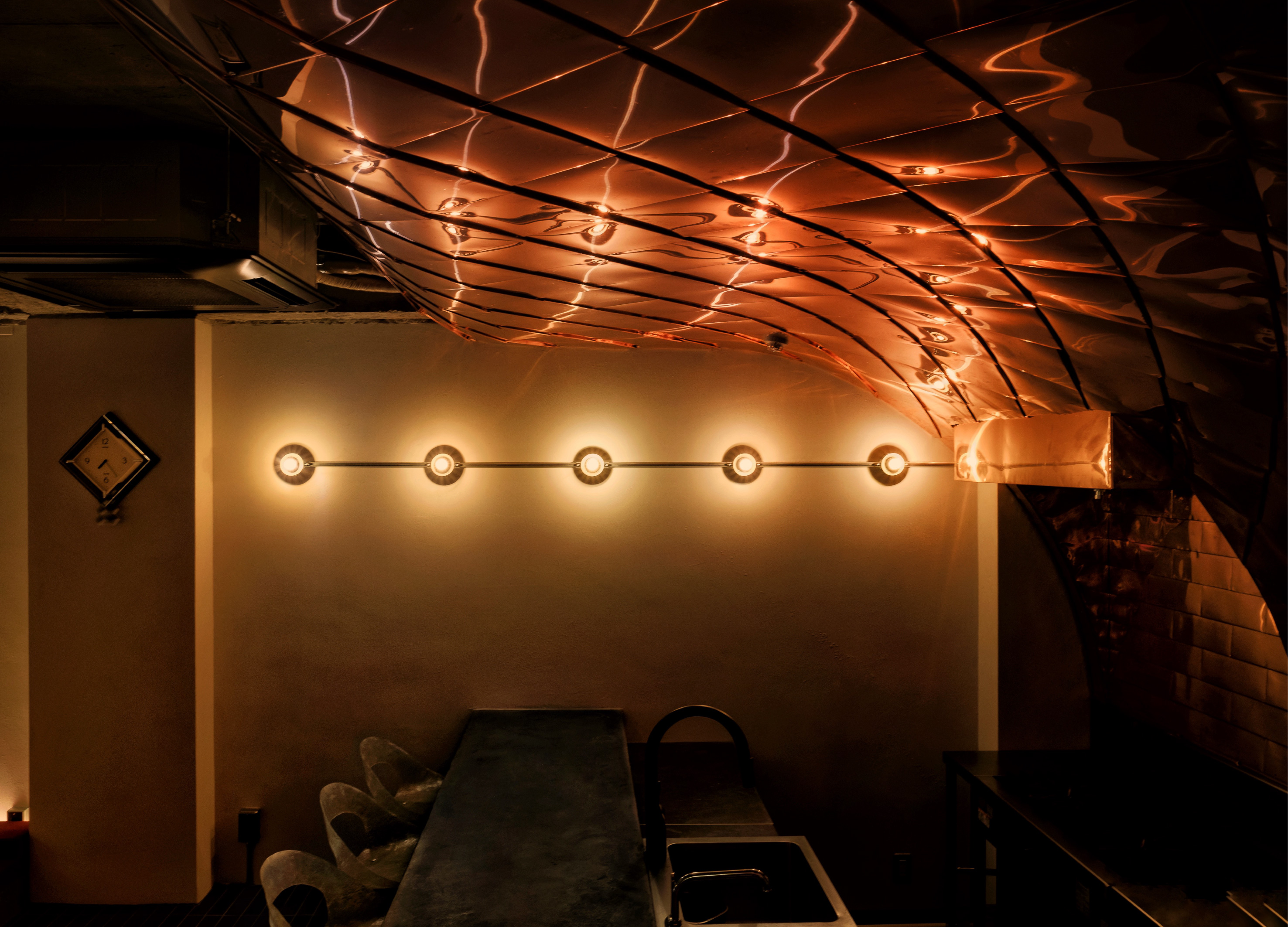
| English | The store is located on the third floor of a tasteful "Shibu Building. The creative ceiling (and walls leading from it) is the work of craftsmen who have been working mainly on copper sheet metal roofs for shrines, temples, and Buddhist temples for 95 years. This technique, which is in decline, was adopted because of its new possibilities. The curved surface of the copper plates envelopes the time of the people standing in the kitchen and catches and diffuses light from the two walls, creating a stage-like effect. We aimed to create an extraordinary space that will remain in the memories of both the renter (the host) and his/her guests. |
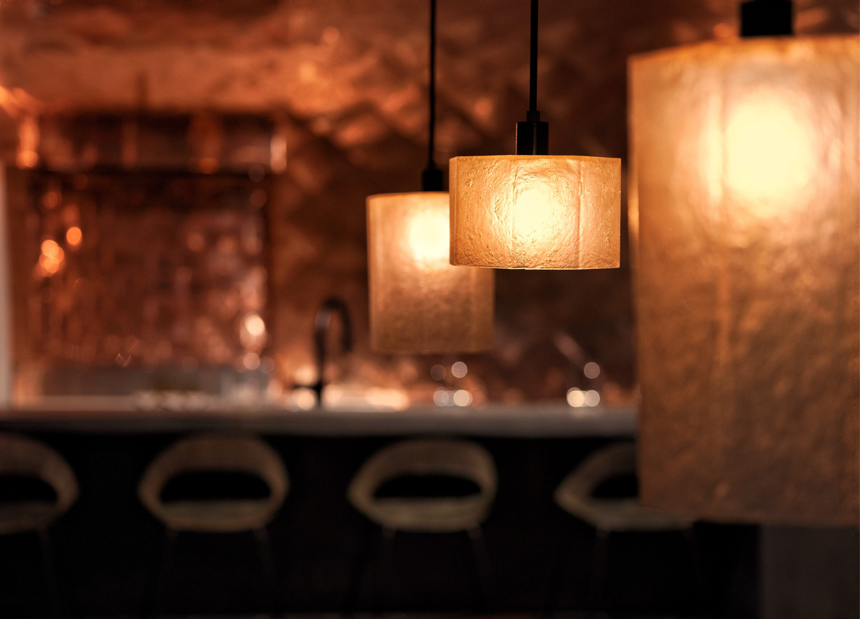
| Native | 店舗は味のある「渋ビル」の3階にある。 独創的な天井(から続く壁)は、創業95年の主に社寺仏閣(近隣では熱田神宮)の銅板金屋根や雨樋などを手掛けてきた鈑金工業所による職人技。270角、約300枚の薄さ0.35mmの菱形銅板によって形成される。菱葺きと呼ばれ、本来は屋根の工法だが、衰退しつつあるこの技術に新しい可能性を感じ、採用するに至った。 この銅板曲面は、厨房に立つ人の時間を包み込み、両壁からの光を受け止め拡散し舞台のように演出する。金の茶室を思わせる絢爛さはあれど、素材の妙で下品さと威圧感はない。酸化による経年変化も許容した。 照明と椅子は、手作業で作られた黄味がかった半透明のFRP製。光を透過しつつ厚薄によるムラっけと濁りが独特の存在感を放つ。 3mのテーブルは、隣町で解体された築100年以上の長屋から樹齢300年(推定)の唐松の差し鴨居を譲ってもらい天板とした。総重量200kgを超えるため、土台は合理的な造形理念にもとづき、幾何学的に設計した。 老舗の純喫茶でよく見られる赤色のソファは、時間を長く感じる心理効果があるとして、昭和初期に流行したらしい。喫茶文化へのメタファーとして、ベンチシートとカーテンに赤いベロアを採用した。 均一化しつつある無個性で利便性の高いレンタルスペースとは一線を画し、 空間を借りる人(主催側・ホスト)と、その客(ゲスト)の記憶に必ず残る非日常的な空間を目指した。 |
| Website | www.instagram.com/shirokuma_and_company |
| Positive Comments |


|
| Judging Comments | Poppy lounge designed by Takuro Nakaya, received the 'Gold Winner' at the Asia Design Prize 2024 for its innovative use of traditional craftsmanship in a modern setting. Located on the third floor of the "Shibu Building," the lounge features a creative ceiling and walls crafted by artisans skilled in copper sheet metal work, a technique primarily used for shrines and temples but now in decline. The jury was impressed by how the copper plates' curved surfaces create a dynamic interplay of light, producing a stage-like effect that enhances the atmosphere. This design stands out for its ability to transform a conventional space into an extraordinary one, leaving a lasting impression on both the renter and their guests by blending traditional techniques with contemporary design to create a memorable ambiance. |
-
TAFALONG Visual Design
-
Welcome Bank Walking Visual Identity Design
-
Golden Brushstrokes on Azure
-
NYGDESIGN Identity Rebrand
-
DREAM CANVAS STUDIO Visual Branding
-
hohe Gyeongju Pool Villa Branding
-
POSTECH Changeup Ground Leaflet
-
Shuiyue Dongtian
-
WEATHER IN NEXEN
-
Hifive
-
Utsuroi
-
Change is the Only Difference Textile Series
-
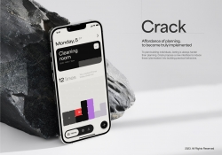
CRACK
-
KYC Brand eXperience Design
-
Sustainable Regeneration Consciousness
-
Dear Earth
-
YOYO
-
Vocal Island
-
FIZZ
-
Nature Tea Syrup Bottle and Packaging Design
-
Christmas Light Fantasia
-
SUM Air Brand Identity Design
-
WATER 2 App And Charger Display
-
Banana paper projects Ashi
-
Niigata Kameda Distillery
-
MUTSRUM the beauty of Najeon Chilgi in Korea
-
Berklee College of Music
-
Hosil
-
Infant Snap
-
INSOUND
-
Exlicon MX A drawing tool without boundaries
-
lalaif
-
NILTO
-
Ding OS Collaborative Computing OS
-
Shroom
-
Columbia New character IKKI
-
Sine AI
-
BURNOUT SYNDROME THERAPY
-
After
-
Heineken Talk Label
-
Eco Friendly Dolmen
-
Suwon Hwaseong branding project
-
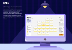
BEAM Light Pollution Data Visualization
-
EDUKOCCA Brand eXperience Design
-
Artiant Hub Branding Design
-
VRIN 3D
-
361 degree kids Jump Rope Limited Packaging
-
Plu packaging design
-
BEVERCITY brand design
-
CREATIVIA Metaverse Platform
-
PulseHeal
-
Braille Emoji Design
-
Columbia WAPPEN of 12 moutains in Seoul
-
NEXERA
-
KISANGCHEONG Alter Weather
-
Growlin
-
SPLASH
-
Creative packaging design of red wine
-
Cuppy bird
-
Touring Torch
Designed by sketchbooks.co.kr / sketchbook5 board skin

