| Country | China |
|---|---|
| Year | 2022 |
| Award | WINNER |
| Affiliation | QIN LUO |
| Designer | QIN LUO |
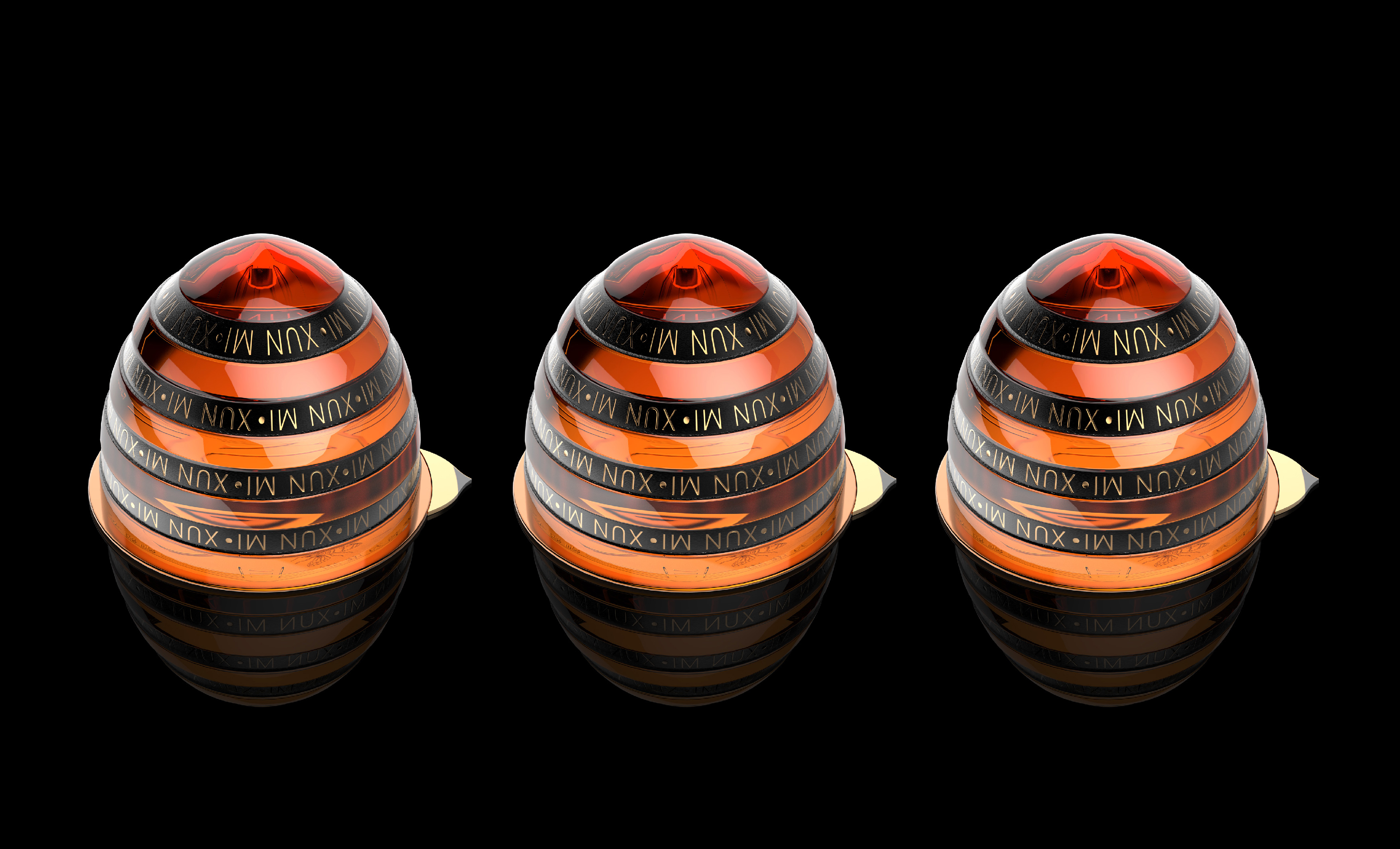
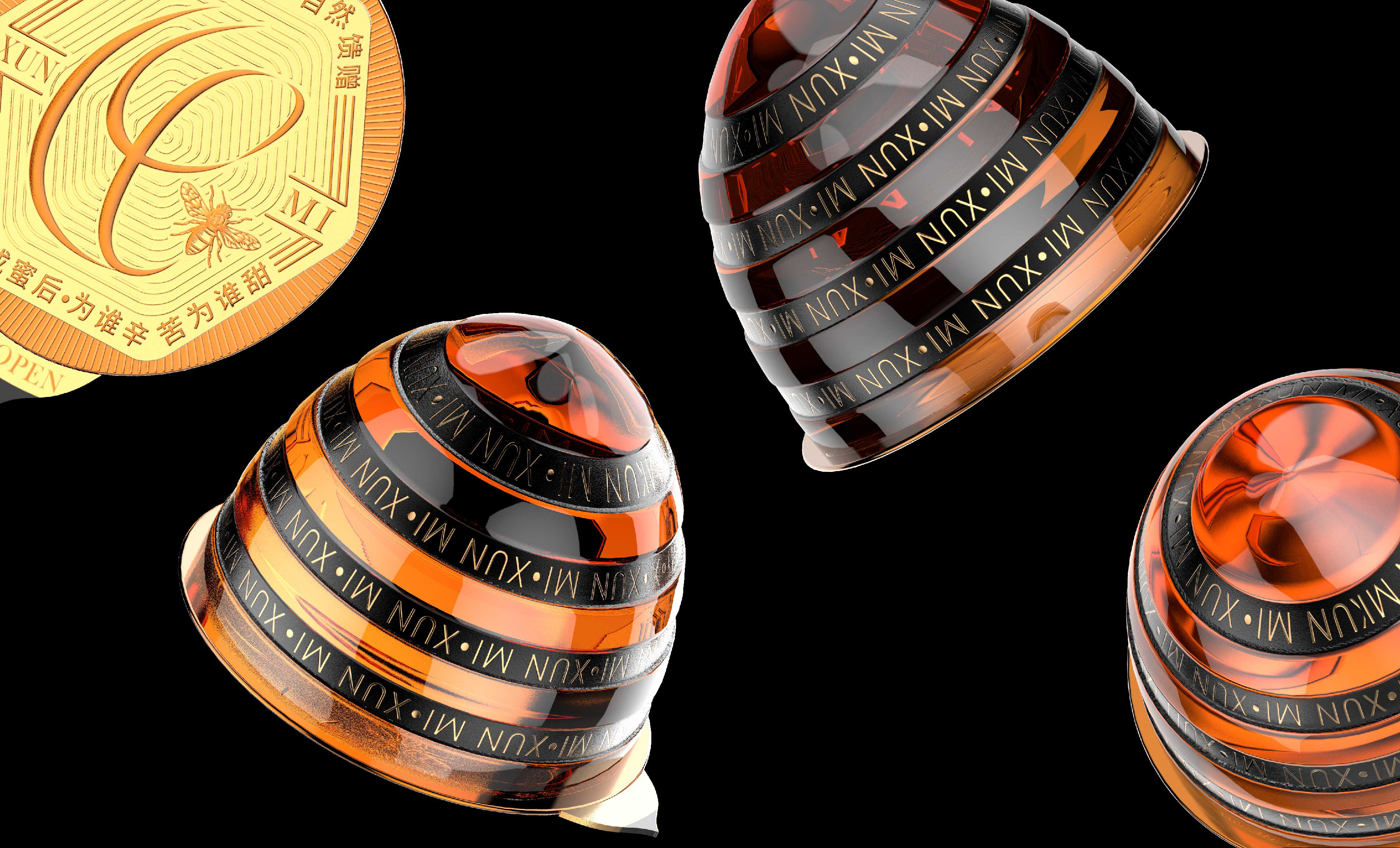
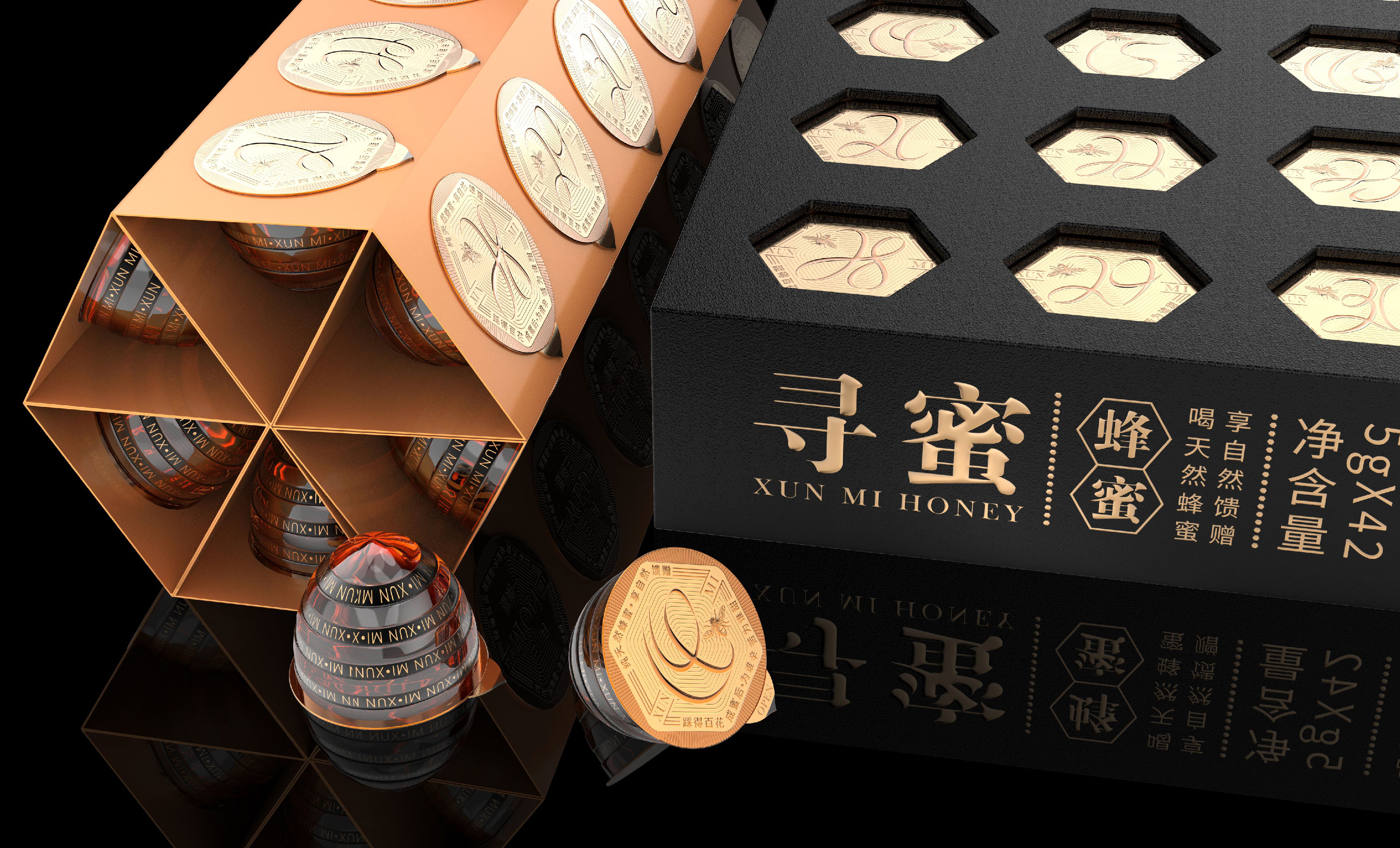
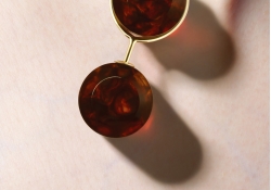
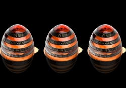
| English | The packaging design of the honey-seeking small jar is inspired by the bee’s tail. The packaging design of the small jar for one-time consumption is not only easy to carry, but also prevents the product from deteriorating if it is not eaten for a long time; the numbers from 1 to 31 on the top cover are based on the daily flight of honey bees. The calendar-shaped hollow packaging can intuitively see the production month of the product. After the packaging is opened, the small jar of honey can be folded into a small hexagonal calendar. The shape of the bee tail indicates that the user can open the Open to eat. |
| Native | 寻蜜小罐蜂蜜包装造型通过蜂尾以及黄黑配色打造该产品独特的视觉符号,小罐式一次性食用的包装设计既便于携带,又能解决大罐蜂蜜开启后长时间未食用而导致产品变质或影响口感;蜜蜂是勤劳的象征,小罐蜂蜜的顶盖1到31的数字是根据蜜蜂每天采蜜飞行的轨迹线设计而来,日历式的镂空包装,能很直观的看到产品生产月份的同时又能督促消费者每天记得喝一杯蜂蜜,包装开启后,还能将固定小罐蜂蜜的纸板连同折成一个六边体的小日历,从蜂尾造型暗示着使用者从此处揭开食用。 |
-
SMILE IS GOOD Visual Branding
-
DFX Brand Identity
-
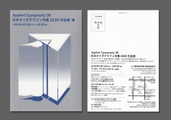
Applied Typography30
-
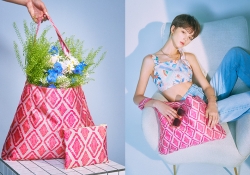
WHY NOT Collection
-
Care Together Happy Together Visual branding
-
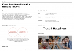
Korea Post Brand Identity Rebrand
-
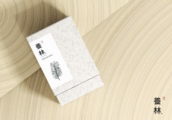
Yangrim
-
XIJIAJIA An AI Digital Human
-
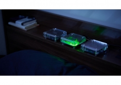
Wireless acrylic speaker tueks
-
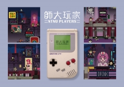
NTNU gamers Metaverse concept exhibition
-
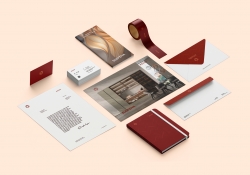
Suofeiya home collection Visual Identity
-
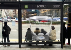
A cup that fades away life
-
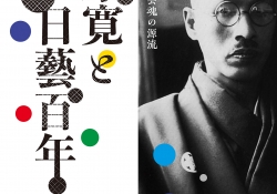
Kan Matsubara and NiCHIGEI100th
-
90MM poster
-
The Iron Ball Visual Branding
-
Xun Mi Honey Packaging Design
-
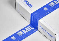
MIL
-
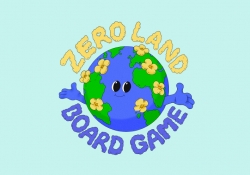
ZERO LAND
-
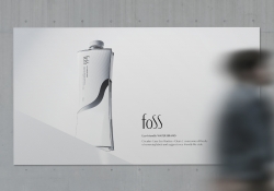
foss
-
MONEY HEIST KOREA NETFLIX
Designed by sketchbooks.co.kr / sketchbook5 board skin

