WINNER
RNMS


| Country | Korea |
|---|---|
| Year | 2021 |
| Award | BRONZE WINNER |
| Affiliation | RNMS |
| Designer | dae hyeon kim |
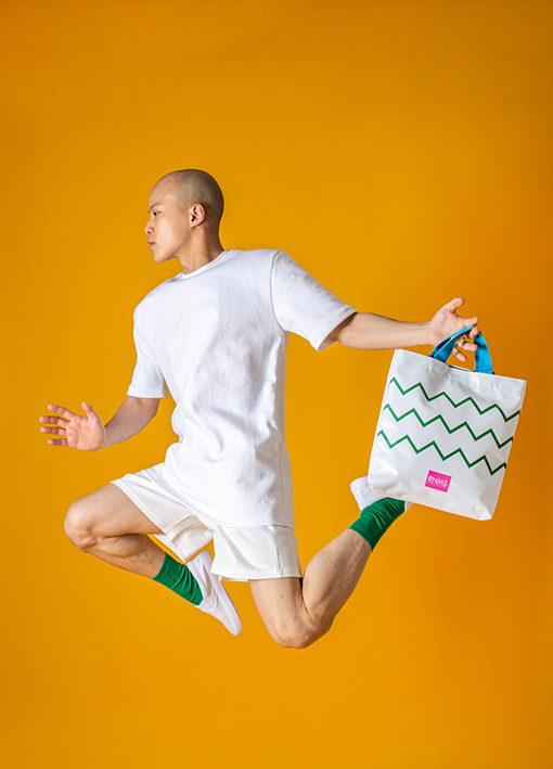
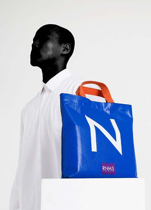
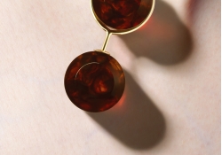
| English | RNMS was launched in September 2018. 8PANEL CAMP (8-Panel Camp Cap) and Eco Bag were the first products to be introduced. In the case of an 8-panel (panel: divided section, side) camp cap, RNMS owns the design right, and the side and rear are split from the 5-panel shape, which is a common type of camp cap found in the market. Since it has 3 more sides than the 5-panel camp cap, it is possible to harmonize with various colors and has gained a lot of popularity. The most representative product of RNMS is RNMS TOTEBAG, which won K-DESIGN, ASIA DESIGN PRIZE (GOLD) and Italy A DESIGN AWARD (SILVER) awards. I think the RNMS identity is the most revealing product. The appearance is simplified as much as possible, and each element of the bag is colored differently to show color contrast. As such, there is no case in which RNMS products consist of only one color. If you look at the product, you can see that at least two colors were used. And using two or more colors is the part where you have to think about the harmony of those colors. This is because if colors are randomly arranged without considering their harmony, aesthetics will be lost. So, when making a product, the harmony of these colors is the most important and difficult part. In other words, since this is the identity of RNMS, we are thinking carefully about the harmony with the various colors to be included in the product. Another important part here is the shape of the exterior. I try to make it as simple as possible. However, it does not ignore the intrinsic function of the product. The reason for the existence of a product is not to look pretty, but because it has a purpose suitable for its purpose. While keeping its functions alive, the form is made as simple as possible. If the exterior is complex, the color will stand out because it can be a hindrance. It's like going to a play, but I think it's similar to the fact that the theater is too complicated or flashy and the actors in the play don't stand out. In this way, it can be seen that RNMS values 'color', but in fact, it is not simply to inform that 'RNMS values color and harmony of colors'. We usually express our own appearance, our own individuality, as our own 'color'. Even in audition programs, I often hear the saying 'I don't have my own color, I have my own color'. That is the message that RNMS is trying to say. Many people live consciously of their surroundings. In other words, there are many people who cannot live 'just like me'. There are people who are conscious of how they will look at me and how they will think, look at me, hide their true self, and live with a new mask on their original self. There will be many people who live in reality with only their hearts in mind. So, what RNMS wants to say to these people is 'show me your own color'. RNMS has sometimes made products that are unlikely to lead to sales with intense colors and very standout colors, but we will continue to try them in the future. I want to convey the feeling that many people want to live a wonderful life by boldly revealing their own 'color' no matter what anyone says. |
| Native | RNMS는 2018년 9월에 세상에 첫발을 내딛었습니다. 8PANEL CAMP(8패널 캠프캡)과 에코백이 처음으로 선보인 제품이었습니다. 8패널(패널:나눠진 구간,면) 캠프캡의 경우, RNMS가 디자인권을 보유하고 있는데, 시중에서 볼수있는 캠프캡의 일반적인 형태인 5패널 형태에서 측면과 후면이 분할된 것입니다. 5패널 캠프캡보다 3개의 면이 더 주어졌기때문에 다양한 색들과의 조화가 가능하고,좋은 반응을 이끌어냈습니다. RNMS의 가장 대표적인 제품으로는, K-DESIGN, ASIA DESIGN PRIZE(GOLD), 이탈리아 A DESIGN AWARD(SILVER) 수상을 안겨준 RNMS TOTEBAG입니다. RNMS 아이덴티티가 가장 잘 드러난 제품이라고 생각하는데요. 외관은 최대한 단순화하고, 가방의 요소들은 각각 색을 달리하여 색의 대비를 나타내었습니다. 이처럼, RNMS의 제품에서 단색으로만 구성되어있는 경우는 찾아볼수없습니다. 제품을 보시면, 최소 2가지 이상의 색을 썼다는것을 알수있죠. 그리고 2가지 이상의 색을 썼다는것은 그 색들의 조화로움에 대해 고민해봐야하는 부분입니다. 마구잡이로 그들의 조화로움을 생각하지 않고 색을 배치한다면, 심미성을 잃어버리게 때문입니다. 그래서, 제품을 만들때 이 색의 조화는 가장 중요시 여기면서, 어려운 부분입니다. 곧, 이것이 RNMS의 아이덴티티이기때문에 제품에 담을 여러 색들과의 조화를 신중하게 생각하고 고민하고 있습니다. 여기서 또 중요한 부분은 외관의 형태인데요. 최대한 심플하게 만들려고 하고있습니다. 그렇다고,제품 본연의 기능까지 무시하지는 않습니다. 제품의 존재이유는 이뻐보이기 위함이 아니라, 그 목적에 맞는 용도가 있기 때문입니다. 그 기능은 살려두면서 형태는 최대한 단순화하여 만들고있습니다. 외관이 복잡하면 색이 돋보이는데 방해요소가 될수있기 때문입니다. 마치, 연극을 보러갔는데 극장이 너무 복잡하거나 화려해서 연극의 배우들이 돋보이지 않는 것과 비슷하지 않을까 생각합니다. 이렇게, RNMS는 색에 관하여 대단히 중요시 여긴다는 것을 알수 있는데, 사실, 단순히 'RNMS는 색을 중시한다, 색의 조화를 중요시한다'라는 것을 알리기위함이 아닙니다. 우리는 보통 나만의 모습, 나만의 개성을 나만의 '색' 이라고도 표현합니다. 오디션 프로그램에서도 '본인만의 색이 없다, 본인만의 색깔이 있다 '라는 말이 많이 들리는데요. 바로, RNMS가 말하고자 하는 메시지입니다. 많은 사람들이 주변을 의식하며 살아갑니다. 즉, 나답게 살아가지 못하는 사람이 많다는 것입니다. 나를 어떻게 바라볼지, 어떻게 생각할지 의식하며, 눈치보며, 본래의 내 모습이 감춰진채로, 본래의 내 모습에 새로운 가면을 쓰고서 살아가는 사람들고 있고, 하고싶은 일이 있지만, 주변의 환경때문에, 시선들때문에 마음에만 담아둔채로 현실을 살아가는 사람들도 많을 것입니다. 그래서 RNMS가 이런 분들에게 하고싶은 말은 '너만의 색을 보여줘' 입니다. RNMS는 때론, 강렬한 색들, 대단히 돋보이는 색들로 판매로 잘 이어지지 않을것 같은 제품들을 만들기도 했지만, 앞으로도 지속적으로 시도해갈 예정입니다. 많은 분들도, 누가 뭐라던간에 과감하게 자신만의 '색'을 드러내면서 멋지게 살아갔으면 하는 마음을 전하고 싶습니다. |
| Website | www.rnms.co.kr |
-
Kan Matsubara and NiCHIGEI100th
-
90MM poster
-
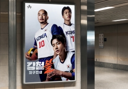
The Iron Ball Visual Branding
-
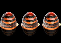
Xun Mi Honey Packaging Design
-
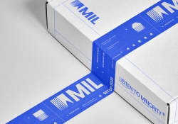
MIL
-
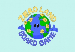
ZERO LAND
-
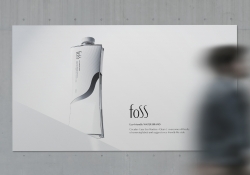
foss
-
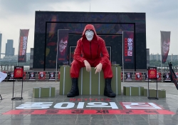
MONEY HEIST KOREA NETFLIX
-
Functional system for wound care
-
8Nests Bird's Nest
-
SEOUL CITY BICYCLE
-
KOREA GOHEUNG YUZA WINE limited edition
-
DAEJEON ECO-EDUCATION COOPERATIVE Branding
-
COCO SENSE
-
Dong-A is 100 Visual Branding
-
398 TRIO Lounge
-
Hugrug
-
RNMS
-
POLO CAFE
-
24 Solar Terms


Designed by sketchbooks.co.kr / sketchbook5 board skin