
WINNER
8Nests Bird's Nest


| Country | Malaysia |
|---|---|
| Year | 2021 |
| Award | SILVER WINNER |
| Affiliation | Tsubaki Studio Co., Ltd. |
| Designer | Jay Lim, Kevin Lin, Jessica Lai, Heero Chen |
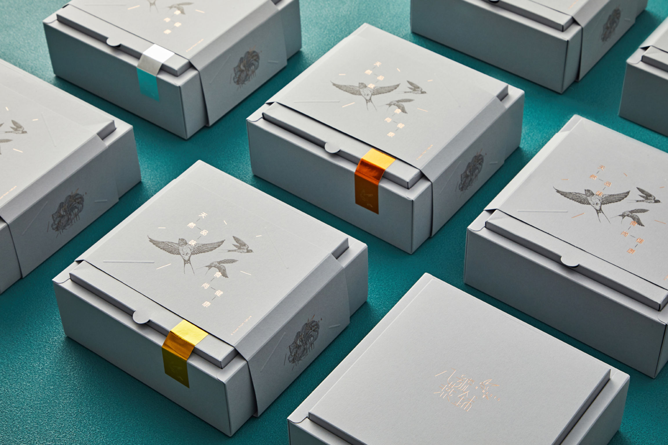
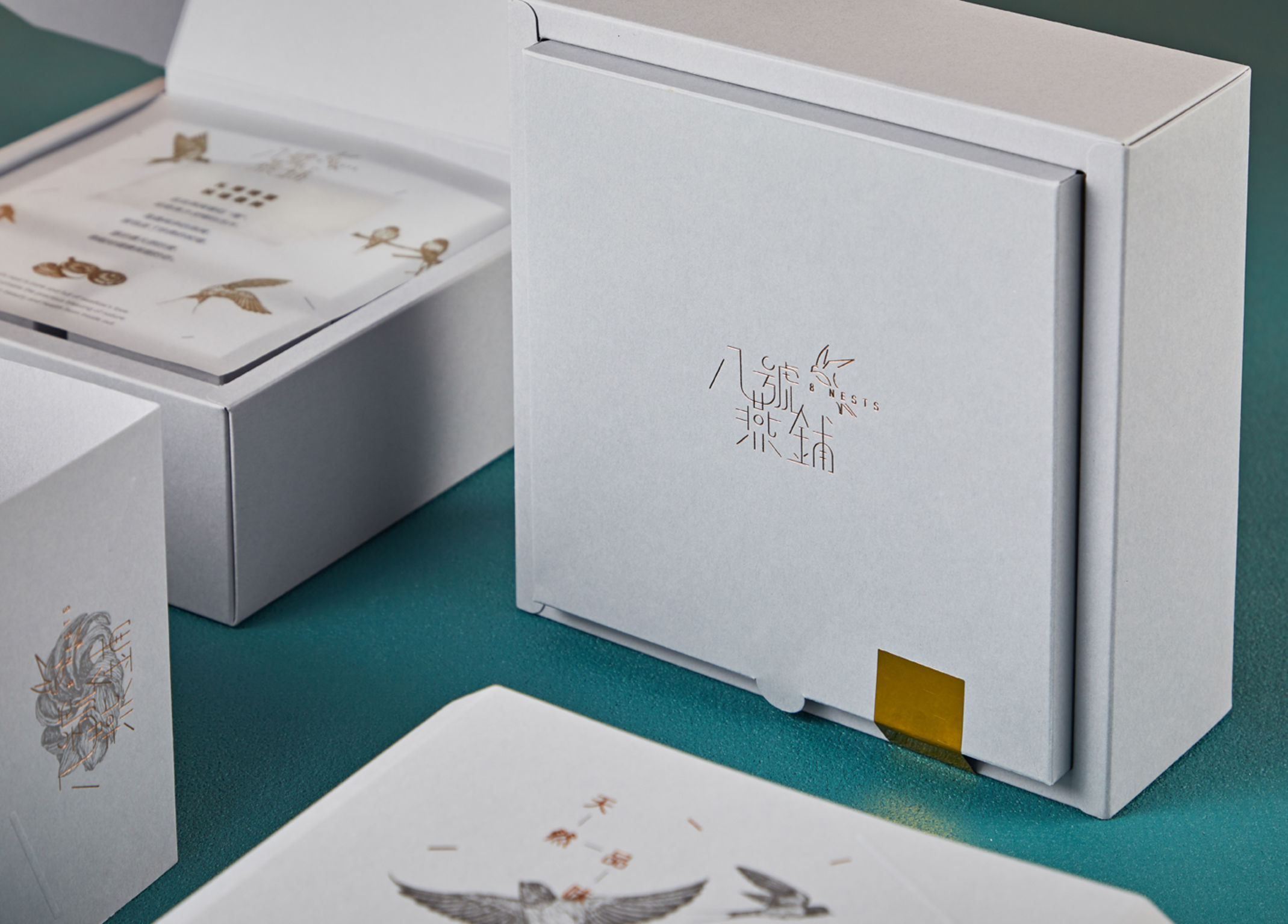
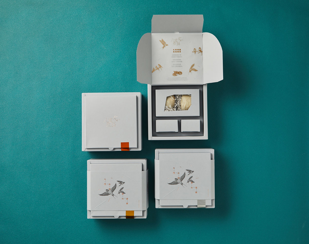
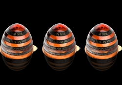
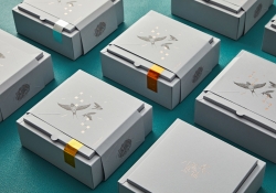
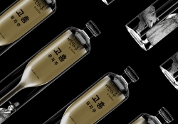
| English | The Idea: Traditionally, the primary colours used in bird’s nest packaging were orange, gold and yellow. However, newer concepts emerged over time. This time around, 8Nests wants to be different so the colours and graphic assets must harmonise together and ‘pop out’ as a shared entity. Form: The primary distinction for the 8Nests packaging is between a premium item and a collectible, so the colours and graphic assets must harmonise together and ‘pop out’ nicely as a shared entity. To achieve that, smooth and uncoated heavy cards from Antalis Pop’Set series are used. Function: The box can hold 2 pieces of bird’s nests and herbs. There’s a gold-like stripe sticker on one side to indicate ingredients used. The stickers, which come in different colours, are designed for quick recognition of products and easy implemention of delivery. Aesthetic: The illustration of birds portrays the business side of the 8Nests brand – always meticulous in providing only the best bird’s nest. Grey is used as the primary colour as this colour is believed to exude an aura that people associate with being young, cool, artsy, and exclusive. As for the finishing details, emboss and foil stamping are preferred to add depth onto certain areas of the box and achieve a classic look. Differentiation: Generally, bird’s nest is consumed mainly by Chinese people. However, a new purpose has led 8Nests into making its bird’s nest products more inclusive and accessible for everyone, especially the modern generation of today. Impact: Today’s consumers have more accepting attitudes toward bird’s nest, with younger generations leading the way. 8Nests forges ahead through design, being among the firsts in this segment to break the mould and set a new trend for bird’s nest products. |
| Native | 想法: 当我们的团队在经过细致的市场调查之后,发现一直以来大多数的燕窝包装都会采用橙色,金色或者是黄色为它们包装的主色。然而,新的概念也慢慢随着时间的推移而渐渐衍生在我们的生活之中,而一个拥有全新概念的燕窝品牌 —— 8号燕铺也随之而诞生。由于时代不停的更新和转变,团队做了一个大胆的决定。那就是突破传统尝试不一样的主色。因此,设计中的颜色和辅助图形必须完美的互相协调并以一个共同的实体呈现。 构造: 8号燕铺的首要区别就是优质品与收藏品之间的关系。所以说颜色和辅助图形必须完美的互相协调并以一个共同的实体呈现。就为了能够完全的达到这个效果,我们选择了使用国际品牌 —— 法国著名纸业制造商康戴里 Antalis Pop’Set 系列里的优质滑性无涂层卡。我们相信这个系列里的优质滑性无涂层卡是最合适并能够把我们想要的效果带出来。 功能: 8号燕铺本次的新包装能装下2个燕窝和2种不同功效的药材。组成了一个新的搭配,让食用者尝试和以往不同的使用方法,并且在同时间能达到更好的增益效果。不仅如此,我们在盒子的右上角会贴上一张拇指大的烫金贴纸来标签盒子内所供应的药材种类。这也是为了以不同颜色的烫金帖纸而达到更好的产品种类的识别和更好、更轻松的产品交付。 美学: 从美学的角度来看的话,燕子的插图其实也描写了8号燕铺的经商概念 —— 时刻供应细致并优质的燕窝食品。一个极简却不失原态的细节,就好像一种的经商概念 —— 以最方便合宜的方式供应最高质量的产品。我们也相信采用的灰色为主色将带出人们年轻、自信、酷、文艺、和独有的气息。不但如此,精加工的细节上我们也在指定的部分采用了浮雕和烫金是为了添加部分的深度和达到一个古典和经典的外观效果。 区别: 由于历史悠久的美容及健康食品 —— 燕窝自古以来都被华裔当作一个优质和稀有的保养品来食用、并以一个奢侈品的价位让燕窝食品在亚洲大量的被生产及售卖。统计上来说,燕窝的食用者占据较多的其实都是华裔。于是,这个现象就带给了8号燕铺一个新目标 —— 使燕窝产品更广泛并且更合宜的供应给每个人,尤其是在当今的现代人。意思就是说,8号燕铺想大胆的把新的目标群体带入整个燕窝产品的市场当中。 影响: 在现代年轻人的引导之下,当今的食用者对于燕窝其实已经都拥有着更加坦然接受新事物的转变的心态。8号燕铺不但在设计上锻造了前路,而且成为第一个在这行业里打破传统并制造了燕窝产品的新潮流。 |
| Website | tsubakistudio.net |
-
Kan Matsubara and NiCHIGEI100th
-
90MM poster
-
The Iron Ball Visual Branding
-
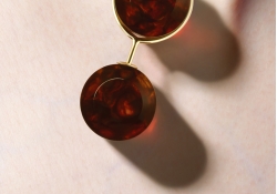
Xun Mi Honey Packaging Design
-
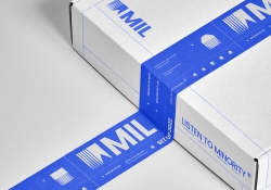
MIL
-
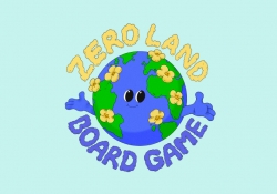
ZERO LAND
-
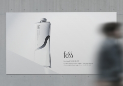
foss
-
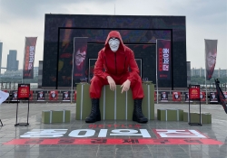
MONEY HEIST KOREA NETFLIX
-
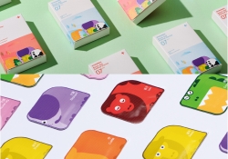
Functional system for wound care
-
8Nests Bird's Nest
-
SEOUL CITY BICYCLE
-
KOREA GOHEUNG YUZA WINE limited edition
-
DAEJEON ECO-EDUCATION COOPERATIVE Branding
-
COCO SENSE
-
Dong-A is 100 Visual Branding
-
398 TRIO Lounge
-
Hugrug
-
RNMS
-
POLO CAFE
-
24 Solar Terms


Designed by sketchbooks.co.kr / sketchbook5 board skin