
GRAND PRIZE
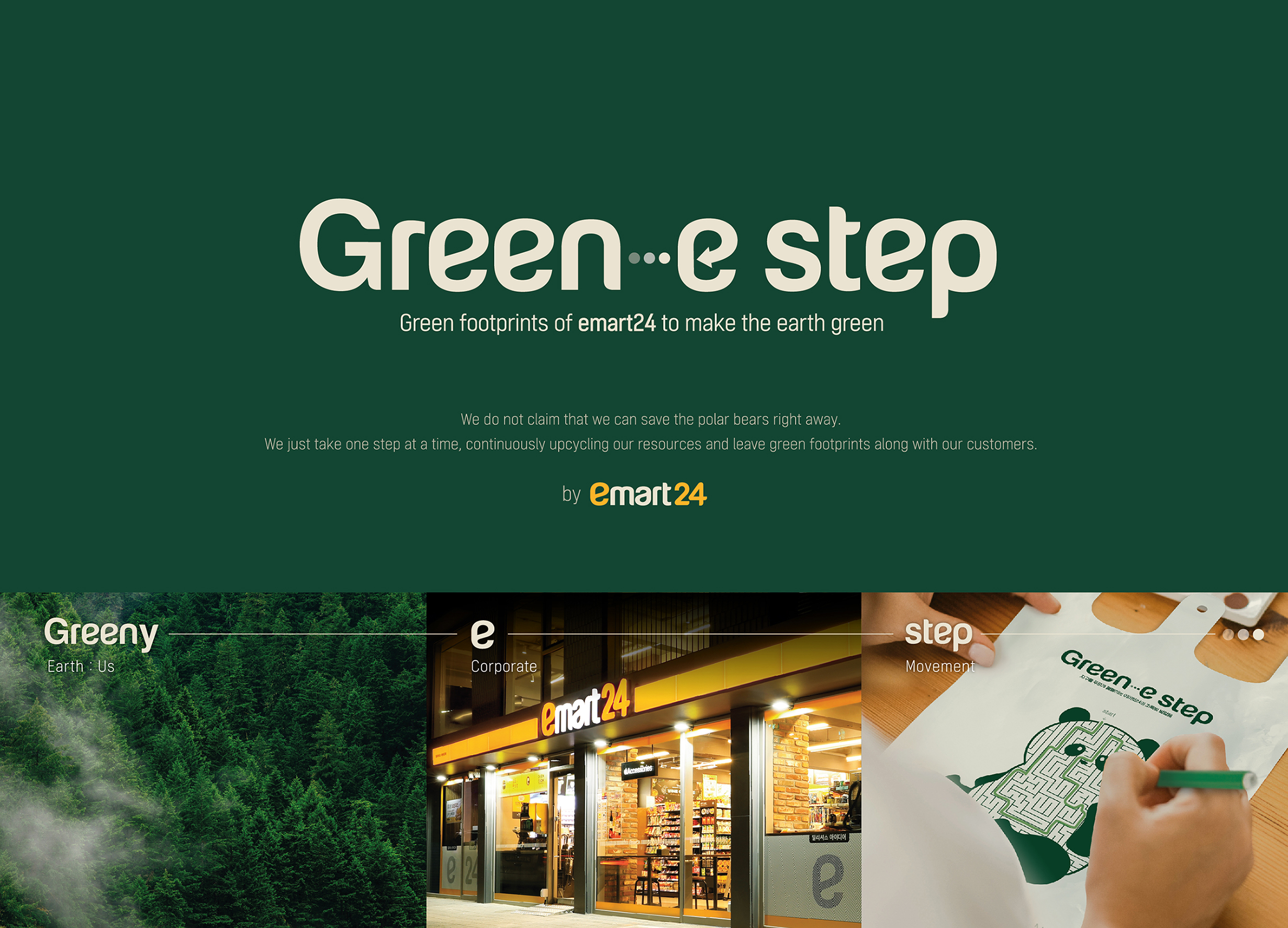
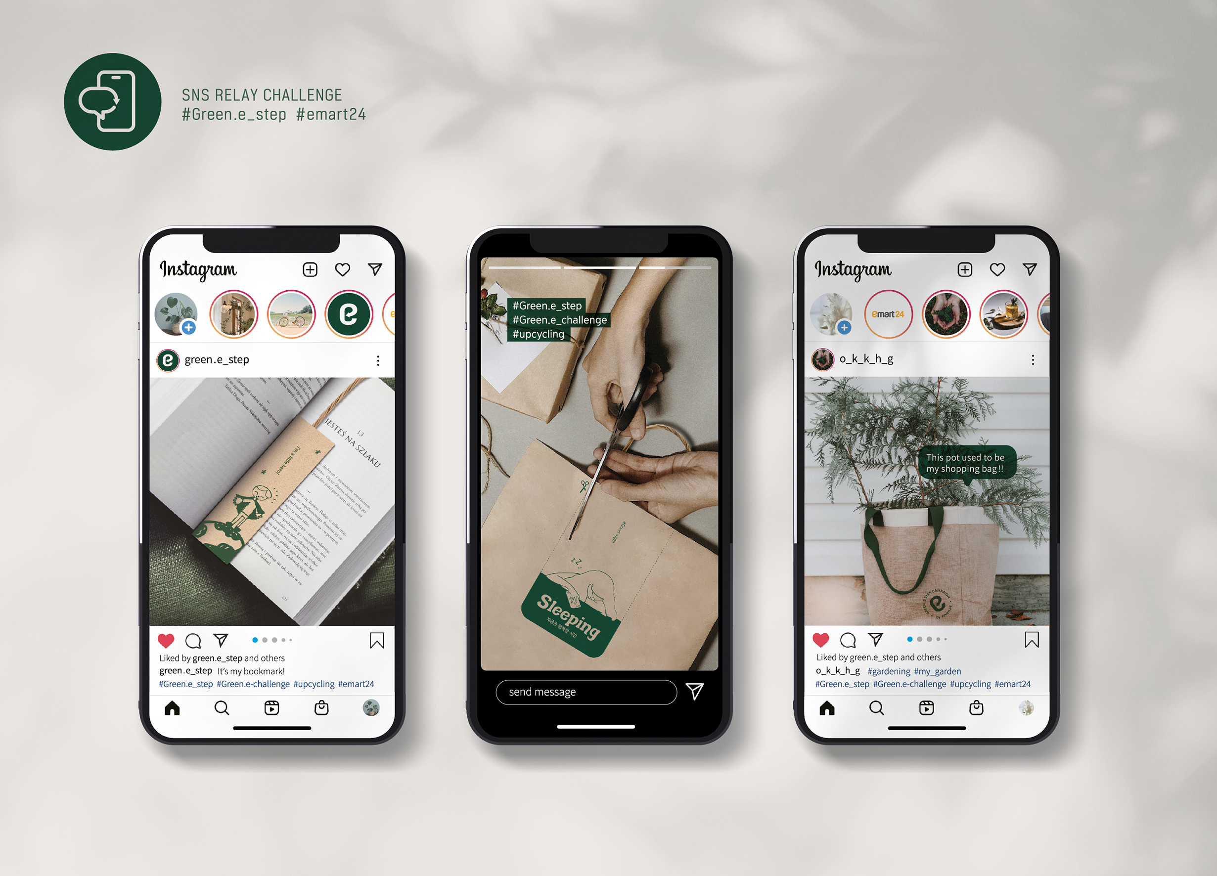
Green-e step

| Country | Korea |
|---|---|
| Year | 2021 |
| Award | GRAND PRIZE |
| Affiliation | emart24 Corp. |
| Designer | Oh hyunchang, Kang byoungjung, Kim minji, Hwang jiyoung, Go minzy |
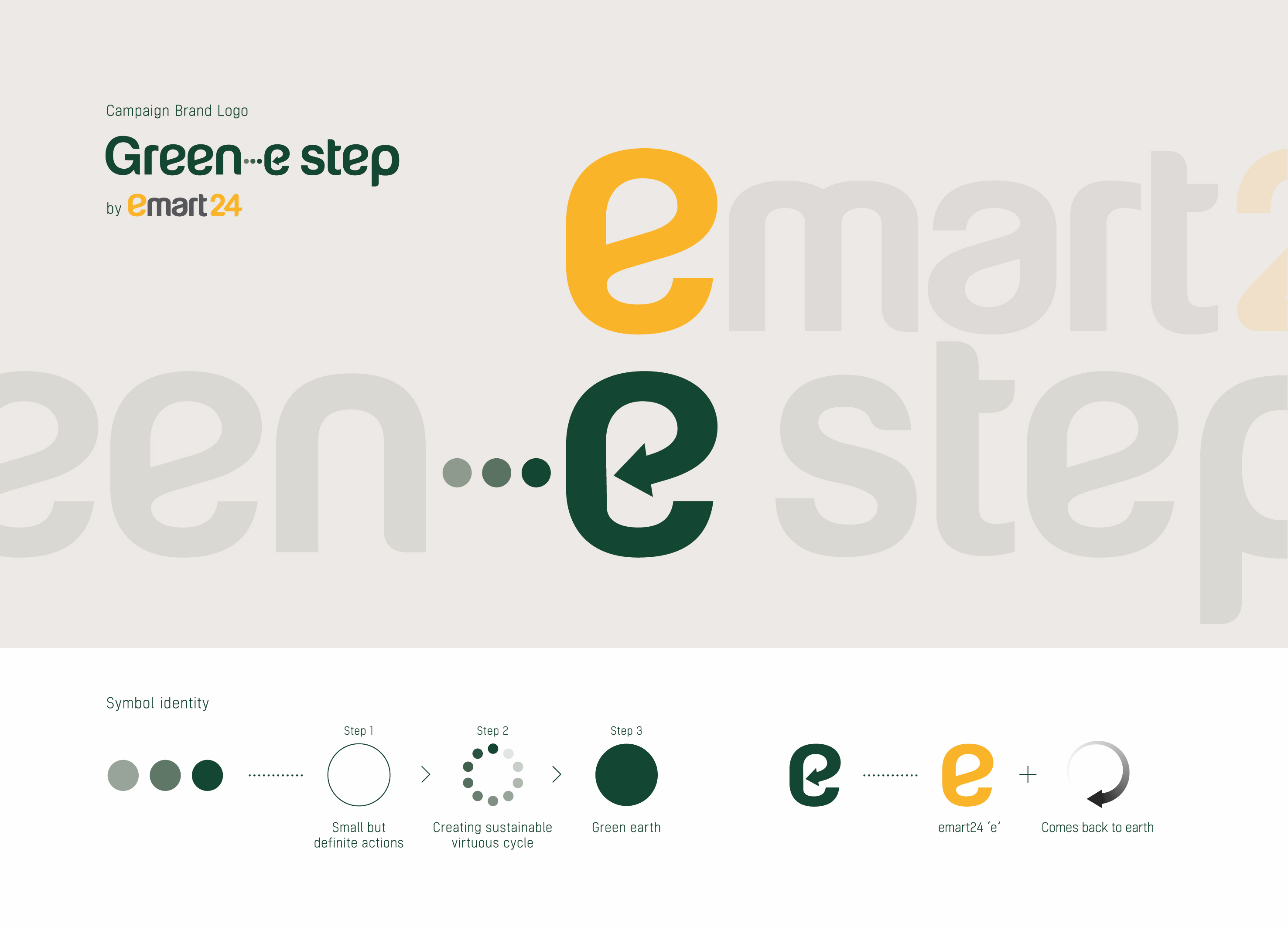
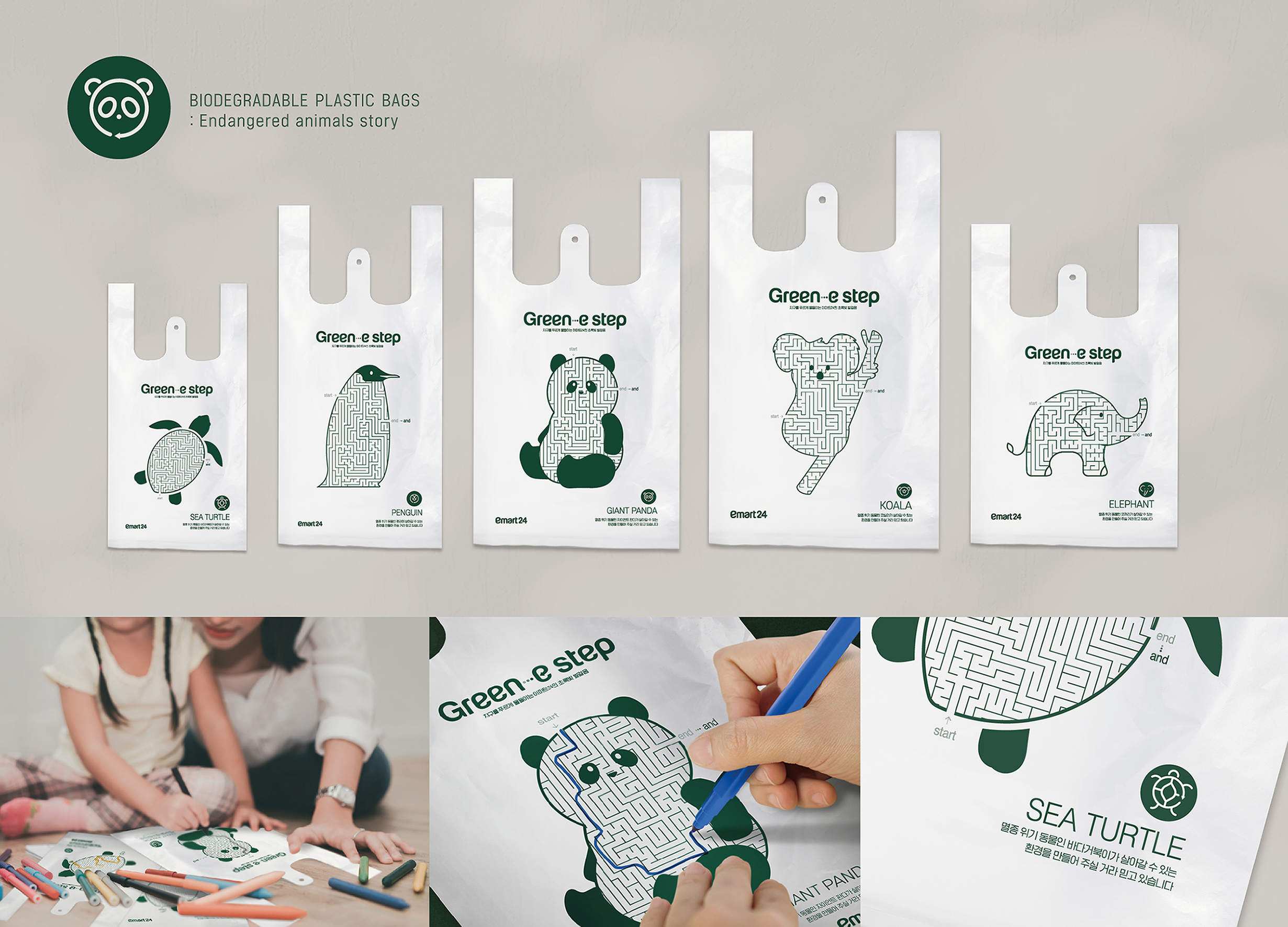
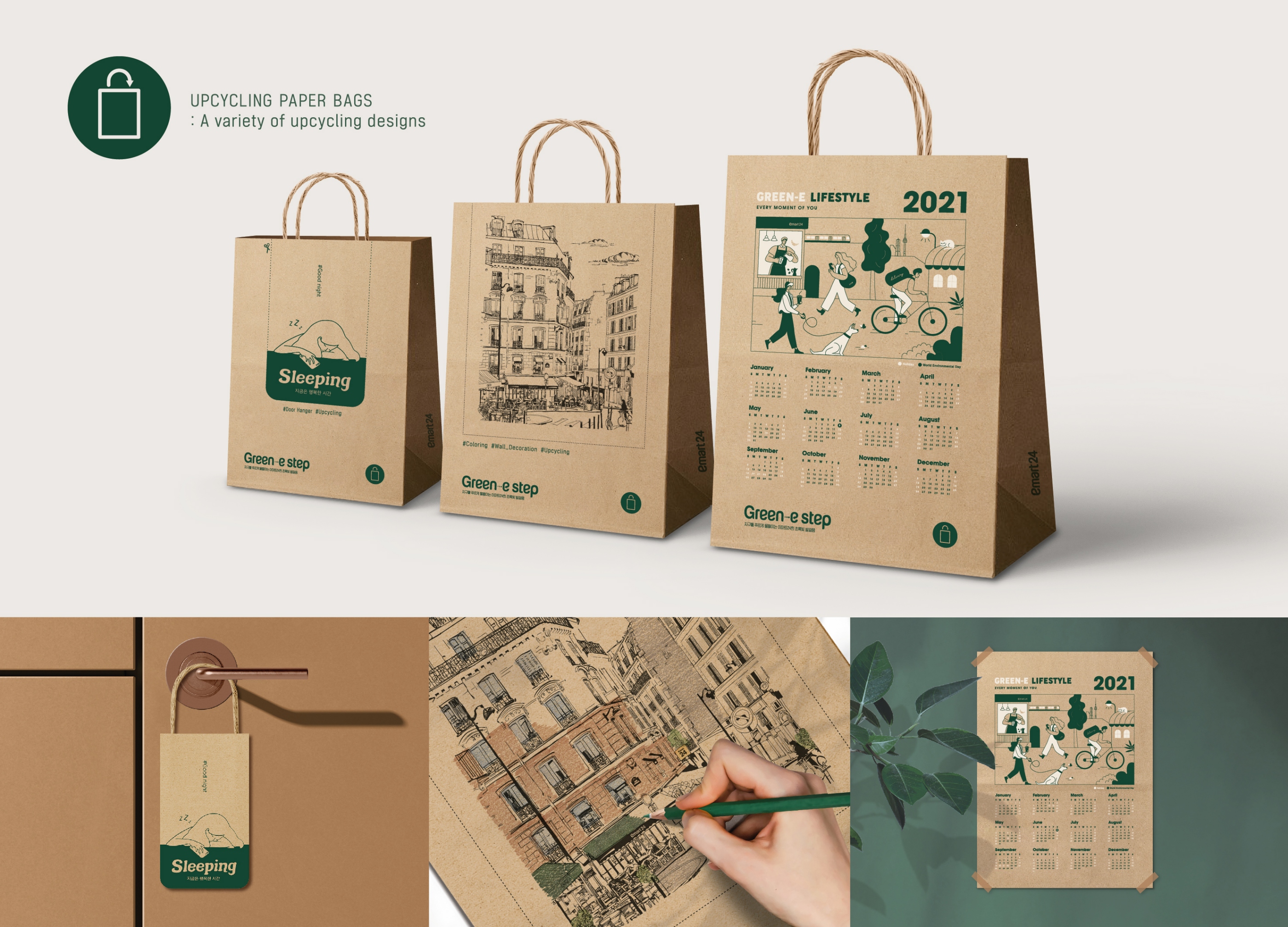
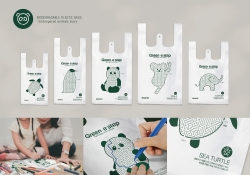
| English | 'Green-e step' is an eco-friendly campaign brand created by Korean convenience store 'emart24' that encourages the consumers to protect our environment by taking 'small but definite actions' on a daily basis. Our goal is to protect our environment by reuse, recycle, and upcycle our resources. To achieve this goal, we will provide the consumers with various options of shopping bags which can be transformed by consumers into reusable, keepsake goods. The letter 'e' in our logo signifies the brand identity of 'emart24' and its message as an 'eco-friendly' brand, and the arrow shape in it symbolizes the virtuous circulation. 'Green-e step' is a campaign brand that wants to save the world by everyday small practices instead of shouting out that we have to save the polar bears. While some of the others draw grandiose pictures to save this planet, we have been asking ourselves what we, as a leading Korean retail distribution company, can actually do on a daily basis. So we have come up with this 'Green-e step' campaign brand with the catch phrase, 'Small but definite action', which should be completed with the consumers' participation. In this irrevocable 'eco-friendly' direction, there are many pseudo campaigns all wrapped up in empty words or glamorous events only for loud show off. This is what we mostly object on this environmental issue. So we present this 'Green-e step' campaign brand, which can be implemented in a daily life of the 'green-sumers'. By 'green-sumers', we mean those who appreciate the values of reuse, recycle and upcycle to reduce the waste of the resources to protect the environment. ⠀ |
| Native | ‘Green-e step’은 북극곰을 살리자는 외침 대신 매일 묵묵히 친환경 가치에 한걸음씩 다가가는 친환경 캠페인 브랜드입니다. 이마트24는 한국의 편의점 유통사로서 ‘소소하지만 확실한 실천’을 모토로, 소비자의 업사이클링 참여로 완성되는 ‘그린e스텝’ 캠페인 브랜드를 기획했습니다. 우리의 실천 방향은 1회용 재화를 ‘덜 버리고, 새로 쓰고, 친환경의 진정한 가치를 의식적으로 되새기는 것’입니다. 소비자가 직접 쇼핑백을 새 활용 하여 다양한 재화로 재탄생 시키는 과정은 ‘천천히, 하지만 꾸준히’ 지속 가능한 브랜드 메시지에 진정성을 더합니다. ‘Green-e step’의 브랜드 로고는 emart24의 브랜드 시그니처인 ‘e’ 로고에 ‘우리의 친환경적인 실천이 결국 푸른 지구의 모습으로 되돌아 온다’는 이치를 담아 형상화하였습니다. 또한 세 개의 점은 한걸음씩 나아가는 발걸음을 따라 남겨진 발자국을 원(circle) 형태로 형상화하여 ‘조금씩 천천히, 그러나 점점 더 선명해지는’ 친환경 가치를 녹여냈습니다. ‘Green-e step’의 발자국은 지구에 뚜렷한 족적을 남겨 인류를 이롭게 하는 아름다운 시작점이자 전환점이 될 것입니다. 브랜드만의 고유한 가치와 메시지] ‘Green-e step’은 북극곰을 살리자는 외침 대신 매일 묵묵히 친환경 가치에 한걸음씩 다가가는 친환경 캠페인 브랜드입니다. 많은 기업과 단체가 친환경을 주창하며 ‘지속가능한 친환경 실천 방법은 무엇인가?’라는 시대의 물음에 답하는 동안 우리는 유통사로서 우리가 나아가야 하는 현명한 친환경 실천 방향에 대해 고민했습니다. 그 결과 우리는 한국의 편의점 유통사로서 ‘소소하지만 확실한 실천’을 모토로, 소비자의 참여로 완성되는 ‘그린-e-스텝’ 브랜드 캠페인을 통해 그 답을 찾았습니다. 우리는 종종 무늬만 친환경으로 포장된 캠페인 및 ESG활동이 결국 ‘보여주기식’의 그린 워싱에 불과한 경우를 마주합니다. 또 ‘북극곰을 살리는 방법’, ‘제로웨이스트’와 같은 거창한 친환경 메시지를 담은 포부가 실제로 실천으로 이어지지 못하는 경우도 자주 목도합니다. 이에 우리는 ‘실천하지 않는 친환경 메시지는 공허한 메아리에 불과하다’는 생각으로, 아주 소소하더라도 꼭 실천할 수 있는 작은 변화를 만들고자 노력했습니다. 지구를 보호하기 위해 가치 소비를 우선시하는 ‘그린슈머(Greensumer)’와 함께 매일 재화를 ‘재사용하여 덜 버리고, 새활용(upcycling)하고, 친환경의 진정한 가치를 의식적으로 되새기는 것’을 목표로 캠페인 브랜드를 기획하였습니다. |
| Website | www.emart24.co.kr |
-
SMILE IS GOOD Visual Branding
-
DFX Brand Identity
-
Applied Typography30
-
WHY NOT Collection
-
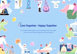
Care Together Happy Together Visual branding
-
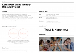
Korea Post Brand Identity Rebrand
-
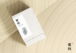
Yangrim
-
Green-e step

Designed by sketchbooks.co.kr / sketchbook5 board skin