

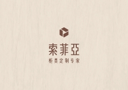
| Country | China |
|---|---|
| Year | 2021 |
| Award | WINNER |
| Affiliation | SUOFEIYA HOME COLLECTION CO |
| Designer | Xiaoke Huang |
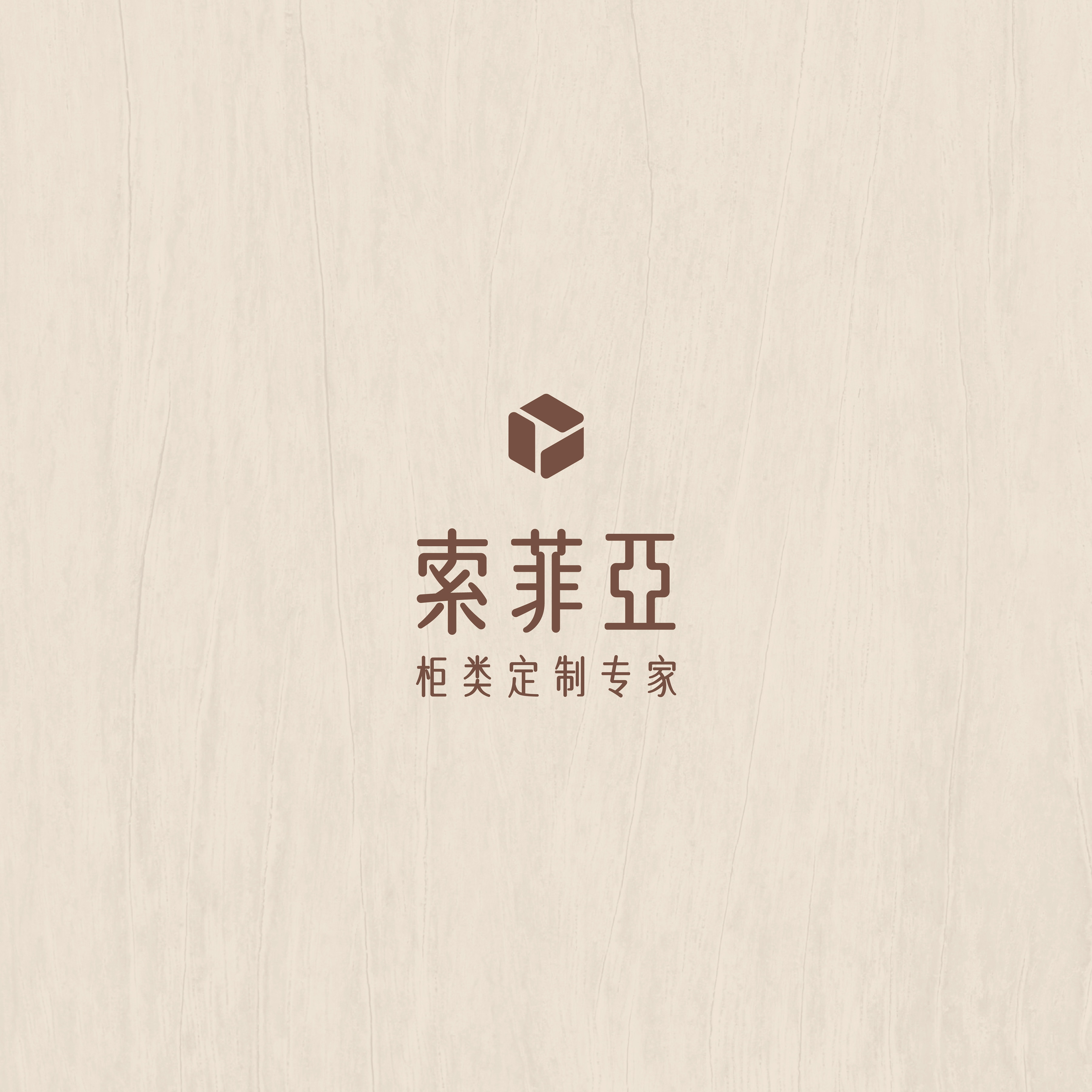
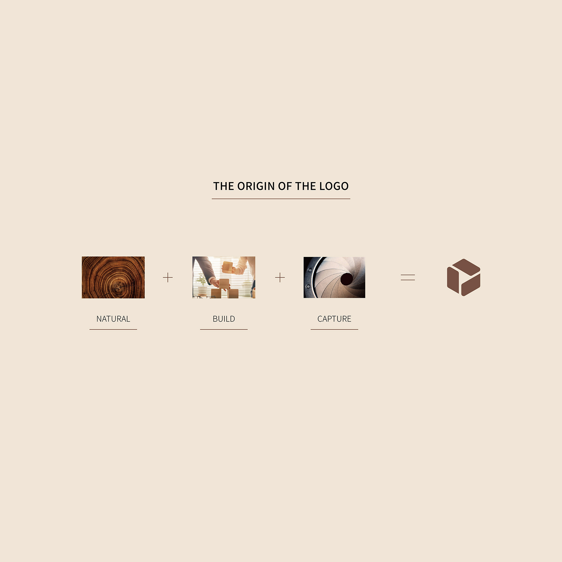
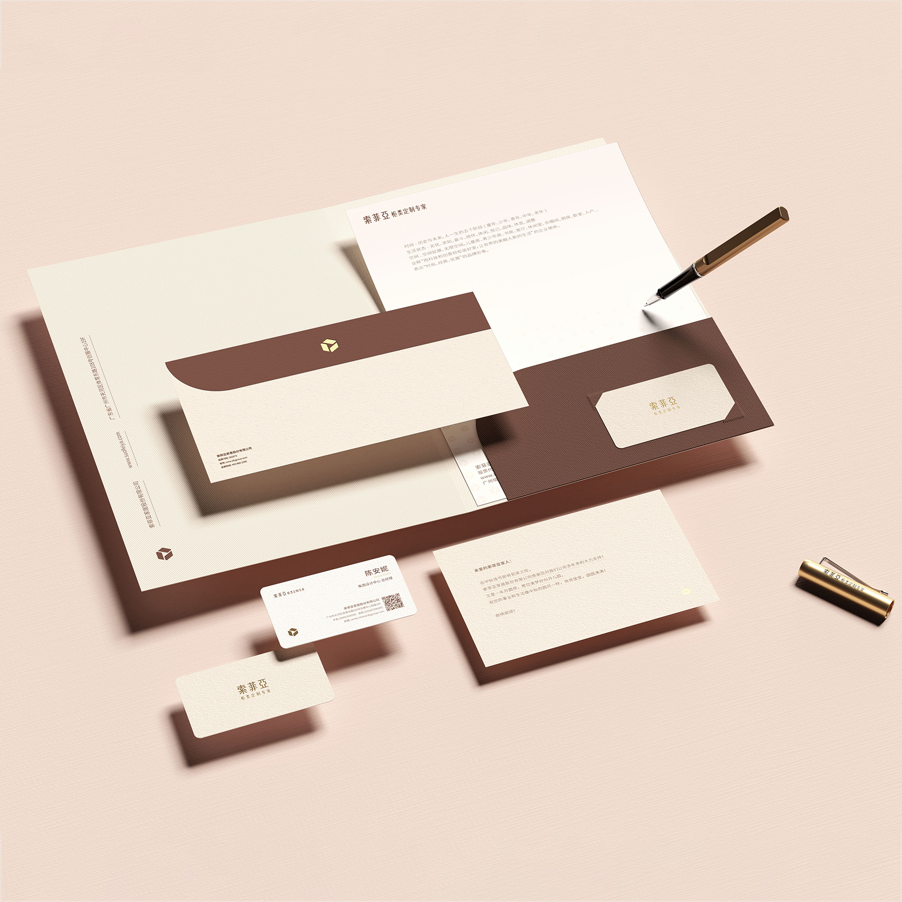
| English | INSPIRATION: Since its establishment in 1981, Suofeiya has been focusing on the customization of home cabinets. The basic and core vision of the new brand image is a graphic evolved from the camera aperture, which means "capture the beauty in life". Building an ideal home for people has always been our pursuit, so the square element is incorporated into the logo. The use of wood that meets environmental protection standards has always been our foundation, so we chose a calm brown. UNIQUE PROPERTIES: Suofeiya provides consumers with professional customized cabinet services. In order to enhance brand recognition and allow consumers to quickly identify Suofeiy's upgraded brand positioning,we design a focused, concise and clear brand image. INTERACTION: The LOGO is a combination of a graphic and Chinese characters. There is no fixed combination of the two, which can be flexibly placed in the design while forming a stable structure. REALIZATION TECHNOLOGY: Different size and combination logos are used in many scenes such as paper, name brands, handbags, and signboards. RESEARCH ABSTRACT: In the context of China's consumption upgrade, consumers have higher requirements for furniture customization. Facing serious homogeneity of products and brand positioning in the China custom furniture industry, Suofeiya seeks new breakthroughs by focusing on promoting the best-selling product - custom cabinets. CHALLENGE: This company has many stores and lacks a unified and complete brand vision system,including office supplies, brand packaging, and storefront design, advertisement. The biggest challenge is to create a unified, easy to apply, easy to recognize, and unique visual system for this brand. |
| Native | 索菲亚自1981年创立以来,一直专注家居柜类定制,力求让世界的美融入到家居设计中。 面对中国家居行业大量涌现的产品同质化定制品牌,消费者很难做出选择。索菲亚以专注的行业精神回归到品牌核心业务及优势——柜类定制,以提供消费者更专业的家具柜类定制服务。为了提升品牌辨识度,让消费者快速识别索菲亚升级后的品牌定位,我们以“简洁”为核心视觉。新品牌VI识别基础和核心视觉是由相机光圈演变而来的图形,意为“捕捉生活中的美”;选用沉稳的棕色和典雅的杏色作为两大主色,结合logo及品牌字以简洁的排版及金色点缀,运用到办公用品、品牌包装、户外空间等七大系统中,向消费者展示了索菲亚“经典、轻奢、优雅”的品牌调性。 索菲亚自1981年创立以来,一直专注家居柜类定制,力求让世界的美融入到家居设计中, 为供消费者更专业的家具柜类定制服务。 专注于“全屋定制”领域的索菲亚家居品牌,自创立以来,力求持之以恒,而不是追赶时髦且随波逐流的品牌价值。 随着中国家居消费市场的升级,全屋定制的出现解决了消费者对定制化个性空间的各种要求。而索菲亚全屋定制设计更注重空间、生活、人三者之间的存在相融关系,在众多全屋定制家居品牌中独树一帜。 启发: 索菲亚自1981年创立以来,一直专注家居柜类定制。 新品牌VI识别基础和核心视觉是由相机光圈演变而来的图形,意为“捕捉生活中的美”。为人们构筑理想家居一直是我们的追求,所以LOGO中融入了方块的元素。使用符合环保标准的木材一直是我们的基础,所以选用了沉稳的棕色。 特点: 索菲亚为供消费者提供专业的家具柜类定制服务。为了提升品牌辨识度,让消费者快速识别索菲亚升级后的品牌定位,我们以一个焦点,简洁明确地塑造品牌形象。 交互: 索菲亚柜类定制专家LOGO由一个图形和中文字组合而成。二者没有固定的组合形式,可灵活地放置在设计中,同时构成一组稳定的结构。 应用: 在许多场合(例如纸张,名牌,手袋和招牌)中使用了不同的大小和组合形式的徽标。 设计背景: 索菲亚自1981年创立以来,一直专注家居柜类定制,力求让世界的美融入到家居设计中。 面对中国家居行业大量涌现的产品同质化定制品牌,消费者很难做出选择。 挑战: 这个品牌本身拥有很多门店和庞大且不统一、不完善的视觉系统(包括办公用品、品牌包装、户外空间宣传、店铺空间视觉)。为这个品牌创造一个统一且容易应用、轻松被识别、具有独特性的视觉系统是最大的挑战。 |
-
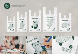
Green-e step
-
Gemeaux Aile
-
White Mountain Club House
-
Functional system for wound care
-
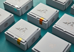
8Nests Bird's Nest
-
SEOUL CITY BICYCLE
-
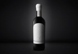
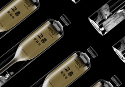
KOREA GOHEUNG YUZA WINE limited edition
-
DAEJEON ECO-EDUCATION COOPERATIVE Branding
-
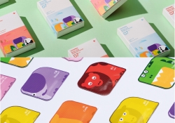
COCO SENSE
-
Dong-A is 100 Visual Branding
-
398 TRIO Lounge
-
Hugrug
-
RNMS
-
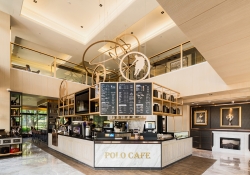
POLO CAFE
-
24 Solar Terms
-
Dood Bottega Gelateria Branding
-
ANBD Kyoto Exhibition
-
Urban Cave
-
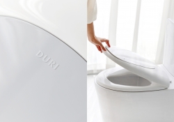
Duri
-
Suofeiya Custom Cabinet Expert VI


Designed by sketchbooks.co.kr / sketchbook5 board skin