WINNER
24 Solar Terms
| Country | Chinese Taipei |
|---|---|
| Year | 2021 |
| Award | WINNER |
| Affiliation | Yi Jia Visual Identity Design |
| Designer | CHIA HUI LIEN |
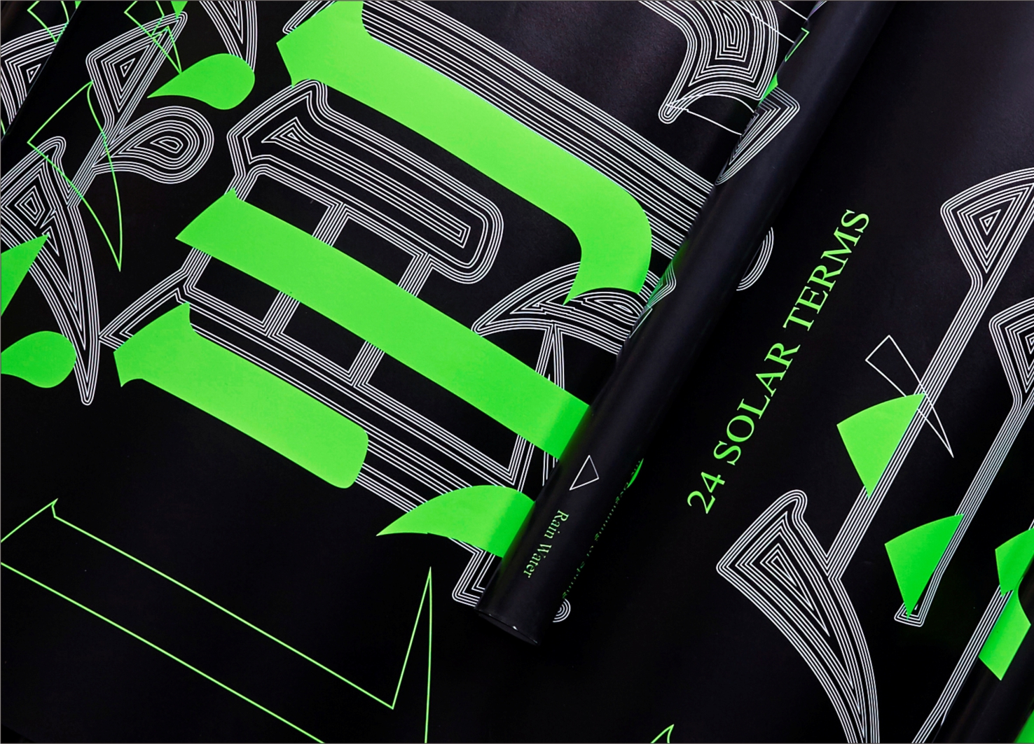
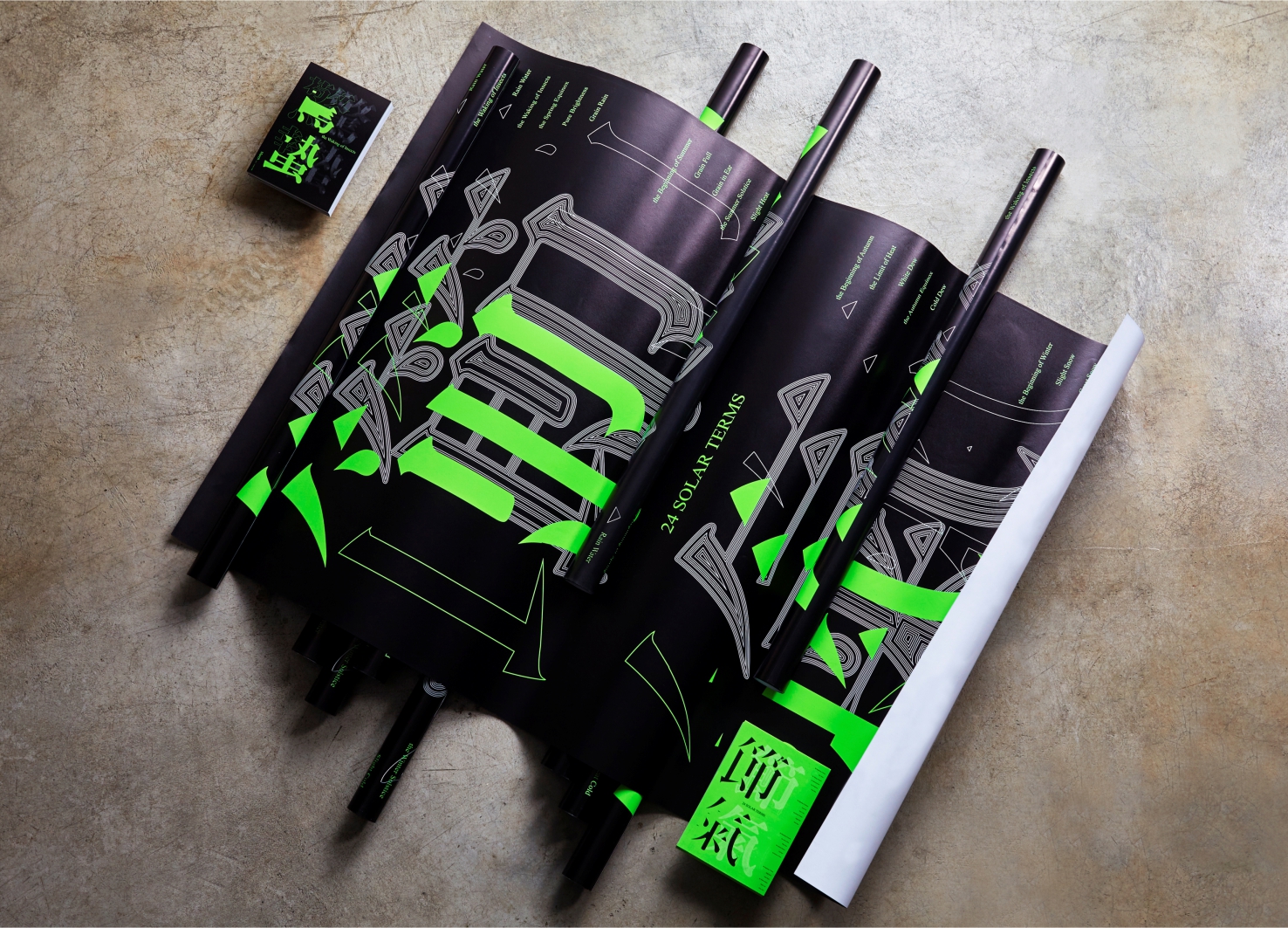
| English | The Huaxia forefathers of China invented the calendar thousands of years ago. They divided the year into 24 solar terms, which guided early farmers on how to work the field. Using the idea of cyclic time flow, font design breaks down the strokes in radicals through an expression of lines. Spatial expressions of the empty and the solid are then put on display. A specific shade of green was chosen to symbolize the vigor of the land. The Chinese farmer's almanac recorded climate patterns based on seasonal changes. Every rotation, turn and placement from the lines and structures of Chinese characters symbolizes the change between "action" and "stillness" under the laws of the world. The crafting of dot, line and plane patterns based on solar terms is an interpretation from the sentimental pens of font creators. |
| Native | 中國華夏先民,在幾千年前就發明了曆法,曆法中把一年分成24個節氣,中國古代的人民,在長期的生產實踐中逐步認識到季節更替和氣候變化的規律,結合日月的運行位置,把一年平分為二十四等份,二十四節氣的名稱分別是立春、雨水、驚蟄、春分、清明、穀雨、立夏、小滿、芒種、夏至、小暑、大暑、立秋、處暑、白露、秋分、寒露、霜降、立冬、小雪、大雪、冬至、小寒、大寒。表示寒來暑往變化為立春、春分;立夏、夏至;立秋、秋分;立冬、冬至。象徵氣溫變化為小暑、大暑、處暑、小寒、大寒。反映降水量為雨水、穀雨、白露、寒露、霜降小雪、大雪。反應物候現象或農事活動為驚蟄、清明、小滿、芒種。古農村民們依照24節氣從事農業耕種活動。在整體形象設計以海報、酷卡及插畫為其設計延伸項目,而視覺設計中以字體結構為發展主軸,字體設計中以時間不斷循環概念,運用線條表現,將字體部首筆劃解構,呈現「虛」與「實」的空間表現,色彩以特別色(螢光綠)印製,讓系列海報象徵大地生生不息的意象,藉由印刷的效果,產生令人視覺聚焦的視覺設計。中國農民曆法運用氣候季節變遷,訂下其規律,以漢字架構線條之迴旋、翻轉、錯位,象徵節氣於天地規律中,「動」與「靜」之間的變化,點與線及面之圖騰繪製,依其節氣變化為創作者感性筆下的詮釋。 |
-
Green-e step
-
Gemeaux Aile
-
White Mountain Club House
-
Functional system for wound care
-
8Nests Bird's Nest
-
SEOUL CITY BICYCLE
-
KOREA GOHEUNG YUZA WINE limited edition
-
DAEJEON ECO-EDUCATION COOPERATIVE Branding
-
COCO SENSE
-
Dong-A is 100 Visual Branding
-
398 TRIO Lounge
-
Hugrug
-
RNMS
-
POLO CAFE
-
24 Solar Terms
-
Dood Bottega Gelateria Branding
-
ANBD Kyoto Exhibition
-
Urban Cave
-
Duri
-
Suofeiya Custom Cabinet Expert VI
Designed by sketchbooks.co.kr / sketchbook5 board skin


