
CUSTOM FONTS
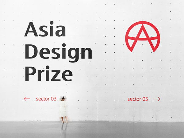
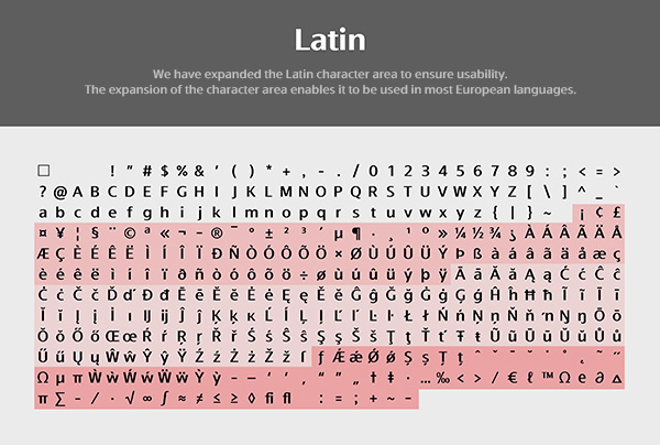
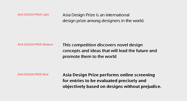
Asia Design Prize has developed exclusive font with FontRix. For high readability for judging, this font must be used on presentation boards at Asia Design Prize. This is a font where you can feel the reputation and authority of Asia's largest international competition, Asia Design Prize. It was created by reflecting the characteristics of the humanist typeface that the influence of handwriting stands out so that it can be read well and expressed in a variety of environments. In consideration of global utilization, the usability has been improved by deriving it in a total of 3 different thicknesses. It has a clean, serif-free shape that gives it a solid yet refined look.
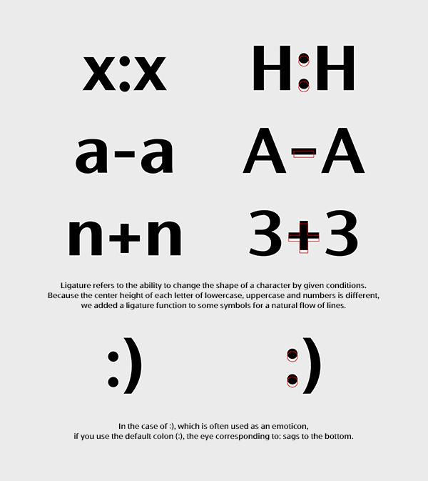
We designed the vertical stroke to be thicker than the horizontal stroke to give the stroke contrast. High-contrast letters can easily be seen on prints or screens, and have the effect of making them stand out visually. One of the characteristics of dynamic cursive writing is that the inner space has an asymmetrical shape in the lowercase letters of the alphabet such as h or n. The vertex of the arch is to the right of the center. It has a deep cut that connects to the left stem (stroke) in the arched text. This steep curve distinguishes between arched letters and rounded letters like the letter o, especially at small sizes. It has an open, wide open aperture. This gives a cool sense of space and helps you to identify letters more easily. This is an English-language font with three thicknesses optimized for award panels and design portfolios. It is available for free to all designers around the world, and can be used without restrictions.
We designed the vertical stroke to be thicker than the horizontal stroke to give the stroke contrast. High-contrast letters can easily be seen on prints or screens, and have the effect of making them stand out visually. One of the characteristics of dynamic cursive writing is that the inner space has an asymmetrical shape in the lowercase letters of the alphabet such as h or n. The vertex of the arch is to the right of the center. It has a deep cut that connects to the left stem (stroke) in the arched text. This steep curve distinguishes between arched letters and rounded letters like the letter o, especially at small sizes. It has an open, wide open aperture. This gives a cool sense of space and helps you to identify letters more easily. This is an English-language font with three thicknesses optimized for award panels and design portfolios. It is available for free to all designers around the world, and can be used without restrictions.
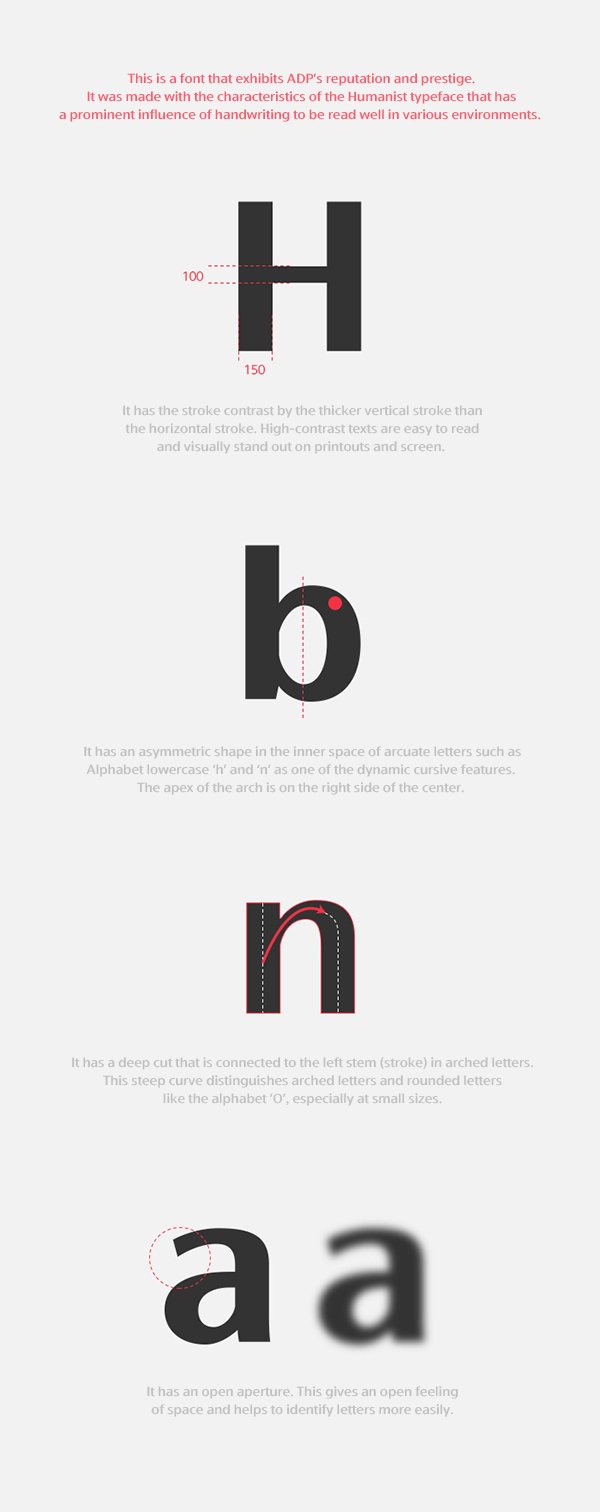
We designed the vertical stroke to be thicker than the horizontal stroke to give the stroke contrast. High-contrast letters can easily be seen on prints or screens, and have the effect of making them stand out visually. One of the characteristics of dynamic cursive writing is that the inner space has an asymmetrical shape in the lowercase letters of the alphabet such as h or n. The vertex of the arch is to the right of the center. It has a deep cut that connects to the left stem (stroke) in the arched text. This steep curve distinguishes between arched letters and rounded letters like the letter o, especially at small sizes. It has an open, wide open aperture. This gives a cool sense of space and helps you to identify letters more easily. This is an English-language font with three thicknesses optimized for award panels and design portfolios. It is available for free to all designers around the world, and can be used without restrictions.
Download
CUSTOM FONT-ASIA DESIGN PRIZE.zip
* The intellectual property rights of Asia Design Prize typefaces belong to Designsori and Fontrix. This Font Software is licensed under the SIL Open Font License, Version 1.1. Gambling, pornography, etc., use on illegal sites is not permitted.


