
Communication
WALRUS PUMP Brand Design
| Country | Chinese Taipei |
|---|---|
| Year | 2023 |
| Award | GOLD WINNER |
| Client | WALRUS PUMP Co., Ltd. |
| Affiliation | Process Group |
| Designer | Raymond Huang, Amy Huang, Xinhong Yeh Eting Liao, Jules Li Yiru Huang, Angel Yang Kaiching Liu |
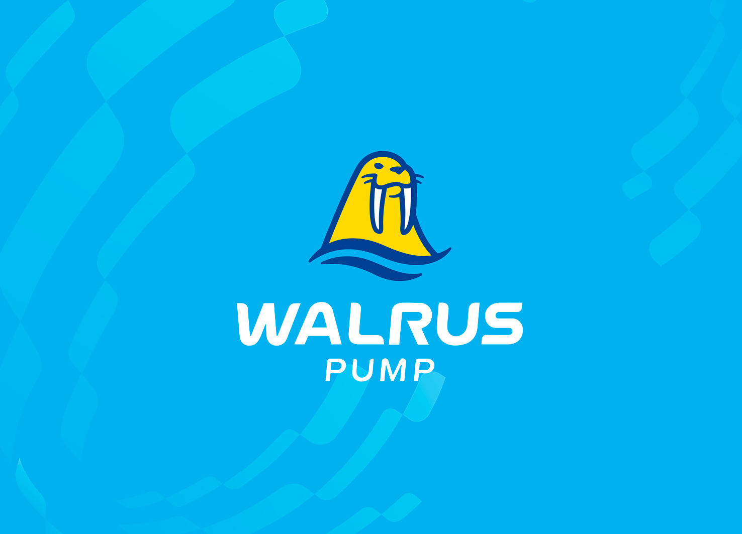
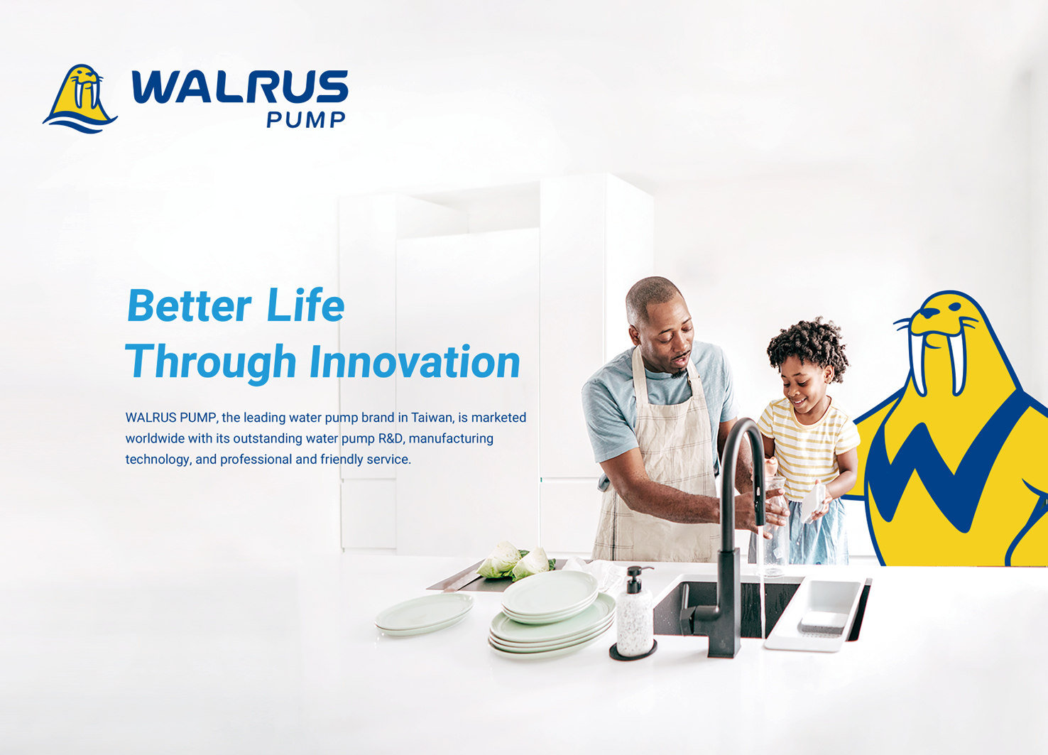
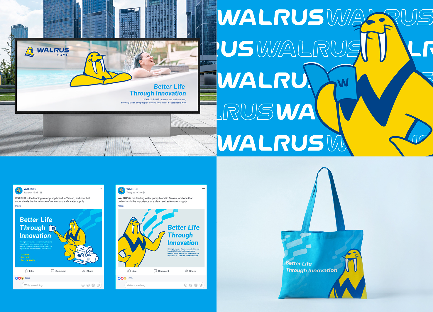
| English | WALRUS is the leading brand of water pumps in Taiwan, activating rebranding to expand the international markets. To reverse the rigid image of the B2B industry, the brand identity uses aqua blue and yellow to show the feeling of sunshine, energy, and youth, and creates a mascot to communicate the emotional traits of the brand. The design is based on the theme of Better Life Through Innovation, and the dynamic ocean currents are used as an expression for promoting a better life and determining to deploy globally. The product structure has also been sorted out with eight industry icons designed to communicate with consumers and dealers. |
| Native | WALRUS大井泵浦創立於1967年,是台灣的領導品牌,在水泵設計研發、製造生產與銷售服務已有五十五年的歷程,產品更銷售世界一百多個國家,提供市場最優質的用水品質。WALRUS大井泵浦為拓展至更多國際市場,須有完整的品牌識別系統、設計應用物和規範,但現有工具不足,且無擬定品牌策略基礎,導致在執行跨國品牌溝通時,不易應用和管理。 為了拓展國際市場進行品牌重塑,以扭轉B2B產業給予人們生硬的形象,WALRUS的品牌識別運用水藍色及黃色展現出陽光、活潑、年輕的感受,並搭配WALRUS 吉祥物溝通品牌感性的特質。設計上以Better Life Through Innovation為主題,以洋流作為輔助圖形的靈感來源,將水流動充滿力量的型態轉化為品牌的視覺形象,持續推動美好生活及佈局全球的決心。 我們重新梳理產品分類系統,運用八大產業分類,並設計代表各產業的圖標與設定圖標規範,進一步與消費者及經銷商溝通,協助WALRUS大井泵浦無論對內或對外皆能有一致且有效的訊息傳遞。同時亦發展出系統化的品牌識別元素與設計應用物,包括品牌圖像規範、產品型錄、海報、線上廣告與網站,以嶄新的面貌宣示WALRUS大井泵浦進入新的里程碑,持續傳遞品牌精神! |
| Website | www.walruspump.com |
| Positive Comments |


|
- No Articles
Designed by sketchbooks.co.kr / sketchbook5 board skin