
Communication
Geongang-won Darin
| Country | Korea |
|---|---|
| Year | 2020 |
| Award | WINNER |
| Affiliation | Sungshin Womens University |
| Designer | Heesoo Son, Seoyeon Yoon |
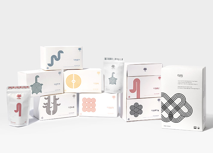
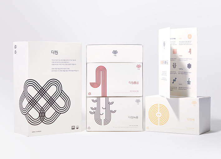
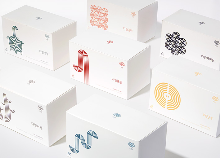
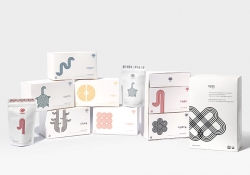
| English | Geongang-won is a Korean health food store,using the traditional decocting methods. There was a problems with a perception that Geongang-won only go to older people and lack of diversity package because of its old designs. So we newly branded it targeting these 20-30s, who have become more interested in health care, to use Geongang-won without any repulsion. We named our brand, 'Darin' which means 'decocted' in korea. Our brand used a logo that visualized blood circulation to convey its goal of providing vitality and health to the 20-30s,and the icons and patterns of all packages embody the materials used and the production sites of them |
| Native | 피로사회가 도래하면서 건강에 대한 현대인들의 관심이 늘어나면서 한국 전통 건강보조식품가게 건강원에 대한 관심도 늘어나고 있다. 하지만 기존의 건강원은 올드한 디자인과 브랜딩으로 인해 나이든 사람들만 간다는 인식과, 모든 가게가 한 두가지의 패키지를 대량 구매해 사용하는 방식이라서 다양성이 부족하다는 문제점이 있었다. 그래서 우리는 건강에 대한 관심이 많아진 2030세대를 타겟으로, 더 다양한 연령층이 거부감 없이 건강원을 이용할 수 있도록 브랜딩하였다. 브랜드의 이름은 ‘다린(Darin)‘으로, 달이다(decocted)에서 파생되었으며, 소비자들에게 정성껏 달인 건강즙을 전달하겠다는 의미를 담았다. 또한 혈액순환을 모티브로 한 로고를 통해 피곤한 2030세대에게 활력과 건강을 선사하겠다는 목표를 전달하고자했다. 우리는 2030세대에게 다가갈 수 있도록 깔끔하면서도 한눈에 보일 수 있는 디자인을 만들고자했다. 박스에는 어떤 재료로 만들어진 즙인지 알 수 있도록 그래픽화시킨 아이콘을 넣었으며, 팩의 상단에는 재료가 자란 환경과 재료의 특성에서 따온 패턴을 넣었다. 또한 아이콘과 패턴은 재료에서 가져온 색상으로 만들어져 메인컬러와 서브컬러로 이루어져있다. |
-
INSOUND
-
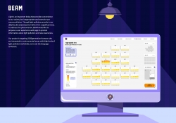
BEAM Light Pollution Data Visualization
-
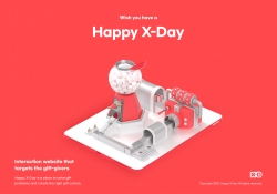
Happy X Day
-
Geongang-won Darin
Designed by sketchbooks.co.kr / sketchbook5 board skin