
Communication
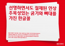
WELCOME Typeface Design
| Country | Korea |
|---|---|
| Year | 2022 |
| Award | WINNER |
| Client | Welcome Savings Bank |
| Affiliation | Welcome Savings Bank BX Design |
| Designer | Lee ByoungOk, Im GyuRi, Jang GoEun |
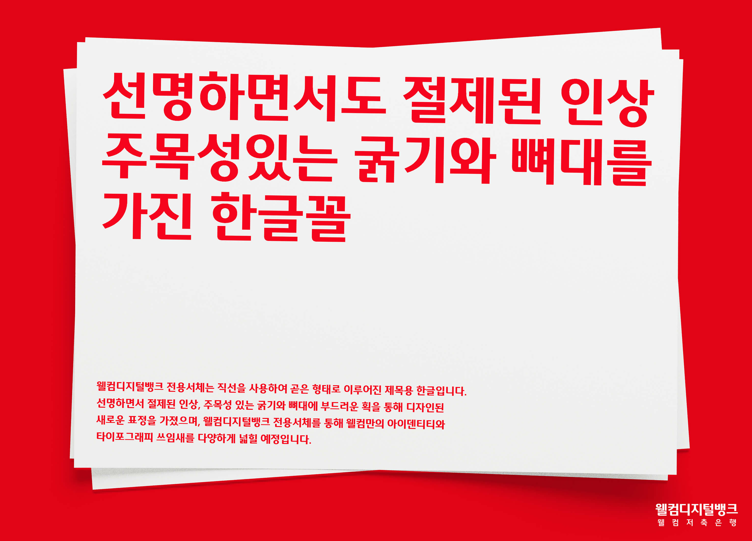
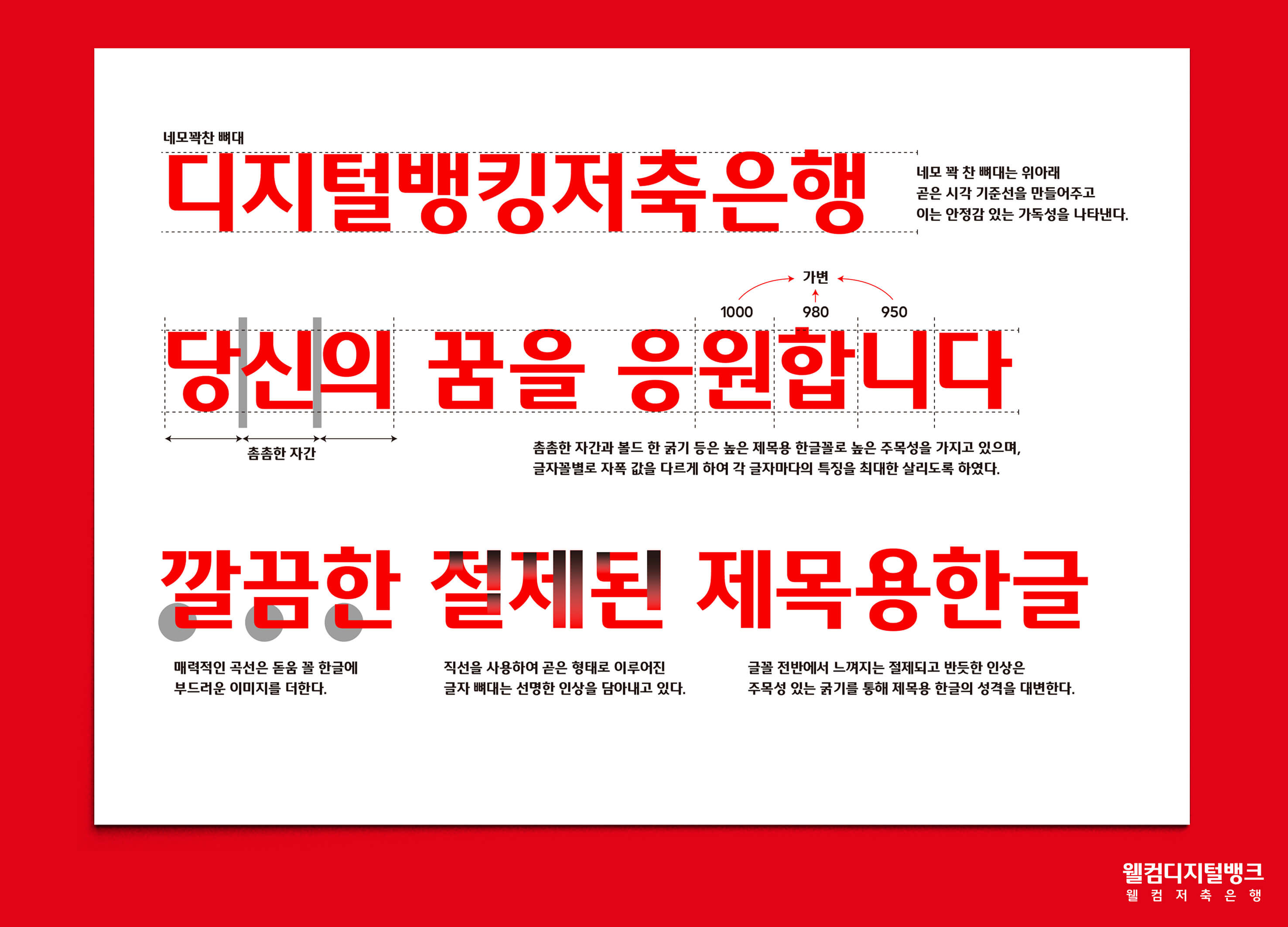
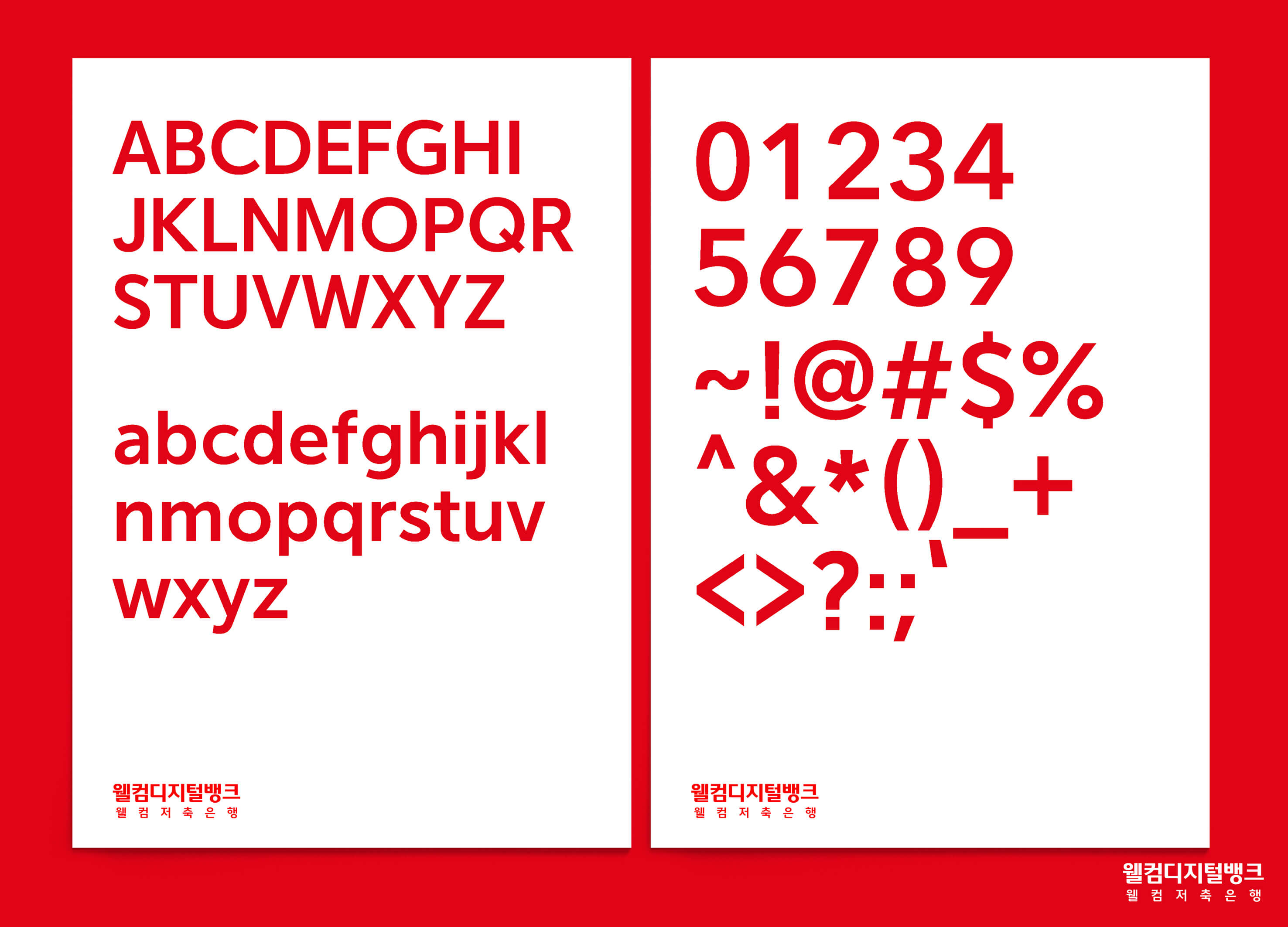
| English | The 'Welcome typeface' is a font for sans serif and titles. It was designed with a clear, restrained impression, bold, and soft stroke. A constant vertical line emphasizes a geometric feel. Hangul's condensed module expresses a youthful feeling and a sense of speed in the typeface. The Welcome typeface will contribute to spreading a consistent brand image through its use for the brand communications of 'WELCOME DIGITAL BANK' through advertising, app etc. |
| Native | 웰컴디지털뱅크 전용서체는 직선을 사용하여 곧은 형태로 이루어진 제목용 한글입니다. 선명하면서 절제된 인상, 주목성 있는 굵기와 뼈대에 부드러운 획을 통해 디자인된 새로운 표정을 가졌습니다. 일정한 세로획은 지오메트릭한 느낌을 강조하며, 디지털을 상징하는 요소로 웰컴만의 아이덴티티를 나타냅니다. 한글의 컨덴시드한 모듈은 서체에 젊은 느낌과 속도감을 표현하며, 공통된 곡선(라운딩 처리)처리는 서체의 개성과 동시에 부드러운 인상을 전달합니다. 또한, 시각 중심을 상단에 두어 시선의 이동, 정렬이 편하게 진행되도록 구성된 가독성 높은 서체입니다. 웰컴디지털뱅크 전용서체를 통해 웰컴만의 아이덴티티와 타이포그래피 쓰임새를 다양하게 넓힐 예정입니다. |
| Positive Comments |


|
-
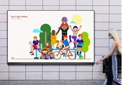
Welcome Bank Walking Visual Identity Design
-
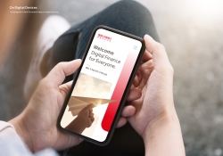
Welcome Digital Bank Visual Identity
-
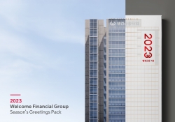
Welcome FG Seasons Greetings Pack
-
WELCOME Typeface Design
Designed by sketchbooks.co.kr / sketchbook5 board skin