
Communication
Hangeul Braille integrated Universal Font
| Country | Korea |
|---|---|
| Year | 2022 |
| Award | WINNER |
| Affiliation | Yeungnam University |
| Designer | Cheolhee Lee |
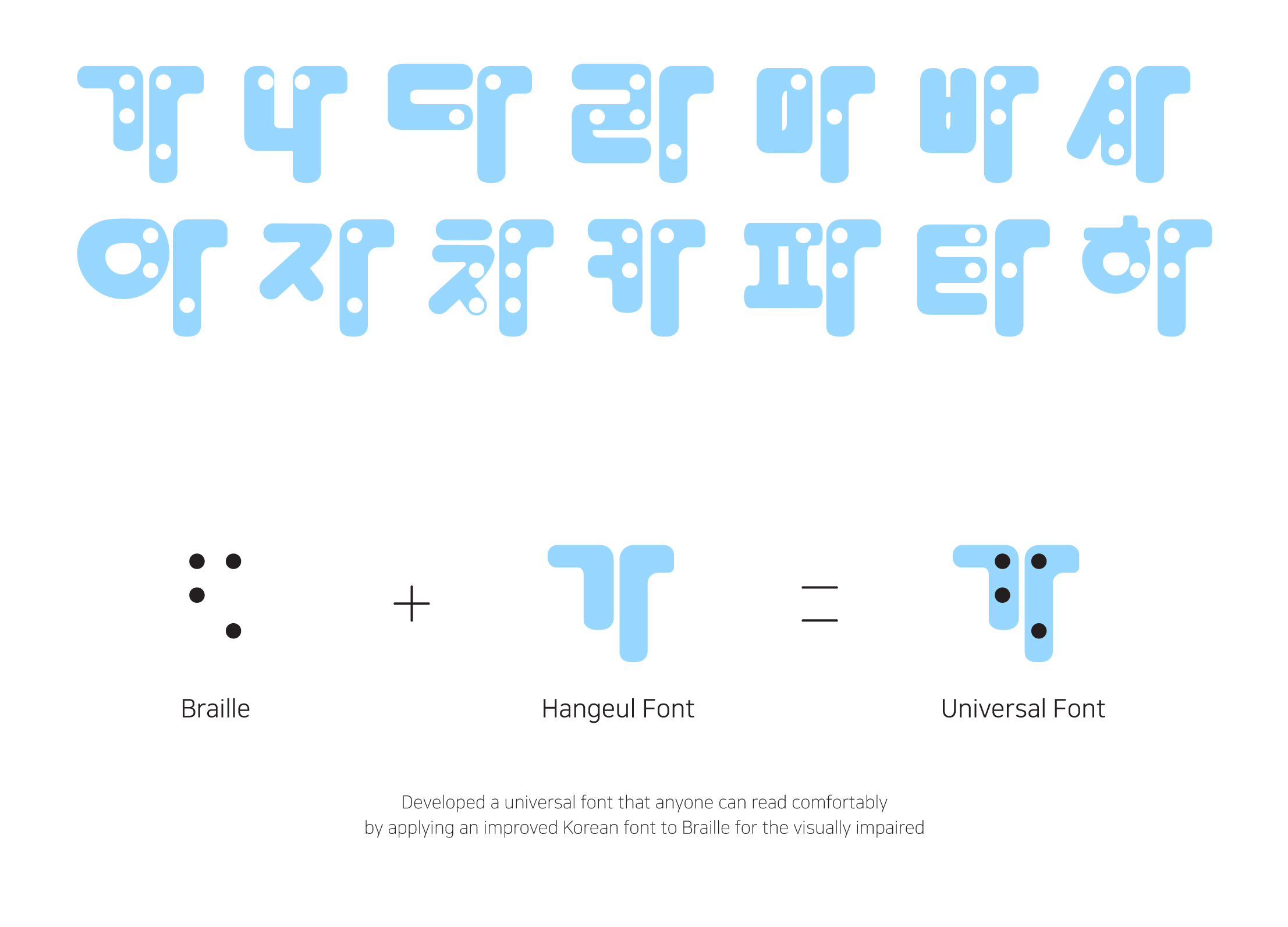
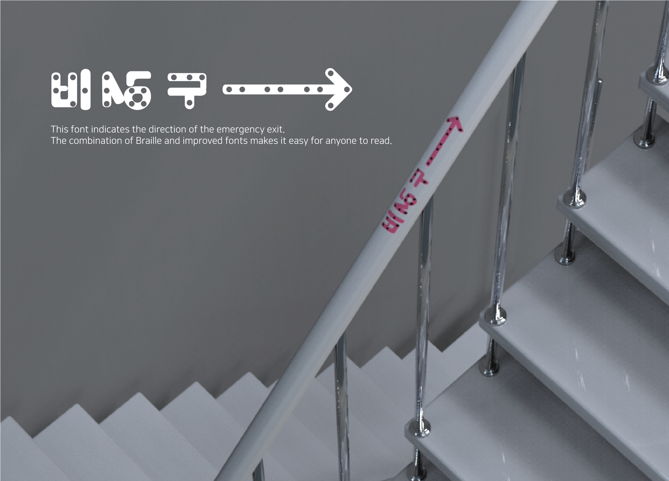
| English | What looks like a design for people with disabilities can give secondary discrimination to people with disabilities. As an example, the good Braille concept is in place, but is disappearing for a number of reasons. The reasons were often that it harmed the aesthetics and that people without disabilities could not be sympathetic. This font design, which started by observing these problems, is really a font that anyone can read within the same standard range. It is a design that can create horizontal communication through fonts without discrimination by unifying the existing Hangeul composition method and Braille development method into one. |
| Native | 현대 사회는 장애인들을 위한 존중이 지속되고 있는 사회로 그들의 생활 환경을 고려하고 있습니다. 하지만, 누가 보아도 너무 장애인들을 위한 디자인처럼 보이는 것은 장애인들에게 2차적인 차별을 줄 수 있습니다. 한 예시로, 우수한 점자 개념이 자리를 잡고 있지만, 여러가지 이유로 점점 사라지고 있습니다. 미관을 해친다는 이유와 비장애인에게는 공감대를 살 수 없다는 점이 이유가 되곤 하였습니다. 이러한 문제들에 대한 관찰에서 시작한 이 폰트 디자인은 정말 누구나 같은 규격범위 내에서 글을 읽을 수 있도록 하는 폰트입니다. 기존 한글의 구성 방식과 점자의 전개 방식을 하나로 통일하여 차별없는 폰트를 통한 수평화된 커뮤니케이션을 만들어낼 수 있는 디자인입니다. |
| Positive Comments |


|
-
Balanca
-
Hangeul Braille integrated Universal Font
-
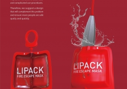
LIPACK
-
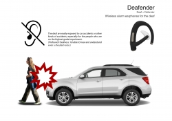
Deafender
-
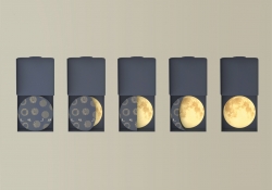
A PIECE OF FULL MOON
Designed by sketchbooks.co.kr / sketchbook5 board skin