
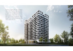
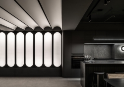
Neuraderm brand design
| Country | Korea |
|---|---|
| Year | 2024 |
| Award | WINNER |
| Client | Medytox Co., Ltd. |
| Affiliation | ohSeven design Co., Ltd. |
| Designer | Sukyoo Bae, Boyeon Yeon, Jahee Lee, Jinju Kim, Sunyoung Yun |
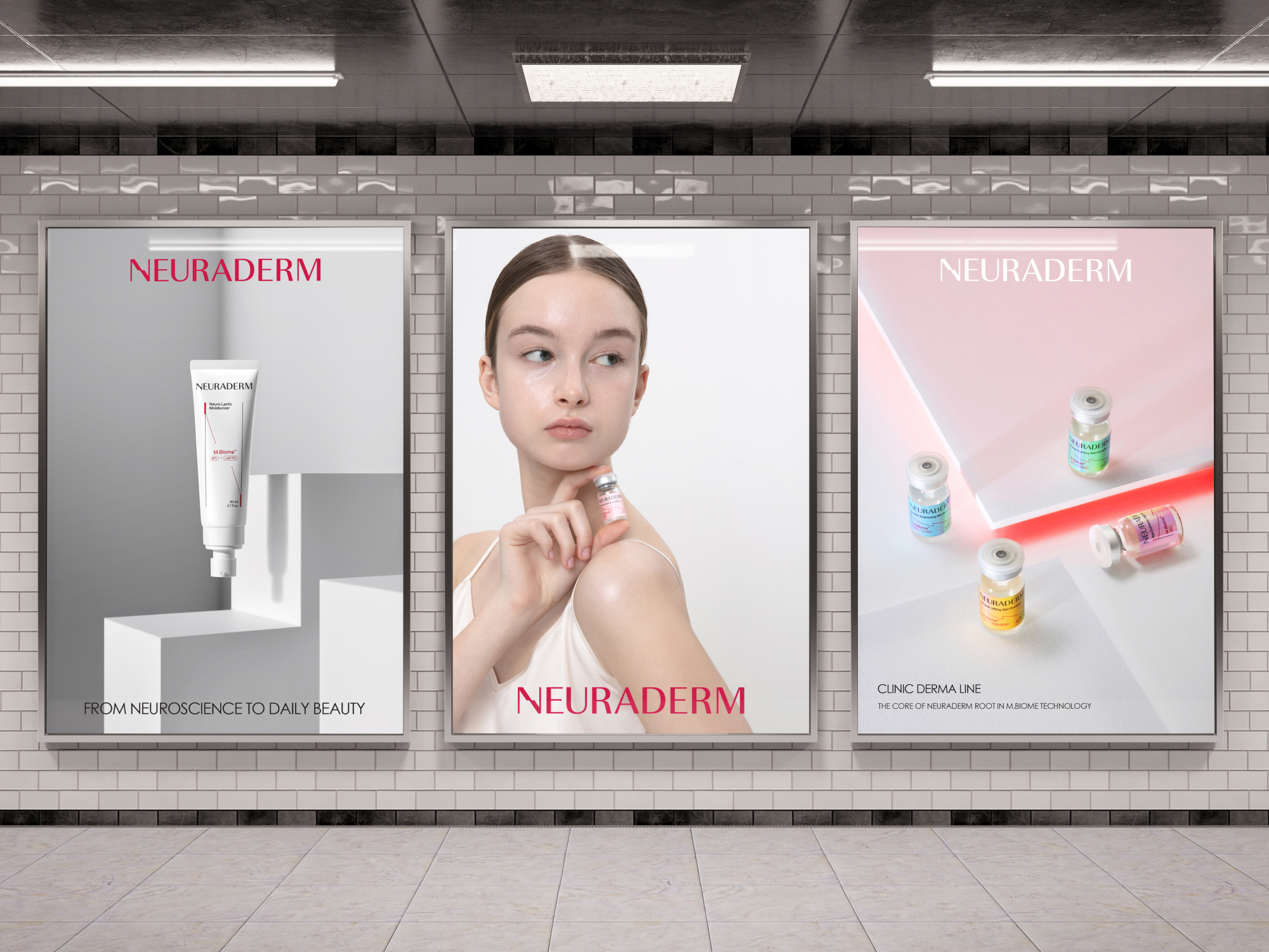
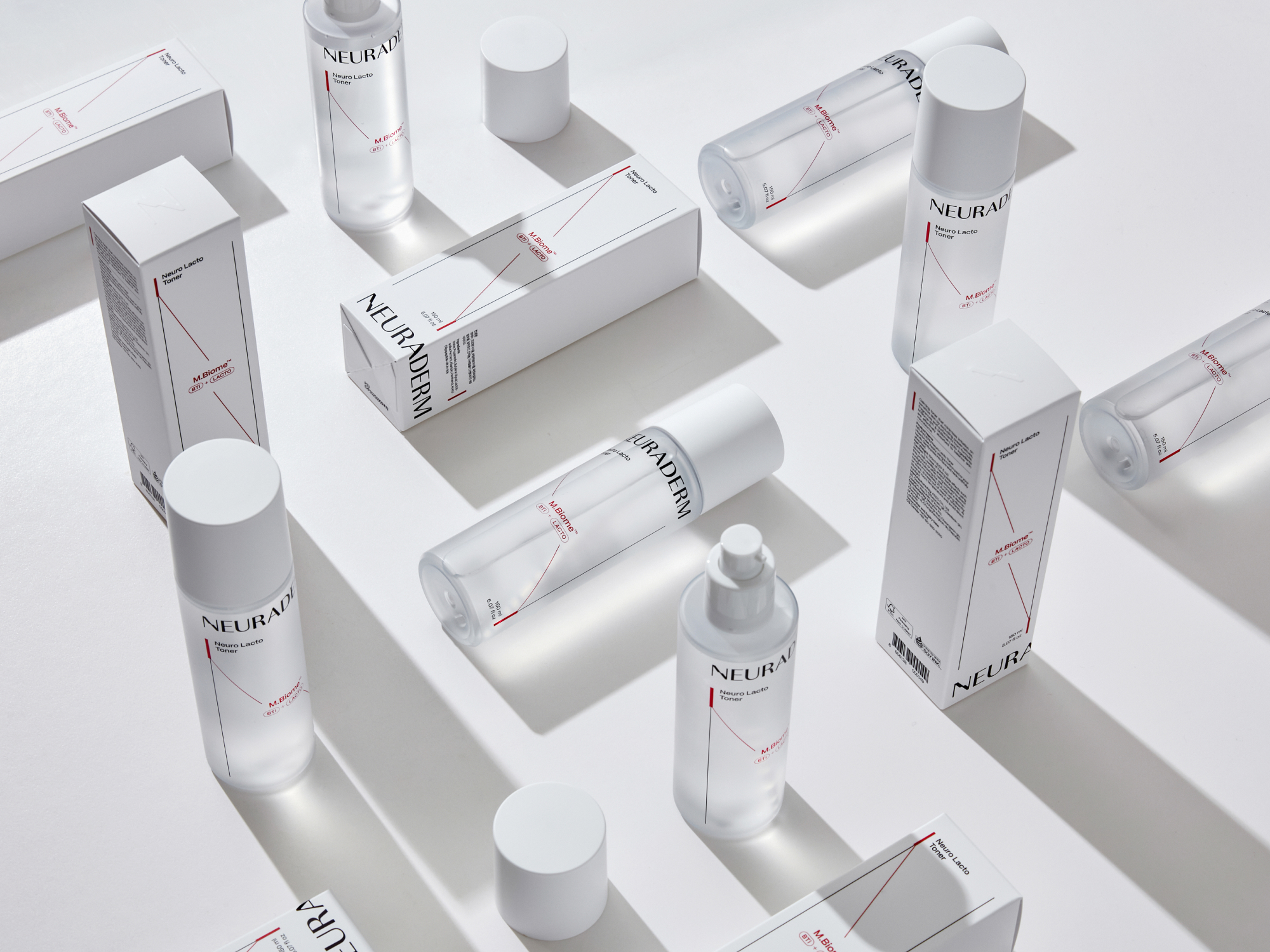
| English | The logo emphasizes NEURADERM's neuroscience-based patented ingredients and uses an alphabet, N, of NEURADERM to express the connection from dermatology to daily beauty. It also implies the movement for connections between neurons. Neuraderm’s graphic asset has a diagonal shape derived from the alphabet, N, which means connection, and it is inspired by the connection of cells. The graphic asset is utilized in diverse layouts flexibly, depending on applications. The package system also uses a graphic theme of diagonal connection as the key layout element. The system is customizable for varying proportions. |
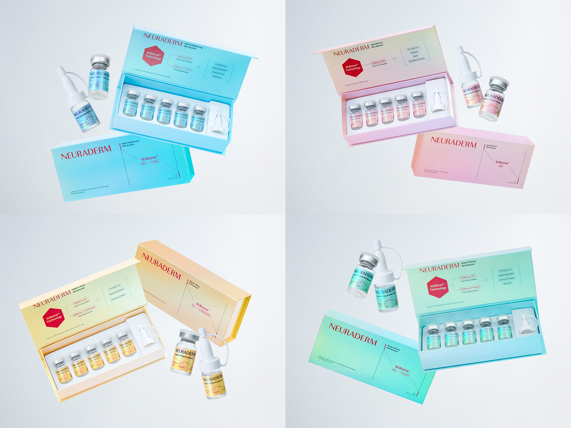
| Native | 뉴라덤은 메디톡스의 기술로 만든 Medical Aesthetics를 근간으로 더마 코스메틱의 전문성을 강조한 스킨케어 브랜드입니다. 뉴라덤은 NEURo science And DERMatology의 연결입니다. 로고는 신경과학을 기반으로 한 뉴라덤의 특허성분을 강조하면서, 동시에 뉴라덤을 통한 더마톨로지에서 데일리뷰티까지의 연결성을 NEURADERM의 N을 통해 표현하였습니다. 현대적이면서도 과학적인 무드를 전달하기위해 모던 산세리프체를 사용해 로고를 디자인 했습니다. 이와 함께 레드와 블랙을 메인컬러로 활용하여 Cosmeceutical 브랜드 무드를 강조합니다.화이트컬러는 의학적인 룩앤필을 완성합니다. 뉴라덤의 그래픽 에셋은 연결을 나타내는 N에서 파생된 사선의 형태로, 세포의 연결을 모티브로 만들어졌습니다. 적용 어플리케이션에 따라 다양한 레이아웃에 맞게 유동적으로 활용됩니다. 패키지 시스템 또한 사선 연결 그래픽 모티브를 레이아웃 구성의 핵심 요소로 사용합니다. 여러 비율에 적용될 수 있도록 시스템을 구축하였습니다. 그리고 프리미엄 에스테틱 스킨 케어라인인 클리닉 더마라인은 메디톡스의 R&D 기술의 집약체로 홀로그램 텍스쳐를 적극적으로 활용하여 혁신적인, 차별화된 기술의 이미지를 전달하고 있습니다. |
| Website | neuraderm.kr |
| Positive Comments |


|
| Judging Comments | NEURADERM's design received high praise for its innovative integration of neuroscience into its brand identity. The use of the letter 'N' to symbolize connections between neurons and dermatology effectively communicates the brand's unique approach to skincare. The flexible graphic asset, inspired by cellular connections, alongside a customizable packaging system, showcases a cohesive and adaptable branding strategy that resonates with the scientific foundation of NEURADERM. |
-
Murakoshi House
-
Weaving Haifu
-
YU SHAN COFFEE BOOKBAR
-
Wave House
-
In Between the Red Brick Wall
-
Chengdu BMW Experience Center
-
QUARK
-
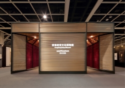
Yung Zing Tung Copper Culture Gallery
-
Grayscale of Light
-
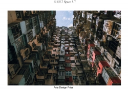
Space 5 point 7
-
bibu pet store
-
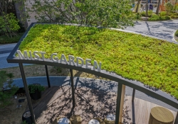
Mist Garden
-
H Wave Wall
-
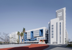
Quanzhou Experimental Middle School
-
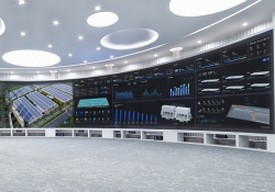
IOC of Jingzhou factory
-
Boundless Boundaries
-
Ribbon House
-
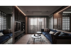
Mancave
-
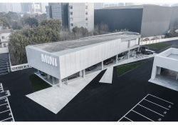
Chengdu MINI Showroom Complex
-
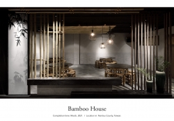
Bamboo House
-
Birch Forest
-
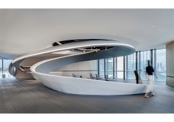
Stream Office
-
My Boundary
-
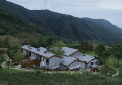
Daotianyi Moutain Hotel
-
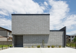
House in Niigata
-
DNAKE Smart Central Control Screen Knob
-
Maguro
-
RENOVATION OF OLD WAREHOUSE ON THE NORTH BUND
-
BTS
-
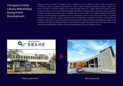
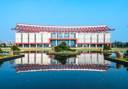
Changwon Public Library Rebranding
-
KClighting Global Flagship Showroom
-
IOC for Midea Headquarter
-
Zhangzhou City Museum
Designed by sketchbooks.co.kr / sketchbook5 board skin