
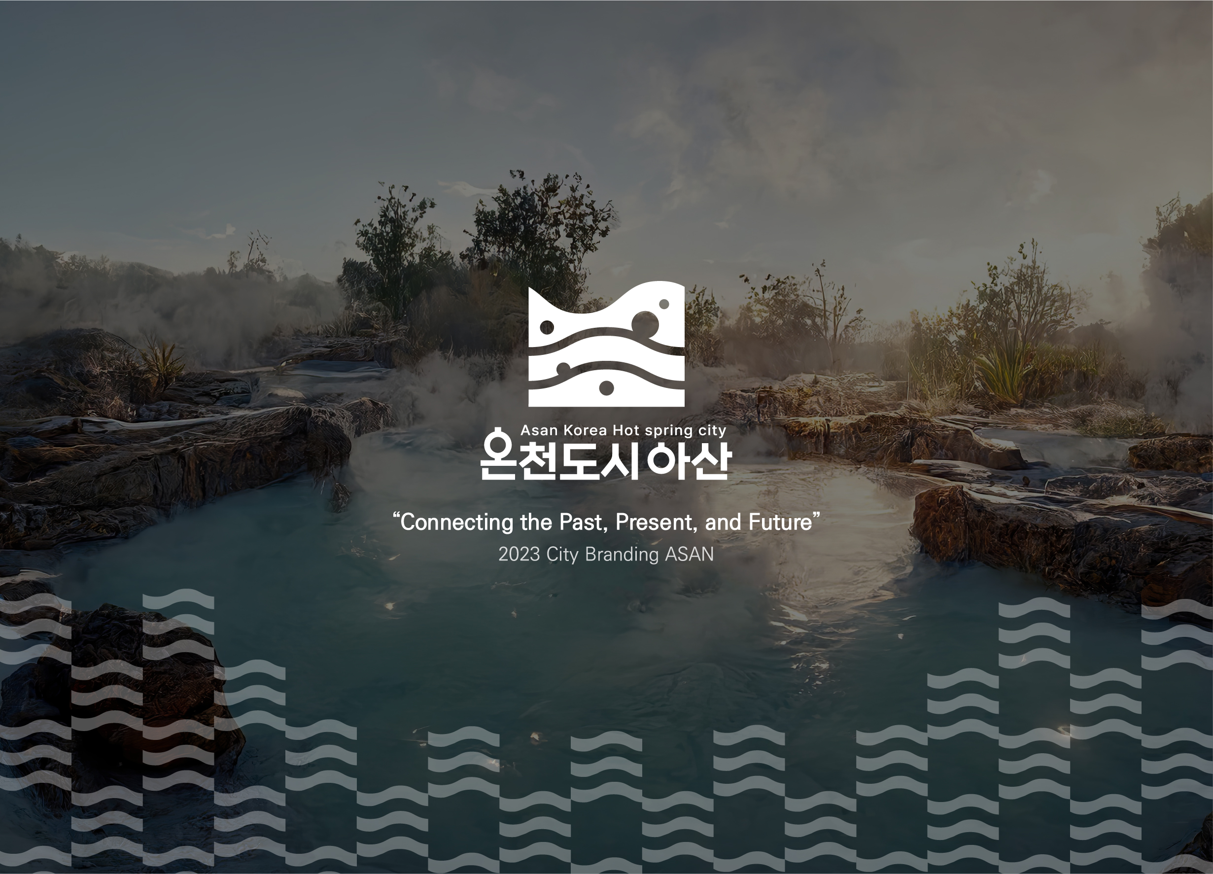
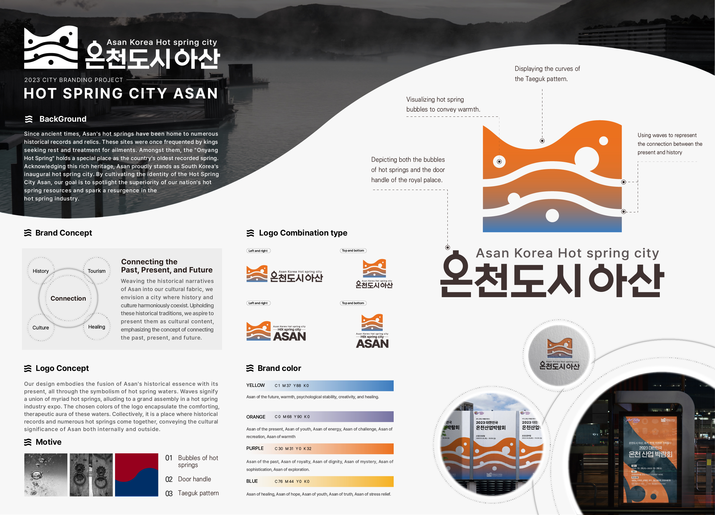
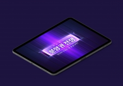
Asan Korea First Hot Spring City
| Country | Korea |
|---|---|
| Year | 2024 |
| Award | WINNER |
| Affiliation | Asan City Hall and SUNMOON UNIV |
| Designer | JANG HUN JONG, GWON JAE MIN, KIM MINHYEOK, LEE GUNWOO, KIM DAE WOONG |
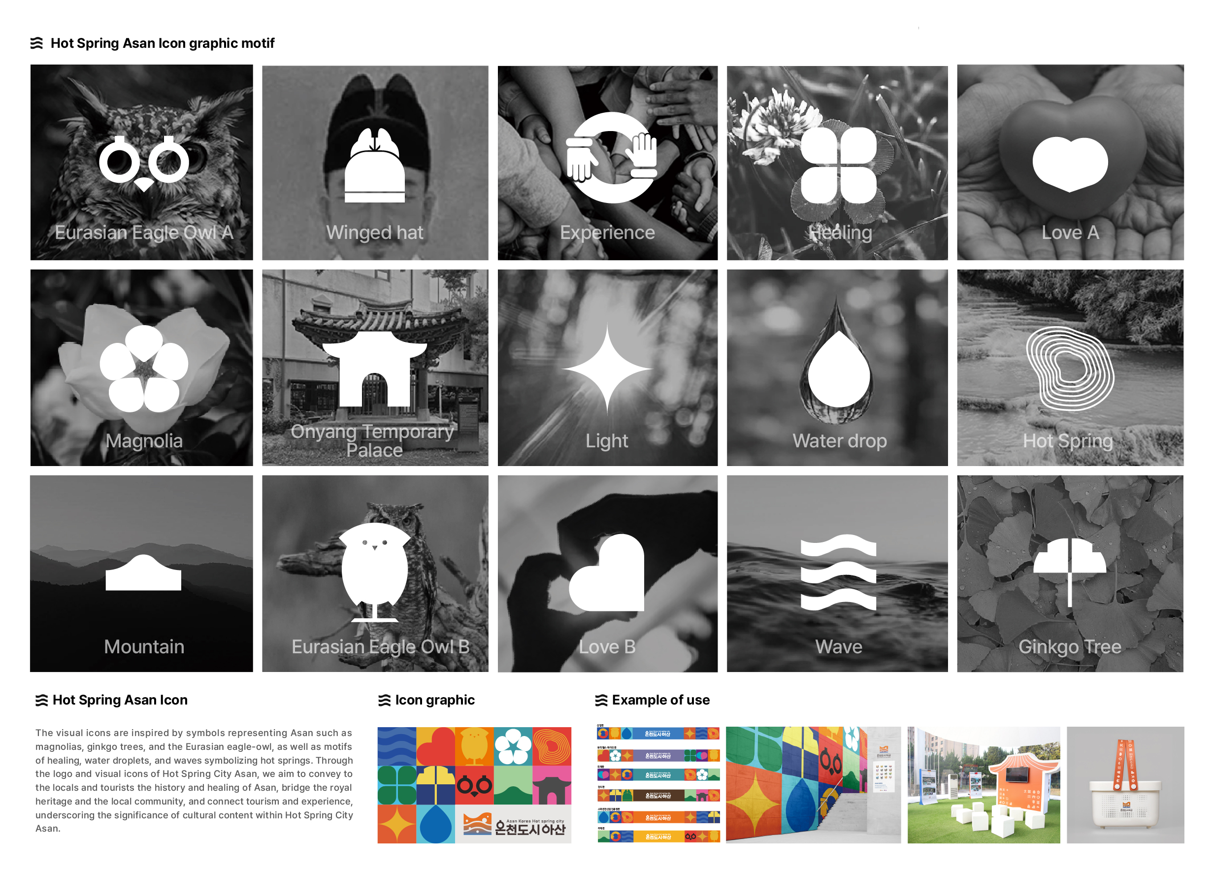
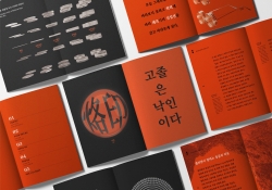
| English | The concept of 'Hot Spring City Asan, bridging past, present, and future,' showcases the blending of past and present through hot spring waters. Distinct wave patterns embody the union of various springs that form the city. The chosen colors depict a warm healing place. Visual icons are inspired by Asan's symbols such as magnolias, ginkgo trees, and the Eurasian eagle-owl, as well as hot spring motifs. Through the introduced logo and visuals, we aim to link Asan's history and healing essence, connect its royal heritage with the locale, and merge tourism with experiential values. |
| Native | 아산의 온천은 과거에서부터 왕들이 휴양이나 병을 치료하고자 머물었던 다수의 역사적 기록과 유적들이 남아있다. 특히 이러한 아산의 온천들중 "온양 온천"은 국내에서 가장 오래된 온천으로 기록되고 있으며 이러한 가치를 인정받아 아산은 현재 대한민국 최초로 온천 도시로 지정되었다. 이러한 '아산시'의 역사적 사실을 하나의 문화적 컨텐츠로 접목하여 역사와 문화가 공존하는 콘텐츠 도시로서 자리매김하며 역사적 전통성을 계승하여 문화적 컨텐츠로 전달하고자 “온천도시 아산 과거, 현재, 미래를 연잇다”라는 컨셉으로 제작한 로고는 온천수로 과거와 현재가 서로 스며드는 형태로 표현하였으며. 여러 물결은 다양한 온천들이 모여 온천도시가 되었다는 의미를 내포하고 로고의 컬러는 따뜻한 치유의 공간을 온천수를 표현하였다. 또한 같이 제작된 비주얼 아이콘은 아산을 상징하는 목련, 은행나무, 수리부엉이등과 온천이 가지고 있는 힐링, 물방울, 물결 등 아산과 온천이 상징하는 것들을 모티브 삼아 도출하였으며. 이러한 온천도시 아산의 로고와 비주얼 아이콘을 통해 지역주민들과 관광객들에게 아산의 역사와 힐링을, 왕실과 지역을, 관광과 체험을 이어주고, 온천도시 아산에 문화적 컨텐츠로 이어준다는 의미를 담았다. |
| Positive Comments |


|
| Judging Comments | The 'Hot Spring City Asan' design effectively communicates Asan's healing identity by connecting past and present hot springs and using regional symbols and warm colors, earning high praise. |
-
Intelligent Water Resources Dispatch System
-
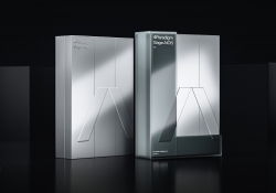
4Paradigm Sage AIOS Packaging Design
-
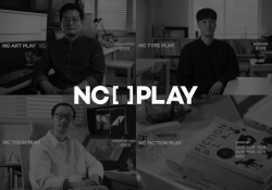
NC PLAY PROJECT
-
ScienceCom
-
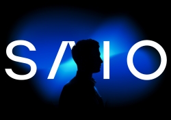
SAIO
-
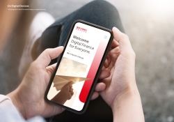
Welcome Digital Bank Visual Identity
-
Care Together Happy Together Visual branding
-
Manna corporate identity design
-
Pingtan Book House
-
Korean Medicine Blooms
-
Re Braille
-
4Paradigm Pandemic Prediction System Design
-
UNAJIRO VI
-
Graphic design for Gwangju city commemoration
-
The Worldly book design
-
Bexei The Wandering Earth
-
Garden Salt
-
SFOC Visual Identity
-
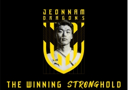
Jeonnam Dragons Football Club Rebranding
-
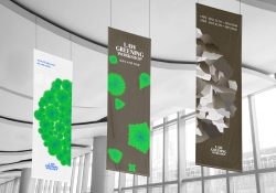
Law Greening Workshop
-
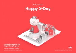
Happy X Day
-
Care U Most
-
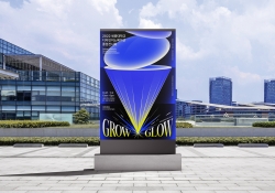
2022 Graduation exhibition GROW GLOW
-
Bubble Bomb
-
Energy Utopia
-
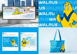
WALRUS PUMP Brand Design
-
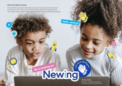
Newing
-
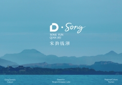
The Song rhythm of Dongqian Lake
-
SHIN KONG Bank Light Evolution
-
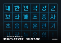
ROKAF Typeface
-
THE PENTHOUSE Visual Branding
-
BE BETTER Packaging for the Earth in 2050
-
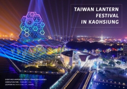
TAIWAN LANTERN FESTIVAL IN KAOHSIUNG
-
YNL Design CI Renewal
-
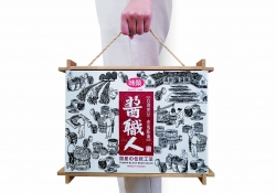
Sauce Expert
-
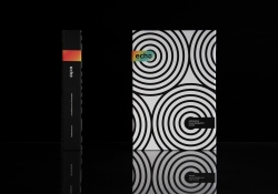
Project Echo
-
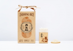
Zaishengdao Rice Packaging Design
-
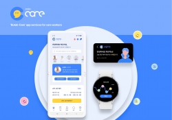
Butak Care app services for care workers
-
Prejudice
-
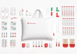
Origami Amenities
-
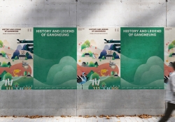
History and Legend of Gangneung
-
Concept ARC Dual Flush Valve
-
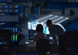
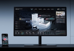
Midea Industrial City smart operation of IOC
-
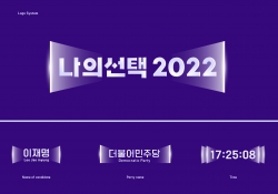
MY CHOICE Visual Branding
-
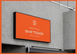
SHIFTDOOR RESIDENCE Brand Identity
-
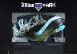
TL BRAND DAY in NC PARK
-
NCSOFT Leaders Kit
-
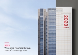
Welcome FG Seasons Greetings Pack
-
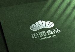
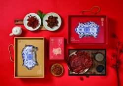
Matsu HandPulled Noodle Brand Design
-
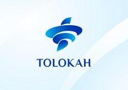
TOLOKAH Brand Design
-
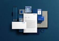
Tuntex Branding
-
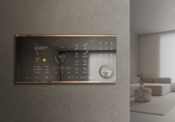
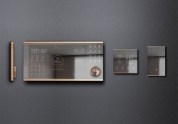
Smart Home Network Wall Pad HDHN4000
-
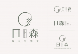
Sunforest
-
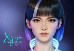
XIJIAJIA An AI Digital Human
-
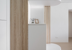
Breeze White
-
AIOT Smart Park Integrated System
-
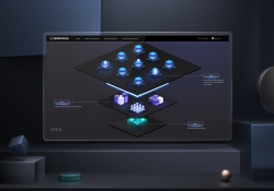
4paradigm Sage HyperCycle CESS
-
60 year memories of WAN CHUAN HSING
-
Smart Home Solution System HDHN 4000SET
-
DNAKE Sapphire Series


Designed by sketchbooks.co.kr / sketchbook5 board skin