
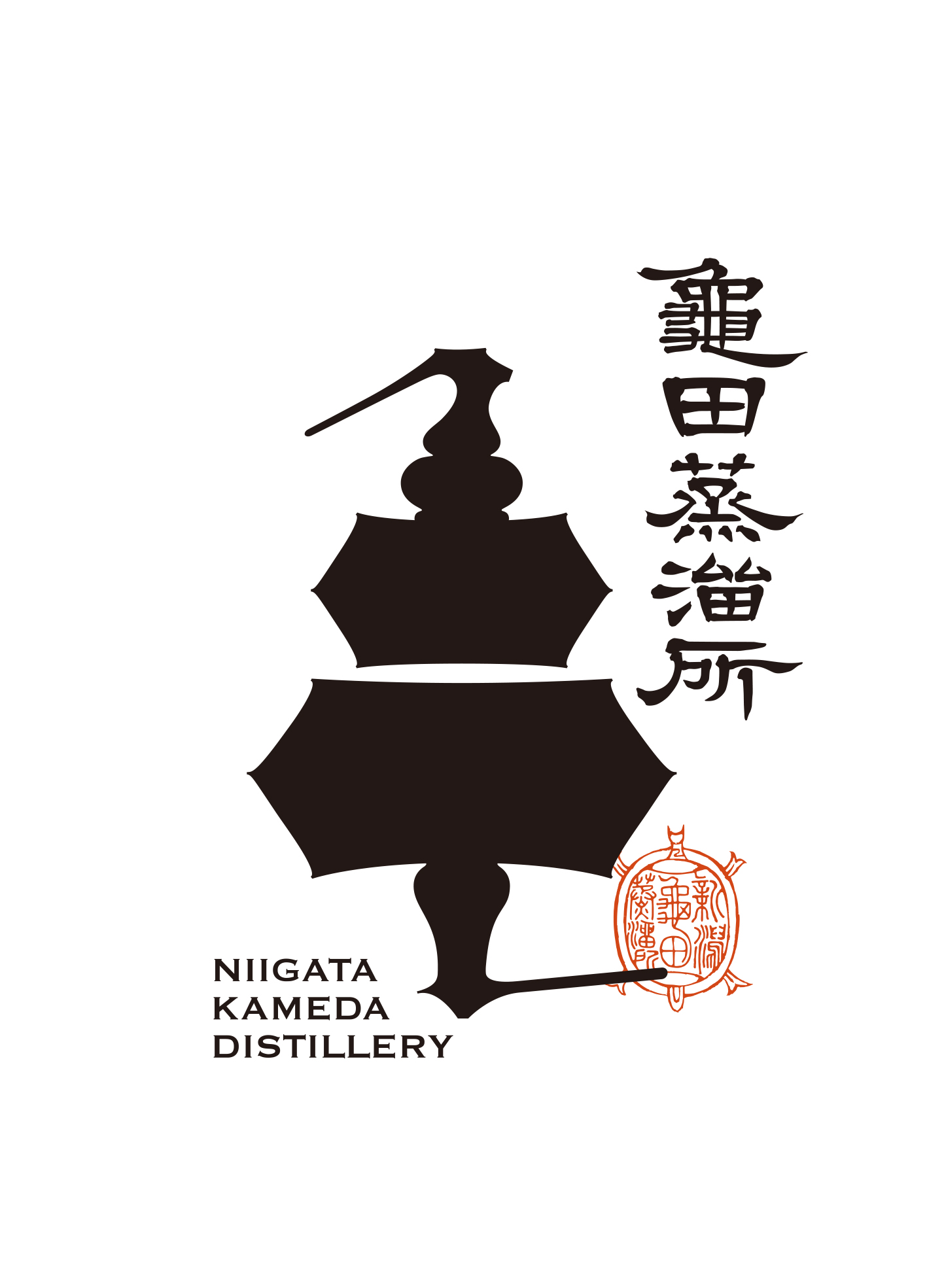
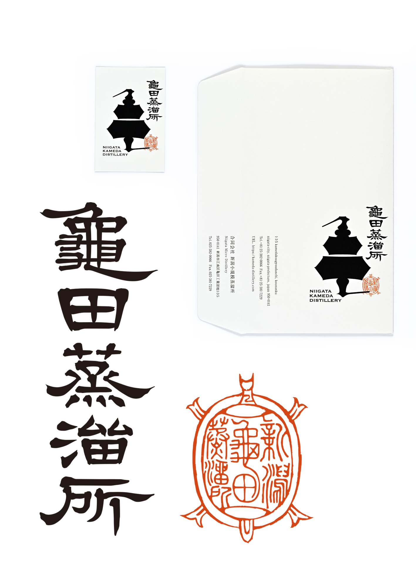
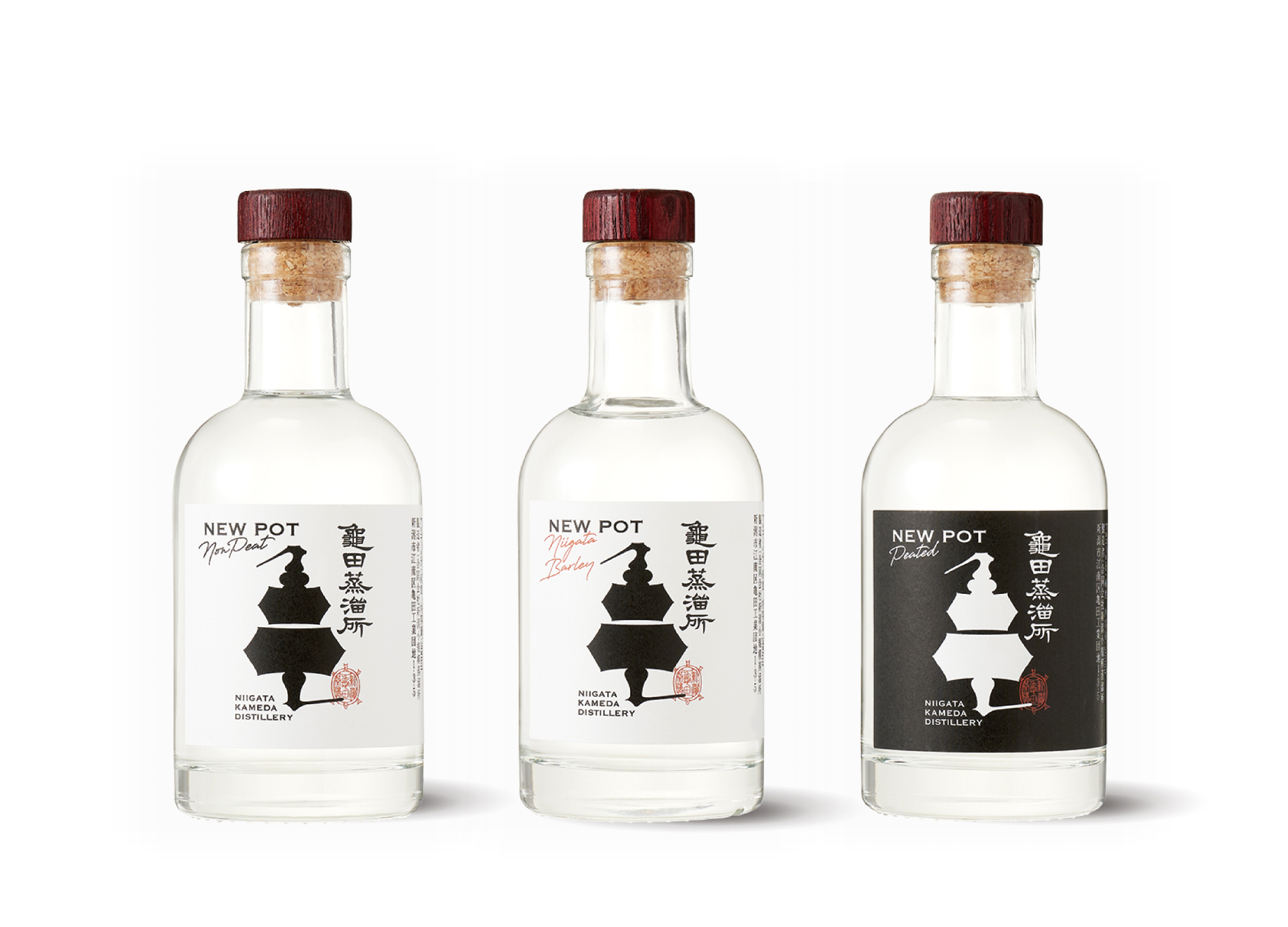
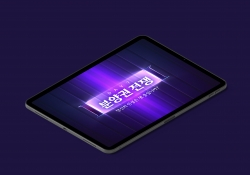
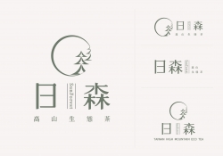
Niigata Kameda Distillery
| Country | Japan |
|---|---|
| Year | 2024 |
| Award | GOLD WINNER |
| Affiliation | Frame |
| Designer | Ryuta Ishikawa |
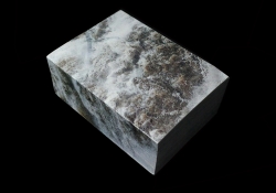
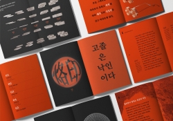
| English | Two distinctive distillation apparatuses, symbolizing the essence of the distillery, were combined to create the Chinese character "亀" (turtle), representing a specific location. This design reflects a dedication to local whiskey production, conveying a strong sense of commitment and passion. To showcase the identity of Japanese whiskey, an original logo in Chinese characters was crafted. The stamp, akin to the creator's signature, adds a unique touch and communicates the maker's philosophy. The design, featuring a bold logo and brand name, is kept simple yet uses carefully chosen materials to make a memorable impression. |
| Native | 日本酒の産地として知られる新潟県。そこに生まれた新たな試み。それは日本酒の産地から発信されるジャパニーズウイスキーブランド。日本酒を思わせるような漢字のロゴを開発することで、そんな土地のイメージを発信できないかと考えた。蒸留所の象徴とも言える2つの蒸留器。そのシルエットを重ねることで地名の漢字「亀」を表現し、地産のウイスキーへのこだわりや思いを表現しました。 ジャパニーズウイスキーのイメージを発信するため、漢字のロゴタイプをオリジナルで作成。作者の署名ともいえる判子をアクセントに添え、作りてのポリシーも表現。強いロゴとブランドネームを印象づけるため、ツールはシンプルでありながらこだわった素材でデザインを展開しました。 |
| Positive Comments |


|
| Judging Comments | Niigata Kameda Distillery, designed by Ryuta Ishikawa, was awarded the 'Gold Winner' at the Asia Design Prize 2024 for its symbolic integration of distillation apparatuses to create the Chinese character "亀" (turtle), reflecting a deep commitment to local whiskey production. The jury was impressed by the design's ability to convey the identity of Japanese whiskey through an original logo and a creator's stamp, combining simplicity with distinctive materials to leave a lasting impression. |
-
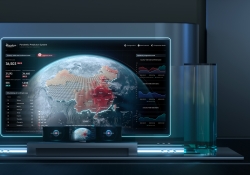
Intelligent Water Resources Dispatch System
-
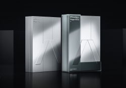
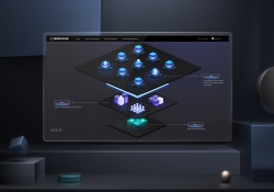
4Paradigm Sage AIOS Packaging Design
-
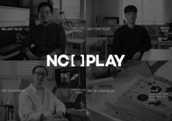
NC PLAY PROJECT
-
ScienceCom
-
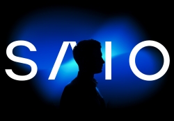
SAIO
-
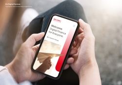
Welcome Digital Bank Visual Identity
-
Care Together Happy Together Visual branding
-
Manna corporate identity design
-
Pingtan Book House
-
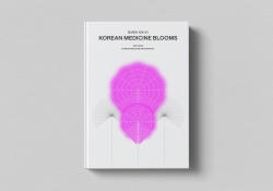
Korean Medicine Blooms
-
Re Braille
-
4Paradigm Pandemic Prediction System Design
-
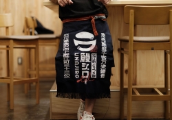
UNAJIRO VI
-
Graphic design for Gwangju city commemoration
-
The Worldly book design
-
Bexei The Wandering Earth
-
Garden Salt
-
SFOC Visual Identity
-
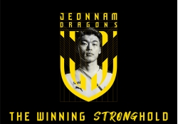
Jeonnam Dragons Football Club Rebranding
-
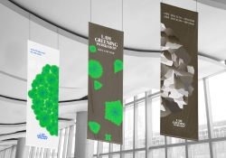
Law Greening Workshop
-
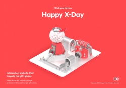
Happy X Day
-
Care U Most
-
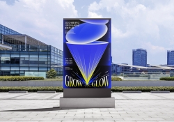
2022 Graduation exhibition GROW GLOW
-
Bubble Bomb
-
Energy Utopia
-
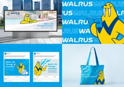
WALRUS PUMP Brand Design
-
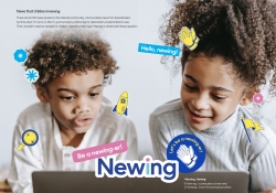
Newing
-
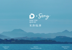
The Song rhythm of Dongqian Lake
-
SHIN KONG Bank Light Evolution
-
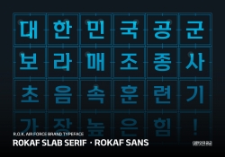
ROKAF Typeface
-
THE PENTHOUSE Visual Branding
-
BE BETTER Packaging for the Earth in 2050
-
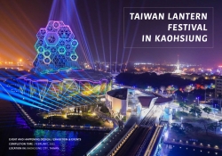
TAIWAN LANTERN FESTIVAL IN KAOHSIUNG
-
YNL Design CI Renewal
-
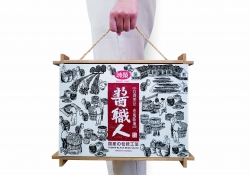
Sauce Expert
-
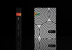
Project Echo
-
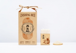
Zaishengdao Rice Packaging Design
-
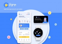
Butak Care app services for care workers
-
Prejudice
-
Origami Amenities
-
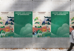
History and Legend of Gangneung
-
Concept ARC Dual Flush Valve
-
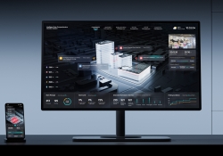
Midea Industrial City smart operation of IOC
-
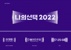
MY CHOICE Visual Branding
-
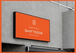
SHIFTDOOR RESIDENCE Brand Identity
-
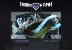
TL BRAND DAY in NC PARK
-
NCSOFT Leaders Kit
-
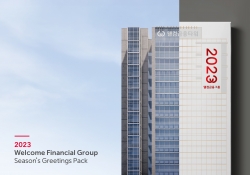
Welcome FG Seasons Greetings Pack
-
Matsu HandPulled Noodle Brand Design
-
TOLOKAH Brand Design
-
Tuntex Branding
-
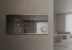
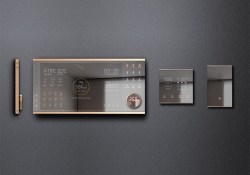
Smart Home Network Wall Pad HDHN4000
-
Sunforest
-
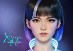
XIJIAJIA An AI Digital Human
-
Breeze White
-
AIOT Smart Park Integrated System
-
4paradigm Sage HyperCycle CESS
-
60 year memories of WAN CHUAN HSING
-
Smart Home Solution System HDHN 4000SET
-
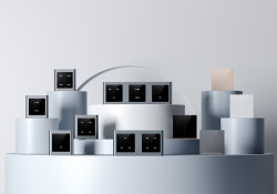
DNAKE Sapphire Series


Designed by sketchbooks.co.kr / sketchbook5 board skin