
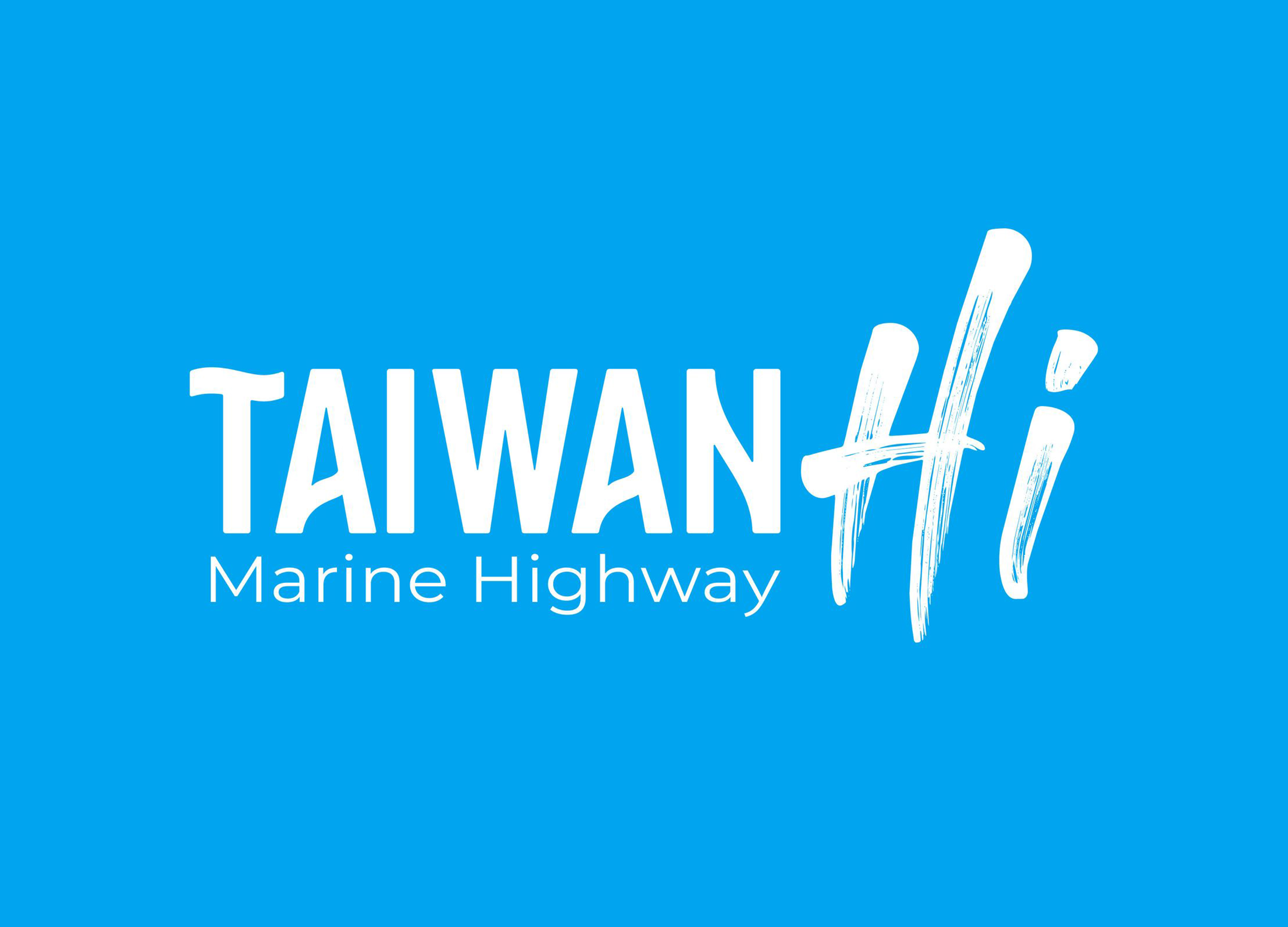
Taiwan Hi marine highway brand
| Country | Chinese Taipei |
|---|---|
| Year | 2025 |
| Award | WINNER |
| Client | Maritime Port Bureau MOTC |
| Affiliation | BENZHI Design Consultant Co., Ltd. |
| Designer | CHEN HSIN YU |
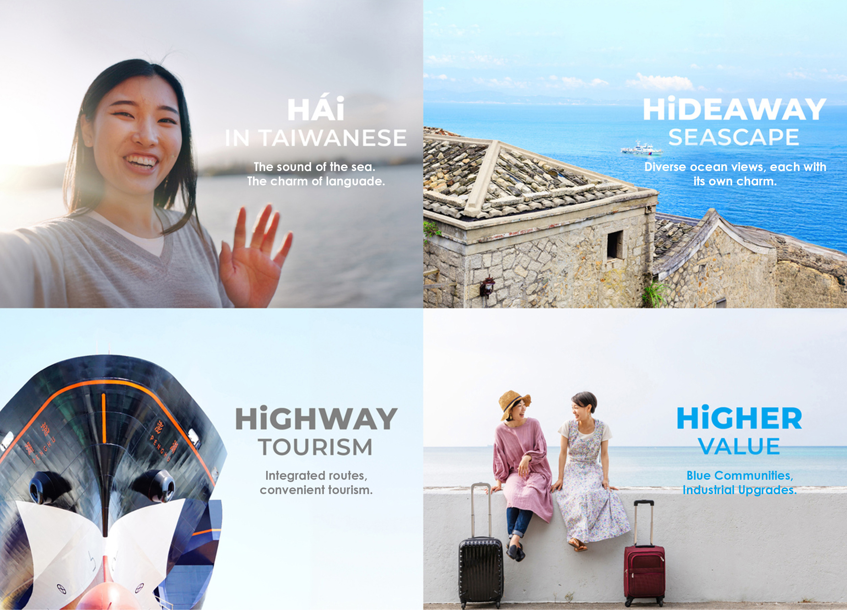
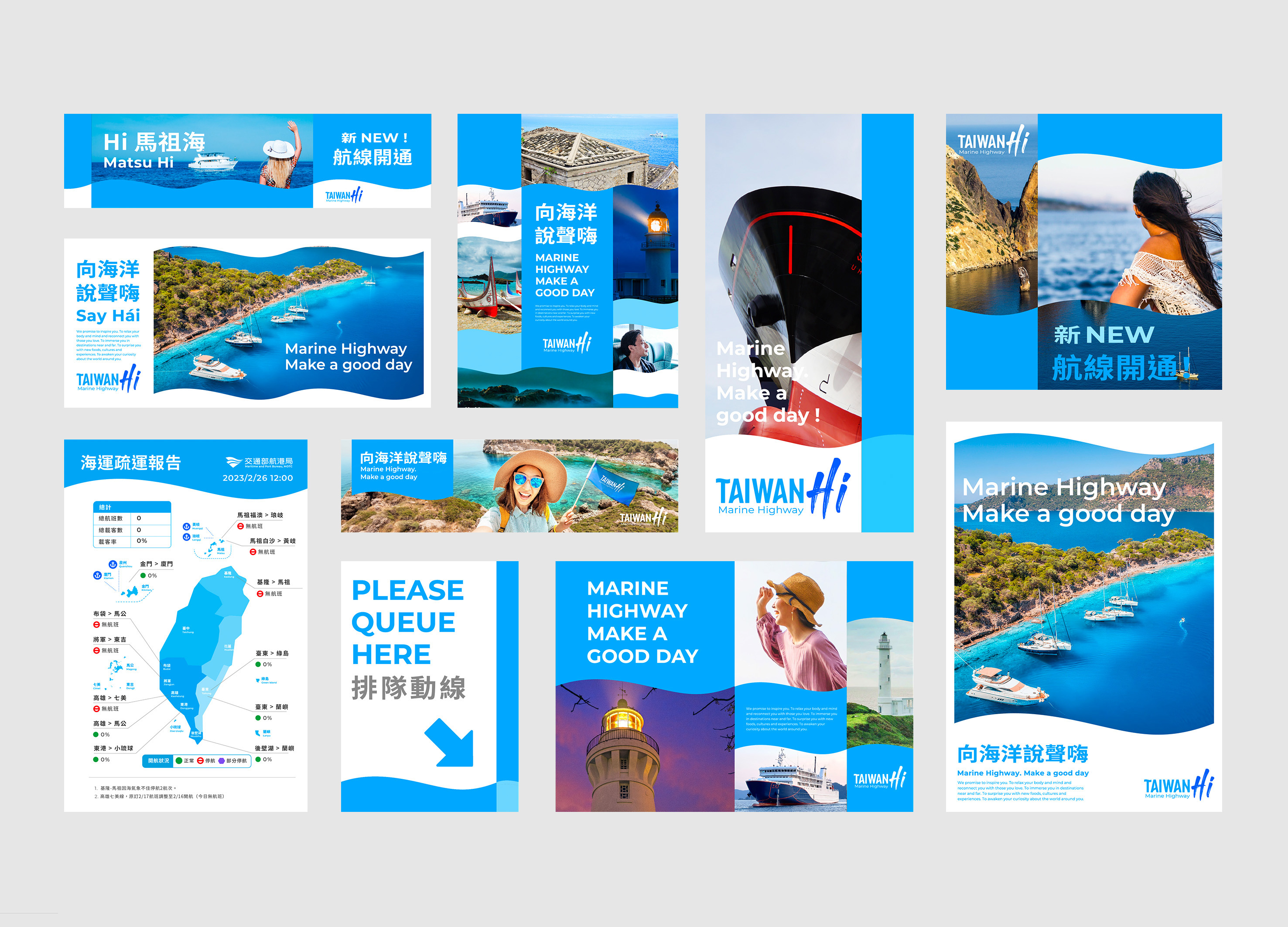
| English | Taiwan, surrounded by the sea with rich marine resources, has a distant connection with the ocean. The Maritime and Port Bureau aims to strengthen this bond through branding. The brand centers on the friendly "Hi," combining "TAIWAN Hi" (English), "台灣海" (Mandarin), and "Tái-uán hái" (Taiwanese) to create a memorable identity. "Hi" also symbolizes HIGHWAY (routes), HIDEAWAY (paradises), and HIGHER (industry growth), inviting people to rediscover Taiwan’s ocean beauty. Wave-inspired visuals are used across websites, lightboxes, and schedules, creating a consistent, high-quality image that highlights Taiwan’s maritime charm. |
| Native | 向海洋說聲嗨!開啟海的無限可能 臺灣雖四面環海,周圍擁有許多離島,民眾與海洋的關係卻顯得疏離,為了讓民眾更加了解臺灣海洋魅力、親近海洋,交通部航港局耗時兩年打造海洋運輸藍色公路品牌。 此品牌透過「航、港、船、遊」等四大執行策略,建立設計導入公共運輸領域之示範標竿,以打造高度整合、優質服務為目標。 為解決民眾與海洋關係的疏離,品牌命名上我們提出TAIWAN「Hi」這個親切活潑、活力的招呼語。它是TAIWAN Hi(英文)、台灣海(中文)也是 Tái-uán hái(閩南語)。藉由好唸、好記的名稱,跨越國界,拉近民眾與海的距離跟海洋打聲招呼,從新的角度認識我們臺灣美麗的海!並藉由不同的Hi /海 接起人、海、文化與在地的感情訴求。而「Hi」也代表著 HIGHWAY(整合航線)、HIDEAWAY (世外桃源) 與 HIGHER(產業升級)。 品牌識別系統方面,我們創造出以波浪為主的一系列輔助圖形與建構出網格系統,並將此應用於相關延伸製作物上,如網站、燈箱、社群、周邊商品、航班時刻表、窗貼、座椅枕巾...等。讓其達到視覺呈現的一致性,形塑海運客運環境高品質、具信賴感之形象! |
| Positive Comments |


|
| Judging Comments | This branding project is praised for its innovative and inclusive approach, merging Taiwan’s diverse linguistic and cultural heritage. The use of "Hi" effectively ties together the various elements of Taiwan’s maritime identity, invoking both familiarity and aspiration. The wave-inspired visuals and the thoughtful integration of the three languages (English, Mandarin, and Taiwanese) create a harmonious and memorable identity. The brand successfully promotes Taiwan's ocean beauty while fostering a deeper connection with the sea, making it a strong and unified symbol of maritime pride. |
-
Hellomet
-
Trolley Trunk
-
Refugium
-
Paper glucometer Kit
-
Warmie
-
GENTROAD
-
Barrier Free Sink for One Handed
-
AllEcho
-
Power Pillar
-
biron
-
Hot hot sofa
-
Food Styler
-
LOKLiK iPaint
-
Easyway Metal Ice Cream
-
Metal Spinning Lamp
-
Exlicon L Golden Ratio Tools for Geometry
-
HEALTRON S
-
VETAS HOMELIFT G200
-
Bamboo
-
Hanok Eaves Chair
-
Chameleon furniture
-
Booky
-
Bamboo Shadow Cube
-
Signal Convex MIRROR of Volvo
-
Mirror Space Time
-
PolyBeat
-
AWBMM
-
Skyscraper Floor Lamp
-
m stool
-
Daria bond II
-
UHUE Custom Cosmetic Creator
-
VETAS HOMELIFT G100
-
COEXISTENCE
-
KYOTOsta Stool
-
3D Vein Viewer Locator
-
Wello
-
ELAFIX Center Face Focusing
-
ANDY


Designed by sketchbooks.co.kr / sketchbook5 board skin


