
OROT
| Country | Korea |
|---|---|
| Year | 2022 |
| Award | WINNER |
| Affiliation | Sejong University |
| Designer | Ji Seung yeon |
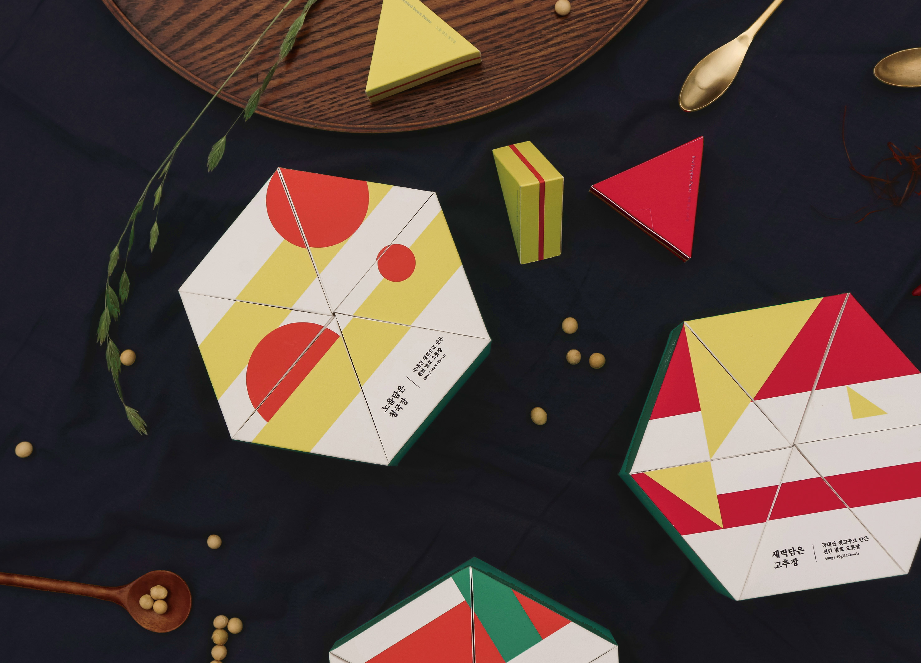
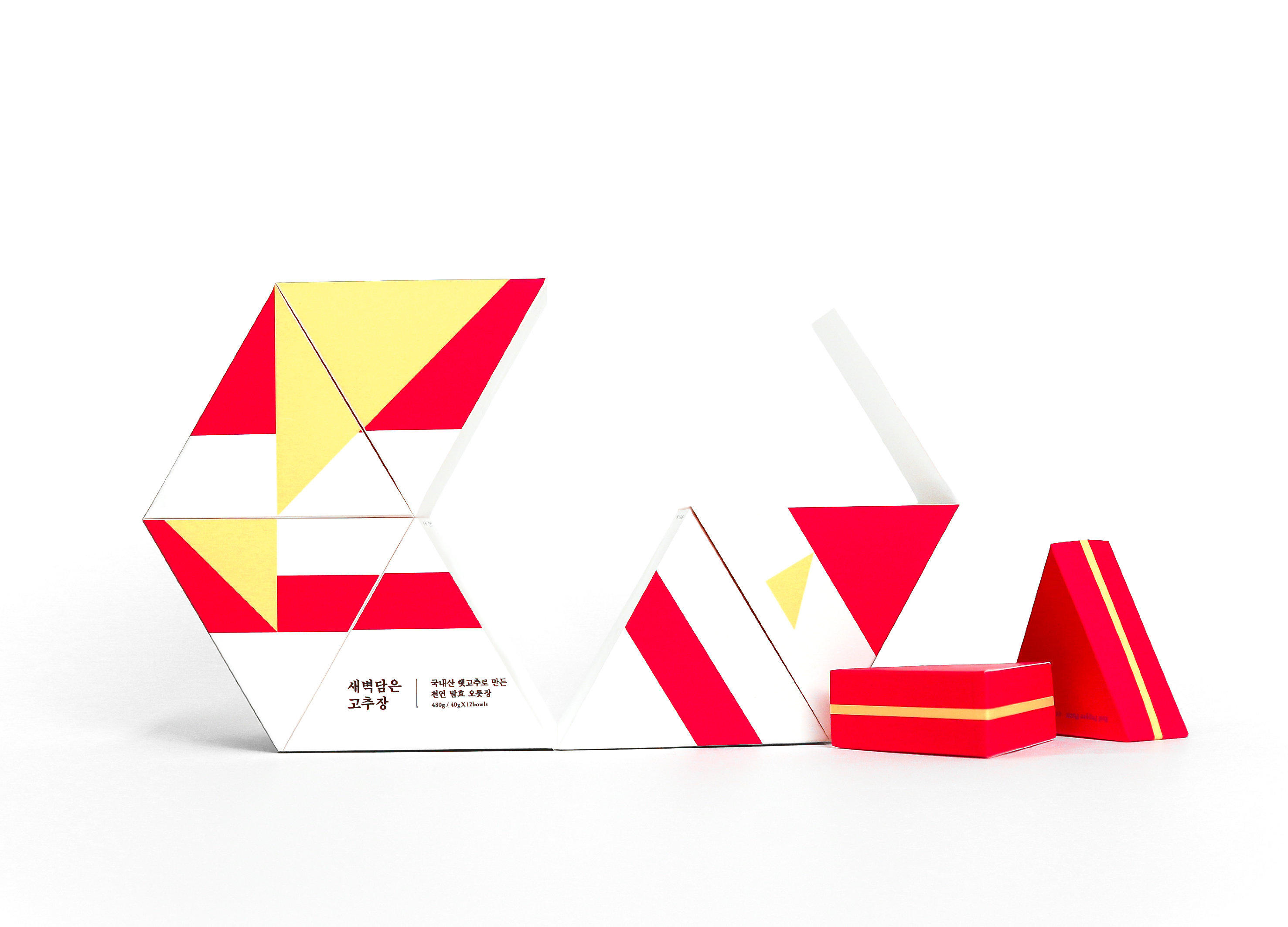
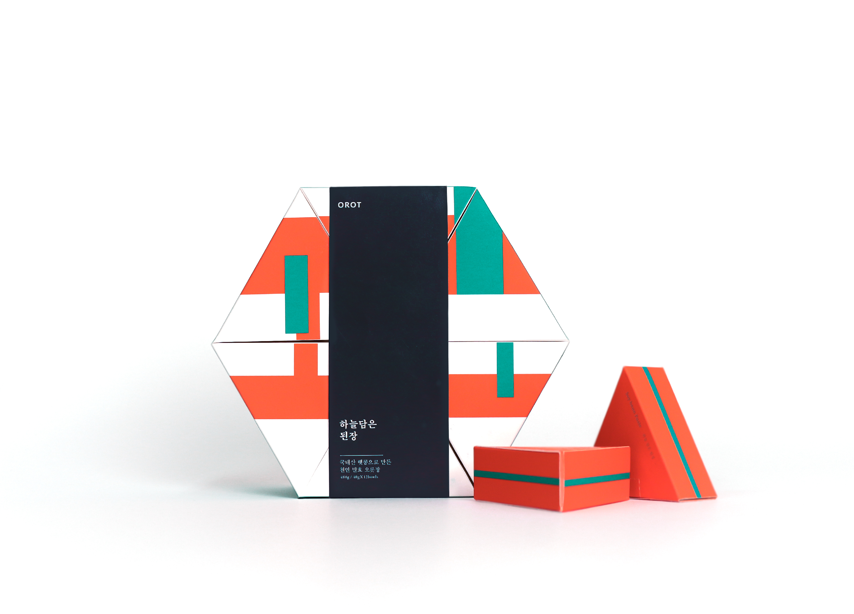
| English | OROT은 1 인 가구를 위한 전통 발효장 패키지이다. 1인 가구의 비중이 30%를 향해가면서 대부분 간편한 외식과 배달 음식으로 식사를 해결한다. 우리 장으로 만드는 전통 한식은 많은 재료가 필요하다. 요리 과정이 복잡하고 많은 재료가 필요하다는 이유로 설 자리를 잃어가고 있다. 이를 보완하기 위해 대부분 대용량으로 판매되는 발효 장을 1인분 씩 소분하여 간편하게 먹고 보관할 수 있게 했다. 발효는 틈으로부터 시작된다. 1700년이라는 긴 '시간' 동안 이어진 우리장은 '재료'가 쌓이고, 섞이고, 숙성되며 이어져 왔다. 재료 사이의 틈 안에 시간이 쌓이고 곰팡이가 들며 숙성과 발효가 진행된다. 메주와 콩, 고추의 형태적 특징에 따라 사각형, 원, 삼각형을 그래픽 요소로 선정하고, 시간의 축적을 반복되는 선으로 표현하였다. 이런 기본 도형과 선을 반복한 개별 패턴을 제작하여 전체 패키지를 디자인했다. 오랜 시간 숙성된 발효의 틈. 그 틈이 끼워 맞춰지는 듯, 한곳으로 맞물리는 패키지 지기구조를 이용했다. 안에 들어가는 삼각형 모양의 소분 패키지를 통해 간편한 보관이 가능하다. |
| Native | OROT is Korean Word '오롯', that mean 'This is perfect, without lacking'. OROT has prepared single-serving packages of fermented sauces, which was previously sold mostly in large-sized packages. Fermentation was In the long 'time' with 'material' accumulated, mixed. The morphological features of meju, beans, and peppers can be simplified into squares, circles, and triangles. It is selected as a graphic element and expresses the accumulation of time as repeated lines. Like the interlocking of the material and time shown in the graphic, the base structure gathers triangles to complete the cube. |
| Positive Comments |


|
-
Zi Zui Jin Ren
-
Indie Game & Culture Festival Burning Beaver
-
O2H TEA Brand Identity
-
Sign Language Badges for Hearing Impaired
-
Absolute W. 2025 Seasons Greetings Pack
-
Welcome Phoenix Visual Identity Rebranding
-
VIVI Cocktail
-
KOBE STORKS japan professional basketball
-
Multiposture Support Pillow
-
eltern
-
Formopia Brand Design
-
HIM TEA Branding
-
Bank of Taiwan Brand Design
-
Columbia 75 degree incline in Package
-
KUAV Visual Identity
-
Zo Clam style Air Cushion Baby Stroller
-
Pulse simulator
-
Slac
-
DOWNFALL OF WHO LET IN SOMETHING NOT ALLOWED
-
Onggi Jonggi
-
L holl
-
lllayer Corporate identity design
-
Scoot Safe
-
Innogrid Cloud Character Inno Crew
-
episode YONGSAN 241 BRANDING and WELCOME KIT
-
episode YONGSAN 241 UX (CON-T)
-
Mobile Banking App UI Design Rebranding
-
World Webtoon Festival
-
King Sejong procession outdoor advertising
-
SNUG SOCKS
-
fation brand renewal
-
The Creation of Heaven and Earth
-
Girls Find Girls App
-
Our AZ
-
eggseoul Brand Identity Design
-
EASTROC Shang Cha Tea Series
-
Brand advertisement for OGISHI TADASHI SHOTEN
-
Oddor
-
minid


Designed by sketchbooks.co.kr / sketchbook5 board skin


