
Communication
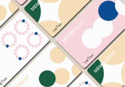
THE ORM
| Country | Korea |
|---|---|
| Year | 2019 |
| Award | Winner |
| Client | Kyowon |
| Affiliation | IDEA DO IT |
| Designer | YEROK AHN, YEONGKEUN JEON, JUYOUN KWON, NAYOUNG KIM, HEASOO SHIN |
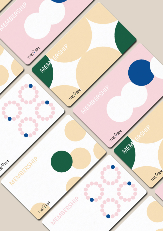
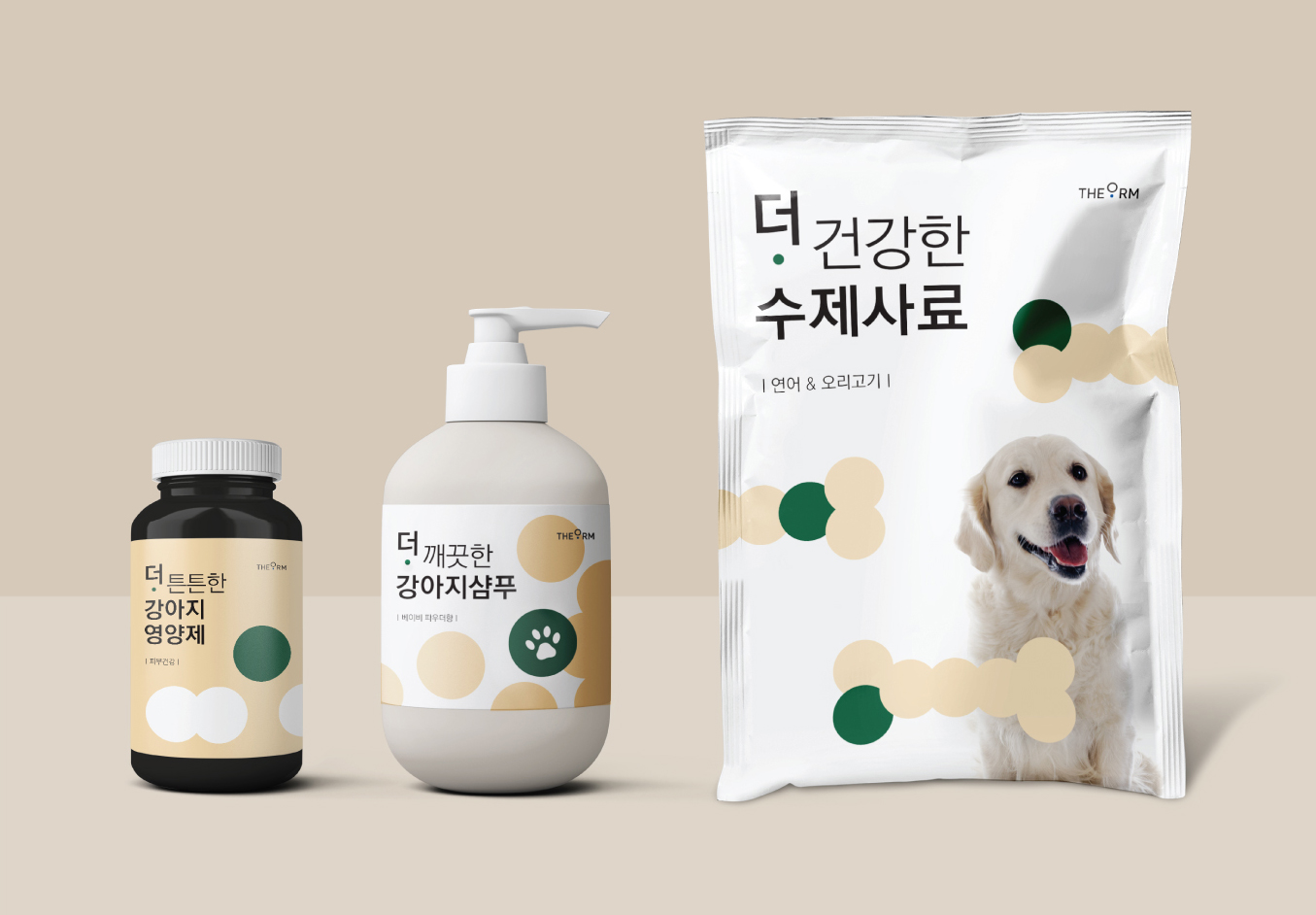
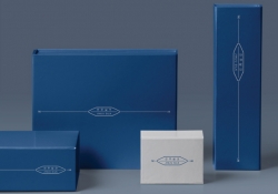
| English | THE ORM is a Life style brand which is founded by Kyowon Group. It sells consumer goods for all family members that can be used in their daily life such as cosmetics, health supplements, daily necessities and living care products. We have interpreted the name of band as “right” and “appreciate(valuable)”. By combining them its slogan can be “the value beyond RIGHT”. A graphic motif we have developed is that the one circle pops out from the other unified circles. It visualizes the action that people making their better and more right choice. |
| Native | 더오름은 기업 ‘교원’의 라이프 스타일 브랜드로, 일상생활에 필요한 화장품, 생활용품, 건강기능 식품, 리빙케어 제품 등 가족 구성원 모두가 일상적으로 사용하는 소비재 상품을 판매합니다. 우리는 더오름이라는 브랜드이름을 ‘옮음’과 ‘가치’ 두 가지 의미로 해석하였습니다. 두 의미를 합쳐 ‘옳은 것 중에 더 옳은 선택.’ ‘옳음 그 이상의 가치’라는 슬로건으로 풀어냈습니다. 더 나은, 더 옳은 선택을 하는 모습을 시각적으로 보여주기 위해 통일된 다수의 동그라미 중 하나만 튀어오른 모습을 그래픽 모티브로 개발하였습니다. 그래픽모티브는 브랜드 아이덴티티를 명확히 인지될 수 있도록 로고 및 패키지에 통일되도록 적용하였습니다. |
| Website | http://www.creativedoit.com/portfolio/de...;part_idx= |
-
Dongchon Charcoal Garden
-
Fresheasy
-
THE JINJU SILK LAB
-
THE ORM
-
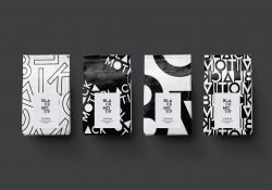
BLACK MOTIV
-
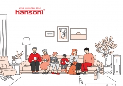
HANSON
-
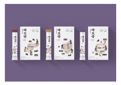
BARYORANG
-
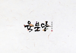
YUKBUNDANG
-
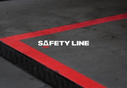
SAFETY LINE
-
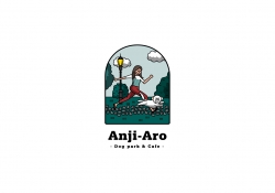
ANJI ARO
Designed by sketchbooks.co.kr / sketchbook5 board skin