
Potori typeface
| Country | Japan |
|---|---|
| Year | 2022 |
| Award | WINNER |
| Affiliation | Graphic Communication Laboratory |
| Designer | Noriyuki Kasai |
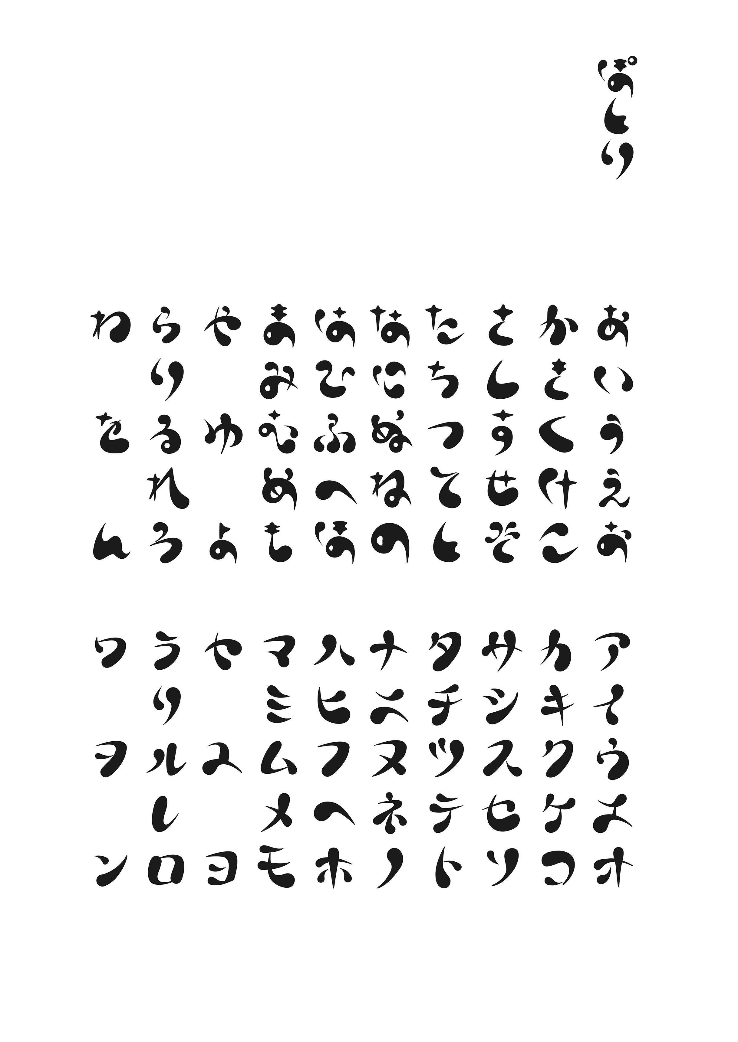
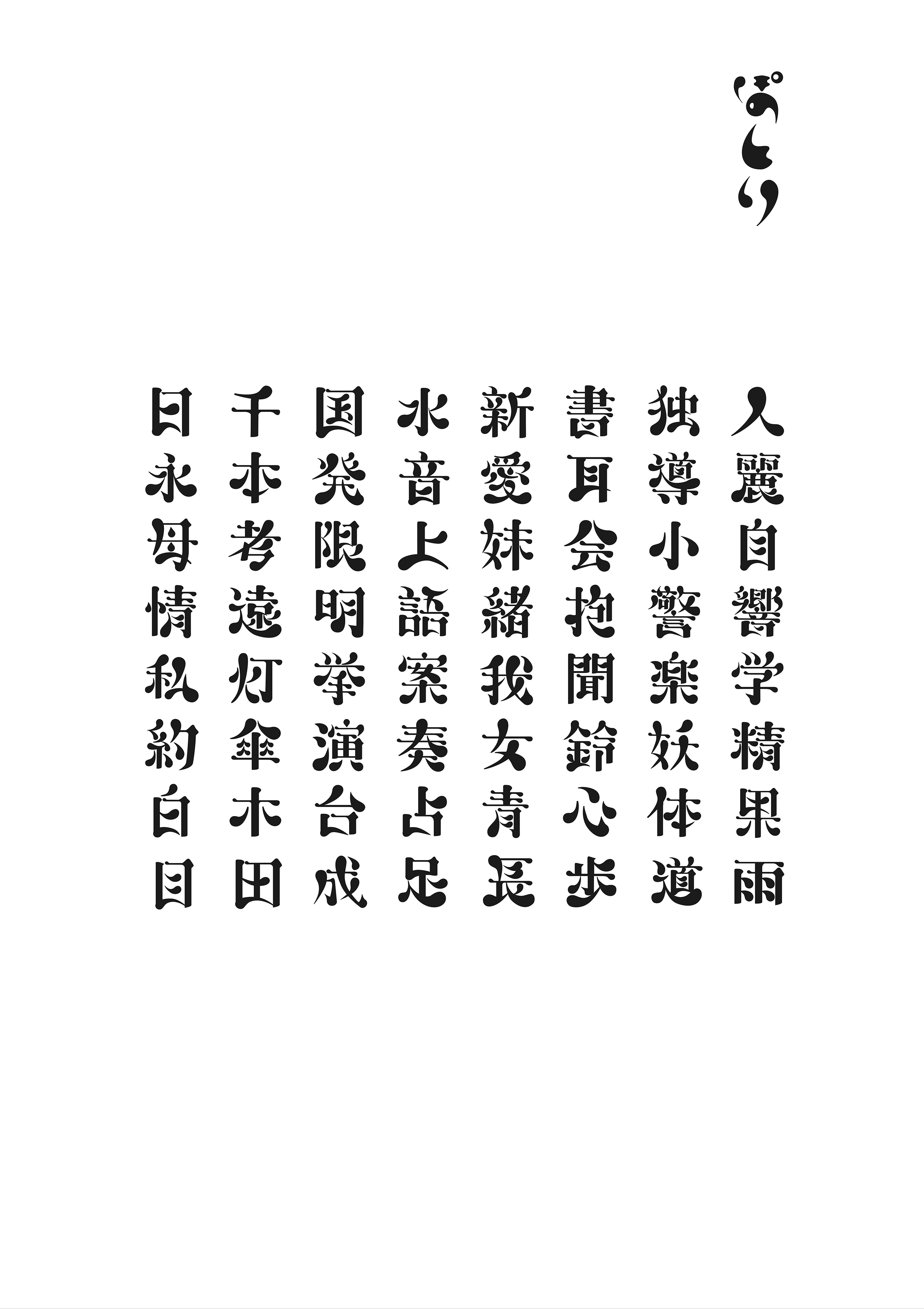
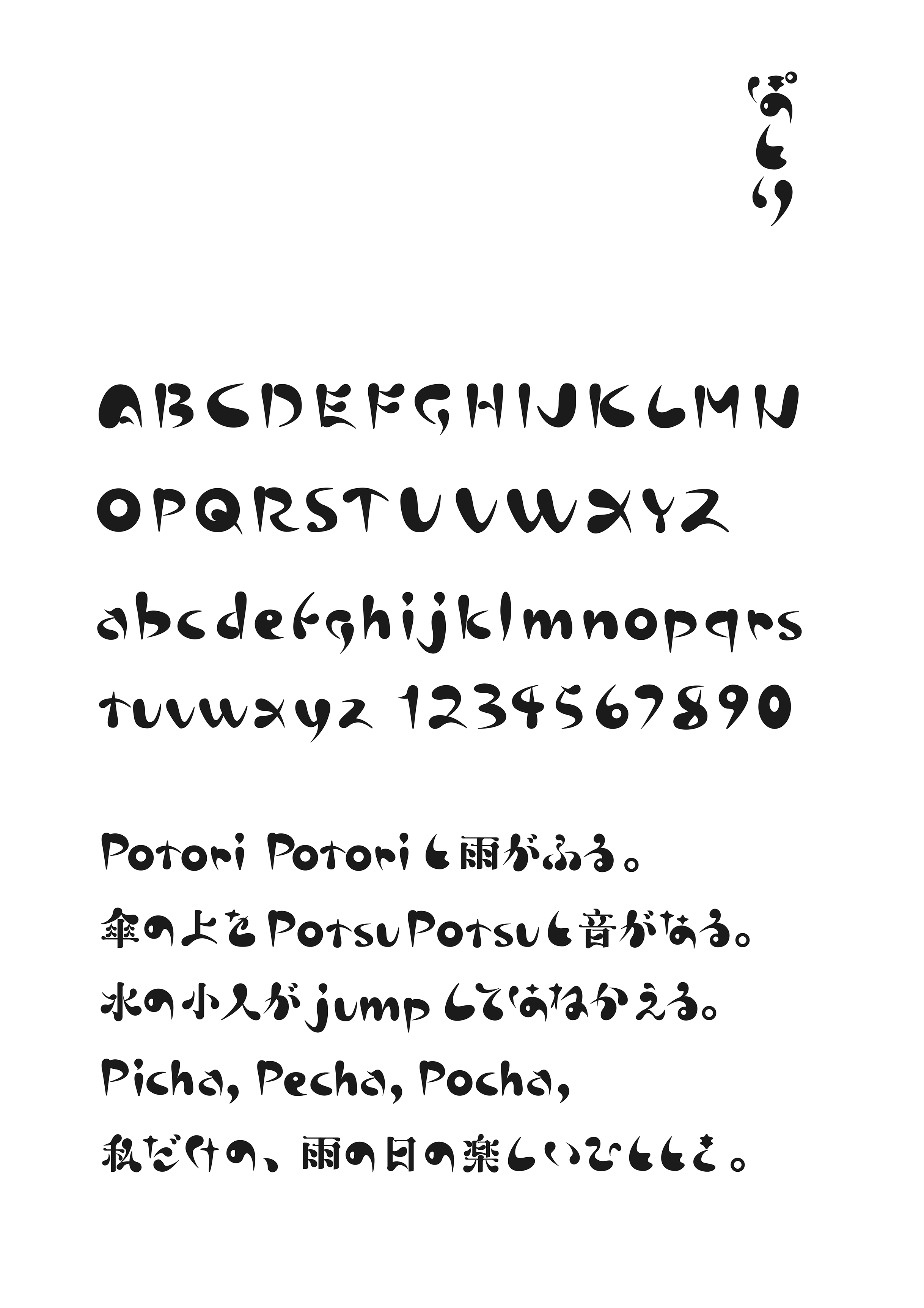
| English | The typeface "Potori" was created with the image of Japanese onomatopoeia. The hiragana and katakana glyphs leave a handwritten atmosphere so that you can feel the sound, and use that as the typeface skeleton. In order to express how the raindrops are about to fall or are falling, thick flesh is added to make it a heavy expression as a whole. For Chinese characters, the character shape of Mincho style was used as the basis because of the number of strokes and readability. The elements are shaped using hiragana and katakana elements to match the concept of the typeface. |
| Native | 書体「ぽとり」は日本語のオノマトペをイメージして制作したものである。ひらがな、カタカナの字形は、音を感じるように手書きの雰囲気を残 し、それを書体骨格とした。雨の雫がまるで落ちそう、もしくは落ちていく様子を表現するために、厚みのある肉付けをして全体に重たい表現とし ている。漢字については、画数と可読性の問題から、明朝体の字形を基本にした。エレメントは、書体のコンセプトに合うように、 ひらがな、カタカナのエレメントを使用し、形を整えた。漢字は画数が多くなると、可読性が悪くなるために、ぽとりの書体コンセプトを維持しつつつ、 垂直、水平の線は明朝体をベースに制作している。はね、はらいなどは楷書体ならびに明朝体の考え方をベースにしている。 アルファベットに関しては、ひらがな、カタカナ同様に骨格については、手書きの軽やかさを残しつつ、ぽってりとした肉付けを施し、少し不安定 感を残している。通常、明朝体やゴシック体などの本文用書体で組版をしていくと、漢字の方がひらがな、カタカナより画数が多く、 また漢字の方が形がしっかりしているため際立って見えるが、この書体は、逆にひらがなやカタカナ、 欧文が際立って見えるような作りになっている。このことにより、オノマトペを生かした文章表現に合うような書体となっている。 小説などの長い文章を読ませるための書体ではなく、詩などの短文で使用することを目的としている。 ディスプレイ書体のようなデザイン性を持ちながらも、可読性のある書体として制作をおこなった。 |
| Positive Comments |


|
-
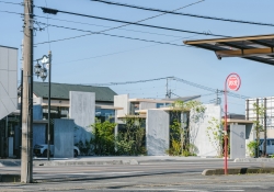
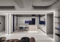
House with skip terrace
-
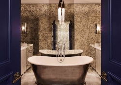
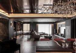
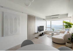
LHarmonie Oceanique
-
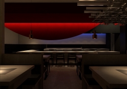
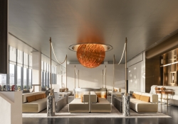
Red Moon
-
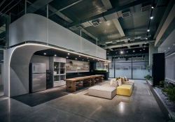
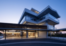
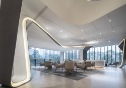
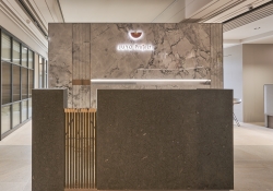
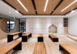
KYF Office
-
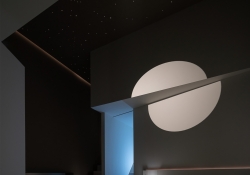
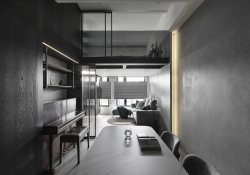
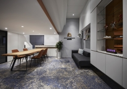
Light and Sense
-
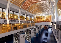
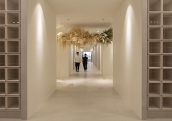
The community library of sunset impression
-
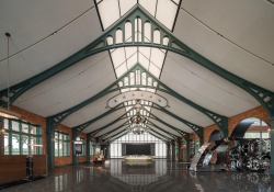
Kamakura country Club Renovation
-
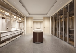
MACIO G Series Ladies Dressing Room
-
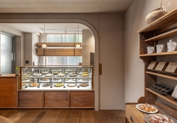
Hair room TOARU
-
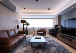
MOUNTAIN LIVING
-
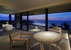
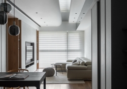
Room With A View
-
Enchanting Haven
-
That is good enough
-
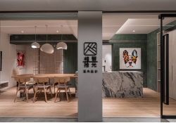
Exclusive Aesthetics
-
Revamp HK Intangible Cultural Heritage Centre
-
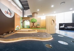
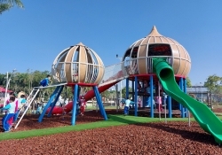
Ployground for Preschoolers
-
CRRC History Cultural Street Exhibition Hall
-
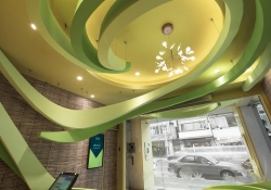
DANCING RIBBON
-
The Heart Of It All
-
A hundred flavors
-
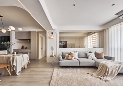
Perth Apartment
-
Gu Bei Private Residence
-
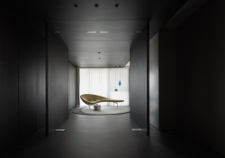
Timemory
-
Subtle lighting
-
THIDAMOON
-
Hue Memorial park BonHyangJeon
-
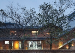
Red brick Courtyard House
-
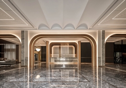
Lively Classic
-
Tower in the Cloud
-
Tan Charm Geometric Feature
-
Keep Feeling Art Center
-
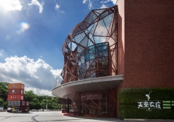
SHENZHEN 8 MALL
-
Wenxi Yihaoyuan Clubhouse
-
KZ MOBILITY Parking Lot
-
Future Deja Vu
-
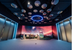
CRRC Tianjin Jin Pu City Exhibition Hall
-
line in old town
-
Sunshine Rhythm
-
Hsing Tian Kong Moral Education Classroom
-
Pingtungs Civic Park Inclusive Playground
-
Wabi sabi Elegance
-
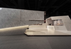
DEKTON AND COSENTINO PAVILION
-
Bellagio
-
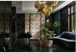
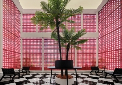
Pandora Box
-
MORE THAN SIMPLCITY
-
Between line and structure
-
Sparkling cloud
-
Divine Afflatus
-
17th MIDNIGHT
-
Pink Dream
-
Lingering Scent of Tea
-
75 Degree White

Designed by sketchbooks.co.kr / sketchbook5 board skin