
Potori typeface
| Country | Japan |
|---|---|
| Year | 2022 |
| Award | WINNER |
| Affiliation | Graphic Communication Laboratory |
| Designer | Noriyuki Kasai |
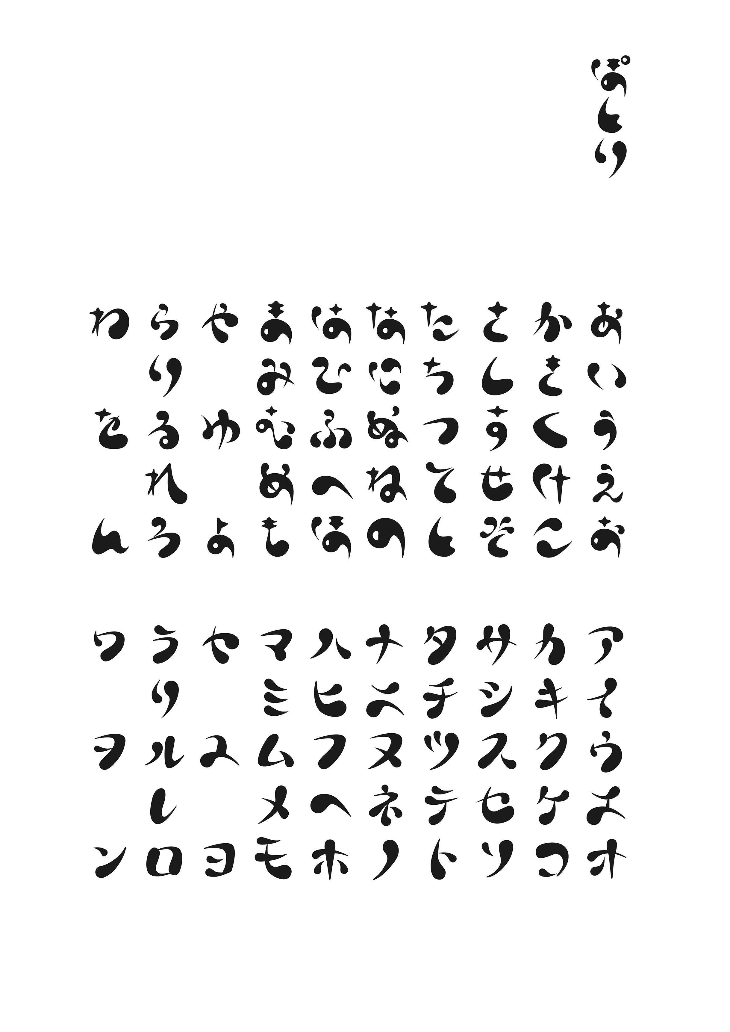
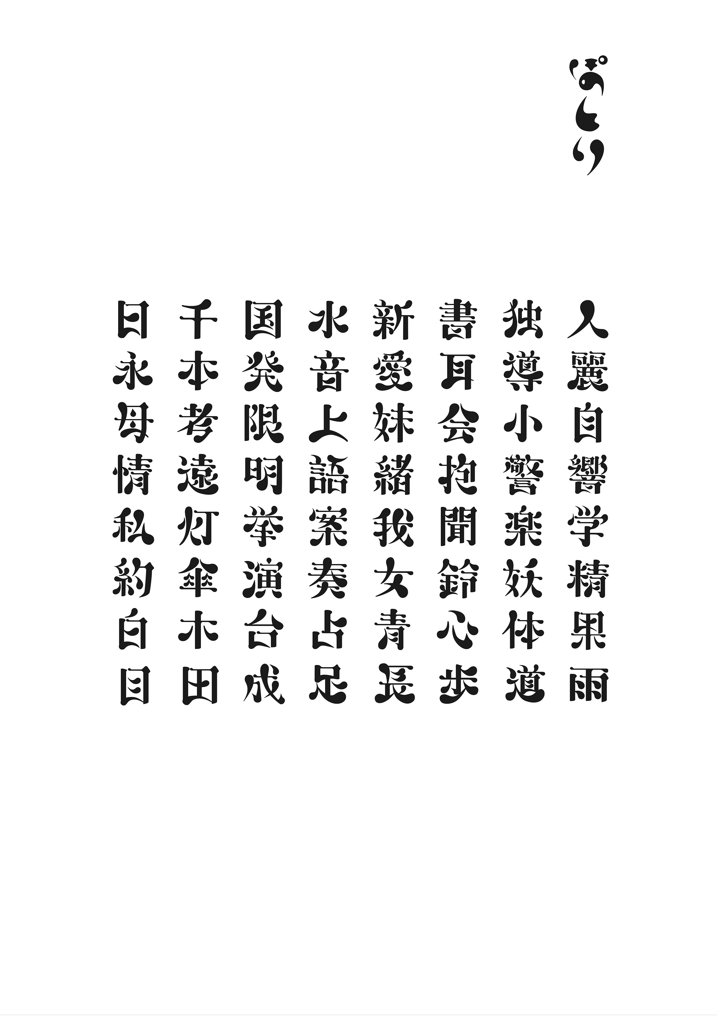
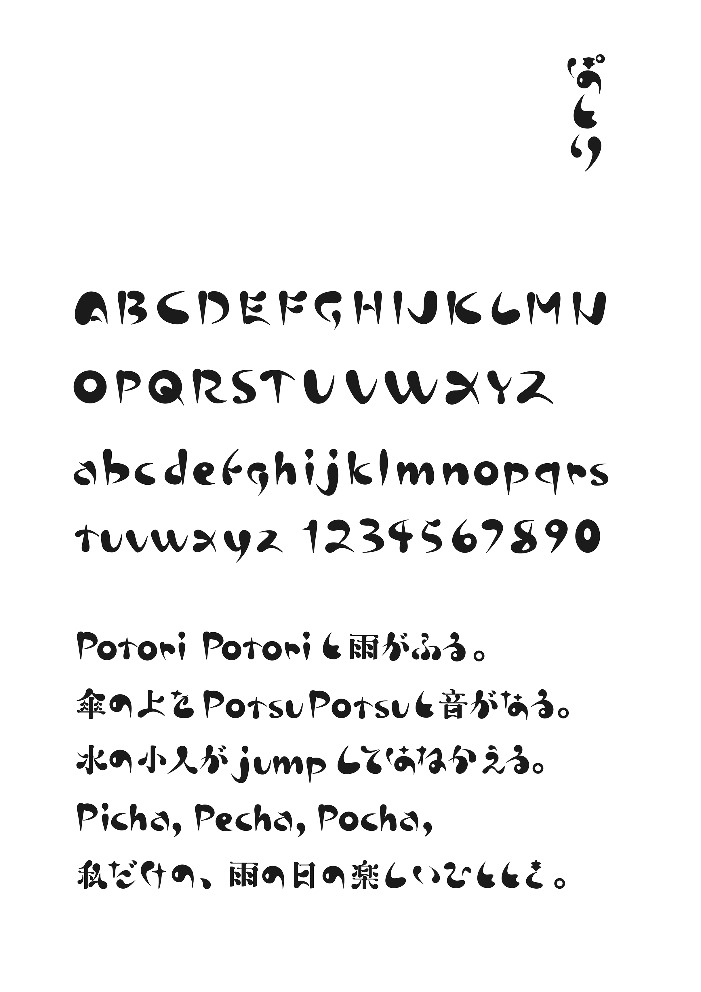
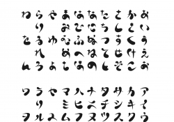
| English | The typeface "Potori" was created with the image of Japanese onomatopoeia. The hiragana and katakana glyphs leave a handwritten atmosphere so that you can feel the sound, and use that as the typeface skeleton. In order to express how the raindrops are about to fall or are falling, thick flesh is added to make it a heavy expression as a whole. For Chinese characters, the character shape of Mincho style was used as the basis because of the number of strokes and readability. The elements are shaped using hiragana and katakana elements to match the concept of the typeface. |
| Native | 書体「ぽとり」は日本語のオノマトペをイメージして制作したものである。ひらがな、カタカナの字形は、音を感じるように手書きの雰囲気を残 し、それを書体骨格とした。雨の雫がまるで落ちそう、もしくは落ちていく様子を表現するために、厚みのある肉付けをして全体に重たい表現とし ている。漢字については、画数と可読性の問題から、明朝体の字形を基本にした。エレメントは、書体のコンセプトに合うように、 ひらがな、カタカナのエレメントを使用し、形を整えた。漢字は画数が多くなると、可読性が悪くなるために、ぽとりの書体コンセプトを維持しつつつ、 垂直、水平の線は明朝体をベースに制作している。はね、はらいなどは楷書体ならびに明朝体の考え方をベースにしている。 アルファベットに関しては、ひらがな、カタカナ同様に骨格については、手書きの軽やかさを残しつつ、ぽってりとした肉付けを施し、少し不安定 感を残している。通常、明朝体やゴシック体などの本文用書体で組版をしていくと、漢字の方がひらがな、カタカナより画数が多く、 また漢字の方が形がしっかりしているため際立って見えるが、この書体は、逆にひらがなやカタカナ、 欧文が際立って見えるような作りになっている。このことにより、オノマトペを生かした文章表現に合うような書体となっている。 小説などの長い文章を読ませるための書体ではなく、詩などの短文で使用することを目的としている。 ディスプレイ書体のようなデザイン性を持ちながらも、可読性のある書体として制作をおこなった。 |
| Positive Comments |


|
-
dreamer
-
ENTROPY OFFICE
-
Yinlu restaurant
-
Jian Sushi
-
Fairy Tale Forest
-
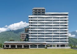
Lakeshore Hotel Hualien Taroko
-
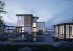
An Villa Aesthetics Pavilion
-
116 Lake House
-
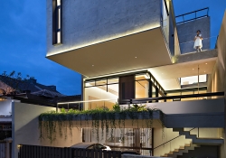
E House
-
The Relaxation in Art
-
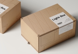
Light Box
-
Food Desert
-
Filling Expert
-
Chase the starlight
-
ZER01NE DAY 2019
-
GINZA SORA
-
The Ink Bench
-
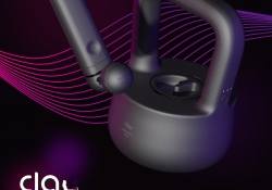
Clay IoT Home workout Station
-
Wound suture equipment
-
Mr. Baldie
-
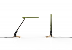
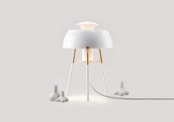
BAMBOOL(desk stand lamp)
-
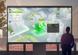
Digital Twin Virtual School Device Management
-
NUANBAO
-
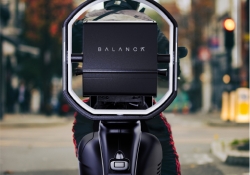
Balanca
-
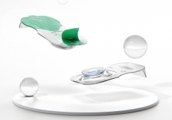
ZERO No touch lenses
-
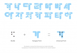
Hangeul Braille integrated Universal Font
-
KITSCH COW BRAND IDENTITY
-
COLD SPRING ORGANIC BRAND IDENTITY
-
PRIOR CORPORATE IDENTITY
-
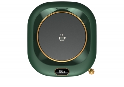
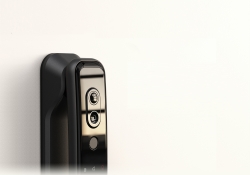
HOTATA Smart Lock V86
-
Governance Jungnang Local Brand Design
-
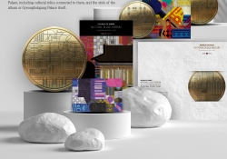
Graphic and Bullion of National Palace Museum
-
HANAGATA
-
no touch knob premium
-
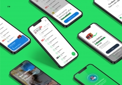
Live shopping platform Chakaday
-
Cabinet de Poissons
-
Park Light
-
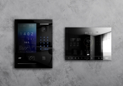
Smart Home Solution System HNFI7130 HLFI3100
-
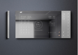
Smart Home Network Wall Pad HNFI6100
-
SPOON RADIO BRAND IDENTITY DESIGN
-
FISH CAKE GIFT SET PACKAGE
-
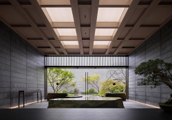
tanigawa hanare
-
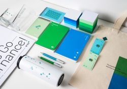
Shinhan Bank MONEYVERSE fintech brand design
-
Potori typeface
-
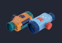
Beachbuddy
-
DtB
-
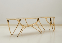
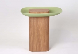
Basket Table
-
Got it
-
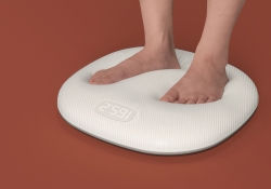
Elastic weight scale
-
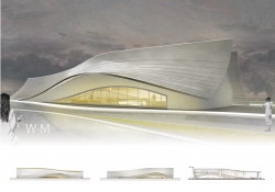
W.M
-
Phare
-
Reminder note
-
Tray Coin Bank
-
Fashion Brand Romantic Tiger Branding
-
mindwalk Brand Identity Design
-
YUSHIN Corporation Identity Design
-
The Iron Squad Visual Branding
-
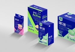
MEDIFOAM
-
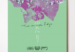
Higan no Futari Two on the edge Poster
-
MILLET
Designed by sketchbooks.co.kr / sketchbook5 board skin