
OROT

| Country | Korea |
|---|---|
| Year | 2022 |
| Award | WINNER |
| Affiliation | Sejong University |
| Designer | Ji Seung yeon |
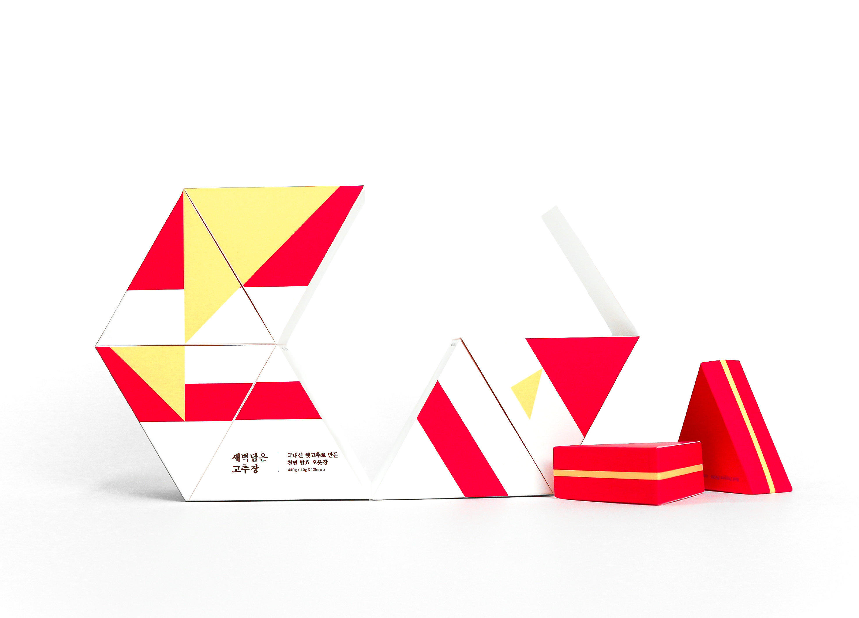
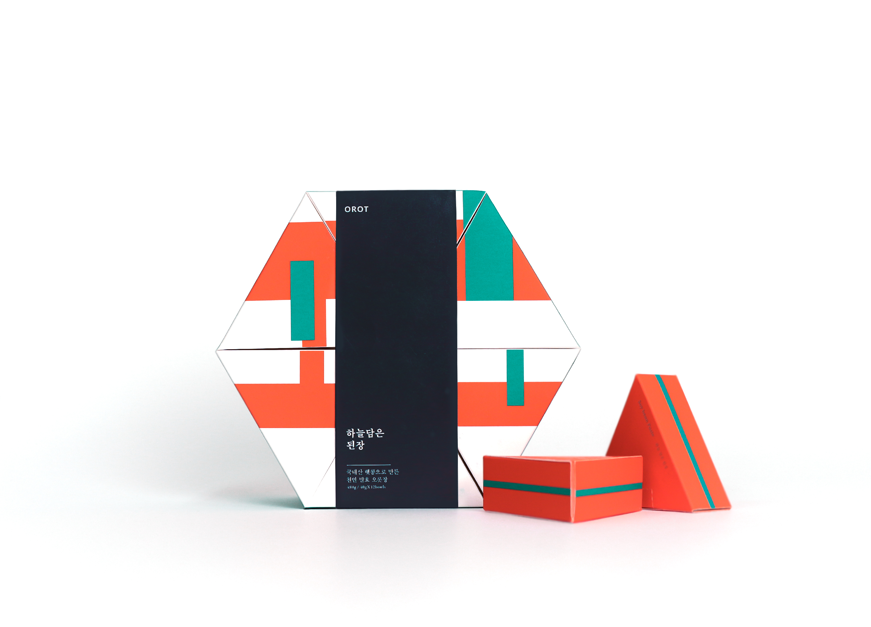
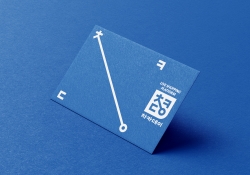
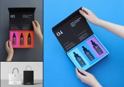
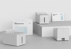
| English | OROT은 1 인 가구를 위한 전통 발효장 패키지이다. 1인 가구의 비중이 30%를 향해가면서 대부분 간편한 외식과 배달 음식으로 식사를 해결한다. 우리 장으로 만드는 전통 한식은 많은 재료가 필요하다. 요리 과정이 복잡하고 많은 재료가 필요하다는 이유로 설 자리를 잃어가고 있다. 이를 보완하기 위해 대부분 대용량으로 판매되는 발효 장을 1인분 씩 소분하여 간편하게 먹고 보관할 수 있게 했다. 발효는 틈으로부터 시작된다. 1700년이라는 긴 '시간' 동안 이어진 우리장은 '재료'가 쌓이고, 섞이고, 숙성되며 이어져 왔다. 재료 사이의 틈 안에 시간이 쌓이고 곰팡이가 들며 숙성과 발효가 진행된다. 메주와 콩, 고추의 형태적 특징에 따라 사각형, 원, 삼각형을 그래픽 요소로 선정하고, 시간의 축적을 반복되는 선으로 표현하였다. 이런 기본 도형과 선을 반복한 개별 패턴을 제작하여 전체 패키지를 디자인했다. 오랜 시간 숙성된 발효의 틈. 그 틈이 끼워 맞춰지는 듯, 한곳으로 맞물리는 패키지 지기구조를 이용했다. 안에 들어가는 삼각형 모양의 소분 패키지를 통해 간편한 보관이 가능하다. |
| Native | OROT is Korean Word '오롯', that mean 'This is perfect, without lacking'. OROT has prepared single-serving packages of fermented sauces, which was previously sold mostly in large-sized packages. Fermentation was In the long 'time' with 'material' accumulated, mixed. The morphological features of meju, beans, and peppers can be simplified into squares, circles, and triangles. It is selected as a graphic element and expresses the accumulation of time as repeated lines. Like the interlocking of the material and time shown in the graphic, the base structure gathers triangles to complete the cube. |
| Positive Comments |


|
-
POSCO Interactive 360
-
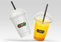
ROUNZ
-
CleanMyMac X
-
Wan Cha
-
Garden
-
NATIONAL PATTERN BOOK
-
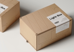
Light Box
-
Food Desert
-
Digital Twin Virtual School Device Management
-
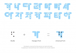
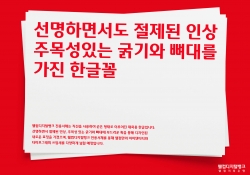
Hangeul Braille integrated Universal Font
-
KITSCH COW BRAND IDENTITY
-
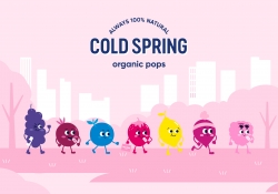
COLD SPRING ORGANIC BRAND IDENTITY
-
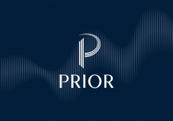
PRIOR CORPORATE IDENTITY
-
Governance Jungnang Local Brand Design
-
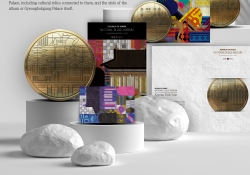
Graphic and Bullion of National Palace Museum
-
Live shopping platform Chakaday
-
Cabinet de Poissons
-
SPOON RADIO BRAND IDENTITY DESIGN
-
FISH CAKE GIFT SET PACKAGE
-
tanigawa hanare
-
Shinhan Bank MONEYVERSE fintech brand design
-
Potori typeface
-
DtB
-
Got it
-
Reminder note
-
Fashion Brand Romantic Tiger Branding
-
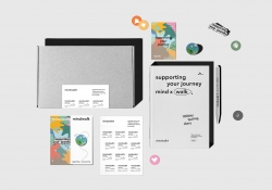
mindwalk Brand Identity Design
-
YUSHIN Corporation Identity Design
-
The Iron Squad Visual Branding
-
MEDIFOAM
-
Higan no Futari Two on the edge Poster
-
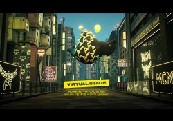
MCM METAVERSE VIRTUAL STAGE
-
Lotte Department Store Dongtan Branding
-
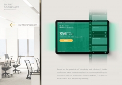
Smart Meeting Room Doorplate
-
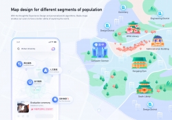
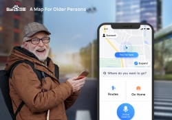
Map for different segments of population
-
a map for older persons
-
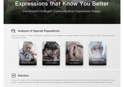
Expressions that Know You Better
-
FunPlus 10th anniversary gift box
-
Premium branded chicken TANZAWA JIGURO SYAMO
-
Auditory Experience Design of BODYFRIEND
-
Litemove Rebranding
-
hugrug
-
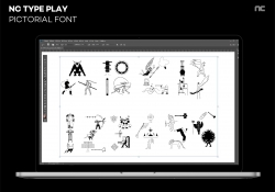
NC TYPE PLAY
-
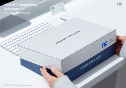
NCSOFT Welcome Kit for New Employee
-
WELCOME Typeface Design
-
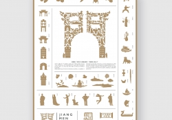
Jiangmen Culture and Tourism Brand Logo
-
LVUPGG Esports Tournament Platform
-
SevenDays and NightsLoveIsDaylight
-
Coloreat : Chromatology in Food coloring
-
OROT
-
AI Learning Assistant ASKBOB
-
JJSSBROS Workwear
-
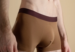
Banshan Boxer Brief
-
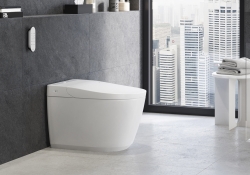
IGINA Shower Toilet Collection
-
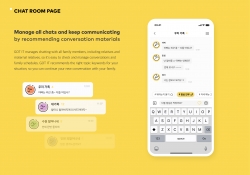
Customized Meeting Assistant
-
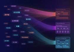
Enterprise Knowledge Management System Design
-
Friends Visual Branding
-
Pure Series Packaging
-
BIGKIT Onboarding kit of BIGPICTURE
-
Follow follow 米 - Samsung Card SNS Event


Designed by sketchbooks.co.kr / sketchbook5 board skin