
Communication
The Fishermen
| Country | Korea |
|---|---|
| Year | 2020 |
| Award | WINNER |
| Client | CHANNEL A |
| Affiliation | CHANNEL A BNC |
| Designer | JISANG YU, HYEJUNG OH, JONGBYUM CHOI, RAHAM KIM, NAMYII LEE |
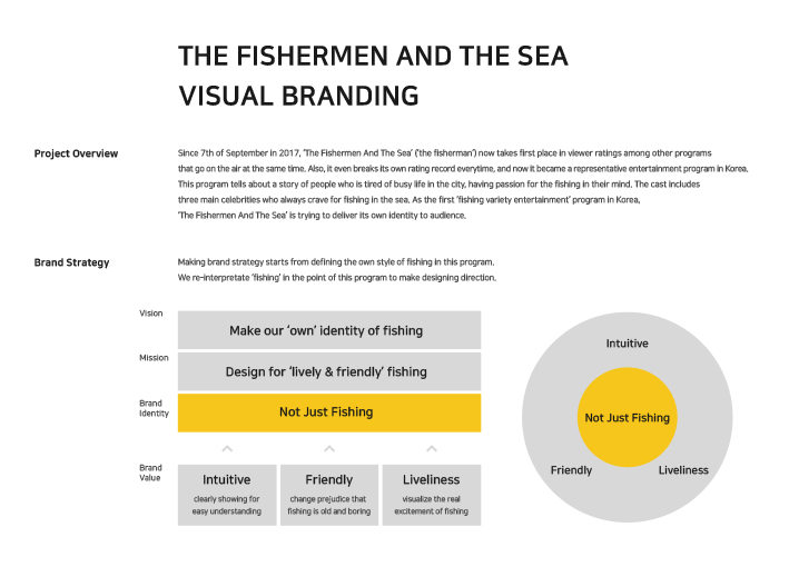
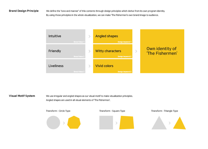
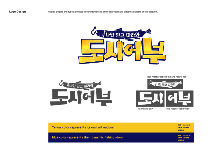
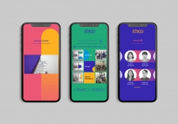
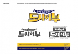
| English | Since September in 2017, ‘The Fishermen And The Sea’ now takes first place in viewer ratings among other programs that go on the air at the same time, breaking its own rating record everytime. In order to effectively visualize 'friendly and enjoyable' fishing activities, we use angled shapes, witty characters, vivid colors as our key design elements and consistently apply those elements in various media. ‘The Fishermen And The Sea’'s irregular and angled visual motif made a highly characterized design principle which is different from other informative contents. |
| Native | 도시어부는 2017년 9월 첫 방송을 시작해 매회 최고 시청률을 경신하는 대한민국 최초 낚시 버라이어티 프로그램입니다. 생동감 넘치고 친근한 낚시의 시각적 구현을 위해 각진 쉐입, 위트 있는 캐릭터라이즈, 원색의 컬러를 디자인 키워드로 설정하여 다양한 매체에 일관성 있게 적용하였습니다. 도시어부만의 비규칙적이고 각진 비주얼 모티프는 일반적인 정보 전달성 콘텐츠디자인과는 차별되는 개성 있는 비주얼룩을 확립하였습니다. 이러한 비주얼브랜딩 확립으로 시각적인 차별성을 부여하여 경험자들이 다양한 시각적 경험을 효율적으로 체험할 수 있는 콘텐츠로서의 경쟁력을 갖추었습니다. |
-
DREAM CANVAS STUDIO Visual Branding
-
THE PENTHOUSE Visual Branding
-
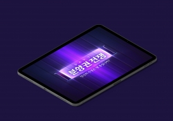
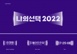
MY CHOICE Visual Branding
-
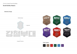
The Iron Squad Visual Branding
-
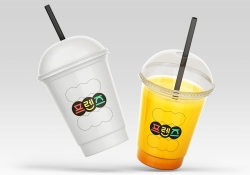
Friends Visual Branding
-
Dong-A is 100 Visual Branding
-
CHANNEL A NETWORK BRANDING
-
The Fishermen
Designed by sketchbooks.co.kr / sketchbook5 board skin