
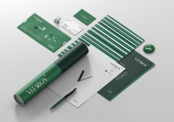
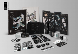
BEVERCITY brand design
| Country | Korea |
|---|---|
| Year | 2024 |
| Award | WINNER |
| Client | Sami corperation Co., Ltd. |
| Affiliation | ohSeven design Co., Ltd. |
| Designer | Sukyoo Bae, Song yi Gu, Yunje Park, Chaelin Kim, Yujin Oh |
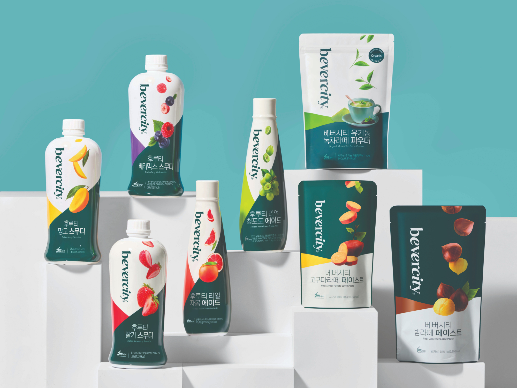
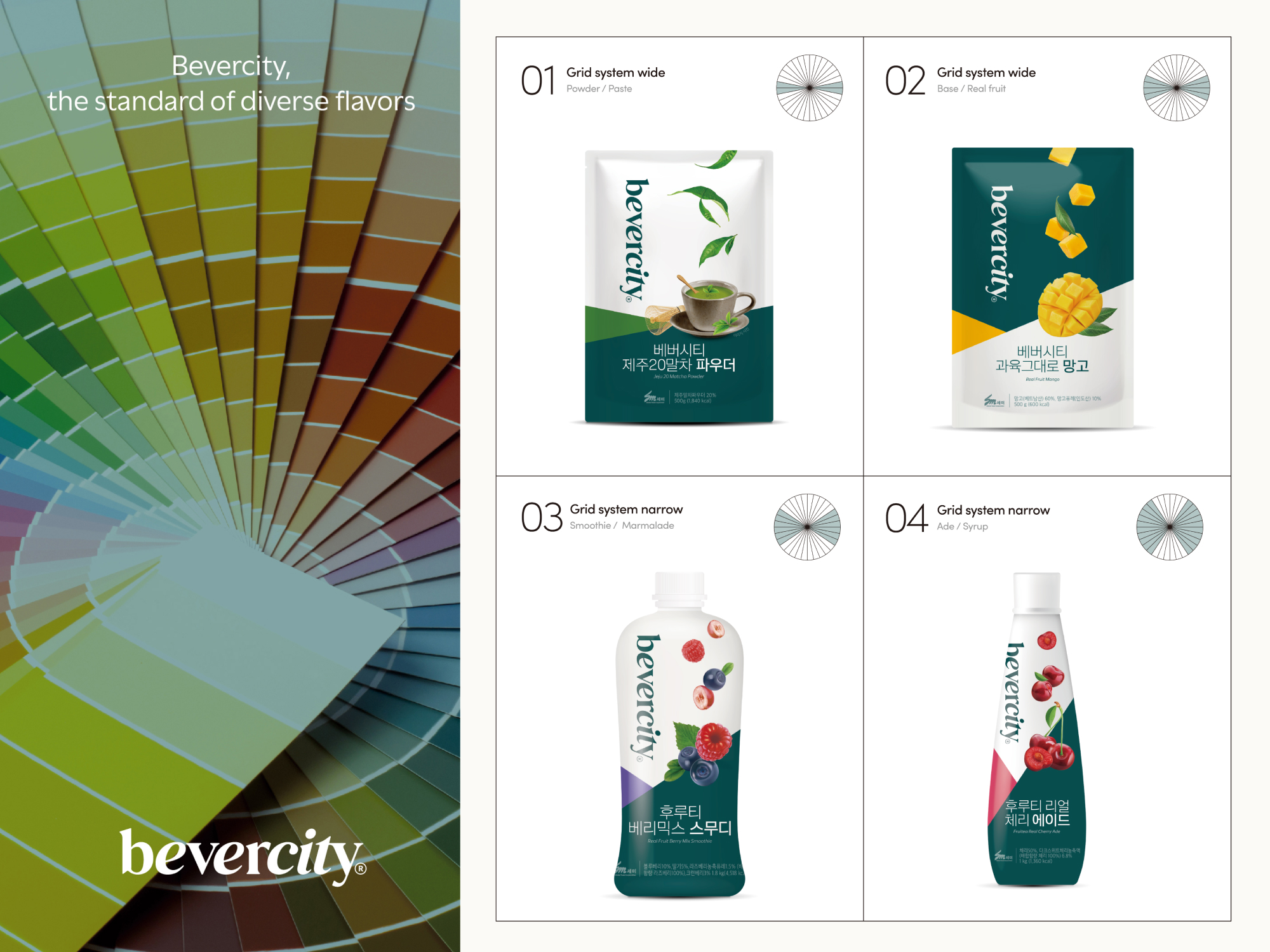
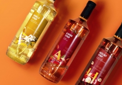
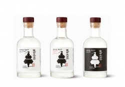
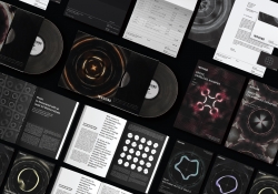
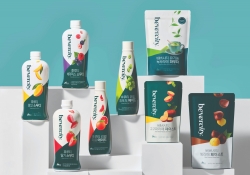
| English | The design of the Bevercity brand is based on the core value of "divercity" and features three characteristics. 01.The diversity of Bevercity leading dessert and beverage culture is expressed in combinations of Roman and Italic fonts. 02. Bevercity’s packaging system is inspired by the color wheel. The wheel means “Standards of Different Colors,” and it shares the same context with Bevercity’s brand concept of “Standards of Diverse Flavors.” 03. Bevercity uses images of diagonally sliced fruits in its packages. It matches the concept of “Diagonal Line” used as the main brand key word for expressing diversity. |
| Native | 베버시티 브랜드 디자인은 "다양성"이라는 브랜드 코어 밸류를 기반으로 하며, 세 가지 특징을 가지고 있습니다. 디저트와 음료 문화를 선도하는 베버시티의 다양함을 로만과 이탤릭 서체의 조합으로 표현하였습니 다. 각도의 차이로 담아낸 다양함은 조화롭게 서로 어우러져 하나의 베버시티가 됩니다. 로고 타입의 각도 변화는 베버시티의 브랜드 아이덴티티 시스템을 구축하는 기반이 되었습니다. 베버시티는 색상환을 모티브로 한 32개의 각도를 활용해 그리드 시스템을 만들었습니다. 4가지 그리드 시스템은 각각 지정된 항목의 패키지 디자인 및 어플리케이션에 활용됩니다. 패키지 디자인에서는 각각의 항목을 분류 및 체계화 할 수 있는 수단으로써 사용됩니다. 로만, 이탤릭체와 색상환 그리드 뿐 아니라 슬라이스 형태의 과일을 활용함으로써 자연스럽게 대각선의 형상을 브랜드 전반에 녹일 수 있고, 이를 통해 일관된 브랜드 가치를 보여줄 수 있습니다. 또한 명확한 슬라이스 과일이라는 사진에 대한 명확한 가이드로 영역을 넓힐 때 또한 쉽게 활용이 가능하다는 장점이 있습니다. |
| Website | ohseven.co.kr |
| Positive Comments |


|
| Judging Comments | Bevercity's design, centered on "divercity," has been lauded for its clever use of Roman and Italic fonts, a color wheel-inspired packaging system, and diagonally sliced fruit images to symbolize flavor diversity. This cohesive approach effectively communicates the brand's commitment to diverse tastes and cultures, earning it high praise for branding innovation. |
-
TAFALONG Visual Design
-
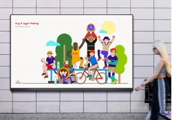
Welcome Bank Walking Visual Identity Design
-
Golden Brushstrokes on Azure
-
NYGDESIGN Identity Rebrand
-
DREAM CANVAS STUDIO Visual Branding
-
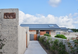
hohe Gyeongju Pool Villa Branding
-
POSTECH Changeup Ground Leaflet
-
Shuiyue Dongtian
-
WEATHER IN NEXEN
-
Hifive
-
Utsuroi
-
Change is the Only Difference Textile Series
-
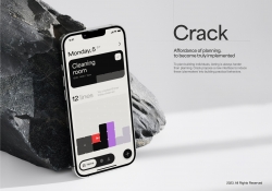
CRACK
-
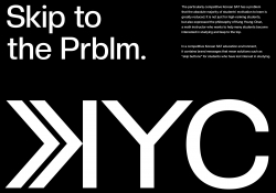
KYC Brand eXperience Design
-
Sustainable Regeneration Consciousness
-
Dear Earth
-
YOYO
-
Vocal Island
-
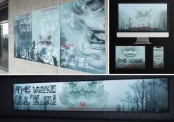
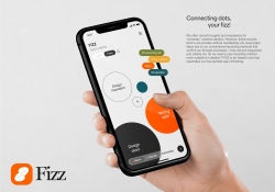
FIZZ
-
Nature Tea Syrup Bottle and Packaging Design
-
Christmas Light Fantasia
-
SUM Air Brand Identity Design
-
WATER 2 App And Charger Display
-
Banana paper projects Ashi
-
Niigata Kameda Distillery
-
MUTSRUM the beauty of Najeon Chilgi in Korea
-
Berklee College of Music
-
Hosil
-
Infant Snap
-
INSOUND
-
Exlicon MX A drawing tool without boundaries
-
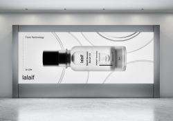
lalaif
-
NILTO
-
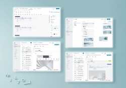
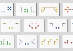
Ding OS Collaborative Computing OS
-
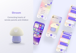
Shroom
-
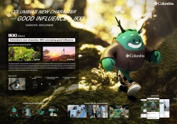
Columbia New character IKKI
-
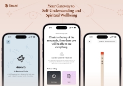
Sine AI
-
BURNOUT SYNDROME THERAPY
-
After
-
Heineken Talk Label
-
Eco Friendly Dolmen
-
Suwon Hwaseong branding project
-
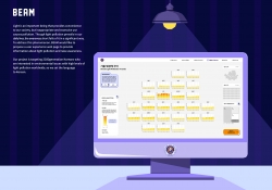
BEAM Light Pollution Data Visualization
-
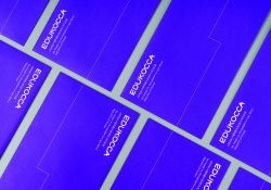
EDUKOCCA Brand eXperience Design
-
Artiant Hub Branding Design
-
VRIN 3D
-
361 degree kids Jump Rope Limited Packaging
-
Plu packaging design
-
BEVERCITY brand design
-
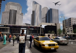
CREATIVIA Metaverse Platform
-
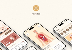
PulseHeal
-
Braille Emoji Design
-
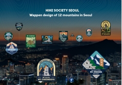
Columbia WAPPEN of 12 moutains in Seoul
-
NEXERA
-
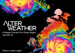
KISANGCHEONG Alter Weather
-
Growlin
-
SPLASH
-
Creative packaging design of red wine
-
Cuppy bird
-
Touring Torch
Designed by sketchbooks.co.kr / sketchbook5 board skin