BEVERCITY brand design
Communication
Regions
Korea
Year
2024
Award
WINNER
Client
Sami corperation Co., Ltd.
Affiliation
ohSeven design Co., Ltd.
Designer
Sukyoo Bae, Song yi Gu, Yunje Park, Chaelin Kim, Yujin Oh
English
The design of the Bevercity brand is based on the core value of "divercity" and features three characteristics.
01.The diversity of Bevercity leading dessert and beverage culture is expressed in combinations of Roman and Italic fonts.
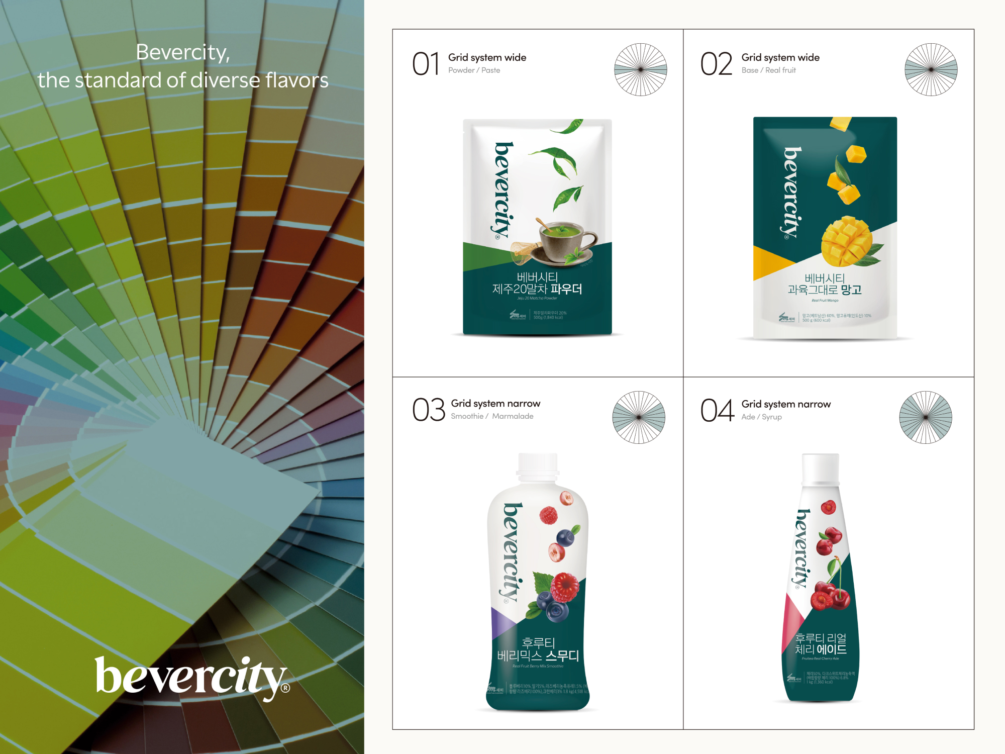
02. Bevercity’s packaging system is inspired by the color wheel. The wheel means “Standards of Different Colors,” and it shares the same context with Bevercity’s brand concept of “Standards of Diverse Flavors.”
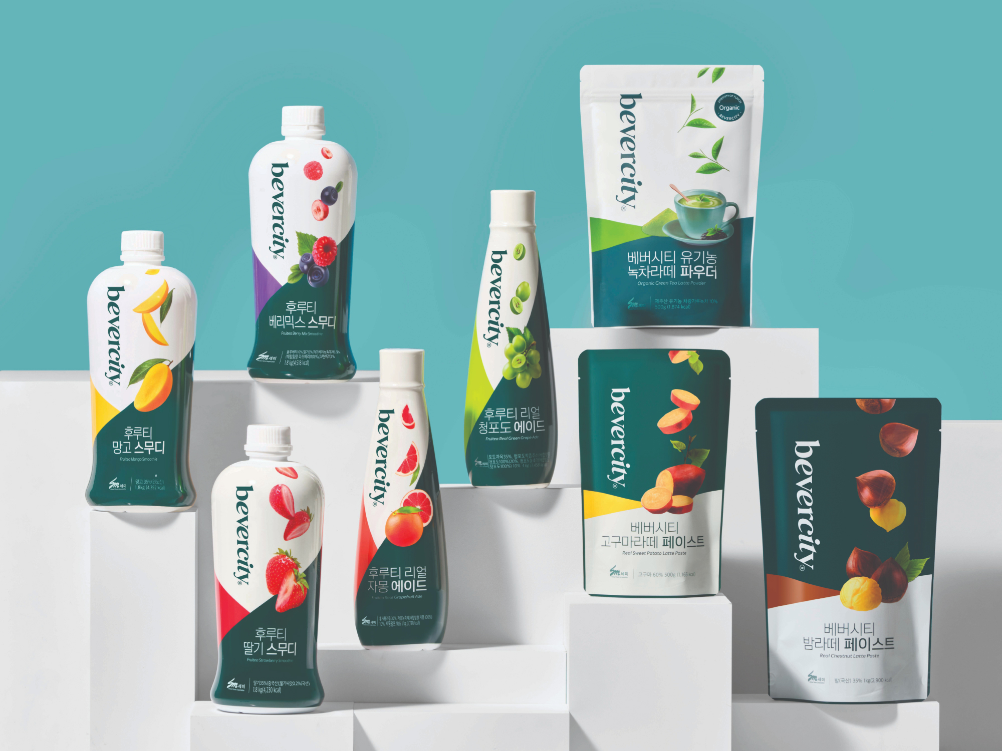
03. Bevercity uses images of diagonally sliced fruits in its packages. It matches the concept of “Diagonal Line” used as the main brand key word for expressing diversity.
Native
베버시티 브랜드 디자인은 "다양성"이라는 브랜드 코어 밸류를 기반으로 하며, 세 가지 특징을 가지고 있습니다.
디저트와 음료 문화를 선도하는 베버시티의 다양함을 로만과 이탤릭 서체의 조합으로 표현하였습니 다. 각도의 차이로 담아낸 다양함은 조화롭게 서로 어우러져 하나의 베버시티가 됩니다. 로고 타입의 각도 변화는 베버시티의 브랜드 아이덴티티 시스템을 구축하는 기반이 되었습니다.
베버시티는 색상환을 모티브로 한 32개의 각도를 활용해 그리드 시스템을 만들었습니다. 4가지 그리드 시스템은 각각 지정된 항목의 패키지 디자인 및 어플리케이션에 활용됩니다. 패키지 디자인에서는 각각의 항목을 분류 및 체계화 할 수 있는 수단으로써 사용됩니다.
로만, 이탤릭체와 색상환 그리드 뿐 아니라 슬라이스 형태의 과일을 활용함으로써 자연스럽게 대각선의 형상을 브랜드 전반에 녹일 수 있고, 이를 통해 일관된 브랜드 가치를 보여줄 수 있습니다. 또한 명확한 슬라이스 과일이라는 사진에 대한 명확한 가이드로 영역을 넓힐 때 또한 쉽게 활용이 가능하다는 장점이 있습니다.
Website
Judging Comments
Bevercity's design, centered on "divercity," has been lauded for its clever use of Roman and Italic fonts, a color wheel-inspired packaging system, and diagonally sliced fruit images to symbolize flavor diversity. This cohesive approach effectively communicates the brand's commitment to diverse tastes and cultures, earning it high praise for branding innovation.
Positive Comments


361 degree kids Jump Rope Limited Packaging
Shanghai Kuyekuye Technology Co., Ltd.
China
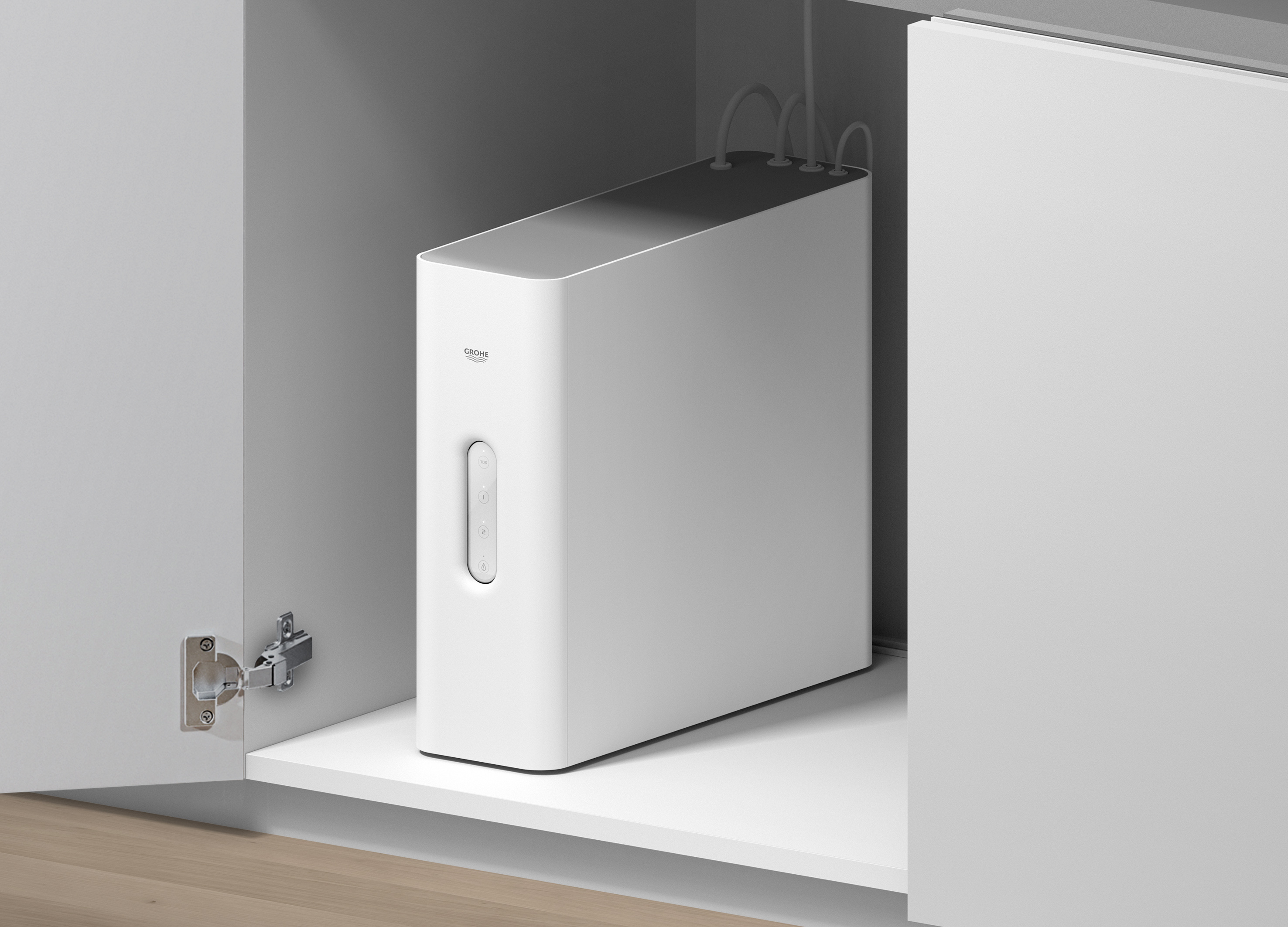
GROHE Pure RO System
GROHE
Singapore
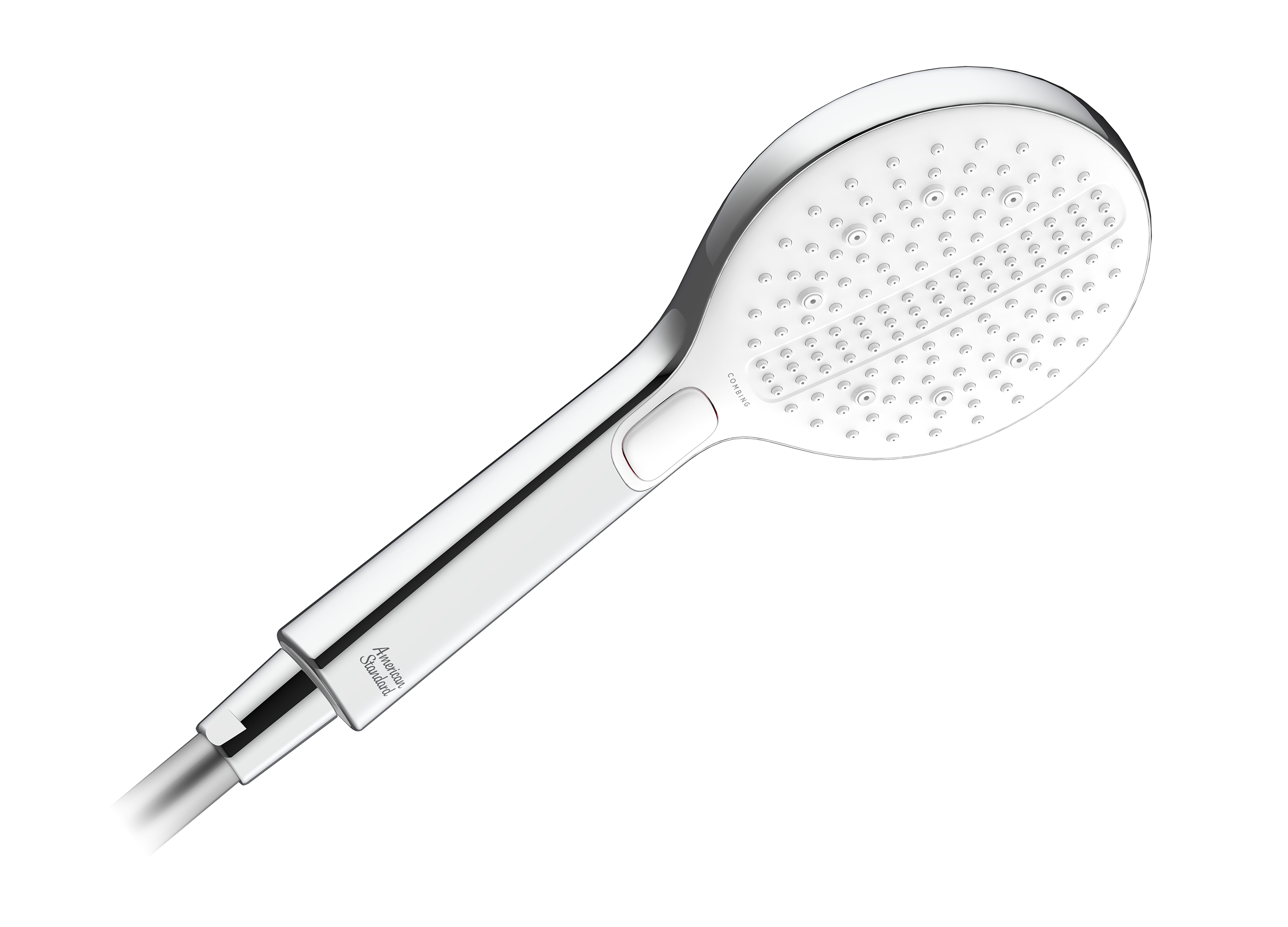
RainClick Combing Hand Shower
American Standard
Singapore
Negative 45
Excelsior interior design Co., Ltd.
China Hong Kong
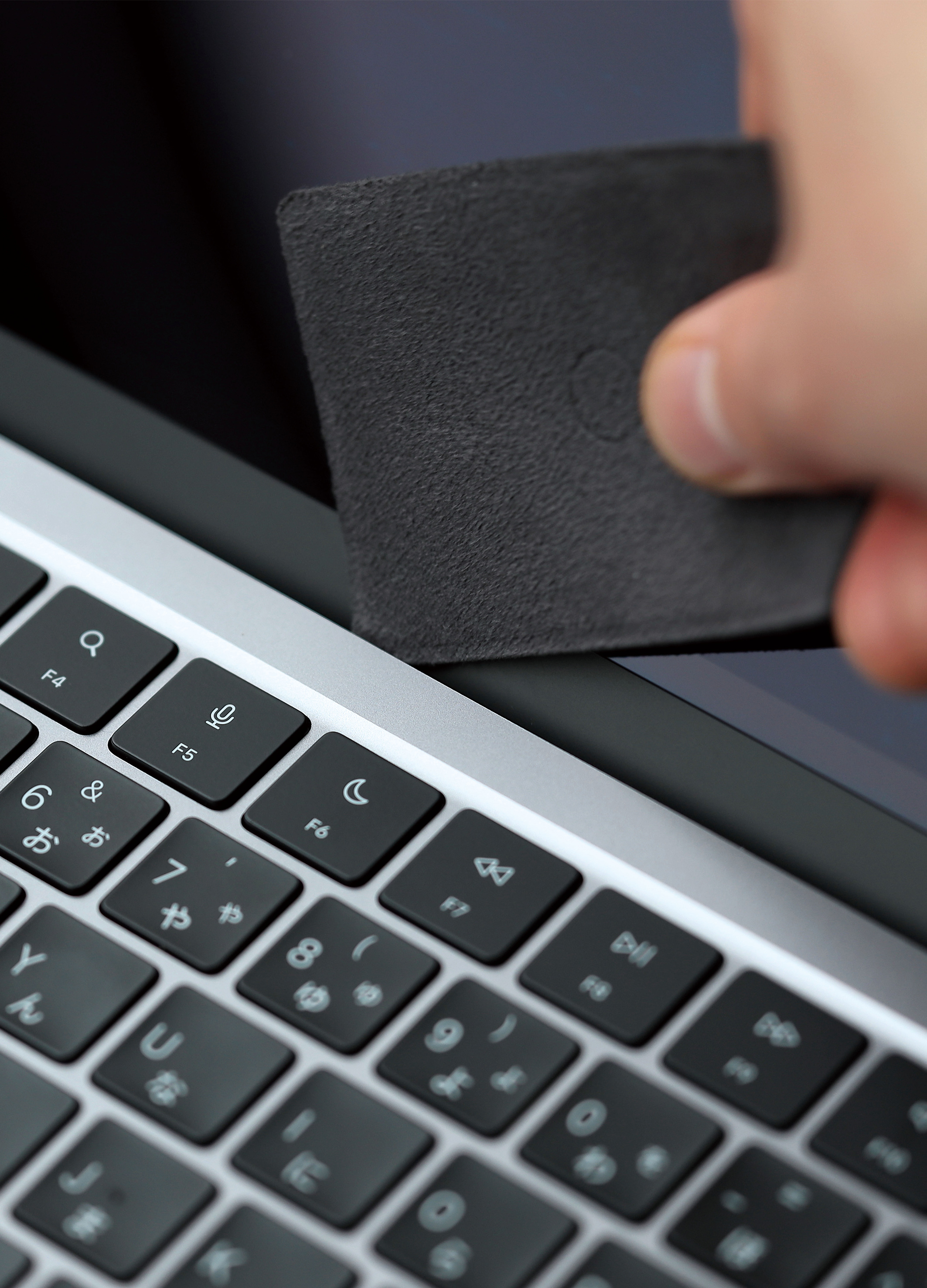
kyu cloth
YASUAKI MATSUURA
Japan
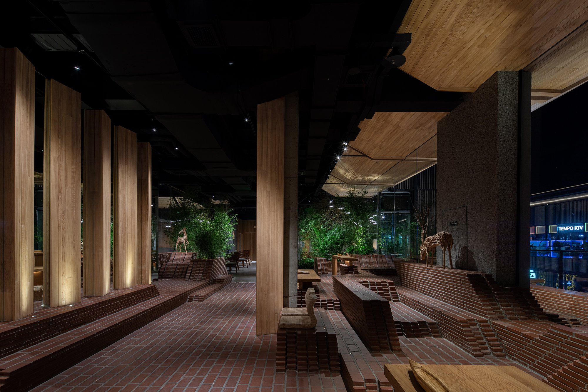
Inner Garden Hotpot in Chengdu Talent Hub
FUSE DESIGN
China
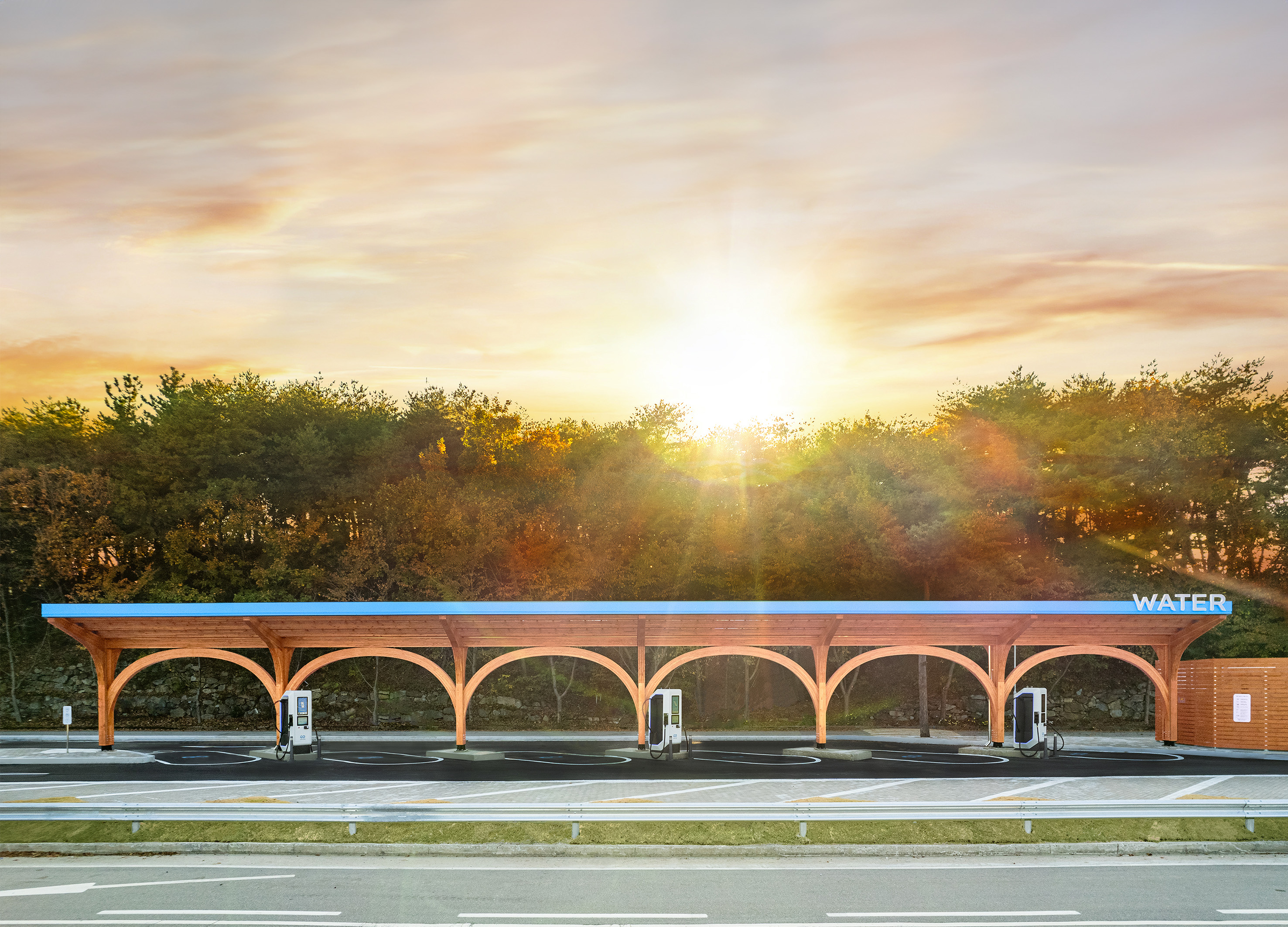
WATER EV Charging Station
Brite Energy Partners Corp.
Korea
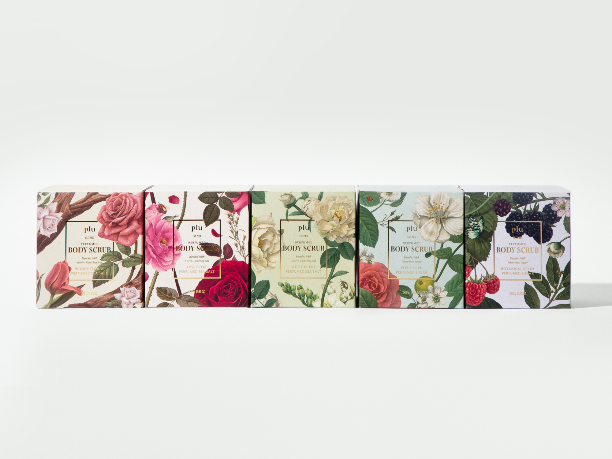
Plu packaging design
ohSeven design Co., Ltd.
Korea
Staircase
Deco Farmer Studio Co., Ltd.
China Hong Kong
BEVERCITY brand design
ohSeven design Co., Ltd.
Korea
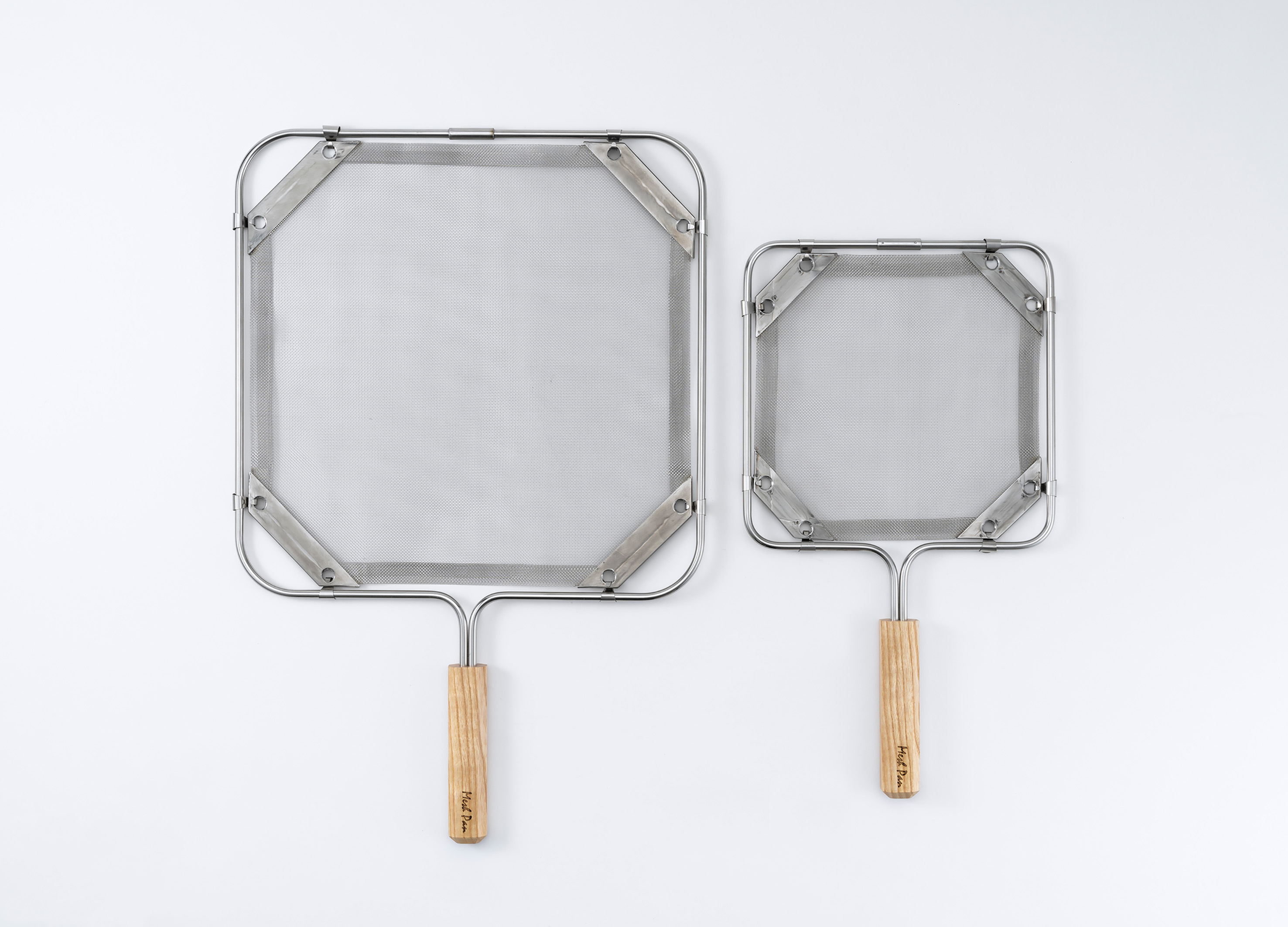
MESH PAN
GateLightDesign Co., Ltd.
Japan
The Dusk
LYYH Studio Co., Ltd.
China Hong Kong
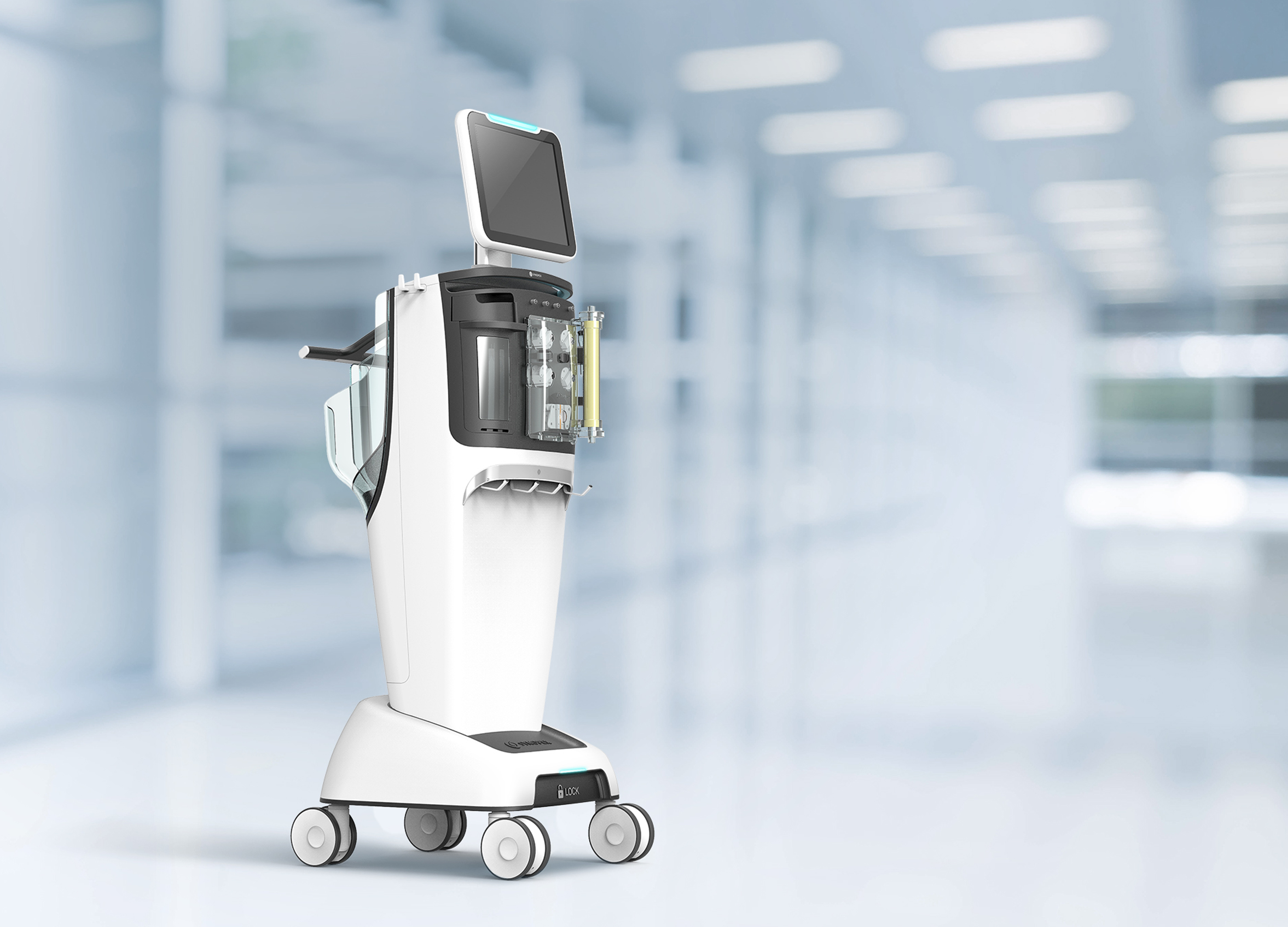
SYNOPEX CRRT Hemodialysis Medical System
GODESIGN
Korea
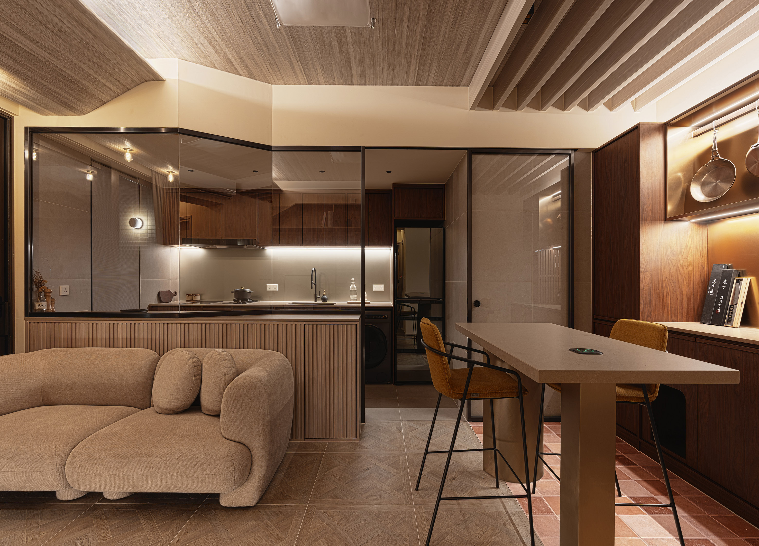
SKY CASA
Real Estate Company Co., Ltd.
China
Treasure of Charms
Yufang Design
Chinese Taipei
The Sea of Books
XIPIN Interior Design Co., Ltd.
Taiwan
SLOW BUT BETTER
THE SUP
Korea

CREATIVIA Metaverse Platform
ICT Convergence Research Center in KIT
Korea


Partner & Sponsor
More


info@asiadesignprize.com
#14057, 905 49, Beolmal-ro 102beon-gil,
Dongan-gu, Anyang-si, Gyeonggi-do, Korea
#14057, 905 49, Beolmal-ro 102beon-gil,
Dongan-gu, Anyang-si, Gyeonggi-do, Korea
Founder: Doyoung Kim
Business Registration Number: 454-86-01044
Online Sales License No.: 2021-Anyang Dongan-1081
Copyright © DESIGNSORI Co., Ltd.
Business Registration Number: 454-86-01044
Online Sales License No.: 2021-Anyang Dongan-1081
Copyright © DESIGNSORI Co., Ltd.
