
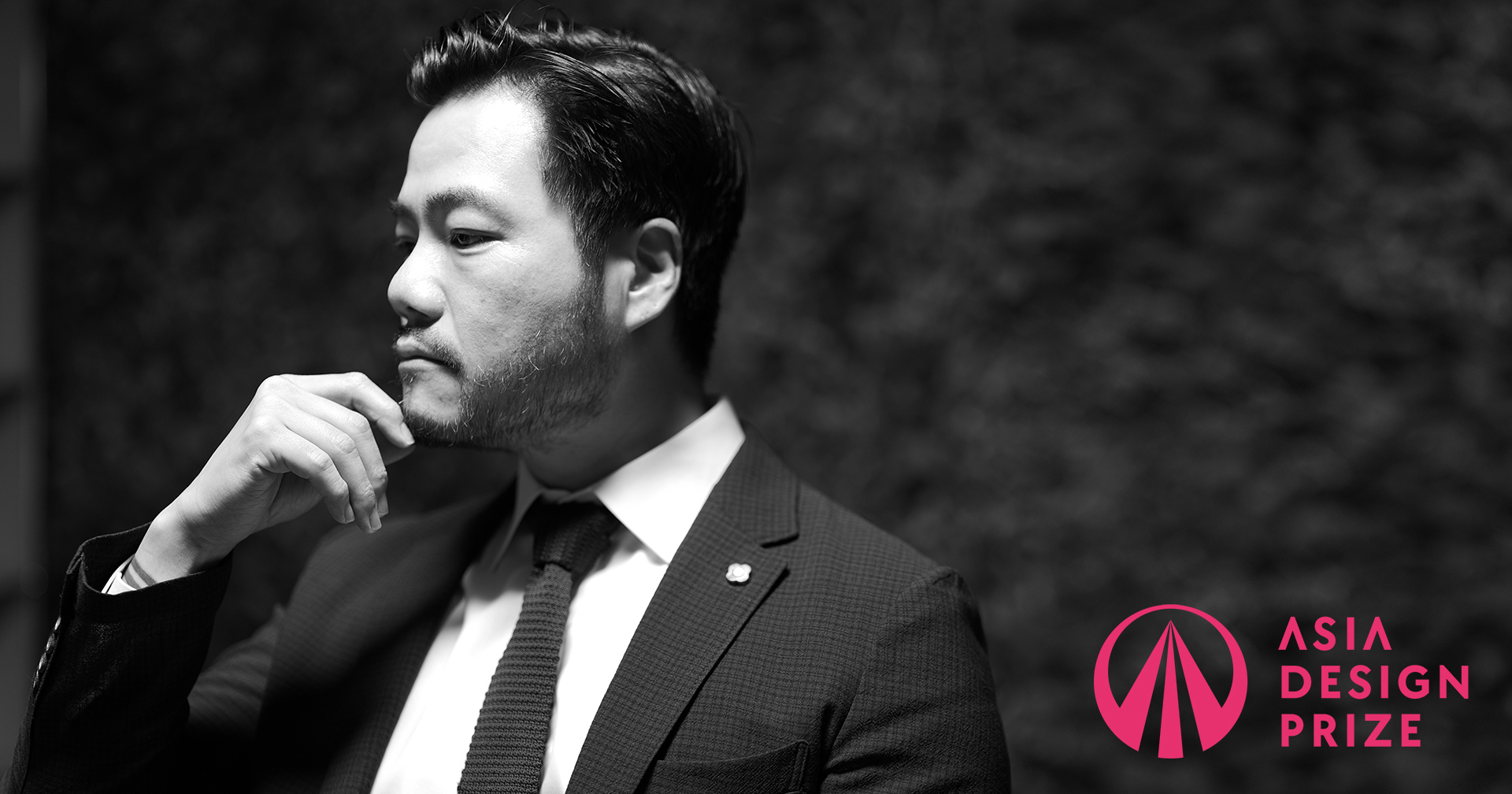
Director Hoyoung Lee Founder of 250design studio
How does 250design perceive the Asia Design Prize, and how do you interpret the philosophy or role the brand holds?
To 250design, the Asia Design Prize is a platform that defines and proposes the future identity of Asian design. It is seen not merely as an organization that recognizes and rewards outstanding design, but as a vital hub that connects and expands the diverse ways of thinking and cultural contexts across Asia through the language of design. The philosophy of ADP goes beyond a competition-based awards structure—it prompts critical questions about how design should engage with society and how it can form meaningful connections across industries. For us, this brand is not only about individual creative achievement, but about fostering a discourse on the perspectives and values design should embody as it communicates with the world.
How does 250design define the future identity of Asian design? Especially within the global design landscape, what differentiated direction do you see it taking?
250design believes that the future identity of Asian design lies in “boundaryless thinking” and “interpretable form.” This is not about merely modernizing tradition or remaining within the bounds of regionalism, but about cultivating a cognitive framework that reads and connects eras and contexts with fluidity—and the ability to translate that philosophy into form. Asian design often reveals its aesthetics and attitude not through explicit messaging, but through a sense of space, flow, and subtle tension. This distinctive approach, we believe, will increasingly stand out as a defining identity within the global design conversation. In a time when design is being asked to accommodate greater complexity and layered interpretation, we see the Asian mindset as a meaningful alternative—one that offers nuanced, context-aware perspectives that resonate across cultures without relying on uniform narratives.
What part did 250design take on in the Asia Design Prize rebranding project?
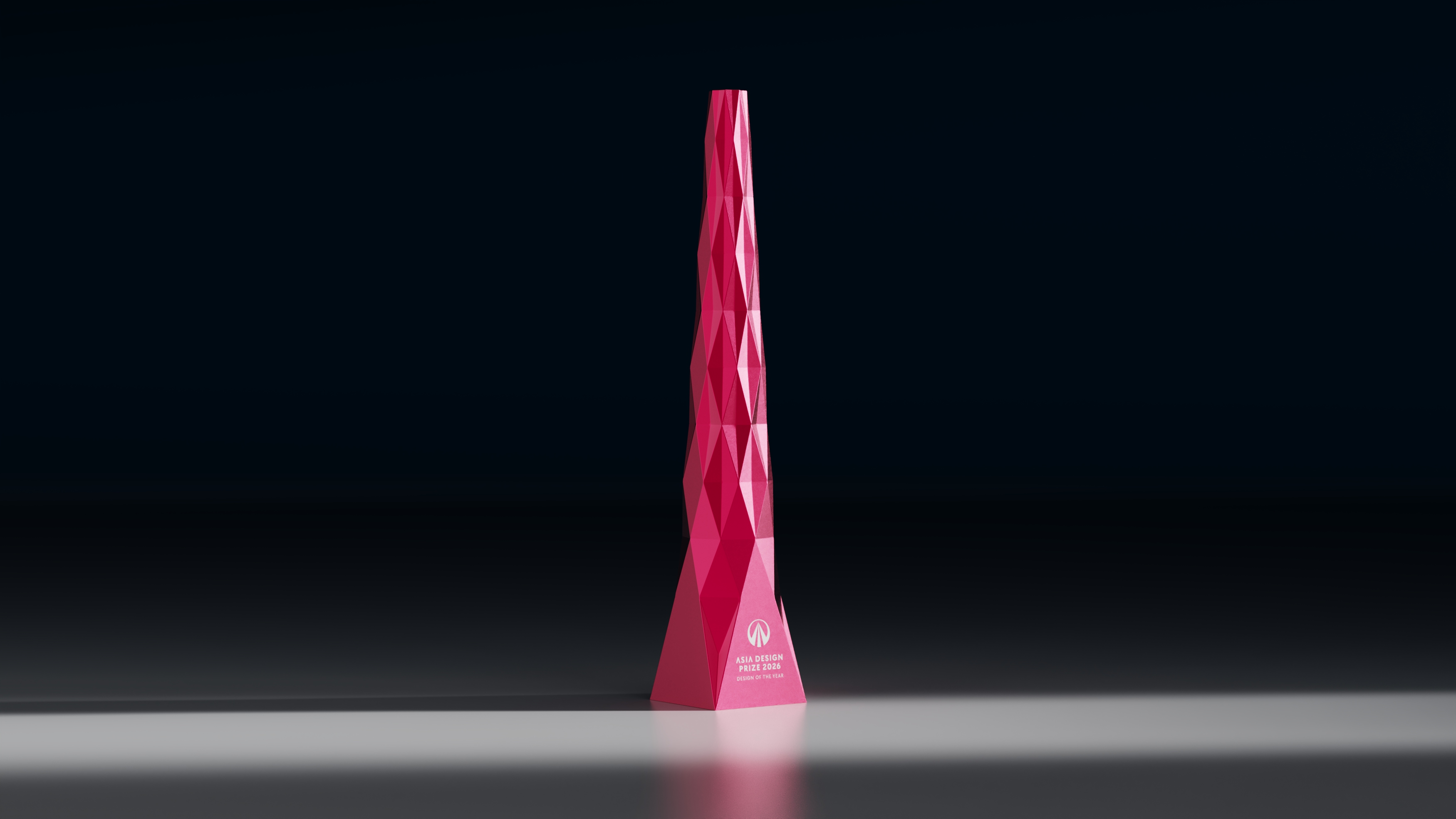
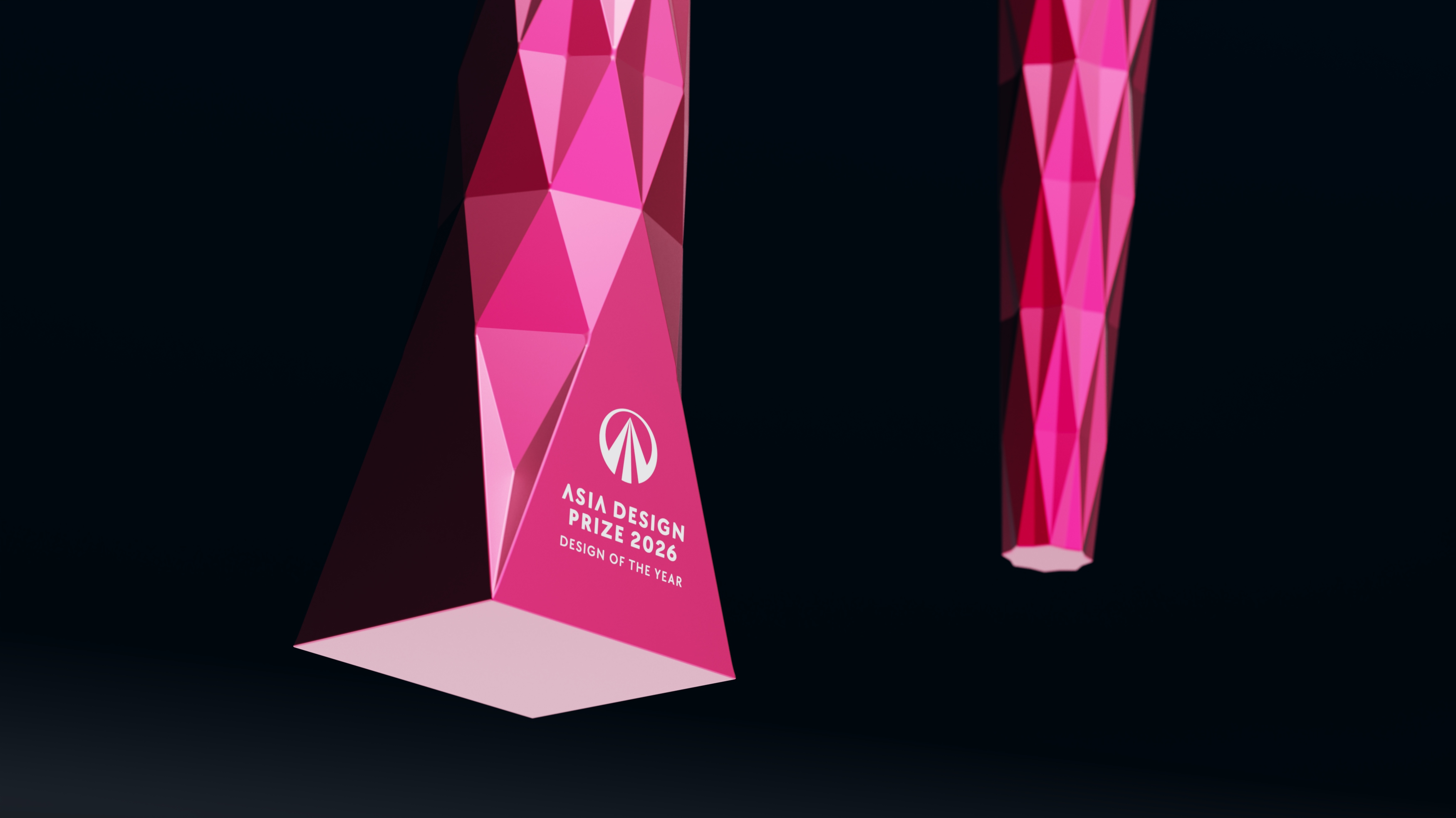
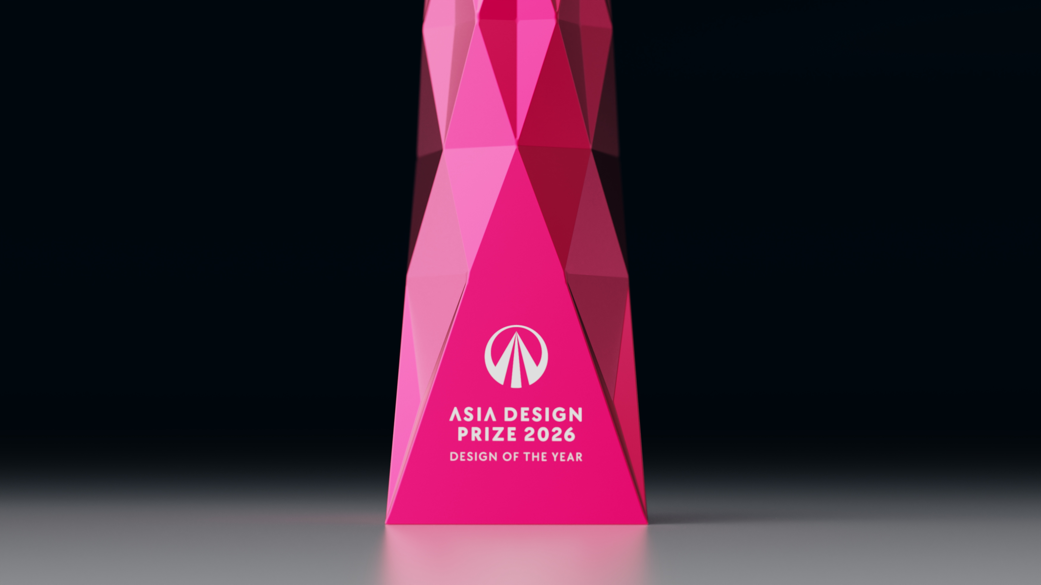
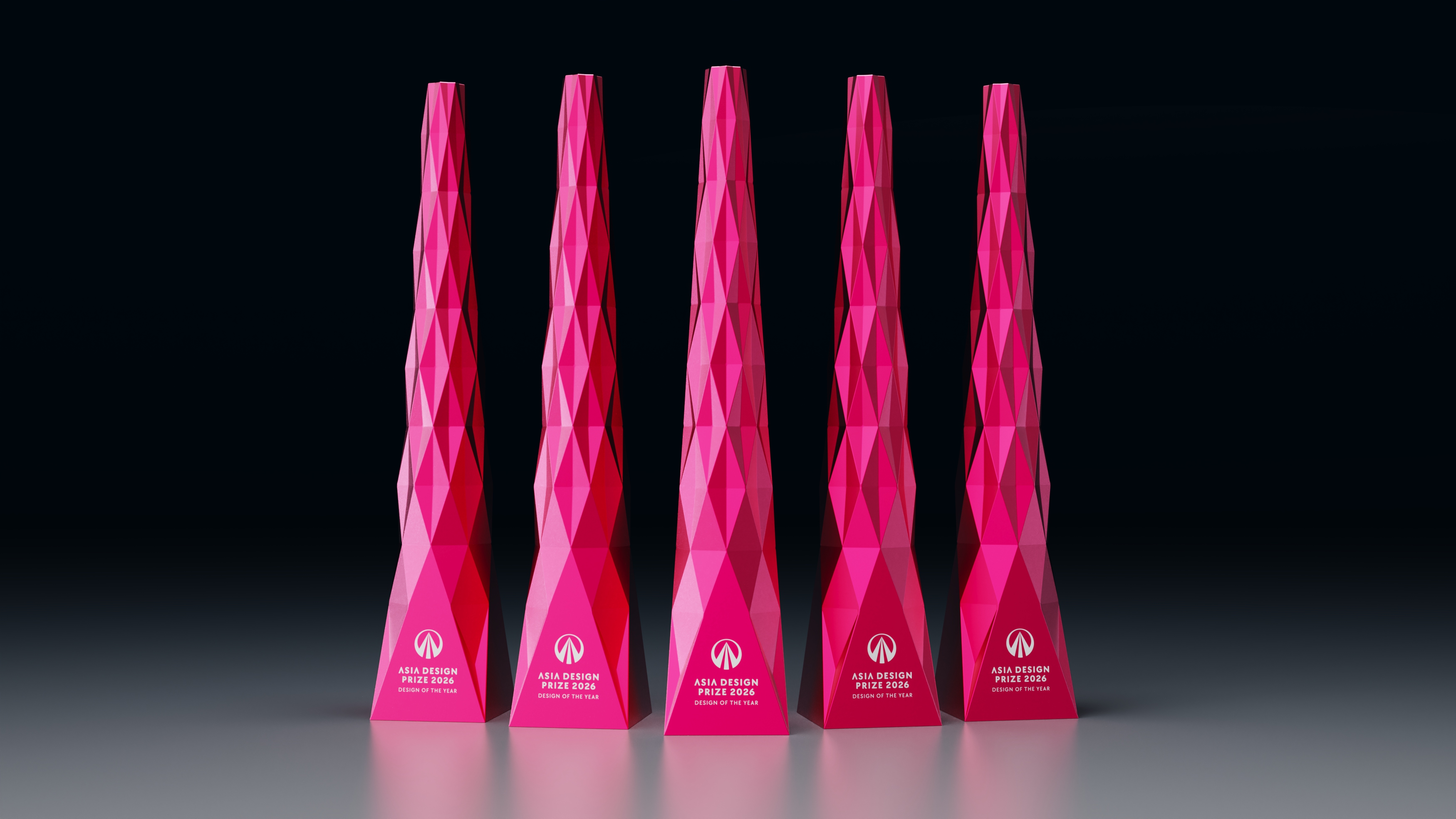
250design was responsible for designing the trophy that embodies the philosophy of the Asia Design Prize in object form. Titled “Legacy Vector,” the trophy serves as the main conceptual artifact that visually expresses the brand’s core message—“LEGACY BEYOND ASIA,” representing the outward trajectory of Asia’s creative legacy extending across the globe. Designed with a sleek, vertically ascending structure, its overall silhouette follows a refined triangular form that tapers toward the top, symbolizing the idea that design is not merely an outcome, but a legacy and benchmark that transcends time. The surface of the trophy is segmented into numerous triangular facets, each representing the layered diversity of Asian design—its cultures, perspectives, and contexts. These fragmented planes are meticulously arranged into a unified structure, metaphorically reflecting the Asia Design Prize’s role in converging this diversity into a new order and direction.
The trophy is finished in Legacy Red, a color chosen for its blend of emotional depth and vitality. When combined with the metallic texture, it forms a unique identity that fluidly moves between tradition and digital modernity. The trophy is more than a symbolic prize; it is intended as a sculptural message that declares: “Your design has become a vector—anchored in legacy, aimed at the world.” Rooted in the belief that design may be wordless, but can articulate philosophy through form, Legacy Vector stands as an object that celebrates both the brand’s vision and the designer’s attitude.

What was the biggest consideration during the design of the ADP trophy? And what core design value did you aim to express through it?
The most critical consideration in designing the ADP trophy was ensuring that this object would not be seen as a mere souvenir for awardees, but as a visual declaration that condenses and symbolizes the core philosophy of the Asia Design Prize itself. We view ADP not simply as a brand that evaluates and awards design, but as a platform that proposes direction, attitude, and philosophical context for design. For that reason, the starting point for the trophy was not “what are we commemorating?” but rather “what philosophy are we expressing?”
The central design value we focused on was diversity and harmony, and we chose the triangle as the core visual and structural language to convey this. From the earliest stages of the design process, our primary question was: How can we connect triangles in a meaningful way? Rather than relying on simple repetition, we pursued a structural configuration with deliberate directionality and cohesion. The triangle symbolizes different perspectives, cultural backgrounds, and voices—and when these facets are ordered along a shared vector, it becomes a direct visual metaphor for ADP’s mission: the convergence and amplification of Asia’s design diversity and energy toward the world. In the end, the trophy was completed as a structure of future-oriented energy—where accumulated design philosophy condenses upward into an ascending force.
The concept of a vertical structure and a composition of triangular facets feels highly aligned with ADP’s brand direction. Could you share how you approached prototyping and testing during the production process, and what was technically the most challenging part?
The ADP trophy design demanded a high level of prototyping complexity due to the dual challenge of maintaining both the sleek vertical proportions and the systematic consistency of triangular facets, while also translating it into a physically producible structure. One of the most critical aspects was determining how to distribute and scale each triangular surface within the form’s upward-narrowing silhouette—from a wide base to a sharp apex. The overall balance and visual stability of the piece were heavily influenced by the density and arrangement of these facets.
Among the most technically challenging issues was achieving consistency in the density of facets while preserving visual cohesion. During the fabrication phase, CNC milling became the foundation for precise angle control. Another major consideration was preserving the clarity of each edge after polishing—a task that required rigorous testing of surface treatments. We experimented with multiple finishing techniques to ensure that every facet maintained its sharpness and structural clarity, even after refinement. Ultimately, this iterative process allowed us to elevate the trophy beyond a mere form into a sculptural embodiment of ADP’s philosophy and identity.
What challenges did you face in applying the new ADP color, 'Legacy Red', to the trophy? What kinds of considerations and experimentation were involved in achieving it?
‘Legacy Red’ was far more than a designated brand color—it was a critical element intended to visually encapsulate the identity and emotional tone of the Asia Design Prize. The biggest challenge was how to express this brand color with depth and sophistication, especially given the symbolic nature of the trophy as a stage object meant to shine alongside its recipient under lights. A standard solid finish felt insufficient to convey the richness we envisioned. As a result, we opted for a metallic texture to give the color dimensionality and luminosity. However, the use of metallic pigment introduced a significant technical challenge: its appearance changes drastically depending on the angle and type of lighting. Unlike solid colors, which can achieve 99% color matching accuracy, metallic finishes vary across illuminated, shadowed, and curved surfaces—sometimes appearing as entirely different shades under different conditions.
To overcome this, we ran multiple lighting and reflectivity simulations under various intensity and temperature conditions. After extensive testing, we selected a hybrid coating method that could preserve the tactile texture while maintaining color balance across lighting variations. As a result, ‘Legacy Red’ was successfully realized as a color that embodies both the brand’s emotional resonance and visual refinement—a fitting finish for a trophy that stands as a symbol of creative legacy.

Do you have plans to expand ADP’s design philosophy into other physical objects or forms beyond the trophy? If so, what are some ideas you envision for that development?
Yes—starting from the trophy, we’re increasingly interested in extending ADP’s design philosophy into physical objects and spatial forms that integrate naturally into everyday experiences and environments. One meaningful direction is to create interactive installations—such as moving walls or transformable screen structures—that compose the award ceremony space while responding to their surroundings. These environmental elements wouldn’t just decorate a space; they would embody the ADP identity in motion and structure. We’re also exploring mobile symbolic sculptures—portable identity extensions that allow the ADP brand to manifest across different venues, events, or international showcases. Additionally, miniaturized versions of the trophy that capture its essential form could serve as collectible design objects, while modular showcase systems that display winning projects and designer work could function as part of a traveling archive or exhibit platform.
These physical extensions act as touchpoints that repeatedly engage audiences with ADP’s philosophy and aesthetic sensibility. Rather than keeping the brand confined to printed or digital media, these artifacts offer a multidimensional way to embody and communicate its values. We see them as powerful instruments for reinforcing ADP’s identity as a design platform—not just a ceremony, but a tangible presence in the creative and cultural landscape.
In your view, what direction should the Asia Design Prize pursue in the future? Do you have any expectations or suggestions for ADP’s continued evolution?
The Asia Design Prize should move beyond the role of a conventional award brand that selects and announces winners—it must evolve into a global platform that communicates design philosophy and drives cultural discourse. Rather than reacting to short-term trends or market-driven evaluations, ADP should position itself as a design leadership brand—one that articulates the values design ought to generate and the attitudes it ought to uphold. As physical layers of experience—like the trophy, space, and content—expand, the connection between the brand’s philosophy and its designers will deepen. When the visual language and message of ADP transcend the awards stage and begin to infuse the creative worlds and lives of designers, that’s when the brand will truly exert lasting influence. It’s not about commemorating a moment but embedding meaning into the continuum of design practice. That, we believe, is the future of ADP.
What did this rebranding project mean to 250design, and what direction are you aiming for next as a result of this experience?
For 250design, this project went far beyond designing a trophy—it reaffirmed the idea that design is a structure that can precisely architect a brand’s philosophy. Working to translate the broad and profound essence of a brand into the most compact and constrained physical object—the trophy—reminded us of the core role design plays in shaping meaning. Through this experience, we came to fully realize that design is not merely an act of visual expression, but a strategic apparatus that shapes attitude and orchestrates meaning. This insight has inspired us to pursue more expansive projects grounded in philosophy-centered design. Moving forward, we plan to develop multidimensional work that connects design strategy with formal language—such as platform-based initiatives, product and spatial design, and visual systems rooted in brand ethos. This rebranding was not just a milestone, but a significant starting point for that next phase of evolution.


#14057, 905 49, Beolmal-ro 102beon-gil,
Dongan-gu, Anyang-si, Gyeonggi-do, Korea
Business Registration Number: 454-86-01044
Online Sales License No.: 2021-Anyang Dongan-1081
Copyright © DESIGNSORI Co., Ltd.
