
Director Kwangwon Kim Co-Founder of lllayer
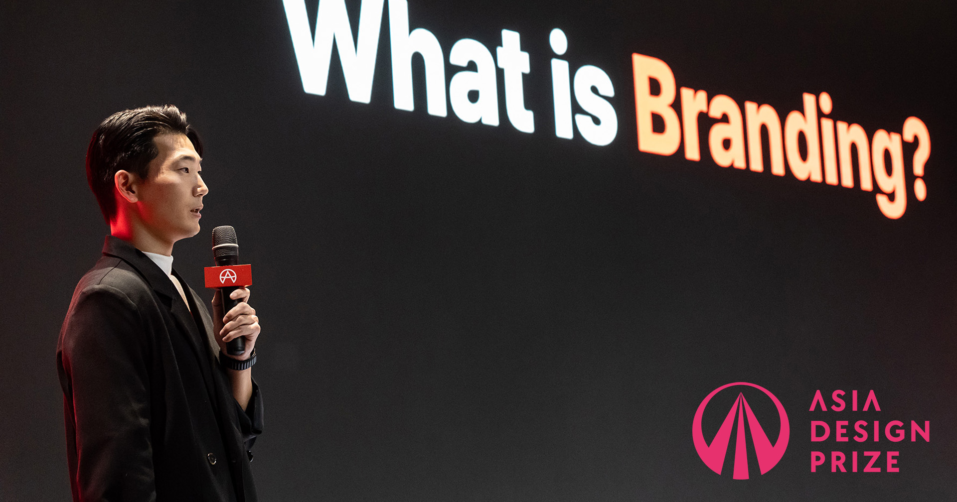
What does the Asia Design Prize mean to you as a brand?
The Asia Design Prize is more than just a design award—it is a brand that has led us to deeply reflect on the direction and attitude of the design we pursue. While we’ve participated as entrants by submitting various project outcomes, even before that, we were already exploring the accumulated archive of past winning works, which helped broaden our understanding of design trends and interpretations. In particular, when our project at lllayer won and we attended the awards ceremony with our team, it became a turning point that transformed our collective energy. Since then, we’ve been able to approach our projects with greater focus and a more proactive mindset. Rather than merely serving as a platform that confers honor, ADP has functioned as a structured environment that enables each practitioner to reacknowledge their creative potential and expand their standards. It has become a tangible reference that allowed us to re-perceive the level of the creative ecosystem we currently belong to.
What role did the lllayer BX team play in the Asia Design Prize rebranding project, and what were the key design considerations in that process?
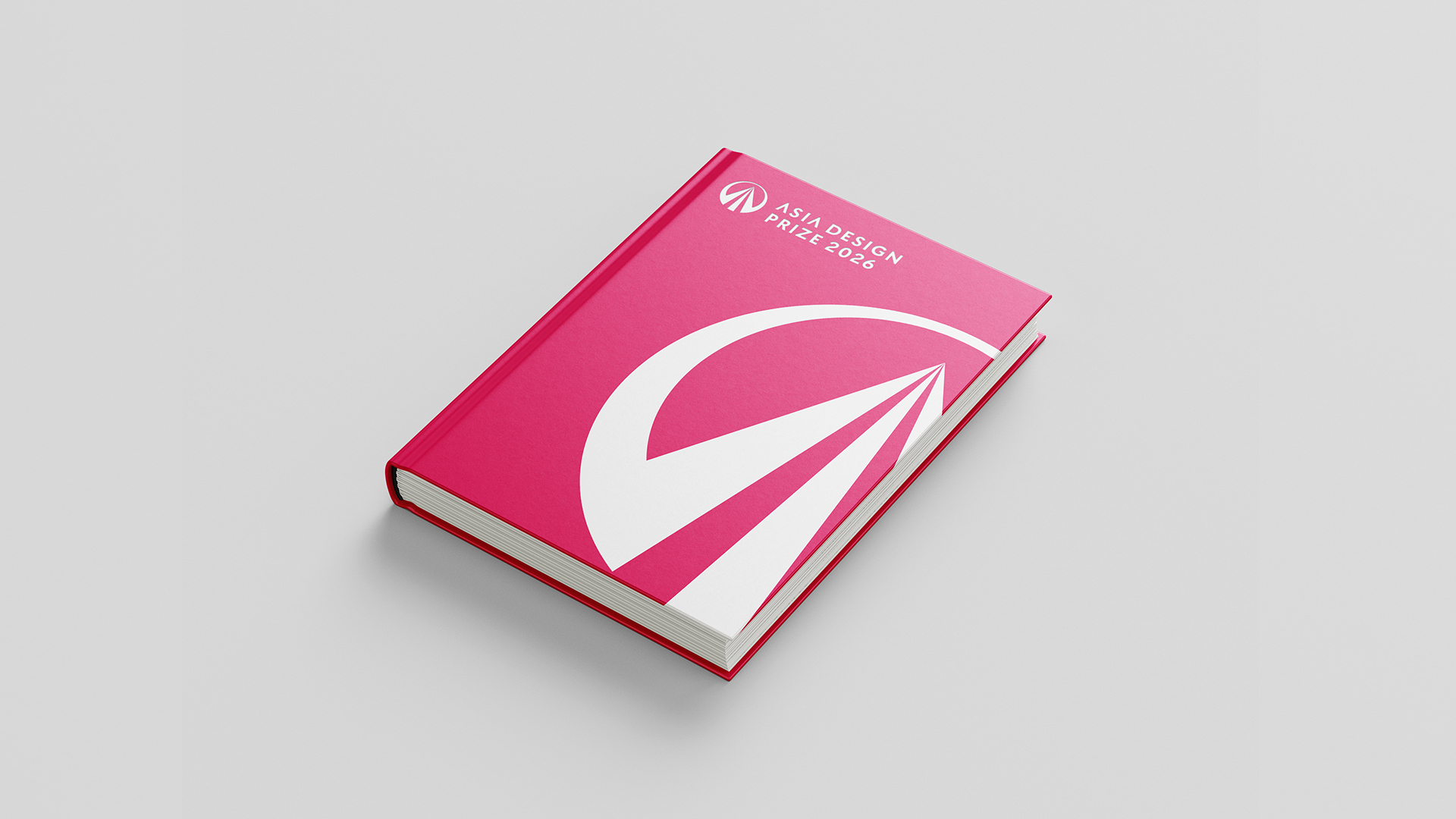
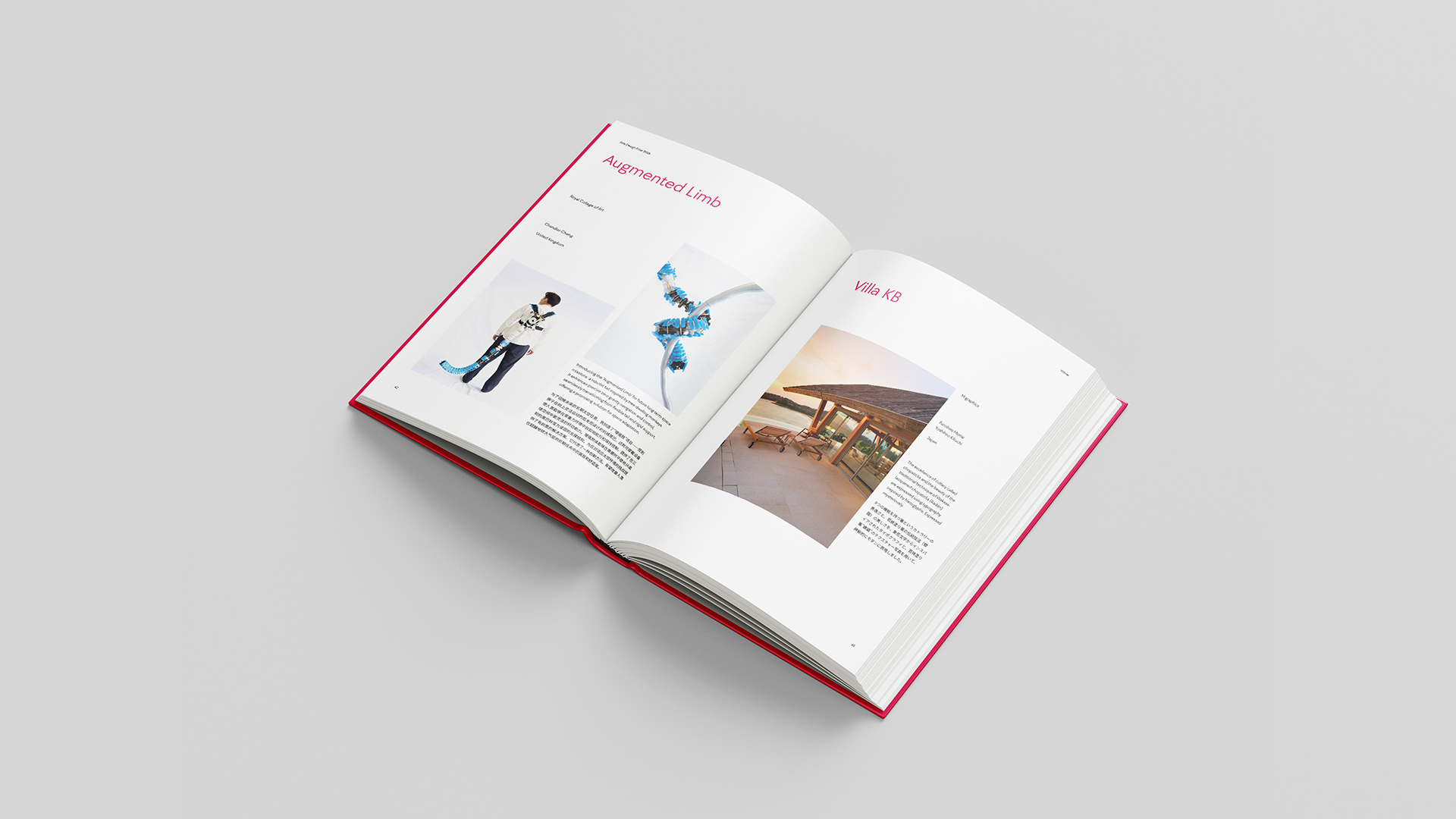
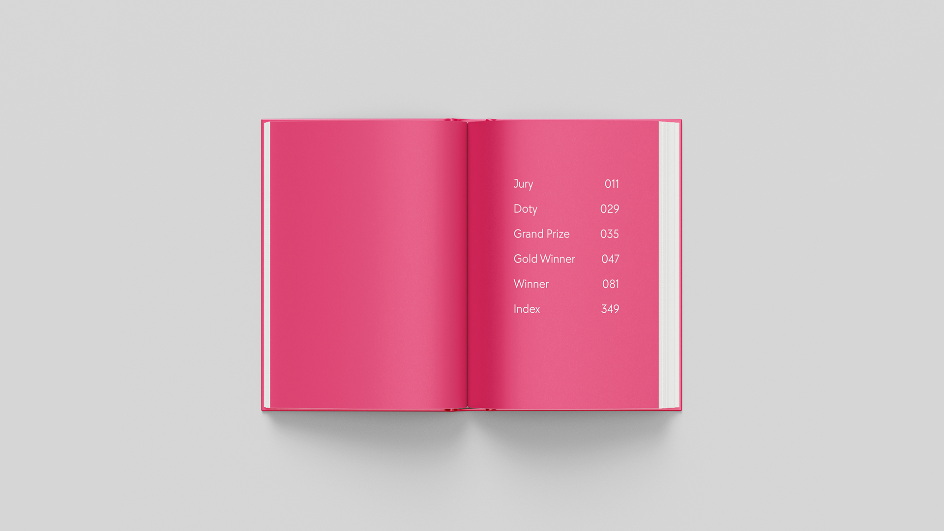
The lllayer BX (Brand eXperience) team was responsible for a complete redesign of the Asia Design Prize's official yearbook during the rebranding project. As a large-format print publication spanning nearly 400 pages and featuring award-winning works from diverse nationalities across Asia and beyond, the yearbook required structural design thinking beyond mere visual arrangement. Our first priority was to build a flexible layout system capable of accommodating the varied formats and specifications of submitted works. To avoid repetitive monotony, we applied a dynamic grid system that allowed image and text to harmonize with rhythmic pacing, and experimented with diverse typographic structures that could sensitively respond to the nature of each project.
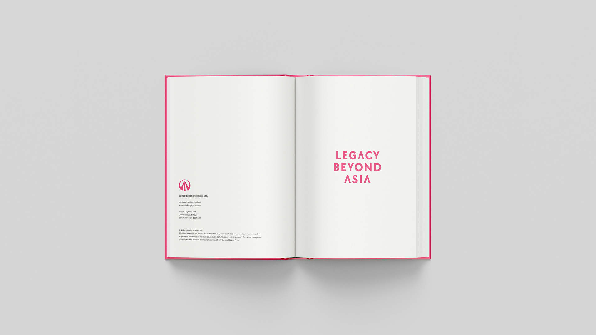
Newly established brand assets such as the updated color palette, typefaces, and slogan were consistently reflected throughout the yearbook’s tone and manner. In particular, the brand philosophy of “LEGACY BEYOND ASIA” was embedded into the editorial narrative so that it could be intuitively felt through the design flow. Most importantly, since the yearbook is a tangible product physically delivered to the awardees, we placed strong emphasis on the material quality—designing details such as image clarity, spatial breathing, and typographic gradation with care. Our goal was to ensure that the book would leave a refined and complete impression even when revisited years later. Ultimately, this yearbook served not only as a record but also as a physical object embodying the Asia Design Prize’s vision for the future identity of Asian design.
From a BX (Brand Experience) perspective, what defines “good design”—particularly good Asian design—and how was that reflected in the ADP yearbook design?
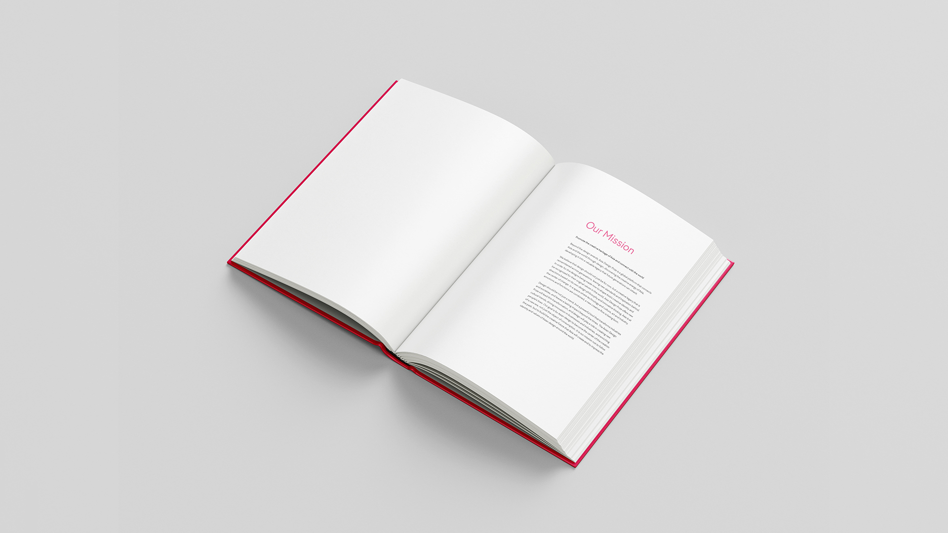
From a Brand Experience perspective, good design goes beyond visual aesthetics—it’s about creating experiences that allow the brand’s identity and message to be naturally imprinted through user interaction. Especially in the context of Asian design, it’s crucial to consider cultural nuance, emotional resonance, and sensory detail to evoke authentic empathy. The Asia Design Prize yearbook is not merely a catalog of winning works; for each awardee, it is a symbolic artifact that validates their design through global recognition. For this reason, we approached the yearbook as a comprehensive brand experience—one that begins the moment it is received and continues through the process of exploring its pages.
We applied the redefined brand colors and custom typeface consistently throughout the publication. Rather than simply applying visual elements, we carefully adjusted kerning, leading, and line heights to suit the print format, achieving both readability and a refined impression. Structurally, we clarified content hierarchy by differentiating titles, highlighted texts, and body paragraphs, applying a consistent layout across sections. This helped guide the reader’s flow intuitively and allowed the brand to be experienced rhythmically within the printed space. Ultimately, the yearbook was designed not just as a deliverable but as a tangible expression of the relationship between the brand and its awardees—a key experience that leaves a positive and lasting impression of the Asia Design Prize.
What was the most important editorial design consideration in the yearbook project?
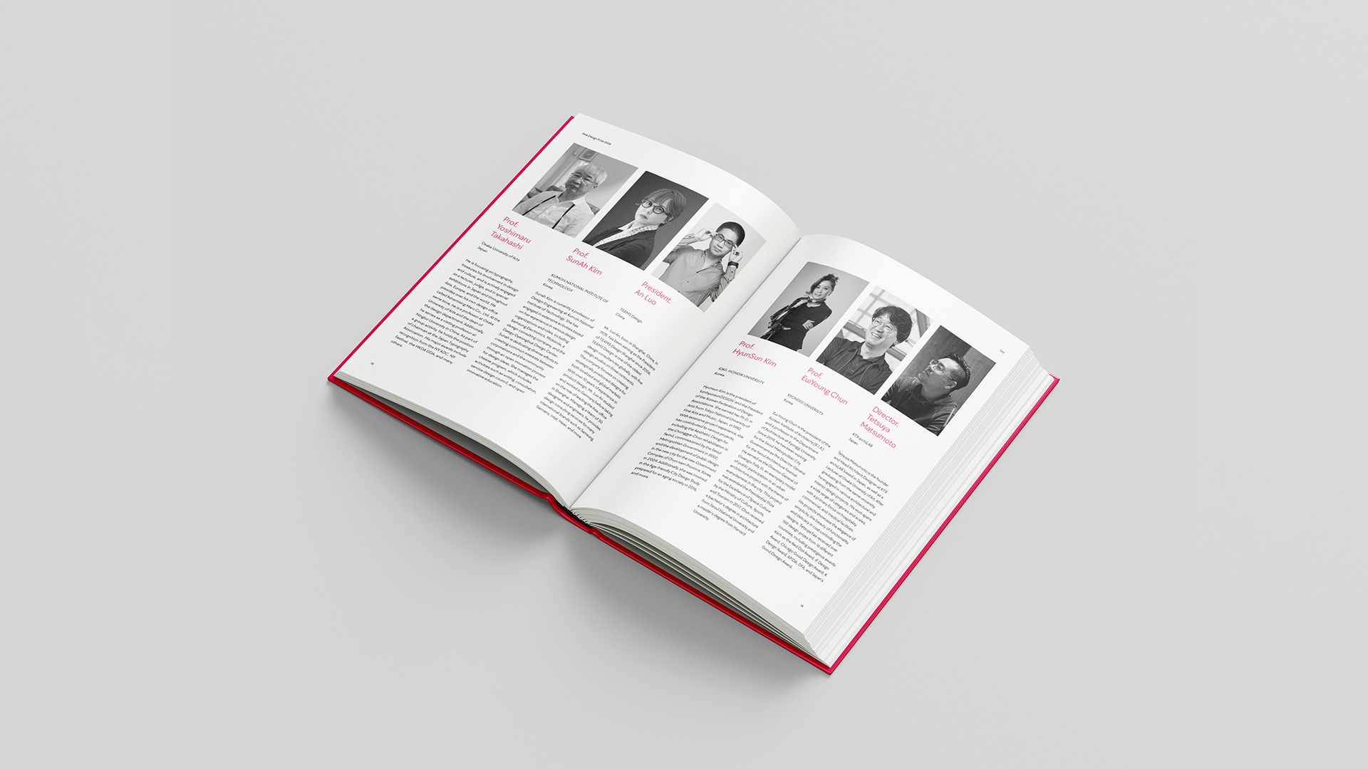
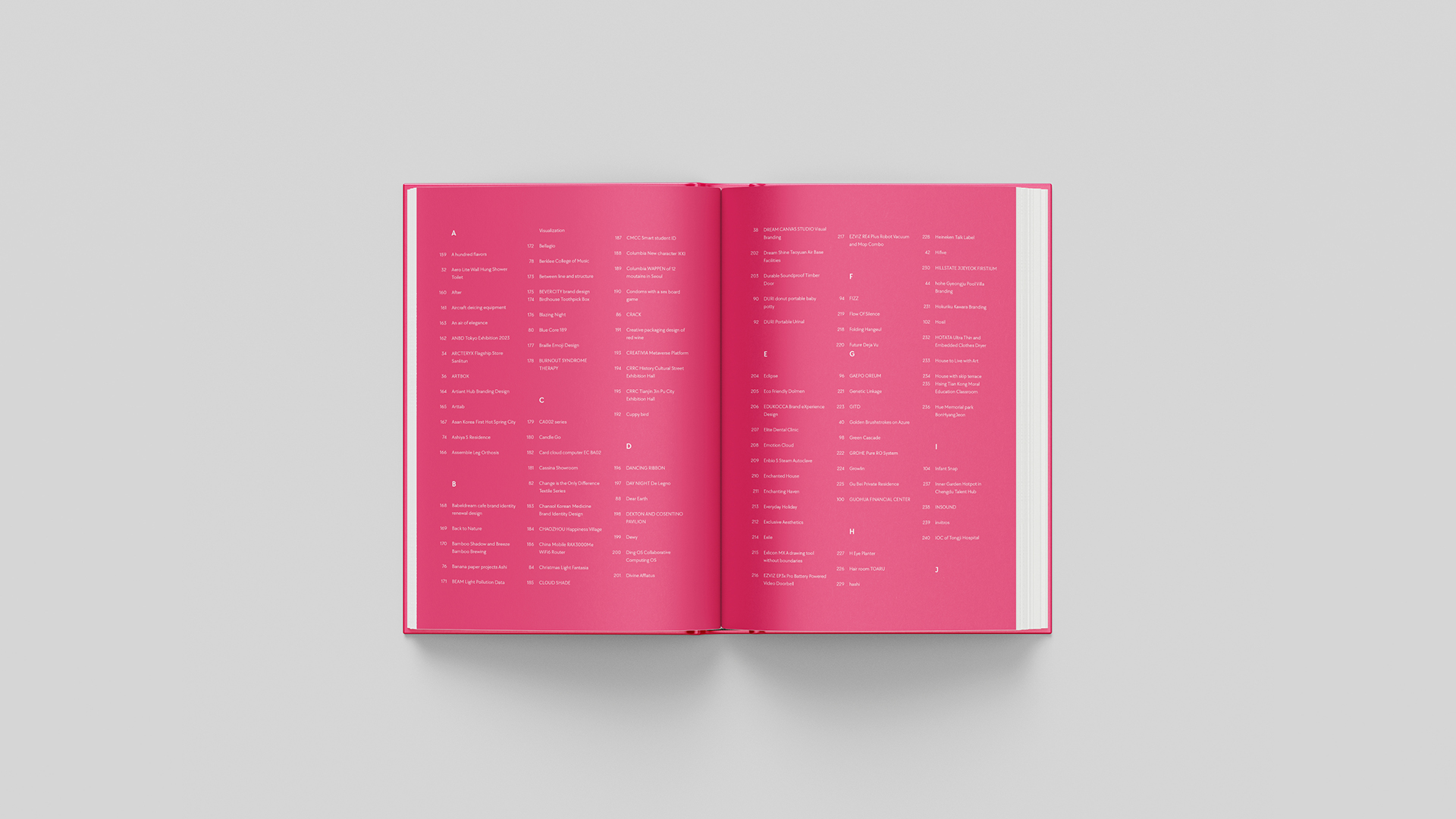
This yearbook, spanning over 400 pages, features an extensive collection of winning works, each with varying image formats and proportions. While the image submission guidelines are standardized, the optimal way to present each project differs significantly, requiring an editorial structure that can accommodate this diversity. To address this, we designed 14 different layout templates in advance, incorporating both horizontal and vertical compositions tailored to highlight each entry’s unique qualities. Our aim was for awardees to see their work featured in a way that feels considered and celebratory, enhancing the emotional value of the award.
Given that Asia Design Prize is a global platform with participants from various nationalities, linguistic accessibility was another key consideration. Each project description was presented bilingually, in both the native language and English, to ensure that the context and message of the work could be fully understood by readers across different regions. This dual-language format demanded careful visual consistency, which meant adjusting kerning, line spacing, and font pairing meticulously between the languages. In the end, this yearbook was designed as a respectful and accurate documentation of each winning work—an editorial artifact that encapsulates the diversity and scalability of Asian design within a cohesive brand experience.

How did you intend to embody the essence of the ADP brand within the physical medium of a book, and were there any particularly challenging technical experiments during the design process?
A physical book serves as the most tangible and analog medium for conveying a brand’s philosophy and message. We approached the yearbook not merely as a record but as the culmination of the brand experience itself—an editorial object that embodies the essence of “LEGACY BEYOND ASIA” through spatiality, texture, and sequencing. Our focus was to deliver a sense of “accumulated time” through the editorial sensibility. We wanted the act of flipping through each page to feel like uncovering the layered heritage of Asian design, rather than just browsing through entries arranged by year or country. To achieve this, we orchestrated the narrative flow and typographic rhythm within each spread to create an immersive reading journey.
On the technical side, the greatest challenge was maintaining both the individuality of each project and the overall visual cohesion across a 400+ page volume. With a variety of image formats and bilingual content, we had to constantly fine-tune text margins and the grid system to ensure compositional balance throughout. Additionally, we conducted careful experiments with multilingual typography—adjusting digital fonts per language and calibrating line spacing and kerning so that the visual weight of each script would not clash. All of these efforts were made with one goal in mind: to have the entire book be remembered as the embodiment of the brand. From the moment one holds the book, to flipping through its pages, reading jury messages, and finding one’s own awarded project—each of these moments was designed to be an organic part of the ADP brand experience.
What do you see as the future of the Asia Design Prize?
Through its recent rebranding, the Asia Design Prize has evolved beyond a conventional award to become a design platform that proposes a clear philosophy and perspective. The slogan “LEGACY BEYOND ASIA” is not a fleeting trend but a bold declaration of the brand’s 100-year vision. The experience and network accumulated over the past nine years have become a strong foundation, and this rebranding project has served to establish a solid framework of identity and direction on top of that base. ADP is now poised to grow into a global hub that connects the identity of Asian design to the world through richer content and a more robust system. Moving forward, ADP will position itself as an “official certification platform” for designers aiming for the global stage, a strategic partner for brands seeking to connect with Asia’s creative sensibilities, and a living archive that inspires both audiences and design professionals. At the core of this vision lies a unified brand language—spanning physical objects, digital media, and spatial experiences—through which the future of Asian design will be built not as a mere possibility, but as a tangible reality.

What changes or growth did your team experience through this rebranding project?
The Asia Design Prize rebranding project was not merely an outsourced assignment—it was a strategic collaboration with a global brand that marked a meaningful turning point for us at lllayer. As we led the project, the most significant shift we observed was a clear expansion in the scale and depth of the design work we were handling. In domestic projects, user environments, language systems, and branding elements often fall within predictable frameworks. However, ADP is a platform that connects with designers not only across Asia but around the world, which required us to go beyond multilingual support and global UX strategy to the more fundamental challenge of translating brand philosophy into a universal design language. The question of how to organically embed a profound brand mission like “LEGACY BEYOND ASIA” across digital interfaces, publications, and physical objects became a valuable exercise in strategic thinking for our entire team.
As the project lead, I continuously engaged with our team on the brand’s mission and carefully ensured that each design decision consistently reflected that philosophy. This process went beyond execution—it was a moment of internalizing brand sensitivity. More than refining visual details, it demanded insight into direction and meaning. Through this experience, our perspective on design has broadened significantly, and we gained the confidence that our design team can play a central, strategic role in shaping brand identity. This rebranding will be remembered not only for the quality of its final outcome but for the constructive impact it had on the mindset and culture within our team.


#14057, 905 49, Beolmal-ro 102beon-gil,
Dongan-gu, Anyang-si, Gyeonggi-do, Korea
Business Registration Number: 454-86-01044
Online Sales License No.: 2021-Anyang Dongan-1081
Copyright © DESIGNSORI Co., Ltd.
