
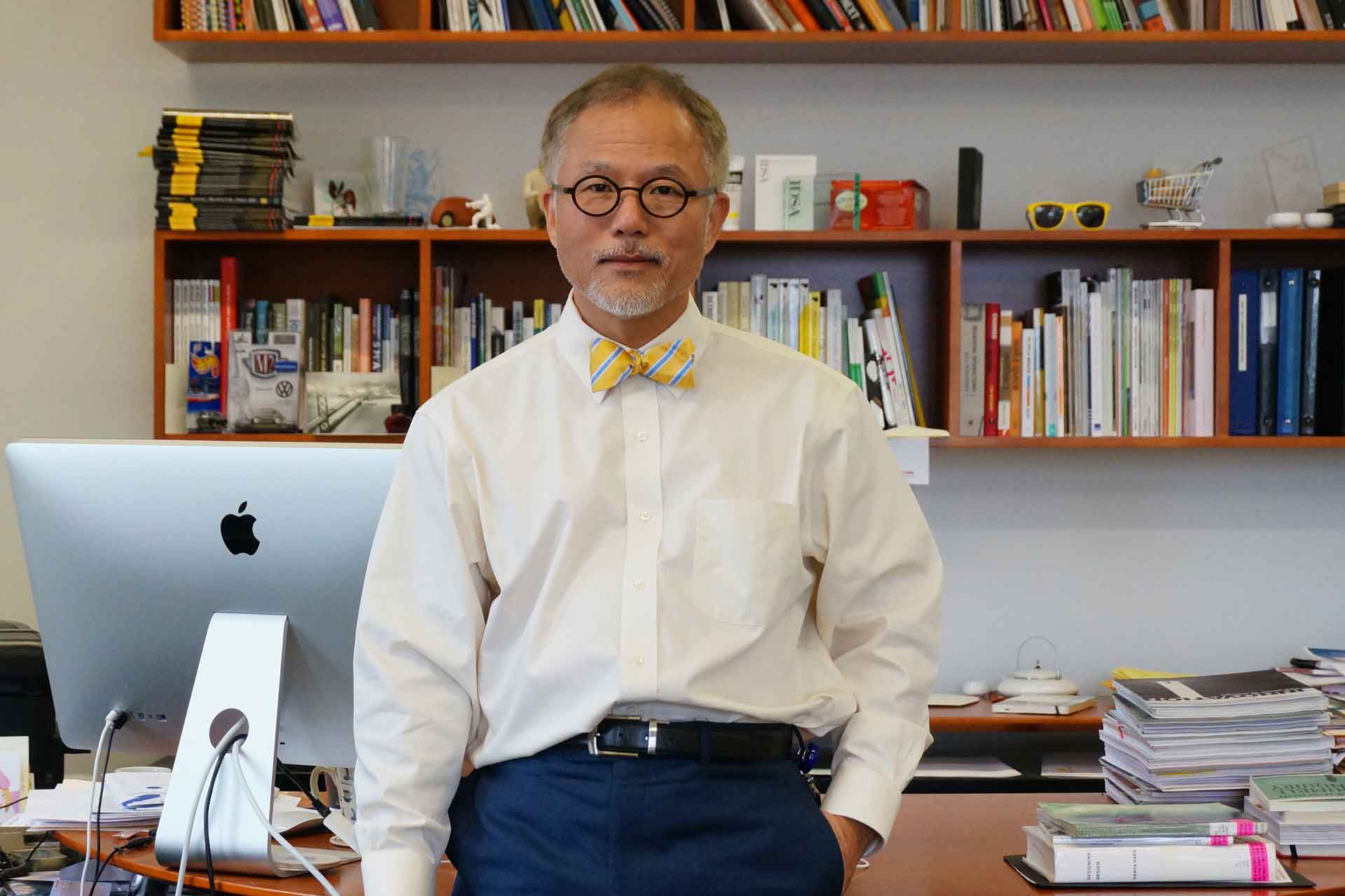
Director Joohwang Kim Co-Founder of lllayer
What does the Asia Design Prize mean to lllayer, and what roles or values did you come to recognize through the experience?
To us at lllayer, the Asia Design Prize is more than just an award—it’s a powerful media platform that naturally introduced our company to the global stage. When we devote months to crafting and refining a project, not every outcome receives the attention or recognition it may deserve. Even works with exceptional value and completeness can sometimes go unnoticed. What the Asia Design Prize provided was a way to assign public value and lasting significance to such projects. It offered more than just the honor of winning; it gave our team a sense of pride and motivation, serving as a symbolic experience that elevated the presence of our work. We believe ADP functions as a public platform that validates the value of both designers and brands. More importantly, it expands the meaning of design itself—transforming it into a medium that continues to resonate far beyond its immediate outcomes.
What role did lllayer take on in the ADP rebranding project, and what design principles guided your process?
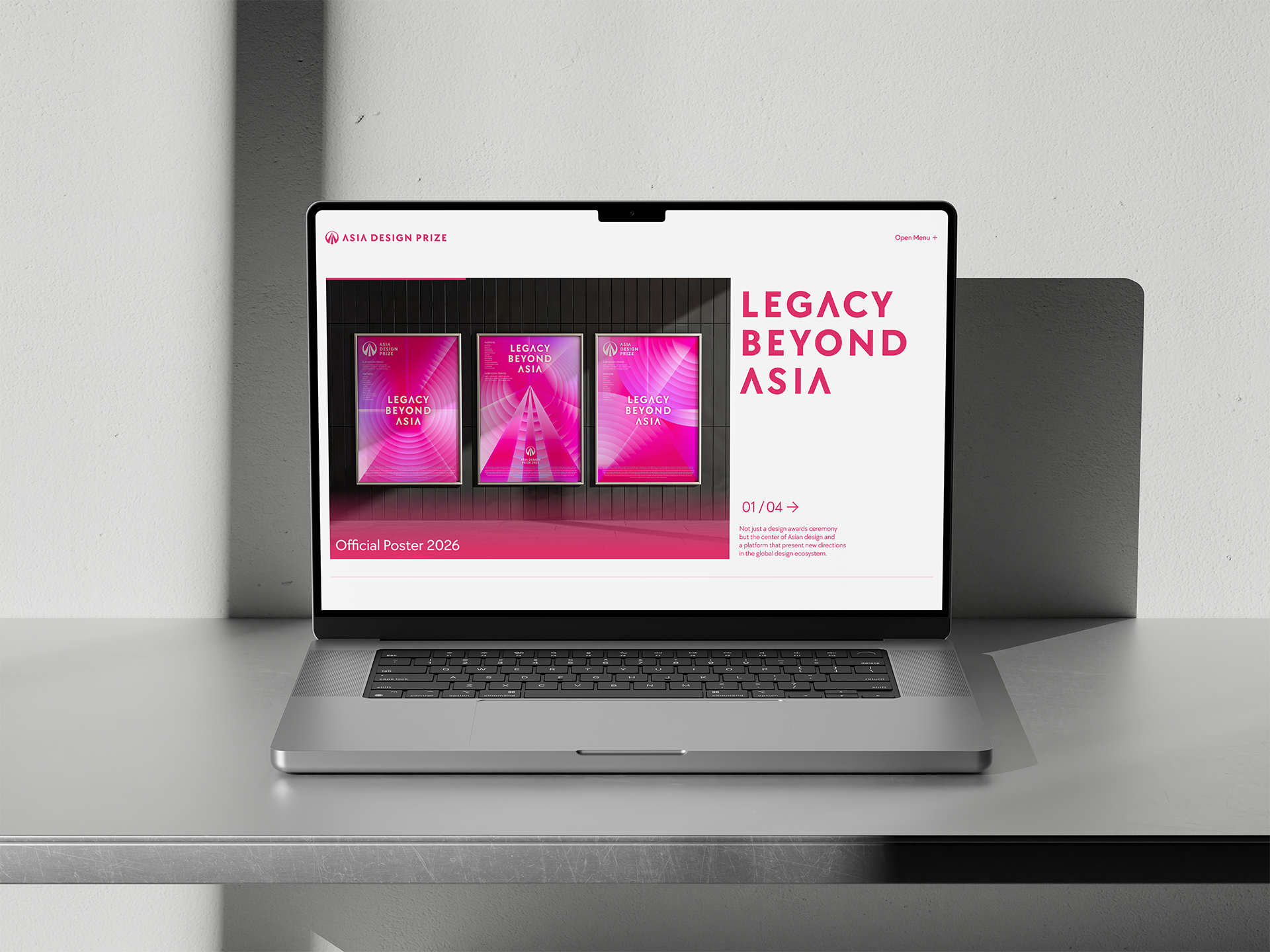
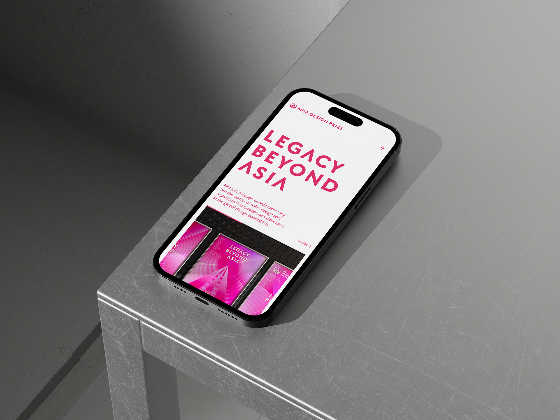
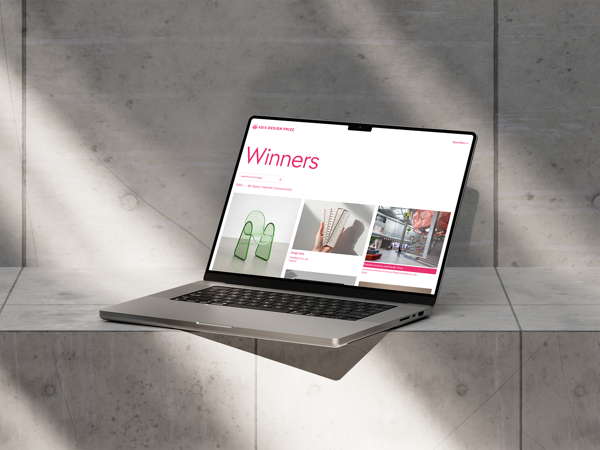
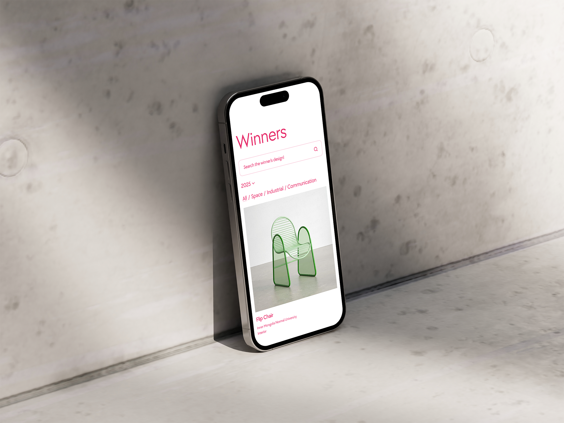
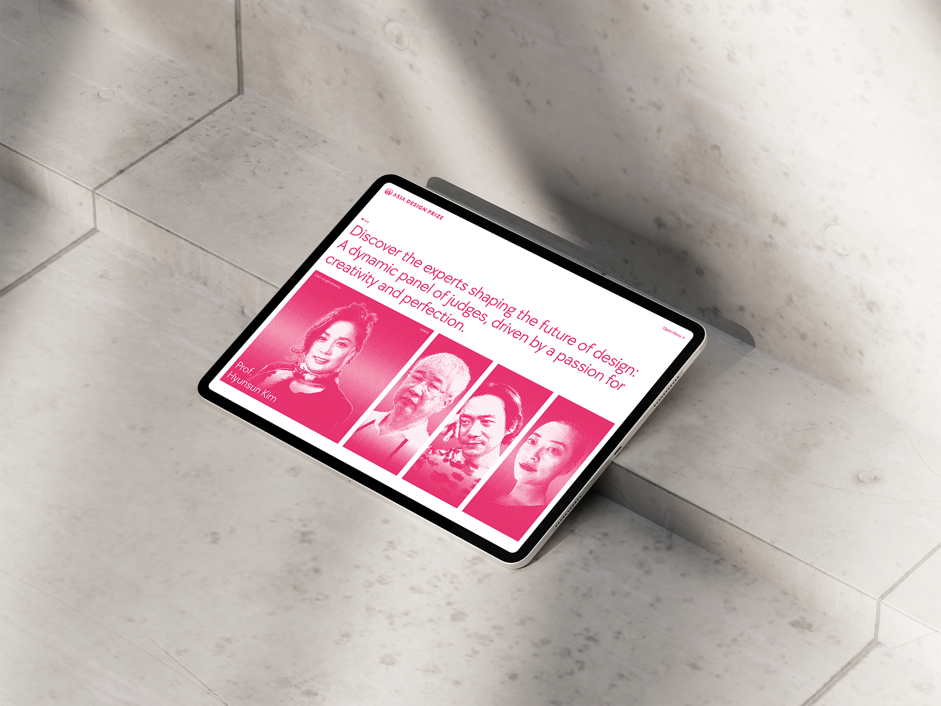
lllayer’s DX (Digital Experience) team led the full redesign of the Asia Design Prize’s official website as part of the rebranding project. Our task was to translate the new identity—anchored by the slogan “LEGACY BEYOND ASIA”—into a seamless and immersive digital experience. With a diverse, global audience in mind, we restructured the entire UI/UX to ensure intuitive access to key information and to embody the brand’s philosophy through user-centered design. We prioritized clarity in navigation and accessibility. For example, those interested in learning about the brand are directed clearly to the ABOUT section, while prospective participants can easily access RULES or SUBMISSION. For content-heavy pages like ABOUT, RULES, or SPONSORSHIP, we introduced fixed scroll buttons to enable fast transitions between content blocks. On history-based pages like JURY and WINNER, we refined the category structure to allow users to digest complex information at a glance.
The newly developed MEDIA section reflects ADP’s vision of evolving beyond an award into a full-fledged media platform. Anticipating a growing archive, we designed a scalable framework with refined categorization. We also added features like hashtag-based content filtering and top-scroll progress bars to improve the reading experience and enable intuitive exploration. This project wasn’t just a visual upgrade—it was a strategic, technical response to the growing demands of ADP’s role as both a global award and digital media platform.
From your perspective, what defines “good design”—particularly in the context of Asian design—and how was that philosophy applied in the redesign?
For us, good design is the visual articulation of a brand’s essence. It should go beyond aesthetics and usability to convey what a brand believes in, and how it positions itself in the world. In this case, the Asia Design Prize’s renewed identity—LEGACY BEYOND ASIA—along with its guiding keywords ICONIC, EXTENSIVE, INSPIRATIONAL, formed the core of our design approach. To reflect this identity, we expanded the interface beyond the previously constrained resolution and introduced a full-screen layout that visually communicates openness and scale. We meticulously designed a responsive structure to ensure consistency across desktops, tablets, and mobile devices.
The new key color, Legacy Red, was applied consistently across the site to increase visual immersion and reinforce brand recall. We also implemented multilingual support—English as the default, with Korean, Japanese, Simplified, and Traditional Chinese available—to accommodate ADP’s international reach. Significant attention was paid to font optimization and language-specific typography, ensuring a uniform experience across all regions. This redesign embodies our belief that good design is not just about how things look—it’s about how brand philosophy is deeply woven into the user’s experience, resonating both emotionally and functionally.
What were some of the technical challenges or experimental approaches involved in transforming the ADP website into a media platform?
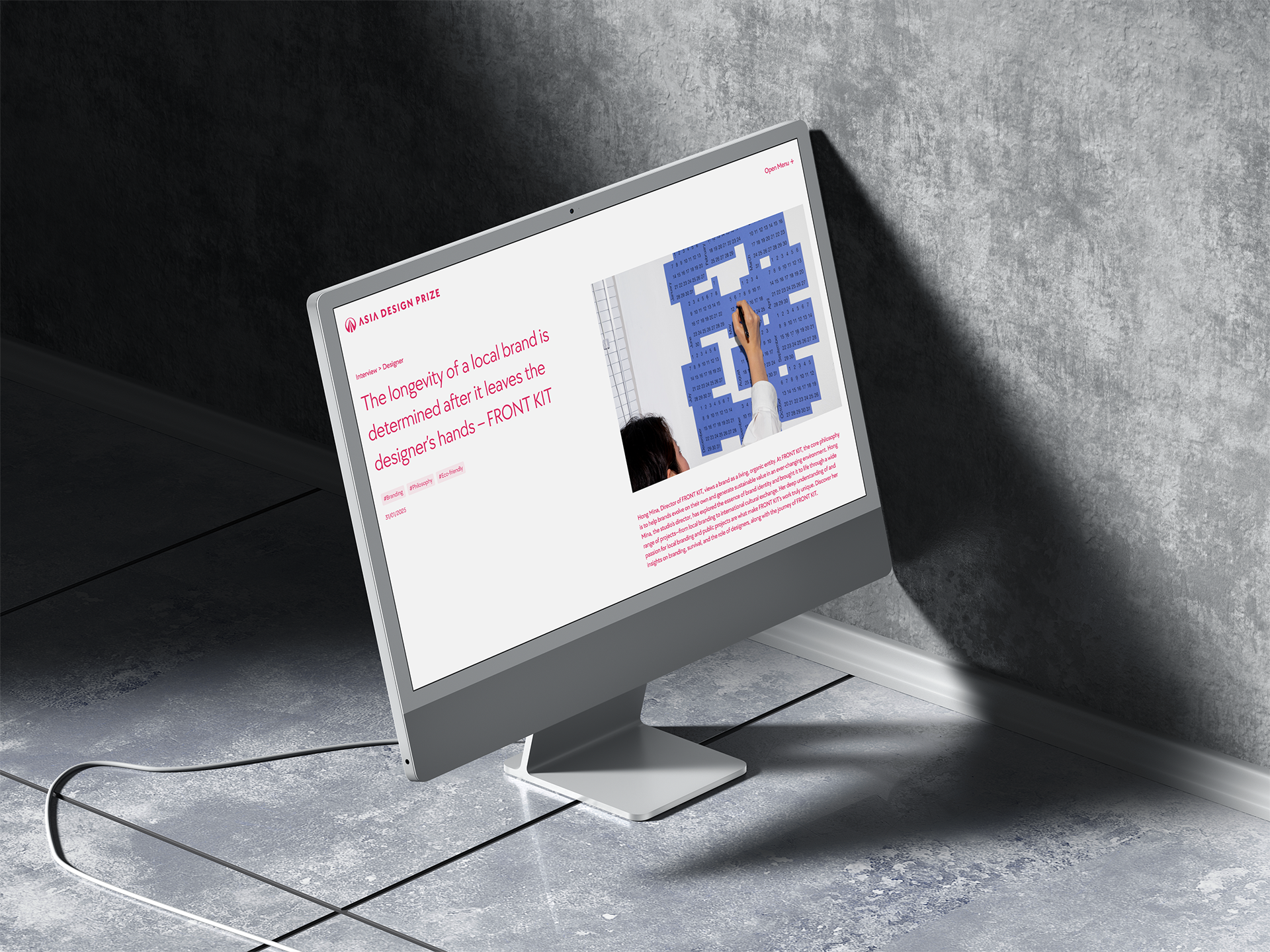
One of the core goals of the ADP website renewal was to shift its role from a purely informational hub—visited mainly during the award submission period—to an everyday digital destination: a design content platform. To achieve this, we focused on two major areas of experimentation: the complete redesign of the main page and the development of the new MEDIA section. The original main page primarily featured winners and jury introductions. In the updated version, we embedded a dynamic content layer by integrating curated articles from the MEDIA section directly into the homepage. Each featured piece is presented as a clickable thumbnail, seamlessly guiding users into the full article view without disrupting their navigation flow.
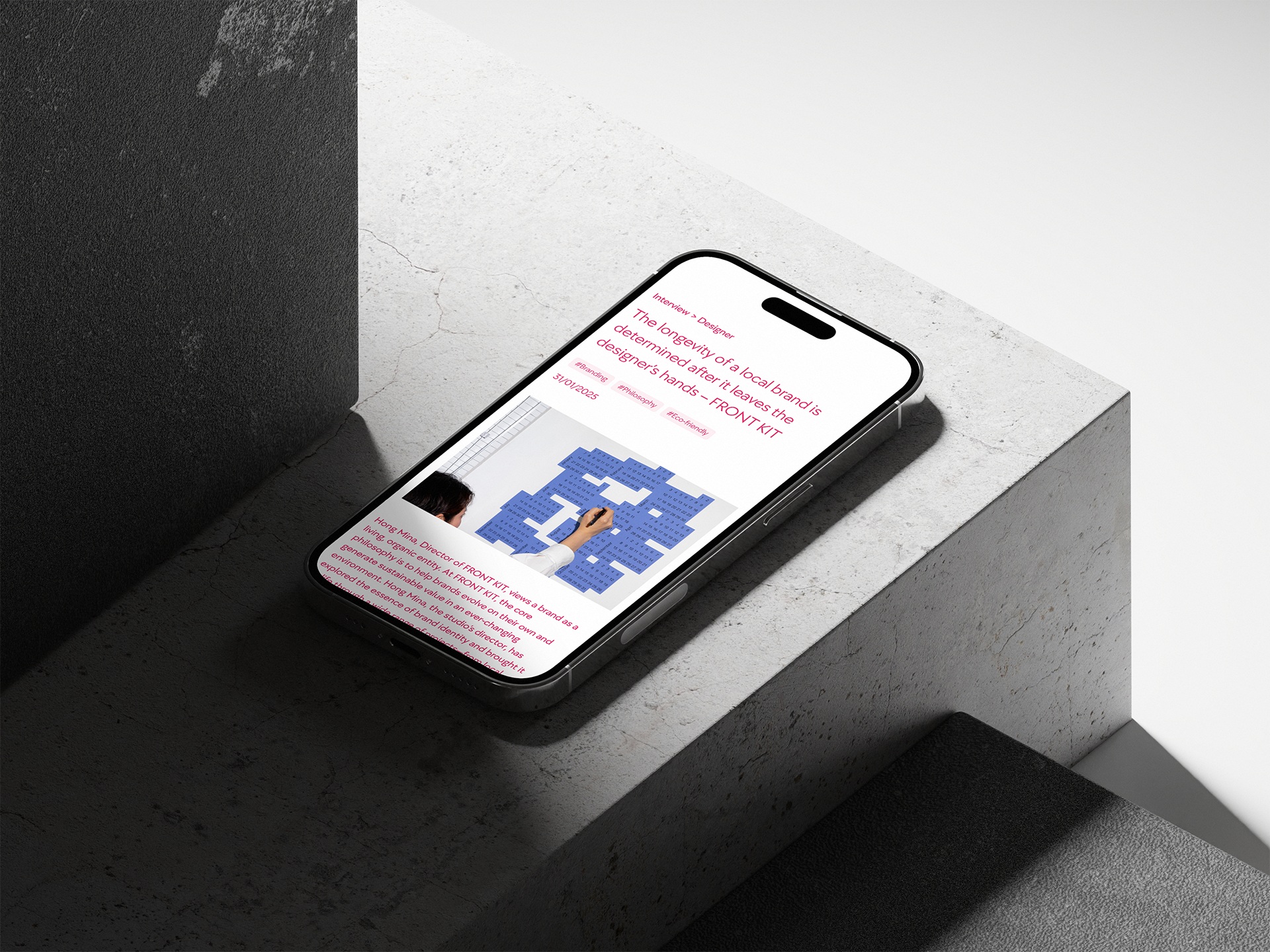
The MEDIA section itself was a substantial technical endeavor. Designed as an expandable archive for Asia’s creative design heritage, it supports both primary and secondary category structures—with the flexibility for administrators to dynamically add new categories over time. To accommodate growing content volume without compromising visual consistency or user experience, we adopted a scalable UI design strategy that emphasizes layout repetition and structural clarity. We also introduced a hashtag system across all content, enhancing semantic linkage between articles and allowing users to easily discover related topics. This significantly improves content discoverability and personalized exploration within the platform.
From a UX standpoint, one key challenge was improving the reading experience for long, scroll-based content. To address this, we implemented a horizontal progress bar at the top of each article, visually indicating how much content remains. This subtle cue enhances user immersion and helps maintain engagement through intuitive feedback. Ultimately, these experimental approaches were not just technical solutions—they were strategic design decisions aimed at redefining the website as more than an award portal. The renewed ADP platform now invites users to explore, revisit, and engage with Asia’s design legacy on an ongoing basis, marking a critical step toward its evolution into a living media platform.
Which aspects of the new ADP website redesign were most successful from a UX perspective?
From a user experience (UX) standpoint, we identified three key elements of the redesigned ADP website that were particularly successful:
1. Intuitive Banner and Menu Interaction
At the top of the homepage, the banner area plays a crucial role in conveying timely, high-priority information. It was designed to be both visually clean and operationally flexible—easily updated via the admin panel to reflect seasonal needs such as submission periods or event announcements.
In contrast to traditional fixed top navigation, we introduced a discreet menu toggle button. When clicked, it reveals a full-screen overlay menu in the brand’s signature “Legacy Red,” presented with a smooth animation. This approach preserves whitespace upon entry while delivering a dynamic and immersive experience once users begin navigating.
2. Floating Buttons for Content-Heavy Pages
Information-rich sections like ABOUT and RULES often involve long vertical scrolling, which can be tiring for users. To address this, we implemented floating buttons that enable quick jumps between the top and bottom of the page. This feature dramatically reduces navigation fatigue and enhances usability, particularly for returning users who are seeking specific content.
3. Immersive Winner Detail View
The WINNER section underwent a significant redesign. Previously, images and text were presented side by side, dividing user focus. In the new layout, images take center stage, allowing users to immerse themselves visually before scrolling to engage with textual information. This restructuring transforms the act of browsing award-winning entries into a more narrative and emotional experience—one that aligns with ADP’s intent to frame design as cultural expression rather than mere output.
Taken together, these UX improvements support the brand’s larger shift: from a static awards database to a living platform where users actively experience and interpret design. They reinforce the message that ADP is not just a site for consuming design but for connecting with the creative legacy of Asia in meaningful, engaging ways.
How did the DX team at lllayer collaborate during the ADP rebranding project, and what insights or memorable moments emerged from that process?
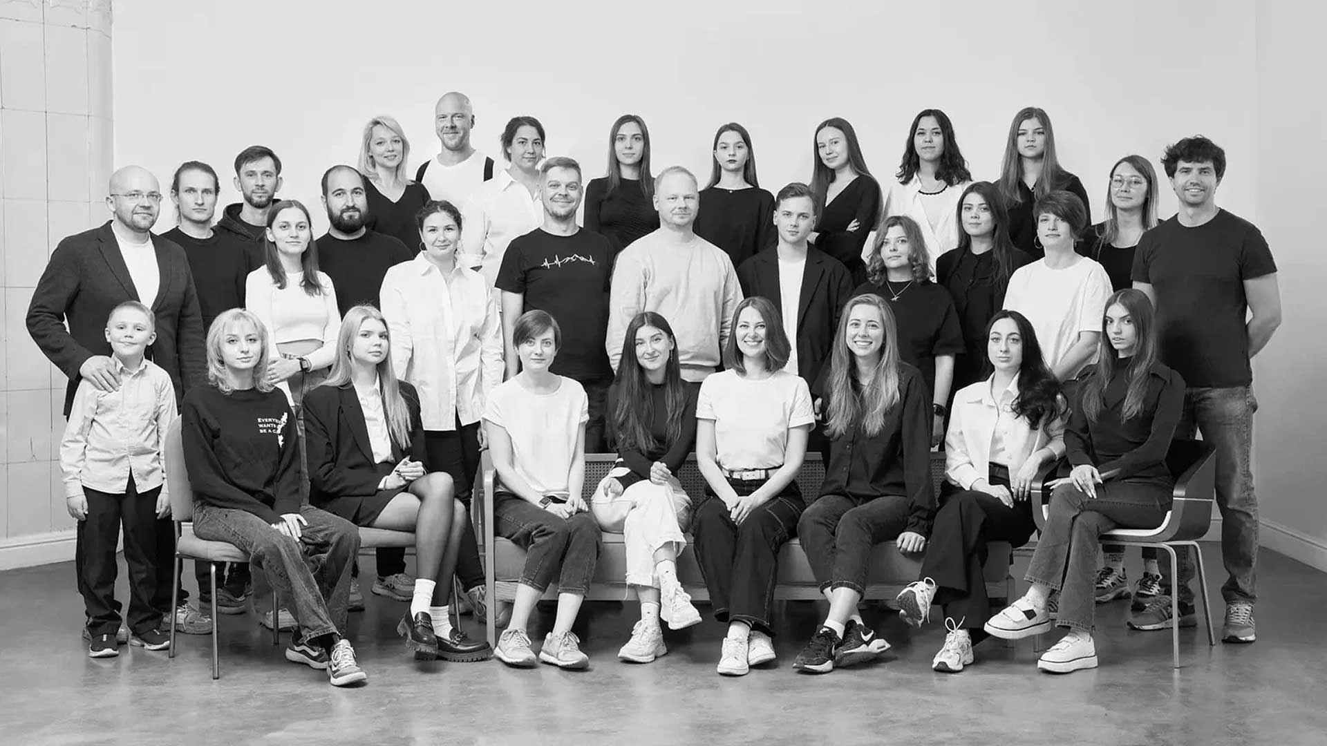
Our collaboration throughout the ADP rebranding project was a new kind of experience for the DX team at lllayer—both structurally and culturally. What stood out most was the clear, strategic direction provided by Branding Director Woosung Jun, which allowed each participating design team to fully exercise their unique strengths within a well-structured framework. The process began with the rigorous establishment of brand identity—spearheaded by designer Youngha Park—who finalized the logo, symbol, typefaces, and color system. From there, our team took those core assets and focused on how best to translate and expand them into a digital experience.
Multiteam collaborations of this scale often risk creative clashes or process inefficiencies. However, the strength and clarity of ADP’s newly defined identity provided a shared foundation that aligned all teams toward a common goal. This taught us a powerful lesson: that a well-articulated brand strategy can transcend individual differences and harmonize diverse outputs into a cohesive whole. It was also a valuable moment for our team to observe firsthand the kind of strategic insight and editorial sensibility required from a design director in such a multifaceted brand environment.
While the collaboration was smooth overall, we’d be remiss not to mention the intensity on our side. Our internal workload increased significantly—not out of necessity, but from a genuine desire to meet the expectations of those who entrusted us with this responsibility. The faith and autonomy given by both the director and the ADP leadership allowed us to work with deep focus and motivation. Looking back, this wasn’t just a design project—it was a meaningful experience that reshaped how we think about collaborative systems in creative work.
In your opinion, what direction should Asia Design Prize take going forward?
As ADP approaches its 10th anniversary in 2026, it stands at a pivotal moment—moving beyond a phase of foundational growth and into one of global expansion. Under the banner of "LEGACY BEYOND ASIA," the platform is evolving into something far greater than an awards program: a media hub dedicated to sharing Asia’s creative legacy with the world.
The recent rebranding, involving a multidisciplinary team of experts, laid the groundwork for ADP to set new global standards in design recognition and storytelling. With this new identity and infrastructure in place, we believe ADP is poised to not only elevate the visibility of Asian design worldwide but also redefine what it means to archive, interpret, and honor design in a truly cross-cultural context. It’s only a matter of time before ADP winners take center stage on the global creative landscape.


#14057, 905 49, Beolmal-ro 102beon-gil,
Dongan-gu, Anyang-si, Gyeonggi-do, Korea
Business Registration Number: 454-86-01044
Online Sales License No.: 2021-Anyang Dongan-1081
Copyright © DESIGNSORI Co., Ltd.
