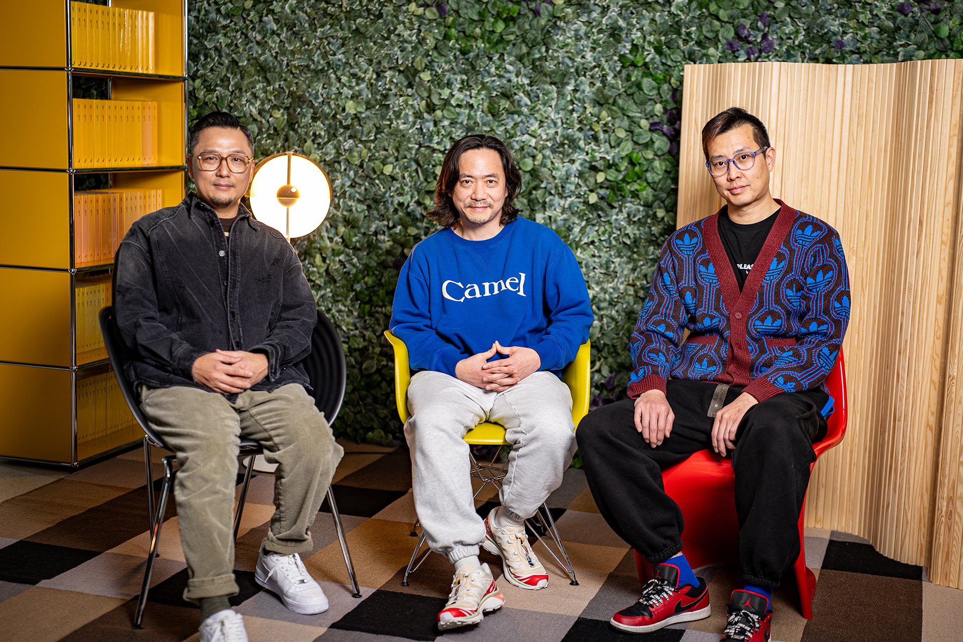
Creative Director Youngha Park CCO at FRUM & Founder of YounghaPark Studio
What was your first impression when you encountered the brand Asia Design Prize? And how do you think that impression translated into potential?
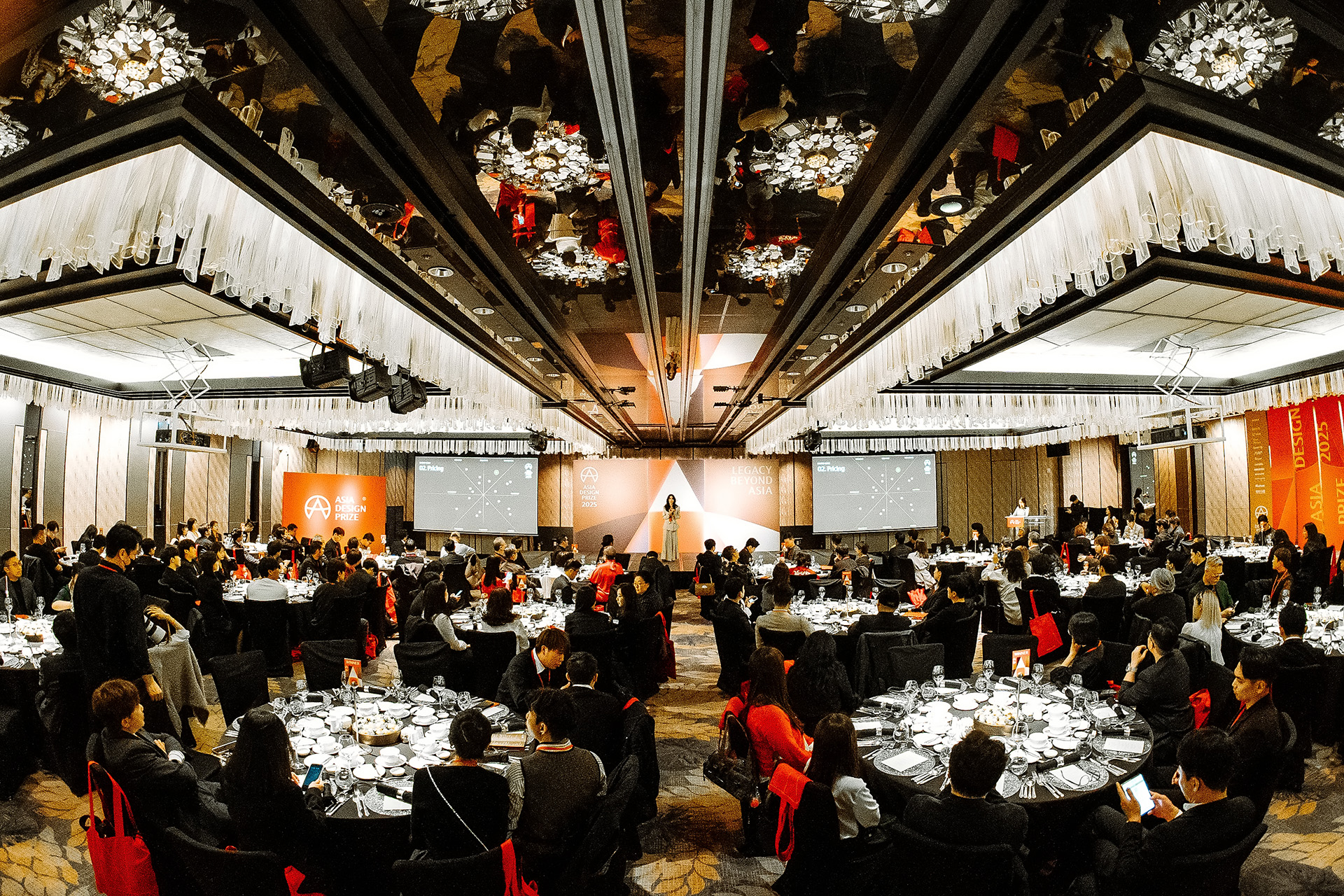
When I first came across the name "Asia Design Prize," what struck me immediately was the strong symbolism and sense of scale inherent in the words themselves. The combination of the regional scope of “Asia” and the designation “Prize” naturally conveyed the image of an award that represents and connects the entire Asian design landscape, evoking the possibility of a brand with significant influence. The fact that the award has been consistently held for ten years suggested deep-rooted potential and accumulated trust, yet at the same time, I felt some regret that its value and meaning were not yet widely recognized externally. I believe this rebranding effort will help bridge that gap and establish a clearer identity and direction for the brand, enabling the unique value and presence of the Asia Design Prize to be more vividly imprinted on both the domestic and international design scenes.
Which design areas were you responsible for in the Asia Design Prize rebranding project, and what philosophies and strategies did you prioritize during the process?
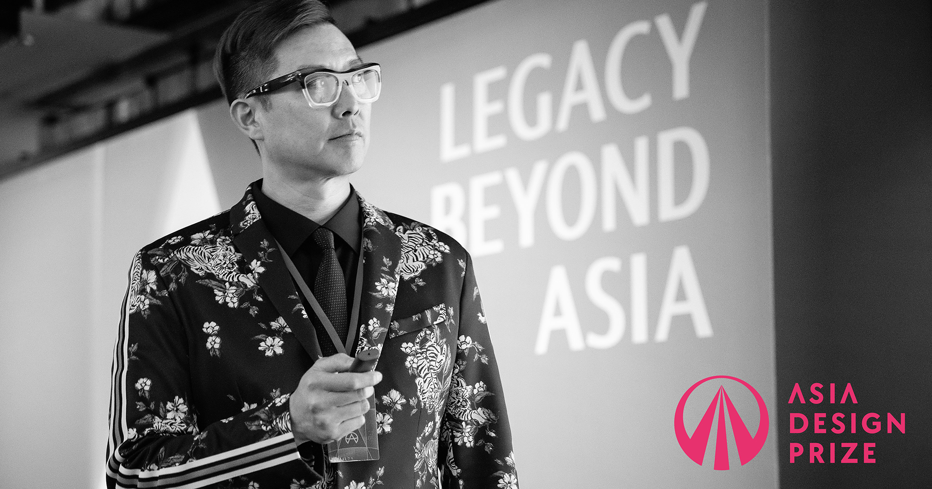
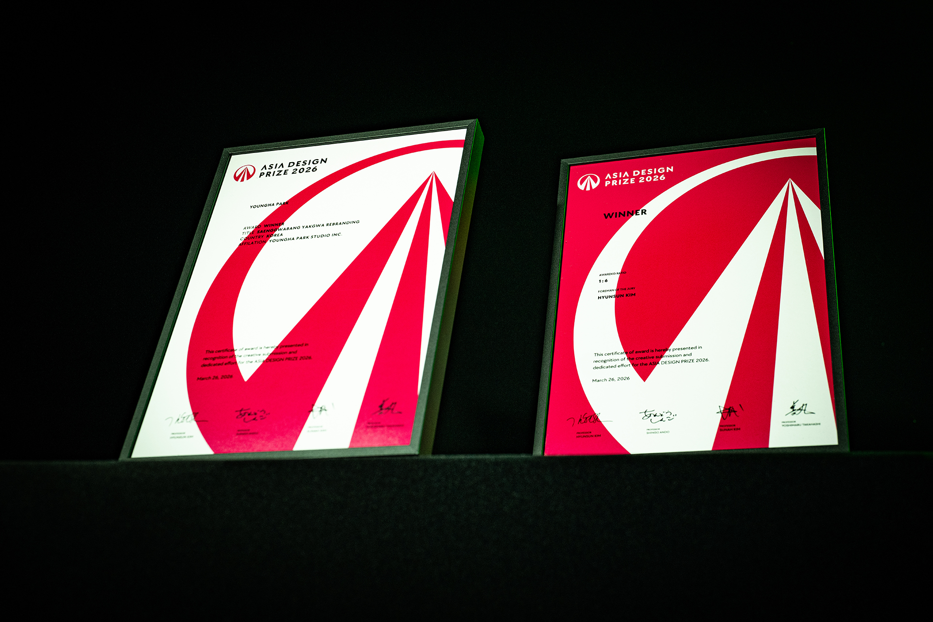
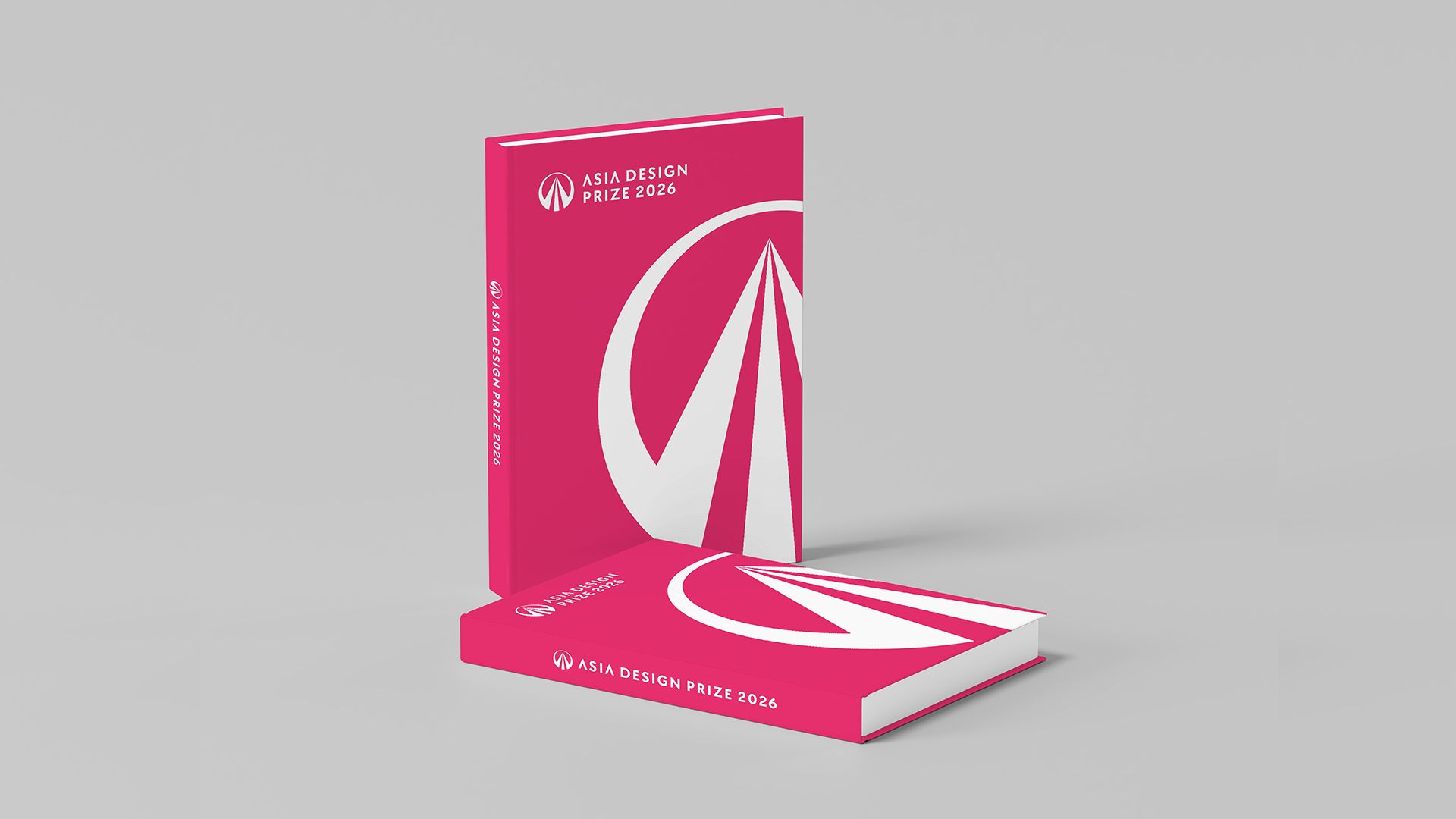
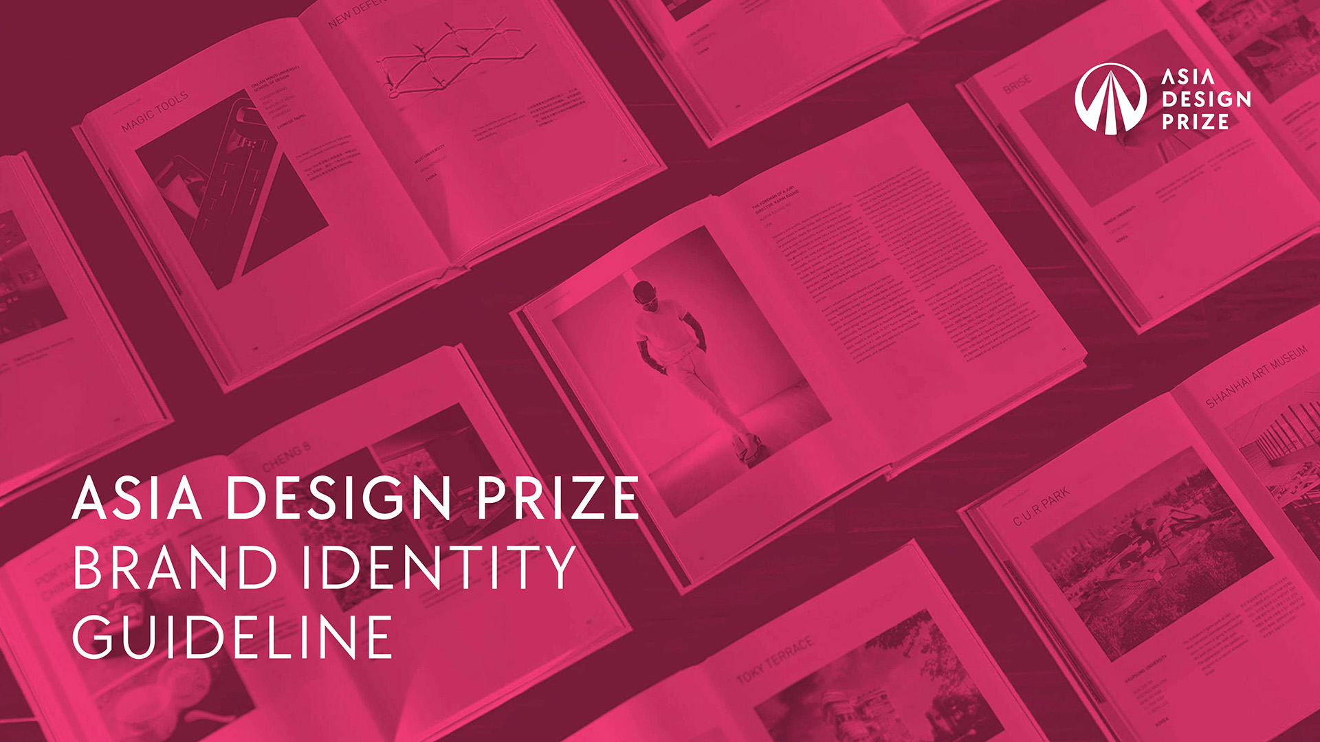
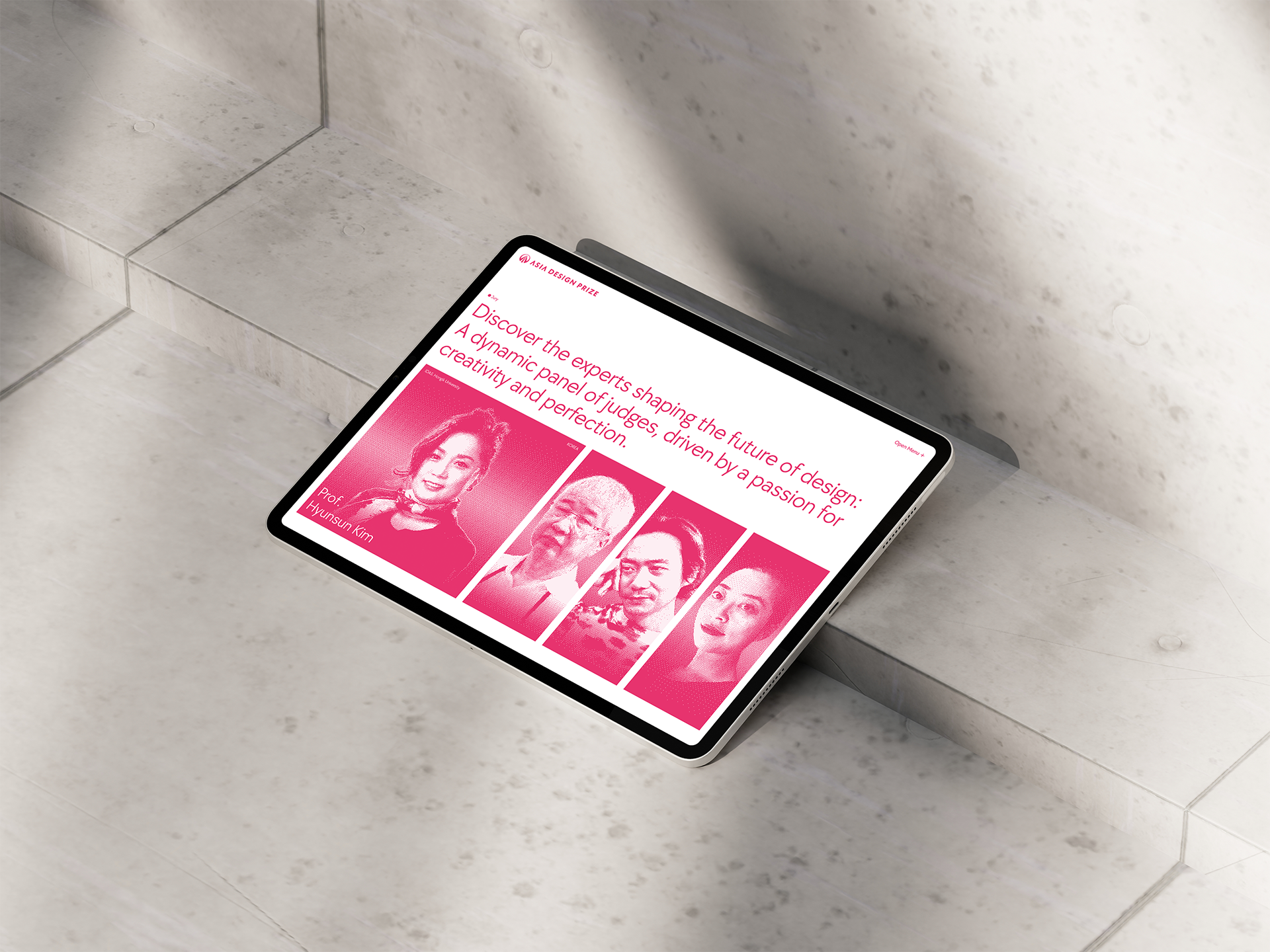
In the Asia Design Prize rebranding project, I was responsible for redefining and constructing the brand’s visual identity. Centered on the creation of a new symbol and logotype—which serve as the brand’s new face—I designed the slogan, proprietary typeface, and color system, forming the core of the basic identity framework and developing a comprehensive BI guideline. I also designed the winner package, certificates, yearbook covers, business cards, and award ceremony document templates, ensuring visual consistency across the brand’s practical applications. One of the most notable changes was in the color system, which plays a pivotal role in shaping the brand’s first impression. The previous red was perceived as heavily influenced by Chinese and Japanese aesthetics and lacked distinctiveness due to its widespread use by other global awards. To differentiate, we selected a vivid legacy red with a pinkish tone as the main color, infusing the brand with a younger, more provocative image.
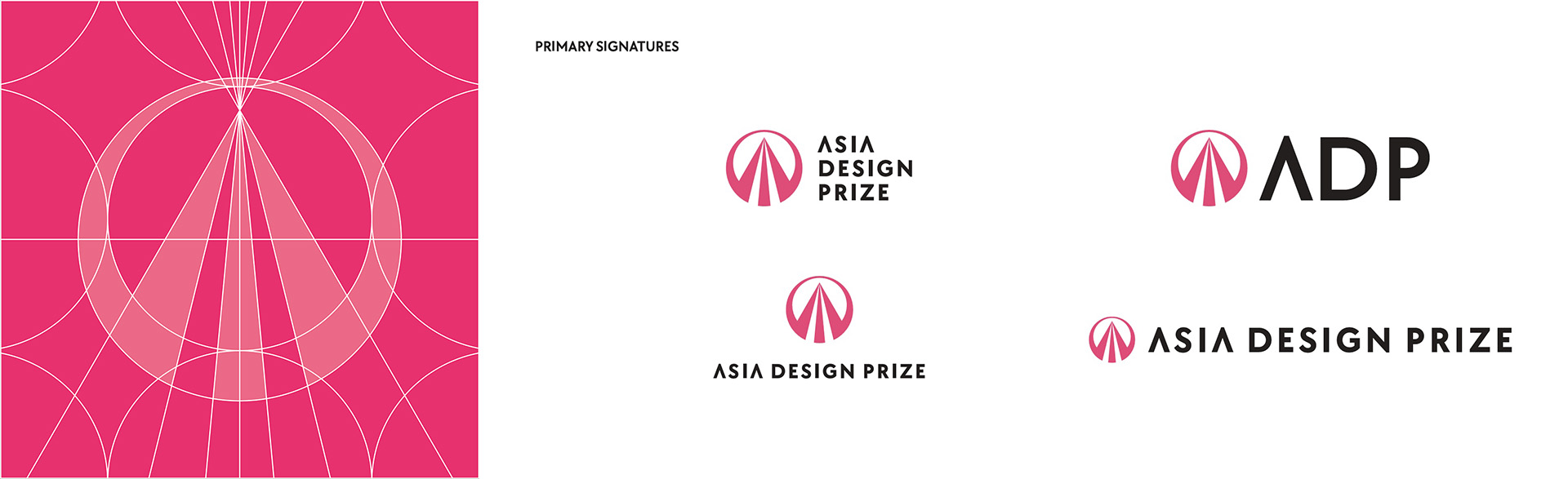
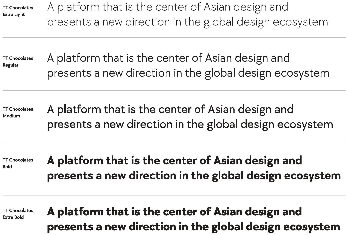
While respecting the brand legacy built over the past decade, the new symbol retains the original A-in-circle structure but reinterprets it to reflect a renewed brand philosophy—that of a platform guiding the global design ecosystem from the heart of Asia. The three-pronged, vanishing point structure of the A symbolizes the emotional keywords Iconic, Extensive, and Inspirational, while the encircling shape represents both the hub of Asian designers and the global stage. For the English typeface, we moved away from a neutral and modest tone by introducing a more distinctive font, TT Chocolates. In the logotype, the letter A was replaced with an inverted V, eliminating horizontal strokes for a more minimal composition that naturally draws attention to the initial. I believe these design evolutions go beyond visual renewal to become the foundational elements that clearly articulate the brand’s values and philosophy while establishing a distinctive identity.
In connecting the visual language to the brand philosophy during this rebranding effort, what core principles or attitudes did you consider most essential?
If we understand rebranding not merely as a cosmetic change but as a process of visually redefining the brand’s essence and direction, then the criteria for linking design language with brand philosophy become crucial. I focused on how to clearly and effectively communicate the brand’s core values and messages through visual means, establishing the overall tone and manner of the design accordingly. I believe every component—from the structure and form of the logo and BI to the color palette and typeface selection—must intuitively convey the brand philosophy. When a user or customer sees the logo, they should be able to sense its direction and attitude without needing a detailed explanation; to me, that is the most important role of brand design. Ultimately, the principle I valued most in this project was ensuring that visual elements serve not just to look appealing or unique, but to make the viewer feel the essence of what the brand stands for.
How does YounghaPark Studio define 'good design,' and how was that philosophy reflected in the Asia Design Prize rebranding project?
Our concept of good design goes beyond the completeness or aesthetic quality of a final outcome. We believe it’s more about the interaction between designer and client—good design emerges from a process that enables sound decision-making. At the heart of this is the element of trust. Designers are experts who understand and visually interpret the philosophy behind the planning and the brand, and clients, by respecting that expertise and engaging with an open mindset, create the conditions for truly successful outcomes. In the Asia Design Prize rebranding project, this ideal collaborative structure was fully realized. Kim Doyoung, the head of DesignSori and the project’s key decision-maker, placed deep trust in each expert involved and maintained an open, communicative attitude throughout the process of defining direction. As a result, each design element was naturally aligned with the brand’s philosophy, culminating in a balanced and sophisticated outcome. Ultimately, I believe our philosophy—that good design is the sum of discerning judgment and mutual trust—was thoroughly reflected throughout this project.
How did collaboration with other teams take place, and were there any new insights or memorable episodes during that process? Also, if there were challenges, how did you overcome them?
This rebranding project was led by overall director Woo Sung Jeon of Seaside City, with leaders from each field contributing their distinct expertise and roles through a clearly defined division of work. While each team focused on their own domain, there was a shared understanding that the overall tone and manner of the project needed to be cohesive. Communication was carried out through a combination of in-person meetings and online collaboration, with progress updates and drafts being shared fluidly, which allowed the various parts to function in a well-integrated manner.
One key factor was the BI guideline developed and distributed early on by Youngha Park Studio, which served as the foundation of the project’s visual language. Thanks to that, it was relatively seamless to maintain visual consistency in applications such as key visuals and trophy design. In the end, the model of each team working with both autonomy and responsibility proved to be a healthy and effective form of collaboration. This experience reaffirmed how powerful and efficient trust-based division of labor can be. It was particularly impressive how each team was able to flexibly infuse their own interpretations while maintaining the project’s overall direction, and I believe this will serve as a strong reference point for future collaborative efforts.
What kind of future do you envision for the Asia Design Prize through this rebranding? If there's a personal hope or direction you'd like to support, we'd love to hear that as well.
This rebranding came at a pivotal moment—both a reflection on the past ten years of the Asia Design Prize and a blueprint for the decade to come—making it a deeply meaningful and timely endeavor. I felt truly honored to be part of this turning point, not just in the sense of refining the brand’s outward appearance, but in participating in a process that redefined and expanded the essence and philosophy of the award itself. That experience has become a valuable asset for me as a designer. I believe the Asia Design Prize is well positioned to evolve beyond simply being a platform for recognition, toward becoming a genuine space for exchange—where designers share their work and philosophies and connect with the global stage in a meaningful way. I'm confident that it will soon become the kind of award every designer in Asia aspires to win—one that holds both symbolic and influential power. I sincerely look forward to continuing to support and be part of that journey in various ways.
Did working on the Asia Design Prize lead you to rethink the concept of ‘brand identity’? Or was there a moment where you redefined that concept as a designer?
Rather than redefining the concept of brand identity entirely, this project made me deeply reconnect with its essence. If we compare a brand to a person, then identity is akin to that person’s unique character, attitude, tone of voice, and temperament. The Asia Design Prize rebranding was, in essence, about giving that person a new personality, and YounghaPark Studio played the role of visually designing and expressing that personality to the outside world. We considered how this person would appear, what kind of atmosphere and impression they would project, and I believe we ultimately created a bold, charismatic character with a hip and sexy allure. It wasn’t just about “how to make it look” but rather “how to make it feel like a certain kind of presence”—and that made the process deeply immersive and compelling from a designer’s perspective. In the end, brand identity is a language that defines existence itself, and this project gave me a vivid, firsthand experience of what that truly means.
What did the Asia Design Prize project mean to you personally, and what’s next for YounghaPark Studio?
This project was the realization of a long-held personal aspiration. In the past, whenever designers gathered, we would often find ourselves—almost instinctively—engaged in heated debates about the branding of various international design awards. During those conversations, a recurring question would arise: “Why do we always end up talking about awards from Germany, Japan, or the U.S.?” We’d often say, “Wouldn’t it be amazing if Korea could have a design award that proudly stands on the global stage someday?” The Asia Design Prize rebranding project felt like the partial fulfillment of that shared desire, making the experience all the more meaningful and rewarding for me.
Youngha Park Studio is currently working not only with domestic clients but also with several overseas brands, including those in New York, on branding and packaging design projects. Two of these will be officially launching in New York in the latter half of this year. Looking ahead, we plan to expand beyond commercial work and delve into experimental and non-commercial creative projects, further deepening and expressing our studio’s unique identity and sensibility. Drawing from the experience and confidence gained through this rebranding journey, we hope to produce even more profound work on a larger stage.


#14057, 905 49, Beolmal-ro 102beon-gil,
Dongan-gu, Anyang-si, Gyeonggi-do, Korea
Business Registration Number: 454-86-01044
Online Sales License No.: 2021-Anyang Dongan-1081
Copyright © DESIGNSORI Co., Ltd.
