
Theiere
| Country | Chinese Taipei |
|---|---|
| Year | 2023 |
| Award | WINNER |
| Affiliation | Existence Design Co., Ltd. |
| Designer | YU TING HUANG |
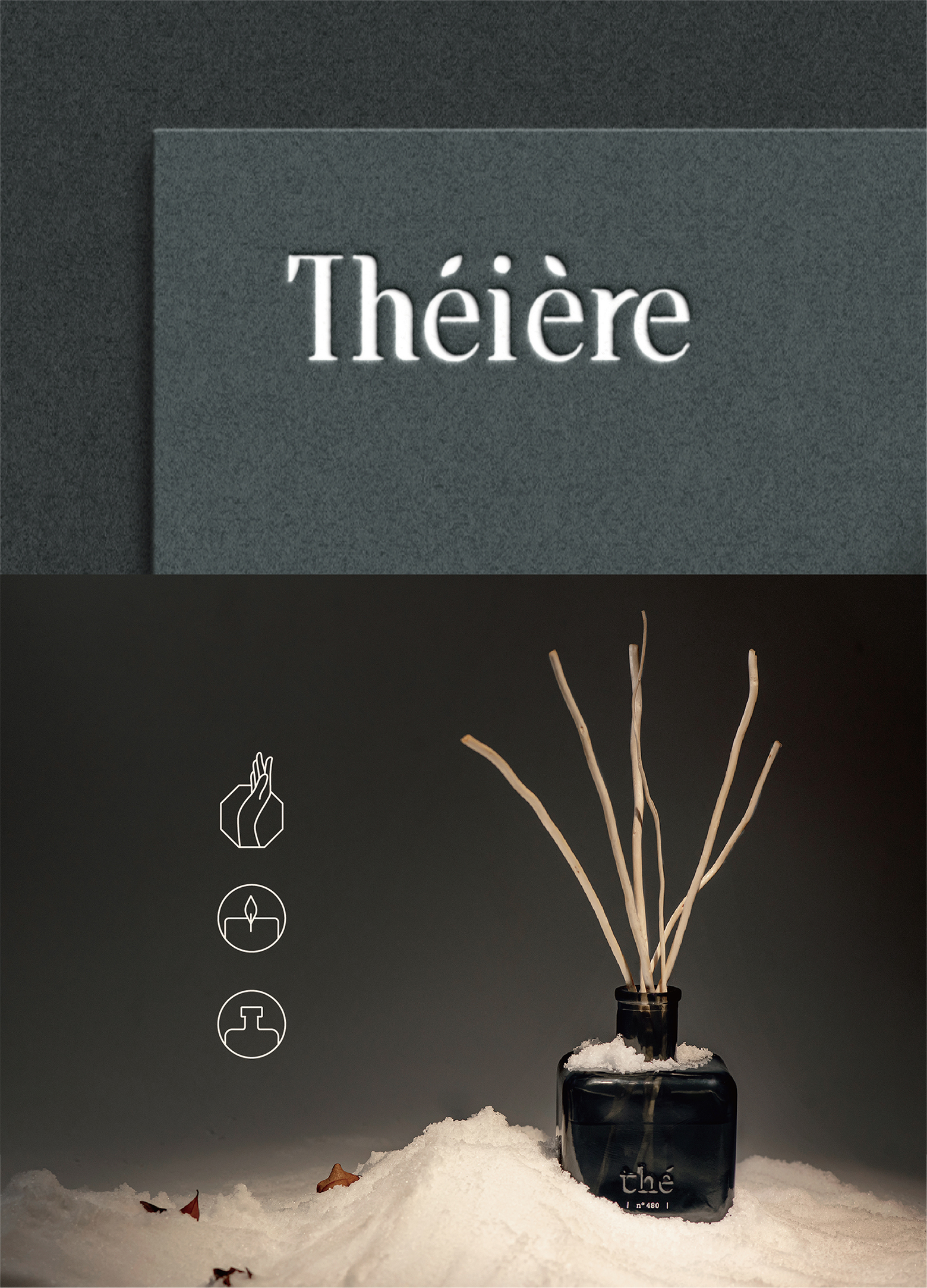
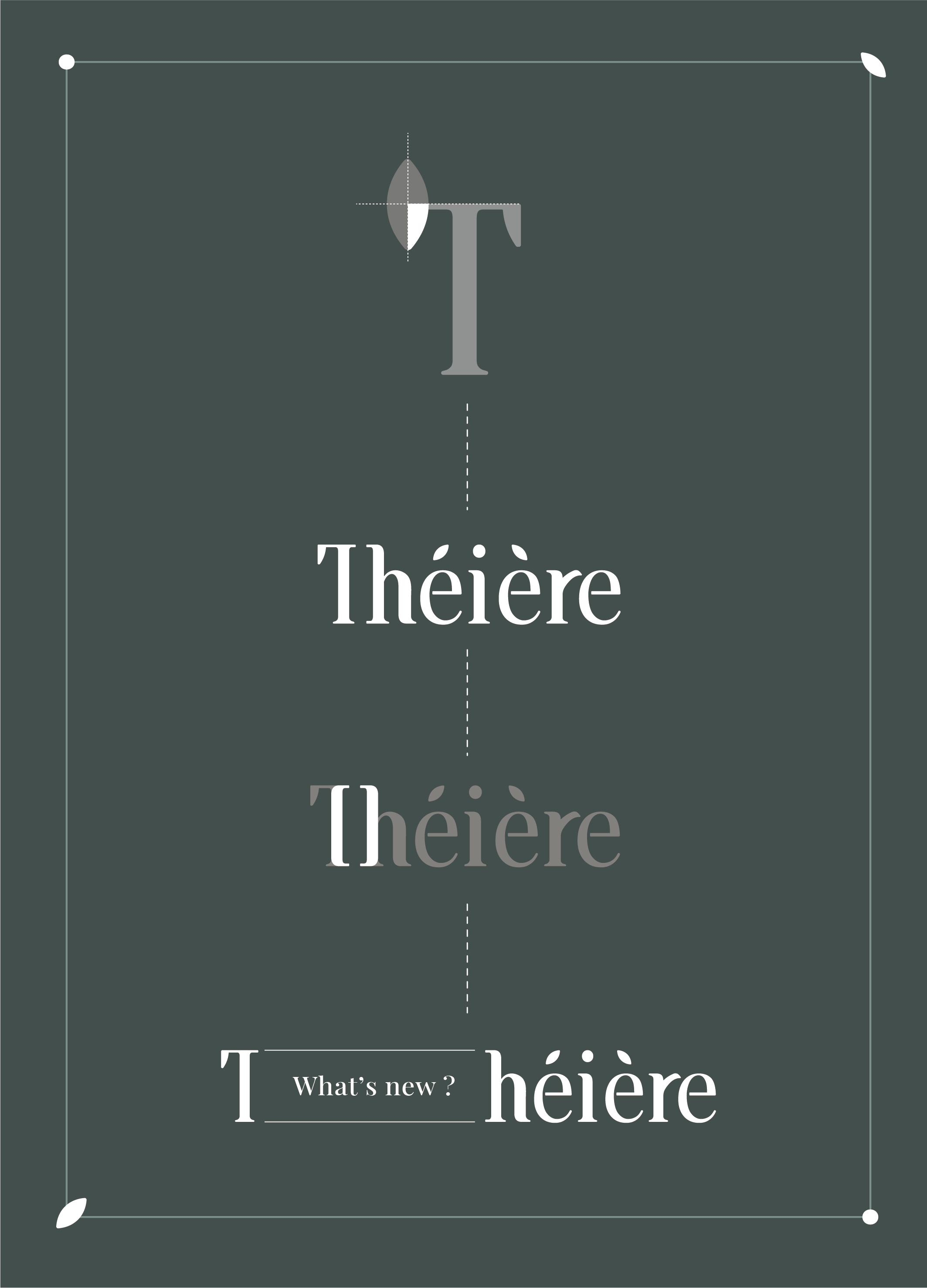
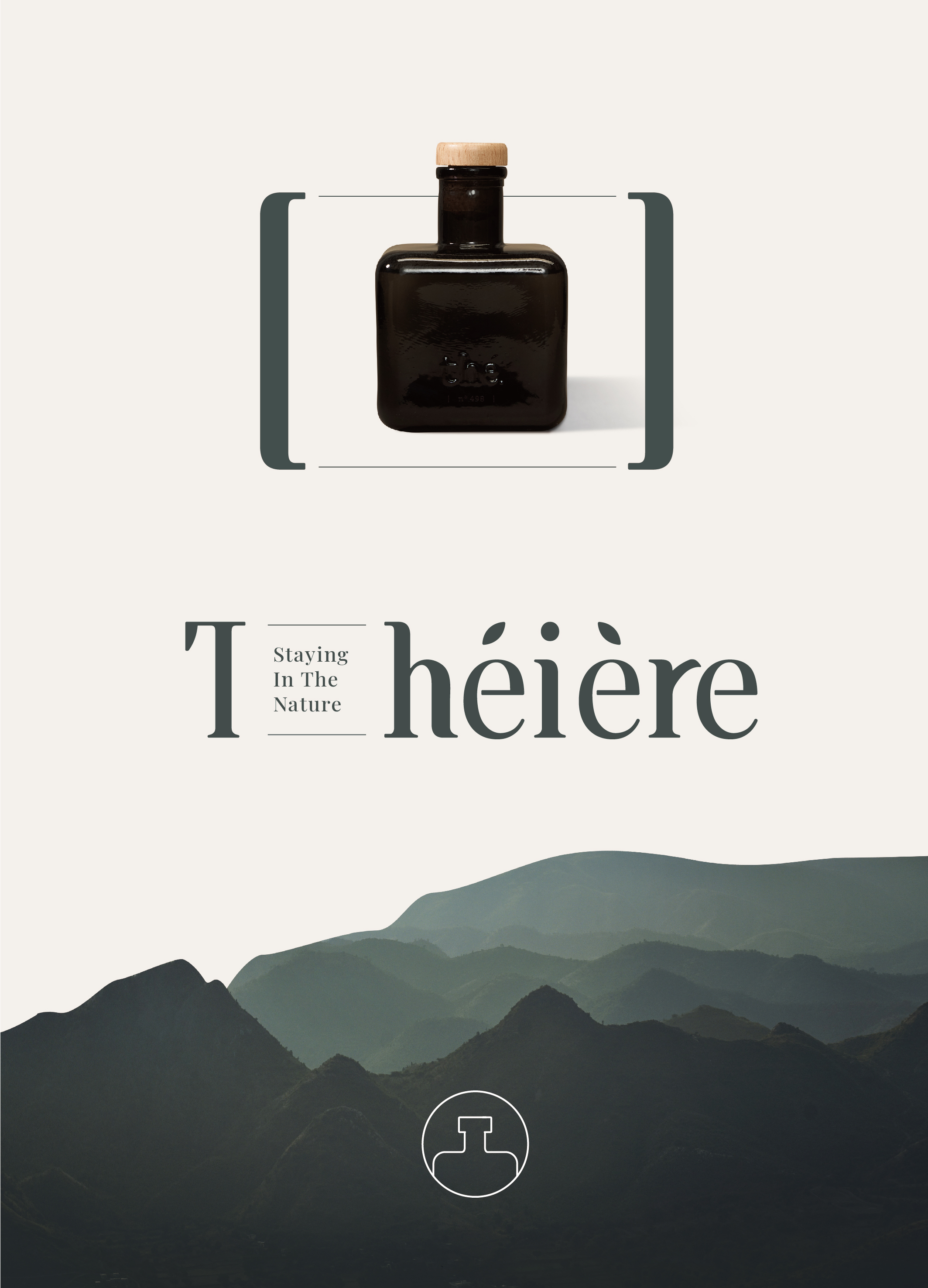
| English | From the soul of the product - "tea," we found the logo inspiration to integrate the image of tea leaves into the serif of the standard font "T" to show the implication of "tea."A bracket is placed in the virtual space between T and h to reflect the concept of the founder’s inspiration for the brand name, which is “how the scent of tea associates with the image of the teapot as the fragrance of the tea can be stored in the teapot.” We use “bracket” as the design symbol for “infusion of fragrance” and also extend the usage of this design symbol in the corporate image system. |
| Native | 從產品的靈魂—「茶葉」中找到融入品牌標誌的切入點,勾勒出氣質優雅的線條,在標準字中的「T」的文字襯線,融入1/4的葉片意象,體現「茶」的概念。 而T與h中間所形成的虛空間[ ],就像濃縮香氛精華的地方。Théière的香氛也將味道聚焦在玻璃瓶裡,我們將此連結巧妙地結合成聚焦的引號,並延伸為識別系統的焦點特色。同時也呼應創辦人原先取名的靈感「想到香氣,就會想到茶壺,因為他能將茶香裝在壺裡」的概念,我們將「引號」作為香氣聚焦的設計符號,讓括弧更有意義的融合在T與h之間,成了真正 [濃縮、聚焦] 香氣的意思。 標準字設計中的「r」也融入龍柳枝自然彎曲的意象,彰顯品牌對於自然環保材質的重視,讓人感受自然原生的濃烈氛圍,各種香味從天然柳枝開始擴散,將線條美學發揮地淋漓盡致,表現出各種層次堆疊下所釋放出的視覺美感與張力。環保與美學也能相輔相成,為識別賦予品牌靈魂,成為識別設計的重要語彙。 |
| Website | theiere-world.com |
| Positive Comments |


|
-
Murakoshi House
-
Weaving Haifu
-
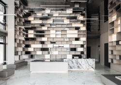
YU SHAN COFFEE BOOKBAR
-
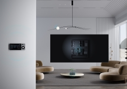
Wave House
-
In Between the Red Brick Wall
-
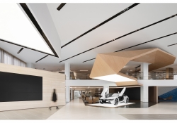
Chengdu BMW Experience Center
-
QUARK
-
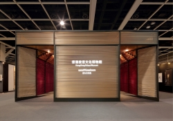
Yung Zing Tung Copper Culture Gallery
-
Grayscale of Light
-
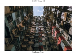
Space 5 point 7
-
bibu pet store
-
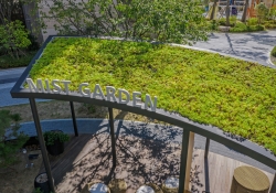
Mist Garden
-
H Wave Wall
-
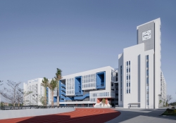
Quanzhou Experimental Middle School
-
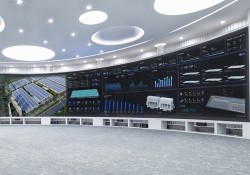
IOC of Jingzhou factory
-
Boundless Boundaries
-
Ribbon House
-
Mancave
-
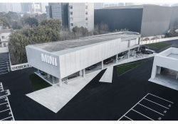
Chengdu MINI Showroom Complex
-
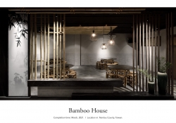
Bamboo House
-
Birch Forest
-
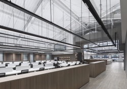
Stream Office
-
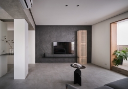
My Boundary
-
Daotianyi Moutain Hotel
-
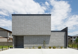
House in Niigata
-
DNAKE Smart Central Control Screen Knob
-
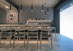
Maguro
-
RENOVATION OF OLD WAREHOUSE ON THE NORTH BUND
-
BTS
-
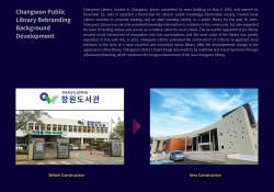
Changwon Public Library Rebranding
-
KClighting Global Flagship Showroom
-
IOC for Midea Headquarter
-
Zhangzhou City Museum
Designed by sketchbooks.co.kr / sketchbook5 board skin