
Artiant Hub Branding Design
| Country | China Hong Kong |
|---|---|
| Year | 2024 |
| Award | WINNER |
| Affiliation | VINCDESIGN |
| Designer | Vince Cheung, Kaman Kan |
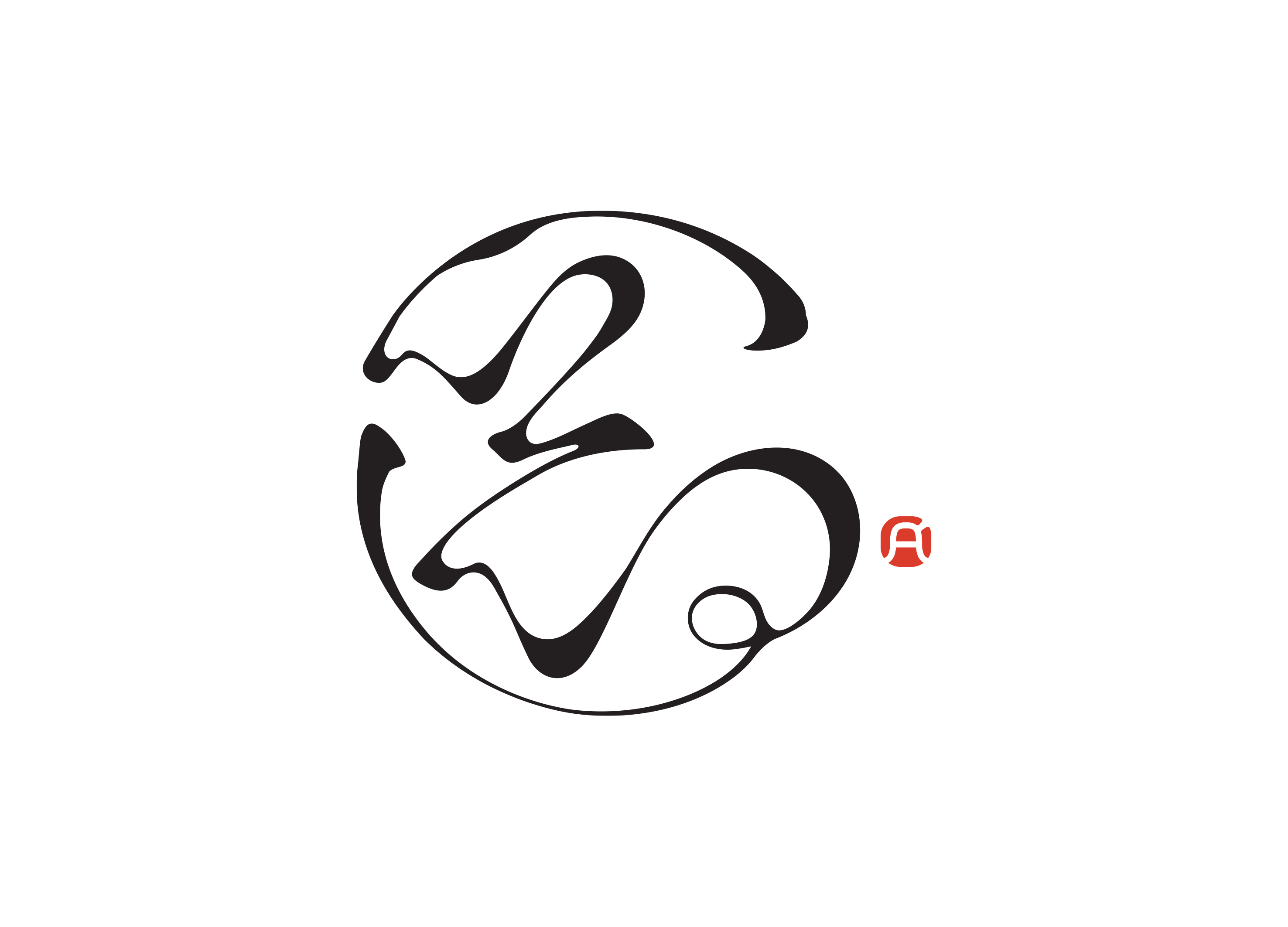
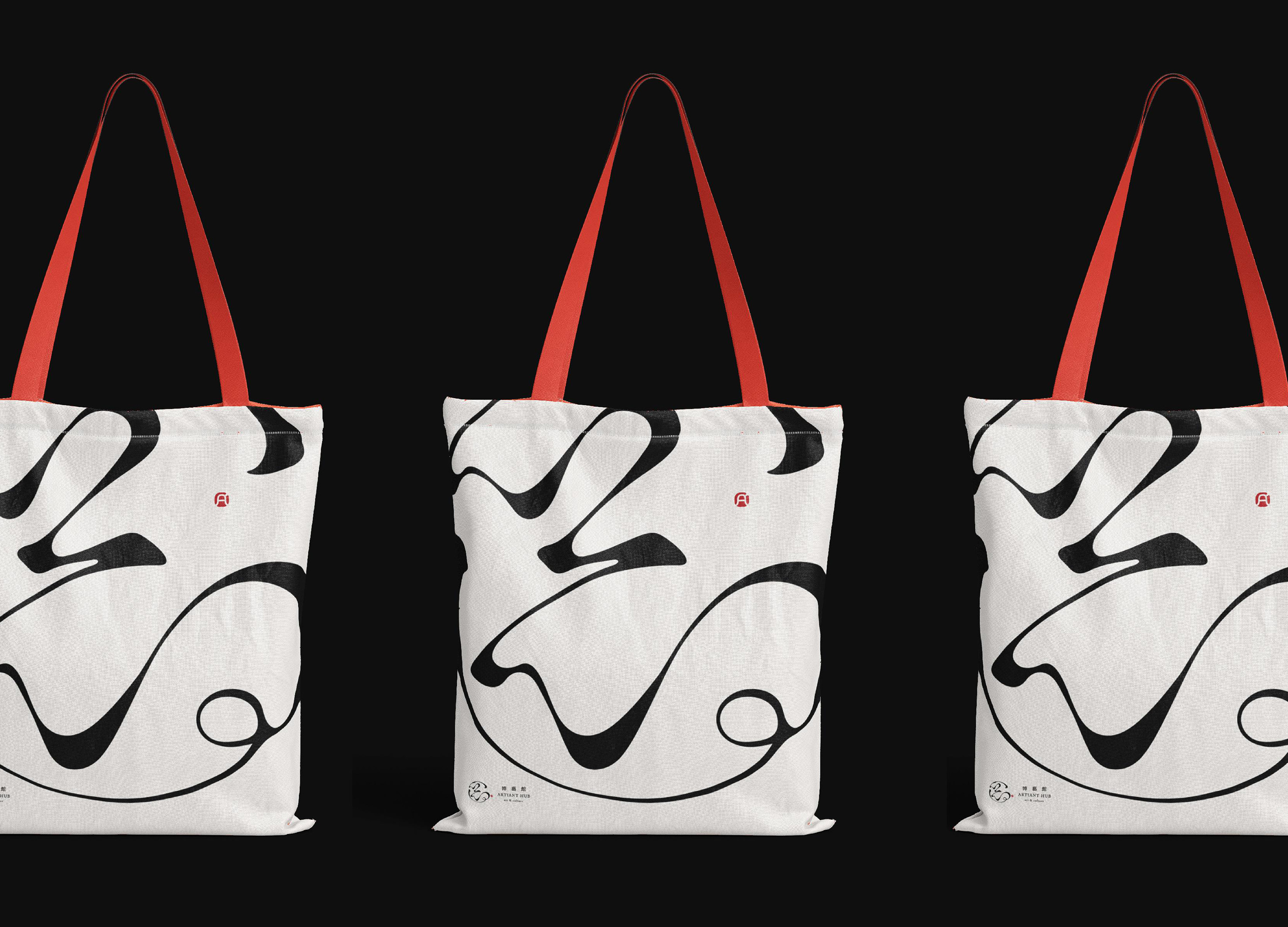
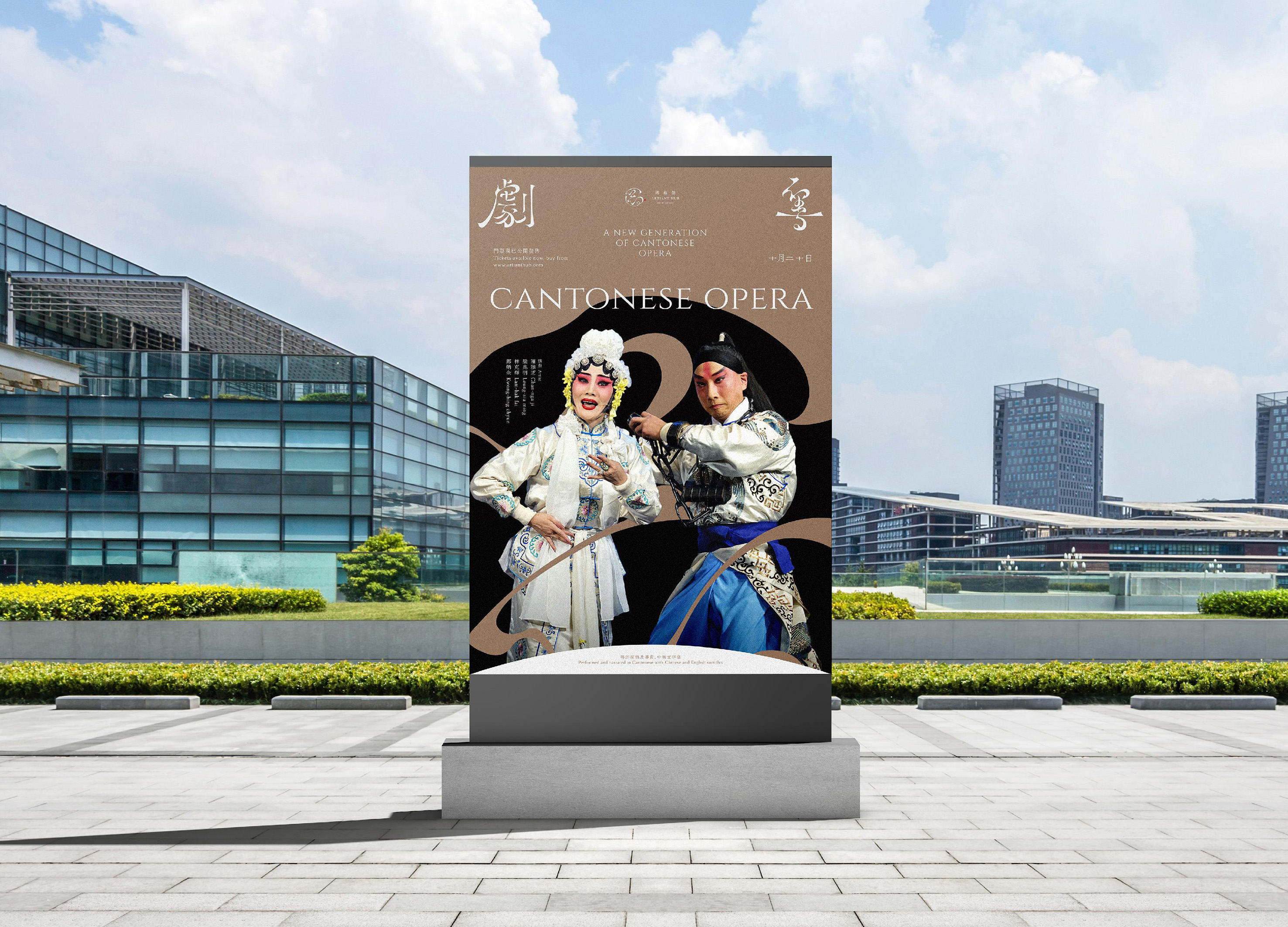
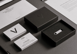
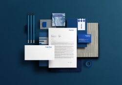
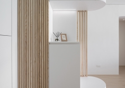
| English | Artiant Hub's branding is an ode to oriental art. Inspired by Liu Bai, a technique in Chinese brush painting, intentional white spaces symbolize that the unsaid carries deeper meaning. Visualized through Chinese calligraphy, it preserves ancient oriental art, emphasizing that much of the message is in what's unsaid. The logo, merging "藝" and action from Chinese opera, blends Eastern traditions with modern design, signifying Artiant Hub's commitment to bridging cultural gaps. |
| Native | Artiant Hub에 대한 브랜딩은 동양 예술의 미학으로 가득 차 있습니다. Liu Bai는 중국 서예의 독특한 기술로, 일러스트레이션에 의도적으로 빈 흰 공간을 남깁니다. 이 철학은 공백이 비어 있는 것이 아니라 깊은 의미를 전하며 관객의 해석을 통해 굳은 공간으로 여겨지는 것을 개념화합니다. 때로는 메시지의 상당 부분이 말하지 않은 것에 내재되어 있다는 것을 상징합니다. 특히 이러한 이념은 중국 서예를 통해 시각화되고 강조됩니다. 고대 동양 예술을 보존하기 위해 상상력으로 완성되기를 기다리는 이 흰 공백은 모든 예술 분야의 애호가들이 자신의 관심사를 추구할 수 있는 개방적이고 시대를 초월한, 포용적인 공간을 나타냅니다. 로고는 "藝" 문자와 광동 오페라에서 온 수어(水袖)를 특징으로 하며 동양 전통과 현대 디자인을 융합합니다. 이 철학은 문화적 격차를 줄이기 위한 Artiant Hub의 헌신을 강조합니다. |
| Positive Comments |


|
| Judging Comments | Artiant Hub's branding was highly praised for its masterful integration of traditional Eastern aesthetics with modern design principles. The use of Liu Bai, or intentional white space, alongside elements of Chinese calligraphy and opera in the logo, was celebrated for its deep cultural resonance and innovative approach to conveying meaning through the unsaid. This design effectively bridges cultural gaps, showcasing a profound respect for oriental art traditions while engaging a contemporary audience, highlighting Artiant Hub's dedication to preserving and contemporizing ancient artistic philosophies. |
-
Intelligent Water Resources Dispatch System
-
4Paradigm Sage AIOS Packaging Design
-
NC PLAY PROJECT
-
ScienceCom
-
SAIO
-
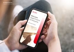
Welcome Digital Bank Visual Identity
-
Care Together Happy Together Visual branding
-
Manna corporate identity design
-
Pingtan Book House
-
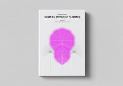
Korean Medicine Blooms
-
Re Braille
-
4Paradigm Pandemic Prediction System Design
-
UNAJIRO VI
-
Graphic design for Gwangju city commemoration
-
The Worldly book design
-
Bexei The Wandering Earth
-
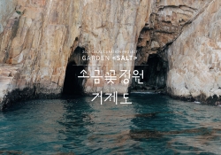
Garden Salt
-
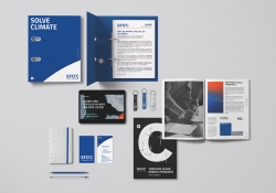
SFOC Visual Identity
-
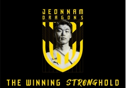
Jeonnam Dragons Football Club Rebranding
-
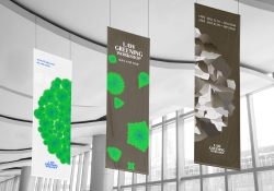
Law Greening Workshop
-
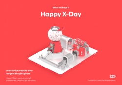
Happy X Day
-
Care U Most
-
2022 Graduation exhibition GROW GLOW
-
Bubble Bomb
-
Energy Utopia
-
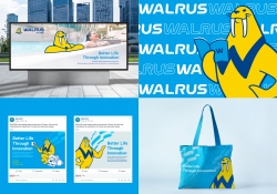
WALRUS PUMP Brand Design
-
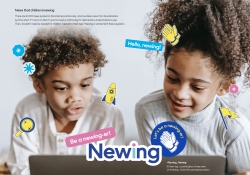
Newing
-
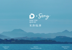
The Song rhythm of Dongqian Lake
-
SHIN KONG Bank Light Evolution
-
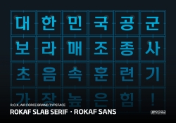
ROKAF Typeface
-
THE PENTHOUSE Visual Branding
-
BE BETTER Packaging for the Earth in 2050
-
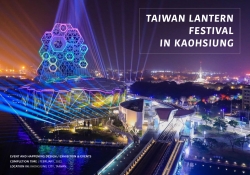
TAIWAN LANTERN FESTIVAL IN KAOHSIUNG
-
YNL Design CI Renewal
-
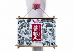
Sauce Expert
-
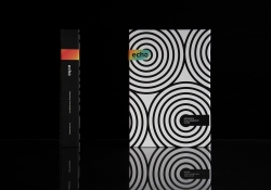
Project Echo
-
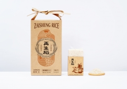
Zaishengdao Rice Packaging Design
-
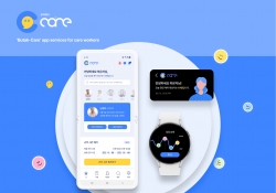
Butak Care app services for care workers
-
Prejudice
-
Origami Amenities
-
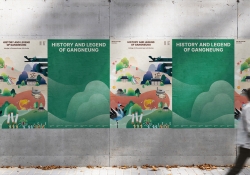
History and Legend of Gangneung
-
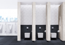
Concept ARC Dual Flush Valve
-
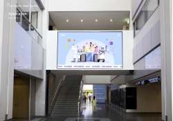
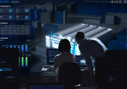
Midea Industrial City smart operation of IOC
-
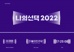
MY CHOICE Visual Branding
-
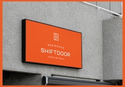
SHIFTDOOR RESIDENCE Brand Identity
-
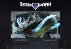
TL BRAND DAY in NC PARK
-
NCSOFT Leaders Kit
-
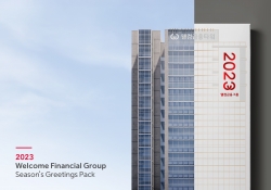
Welcome FG Seasons Greetings Pack
-
Matsu HandPulled Noodle Brand Design
-
TOLOKAH Brand Design
-
Tuntex Branding
-
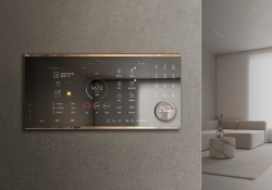
Smart Home Network Wall Pad HDHN4000
-
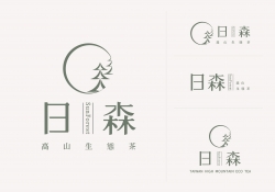
Sunforest
-
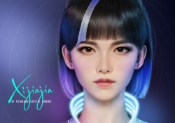
XIJIAJIA An AI Digital Human
-
Breeze White
-
AIOT Smart Park Integrated System
-
4paradigm Sage HyperCycle CESS
-
60 year memories of WAN CHUAN HSING
-
Smart Home Solution System HDHN 4000SET
-
DNAKE Sapphire Series

Designed by sketchbooks.co.kr / sketchbook5 board skin