
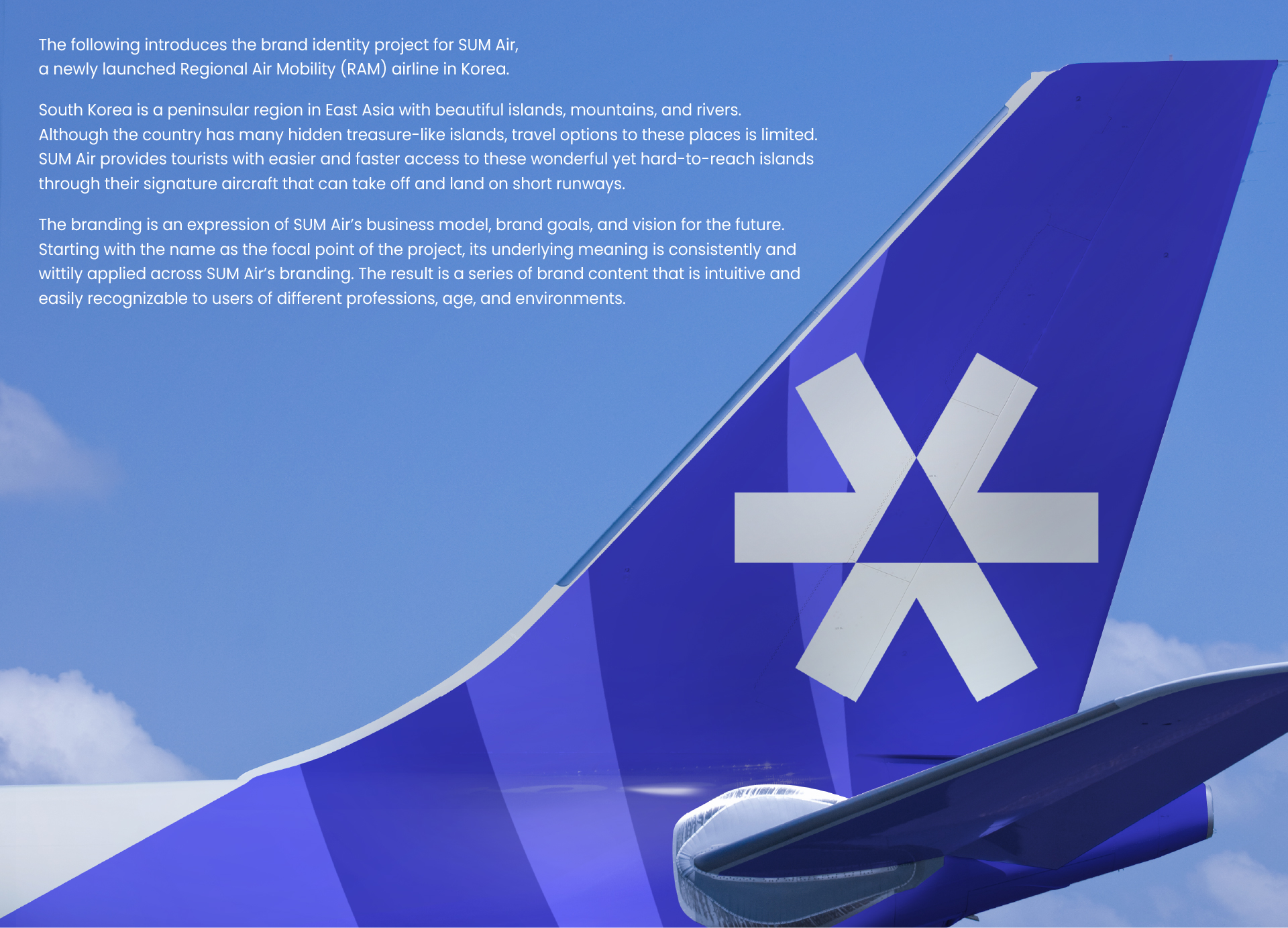
SUM Air Brand Identity Design
| Country | Korea |
|---|---|
| Year | 2024 |
| Award | GOLD WINNER |
| Client | SUM Air Co., Ltd. |
| Affiliation | EIDETIC Inc. |
| Designer | AERIN KIM, AIDEN KANG, KIMMI KIM, JED JUNG, EVA BYEON |
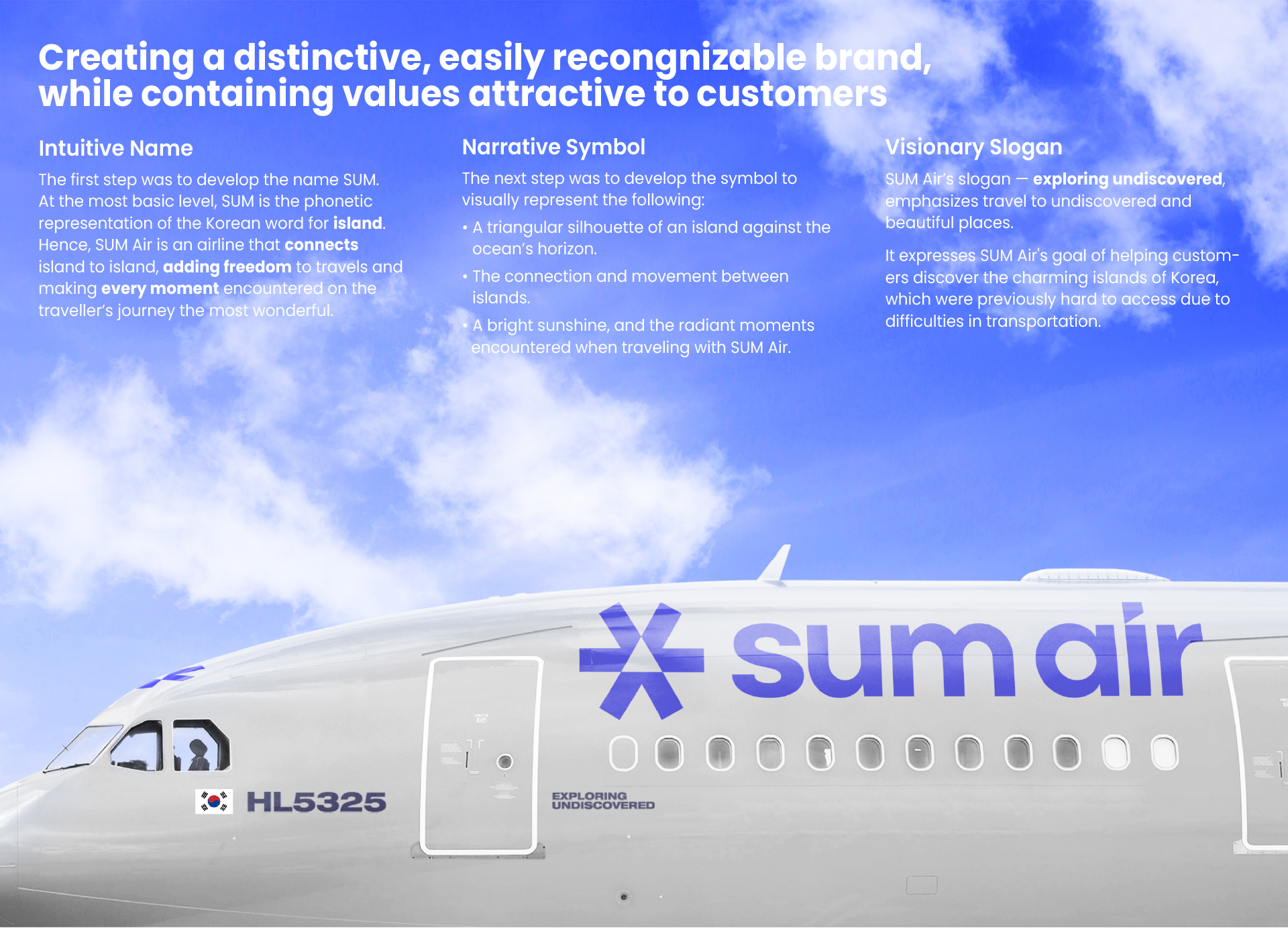
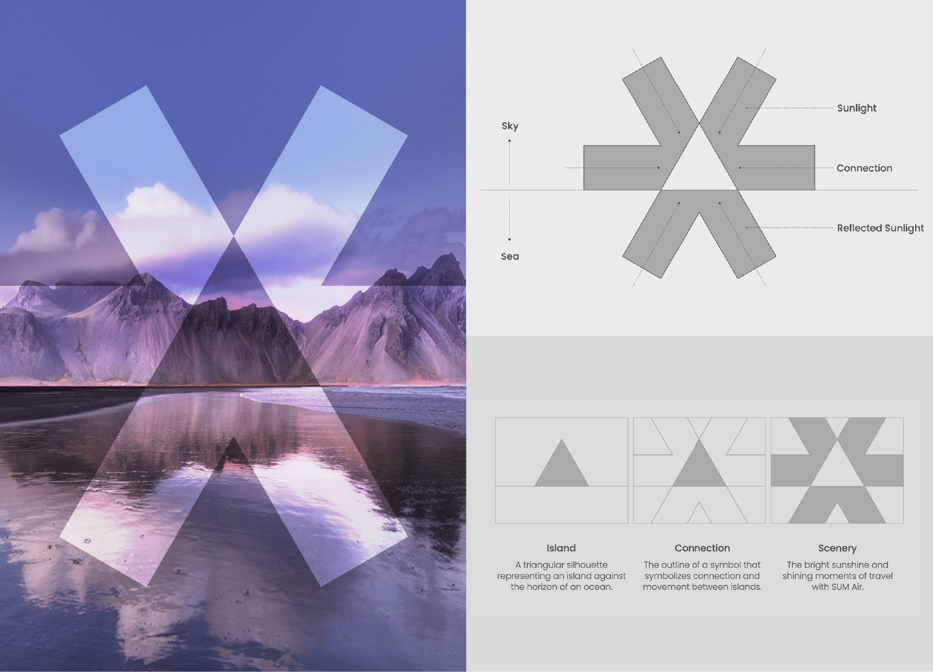
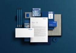
| English | SUM Air, aptly named, embodies values of connection and freedom in travel, signifying an island-to-island link. SUM phonetically represents ‘island' in the Korean language. The logo symbol begins with a triangle at the center, which depicts an island meeting the sea's horizon. The outline of the symbol is a visual metaphor for the movement and connection between cities. At the same time, it embodies the brand's core values, portraying the 'shining sun' and 'radiant moments' encountered when travelling with SUM Air. |
| Native | 신생 항공사가 돋보이기 위해서는 섬에어의 가치를 고객에게 어필할 수 있도록 직관적이고 명확한 브랜딩이 필요하였습니다. 첫 번째로 '연결'을 표현하는 SUM이라는 이름을 개발하였습니다. 섬과 섬을 '연결'하고, 여행에 '자유'를 더하며, 여행에서 만나는 '모든' 순간을 가장 멋진 순간으로 만들어주는 항공사, 동시에 '섬(Island)'을 뜻하는 우리말을 소리 나는 대로 표기하였습니다. 두번째로 섬에어의 심볼은 바다 수평선과 맞닿아 있는 섬을 직관적으로 나타내는 삼각 조형에서 시작됩니다. 심볼의 아웃라인은 섬과 도시 사이의 연결과 이동을 상징하고 섬에어를 통해 만나는 ‘빛나는 태양’과 여행의 ‘빛나는 순간’들을 시각화 하여 브랜드 핵심 가치를 표현하였습니다. 2024년 울산과 사천 취항을 시작으로 브랜드가 론칭되며, 2026년에는 울릉도에 공항이 개항할 예정입니다. 섬에어를 이용하면 1시간 만에 울릉도로 이동할 수 있으며 앞으로 하늘길이 열리는 흑산도, 백령도 같은 아름다운 섬과 근거리에 있는 작은 해외도시까지 항공편을 연결할 예정입니다. |
| Website | www.sumair.kr |
| Positive Comments |


|
| Judging Comments | SUM Air Brand Identity Design by EIDETIC clinched the 'Gold Winner' at the Asia Design Prize 2024 for its ingenious embodiment of connection and freedom in travel through a meticulously crafted logo. The jury commended its symbolic representation of island-to-island links and the core values of the brand, captured in the logo's visual metaphor of an island meeting the sea's horizon, signifying movement, connection, and the radiant experiences SUM Air offers. |
-
Intelligent Water Resources Dispatch System
-
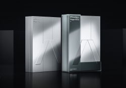
4Paradigm Sage AIOS Packaging Design
-
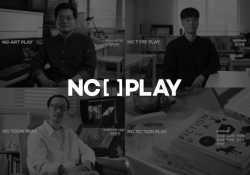
NC PLAY PROJECT
-
ScienceCom
-
SAIO
-
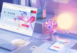
Welcome Digital Bank Visual Identity
-
Care Together Happy Together Visual branding
-
Manna corporate identity design
-
Pingtan Book House
-
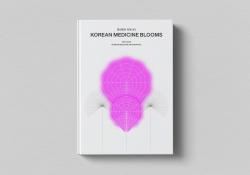
Korean Medicine Blooms
-
Re Braille
-
4Paradigm Pandemic Prediction System Design
-
UNAJIRO VI
-
Graphic design for Gwangju city commemoration
-
The Worldly book design
-
Bexei The Wandering Earth
-
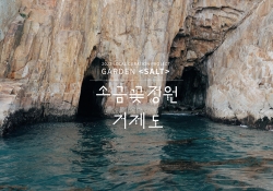
Garden Salt
-
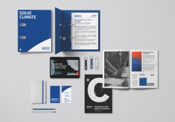
SFOC Visual Identity
-
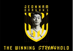
Jeonnam Dragons Football Club Rebranding
-
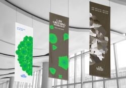
Law Greening Workshop
-
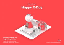
Happy X Day
-
Care U Most
-
2022 Graduation exhibition GROW GLOW
-
Bubble Bomb
-
Energy Utopia
-
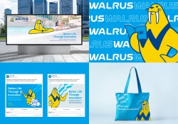
WALRUS PUMP Brand Design
-
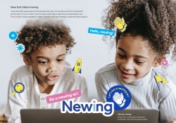
Newing
-
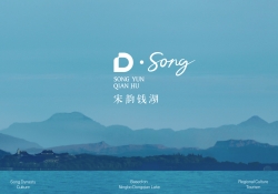
The Song rhythm of Dongqian Lake
-
SHIN KONG Bank Light Evolution
-
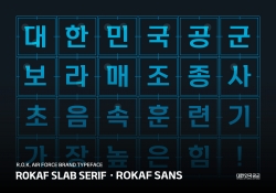
ROKAF Typeface
-
THE PENTHOUSE Visual Branding
-
BE BETTER Packaging for the Earth in 2050
-
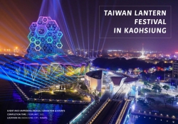
TAIWAN LANTERN FESTIVAL IN KAOHSIUNG
-
YNL Design CI Renewal
-
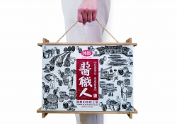
Sauce Expert
-
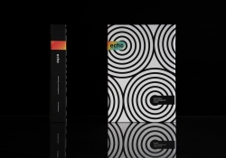
Project Echo
-
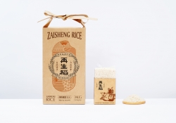
Zaishengdao Rice Packaging Design
-
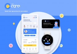
Butak Care app services for care workers
-
Prejudice
-
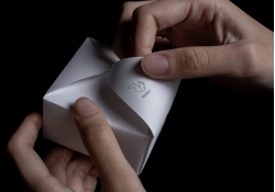
Origami Amenities
-
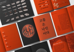
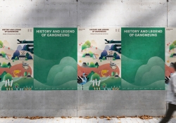
History and Legend of Gangneung
-
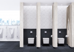
Concept ARC Dual Flush Valve
-
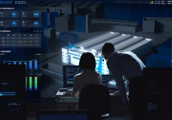
Midea Industrial City smart operation of IOC
-
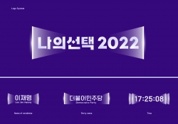
MY CHOICE Visual Branding
-
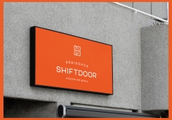
SHIFTDOOR RESIDENCE Brand Identity
-
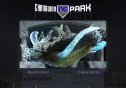
TL BRAND DAY in NC PARK
-
NCSOFT Leaders Kit
-
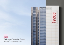
Welcome FG Seasons Greetings Pack
-
Matsu HandPulled Noodle Brand Design
-
TOLOKAH Brand Design
-
Tuntex Branding
-
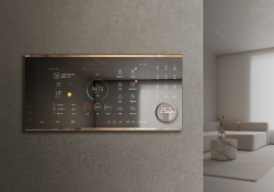
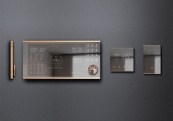
Smart Home Network Wall Pad HDHN4000
-
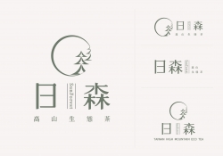
Sunforest
-
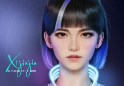
XIJIAJIA An AI Digital Human
-
Breeze White
-
AIOT Smart Park Integrated System
-
4paradigm Sage HyperCycle CESS
-
60 year memories of WAN CHUAN HSING
-
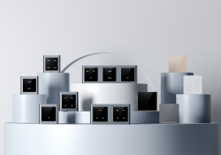
Smart Home Solution System HDHN 4000SET
-
DNAKE Sapphire Series

Designed by sketchbooks.co.kr / sketchbook5 board skin