
Communication
VI Design for Tripod Design Award
| Country | China |
|---|---|
| Year | 2021 |
| Award | GOLD WINNER |
| Designer | Yuanzhao Xia |
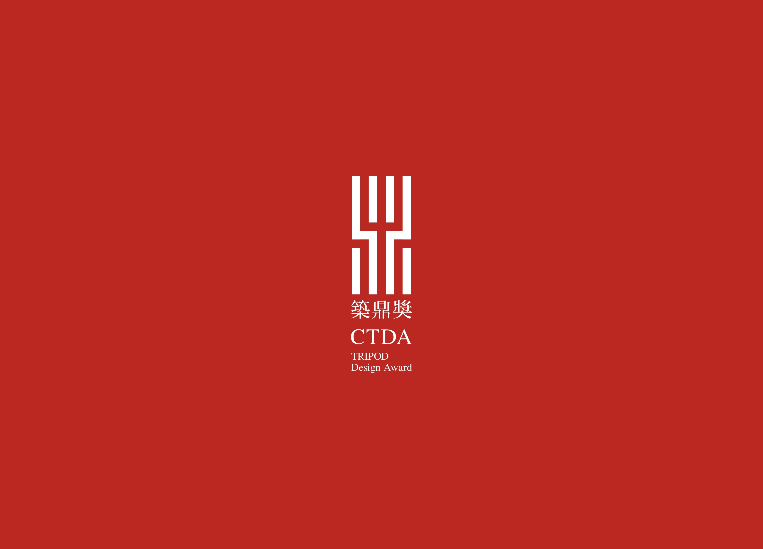
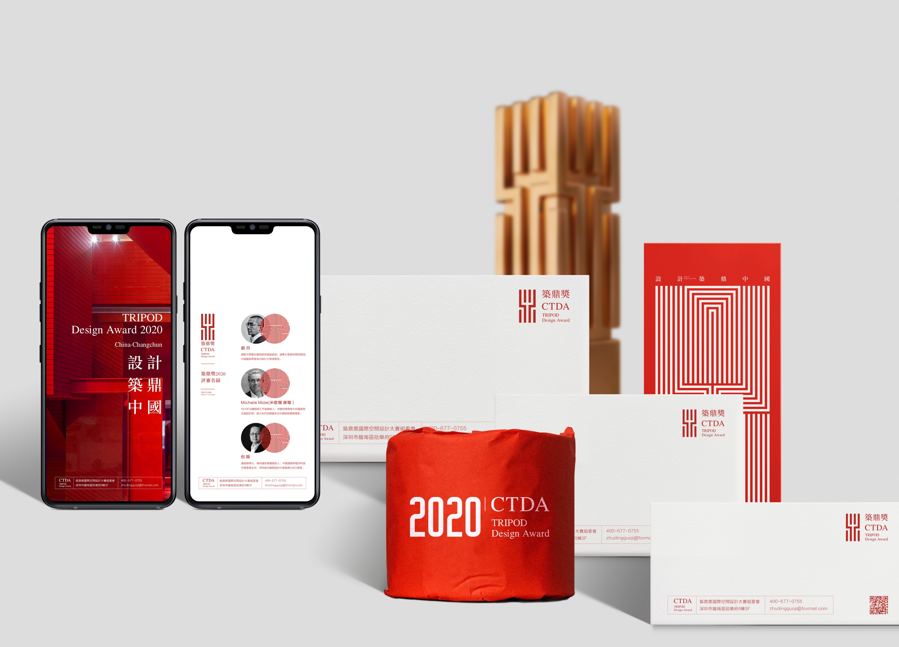
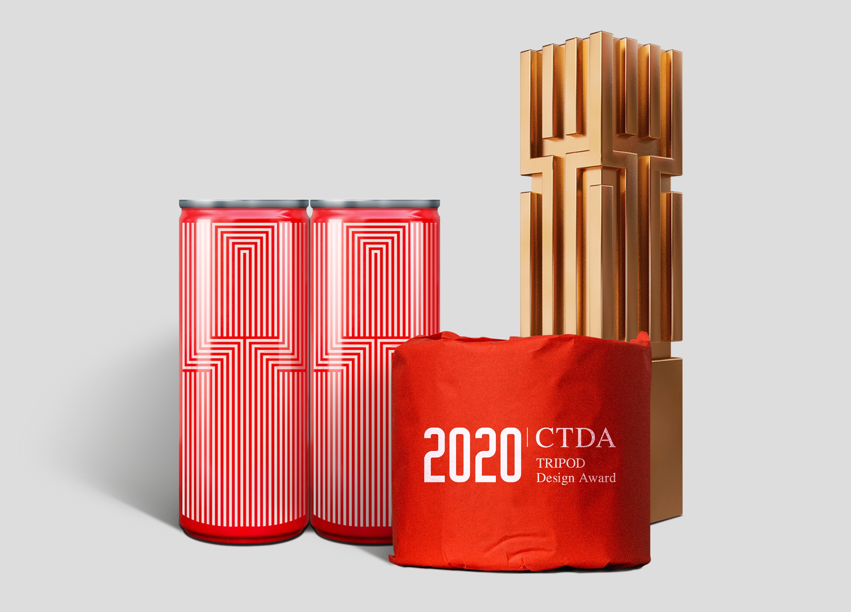
| English | The main body of the logo is evolved from the Chinese word “Ding”, expressing the abidance by a professional and rigorous attitude, as well as integrity and authoritativeness; in the structure, some horizontal strokes are disassociated, standing for the selection principles of fairness, justice, and openness. As a whole, the logo embodies the industrial attribute with the beauty of tallness and straightness. As a standard color with a broad international perspective, Chinese Red symbolizes life and sustainable development. |
| Native | 《筑鼎奖》视觉识别设计设计说明:筑鼎奖,由中国建筑学会室内设计分会指导,长春装饰设计行业商会发起并主办,特邀国际领域多国家及两岸四地一线导师及评委参与评审。标志主体由中文“鼎”衍变而成,表达恪守专业、严谨的态度,以及诚信力与权威性,在结构上抽离部分横向笔划,象征公平、公正、公开的评选原则,标志整体以挺拔之美体现行业属性。标准色中国红放眼国际视野,象征生命与持久发展,以汇聚中国创意设计精英智慧为宗旨,以推动中国设计行业发展为愿景,对设计者提出同步国际的设计标准,打造中国乃至世界最具影响力和创造力的设计大奖。支持单位:装饰行业上市企业设计联盟、东北师范大学美术学院、吉林建筑大学艺术设计学院。主办单位:筑鼎方舟文化传媒。 |
| Positive Comments |


|
-
Oasis Opulence
-
Leyeshan Township Rural Cultural Center
-
Family Fun Oasis
-
Dark Oak Apartment
-
Simple clean and transparent
-
The Transition of Elegance
-
The Art of Living
-
Tansu Tranquility
-
Coffeehouse
-
A Symbiotic Second Home
-
Vive la vie
-
Rewind
-
ZENIQUE
-
Harlemroot center
-
Meet Jiangnan
-
Xingshufu Banouet
-
Shanghai Hongming Office Showroom Design


Designed by sketchbooks.co.kr / sketchbook5 board skin


