VI Design for Tripod Design Award
Communication
Regions
China
Year
2021
Award
GOLD WINNER
Designer
Yuanzhao Xia
English
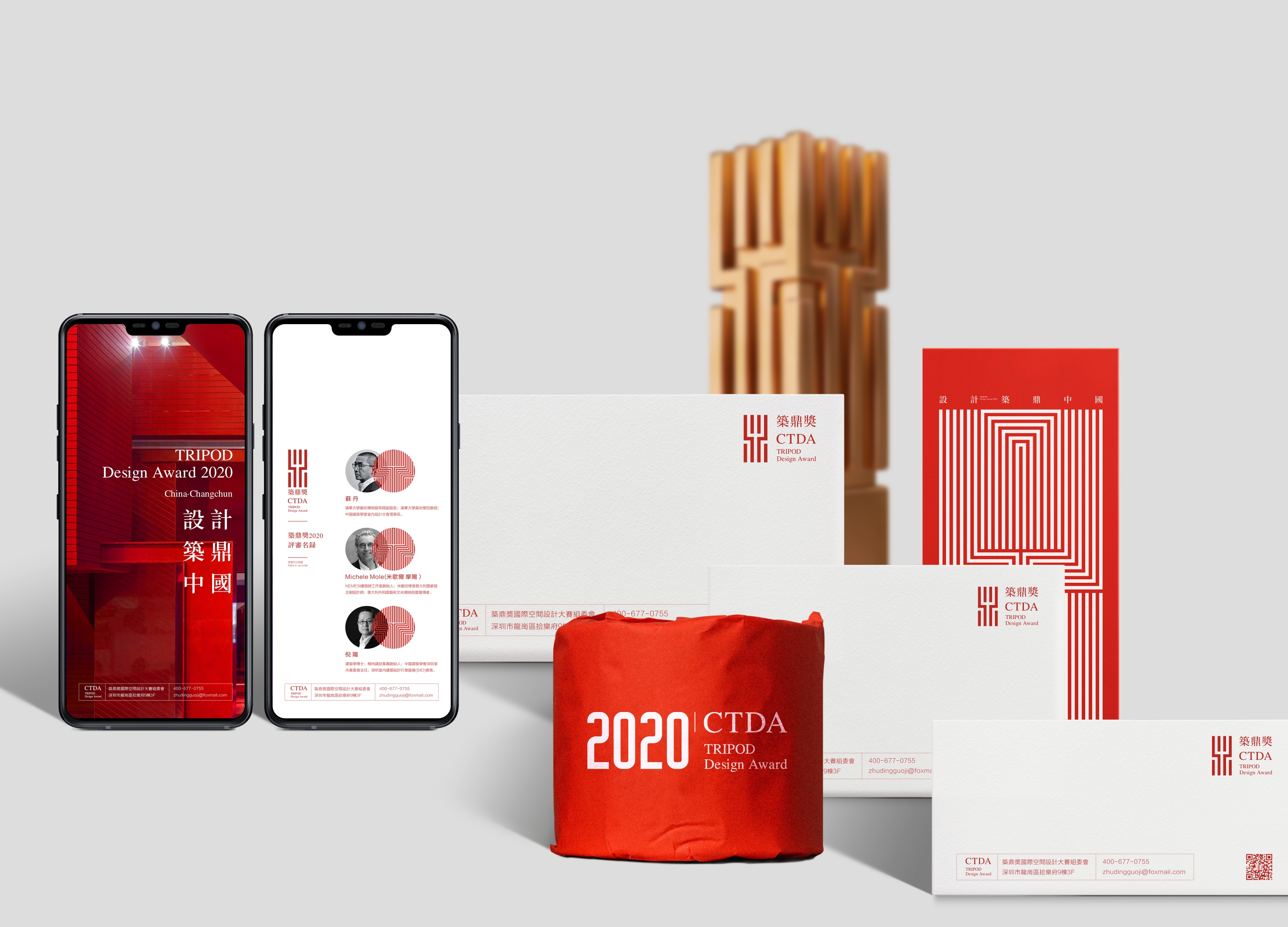
The main body of the logo is evolved from the Chinese word “Ding”, expressing the abidance by a professional and rigorous attitude, as well as integrity and authoritativeness; in the structure, some horizontal strokes are disassociated, standing for the selection principles of fairness, justice, and openness. As a whole, the logo embodies the industrial attribute with the beauty of tallness and straightness. As a standard color with a broad international perspective, Chinese Red symbolizes life and sustainable development.
Native
《筑鼎奖》视觉识别设计设计说明:筑鼎奖,由中国建筑学会室内设计分会指导,长春装饰设计行业商会发起并主办,特邀国际领域多国家及两岸四地一线导师及评委参与评审。标志主体由中文“鼎”衍变而成,表达恪守专业、严谨的态度,以及诚信力与权威性,在结构上抽离部分横向笔划,象征公平、公正、公开的评选原则,标志整体以挺拔之美体现行业属性。标准色中国红放眼国际视野,象征生命与持久发展,以汇聚中国创意设计精英智慧为宗旨,以推动中国设计行业发展为愿景,对设计者提出同步国际的设计标准,打造中国乃至世界最具影响力和创造力的设计大奖。支持单位:装饰行业上市企业设计联盟、东北师范大学美术学院、吉林建筑大学艺术设计学院。主办单位:筑鼎方舟文化传媒。
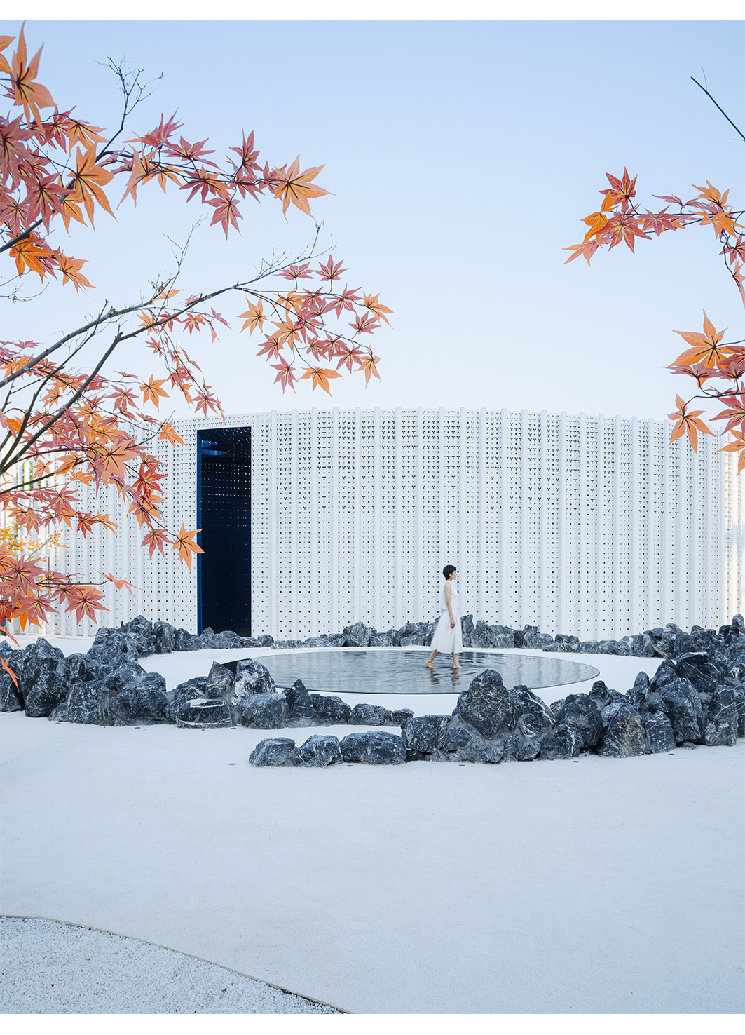
White Upland
Shanghai Huijian Investment
China
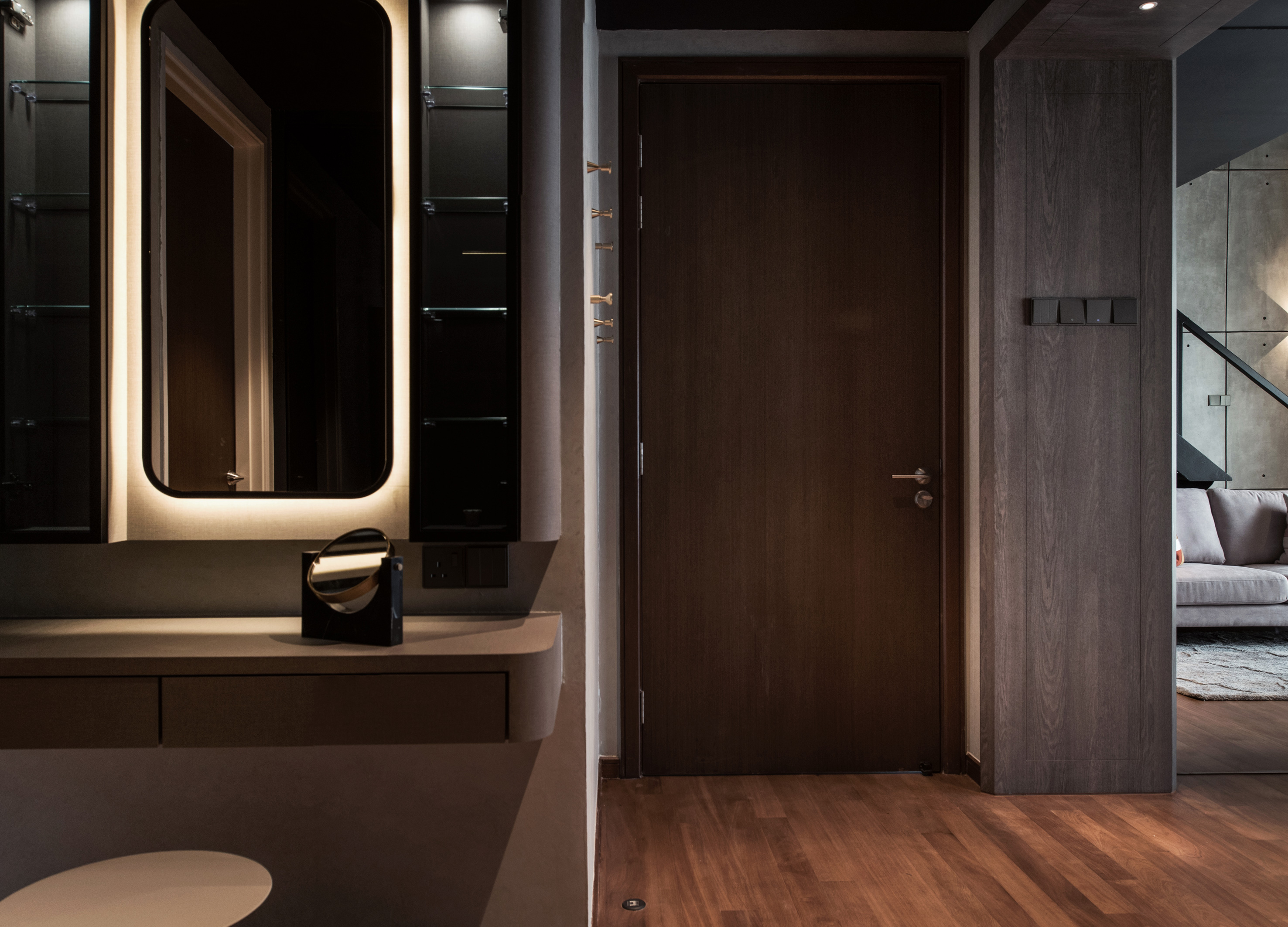
Ethos
Vault Design Lab
Malaysia
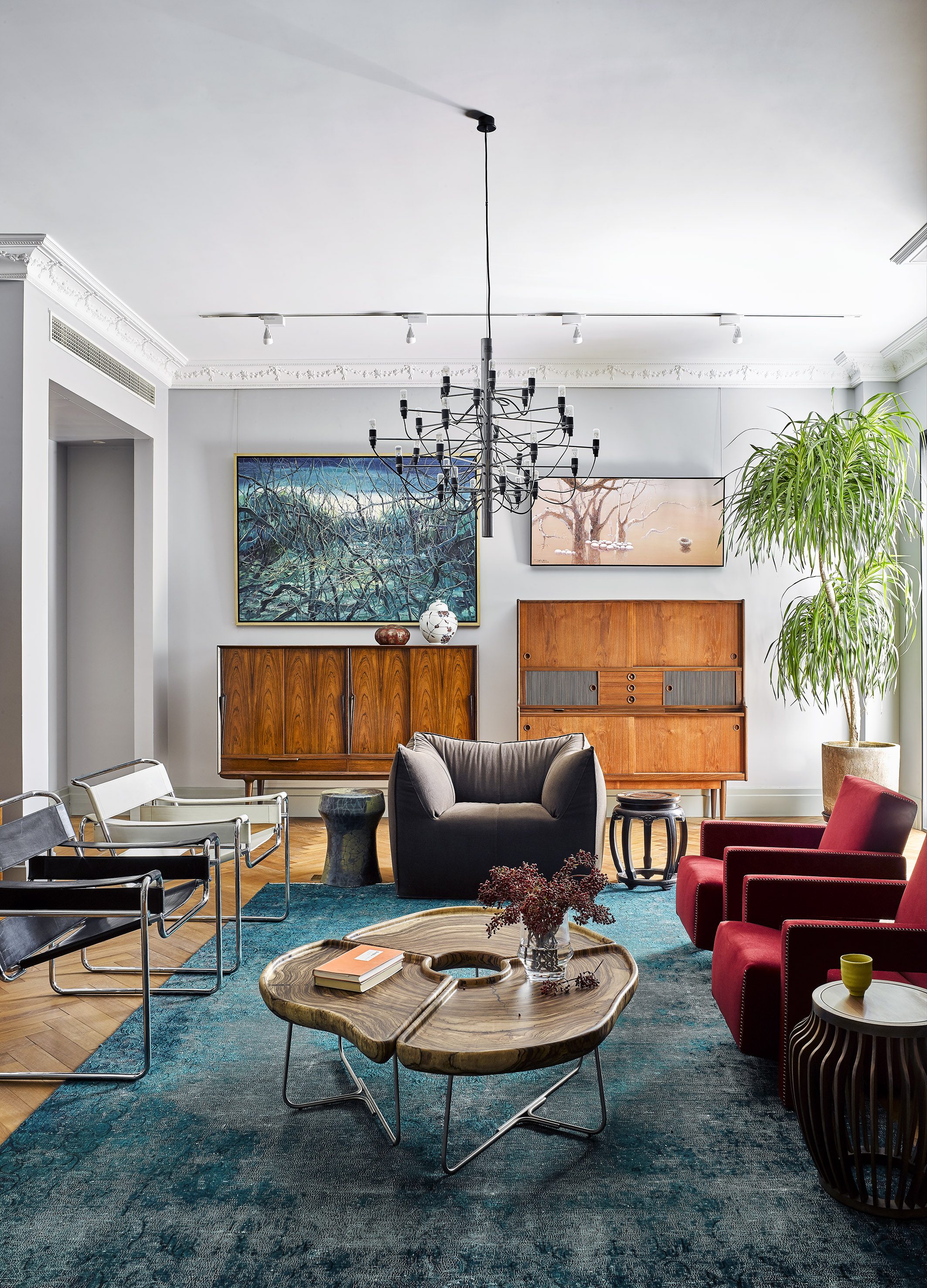
8C The Art home
8C
China

LECLAT Toothpaste
TOAON
Korea
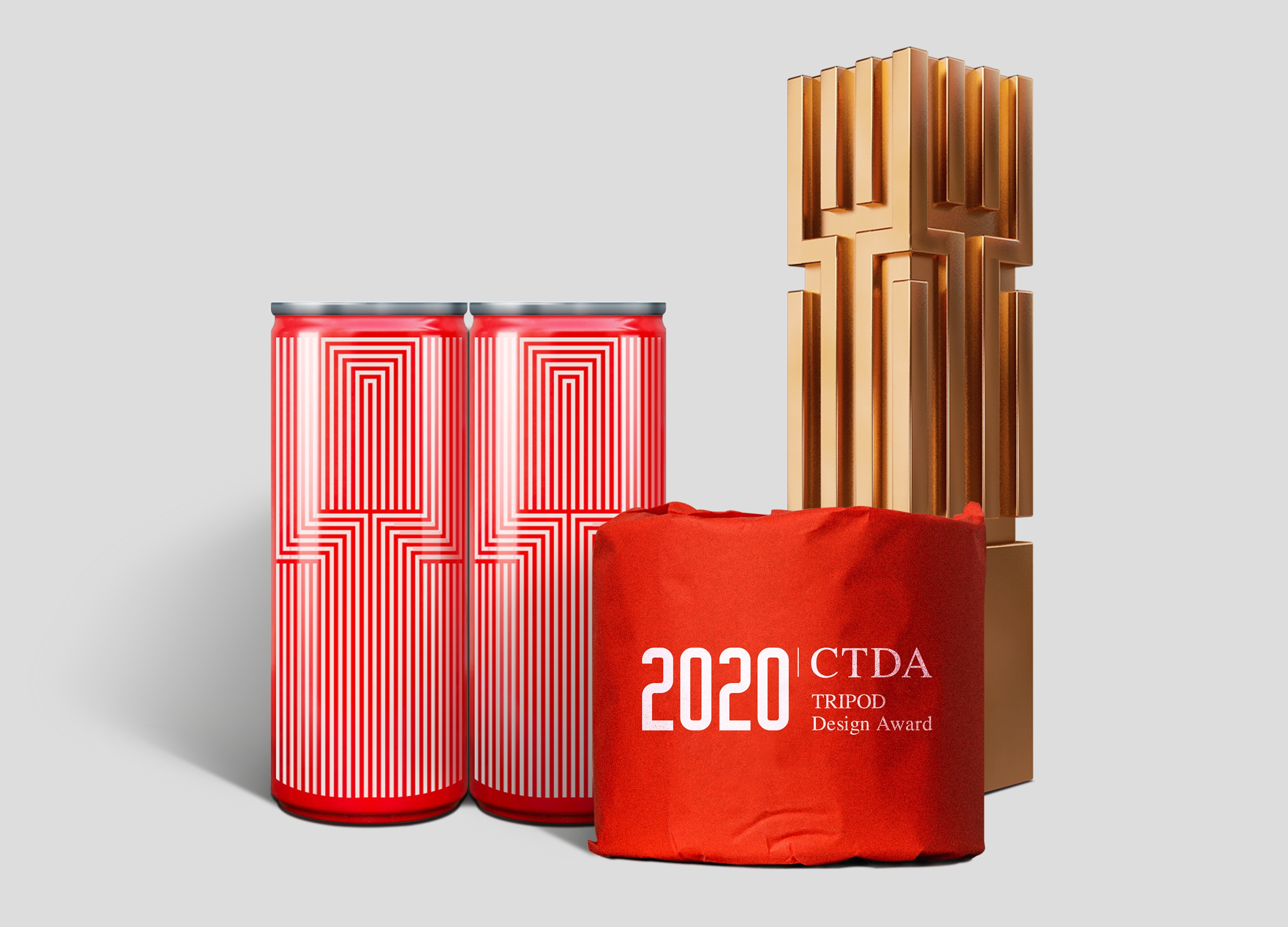
VI Design for Tripod Design Award
China
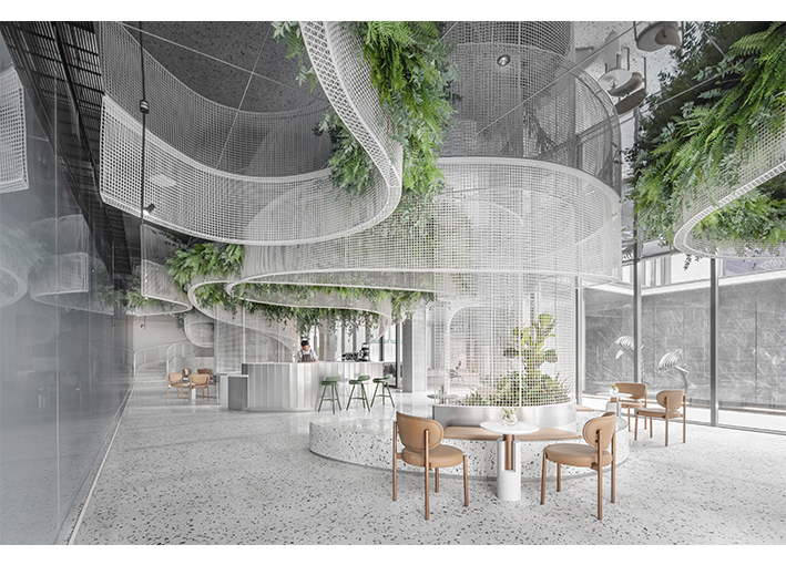
Fuzhou Vanke Times Treasure Sales Center
Shanghai Yuguo Decoration Design Co., Ltd.
China
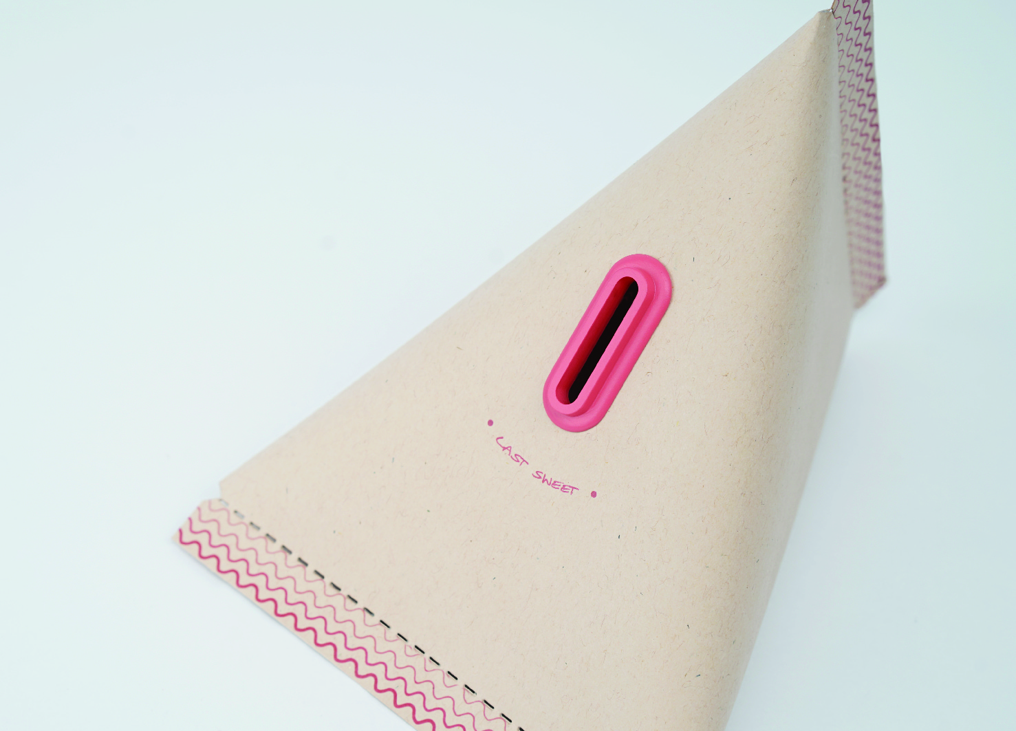
Last sweet -Money bag Design
The Guangzhou Academy of Fine Arts
China

SAPE
Incheon National University
Korea

Iceland Guest House
SAHMYOOK UNIVERSITY
Korea
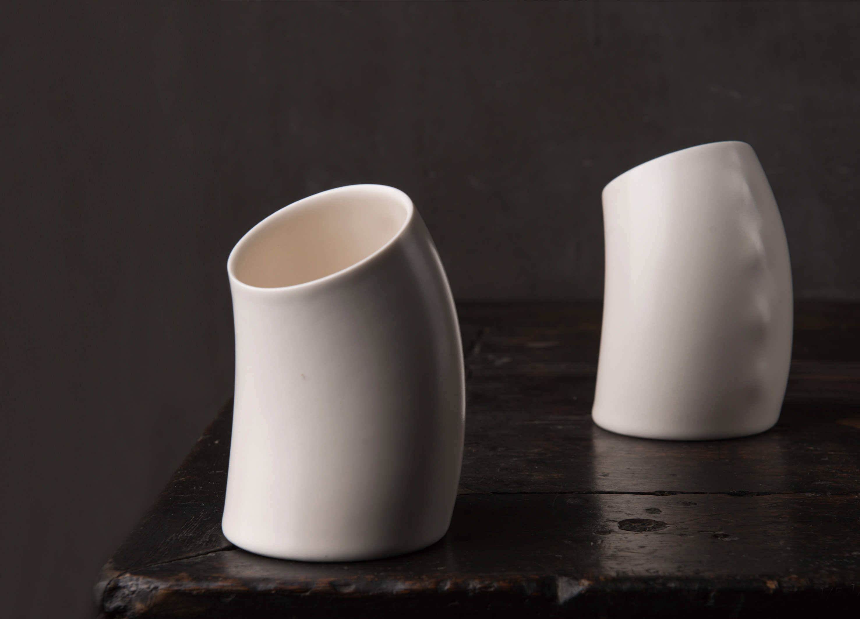
Bend
Jingdezhen Ceramic Institute
China
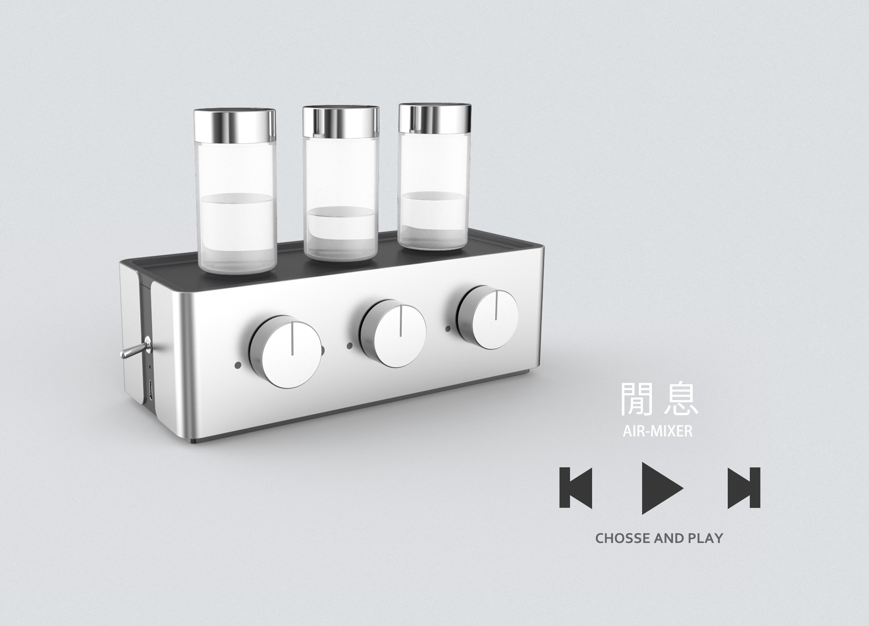
AIR MIXER DIFFUSER
Hong Kong Design Institute and BCU
CHINA HONG KONG

Sea Cleaner
Dalian Minzu University
China
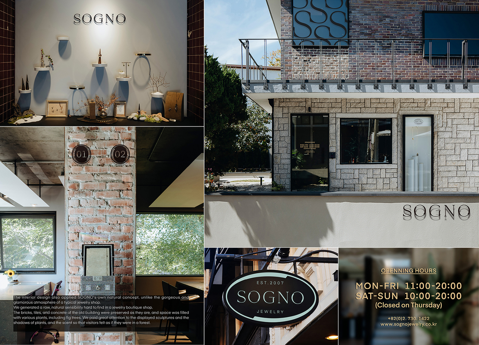
Sogno Brand Identity Design
named
Korea

Toky Terrace
CEST Design Studio
China
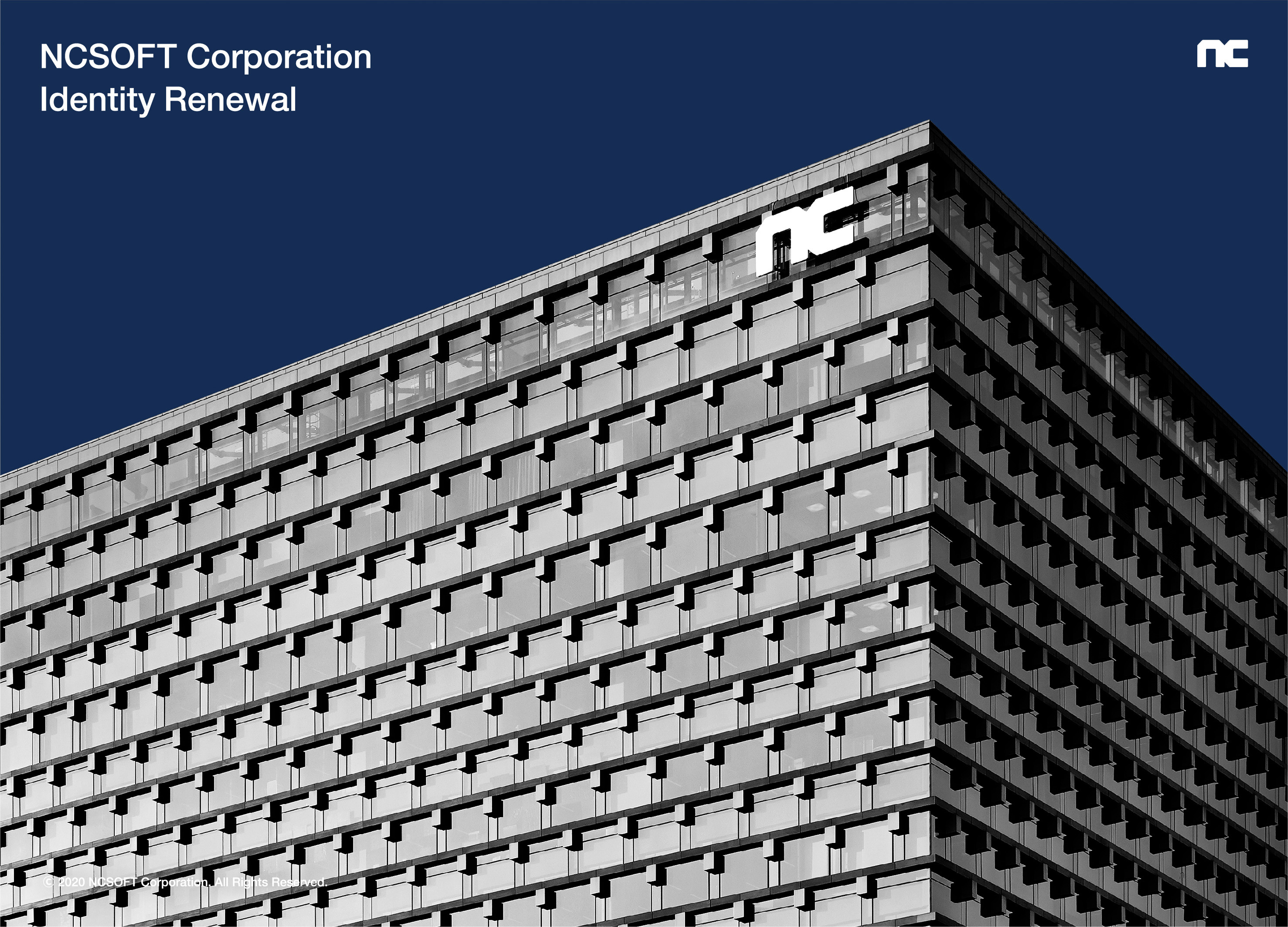
NCSOFT Corporation Identity Renewal
NCSOFT
Korea
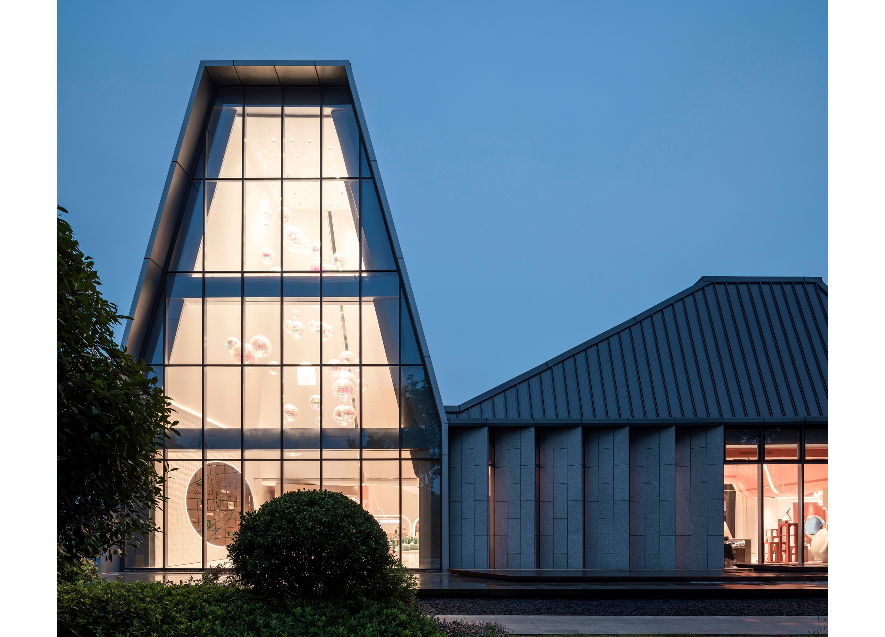
TIANTAI LAIXI SALES CENTER
MOD ARCHITECTURAL DESIGN
China
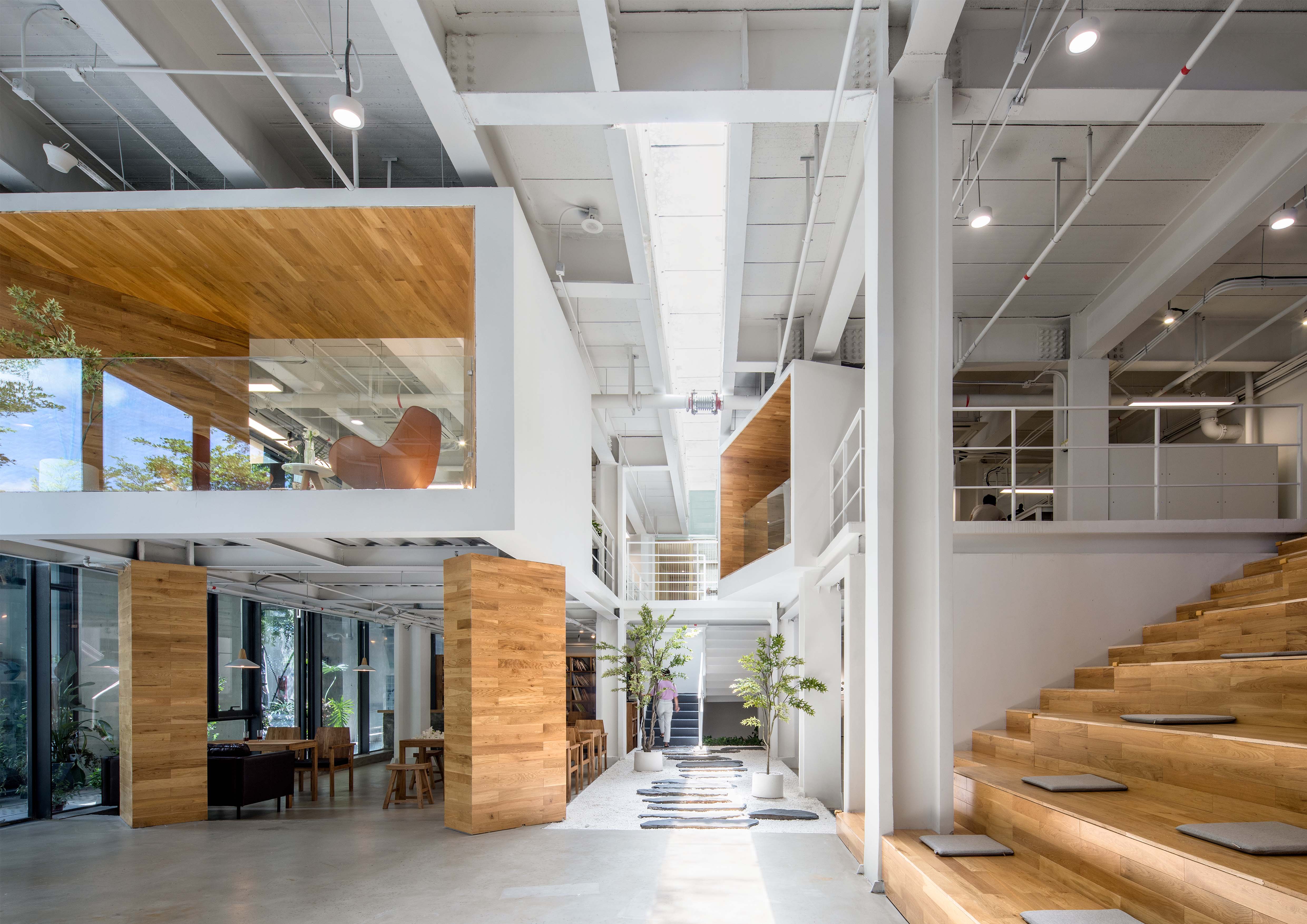
YIJING Architecture Design Studio
Shenzhen Yijing Architectural design
China
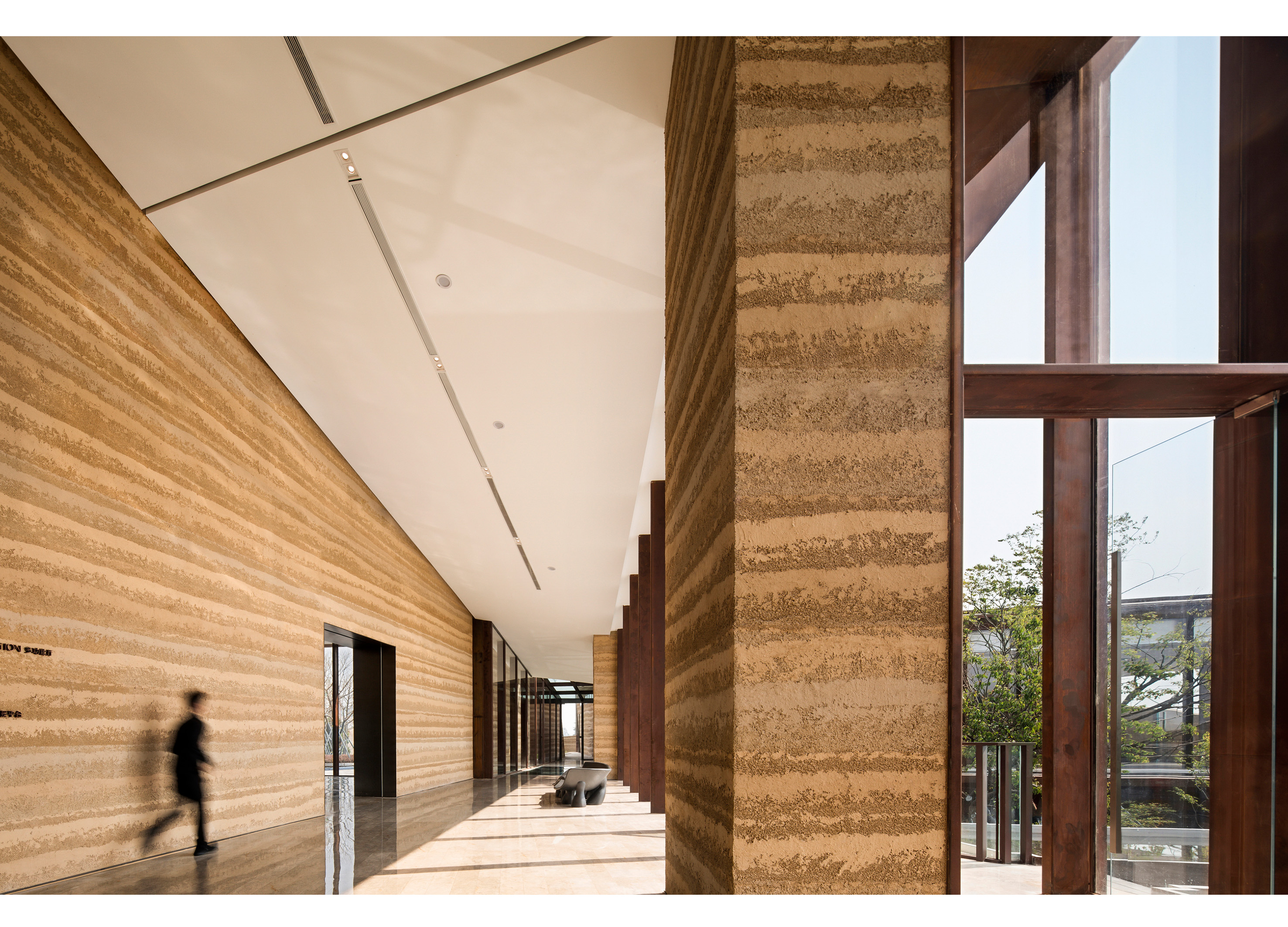
Shanhai Art Museum
IDMatrix
China
Partner & Sponsor
More


