
DREAM CANVAS STUDIO Visual Branding
| Country | Korea |
|---|---|
| Year | 2024 |
| Award | GRAND PRIZE |
| Client | DONG A ILBO |
| Affiliation | CHANNEL A BNC |
| Designer | JISANG YU, JONGBEOM CHOI |
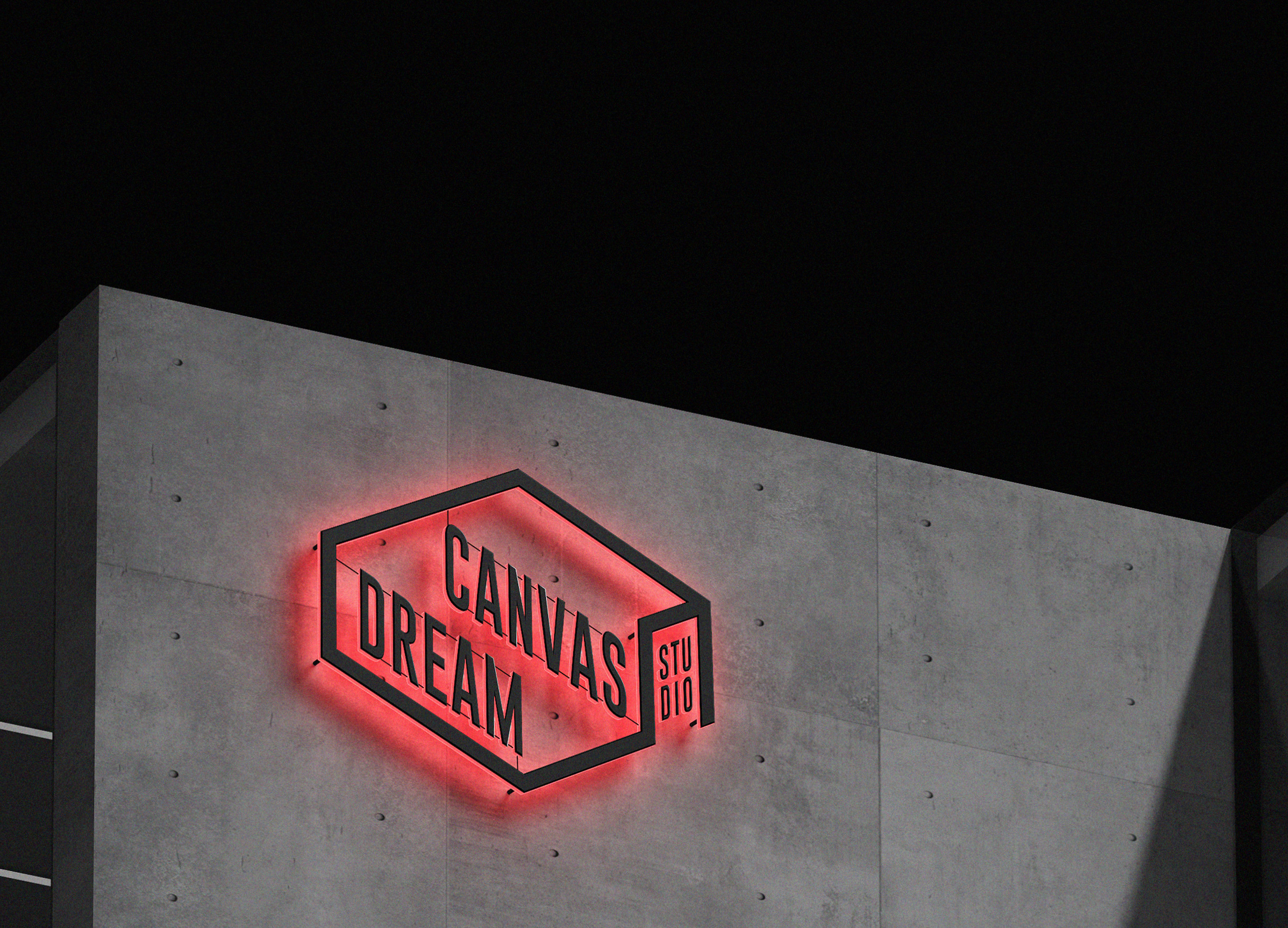
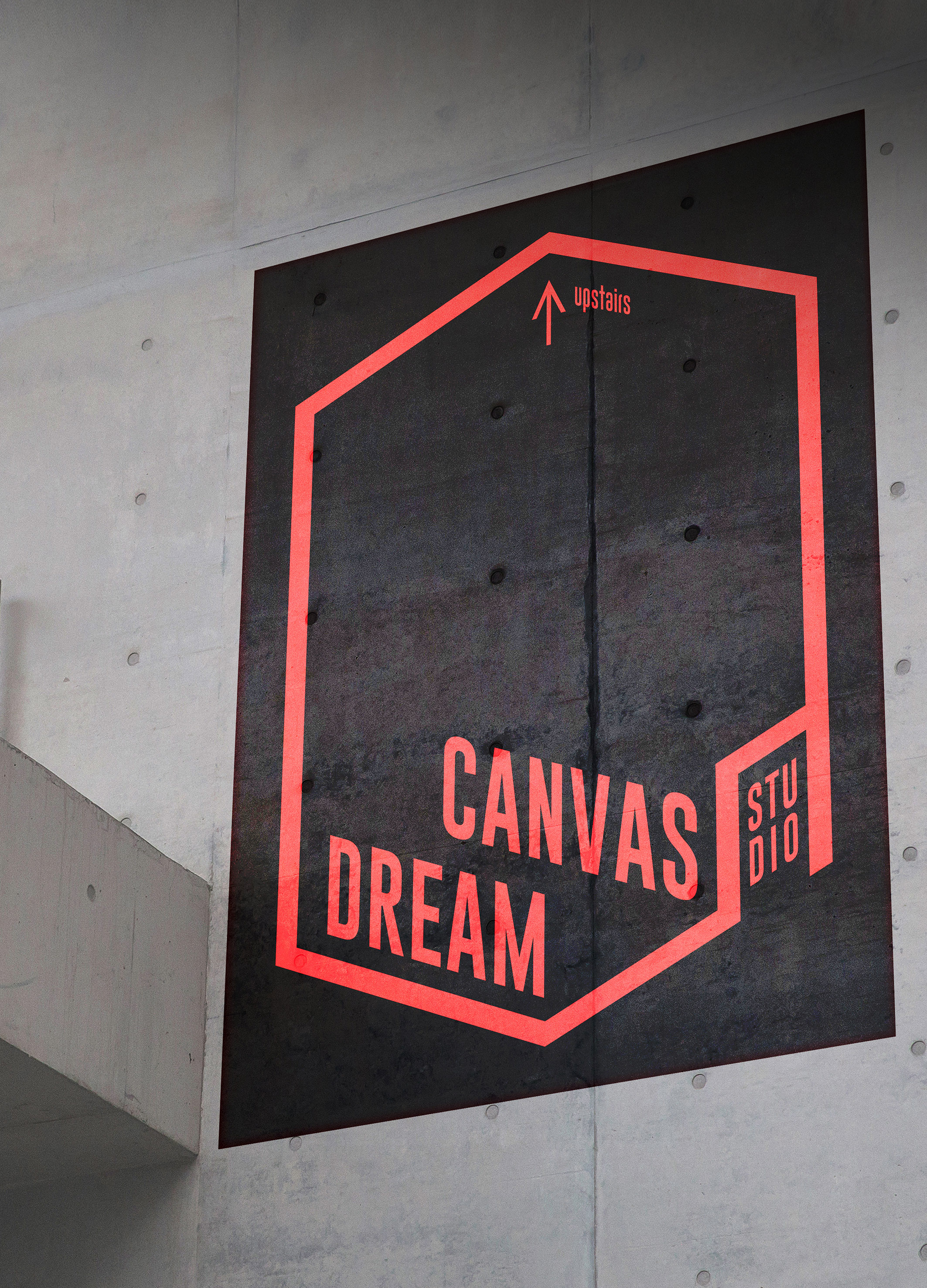
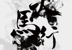
| English | Our goal was to create a design that anyone using <Dream Canvas Studio> could intuitively and easily recognize just by looking at the shape and color, and that <Dream Canvas Studio> would immediately come to mind. High visibility is ensured by using only a vivid orange color against a black background. This is a powerful advantage unique to <Dream Canvas Studio>, which can clearly convey information to the various signage used within the shooting location. In addition, the hexagonal logo shape that transforms up/down and left/right was designed so that various information generated at the shooting location can be easily applied to signage. |
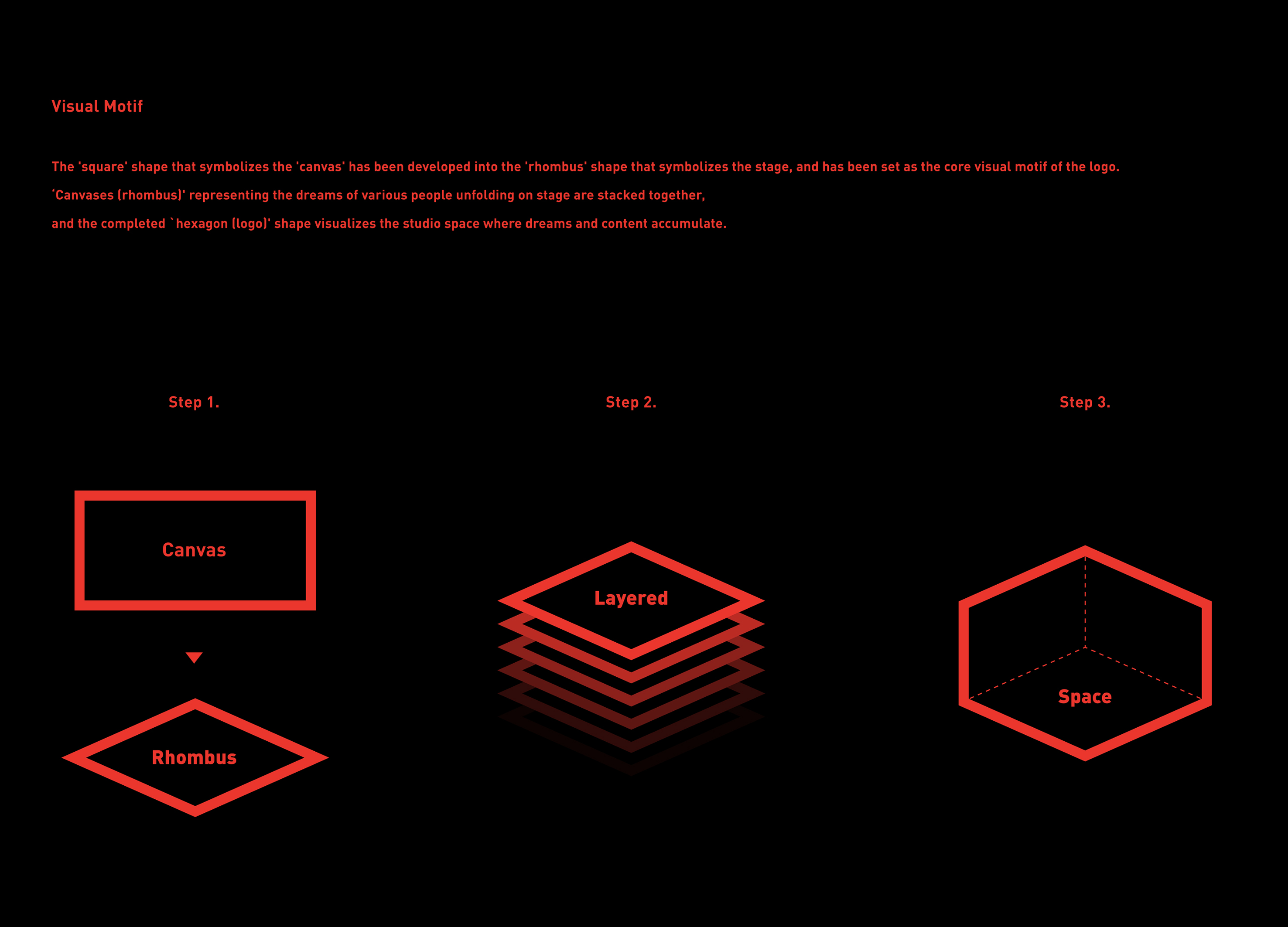
| Native | '캔버스'를 형상화하는 '사각'의 형태를 무대를 상징하는 '마름모'형태로 발전시켜 로고의 핵심 비주얼 모티프로 설정하였습니다. 무대위에서 펼쳐지는 다양한 이들의 꿈을 의미하는 '캔버스(마름모)'가 쌓이며 완성된 '6각형(로고)'의 형태는, 꿈과 콘텐츠가 쌓여가는 스튜디오의 공간을 시각화합니다. 또한 더욱 가치 있는 콘텐츠를 생산하기 위한 그들의 열정을 '주황색'으로 설정하여, 선명한 비주얼브랜딩을 전달하고자 하였습니다. <드림 캔버스 스튜디오>를 사용하는 누구나 형태와 컬러만 봐도 직관적이고 쉽게 인지할 수 있고, <드림 캔버스 스튜디오>가 바로 떠오르는 디자인을 만드는 것이 목표였습니다. 블랙 컬러를 배경으로 비비드한 오렌지 컬러만을 사용함으로써 높은 시인성을 확보하였습니다. 이는 촬영장 내 사용되는 다양한 사이니지에 선명한 정보 전달을 할 수 있는 <드림 캔버스 스튜디오>만의 강력한 장점입니다. 또한 위/아래, 좌/우로 변형되는 육각형의 로고 형상은 촬영장 내 발생하는 다양한 정보를 사이니지에 무리 없이 적용할 수 있도록 설계하였습니다. <드림 캔버스 스튜디오>의 브랜딩은 단순히 멋져 보이는 시각적 표현만을 전달하는 것이 아닌, 열정을 다해 K-콘텐츠를 제작하는 현장의 많은 이들에게 더 나은 꿈과 영감을 줄 것이라 확신합니다. |
| Positive Comments |


|
| Judging Comments | DREAM CANVAS STUDIO Visual Branding, crafted by CHANNEL A B&C, was awarded the 'Grand Prize' at the Asia Design Prize 2024 for its distinctive and intuitive branding approach. The jury valued the strategic use of vivid orange against a black background for high visibility and instant recognition, a feature that makes <Dream Canvas Studio> stand out. The adaptable hexagonal logo design, facilitating easy application of various information on signage within the shooting location, was noted for its innovative and practical application in enhancing brand identity. This design's ability to communicate effectively in diverse settings while maintaining simplicity and brand recall secured its top spot. |
-
MiCareo Brand Design
-
healthy tea & caramel
-
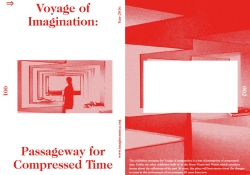
Passageway for compressed time
-
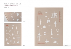
Gyubang Culture and Art - wisdom of life and beauty of use
-
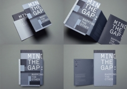
Mind The Gap
-
Sesi (All the time in the world)
-
THE LOVING INSTRUCTION MANUAL
-
Thermos Bauhaus Bottle Pattern Design
-
Women’s Life Brand, AUDREY SUN
-
Zero Zero Recycle Brand Design
-
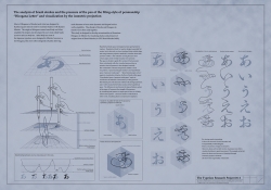
Typeface Research Project
-
CD Cover for Jan Heinrich
-
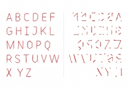
Covert-regular / Covert-irregular Typeface
-
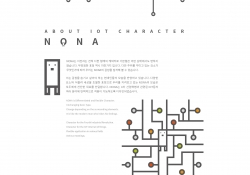
IOT COMMUNICATION CHARACTER
-
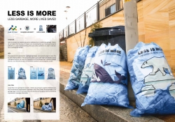
LESS IS MORE
-
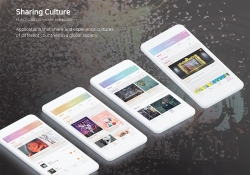
SHARING CULTURE
-
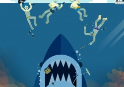
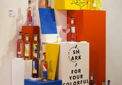
[PACKAGE DESIGN] 'THE SHARK' causal wine brand.
-
Seating Guide
-
Ridiculous Thoughts of 'TIAN MA XING KONG'
-
4D Museum of Space
-
Origami animal tickets for children

Designed by sketchbooks.co.kr / sketchbook5 board skin