
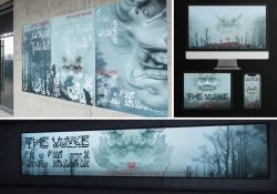
Artiant Hub Branding Design
| Country | China Hong Kong |
|---|---|
| Year | 2024 |
| Award | WINNER |
| Affiliation | VINCDESIGN |
| Designer | Vince Cheung, Kaman Kan |
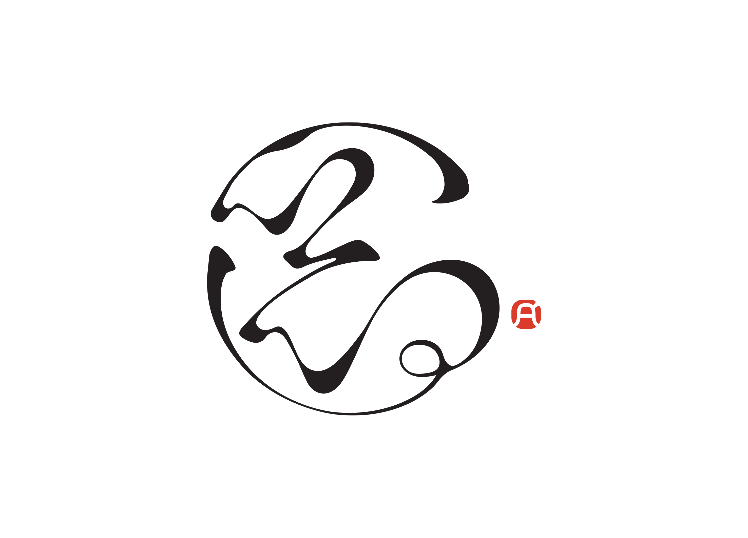
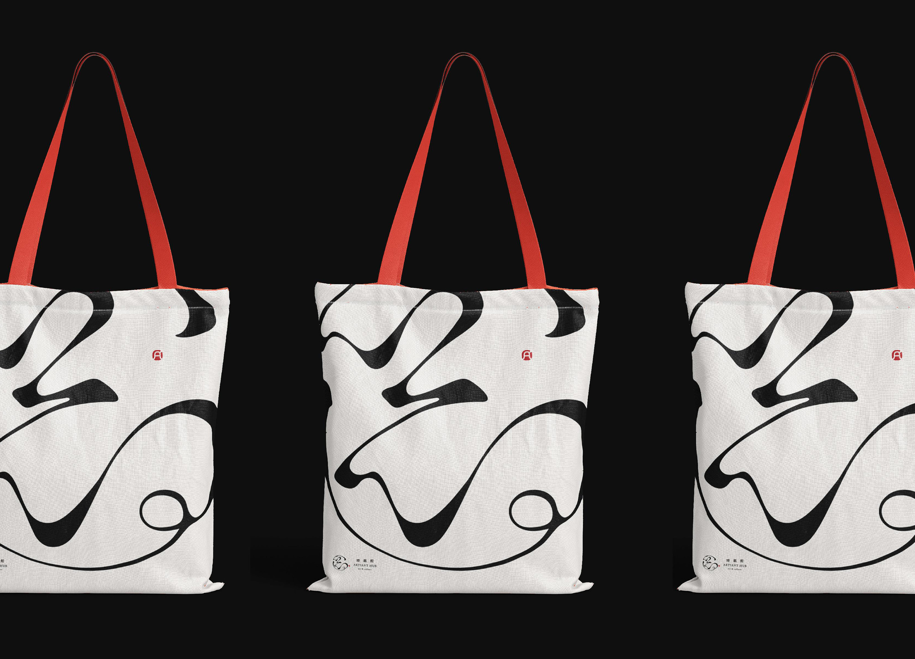
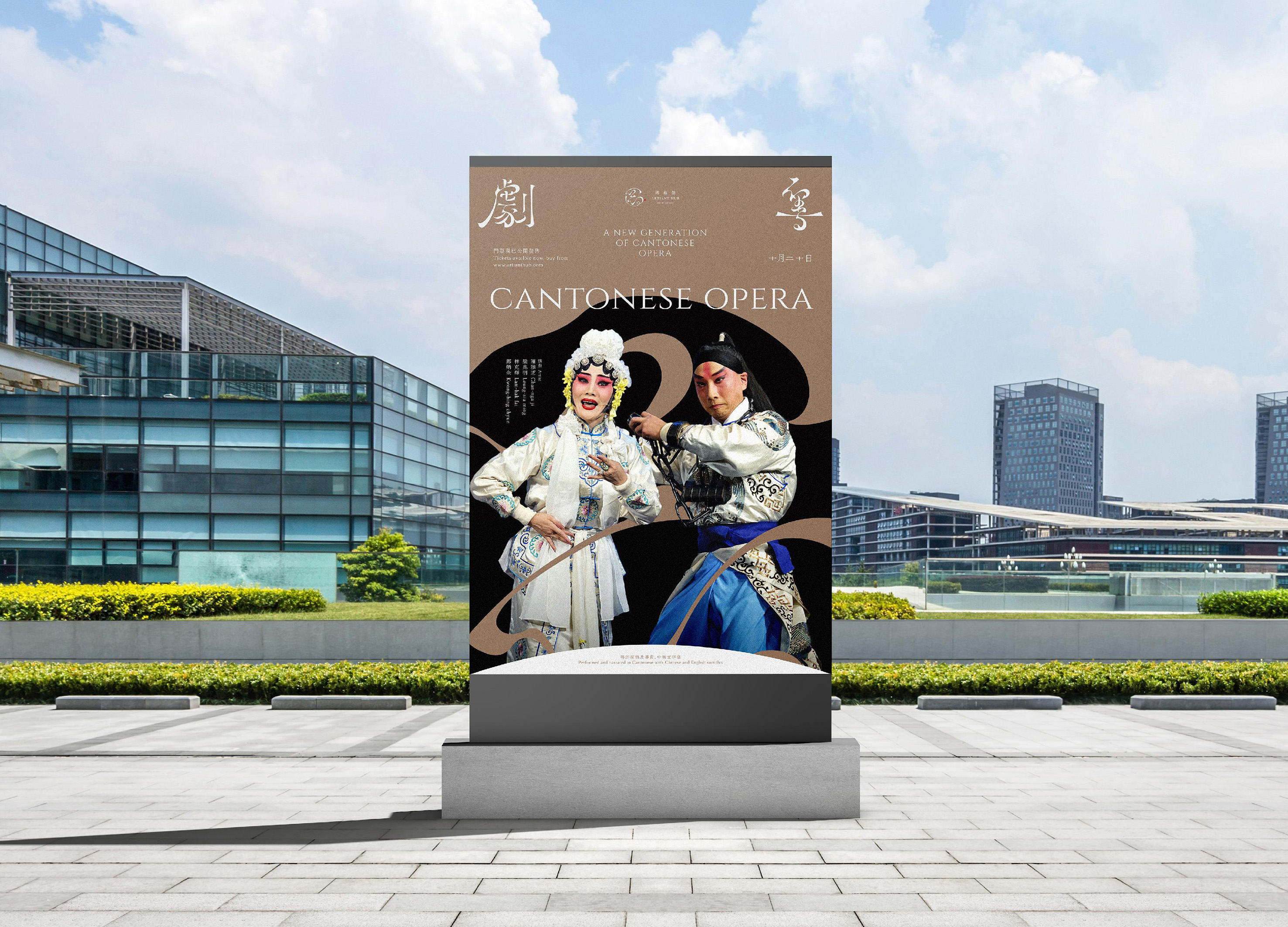
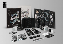
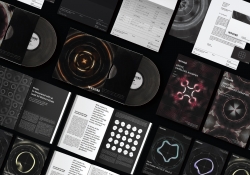
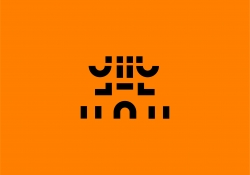
| English | Artiant Hub's branding is an ode to oriental art. Inspired by Liu Bai, a technique in Chinese brush painting, intentional white spaces symbolize that the unsaid carries deeper meaning. Visualized through Chinese calligraphy, it preserves ancient oriental art, emphasizing that much of the message is in what's unsaid. The logo, merging "藝" and action from Chinese opera, blends Eastern traditions with modern design, signifying Artiant Hub's commitment to bridging cultural gaps. |
| Native | Artiant Hub에 대한 브랜딩은 동양 예술의 미학으로 가득 차 있습니다. Liu Bai는 중국 서예의 독특한 기술로, 일러스트레이션에 의도적으로 빈 흰 공간을 남깁니다. 이 철학은 공백이 비어 있는 것이 아니라 깊은 의미를 전하며 관객의 해석을 통해 굳은 공간으로 여겨지는 것을 개념화합니다. 때로는 메시지의 상당 부분이 말하지 않은 것에 내재되어 있다는 것을 상징합니다. 특히 이러한 이념은 중국 서예를 통해 시각화되고 강조됩니다. 고대 동양 예술을 보존하기 위해 상상력으로 완성되기를 기다리는 이 흰 공백은 모든 예술 분야의 애호가들이 자신의 관심사를 추구할 수 있는 개방적이고 시대를 초월한, 포용적인 공간을 나타냅니다. 로고는 "藝" 문자와 광동 오페라에서 온 수어(水袖)를 특징으로 하며 동양 전통과 현대 디자인을 융합합니다. 이 철학은 문화적 격차를 줄이기 위한 Artiant Hub의 헌신을 강조합니다. |
| Positive Comments |


|
| Judging Comments | Artiant Hub's branding was highly praised for its masterful integration of traditional Eastern aesthetics with modern design principles. The use of Liu Bai, or intentional white space, alongside elements of Chinese calligraphy and opera in the logo, was celebrated for its deep cultural resonance and innovative approach to conveying meaning through the unsaid. This design effectively bridges cultural gaps, showcasing a profound respect for oriental art traditions while engaging a contemporary audience, highlighting Artiant Hub's dedication to preserving and contemporizing ancient artistic philosophies. |
-
TAFALONG Visual Design
-
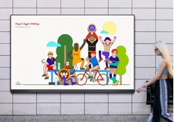
Welcome Bank Walking Visual Identity Design
-
Golden Brushstrokes on Azure
-
NYGDESIGN Identity Rebrand
-
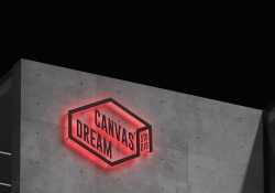
DREAM CANVAS STUDIO Visual Branding
-
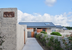
hohe Gyeongju Pool Villa Branding
-
POSTECH Changeup Ground Leaflet
-
Shuiyue Dongtian
-
WEATHER IN NEXEN
-
Hifive
-
Utsuroi
-
Change is the Only Difference Textile Series
-
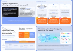
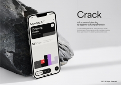
CRACK
-
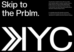
KYC Brand eXperience Design
-
Sustainable Regeneration Consciousness
-
Dear Earth
-
YOYO
-
Vocal Island
-
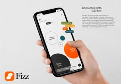
FIZZ
-
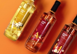
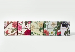
Nature Tea Syrup Bottle and Packaging Design
-
Christmas Light Fantasia
-
SUM Air Brand Identity Design
-
WATER 2 App And Charger Display
-
Banana paper projects Ashi
-
Niigata Kameda Distillery
-
MUTSRUM the beauty of Najeon Chilgi in Korea
-
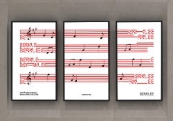
Berklee College of Music
-
Hosil
-
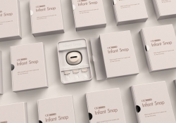
Infant Snap
-
INSOUND
-
Exlicon MX A drawing tool without boundaries
-
lalaif
-
NILTO
-
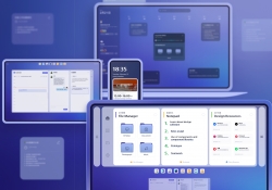
Ding OS Collaborative Computing OS
-
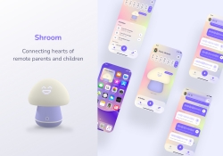
Shroom
-
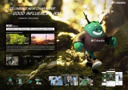
Columbia New character IKKI
-
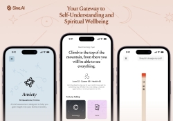
Sine AI
-
BURNOUT SYNDROME THERAPY
-
After
-
Heineken Talk Label
-
Eco Friendly Dolmen
-
Suwon Hwaseong branding project
-
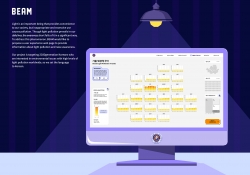
BEAM Light Pollution Data Visualization
-
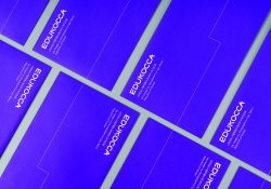
EDUKOCCA Brand eXperience Design
-
Artiant Hub Branding Design
-
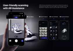
VRIN 3D
-
361 degree kids Jump Rope Limited Packaging
-
Plu packaging design
-
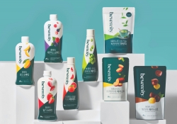
BEVERCITY brand design
-
CREATIVIA Metaverse Platform
-
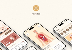
PulseHeal
-
Braille Emoji Design
-
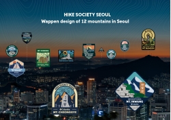
Columbia WAPPEN of 12 moutains in Seoul
-
NEXERA
-
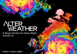
KISANGCHEONG Alter Weather
-
Growlin
-
SPLASH
-
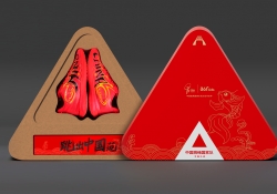
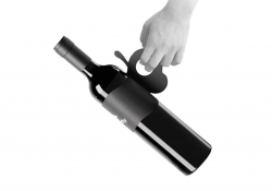
Creative packaging design of red wine
-
Cuppy bird
-
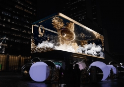
Touring Torch

Designed by sketchbooks.co.kr / sketchbook5 board skin