
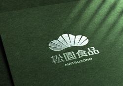
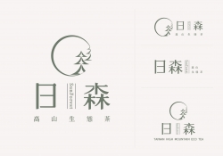
Matsu HandPulled Noodle Brand Design
| Country | Chinese Taipei |
|---|---|
| Year | 2023 |
| Award | WINNER |
| Client | Matsu Co., Ltd. |
| Affiliation | IDEAMAX DIGITAL VISUAL DESIGN Co., Ltd. |
| Designer | HUNG JUI CHUN AND LIN CHUN CHANG |
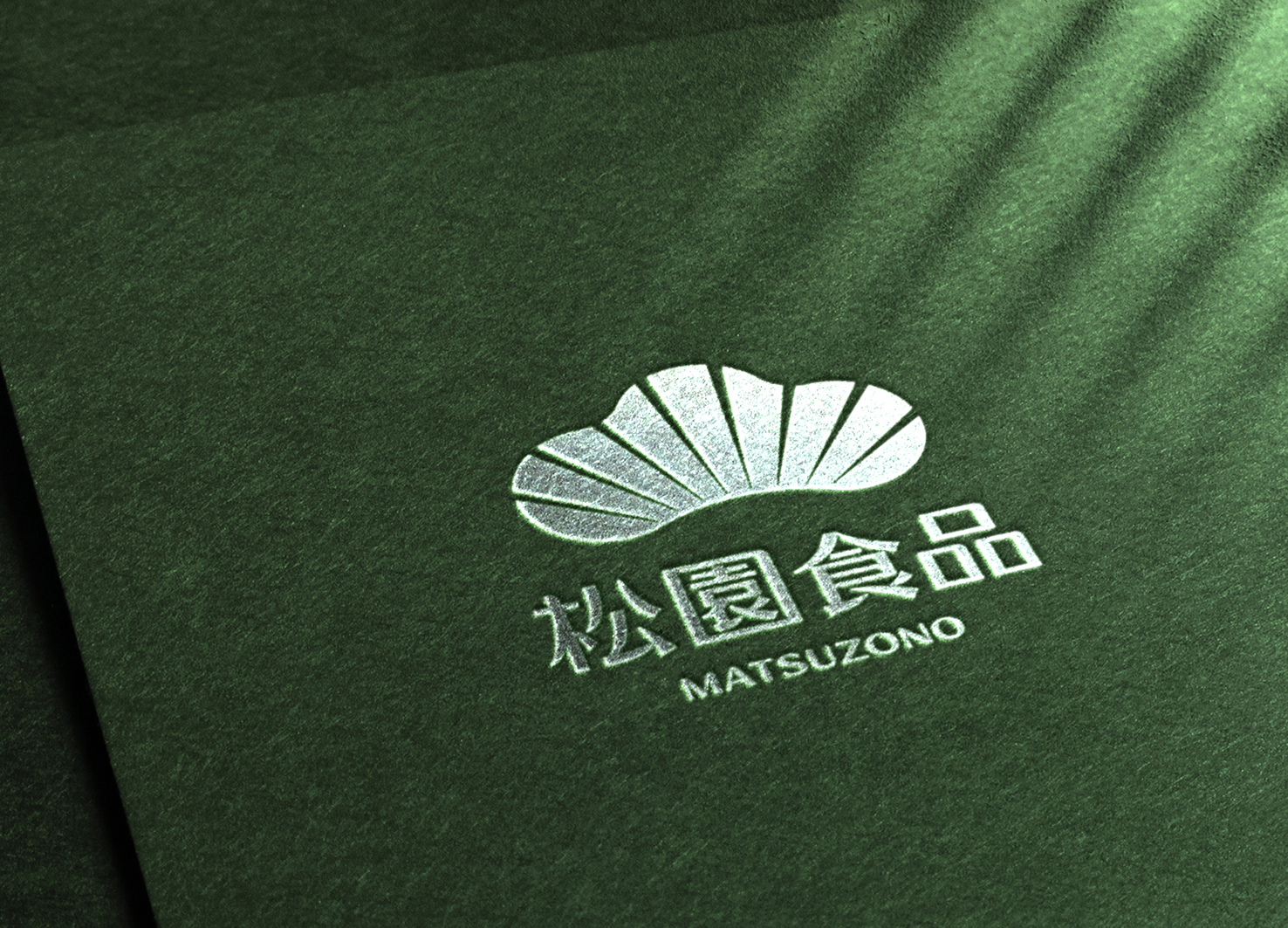
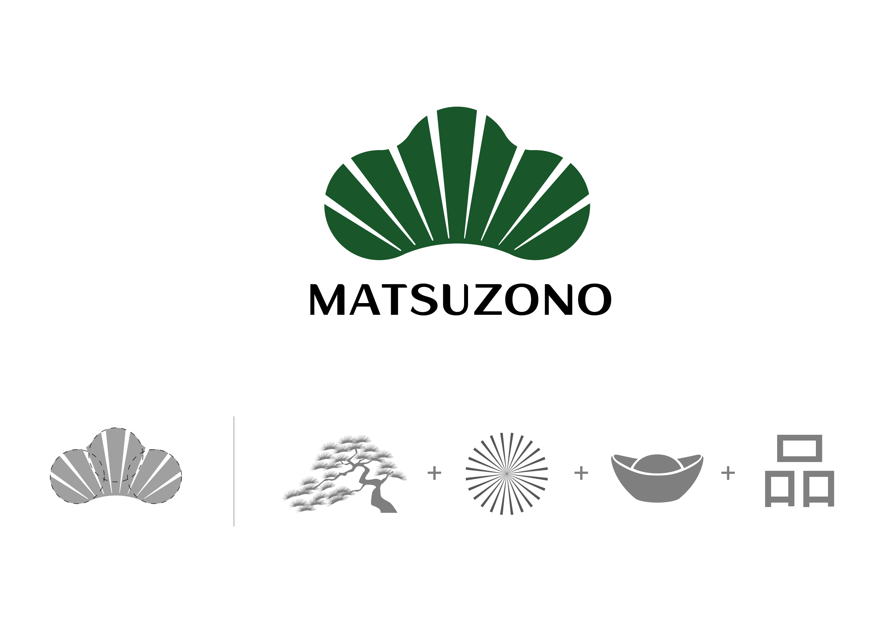
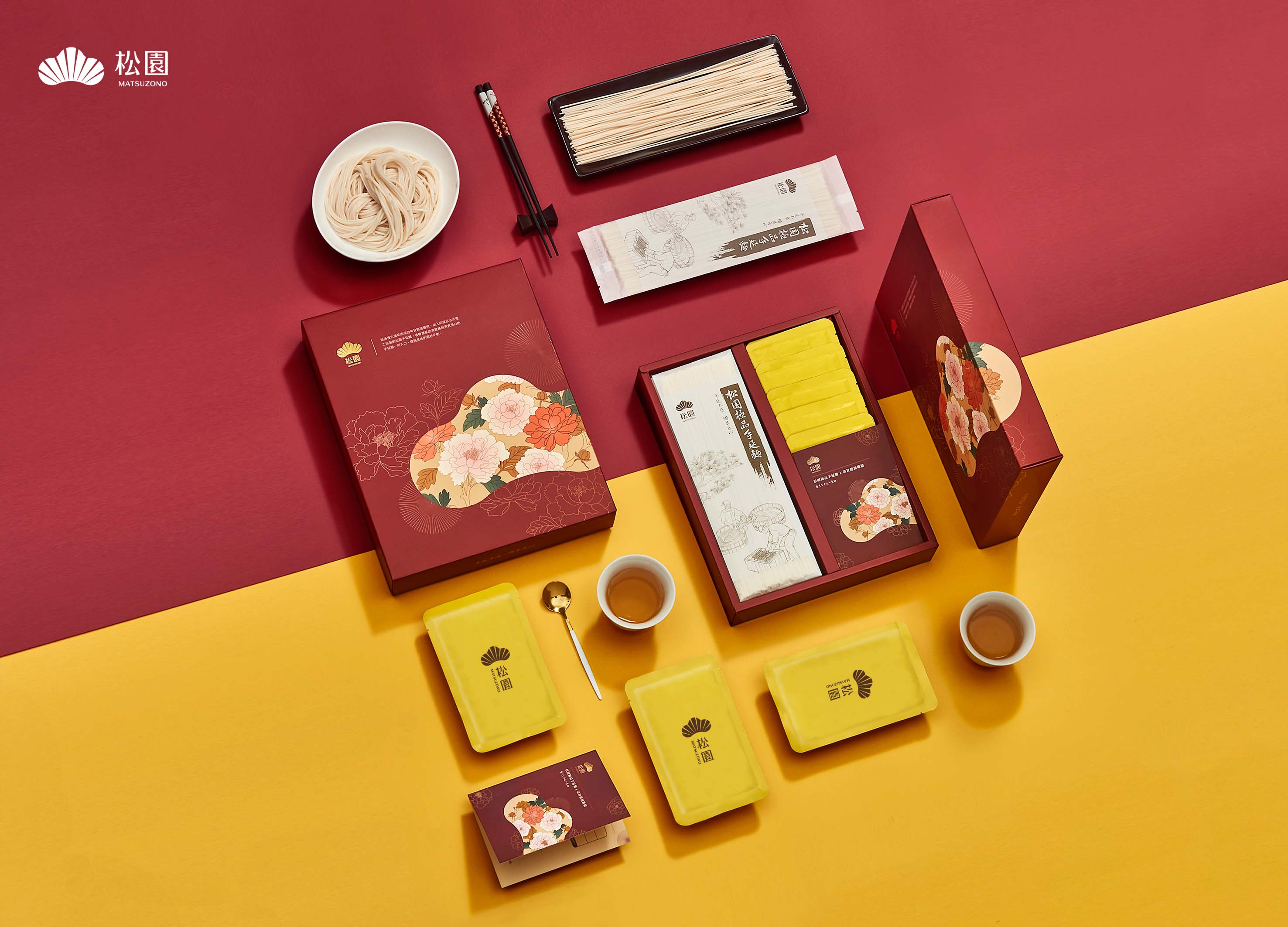
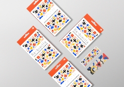
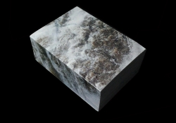
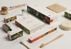
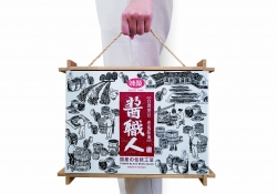
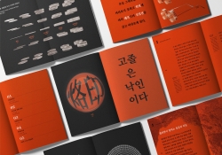
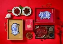
| English | Matsu means Garden of Pine Trees, so the Logo shows a pine tree cut by eight rays of light into nine sections to indicate long-standing auspiciousness. Three overlapping circles are in place to form Ping, a Chinese word for quality, and to infer that quality is of the essence in Matsu. Shaped like an ancient monetary ingot to mean Fortune, the Logo is viewed as a family emblem illustrating a spirit of professionalism and that Matsu makes the best hand-pulled noodles by adhering to the emblem ethos. The logo is also extended to the packaging with exquisite gold-lined Eastern floral patterns for a unique visual layout that is regal yet low-key. |
| Native | 「麵為絲,技為針,穿針引線間,需剛柔並濟,才能織成藍圖大網。」是松園的企業核心。松園秉持日本工匠精神,堅持遵循日式古法技術,歷經48小時與16道工法研製方能完成美味的手延麵。松園也致力於無添加物麵的製作,堅持回歸麵食原點,僅採用麵粉、水、鹽三種成分進行加工。 而松園的松字意旨長青、長壽;園字表特定的區域。品牌更寓意為「一輩子只堅持做好一件事」,亦象徵松園食品一輩子秉持健康飲食及職人的精神製作美味麵食。在Logo設計中,以松樹作為主體,並形成三個圓圈表述品質至上的品字。其中採用8道白光將色塊切為9份,象徵長長久久的吉祥意象。而8道白光與整體造型更形成「元寶」之財源概念。松園將Logo視為家徽,闡述職人精神,並遵循家徽宗旨製作最好的手延麵。 本設計亦將Logo大方導入品牌禮盒視覺,並採用東方日式、精緻的繪製調性,琢磨花卉間的金色線條,加上Logo燙金質感與背景素雅底紋,讓禮盒呈現高尚既內斂風格,也形成松園獨有的視覺排列方式與設計。 |
| Positive Comments |


|
-
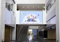
Intelligent Water Resources Dispatch System
-
4Paradigm Sage AIOS Packaging Design
-
NC PLAY PROJECT
-
ScienceCom
-
SAIO
-
Welcome Digital Bank Visual Identity
-
Care Together Happy Together Visual branding
-
Manna corporate identity design
-
Pingtan Book House
-
Korean Medicine Blooms
-
Re Braille
-
4Paradigm Pandemic Prediction System Design
-
UNAJIRO VI
-
Graphic design for Gwangju city commemoration
-
The Worldly book design
-
Bexei The Wandering Earth
-
Garden Salt
-
SFOC Visual Identity
-
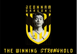
Jeonnam Dragons Football Club Rebranding
-
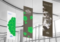
Law Greening Workshop
-
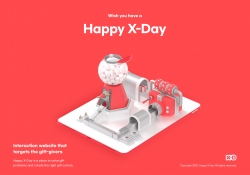
Happy X Day
-
Care U Most
-
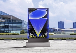
2022 Graduation exhibition GROW GLOW
-
Bubble Bomb
-
Energy Utopia
-
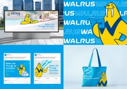
WALRUS PUMP Brand Design
-
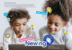
Newing
-
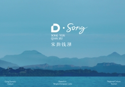
The Song rhythm of Dongqian Lake
-
SHIN KONG Bank Light Evolution
-
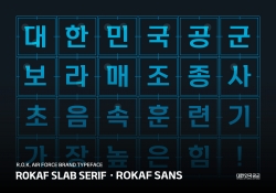
ROKAF Typeface
-
THE PENTHOUSE Visual Branding
-
BE BETTER Packaging for the Earth in 2050
-
TAIWAN LANTERN FESTIVAL IN KAOHSIUNG
-
YNL Design CI Renewal
-
Sauce Expert
-
Project Echo
-
Zaishengdao Rice Packaging Design
-
Butak Care app services for care workers
-
Prejudice
-
Origami Amenities
-
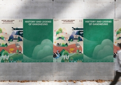
History and Legend of Gangneung
-
Concept ARC Dual Flush Valve
-
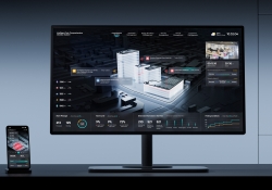
Midea Industrial City smart operation of IOC
-
MY CHOICE Visual Branding
-
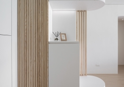
SHIFTDOOR RESIDENCE Brand Identity
-
TL BRAND DAY in NC PARK
-
NCSOFT Leaders Kit
-
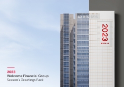
Welcome FG Seasons Greetings Pack
-
Matsu HandPulled Noodle Brand Design
-
TOLOKAH Brand Design
-
Tuntex Branding
-
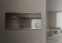
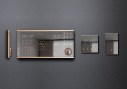
Smart Home Network Wall Pad HDHN4000
-
Sunforest
-
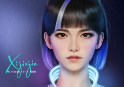
XIJIAJIA An AI Digital Human
-
Breeze White
-
AIOT Smart Park Integrated System
-
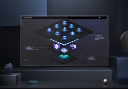
4paradigm Sage HyperCycle CESS
-
60 year memories of WAN CHUAN HSING
-
Smart Home Solution System HDHN 4000SET
-
DNAKE Sapphire Series

Designed by sketchbooks.co.kr / sketchbook5 board skin