Matsu HandPulled Noodle Brand Design
Communication
Regions
Chinese Taipei
Year
2023
Award
WINNER
Client
Matsu Co., Ltd.
Affiliation
IDEAMAX DIGITAL VISUAL DESIGN Co., Ltd.
Designer
HUNG JUI CHUN AND LIN CHUN CHANG
English
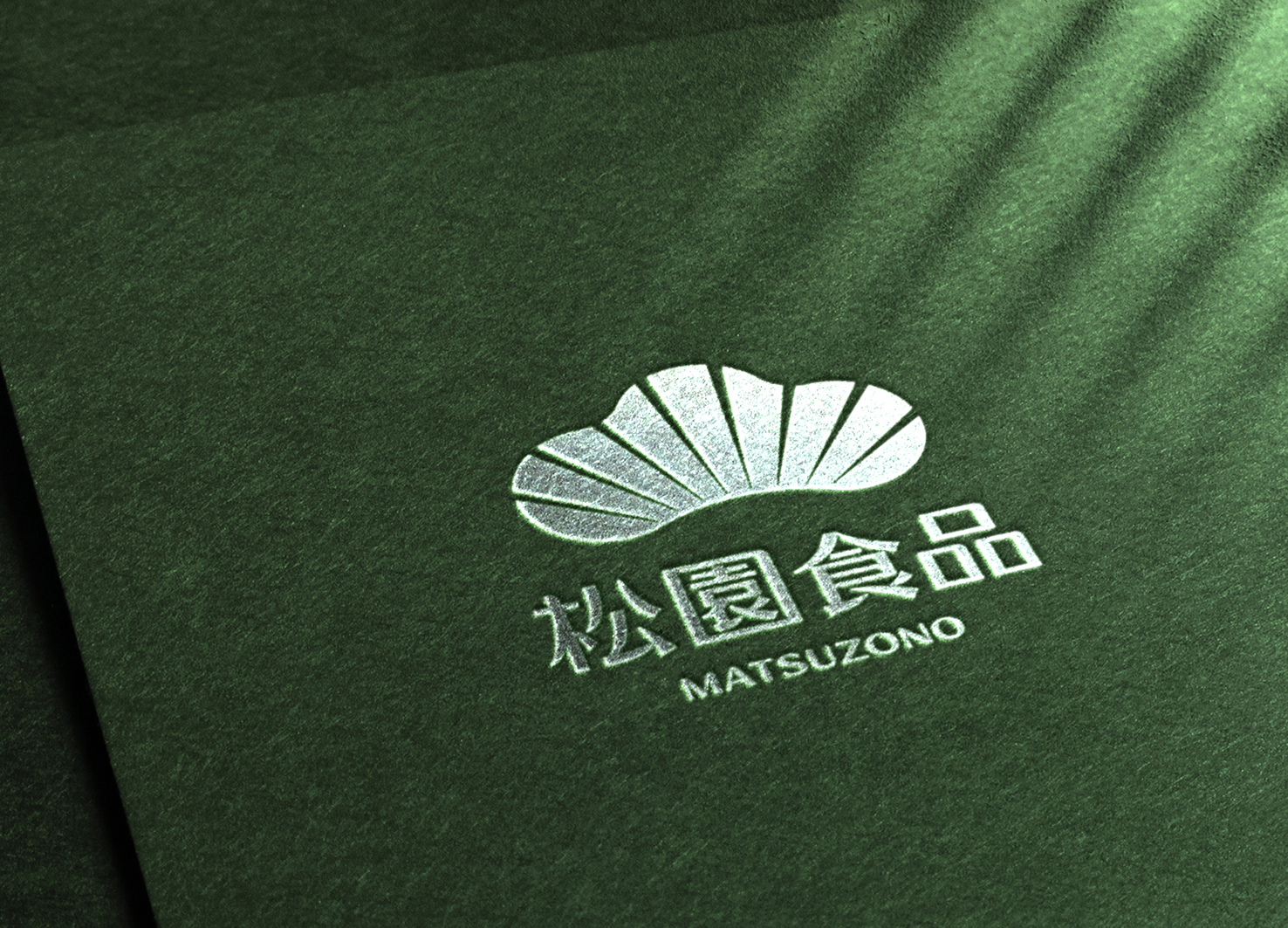
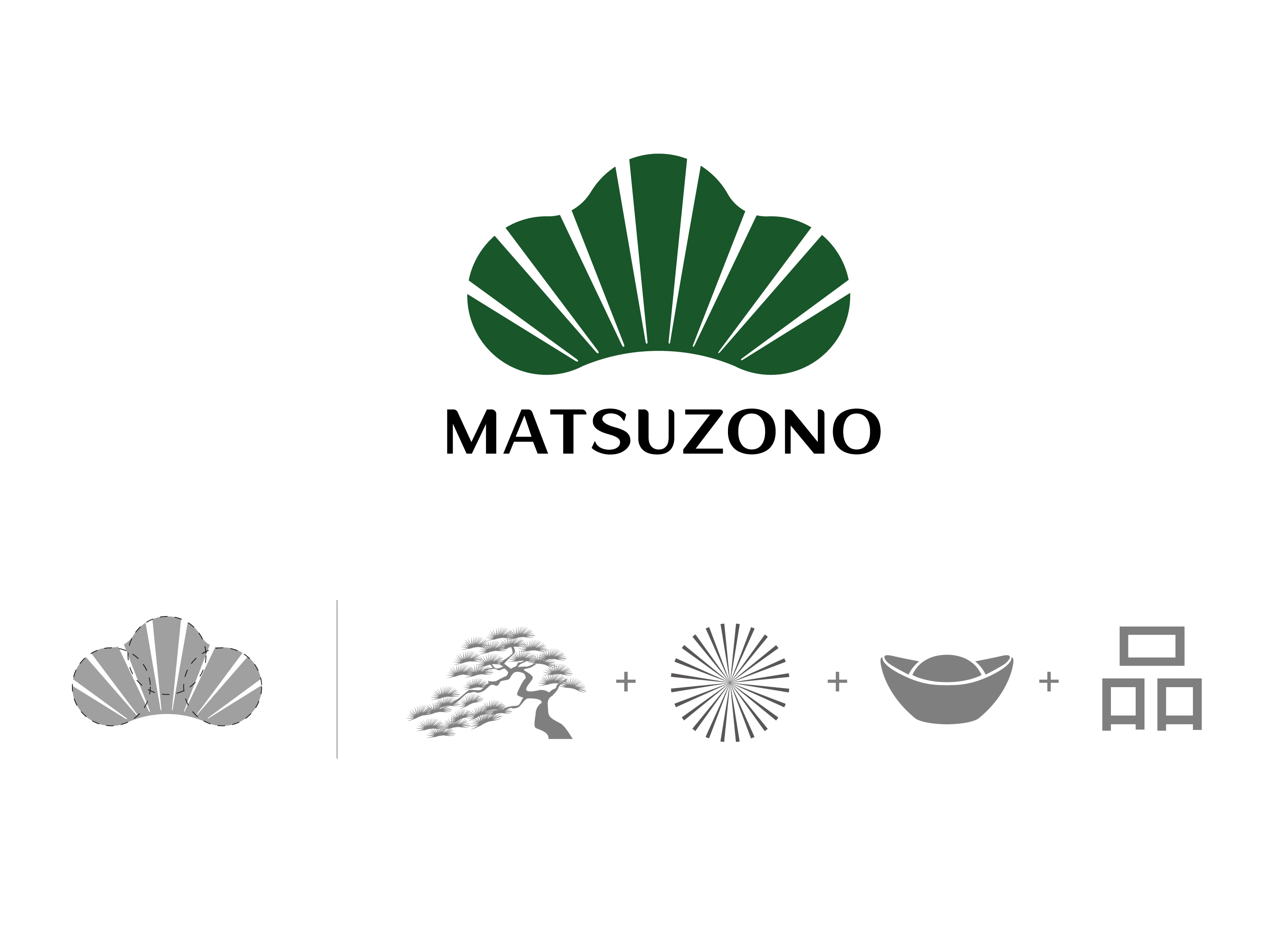
Matsu means Garden of Pine Trees, so the Logo shows a pine tree cut by eight rays of light into nine sections to indicate long-standing auspiciousness. Three overlapping circles are in place to form Ping, a Chinese word for quality, and to infer that quality is of the essence in Matsu. Shaped like an ancient monetary ingot to mean Fortune, the Logo is viewed as a family emblem illustrating a spirit of professionalism and that Matsu makes the best hand-pulled noodles by adhering to the emblem ethos.
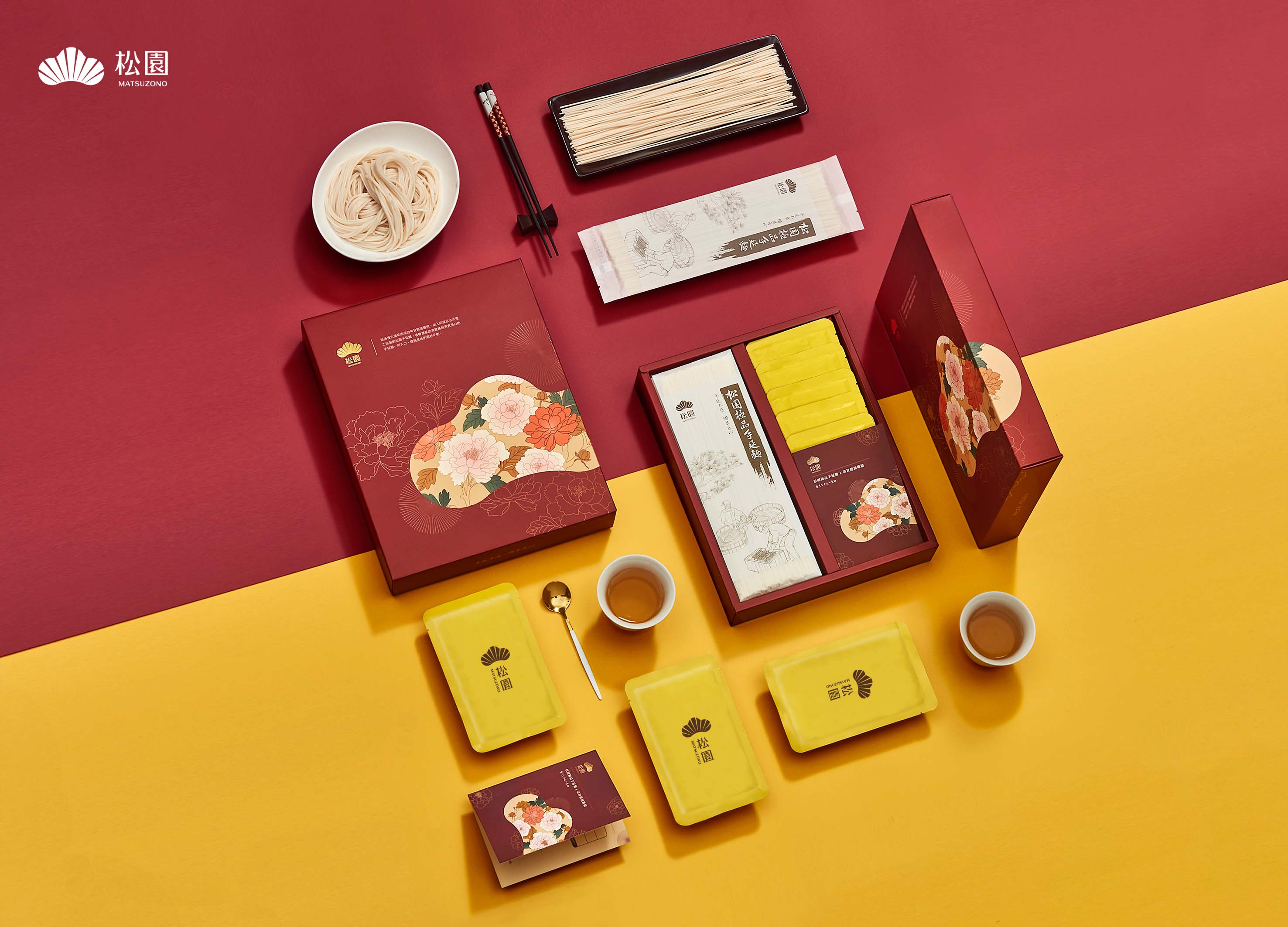
The logo is also extended to the packaging with exquisite gold-lined Eastern floral patterns for a unique visual layout that is regal yet low-key.
Native
「麵為絲,技為針,穿針引線間,需剛柔並濟,才能織成藍圖大網。」是松園的企業核心。松園秉持日本工匠精神,堅持遵循日式古法技術,歷經48小時與16道工法研製方能完成美味的手延麵。松園也致力於無添加物麵的製作,堅持回歸麵食原點,僅採用麵粉、水、鹽三種成分進行加工。
而松園的松字意旨長青、長壽;園字表特定的區域。品牌更寓意為「一輩子只堅持做好一件事」,亦象徵松園食品一輩子秉持健康飲食及職人的精神製作美味麵食。在Logo設計中,以松樹作為主體,並形成三個圓圈表述品質至上的品字。其中採用8道白光將色塊切為9份,象徵長長久久的吉祥意象。而8道白光與整體造型更形成「元寶」之財源概念。松園將Logo視為家徽,闡述職人精神,並遵循家徽宗旨製作最好的手延麵。
本設計亦將Logo大方導入品牌禮盒視覺,並採用東方日式、精緻的繪製調性,琢磨花卉間的金色線條,加上Logo燙金質感與背景素雅底紋,讓禮盒呈現高尚既內斂風格,也形成松園獨有的視覺排列方式與設計。
Positive Comments


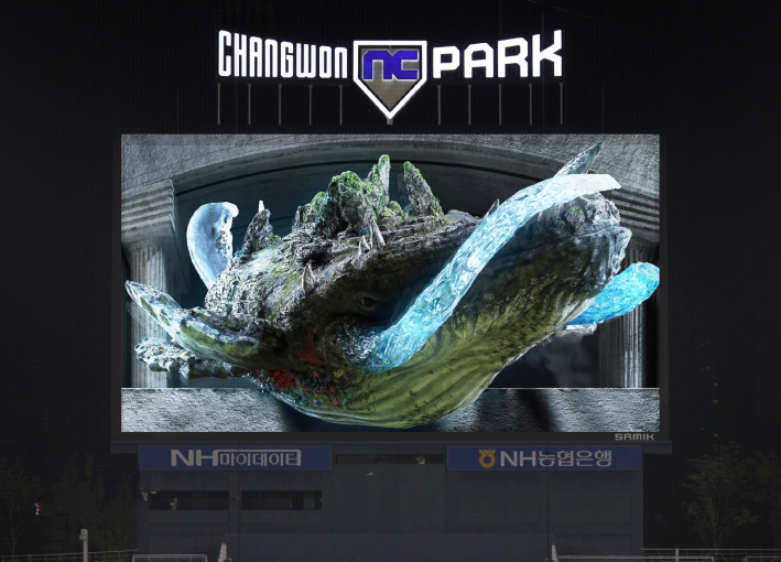
TL BRAND DAY in NC PARK
NCSOFT
Korea
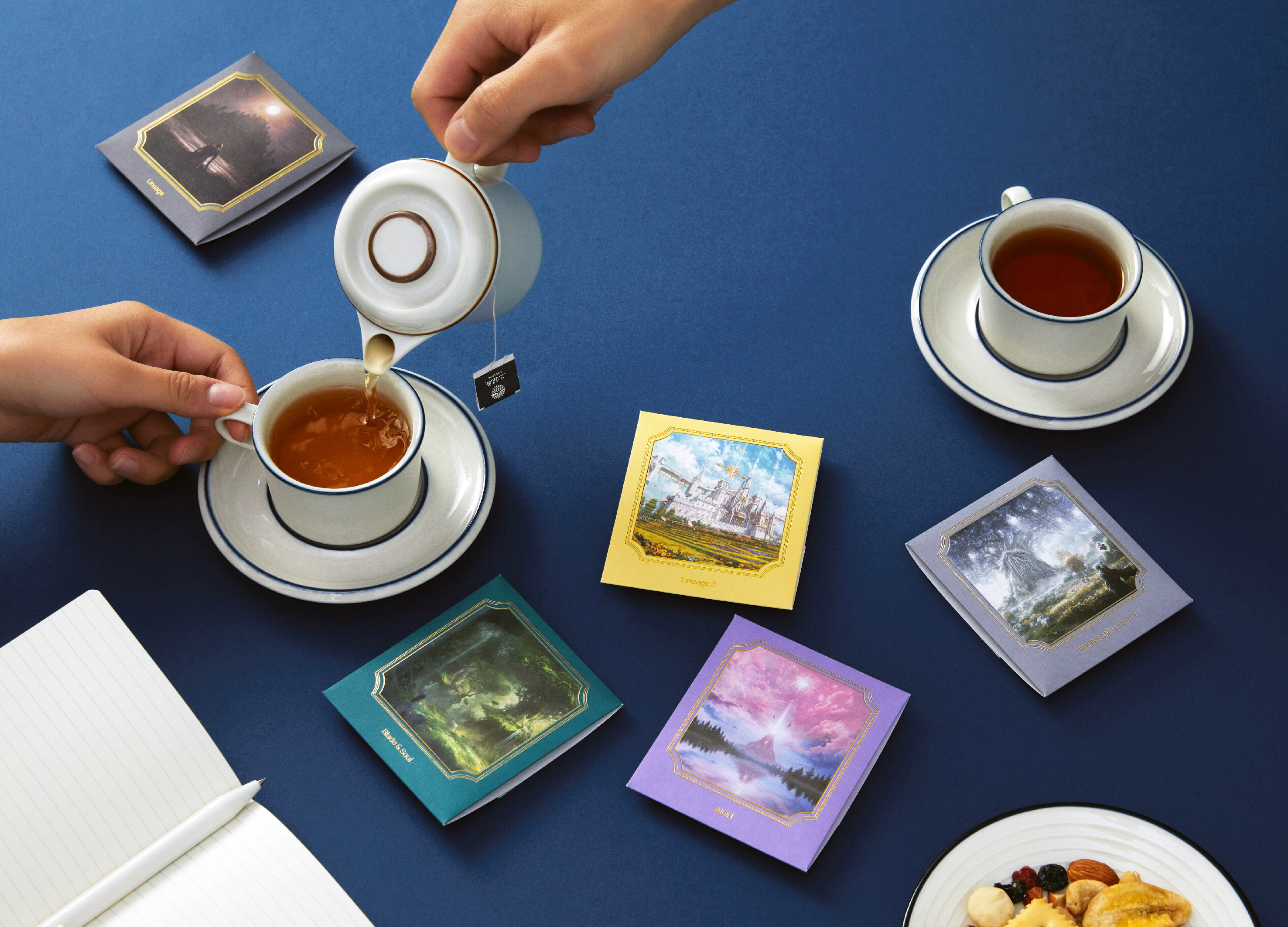
NCSOFT Leaders Kit
NCSOFT
Korea
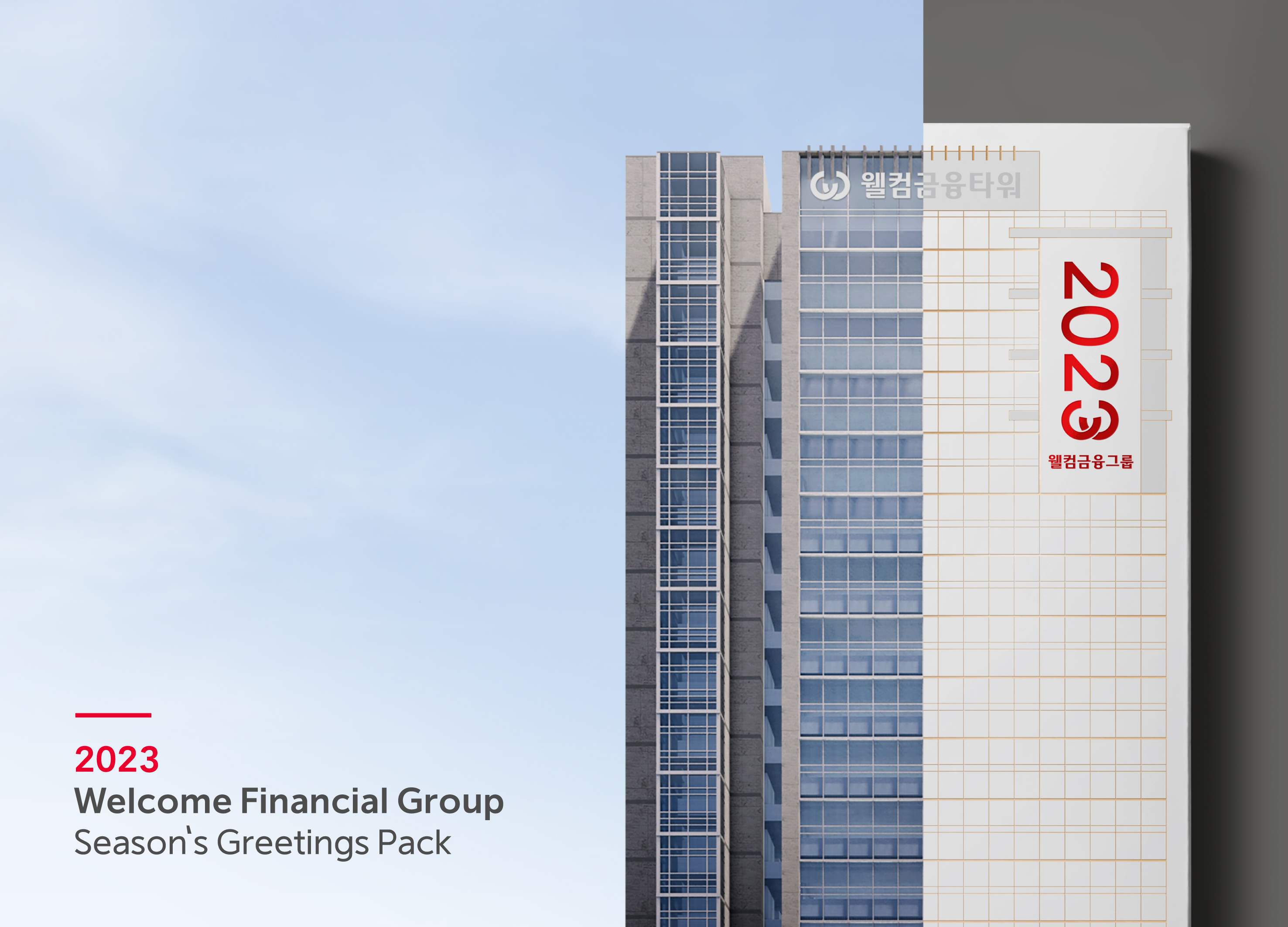
Welcome FG Seasons Greetings Pack
Welcome Savings Bank Co., Ltd.
Korea
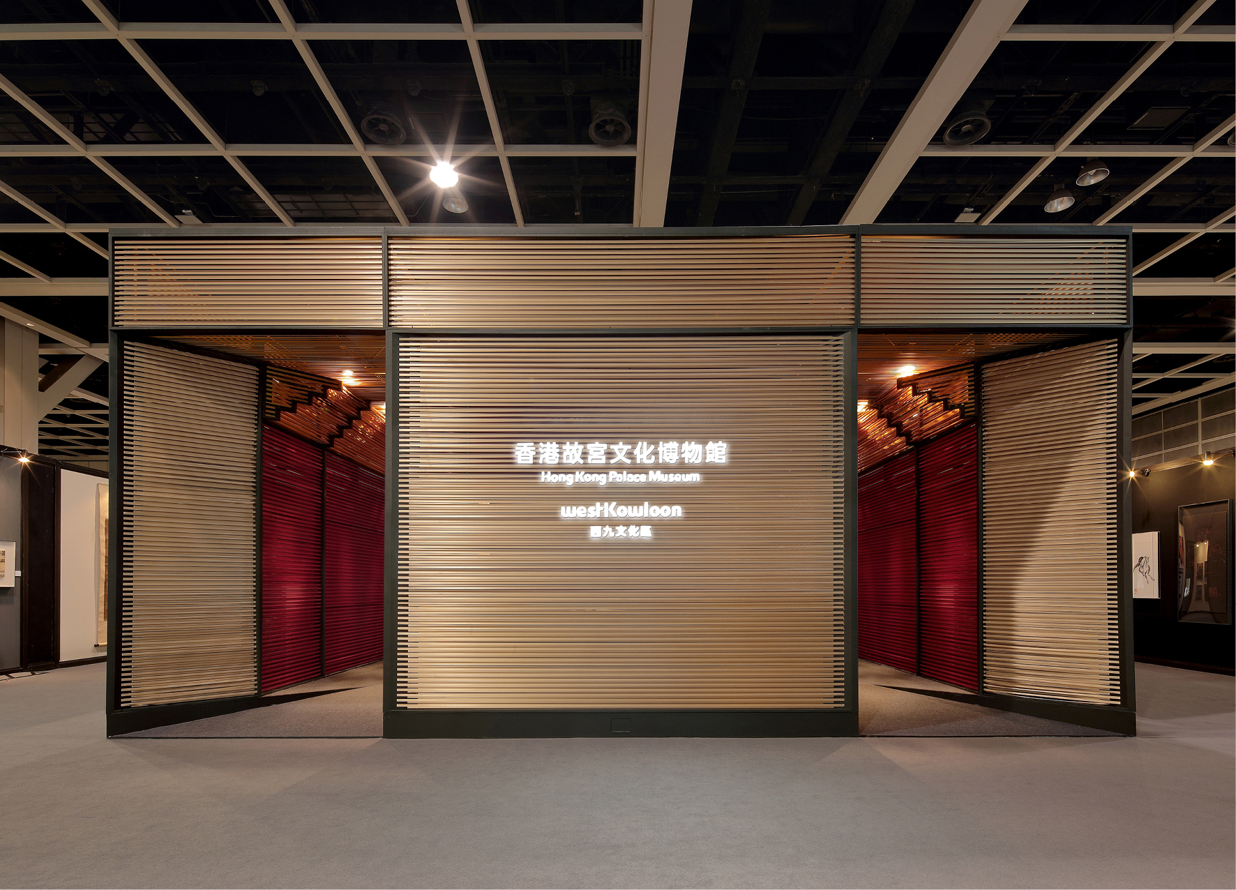
Ribbon House
Daydreamers Design
China Hong Kong
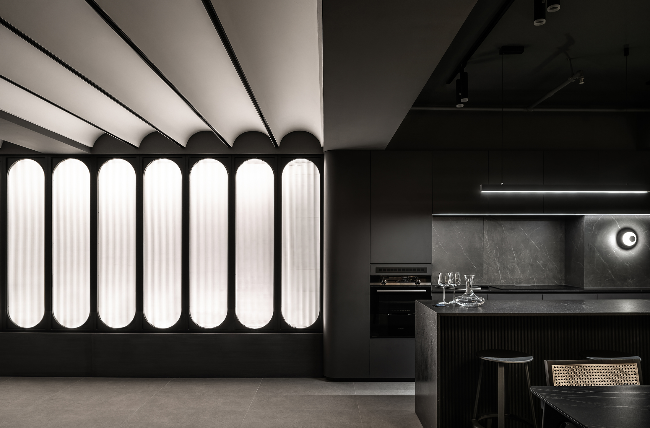
Mancave
zinc studio Co., Ltd.
China Hong Kong
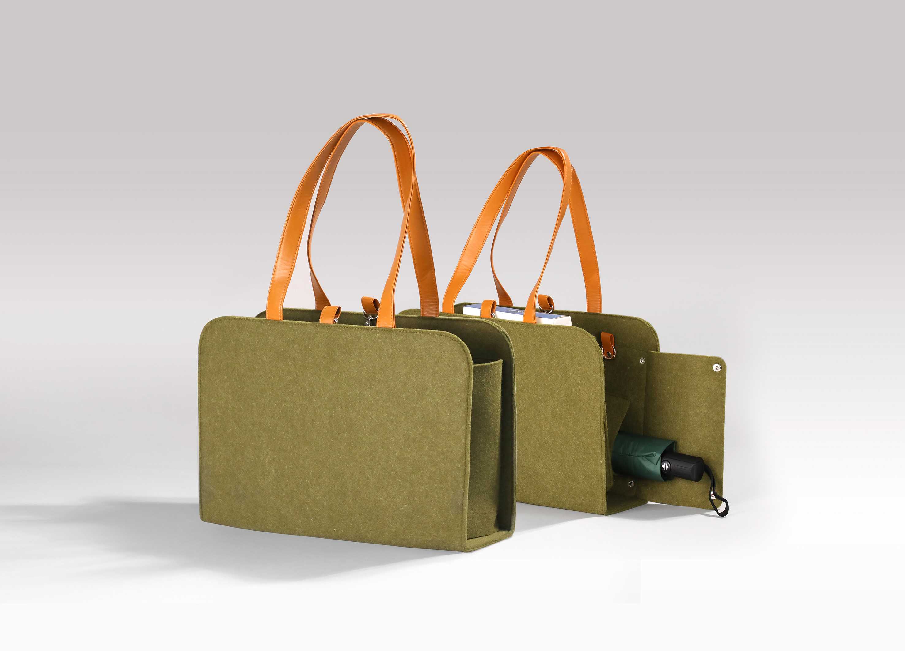
Ecological friendly multifunctional felt bag
Shenzhen Junfei Industrial Co., Ltd.
China
Matsu HandPulled Noodle Brand Design
IDEAMAX DIGITAL VISUAL DESIGN Co., Ltd.
Chinese Taipei

TOLOKAH Brand Design
Process Group
Taiwan
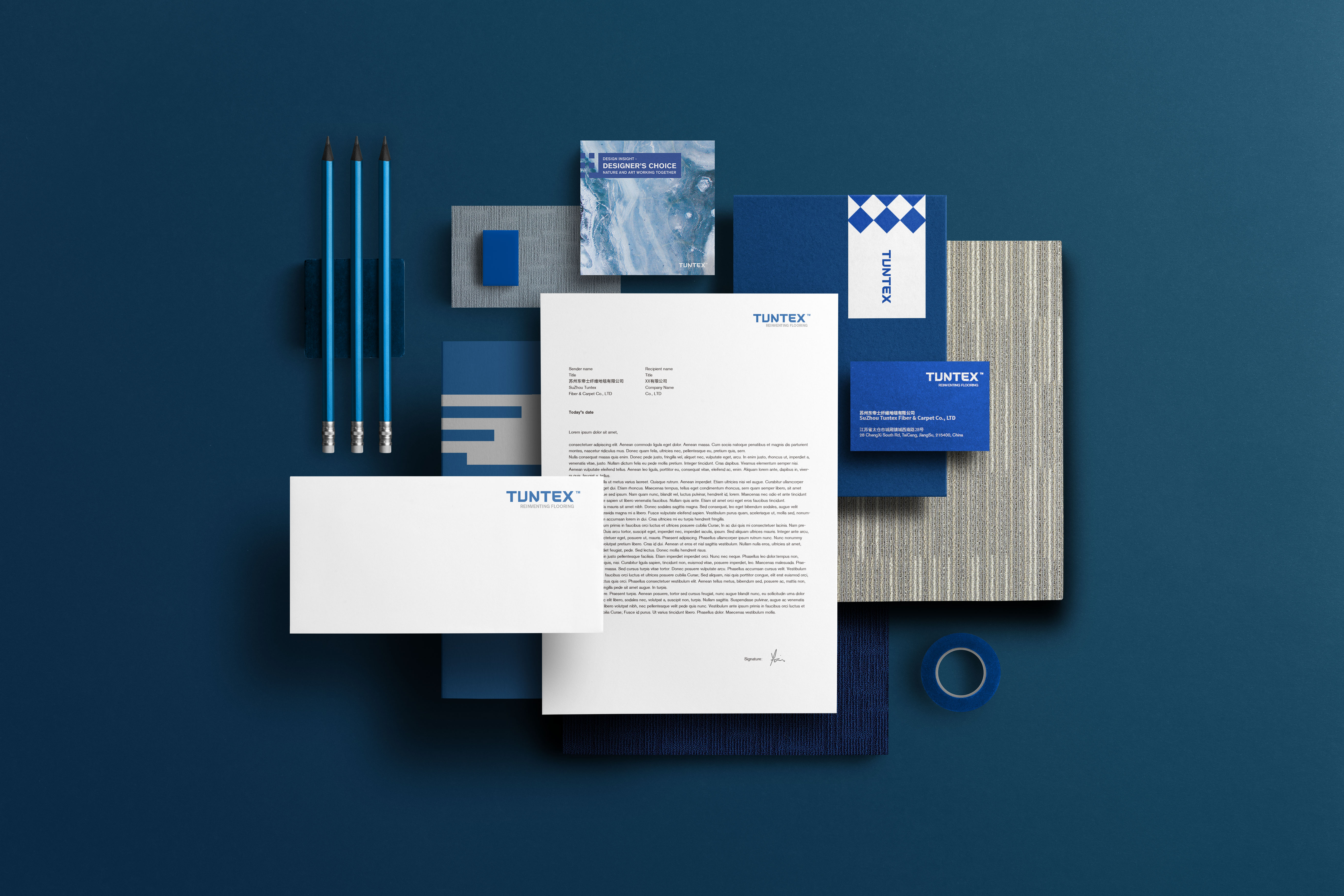
Tuntex Branding
workingimages Co., Ltd.
China
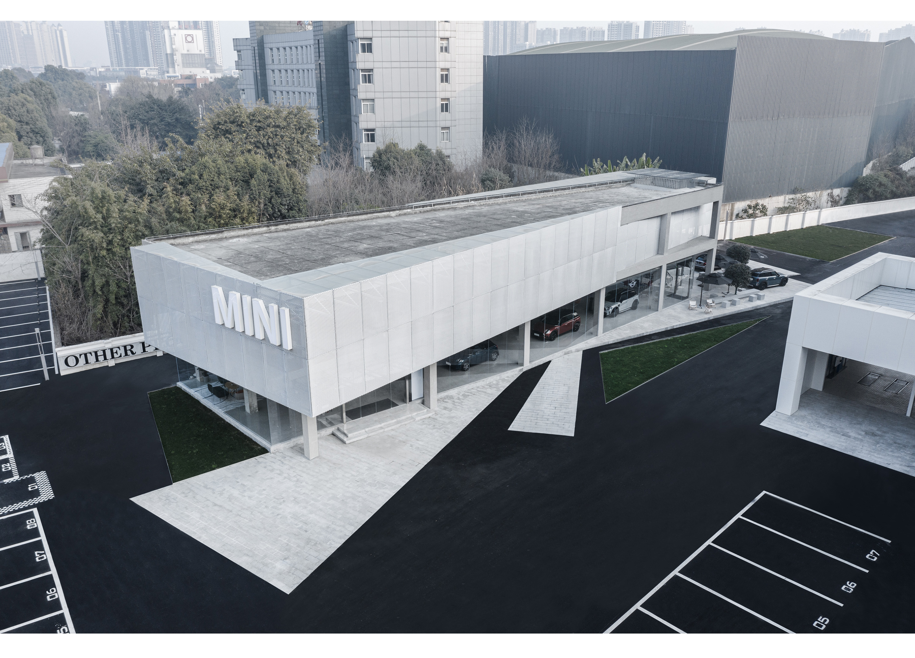
Chengdu MINI Showroom Complex
ARCHIHOPE Co., Ltd.
China
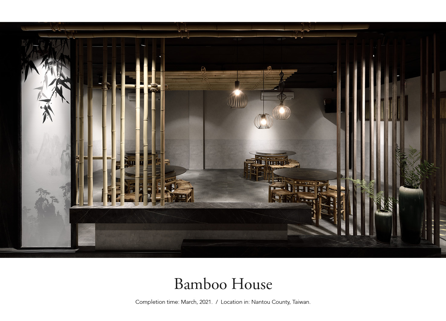
Bamboo House
KUAN WEN CHEN LI CHUAN LIN
Chinese Taipei
Birch Forest
Kris Lin International Design
China
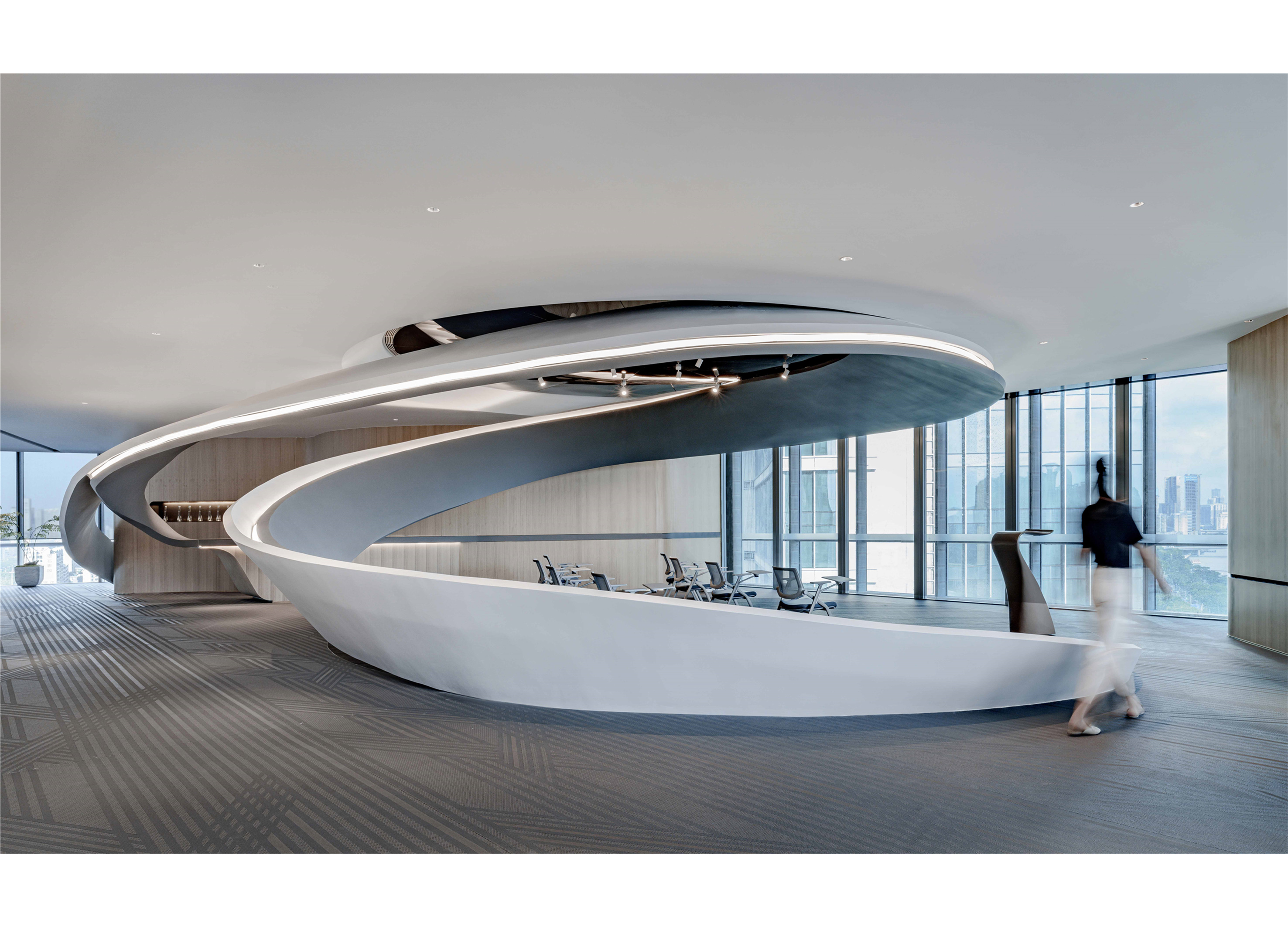
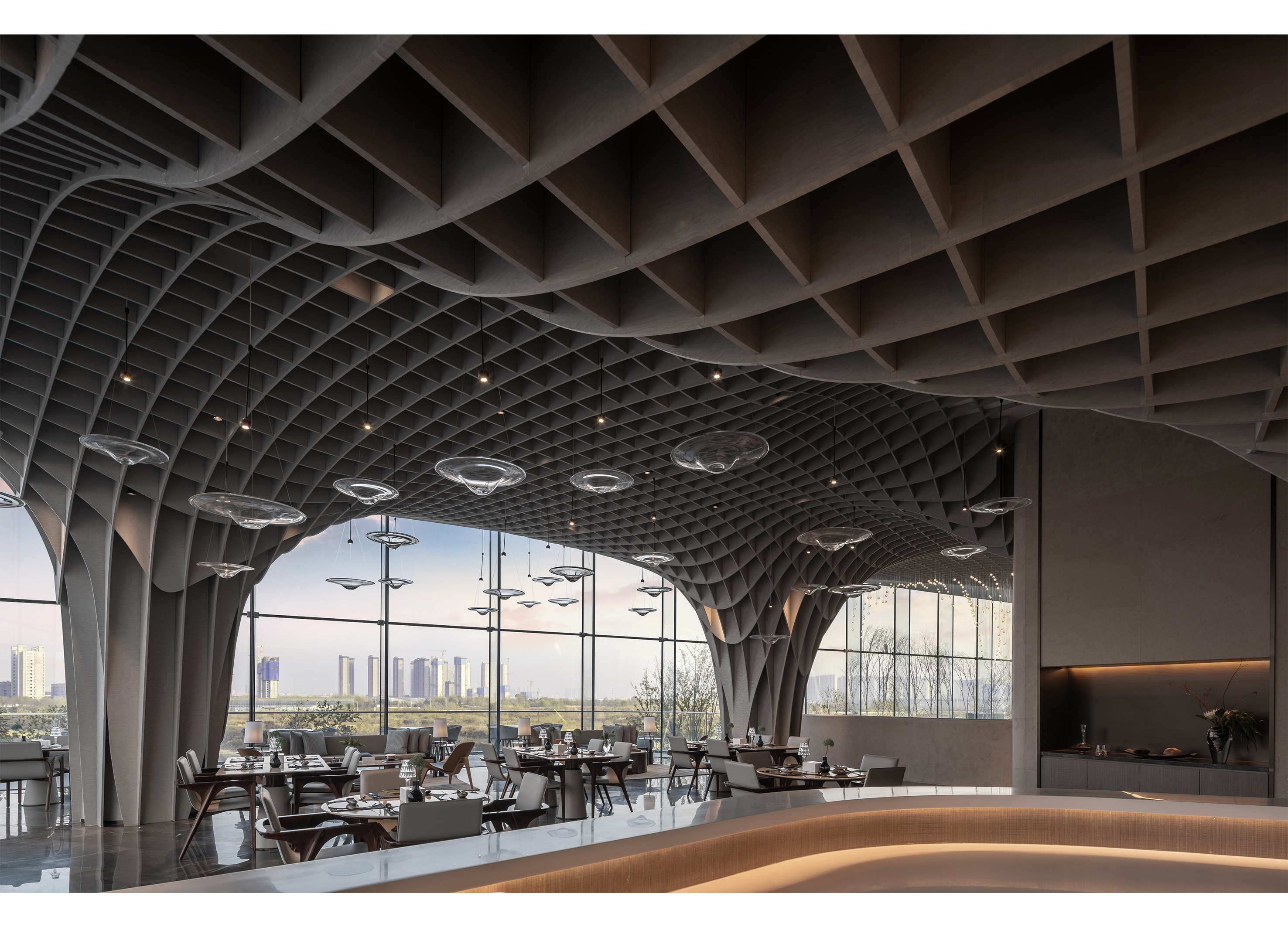
Stream Office
Kris Lin International Design
China
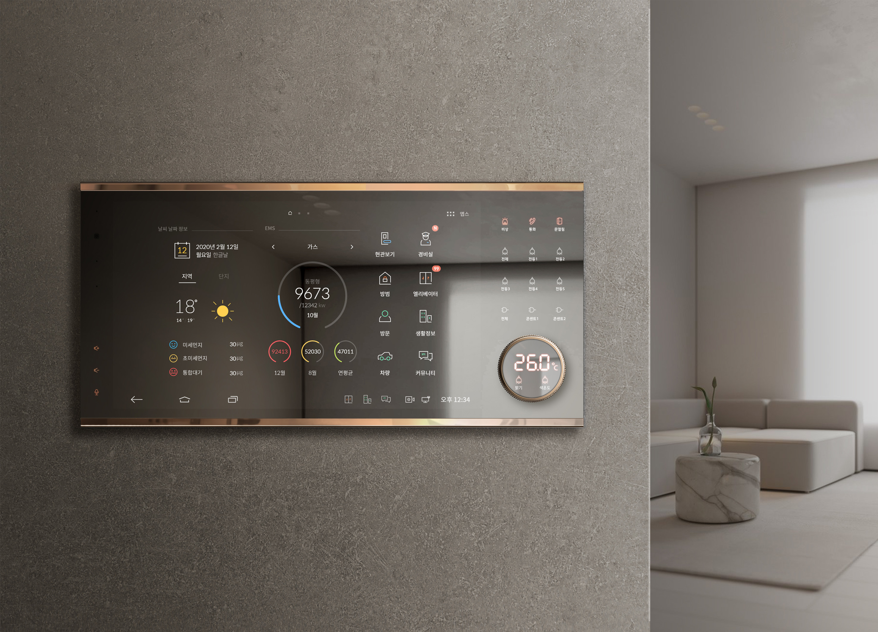
Smart Home Network Wall Pad HDHN4000
HYUNDAI HT Co., Ltd.
Korea
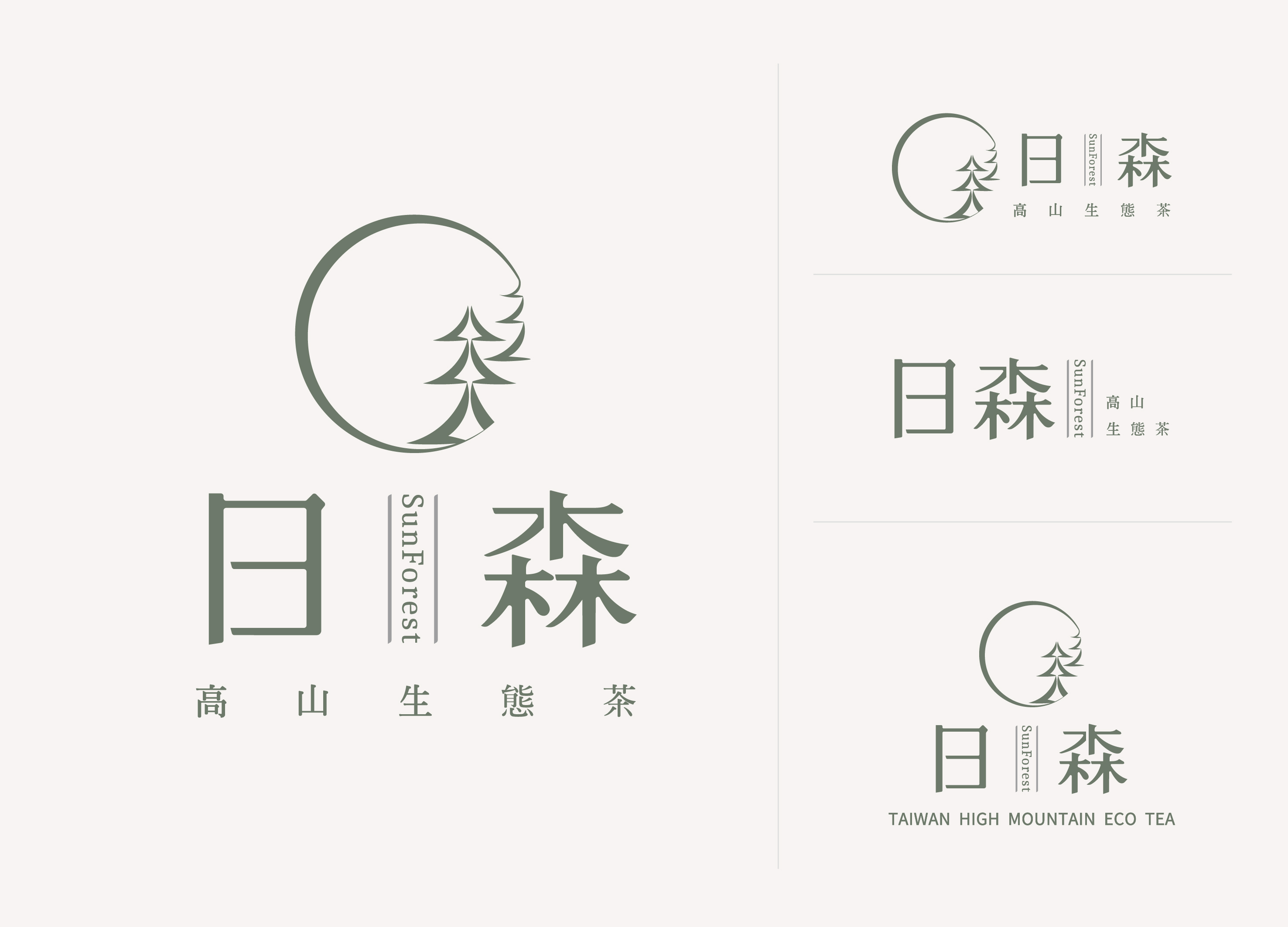
Sunforest
Collaboration Organic Farm Co., Ltd.
Chinese Taipei

XIJIAJIA An AI Digital Human
BEIJING BENBUN SCIENCE AND TECHNOLOGY
China
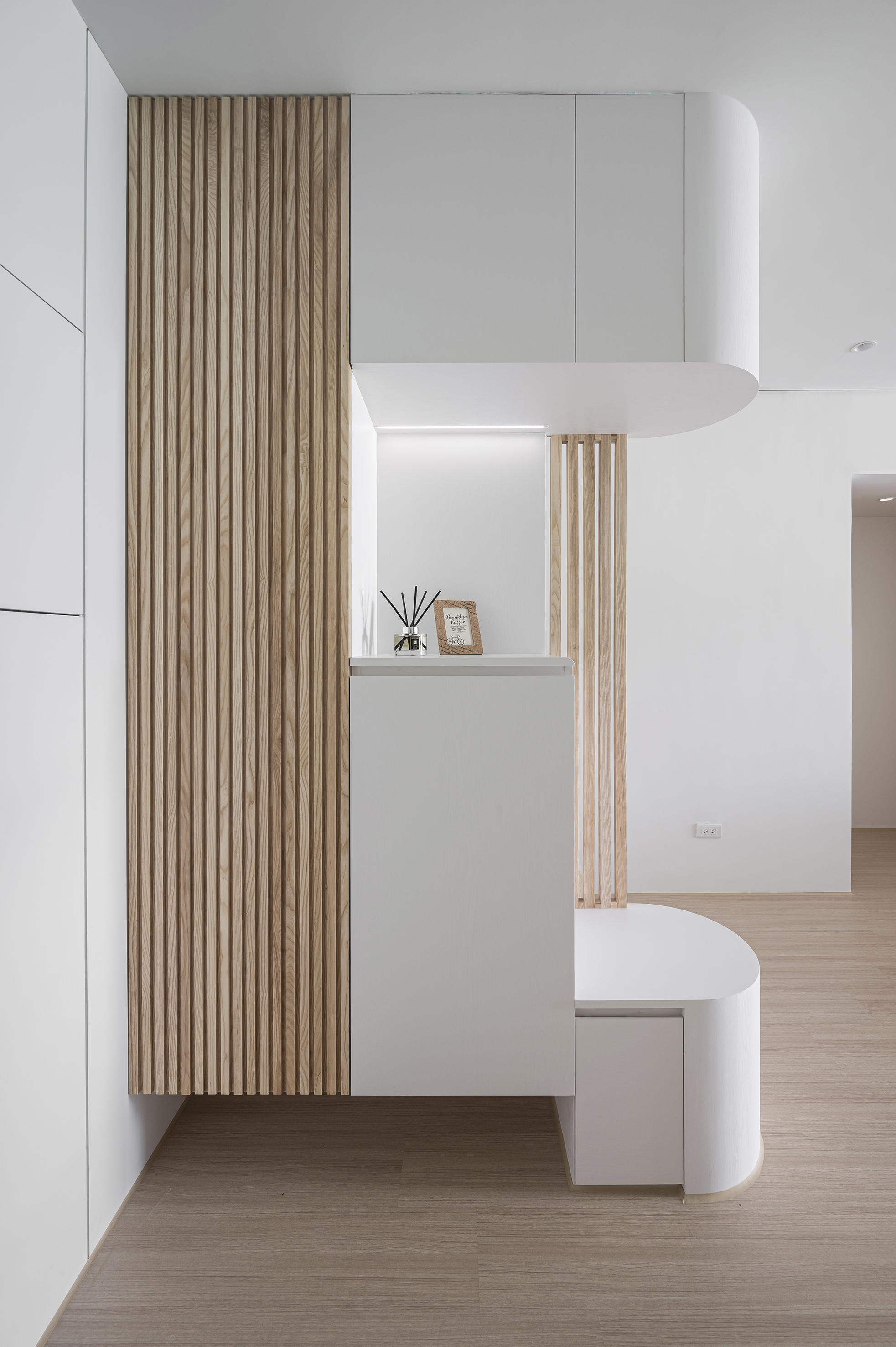
Breeze White
Serena Chen
Chinese Taipei
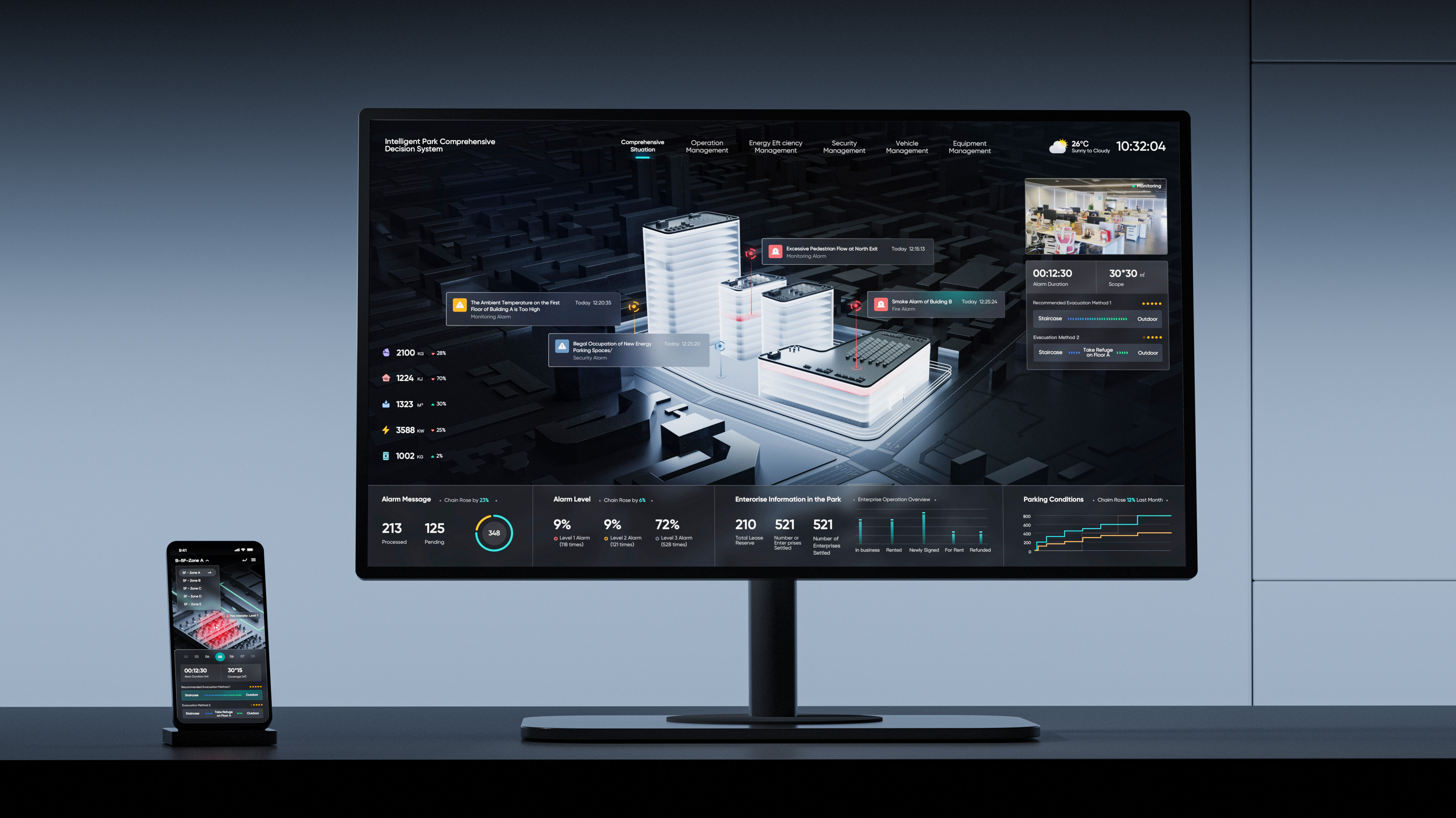
AIOT Smart Park Integrated System
EpicHust Technology (Wuhan) Co., Ltd.
China


Partner & Sponsor
More


info@asiadesignprize.com
#14057, 905 49, Beolmal-ro 102beon-gil,
Dongan-gu, Anyang-si, Gyeonggi-do, Korea
#14057, 905 49, Beolmal-ro 102beon-gil,
Dongan-gu, Anyang-si, Gyeonggi-do, Korea
Founder: Doyoung Kim
Business Registration Number: 454-86-01044
Online Sales License No.: 2021-Anyang Dongan-1081
Copyright © DESIGNSORI Co., Ltd.
Business Registration Number: 454-86-01044
Online Sales License No.: 2021-Anyang Dongan-1081
Copyright © DESIGNSORI Co., Ltd.
