MiCareo Brand Design
Communication
Regions
Taiwan
Year
2018
Award
Gold Winner
Client
MiCareo Taiwan Co., Ltd.
Affiliation
PROCESS GROUP
Designer
Xinhong Yeh, Eting Liao, Jayden Cheng
English
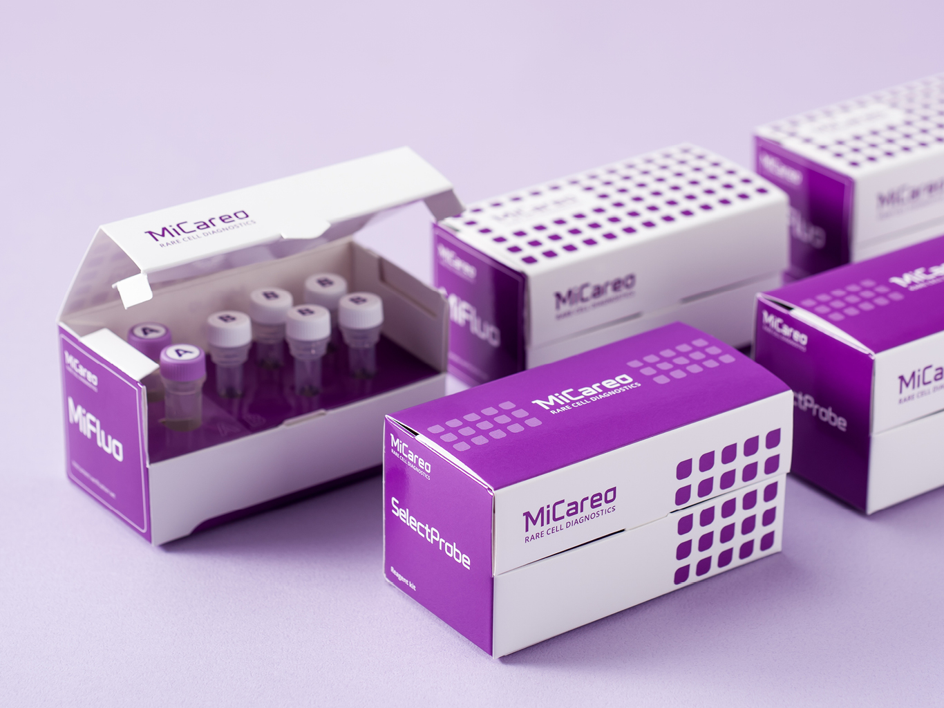
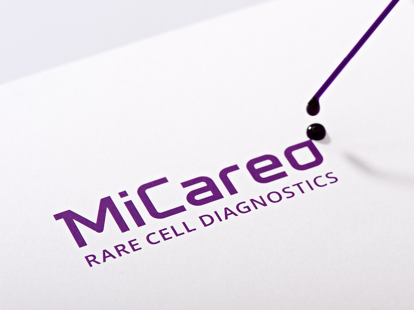
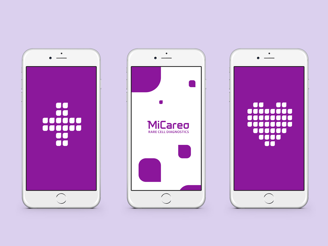
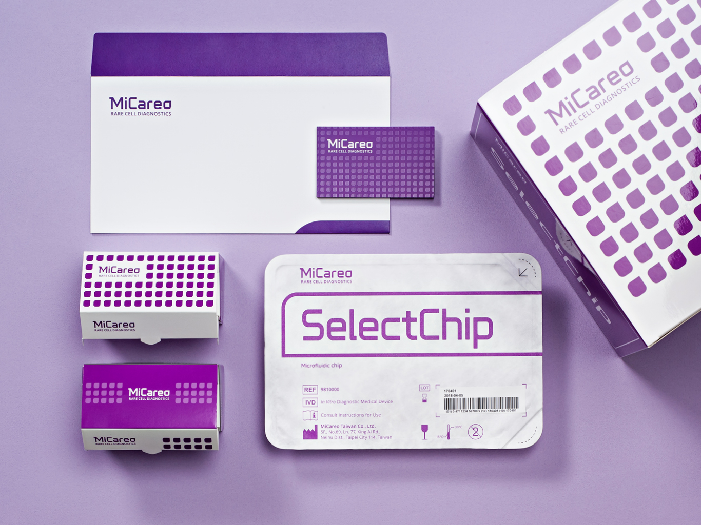
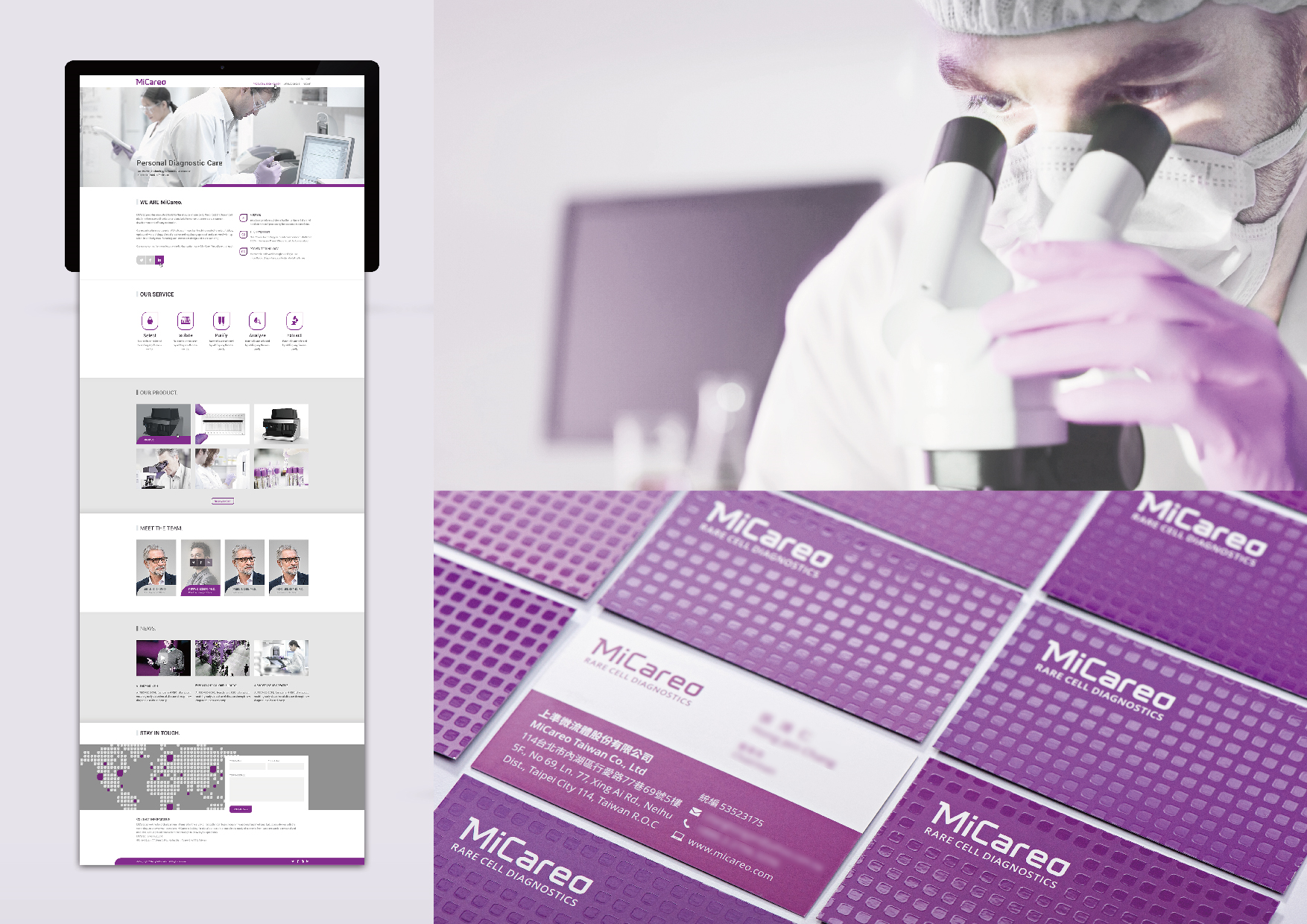
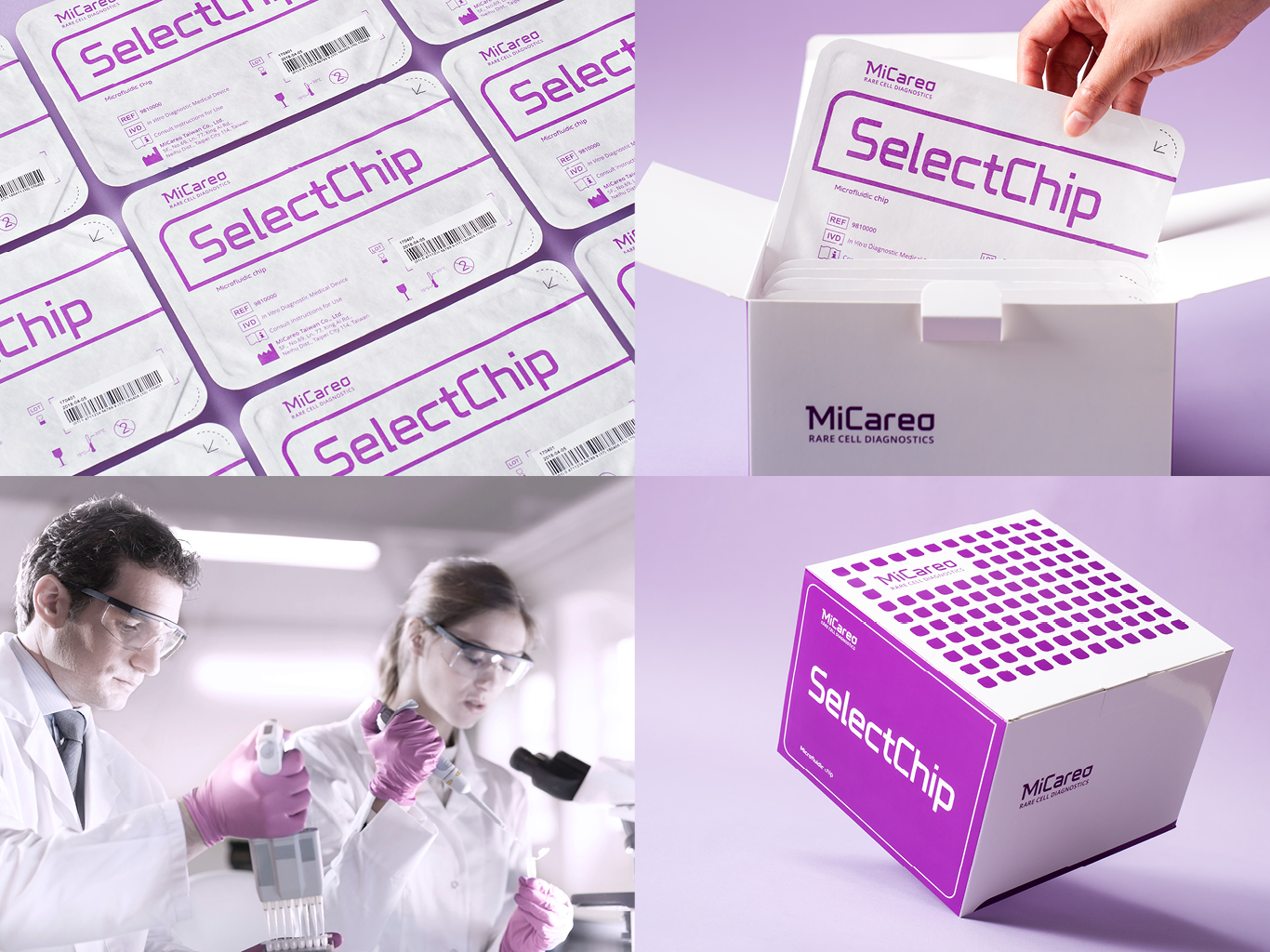
MiCareo is a medical precision device manufacturing company, providing innovative tools for the analysis of rare cells.Furthermore, the letter “o” in the logo of MiCareo is presented in the shape of water drop as the supporting graphic to establish the brand consistency. With a contextual branding principle, the eye-catching purple and the shape of water drop can be randomly permutated and combined for more design applications, and a dynamic identity can be further developed to increase the richness of the brand and create the special presence in the market.
Native
MiCareo 為一間醫療精密儀器公司,主要開發血液檢測癌症相關性產品。為區隔品牌視覺在市場的獨特形象,我們運用了紫色突顯品牌的個性。為聯結品牌與產品之間的關聯性,我們將Logo 文字中MiCare”o” 以水滴方式呈現,建立品牌在輔助視覺一致性。在品牌營運的過程中,鮮明的紫色及強而有力的水滴造型應用,隨機的排列組合,更可發展出動態識別的應用,增加品牌豐富度,以奠定了品牌在市場的獨特地位,讓後續更多的發展應用物,有一套脈絡性的發展原則。
Interview
Website
MiCareo Brand Design
PROCESS GROUP
Taiwan
healthy tea & caramel
BETTER MONDAY
Korea
Passageway for compressed time
National Museum of Modern and Contemporary Art, Korea - Design team
Korea
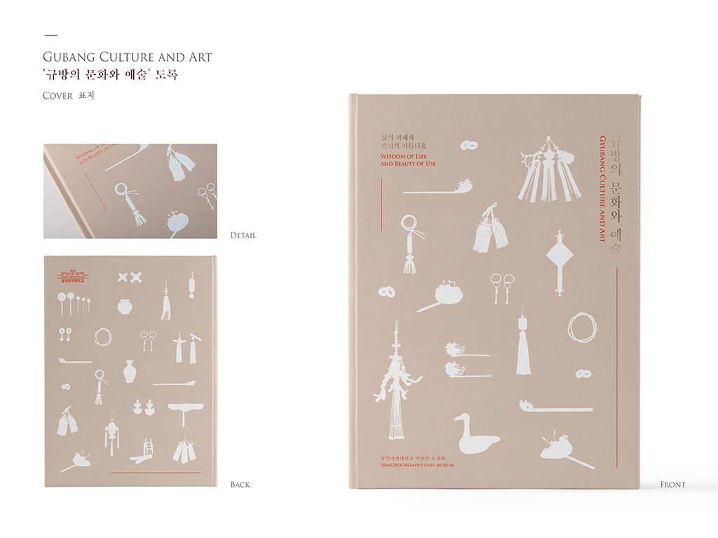
Gyubang Culture and Art - wisdom of life and beauty of use
DAL
Korea
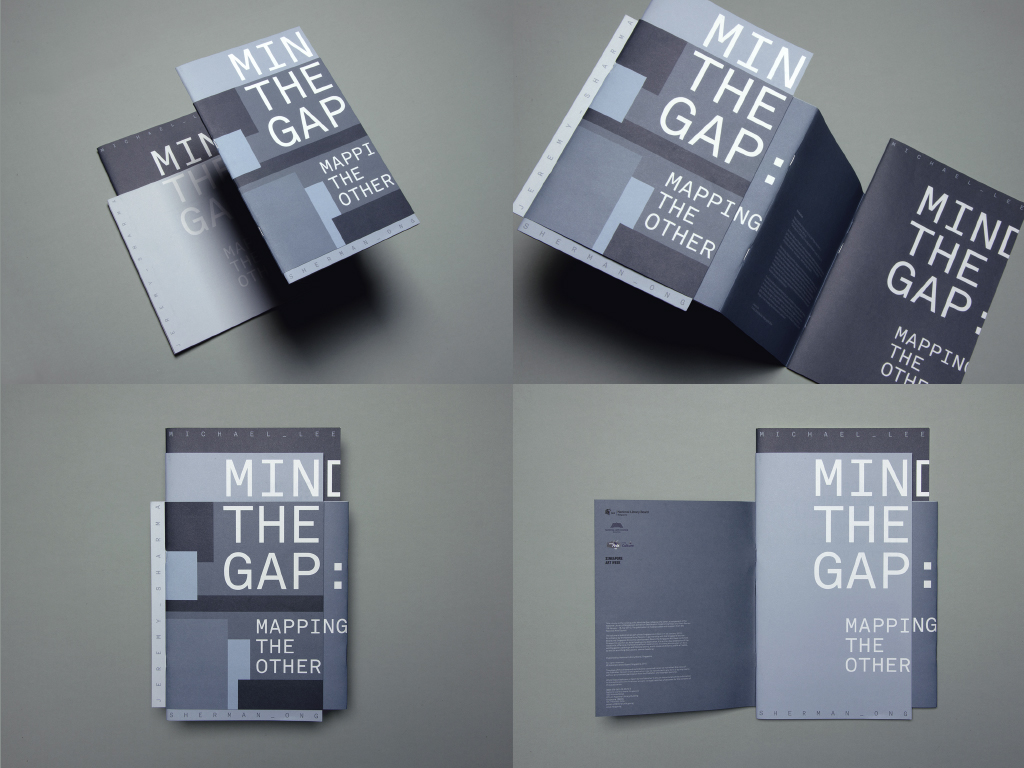
Mind The Gap
studioKALEIDO
Singapore
Sesi (All the time in the world)
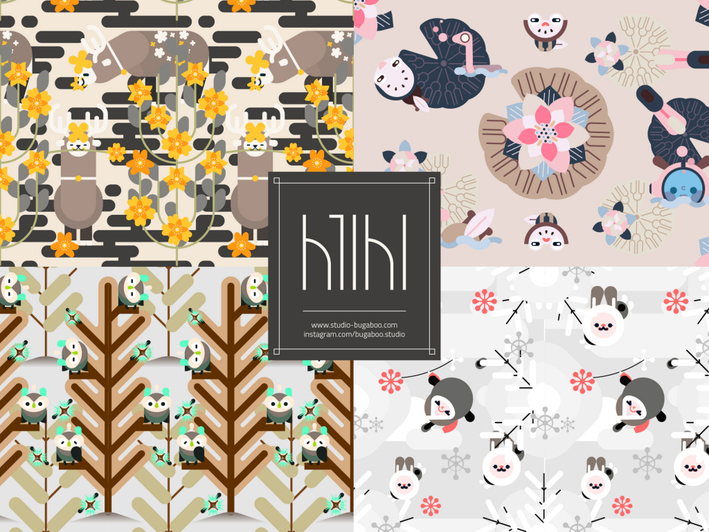
Studio.bugaboo
Korea
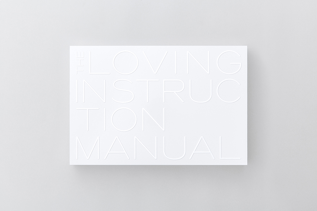
THE LOVING INSTRUCTION MANUAL
AD&D
Japan
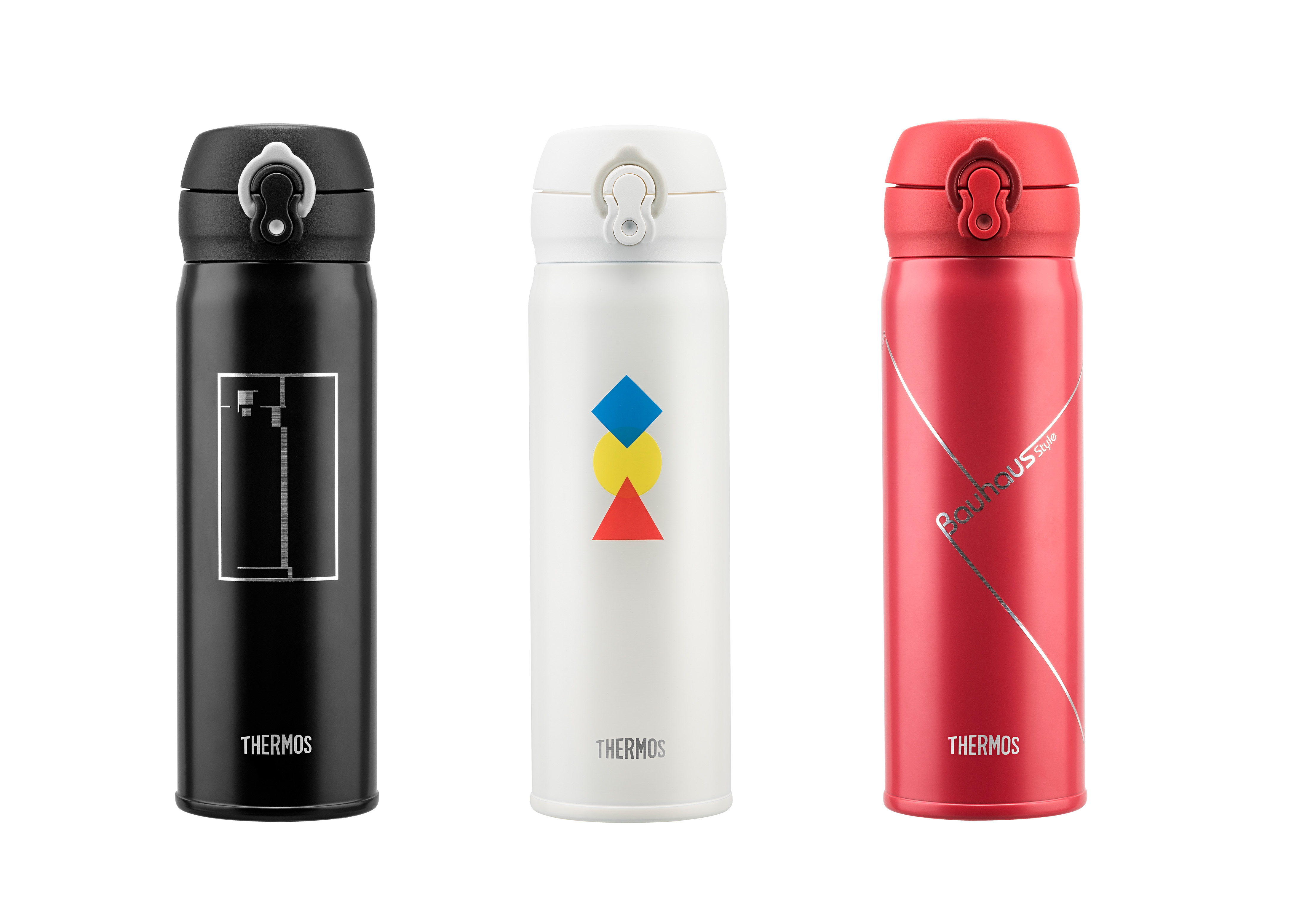
Thermos Bauhaus Bottle Pattern Design
Process Brand Evolution Limited
China
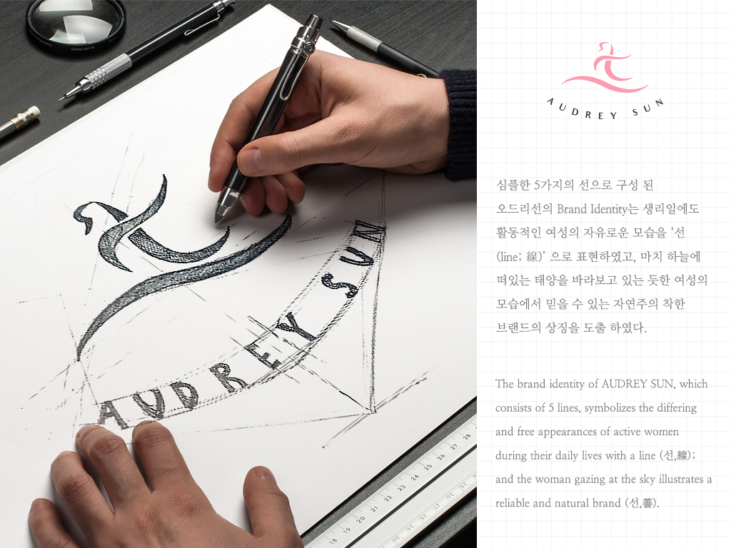
Women’s Life Brand, AUDREY SUN
AUDREY REEFS
Australia
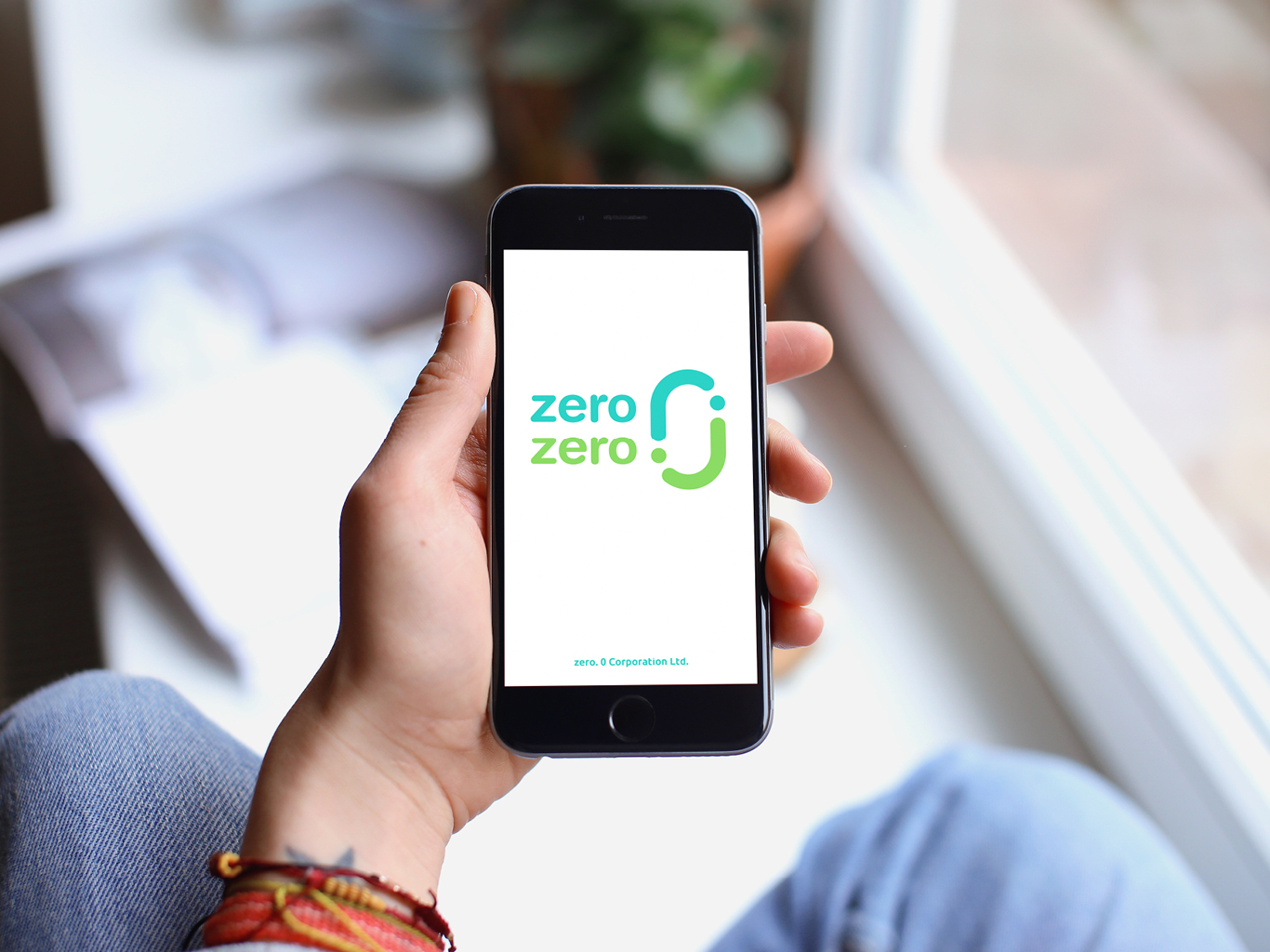
Zero Zero Recycle Brand Design
PROCESS GROUP
Taiwan
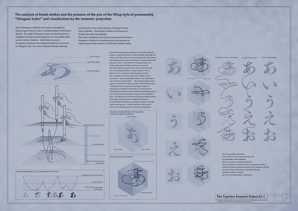
Typeface Research Project
Graphic Communication Laboratory
Japan

CD Cover for Jan Heinrich
Jaye Kang
Germany
Covert-regular / Covert-irregular Typeface
Self promotion
United States America
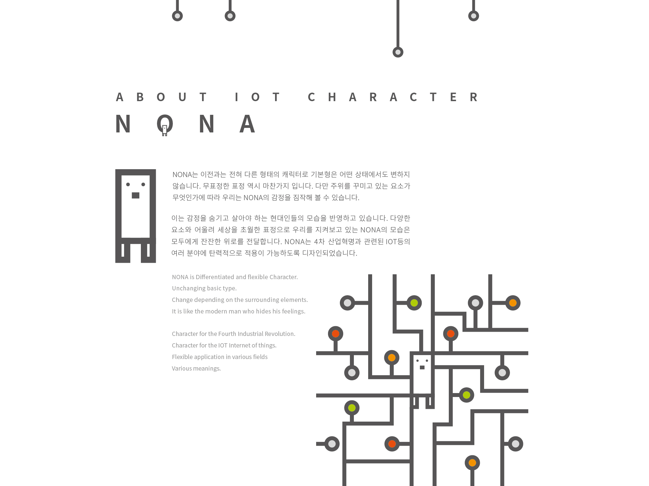
IOT COMMUNICATION CHARACTER
FREELANCER
Korea
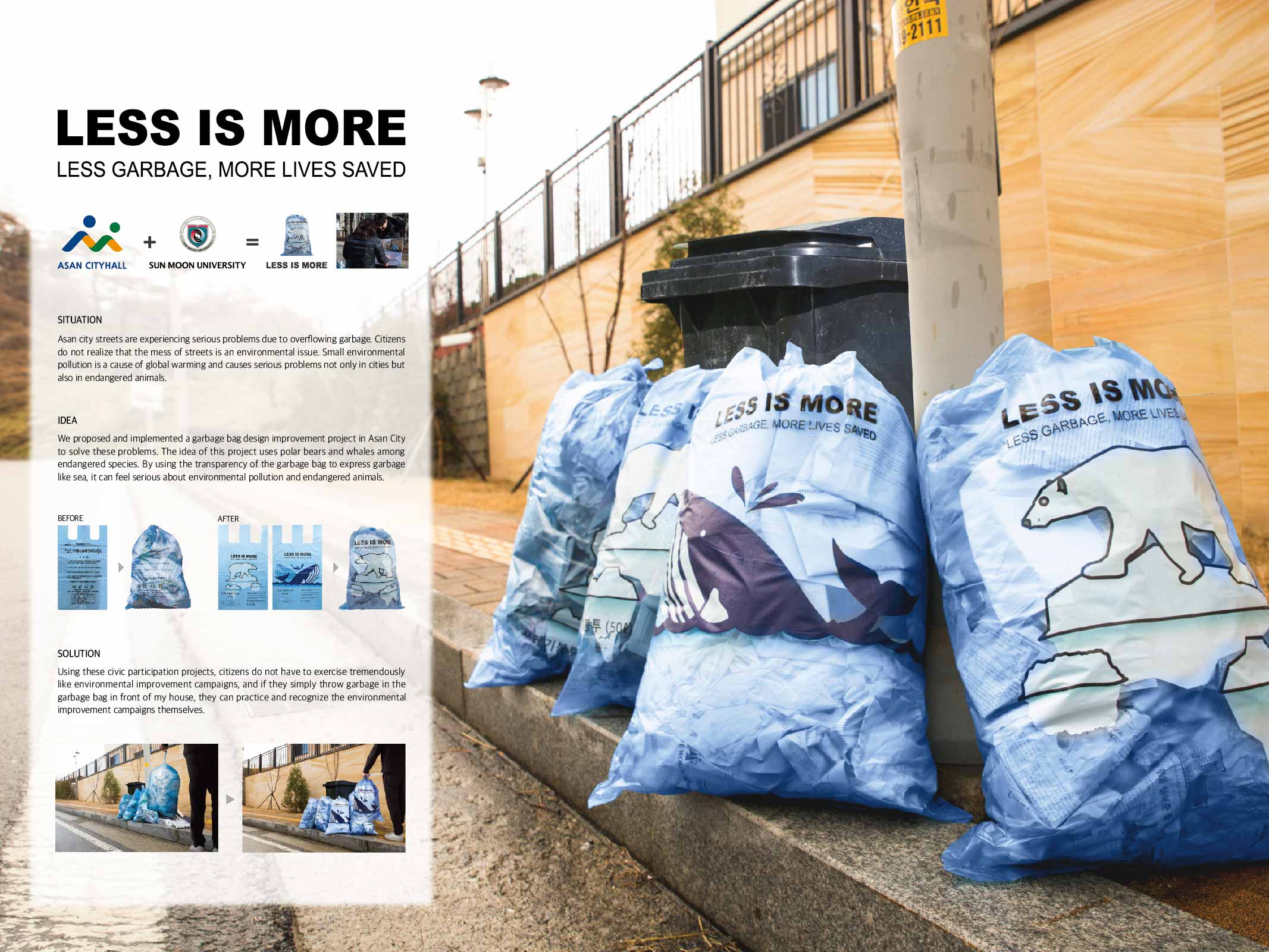
LESS IS MORE
SunMoon University Visual Design School
Korea
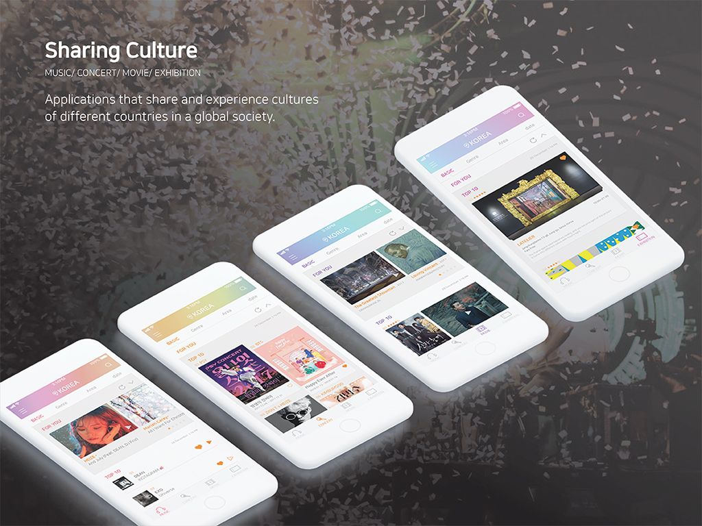
SHARING CULTURE
ChungAng University
Korea
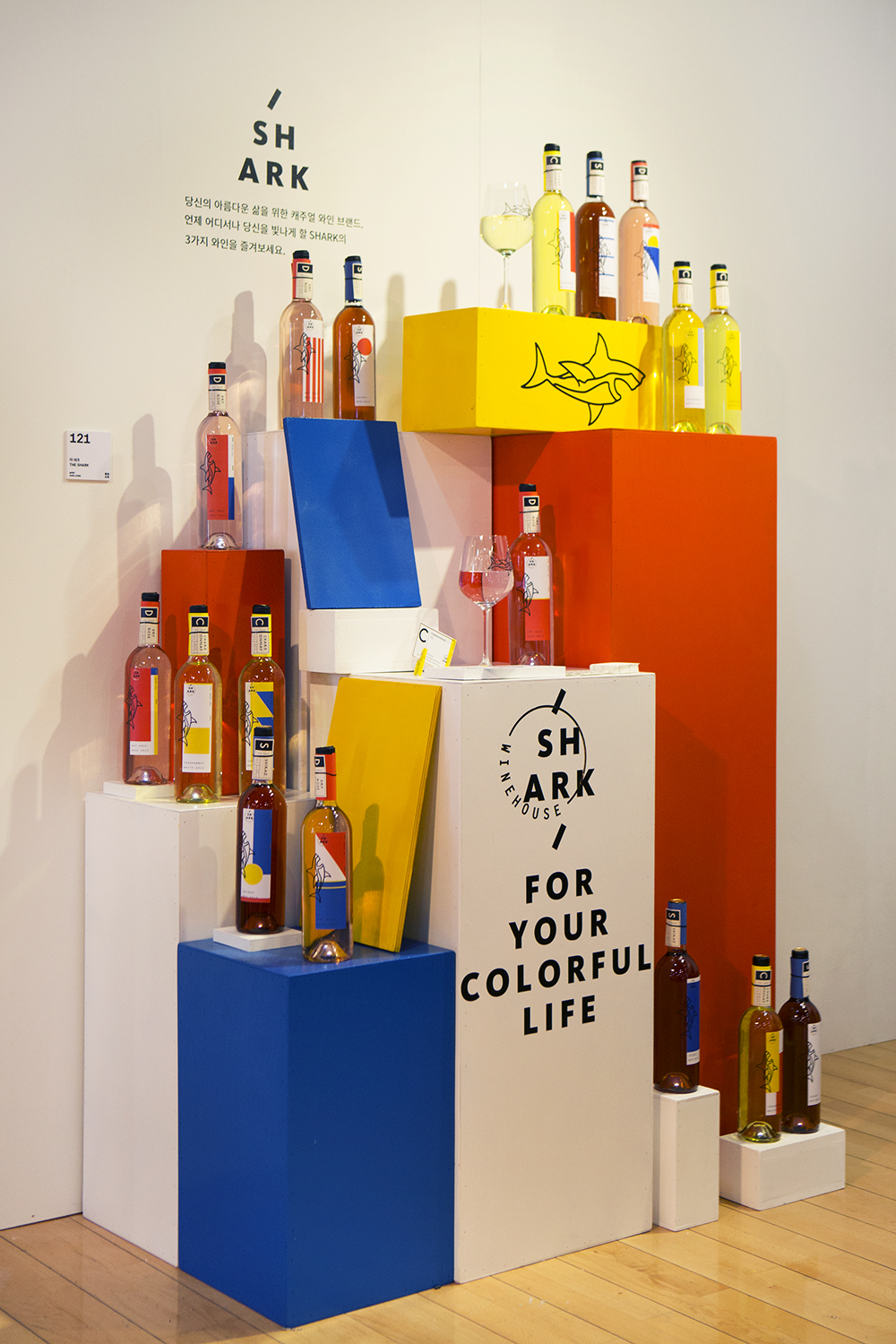
[PACKAGE DESIGN] 'THE SHARK' causal wine brand.
HONGIK UNIVERSITY
Korea
Seating Guide
Hubei Academy Of Fine Arts
China


Partner & Sponsor
More


info@asiadesignprize.com
#14057, 905 49, Beolmal-ro 102beon-gil,
Dongan-gu, Anyang-si, Gyeonggi-do, Korea
#14057, 905 49, Beolmal-ro 102beon-gil,
Dongan-gu, Anyang-si, Gyeonggi-do, Korea
Founder: Doyoung Kim
Business Registration Number: 454-86-01044
Online Sales License No.: 2021-Anyang Dongan-1081
Copyright © DESIGNSORI Co., Ltd.
Business Registration Number: 454-86-01044
Online Sales License No.: 2021-Anyang Dongan-1081
Copyright © DESIGNSORI Co., Ltd.
