
TWINKLE MOON
| Country | Chinese Taipei |
|---|---|
| Year | 2024 |
| Award | WINNER |
| Affiliation | Bigsense Design Studio |
| Designer | Marco Hsiao |
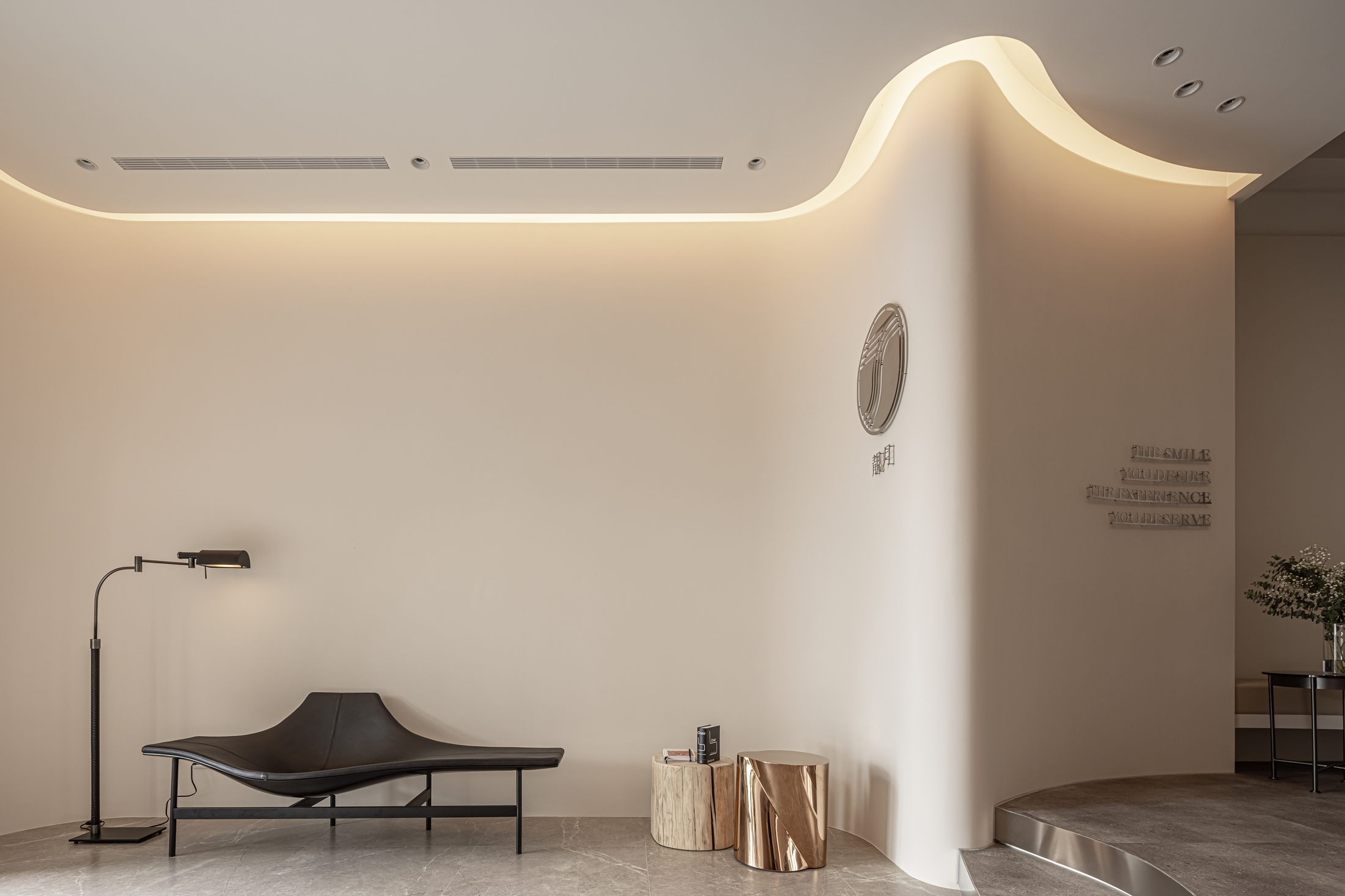
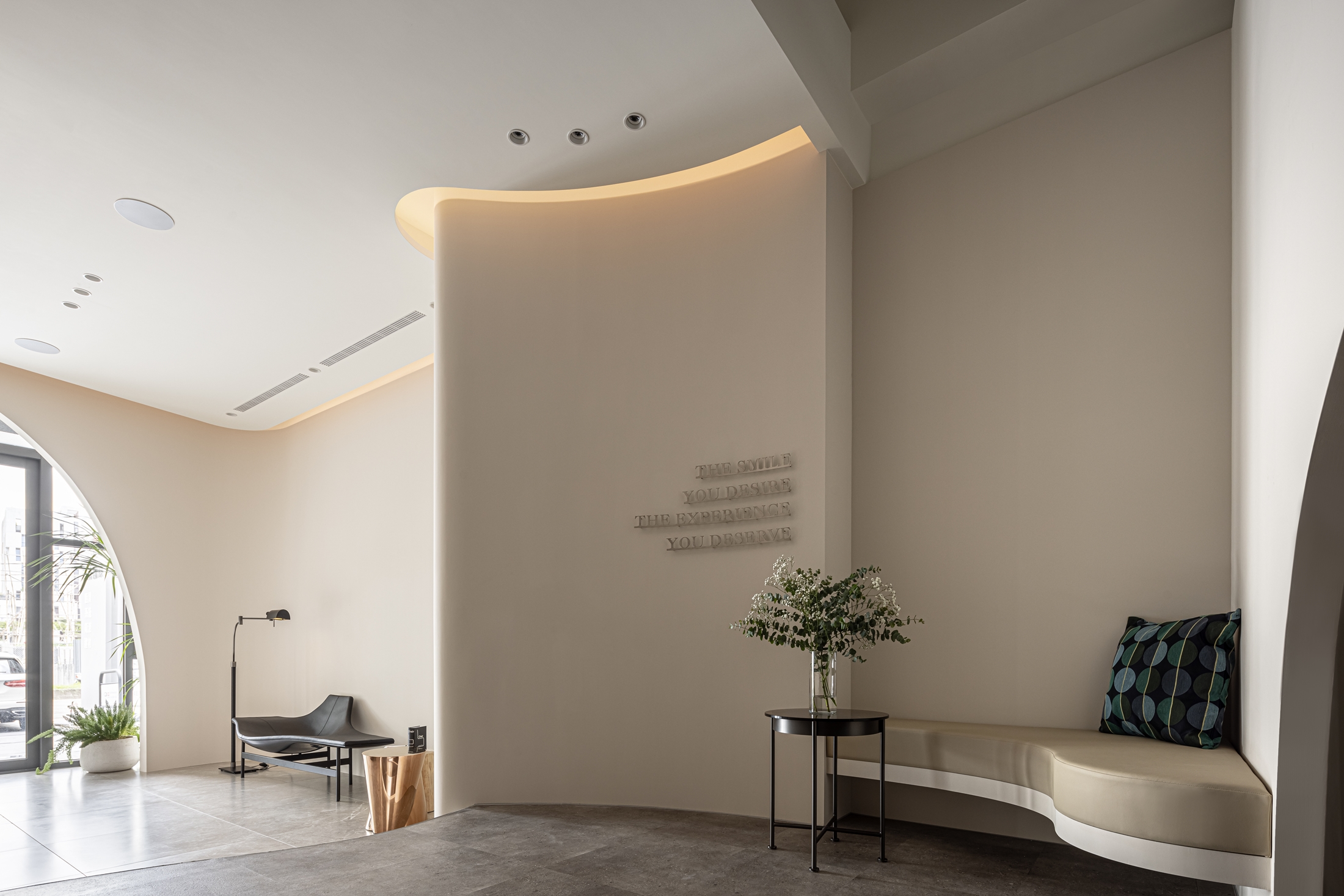
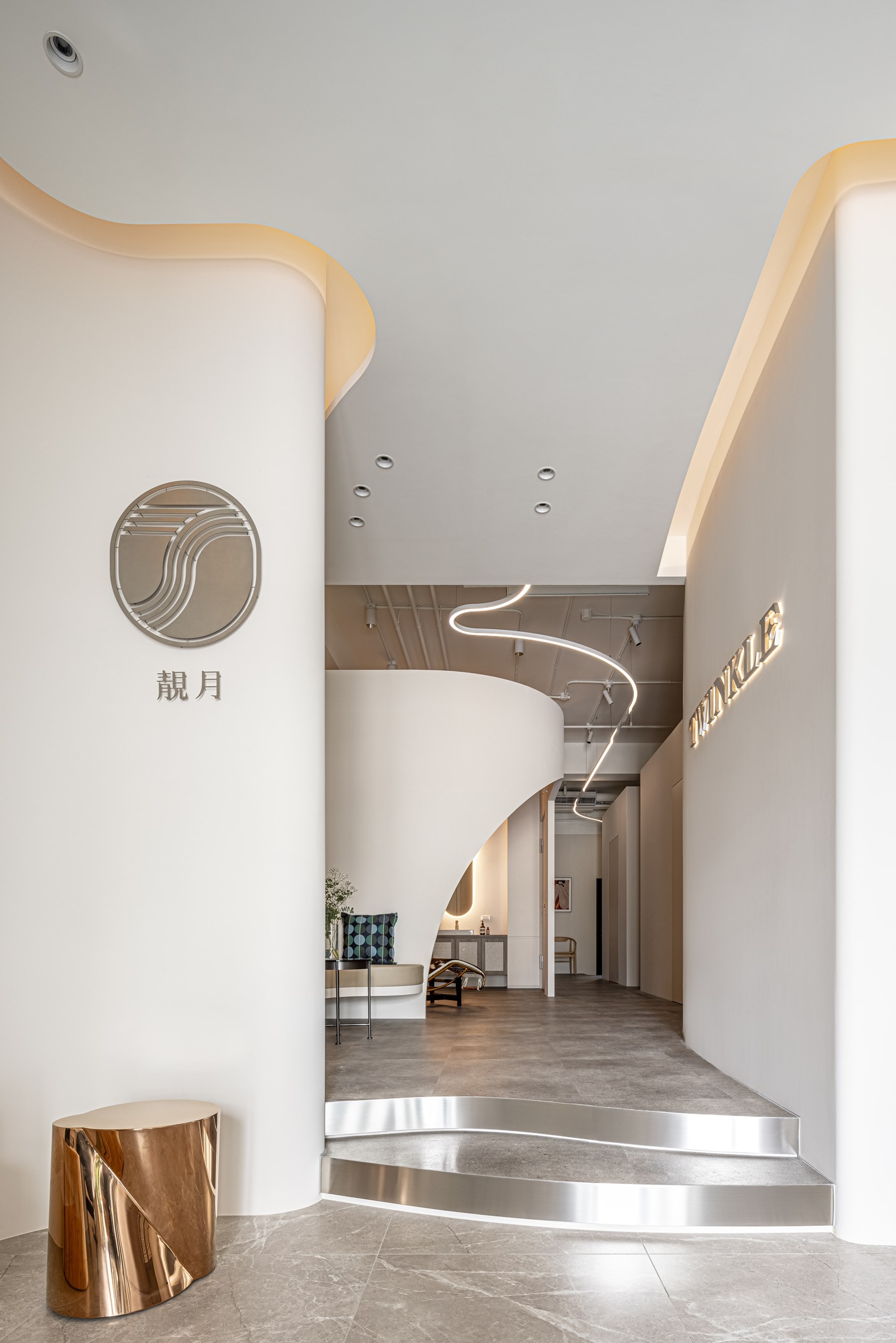
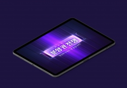
| English | In response to the long and narrow nature of the space, this design segmentizes the space based on functionality and traffic flow, so that the service process and privacy offered by the facility can be optimized and maximized. Using a pure, warm apricot white as the theme color, and transforming different lunar phases into flowing arcs and curves combined with glossy metal textures. The soft and flowing arcs and curves not only serve to carry the visual theme and brand image, invoking the different lunar phases, but also enhance the efficiency and utilization of the space with an elegant, refined aesthetic impression. |
| Native | 本案為美齒淨白中心設計,以純淨、溫暖的杏白色為基底,跨越特定性別客群的刻板印象,並於格局機能和動線的布局,融入柔緩弧線的流淌穿梭,以及月相的盈缺變化,賦予優雅柔和的美學表現,同時也呼應品牌精神。 為因應狹長型的基地型態,設計師以二進式的動線規劃和抬升的地坪設計,將入口玄關、接待櫃檯和療程包廂,劃分為三個開放而獨立的場域,透過空間機能與動線的階段性,透過達成服務流程的最佳化和隱私性,並將品牌意象無痕地融入格局、機能和風格美學之中,創造沉浸式的美容診療體驗。 整體空間使用純淨溫暖的杏白色為主題色彩,並將滿月、盈凸月、弦月、眉月等月相型態,柔軟流動的弧線和曲型立面不僅乘載品牌形象的視覺主題,更援引月相的盈缺互補意象,提升空間的使用效益,以柔緩的轉折隱蔽了建築結構和收納,也為顧客提供安心和獨立的隱私空間。 而另一方面,透過迂迴而開放的動線設計,適度地形成視線的隱蔽,搭配流線、光帶和暈映等不同的燈光形式,與金屬材質的光澤細節,挹注優雅精緻的美學印象。 |
| Positive Comments |


|
| Judging Comments | This design has been commended for its strategic segmentation of a long and narrow space into functional areas, optimizing service processes and privacy. The choice of apricot white as the theme color, along with the incorporation of lunar phases into the design through flowing arcs and curves, paired with glossy metal textures, has been praised for its elegance and efficiency. This approach not only strengthens the brand's visual identity but also maximizes space utilization, offering an environment that is both aesthetically pleasing and functional. |
-
Intelligent Water Resources Dispatch System
-
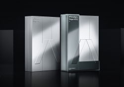
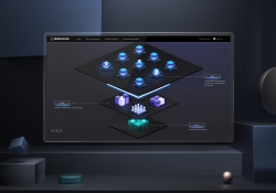
4Paradigm Sage AIOS Packaging Design
-
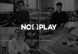
NC PLAY PROJECT
-
ScienceCom
-
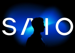
SAIO
-
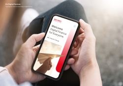
Welcome Digital Bank Visual Identity
-
Care Together Happy Together Visual branding
-
Manna corporate identity design
-
Pingtan Book House
-
Korean Medicine Blooms
-
Re Braille
-
4Paradigm Pandemic Prediction System Design
-
UNAJIRO VI
-
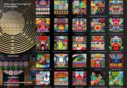
Graphic design for Gwangju city commemoration
-
The Worldly book design
-
Bexei The Wandering Earth
-
Garden Salt
-
SFOC Visual Identity
-
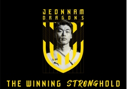
Jeonnam Dragons Football Club Rebranding
-
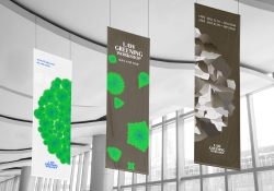
Law Greening Workshop
-
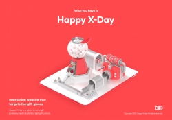
Happy X Day
-
Care U Most
-
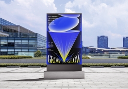
2022 Graduation exhibition GROW GLOW
-
Bubble Bomb
-
Energy Utopia
-
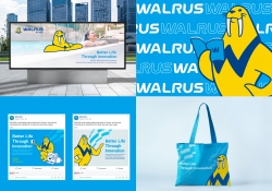
WALRUS PUMP Brand Design
-
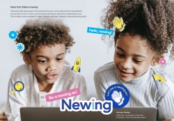
Newing
-
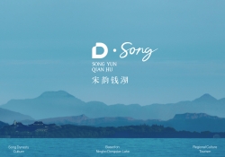
The Song rhythm of Dongqian Lake
-
SHIN KONG Bank Light Evolution
-
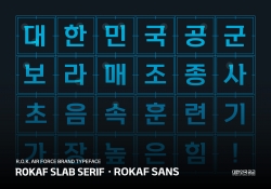
ROKAF Typeface
-
THE PENTHOUSE Visual Branding
-
BE BETTER Packaging for the Earth in 2050
-
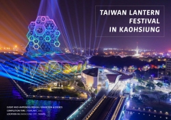
TAIWAN LANTERN FESTIVAL IN KAOHSIUNG
-
YNL Design CI Renewal
-
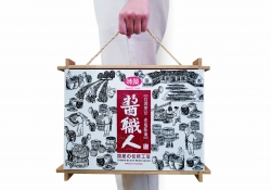
Sauce Expert
-
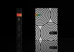
Project Echo
-
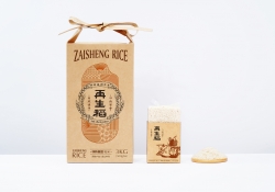
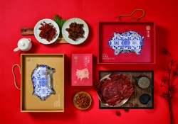
Zaishengdao Rice Packaging Design
-
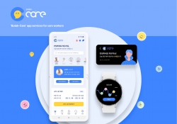
Butak Care app services for care workers
-
Prejudice
-
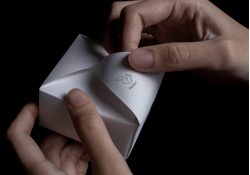
Origami Amenities
-
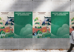
History and Legend of Gangneung
-
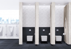
Concept ARC Dual Flush Valve
-
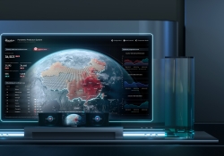
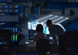
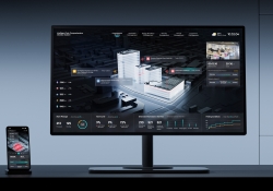
Midea Industrial City smart operation of IOC
-
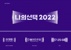
MY CHOICE Visual Branding
-
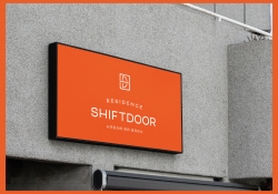
SHIFTDOOR RESIDENCE Brand Identity
-
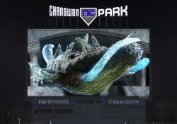
TL BRAND DAY in NC PARK
-
NCSOFT Leaders Kit
-
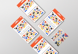
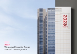
Welcome FG Seasons Greetings Pack
-
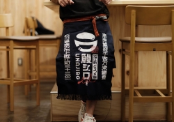
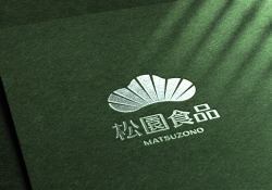
Matsu HandPulled Noodle Brand Design
-
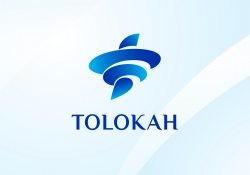
TOLOKAH Brand Design
-
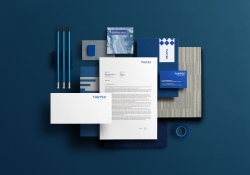
Tuntex Branding
-
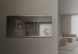
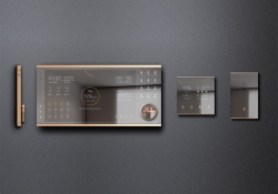
Smart Home Network Wall Pad HDHN4000
-
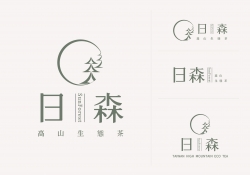
Sunforest
-
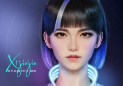
XIJIAJIA An AI Digital Human
-
Breeze White
-
AIOT Smart Park Integrated System
-
4paradigm Sage HyperCycle CESS
-
60 year memories of WAN CHUAN HSING
-
Smart Home Solution System HDHN 4000SET
-
DNAKE Sapphire Series


Designed by sketchbooks.co.kr / sketchbook5 board skin