
Decade the love
| Country | China |
|---|---|
| Year | 2021 |
| Award | WINNER |
| Affiliation | Touch Design |
| Designer | Zhang Yong, Ma Xin |
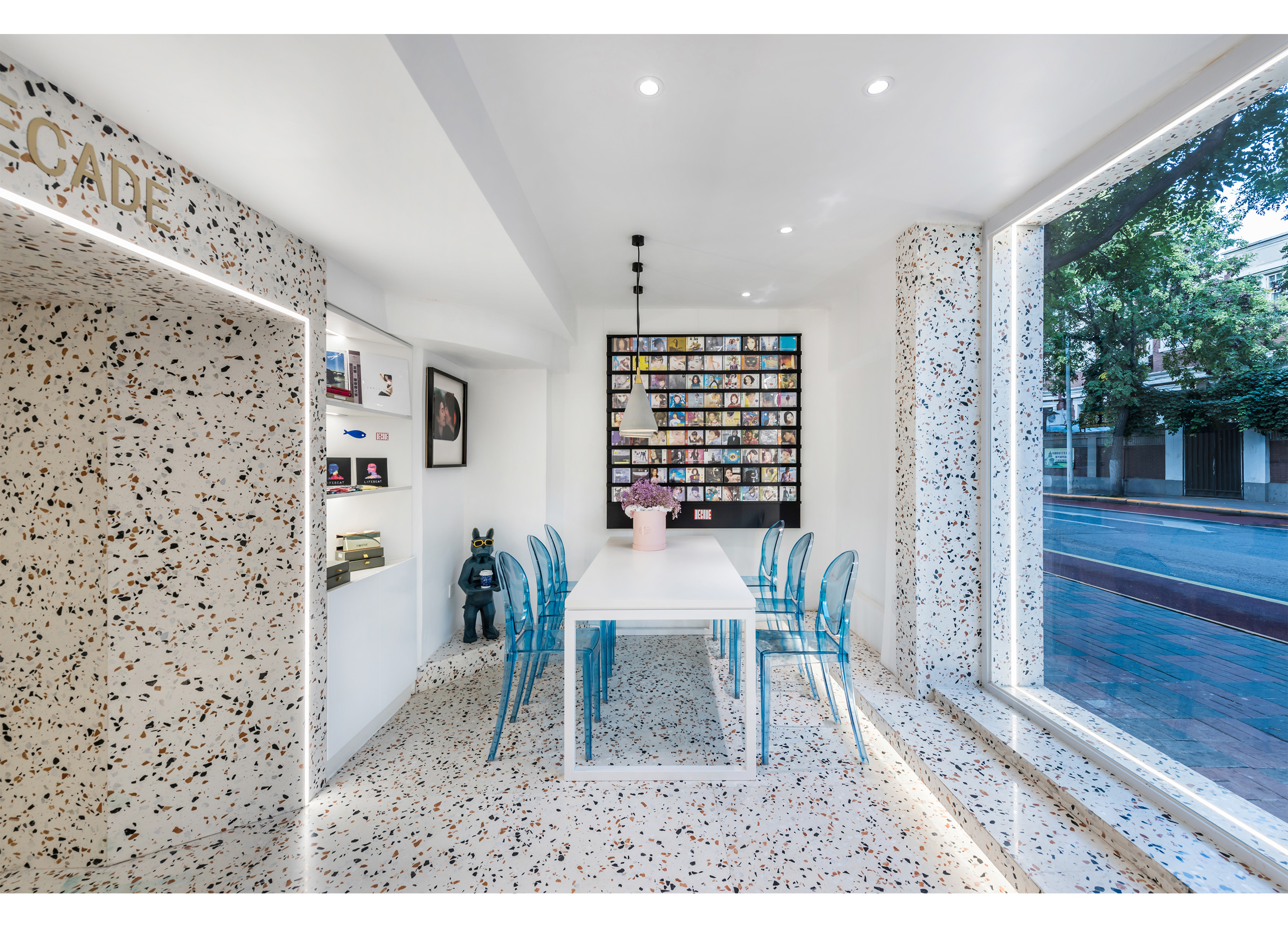
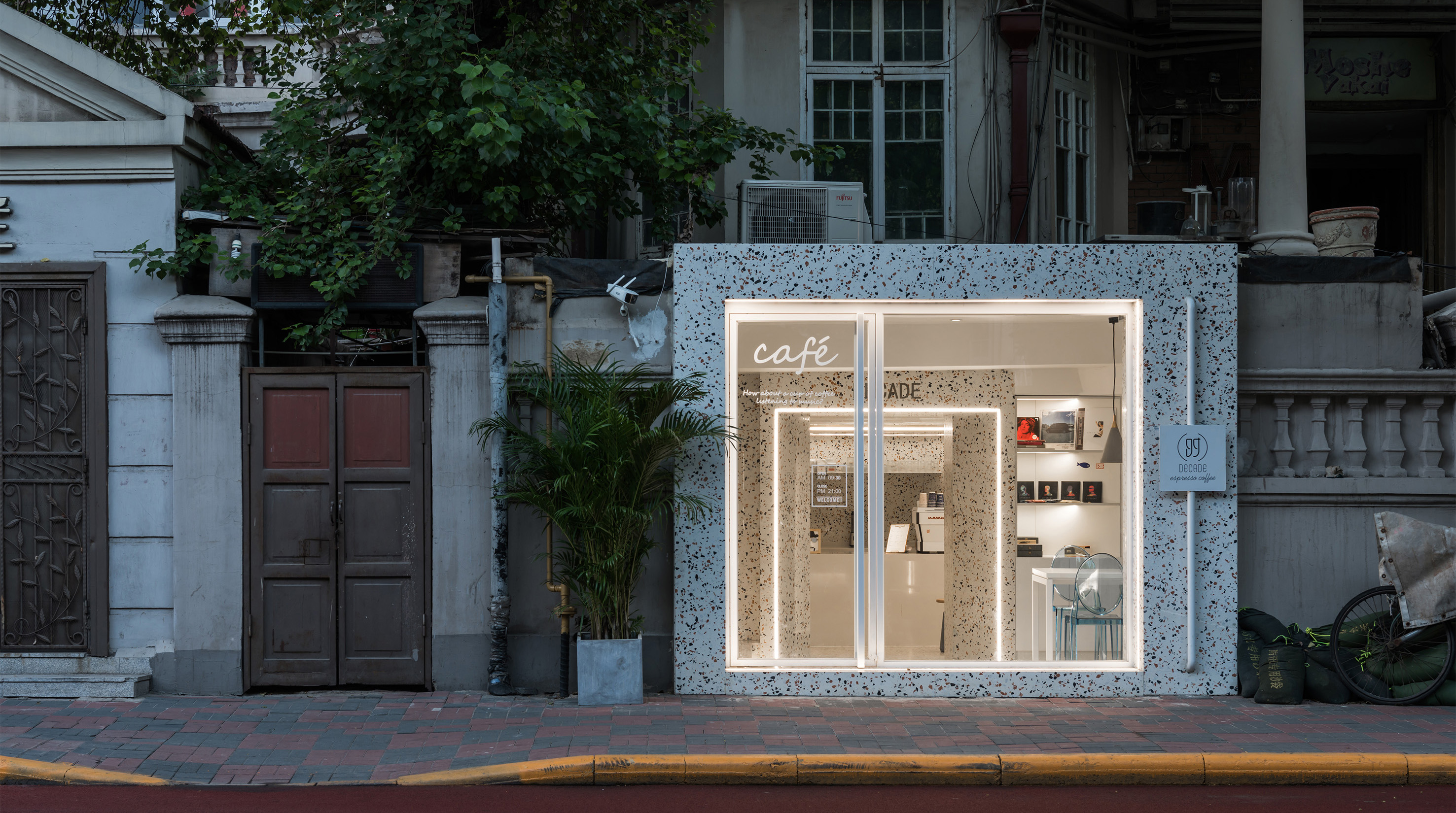
| English | The left and right sides of the glass door entrance are designed to display old records on the wall, which highlights the owner's taste and also reflects the theme culture of the cafe's music review. As a transition between the indoor and outdoor conversion of the sunken space and the entrance space, the second linear light separates the open and wrapped space, redefining the relationship between the interior of the space. Mirrored stainless steel cleverly hides the storage area and forms a visual widening, dispersing the narrow sense of space, plus a circle of symbolic linear lights to form its own architectural language. |
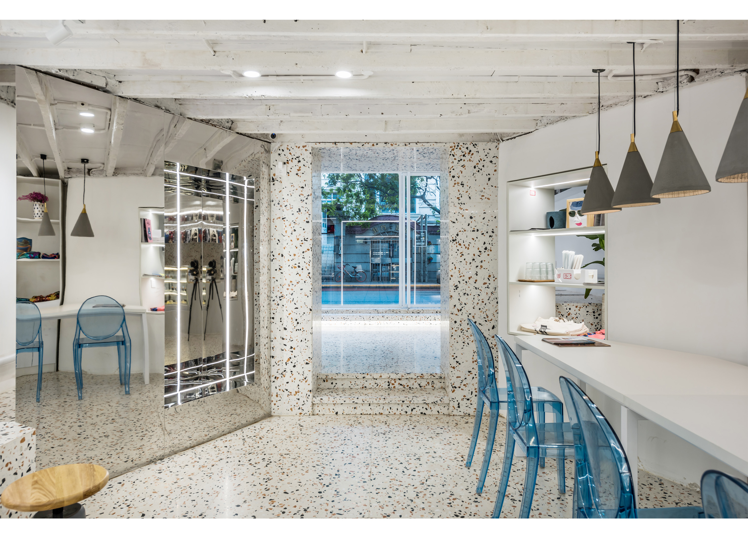
| Native | 玻璃门入口的左右两侧均设计成了摆放老唱片的墙面,彰显着两位主理人的品位的同时也体现了这家咖啡馆的乐评主题文化。门旁雕塑手捧托盘,托盘中摆放着定制的咖啡杯与周边产品,彰显着咖啡店的主题文化。作为下沉式空间与入口处空间的室内外转换的过渡,第二条线性灯光分隔出开放与包裹的空间,重新界定空间内部之间的关系。 镜面不锈钢将储藏区巧妙地隐藏起来,并形成视觉上的拓宽,将空间的狭长感驱散了几分,再加上一圈标志性的线性灯带,形成自身的建筑语言。人在其中穿梭,没有丝毫的局促感,在空间的跨度中开启唱片与咖啡的艺术之旅。 与整体风格呼应的清水混凝土吊灯,纯白的长桌,亚克力材质的蓝色座椅,彰显着现代感和高级感。抚平内心焦躁,同时带给人平静的体验。单客区的与多人卡座区以走道相隔,在保证互不干扰的同时对有限的空间进行合理布置。带有金属质感的水磨石吊灯再次赋予了空间的灵魂,让混凝土、水磨石、金属等材质与柔和且不失醒目的线性灯光设计,营造出一种温暖、私密、惊艳的氛围。座位面向墙面,让来店的单人顾客能最大限度的沉浸在个人思维。 甜品柜和吧台呈现完全透明的状态,研磨、萃取,咖啡的形态及制作的过程一览无余。简练而精致,以低调的姿态烘托产品,使得人们把视觉的焦点集中在咖啡与甜品上。演绎出极为纯粹的现代主义风格。 |
| Positive Comments |


|
-
Zi Zui Jin Ren
-
Indie Game & Culture Festival Burning Beaver
-
O2H TEA Brand Identity
-
Sign Language Badges for Hearing Impaired
-
Absolute W. 2025 Seasons Greetings Pack
-
Welcome Phoenix Visual Identity Rebranding
-
VIVI Cocktail
-
KOBE STORKS japan professional basketball
-
Multiposture Support Pillow
-
eltern
-
Formopia Brand Design
-
HIM TEA Branding
-
Bank of Taiwan Brand Design
-
Columbia 75 degree incline in Package
-
KUAV Visual Identity
-
Zo Clam style Air Cushion Baby Stroller
-
Pulse simulator
-
Slac
-
DOWNFALL OF WHO LET IN SOMETHING NOT ALLOWED
-
Onggi Jonggi
-
L holl
-
lllayer Corporate identity design
-
Scoot Safe
-
Innogrid Cloud Character Inno Crew
-
episode YONGSAN 241 BRANDING and WELCOME KIT
-
episode YONGSAN 241 UX (CON-T)
-
Mobile Banking App UI Design Rebranding
-
World Webtoon Festival
-
King Sejong procession outdoor advertising
-
SNUG SOCKS
-
fation brand renewal
-
The Creation of Heaven and Earth
-
Girls Find Girls App
-
Our AZ
-
eggseoul Brand Identity Design
-
EASTROC Shang Cha Tea Series
-
Brand advertisement for OGISHI TADASHI SHOTEN
-
Oddor
-
minid


Designed by sketchbooks.co.kr / sketchbook5 board skin


