
Vertical Filters
| Country | Korea |
|---|---|
| Year | 2025 |
| Award | WINNER |
| Client | KZ Corp. |
| Affiliation | Diffusion Architecture |
| Designer | KIM JAE SUNG, LEE JUNG SOOK, KIM DOYEON |
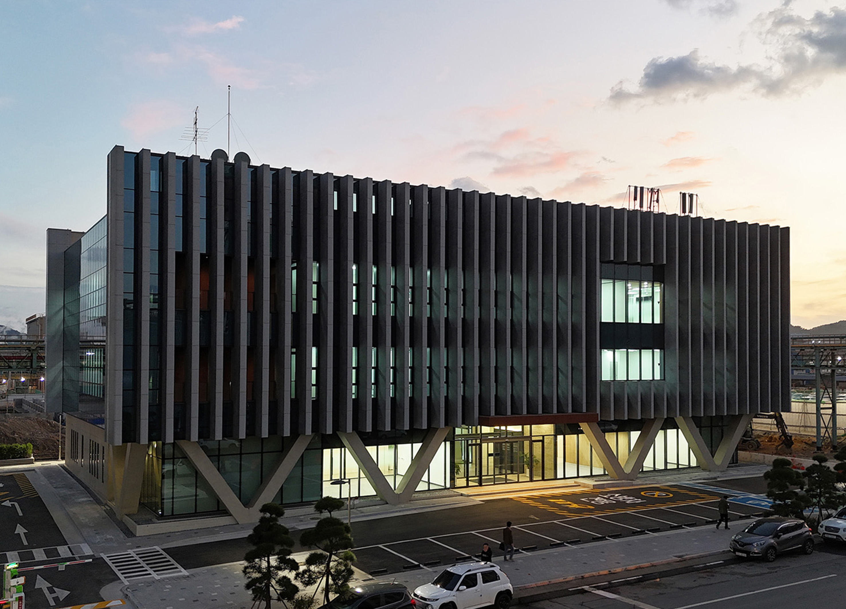
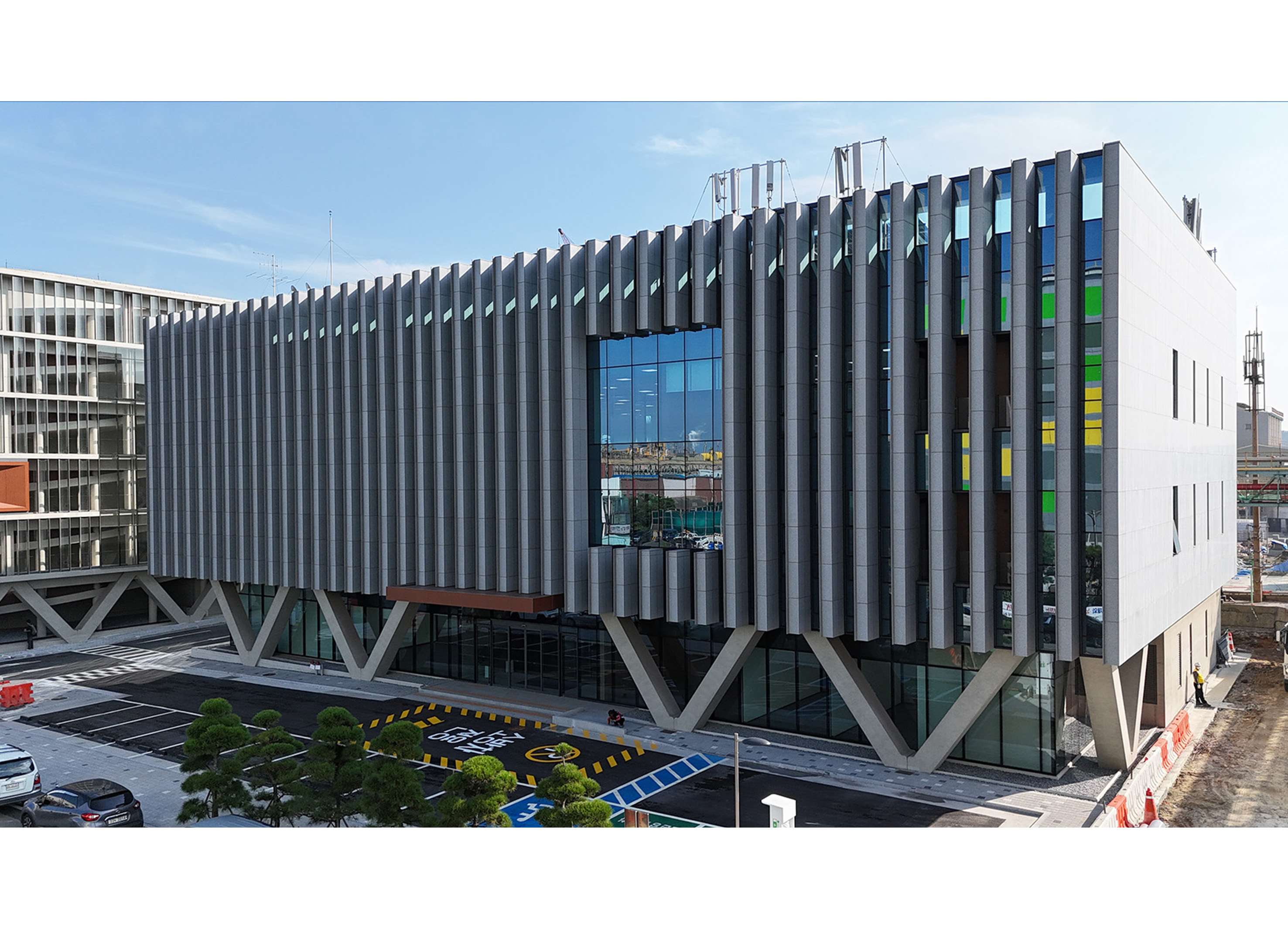
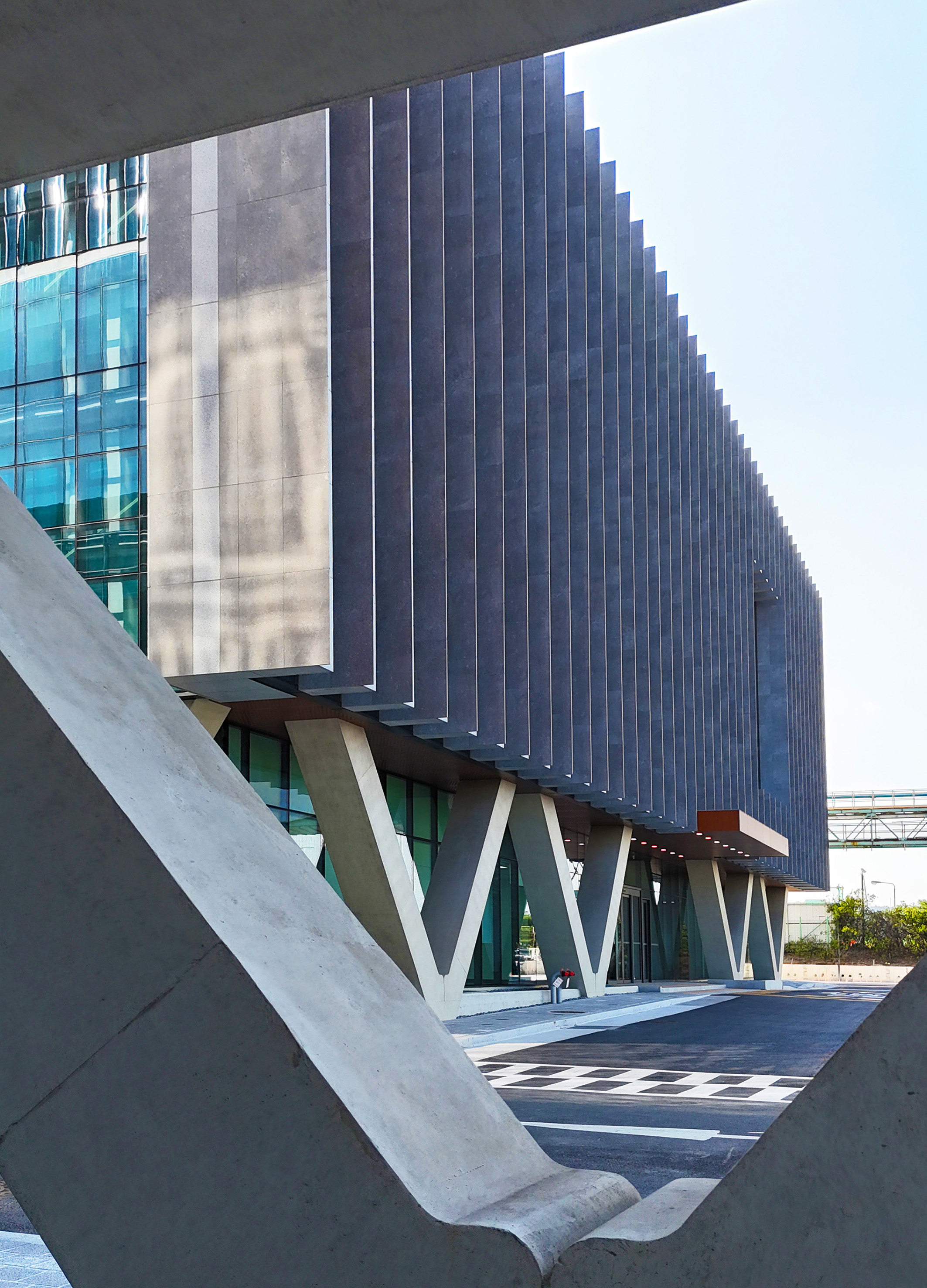
| English | This building is designed as a safety training center for factory workers, providing a space where various safety experiences are possible. The primary vertical louvers on the building are treated with different colors on each side—dark and sharp on the left, thick and light on the right. From the front, the glass emphasizes a sense of lightness. The V-shaped columns on the first floor create a visual effect, as if rocks are being held aloft. Additionally, the windows on either side are arranged in extreme contrasts, with one side having very few and the other many, dramatically highlighting the building’s duality. |
| Native | 이 건물은 공장 근로자를 위한 안전 교육 센터로 설계되어 다양한 안전 체험이 가능한 공간을 제공합니다. 건물의 주요 수직 루버는 양쪽이 어두운 색과 날카로운 색으로 처리되어 있으며 왼쪽은 두껍고 밝은 색으로 처리되어 있습니다. 전면에서 보면 유리는 가벼움을 강조합니다. 1층의 V자형 기둥은 마치 바위를 높이 들고 있는 것 같은 시각적 효과를 만들어냅니다. 또한 양쪽의 창문은 극단적인 대조를 이루며 한쪽은 매우 적고 다른 쪽은 매우 많아 건물의 이중성을 극적으로 강조합니다. 이 건물에 적용된 수직 루버는 고객의 광물 생산에 사용되는 여과 공정을 은유적으로 표현합니다. 시야각에 따라 루버를 통한 내부 공간의 외관이 변화하여 공간이 좁거나 넓거나 깊어 보이는 효과를 창출합니다. 이러한 루버를 통해 경험되는 색상 변화는 시각적 다양성을 더욱 강화하여 이용자의 시각에 기반한 독특한 공간 경험을 제공합니다. 건물의 주요 디자인 요소인 수직 루버는 화강석으로 제작되어 단단한 돌을 연상시키는 매시브한 외관을 나타냅니다. 가장자리는 타일로 마감하여 날카롭고 명확한 형태를 강조합니다. 이 디자인은 측면에서 볼 때 암석과 유사한 견고함을 전달합니다. 반면 1층의 V자형 기둥과 유리 창문은 건물에 경쾌함을 더해 마치 공중에 떠 있는 듯한 인상을 줍니다. |
| Positive Comments |


|
| Judging Comments | This design was highly praised for its bold visual contrasts and functional clarity, effectively reflecting the dual nature of safety—protection and openness. The color-treated vertical louvers create a dynamic, ever-changing facade, symbolizing the constant vigilance required in safety training. The V-shaped columns enhance the structural aesthetic, giving the building a sense of lightness and strength simultaneously. The intentional window contrast adds a dramatic architectural statement, reinforcing the balance between restriction and transparency—a concept central to worker safety and education. |
-
Zi Zui Jin Ren
-
Indie Game & Culture Festival Burning Beaver
-
O2H TEA Brand Identity
-
Sign Language Badges for Hearing Impaired
-
Absolute W. 2025 Seasons Greetings Pack
-
Welcome Phoenix Visual Identity Rebranding
-
VIVI Cocktail
-
KOBE STORKS japan professional basketball
-
Multiposture Support Pillow
-
eltern
-
Formopia Brand Design
-
HIM TEA Branding
-
Bank of Taiwan Brand Design
-
Columbia 75 degree incline in Package
-
KUAV Visual Identity
-
Zo Clam style Air Cushion Baby Stroller
-
Pulse simulator
-
Slac
-
DOWNFALL OF WHO LET IN SOMETHING NOT ALLOWED
-
Onggi Jonggi
-
L holl
-
lllayer Corporate identity design
-
Scoot Safe
-
Innogrid Cloud Character Inno Crew
-
episode YONGSAN 241 BRANDING and WELCOME KIT
-
episode YONGSAN 241 UX (CON-T)
-
Mobile Banking App UI Design Rebranding
-
World Webtoon Festival
-
King Sejong procession outdoor advertising
-
SNUG SOCKS
-
fation brand renewal
-
The Creation of Heaven and Earth
-
Girls Find Girls App
-
Our AZ
-
eggseoul Brand Identity Design
-
EASTROC Shang Cha Tea Series
-
Brand advertisement for OGISHI TADASHI SHOTEN
-
Oddor
-
minid


Designed by sketchbooks.co.kr / sketchbook5 board skin


