Bank of Taiwan Brand Design
Communication
Area
Taiwan
Year
2025
Award
WINNER
Client
Bank of Taiwan
Affiliation
Process Group
Designer
Bank of Taiwan Team, Process Taipei Team
https://www.youtube.com/watch?v=XyTppeKffyI
English
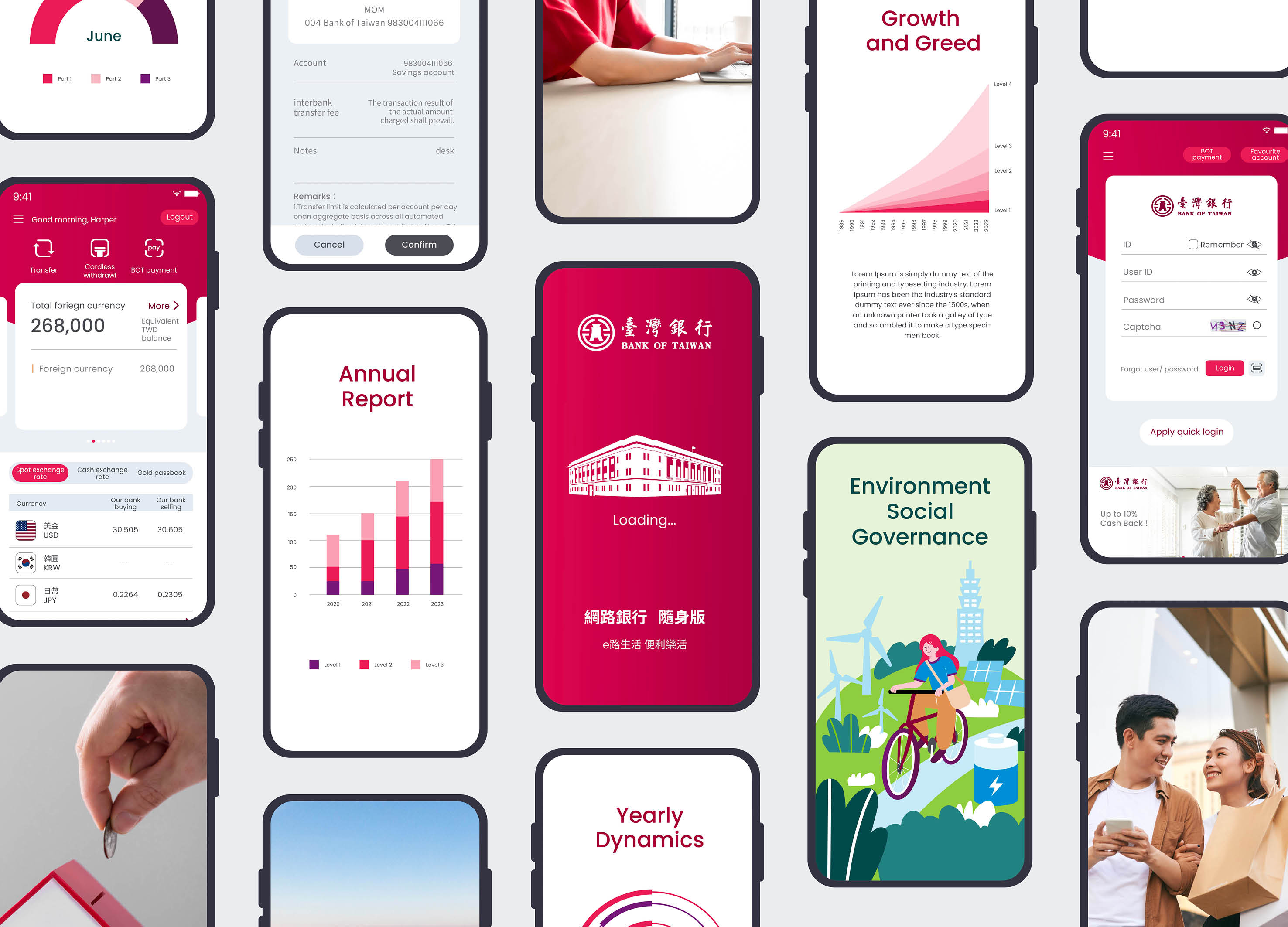
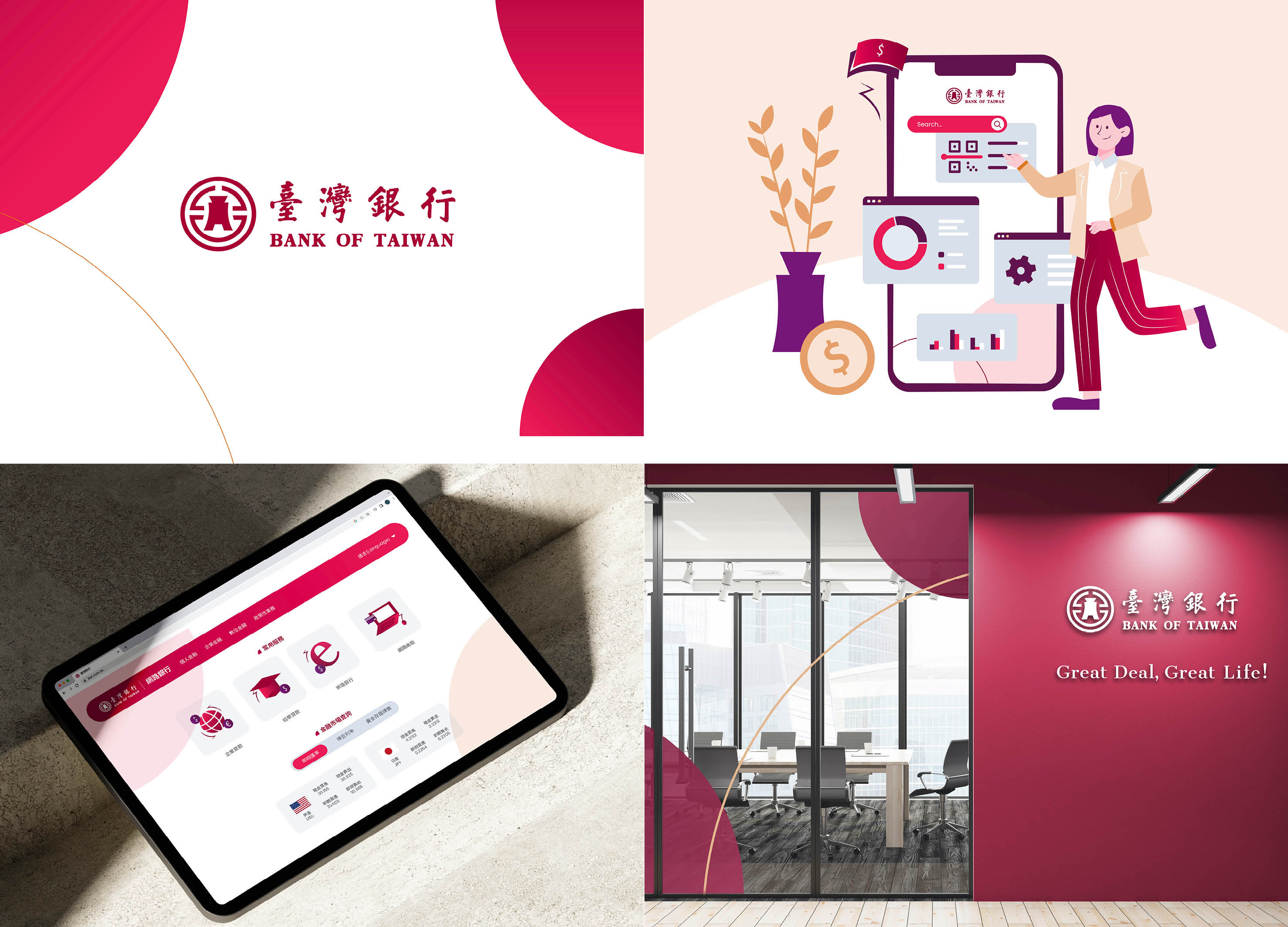
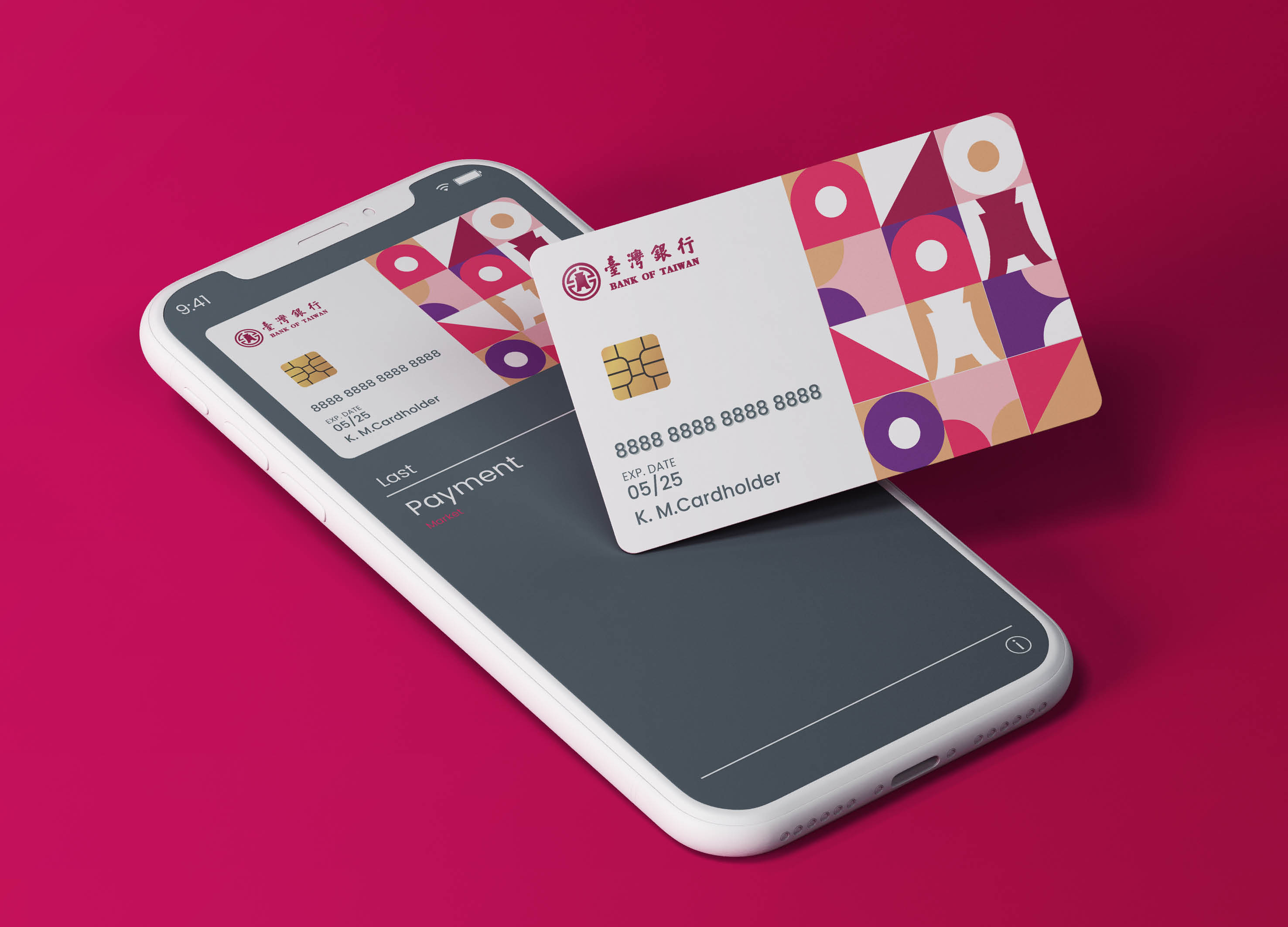
Amidst digital trends and competition, Bank of Taiwan rejuvenated its brand without altering the original trademark or main color, conveying its cultural spirit, and establishing new possibilities for state-owned enterprise rebranding. Drawing inspiration from ancient oriental "spade money" currency and the "circle" symbol in the trademark, the design inherits unique cultural style with dynamic, circular transformations. Bank of Taiwan showcases stable, diverse services, enriching customers' lives. The wine-red gradient elements modernize the brand while preserving a century of heritage, building social influence.
Native
臺灣銀行面臨數位化趨勢及競爭對手的衝擊,在不更動原有商標和主色下,翻轉品牌守舊的樣貌,以傳遞品牌理念與文化精神為初衷,開啟國營企業品牌再造新的可能性。
整體視覺圖形從商標元素中的「布錢」東方古代貨幣的造型及「圓」符號汲取靈感,將布錢元素設計於圖標、插畫中,傳承獨有文化風格,並以動態思維創造出圓的翻轉和豐富的造型變化,傳遞臺灣銀行以穩健且多元的服務內容,轉動每一筆金融交易,為客戶實現美好生活。 色彩發展上,因應數位趨勢將品牌主色酒紅色加入漸層元素,保留百年歷史的文化涵養,同時演繹出現代且數位的新穎形象,建立社會影響力。 近年金融市場迎向數位浪潮,競爭品牌面臨數位轉型問題時,即開展新的子品牌,而非建立在母品牌的本質上進行轉型,臺灣銀行從既有架構下思考數位轉型,延續品牌價值及文化歷史,建立全方位新穎形象。
此次品牌再造以下三項重點: 1. 臺灣銀行建立國營銀行品牌再造的可能性,建立社會影響力。 2. 臺灣銀行延續品牌文化與價值,並因應數位轉型加入數位化及新穎的元素。 3. 建立嚴謹的品牌識別系統,讓推動各項服務溝通及數位應用時具系統性與一致性。
Website
Judging Comments
Bank of Taiwan’s rebranding has been recognized for its seamless blend of tradition and modernity. By maintaining its original trademark and colors, the design preserves cultural heritage while introducing dynamic circular motifs inspired by ancient "spade money" and the brand’s signature emblem. The wine-red gradient adds a contemporary touch, symbolizing stability and progress. This strategic update successfully enhances brand recognition, reinforcing the bank’s identity as a forward-thinking yet historically rooted institution, strengthening its social influence and customer engagement.
Positive Comments


Hallucinogenic Mushrooms
Sejong University
Korea
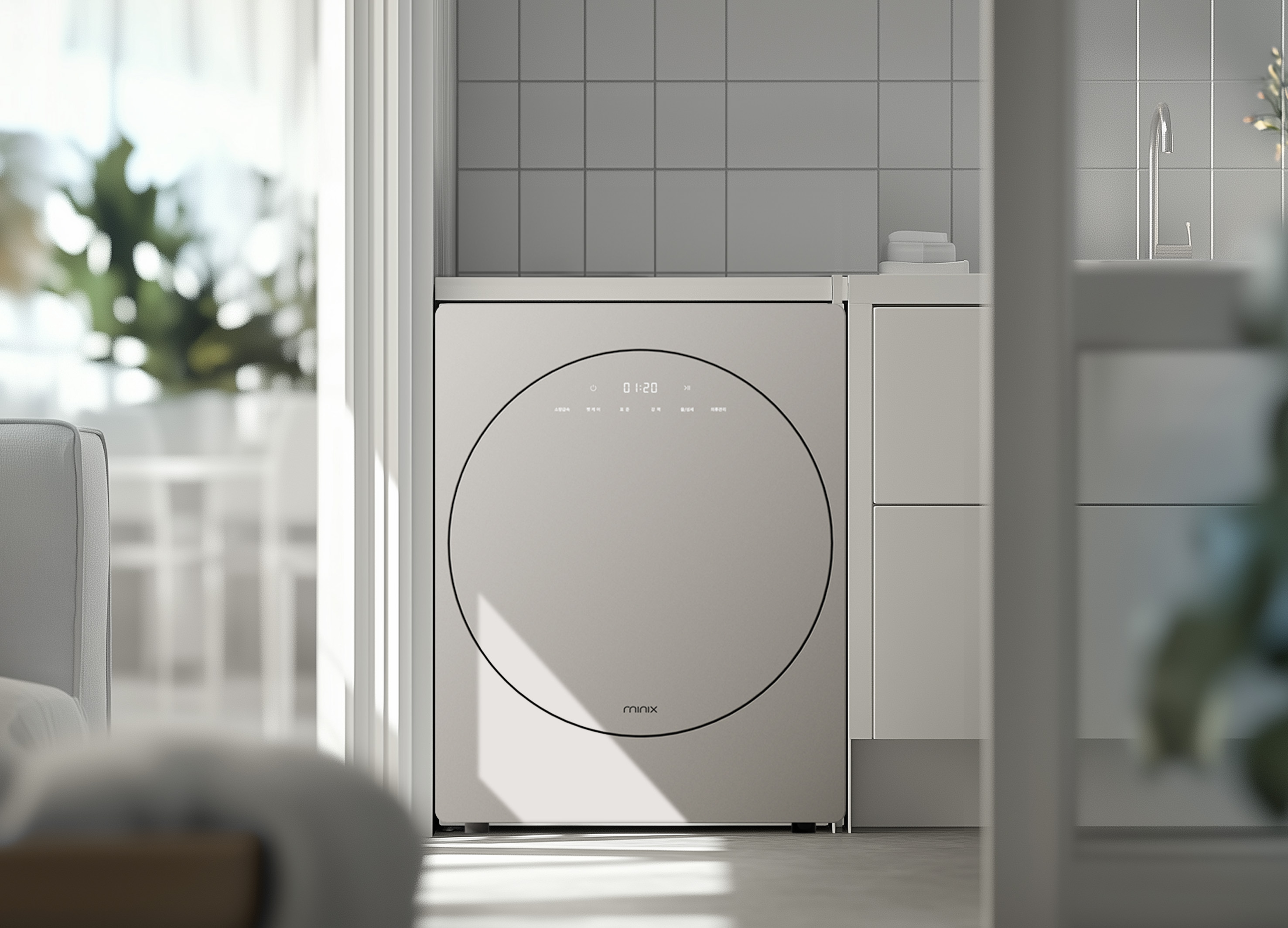
minix clothes dryer
Athome Corp.
Korea
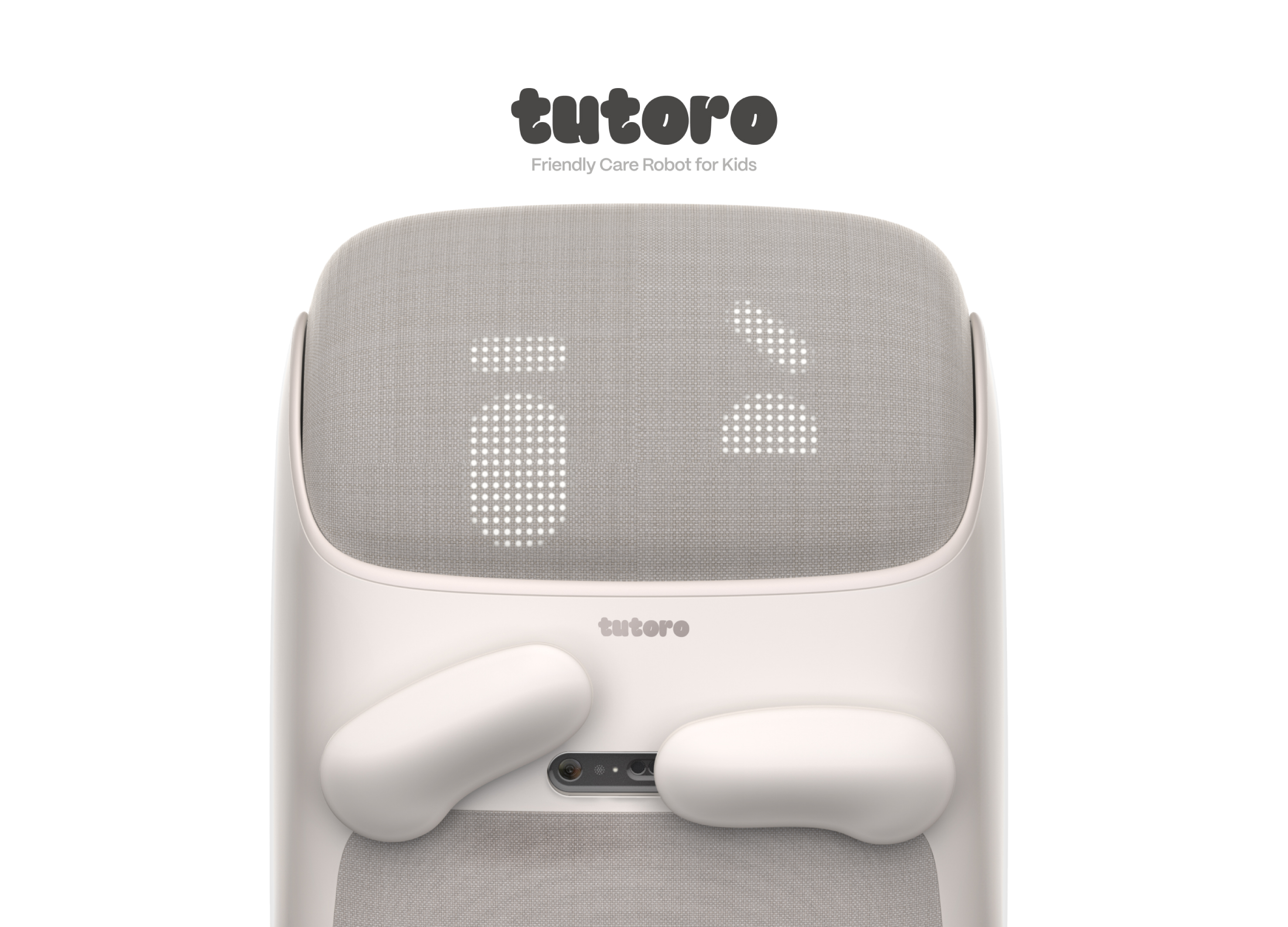
Tutoro
Hongik University
Korea
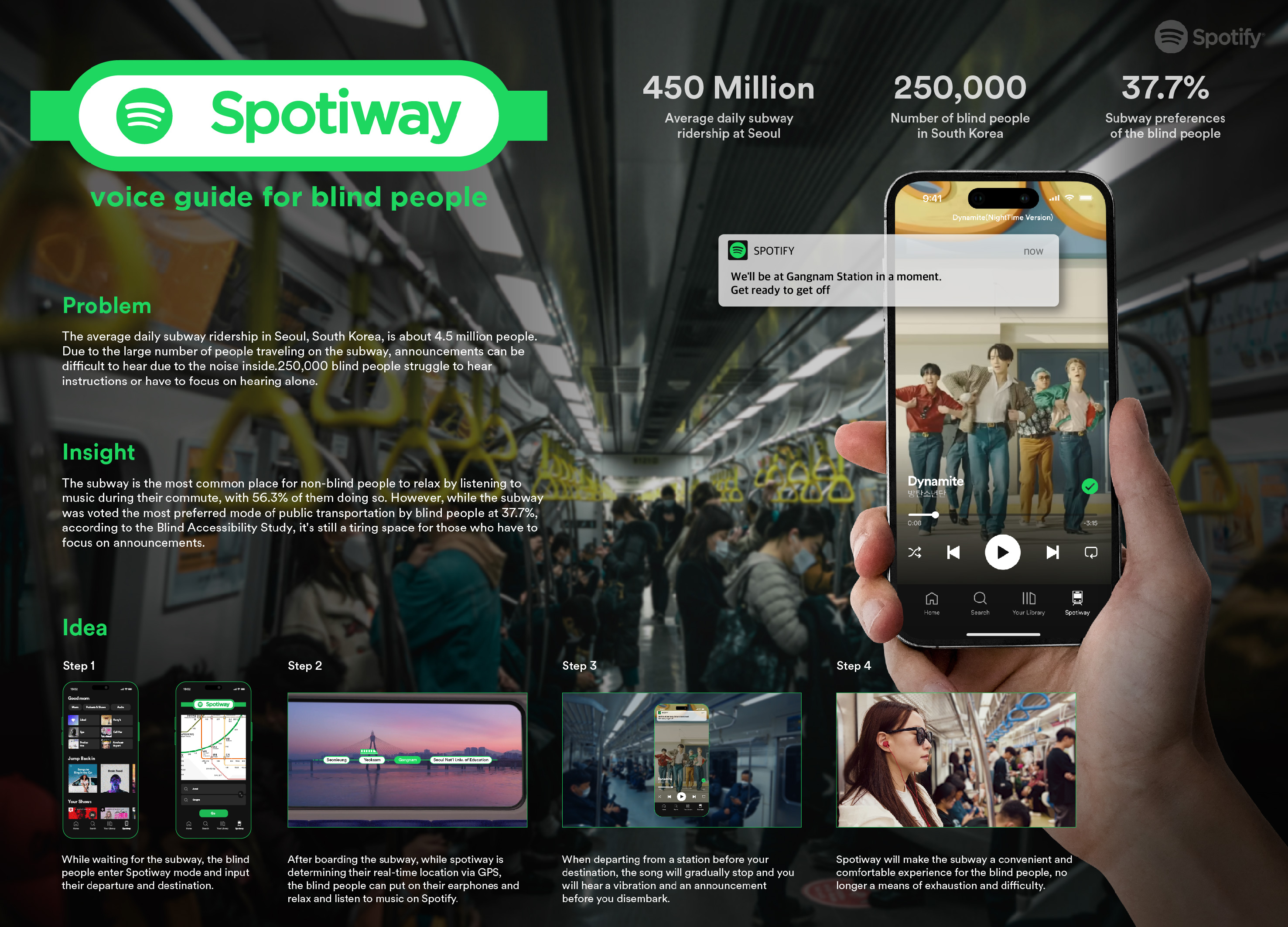
Spotiway.voice guide for blind people
Dongseo University
Korea

Grohe PreFilter
GROHE
Singapore
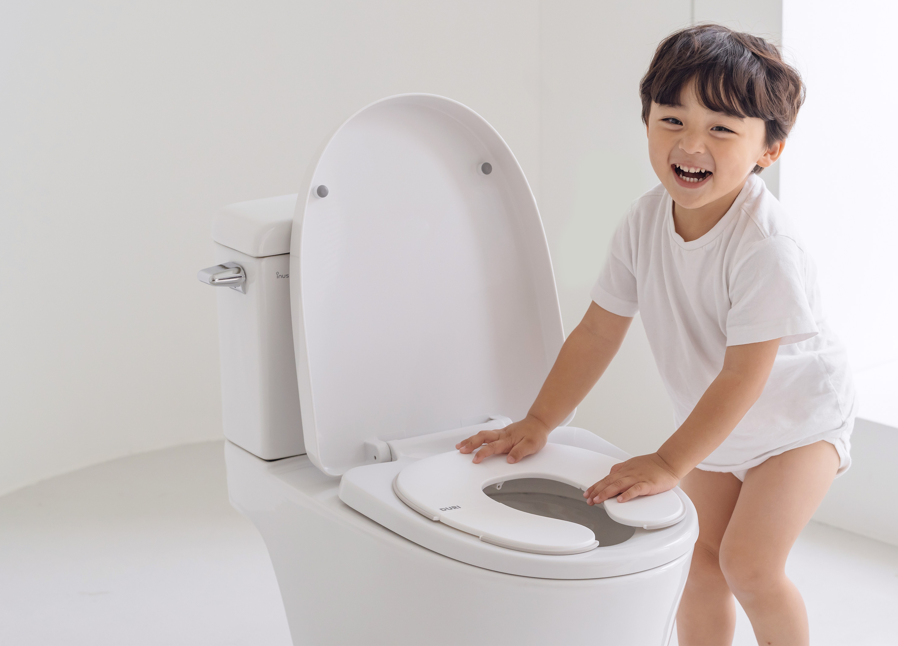
DURI portable folding potty
PRESENT
Korea
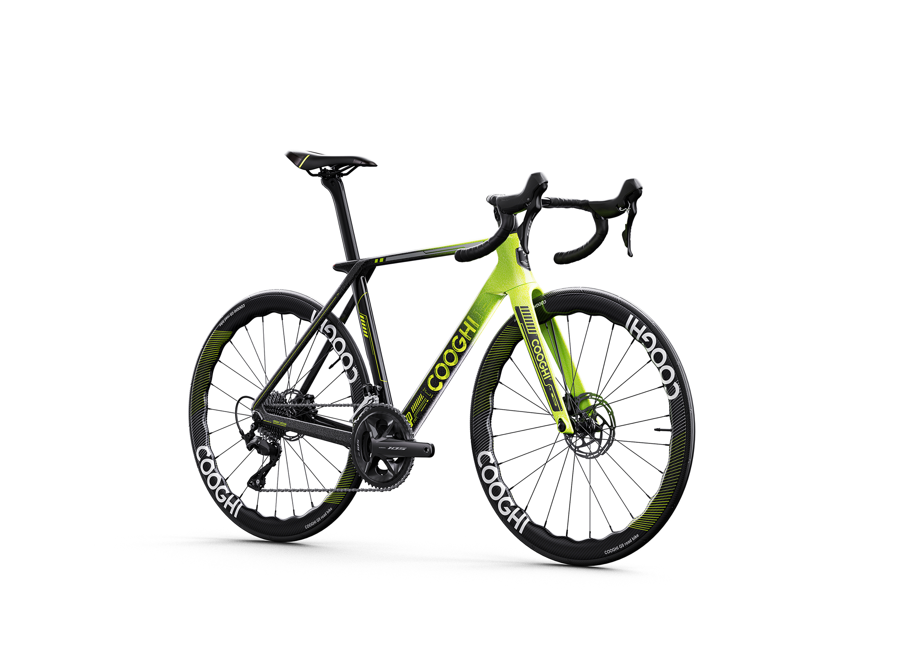
COOGHI G9 Green Mamba road bike
Shenzhen COOGHI Funkids Technology Co., Ltd.
China
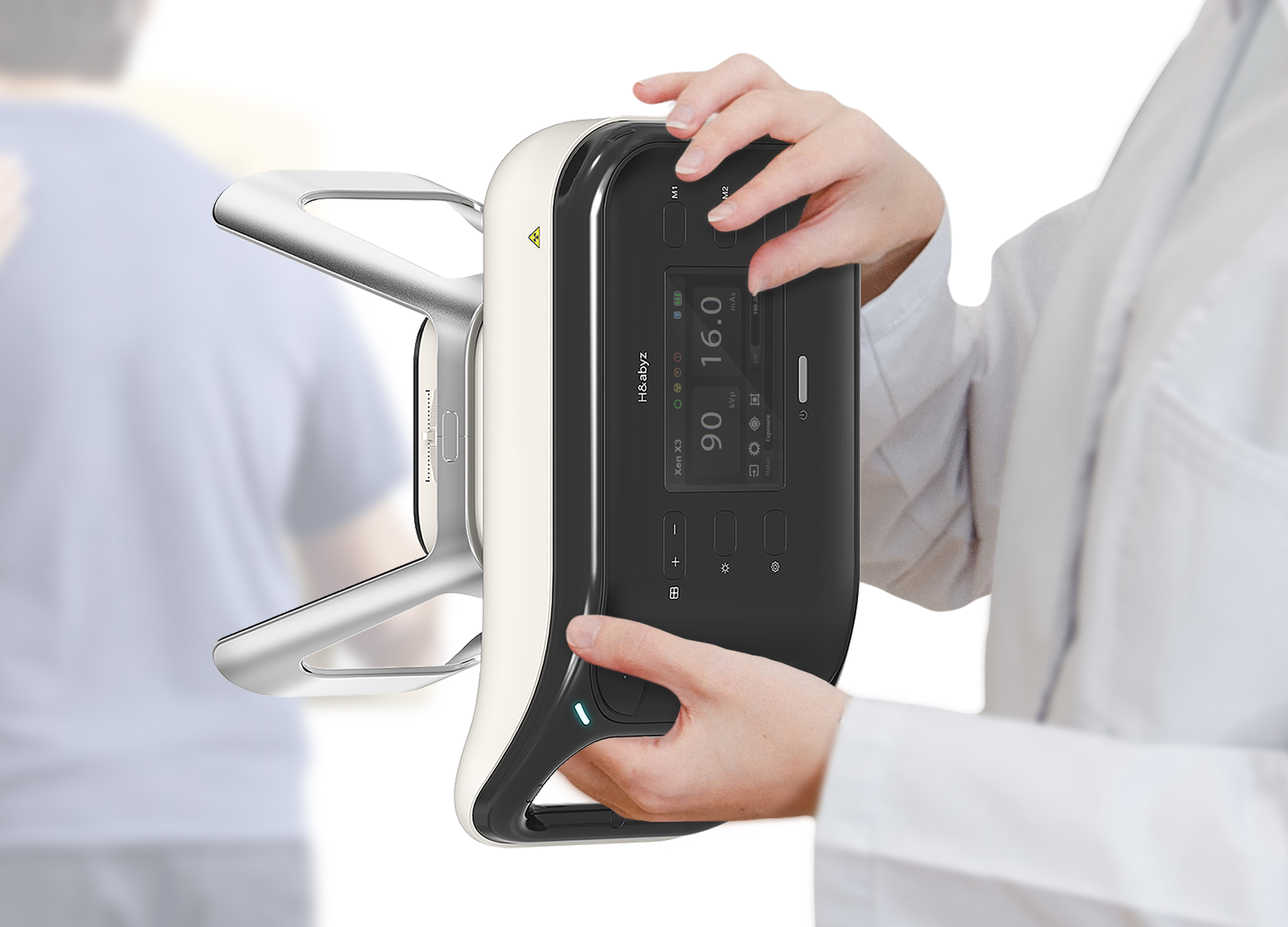
H n abyz HnX 1 Portable X Ray
GODESIGN
Korea
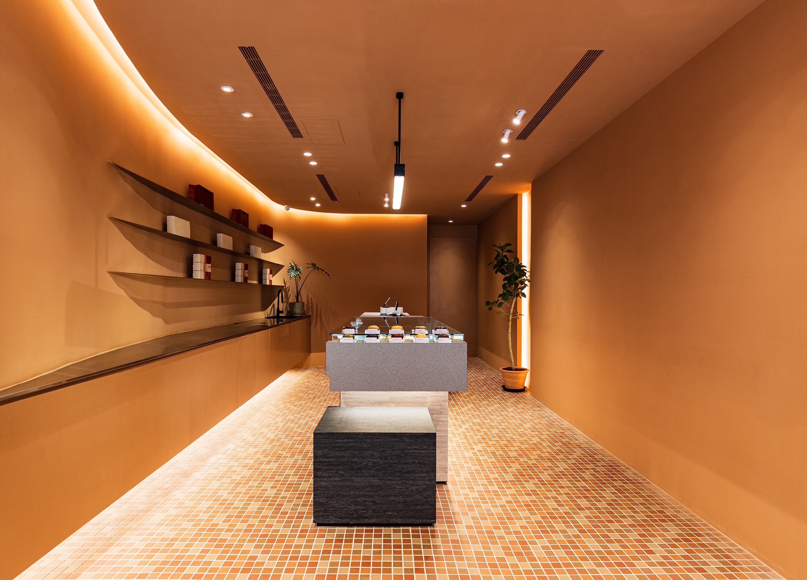
SWEETFULL
Union Atelier
Chinese Taipei
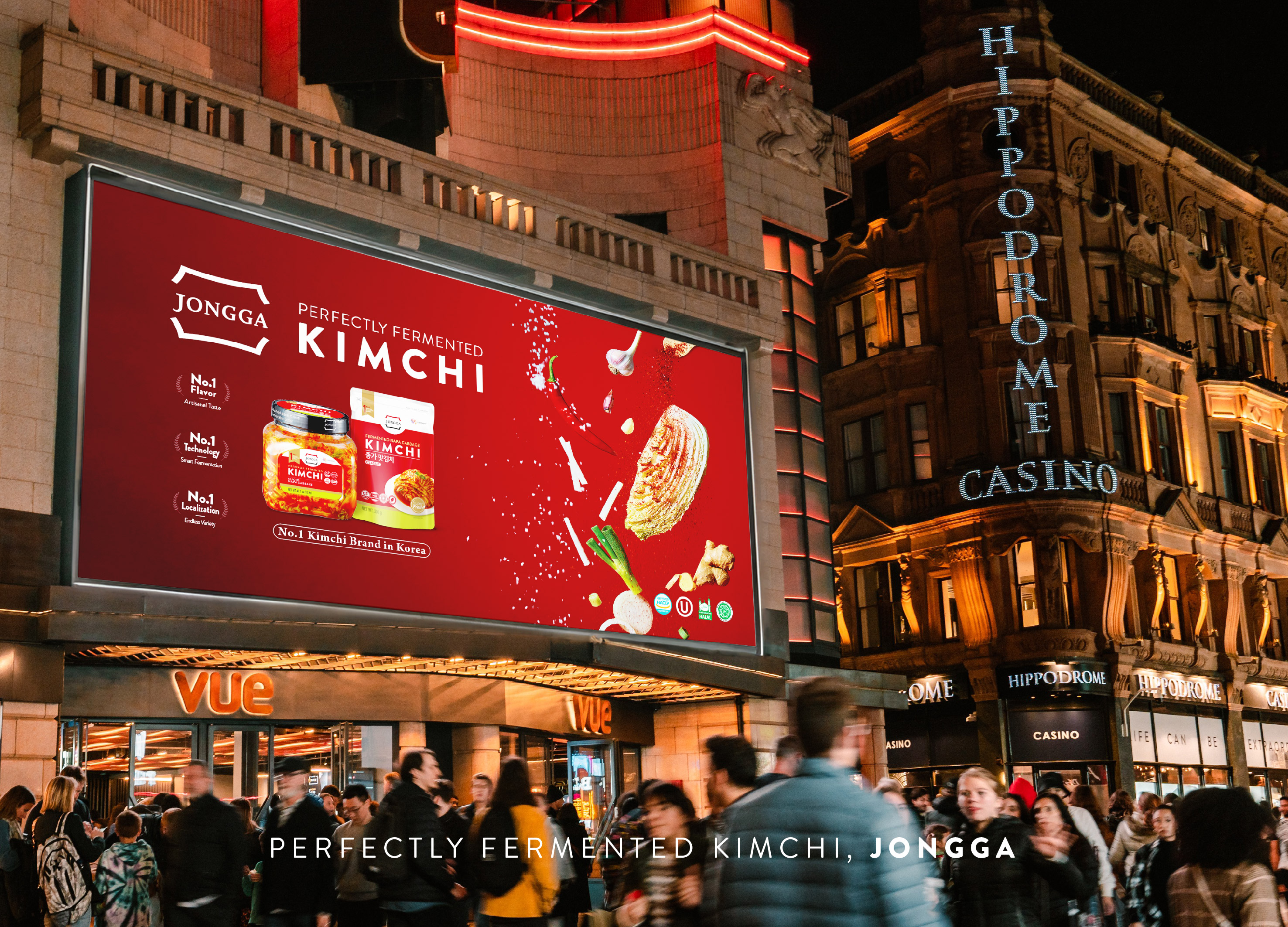
Global JONGGA Kimchi Design
Daesang Corporation Co., Ltd.
Korea

KIMCHI CRUNCH BITES CRUNCH THE WORLD
Daesang Corporation Co., Ltd.
Korea
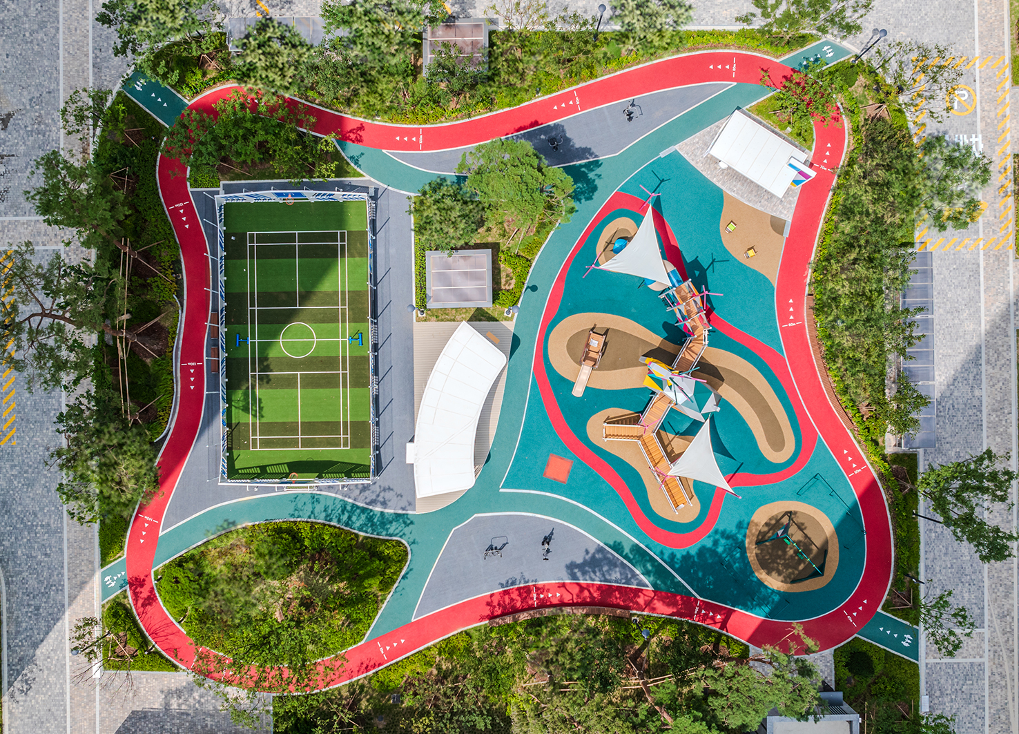
Healthy Pleasure Park
HYNUDAI ENGINEERING Co., Ltd.
Korea


Partner & Sponsor
More


info@asiadesignprize.com
#14057, 905 49, Beolmal-ro 102beon-gil,
Dongan-gu, Anyang-si, Gyeonggi-do, Korea
#14057, 905 49, Beolmal-ro 102beon-gil,
Dongan-gu, Anyang-si, Gyeonggi-do, Korea
Founder: Doyoung Kim
Business Registration Number: 454-86-01044
Online Sales License No.: 2021-Anyang Dongan-1081
Copyright © DESIGNSORI Co., Ltd.
Business Registration Number: 454-86-01044
Online Sales License No.: 2021-Anyang Dongan-1081
Copyright © DESIGNSORI Co., Ltd.
