Grampus Brand Identity
Communication
Regions
Korea
Year
2021
Award
WINNER
Client
IVY SPORTS
Affiliation
YNL DESIGN
Designer
YOONA LEE SANGMI PARK
https://www.youtube.com/watch?v=WI3Oiewbx_o
English
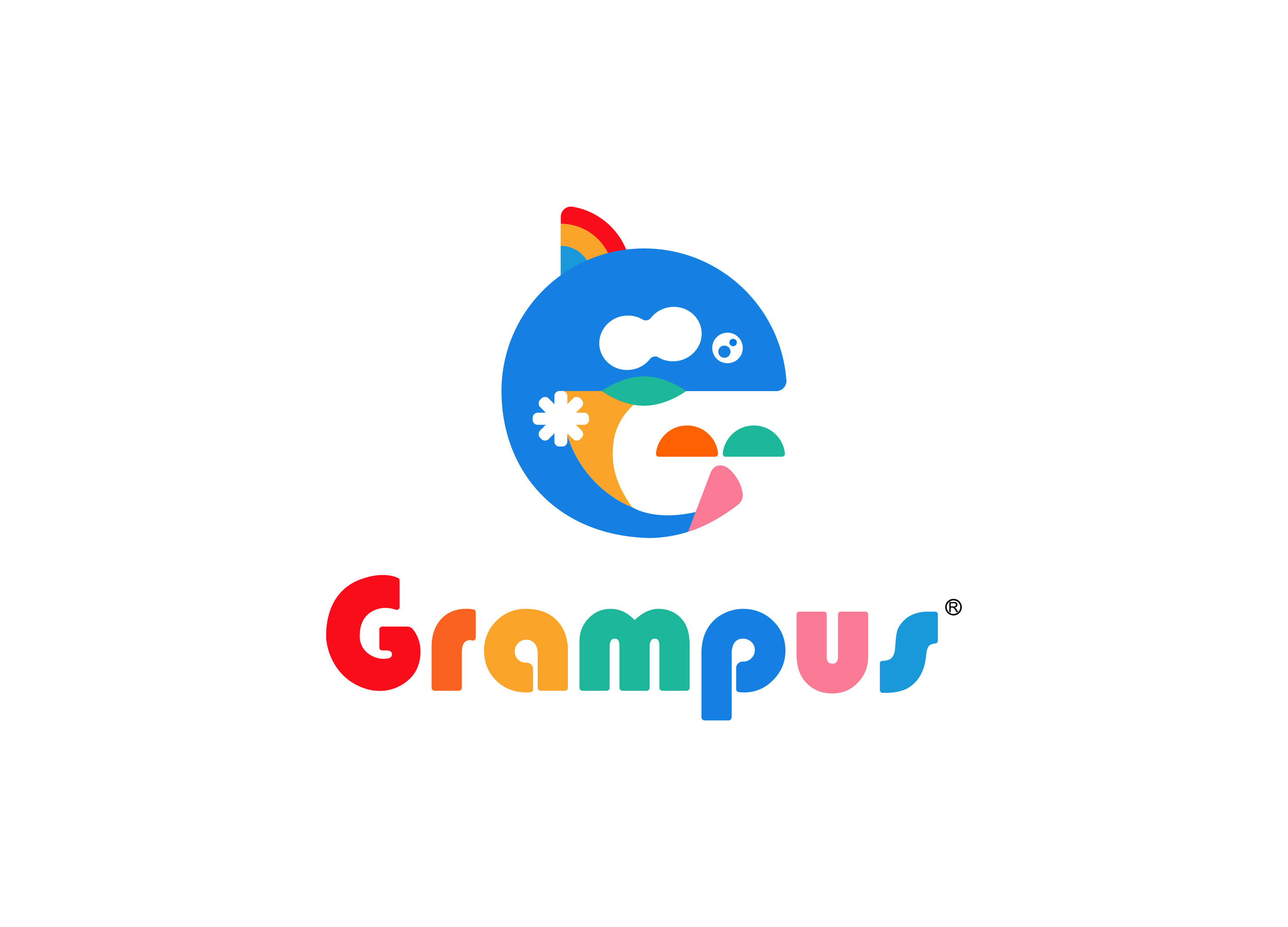
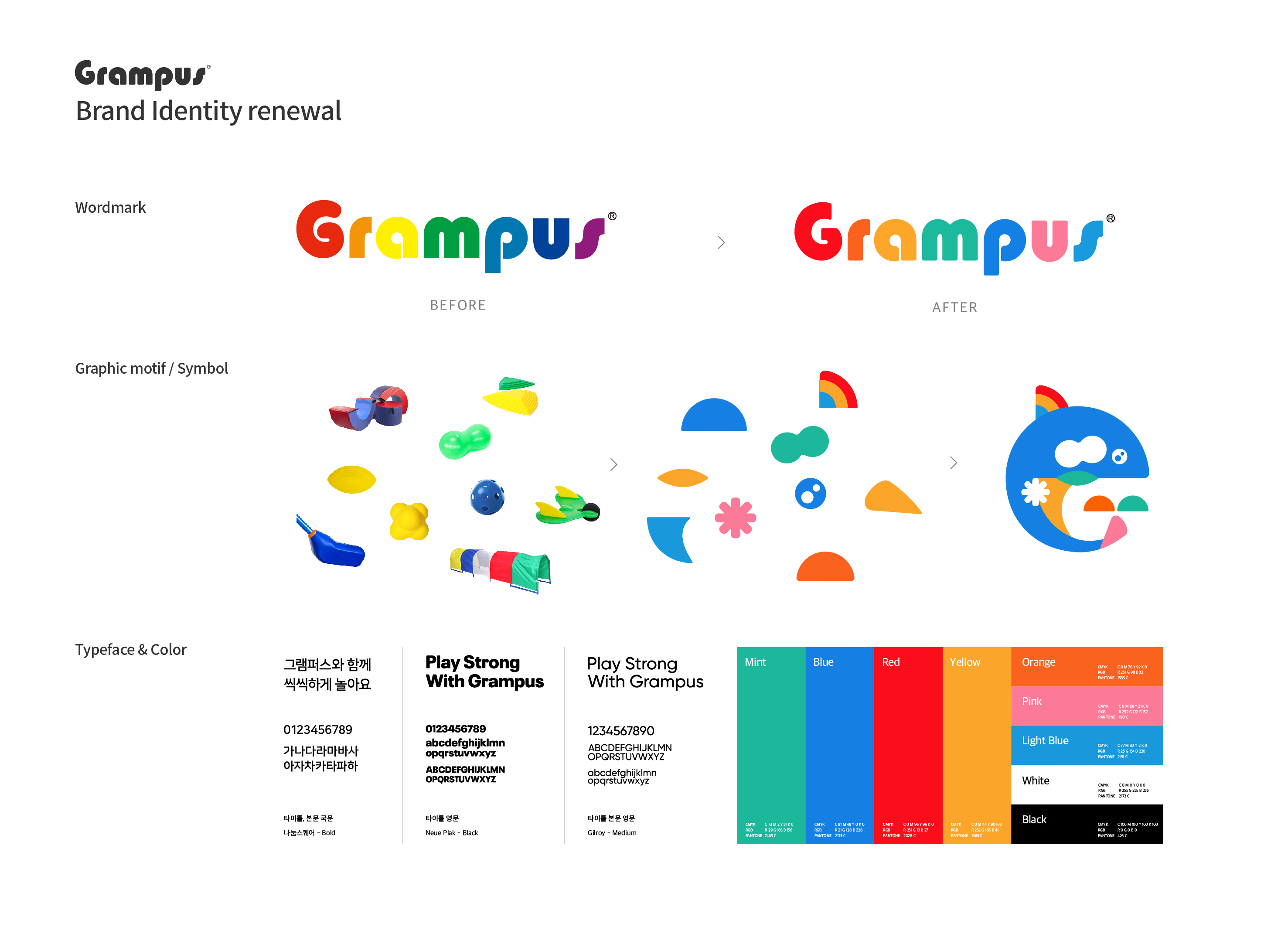
Grampus is a brand that develops and sells various kids' teaching aids to improve children's athletic ability and health. An active identity renewal was needed that matched the consumer trend of looking for convenient and usable teaching aids and focused on brand diversity and potential. To this end, we have newly established a brand image of sporty, energetic, and playful, taking into account the morphological characteristics of the Grampus parish and the sensitivity of the target class children. The main symbol of the killer whale is a collection of graphic elements that uniquely represent the shape of the parish.
Native
그램퍼스는 아이들의 운동신경과 건강 증진을 위해 다양한 키즈 교구를 개발 및 판매하는 브랜드입니다.
편리하고 사용성이 좋은 교구를 찾는 소비자 트렌드에 부합하고 브랜드의 다양성과 잠재력에 주목한 능동적인 아이덴티티 리뉴얼이 필요했습니다.
이를 위해 그램퍼스 교구의 형태적 특성과 타겟층인 어린이의 감성을 고려하여 spoty, energetic, playfu한 브랜드 이미지를 새롭게 구축했습니다.
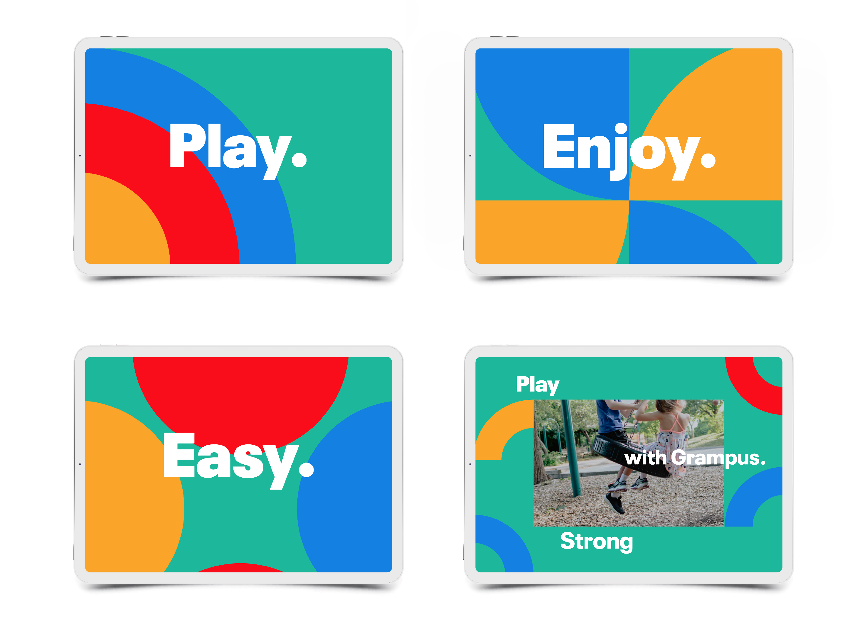
범고래를 표현한 메인심볼은 교구의 형태를 유니크하게 표현한 각각의 그래픽 요소를 한데 모아 형상화하였습니다. 워드마크의 경우 기존의 각진 코너를 라운드화하여 아이들을 위한 제품으로서 안전성을 강조하였으며 교구의 다채로운 컬러를 반영해 브랜드 상징성을 높였습니다. 그램퍼스의 교구 형태에서 영감을 얻은 그래픽 모티브와 그램퍼스의 브랜드 키워드인 ‘PLAY’, ‘ENJOY’, ‘EASY’ 워딩을 조화롭게 표현하여 브랜드 톤앤매너를 구축했습니다.
그램퍼스의 포장박스, 테이프, 명함 등 다양한 애플리케이션 활용을 위해 그래픽 모티브와 로고타입의 유동적인 조합을 적용했습니다.
Positive Comments


Wuxi Shi Ba Dang Restaurant
Lonson Design
China
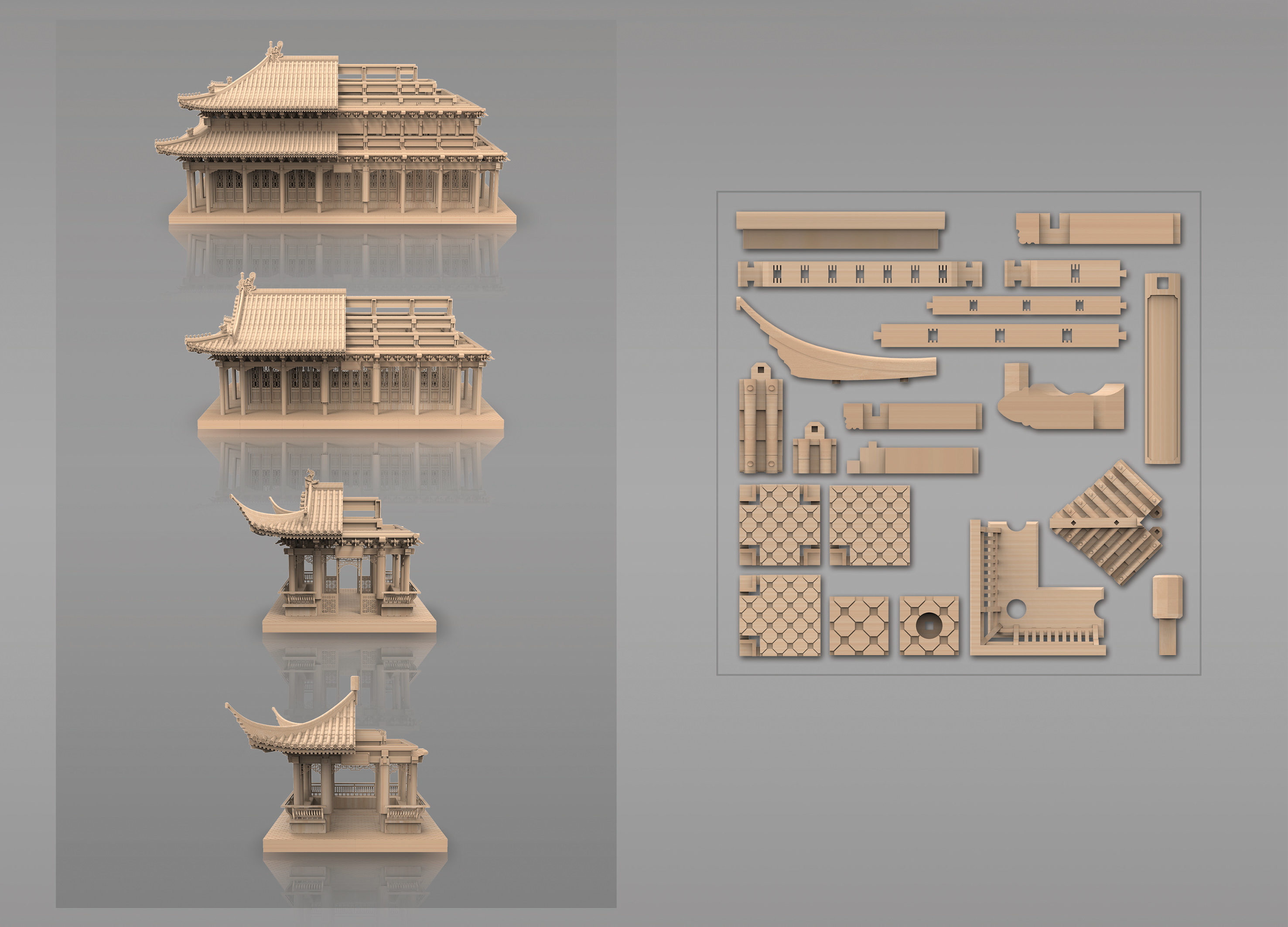
Building blocks for general structures
40
China
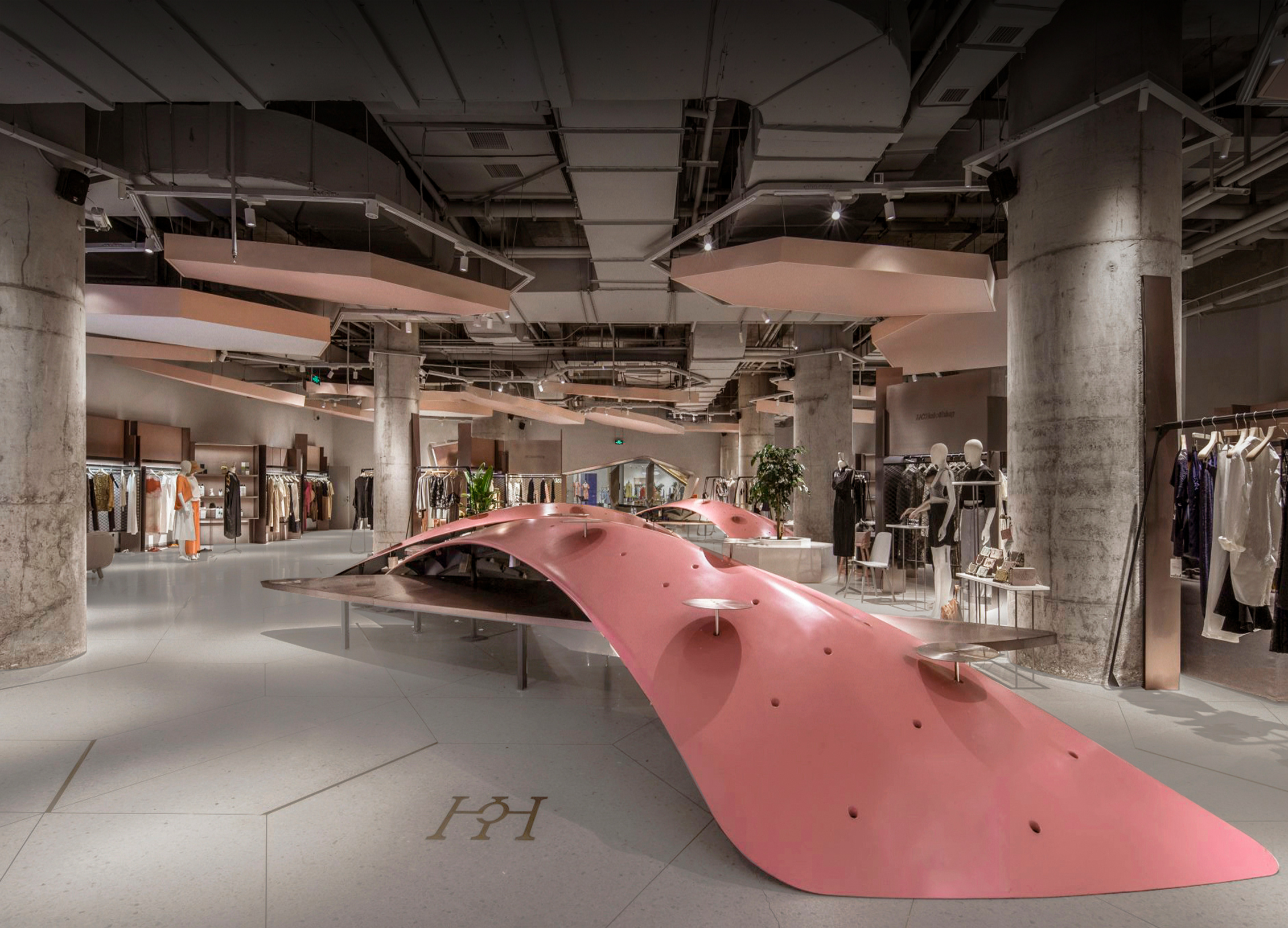
HCH Fashion Boutique Store
SpActrum
China
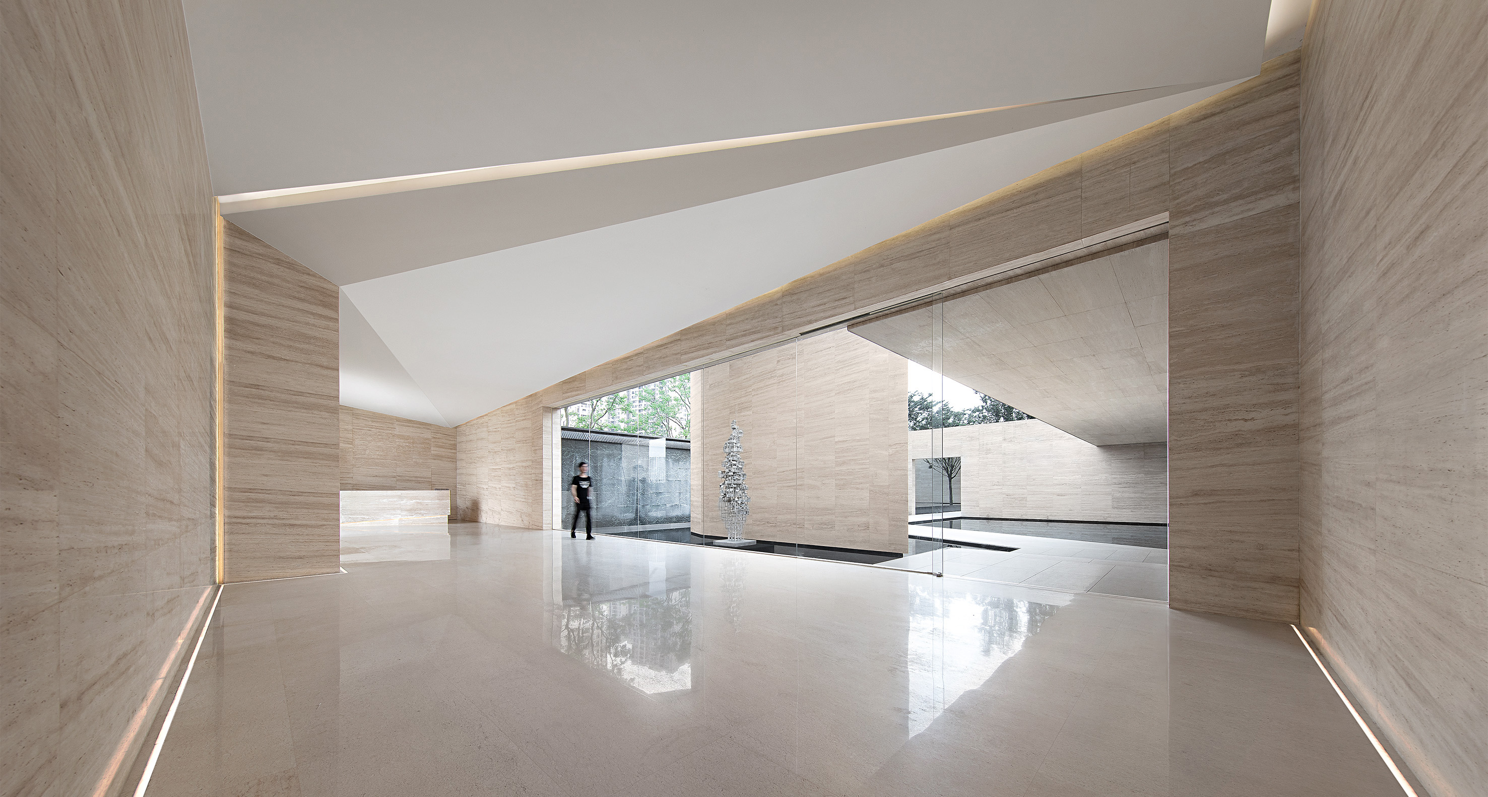
SUNAC Chongqing One Sino Park
Matrix Design
China
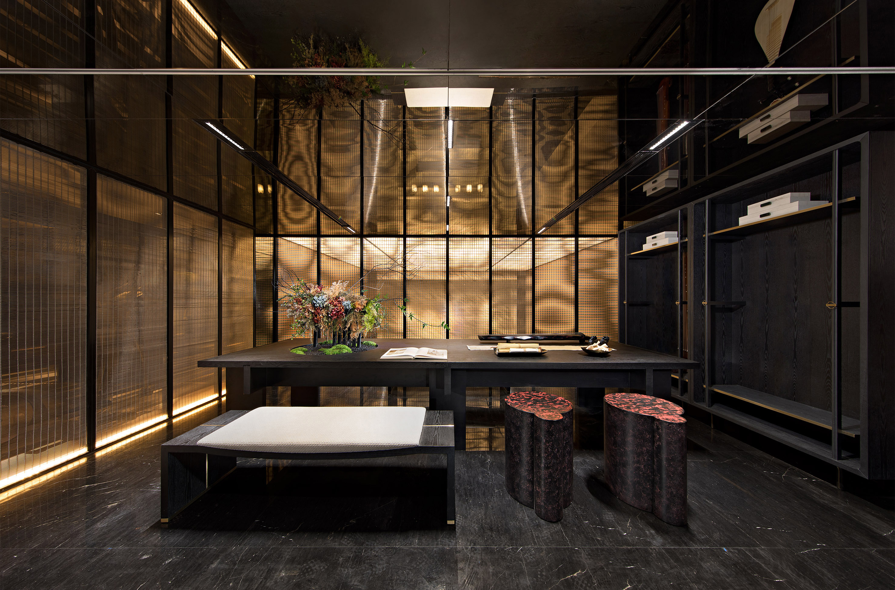
RONSHINE JONOON · MOON & YARD
IDMatrix
China
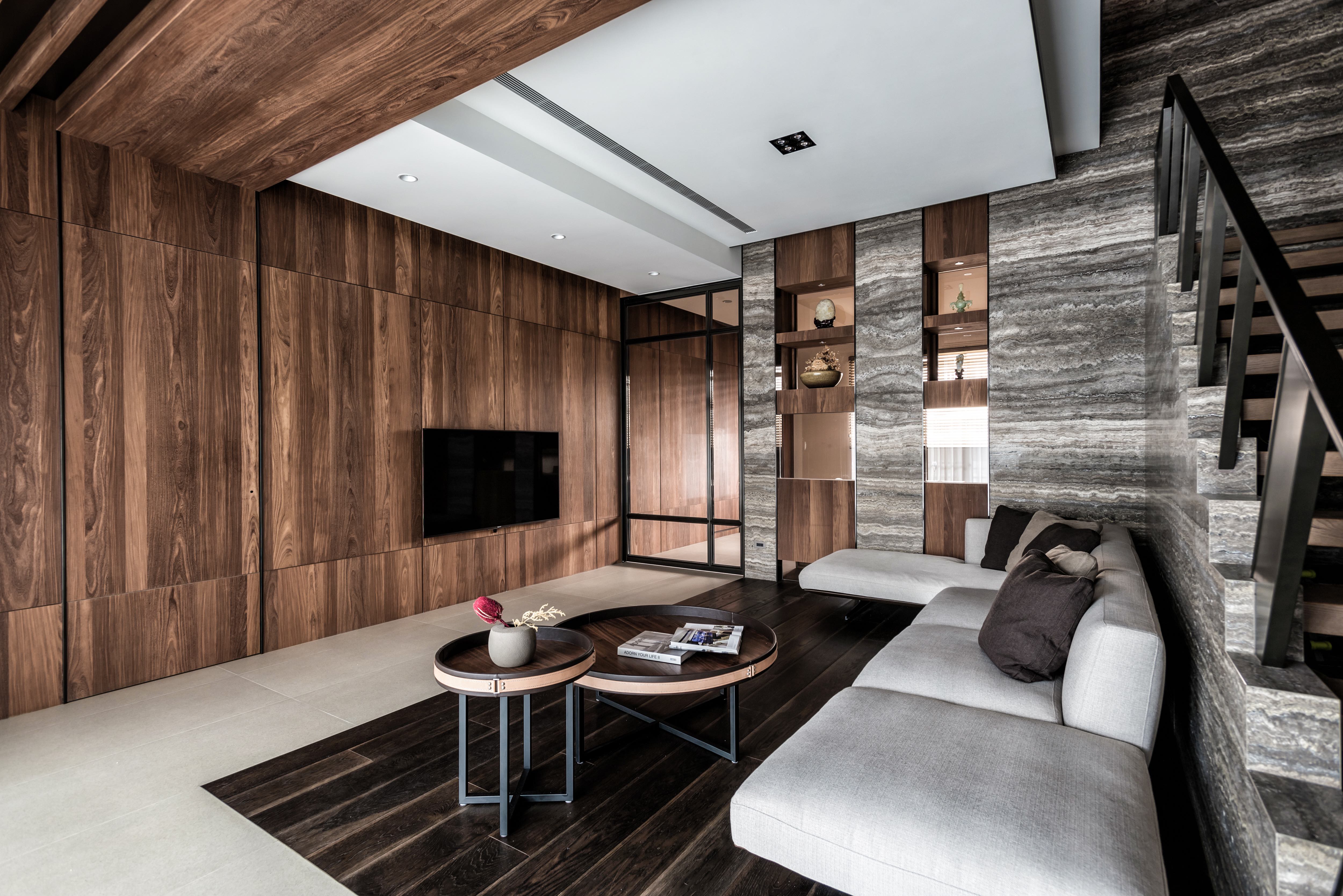
Wood, Stone, Serenity
your tale design
Chinese Taipei
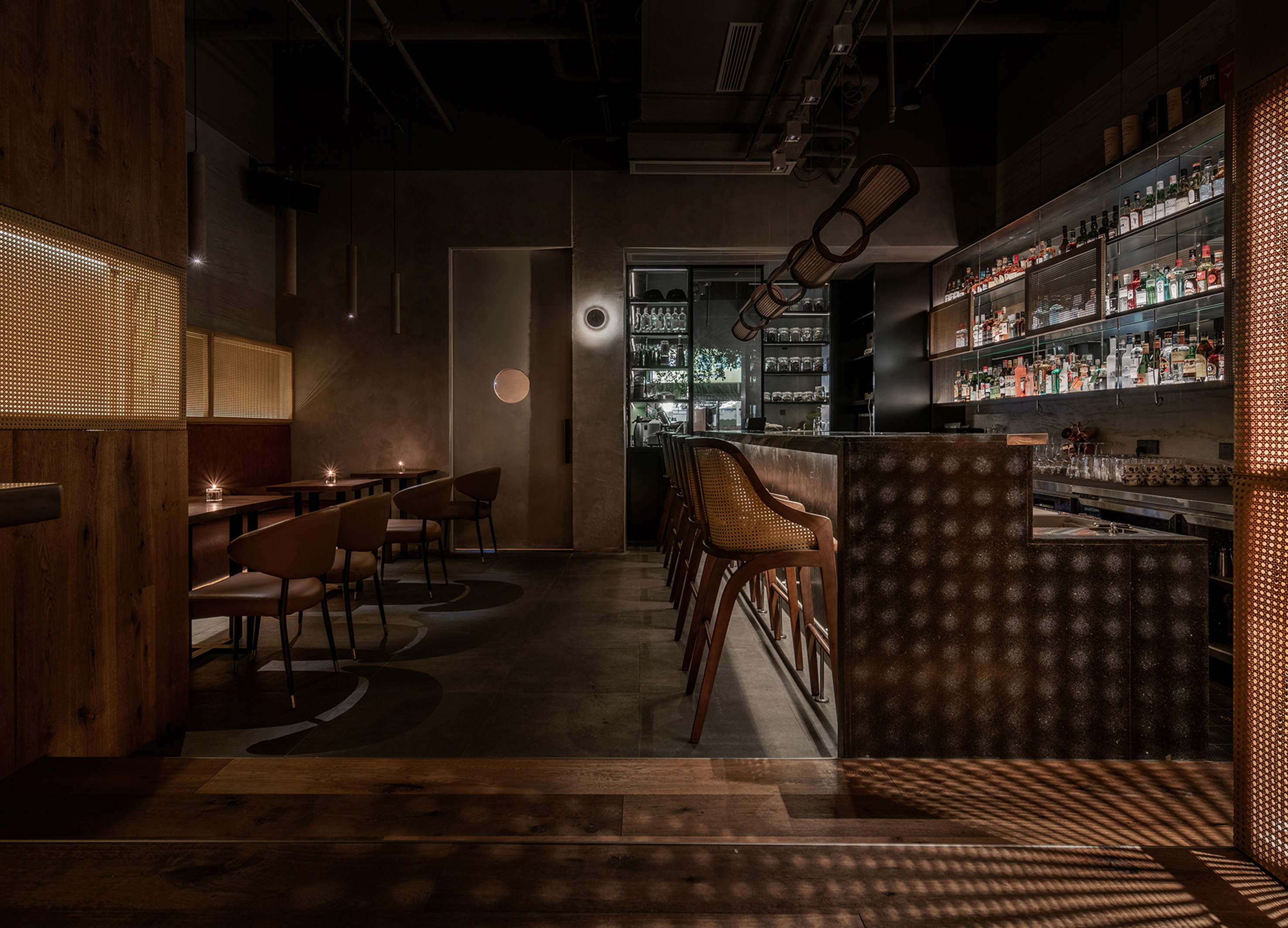
THE TASTING ROOM
GE SPACE DESIGN
China
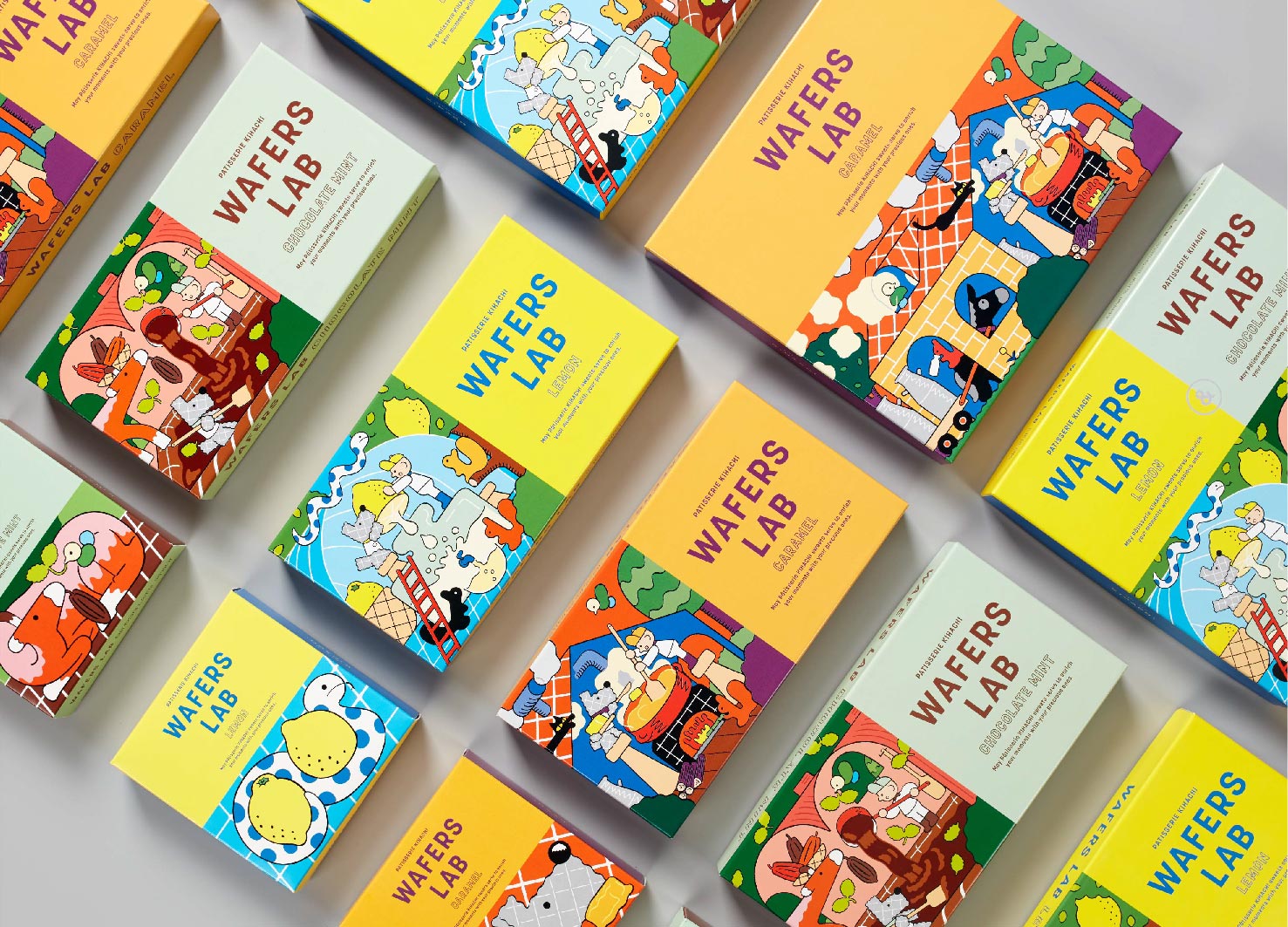
WAFERS LAB
DODO DESIGN
Japan
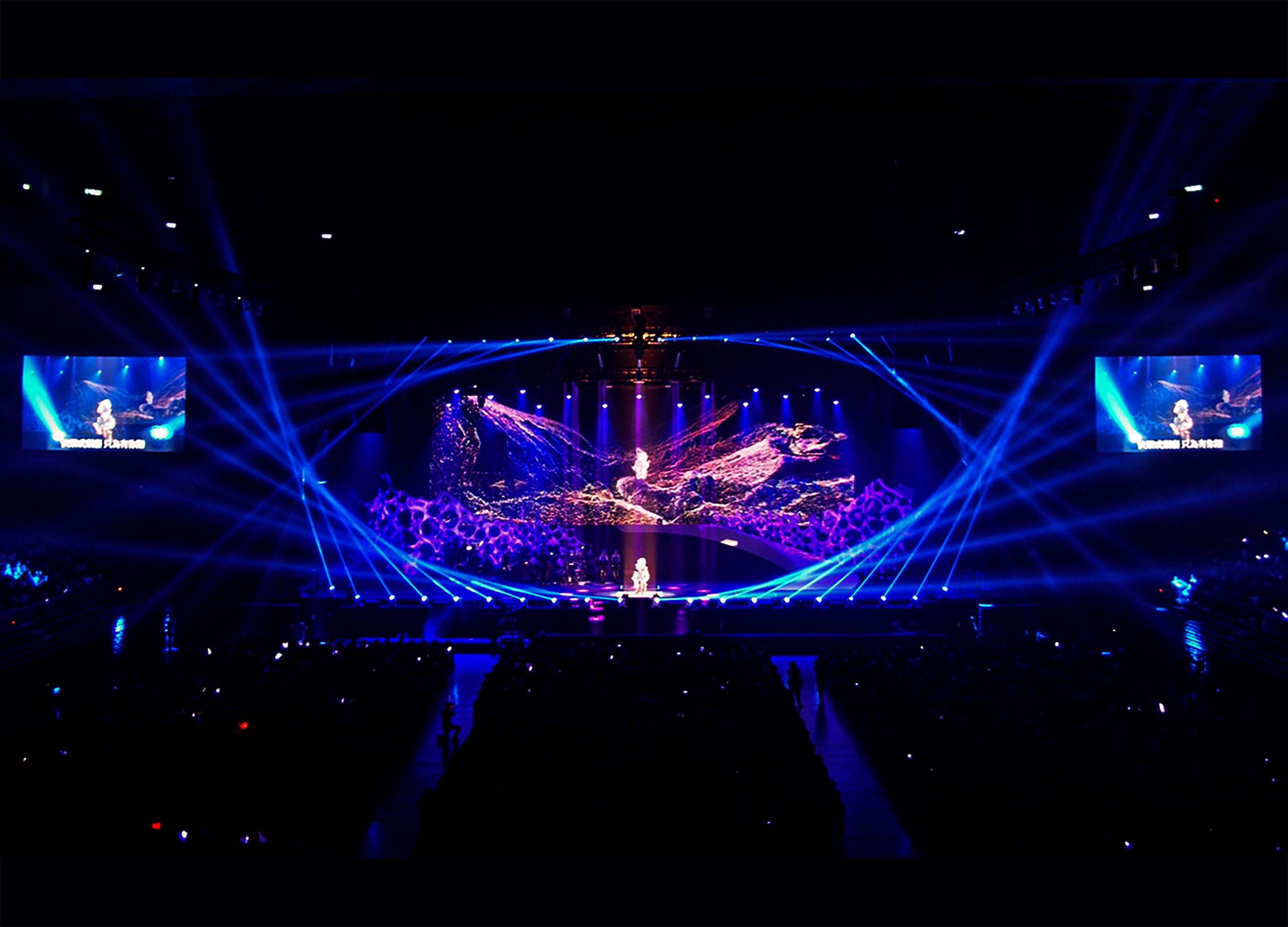
Tanya Chua [LEMURIA] world tour 2016
PLAYFUL Design Studio
Chinese Taipei
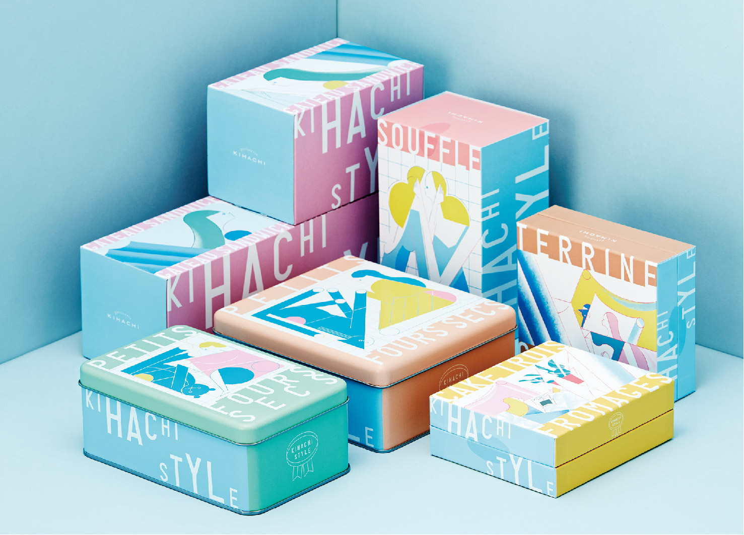
KIHACHI STYLE
DODO DESIGN
Japan
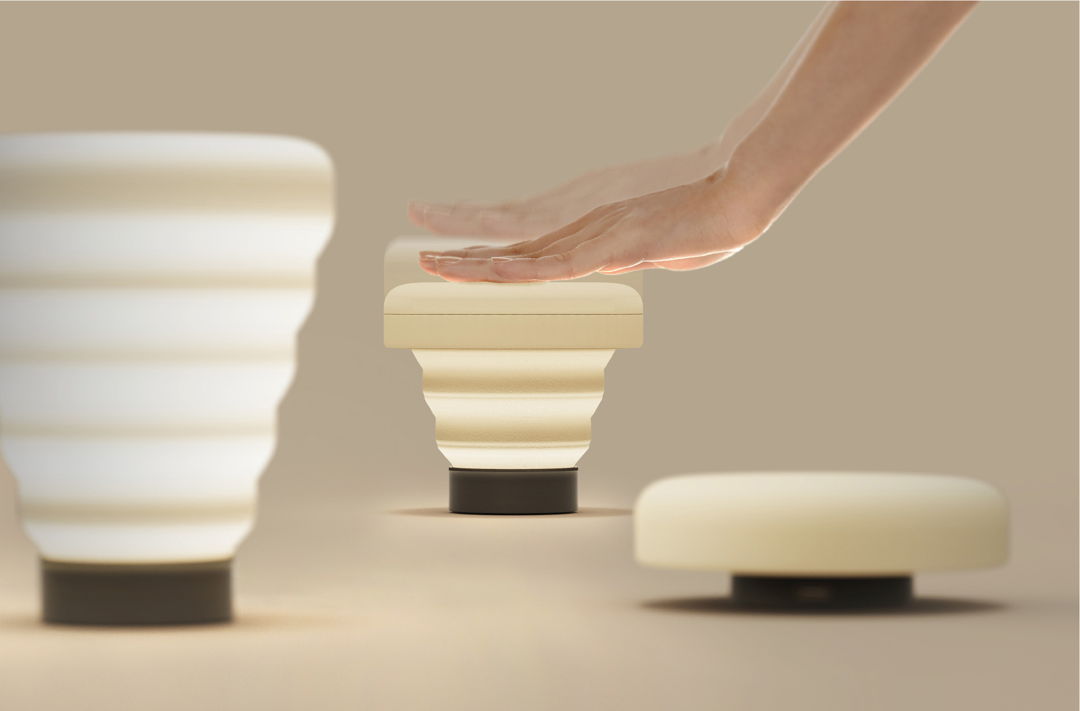
The bloom slim
Shenzhen Yunding Information Technology Co., Ltd.
China
CM Cruise Terminal Sales Center
Matrix Design
China
Grampus Brand Identity
YNL DESIGN
Korea
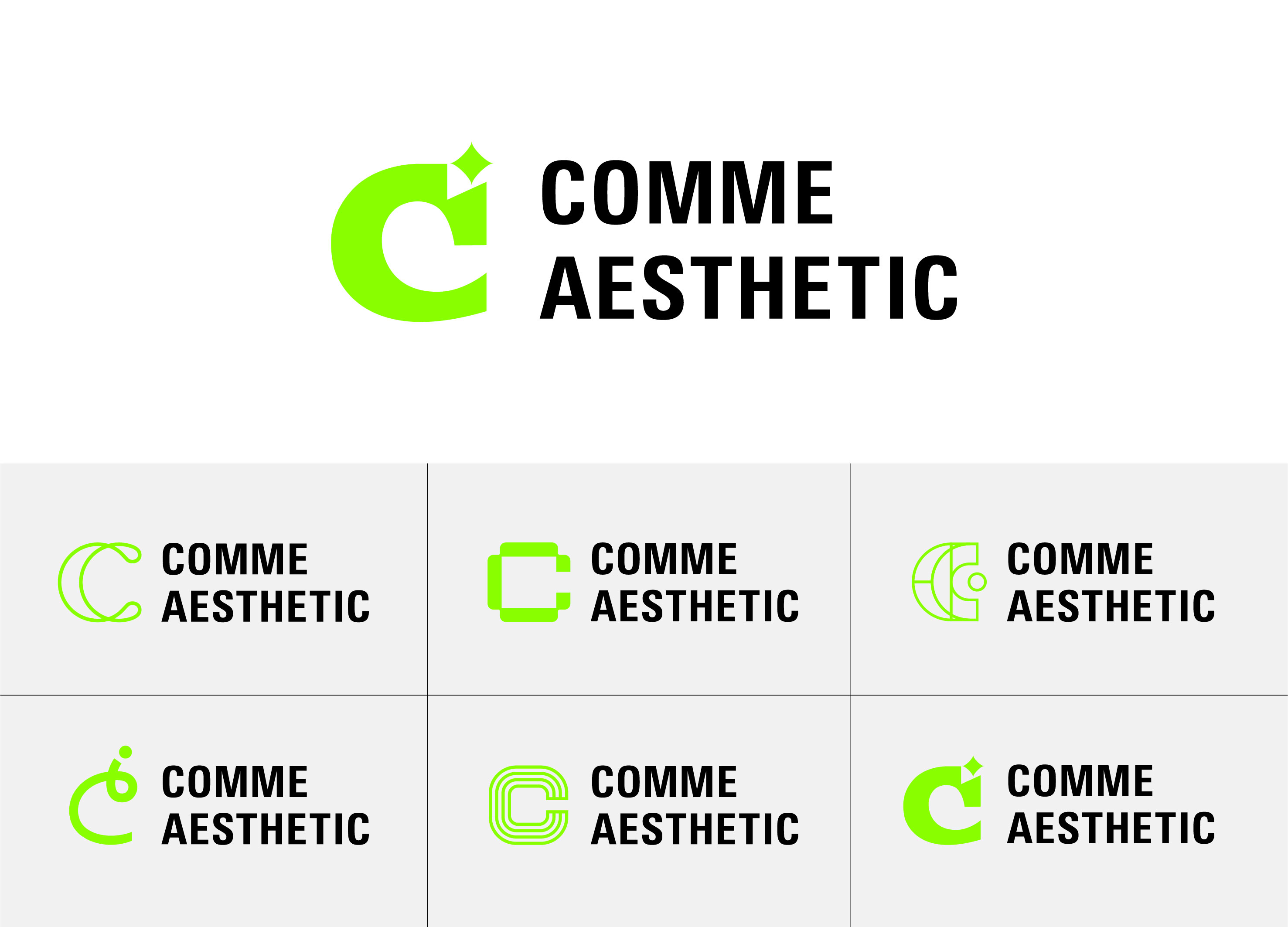
Comme Aesthetic Brand Identity
YNL DESIGN
Korea
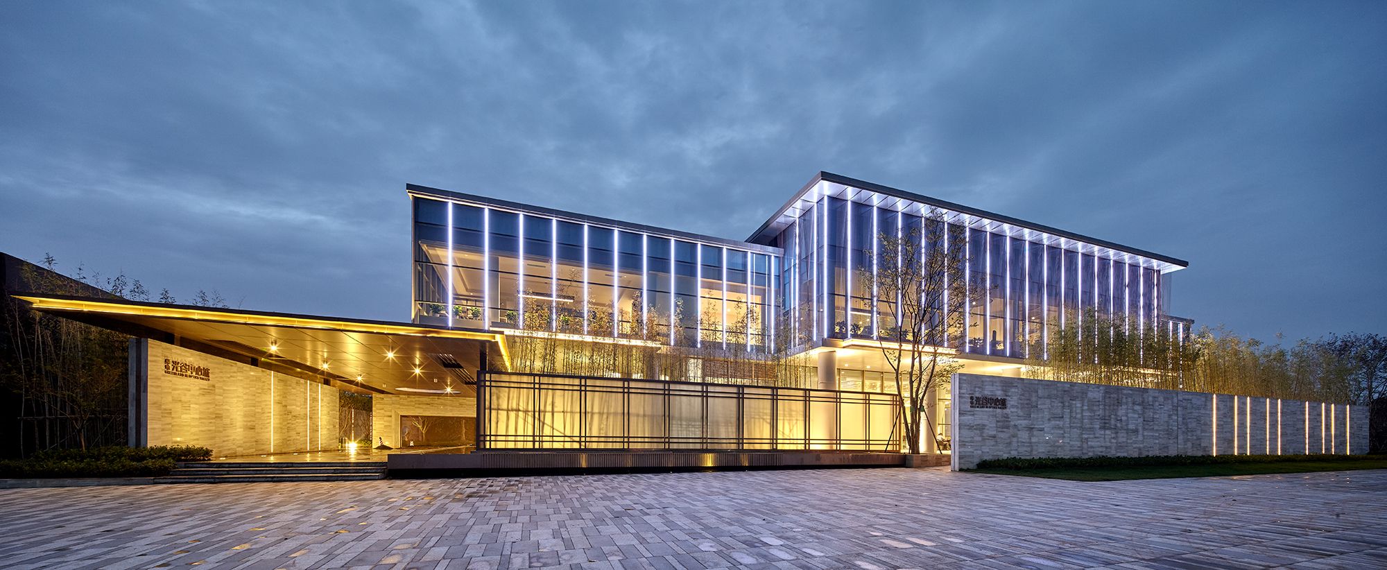
GREENLAND IN OPTICS VALLEY Sales Center
Shanghai PTArchitects
China
Z-LAMP
Shenzhen explore home Industrial Design Co
China
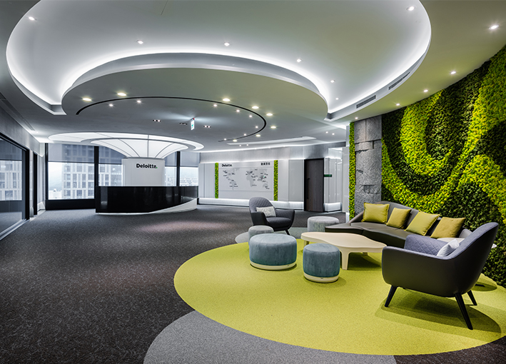
Deloitte Taiwan
Kathy Chien
Chinese Taipei
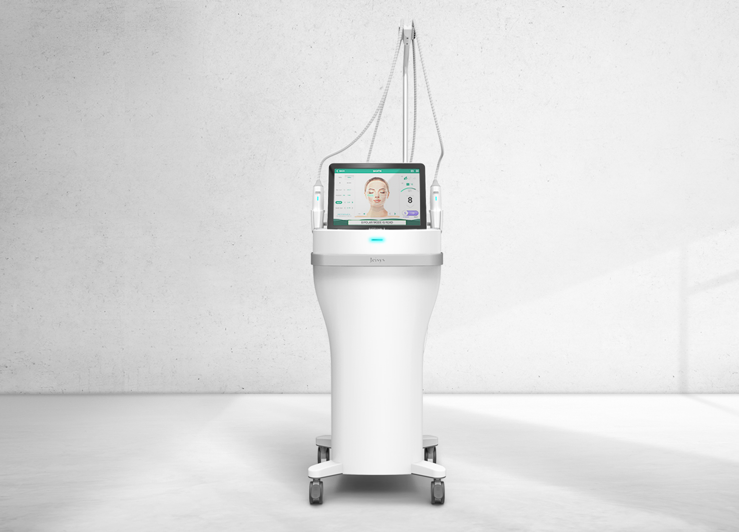
POTENZA RF Needle Laser
GODESIGN
Korea


Partner & Sponsor
More


info@asiadesignprize.com
#14057, 905 49, Beolmal-ro 102beon-gil,
Dongan-gu, Anyang-si, Gyeonggi-do, Korea
#14057, 905 49, Beolmal-ro 102beon-gil,
Dongan-gu, Anyang-si, Gyeonggi-do, Korea
Founder: Doyoung Kim
Business Registration Number: 454-86-01044
Online Sales License No.: 2021-Anyang Dongan-1081
Copyright © DESIGNSORI Co., Ltd.
Business Registration Number: 454-86-01044
Online Sales License No.: 2021-Anyang Dongan-1081
Copyright © DESIGNSORI Co., Ltd.
