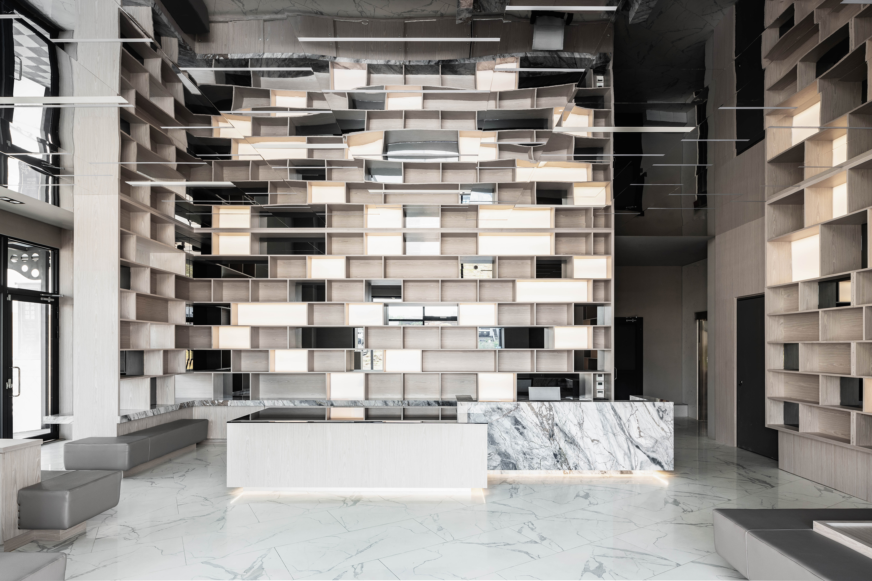
SHIFTDOOR RESIDENCE Brand Identity
Communication
Regions
Korea
Year
2023
Award
WINNER
Client
SHIFTDOOR RESIDENCE
Affiliation
PEACE N PLENTY
Designer
LEE DAL RAE, LEE MIN DEUR LE, HAN DA WOON
English
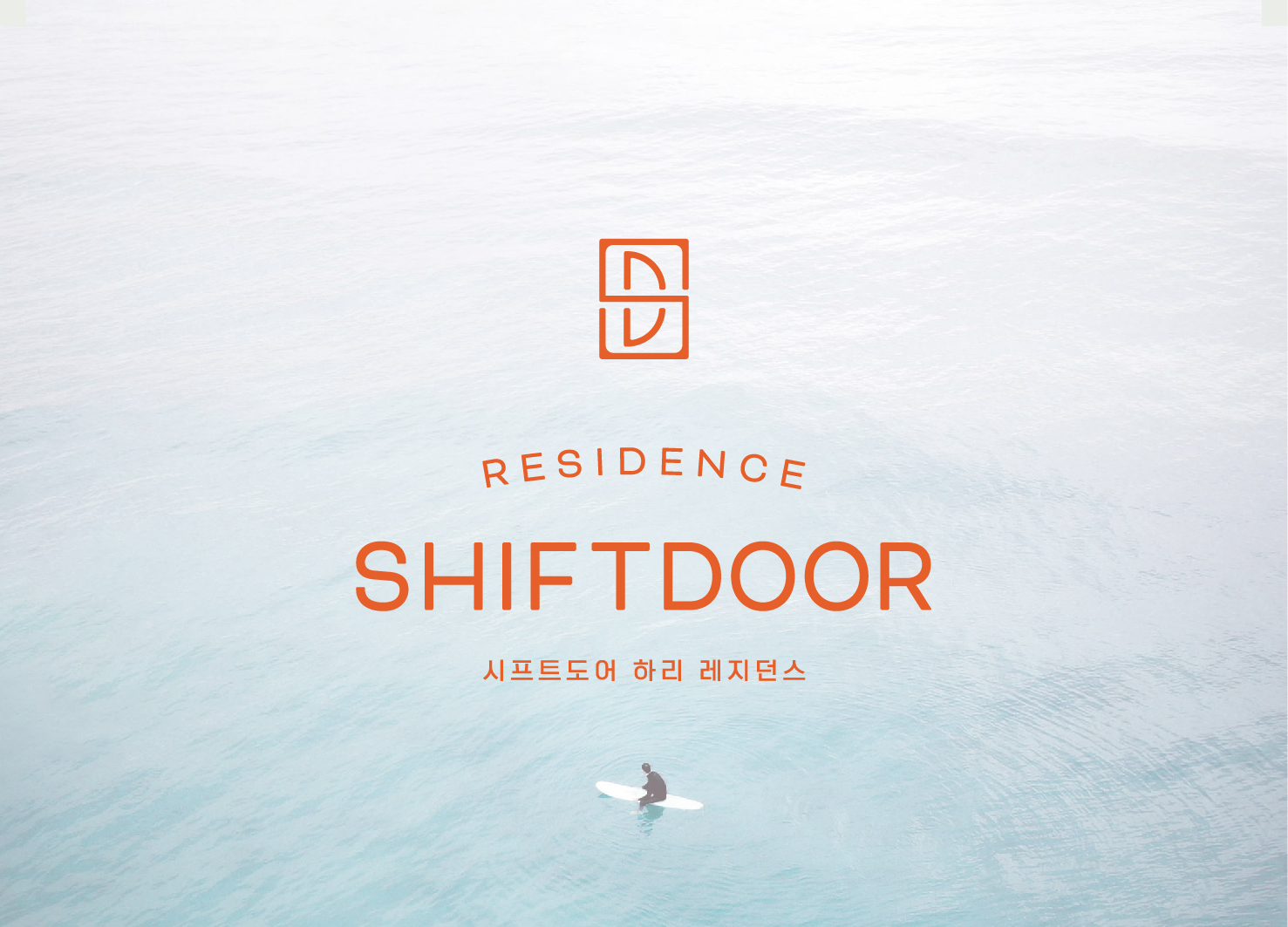
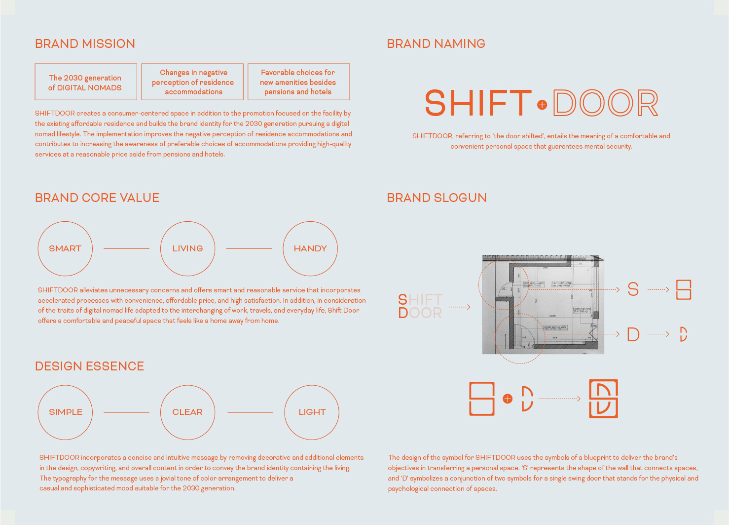
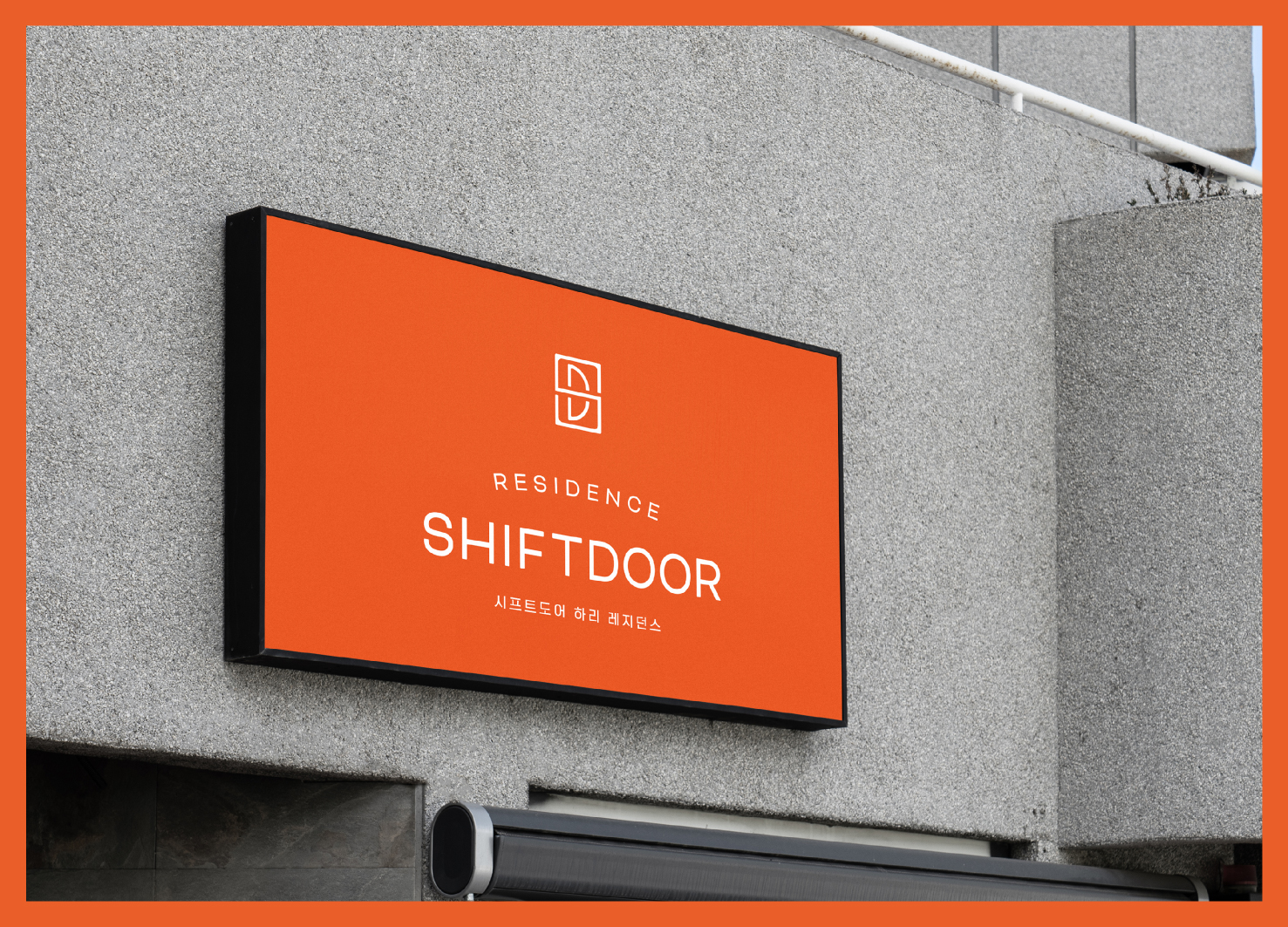
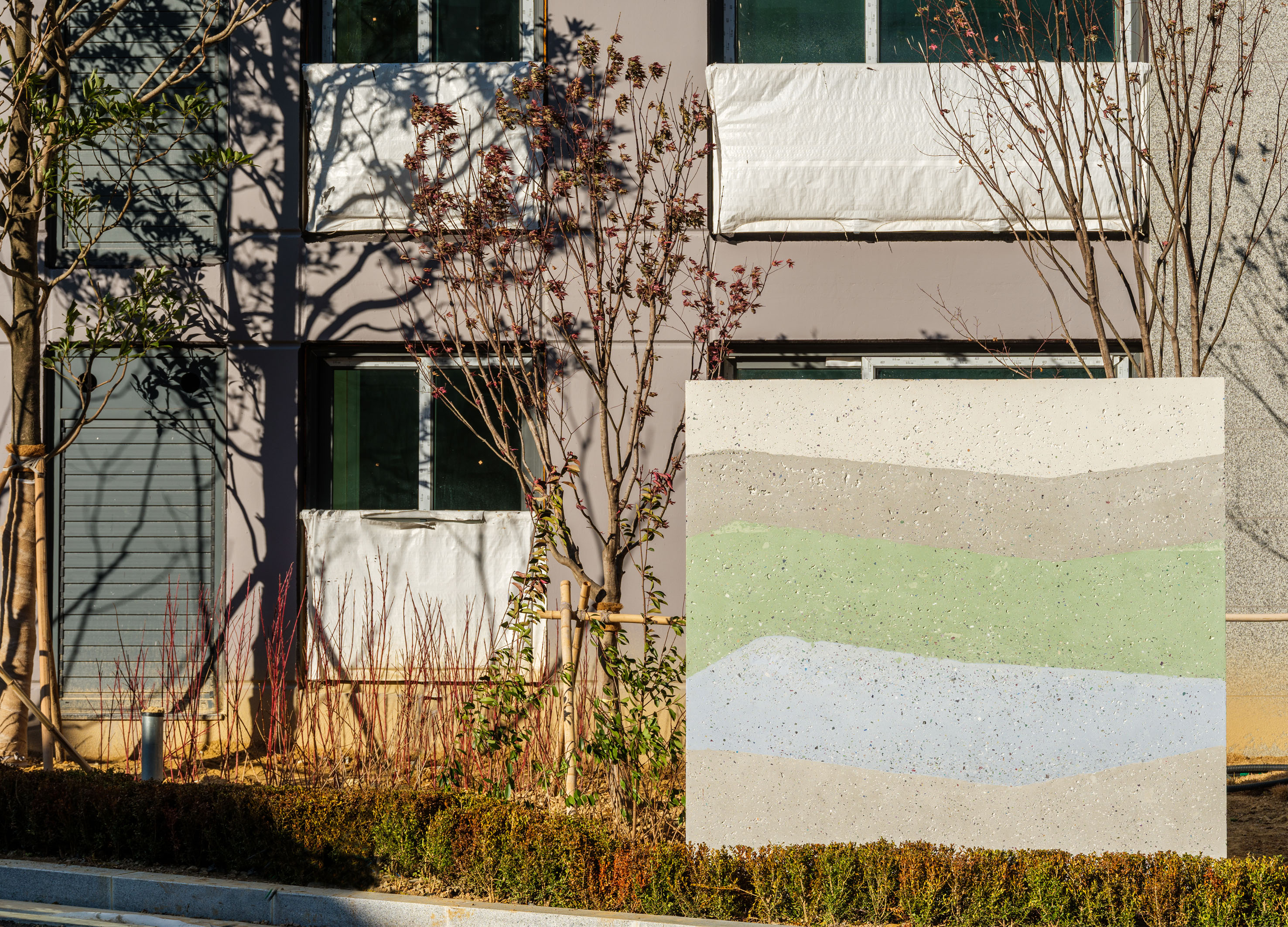
SHIFTDOOR, which means ‘the door shifted’, is a comfortable and convenient place. SHIFTDOOR offers smart and reasonable service with convenience, affordable price, and high satisfaction For the 2030 digital nomads. We designed the symbol of SHIFTDOOR using the symbols of a blueprint. ’S’ represents the shape of the wall that connects spaces, and ‘D’ symbolizes a conjunction of two symbols for a single swing door that connection of spaces. SHIFTDOOR uses a concise and intuitive message in the copywriting and content to convey the brand identity and uses light and rounded typography and a light color to deliver a casual and sophisticated mood.
Native
시프트도어는 ‘문을 옮기다’라는 의미로 내 공간을 그대로 옮긴 듯이 편안하고 편리한 레지던스입니다. 시프트도어는 어디에서든 일할 수 있으며 여행과 일상이 공존하는 것이 익숙한 2030 디지털노마드 세대를 타겟으로 불필요한 고민을 줄이고 빠르고 편리하게, 저렴하면서도 높은 만족감을 줄 수 있는 스마트하고 합리적인 서비스를 제공합니다. 시프트도어의 심볼은 공간을 옮긴다는 브랜드의 의미를 전달하기 위해 건축 도면에서 활용되는 기호들을 활용하여 디자인 했습니다. 스마트하고 합리적이고 생활과 가까운 브랜드의 아이덴티티를 전달하기 위해 디자인과 카피라이팅, 컨텐츠 전반에 있어 장식적이고 부가적인 요소를 배제하고 간결하고 직관적인 메세지를 사용합니다. 또한 경쾌한 분위기의 컬러 배색, 무겁지 않은 타이포그래피 등을 사용해 2030세대가 공감할 수 있는 캐주얼하면서도 세련된 무드를 전달합니다.
Positive Comments


Plani
Hansung University
Korea
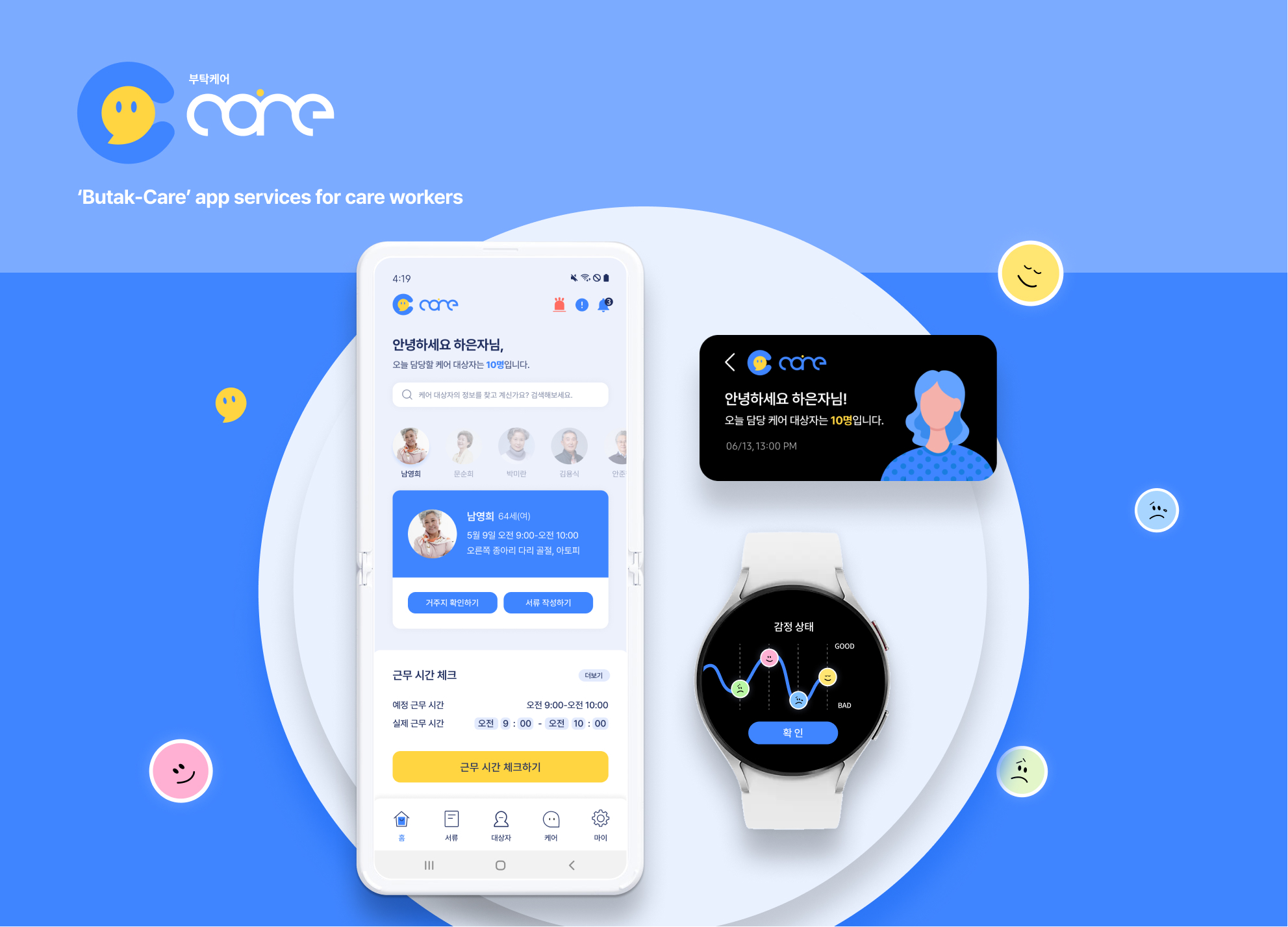
Butak Care app services for care workers
Hongik university
Korea

Seal Built with Native Soil
Guangzhou Academy of Fine Arts
China
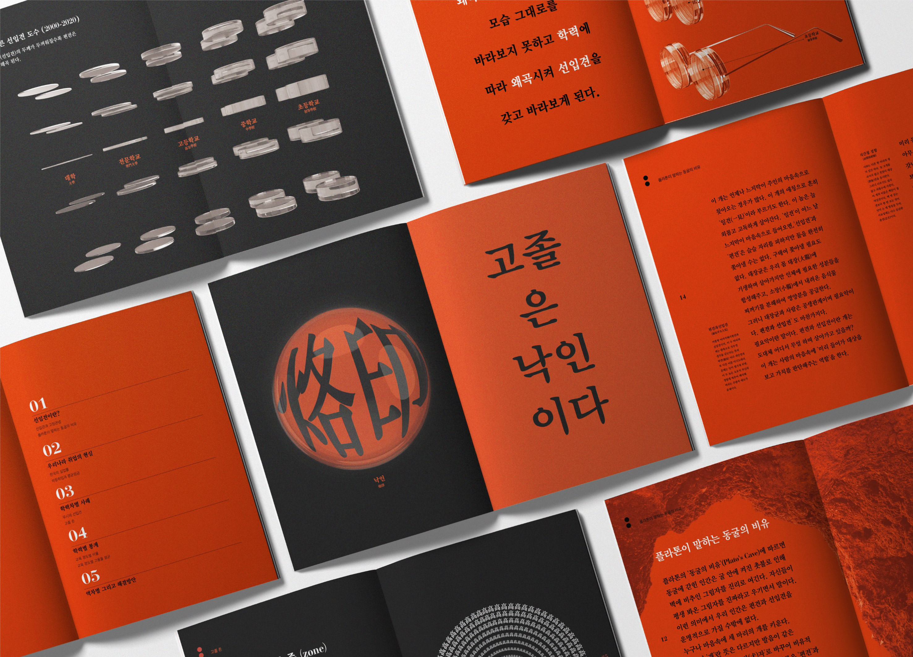
Prejudice
Sejong University
Korea
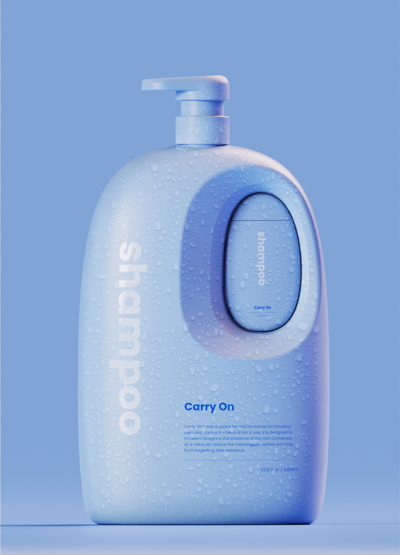
Carry On
HONGIK UNIVERSITY
Korea
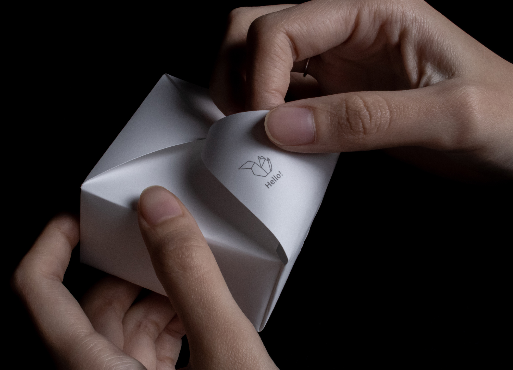
Origami Amenities
Korea Design Membership Plus
Korea
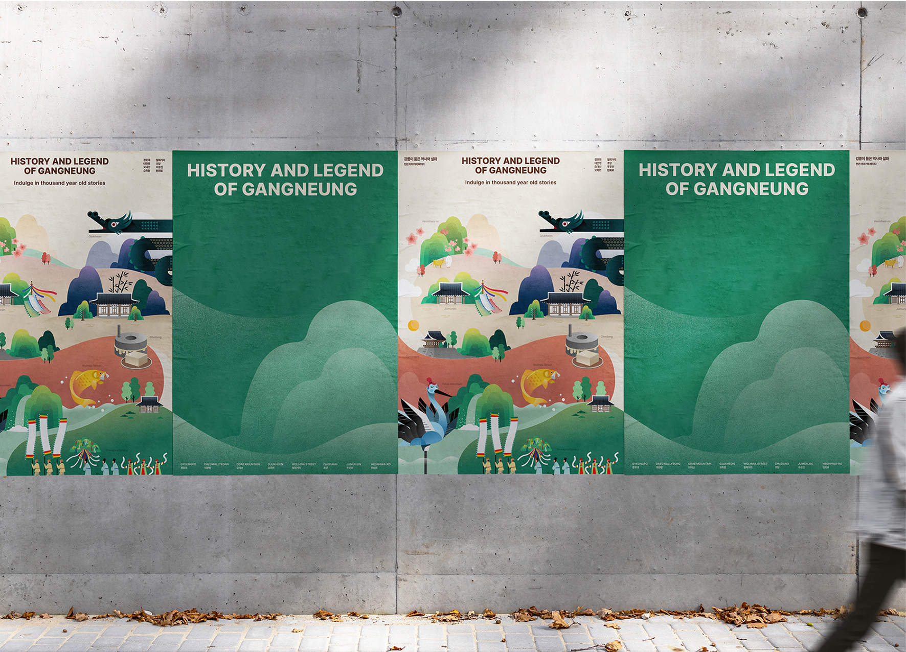
History and Legend of Gangneung
Ireyostudio, Sejong University
Korea
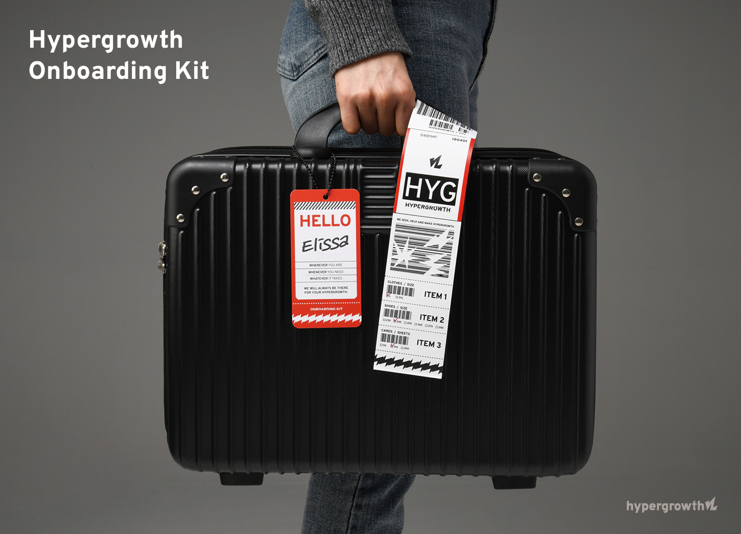
Hypergrowth Onboarding Kit
Hypergrowth
Korea
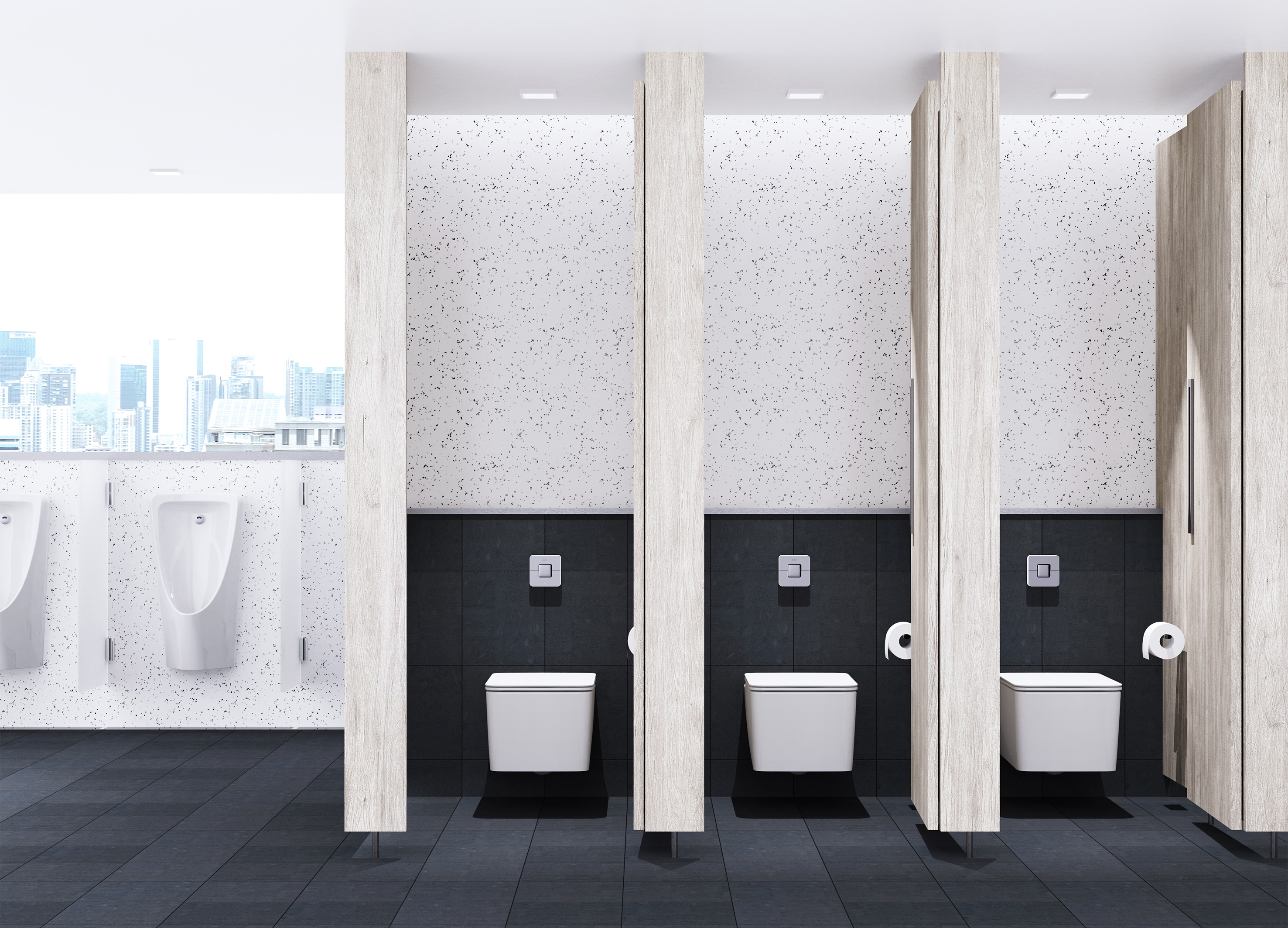
Concept ARC Dual Flush Valve
American Standard
Singapore
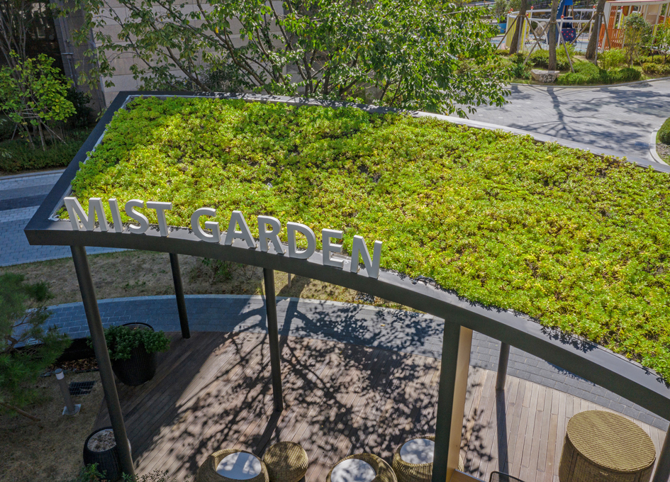
Mist Garden
SAMSUNG C and T Engineering and Construction Group
Korea
H Wave Wall
Hyundai Engineering and Cosntruction Co., Ltd.
Korea
cocoda chair
KOMA Co., Ltd.
Japan
Quanzhou Experimental Middle School
Shenzhen University & BYAD & Polar Coordinates Design
China

Midea Industrial City smart operation of IOC
Midea Building Technologies Division
China
IOC of Jingzhou factory
Midea Building Technologies Division
China
Boundless Boundaries
Shih Yu Chen
Chinese Taipei
MY CHOICE Visual Branding
CHANNEL A BNC
Korea
SHIFTDOOR RESIDENCE Brand Identity
PEACE N PLENTY
Korea


Partner & Sponsor
More


info@asiadesignprize.com
#14057, 905 49, Beolmal-ro 102beon-gil,
Dongan-gu, Anyang-si, Gyeonggi-do, Korea
#14057, 905 49, Beolmal-ro 102beon-gil,
Dongan-gu, Anyang-si, Gyeonggi-do, Korea
Founder: Doyoung Kim
Business Registration Number: 454-86-01044
Online Sales License No.: 2021-Anyang Dongan-1081
Copyright © DESIGNSORI Co., Ltd.
Business Registration Number: 454-86-01044
Online Sales License No.: 2021-Anyang Dongan-1081
Copyright © DESIGNSORI Co., Ltd.
