NYGDESIGN Identity Rebrand
Communication
Area
China
Year
2024
Award
GRAND PRIZE
Affiliation
NYGDESIGN Co., Ltd.
Designer
Qi LI
English
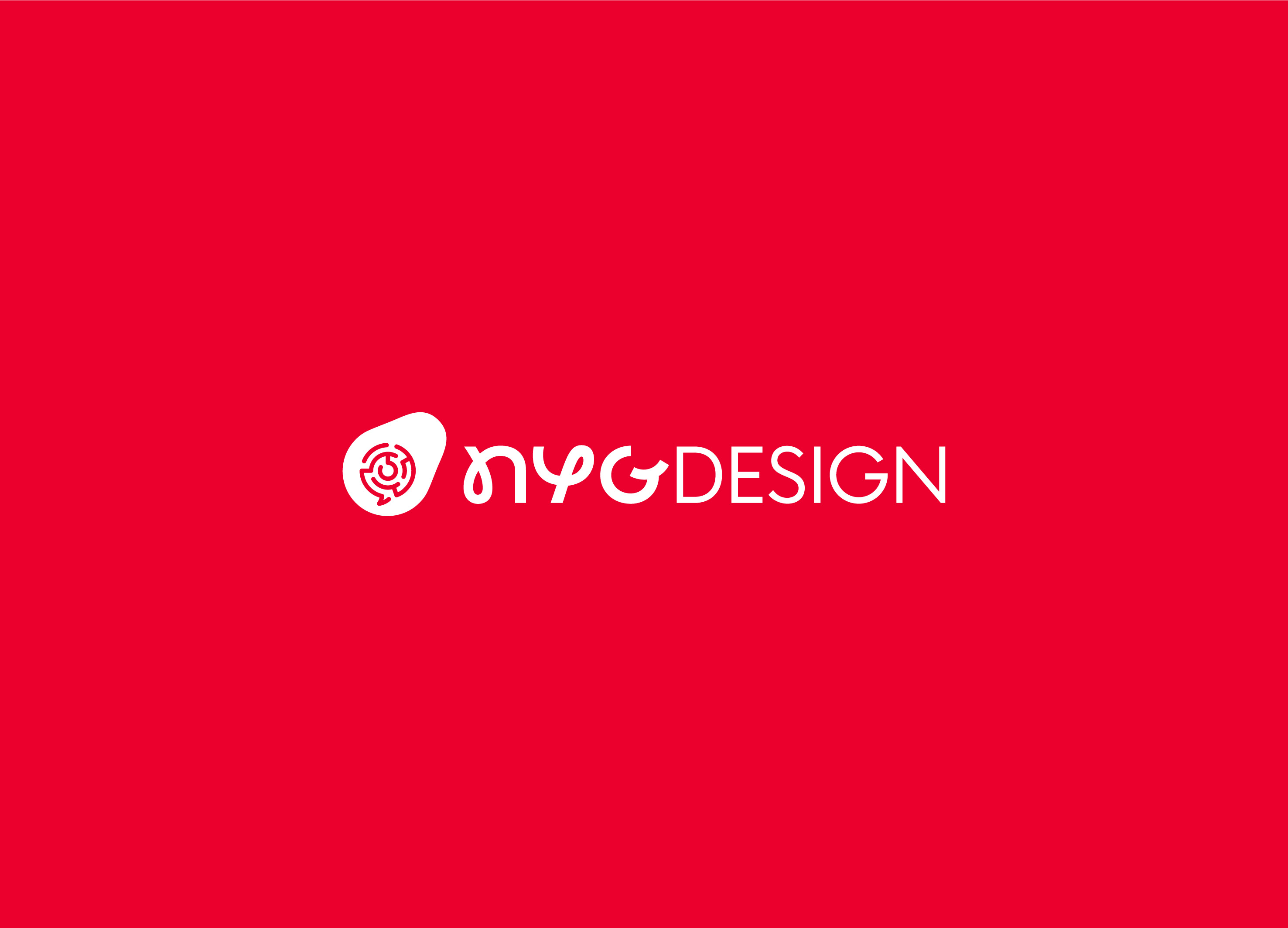
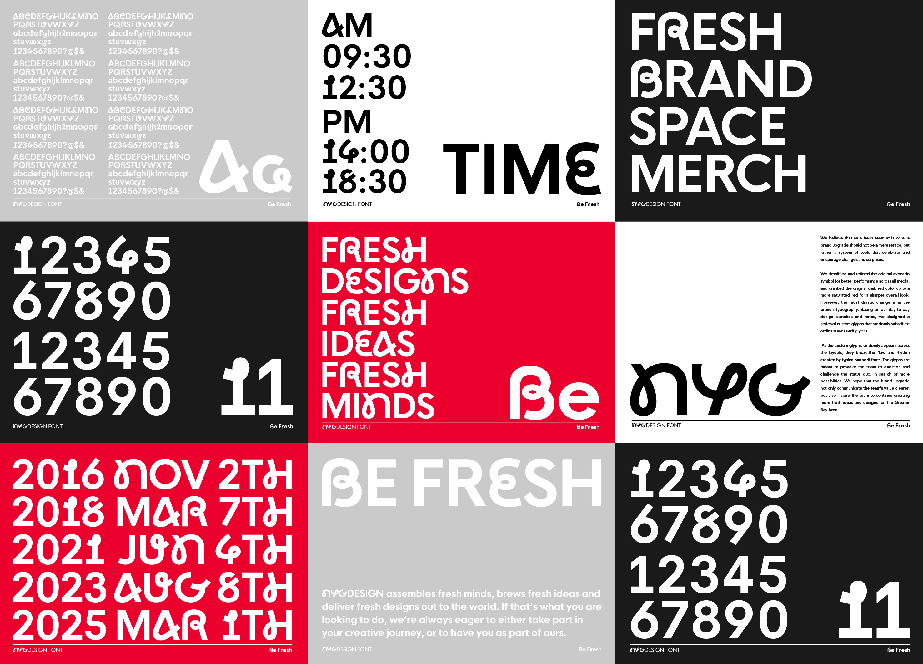
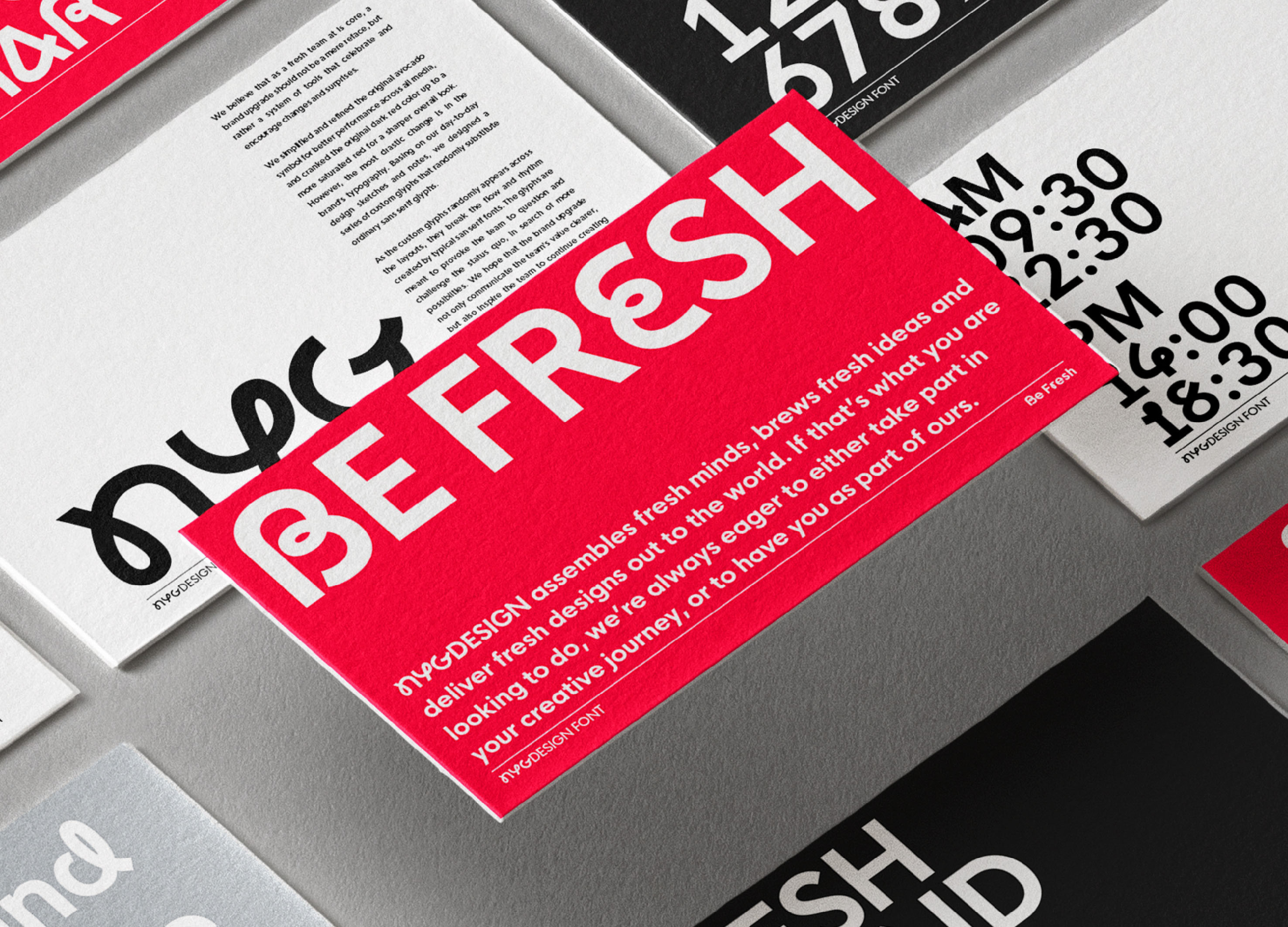
In this brand upgrade, we simplified the design, optimized the display effect of graphics in various scenes, and made the shape more full and capable. Use pictures to make the overall visual impression more lively and refreshing. In addition, NYGDESIGN used daily design drafts and notes as inspiration to create a special set of alphanumeric characters with handwritten structures. The design is integrated into the layout of the title words, allowing these characters to appear randomly in the title layout. This breaks the rules and makes no mistakes. The rhythm composed of serifs keeps NYGDESIGN’s design language fresh at all times.
Native
这次的品牌升级中,我们简化了牛油果中间的迷宫结构和牛油果的外形。优化了图形在各种场景的显示效果,并使造型更加饱满干练。此外,我们将 NYGDESIGN 本来的暗红色调换成了鲜艳利落的亮红,并增补了12款鲜艳的辅助色搭配主色调应用于文创延展内容,以图将整体的视觉印象打造得更加活泼清爽。
此外,我们以平时的设计草稿和笔记为灵感,为 NYGDESIGN 特制了一套带有手写结构的特殊英数字符,一方面是在字体中融入平时我们的书写特色,同时也代表对常态的反思和挑战。我们以这套字体重新设计 NYGDESIGN 的品牌标准字,并贯穿到标题字的排版中,让这些字符在标题排版中随机出现,此打破常规无衬线体构成的节奏,让 NYGDESIGN 的设计语言时刻保持新鲜感。这套字符代表着 NYGDESIGN 不甘于常规、勇于质疑和挑战的态度,也是在提醒团队持续探索新的可能性。
Judging Comments
NYGDESIGN's Identity Rebrand, crafted by Qi LI, secured the 'Grand Prize' at the Asia Design Prize 2024, celebrated for its innovative blend of simplicity and vitality in visual communication. The jury was particularly taken with the rebrand's ability to enhance the graphic display across different settings, rendering the visual identity more compelling and versatile. The use of custom alphanumeric characters inspired by daily design drafts and notes introduces a unique, handwritten essence to the brand, creating a lively and fresh design language. This inventive approach, along with the strategic use of imagery and a dynamic serif rhythm, ensures NYGDESIGN’s identity remains constantly fresh and engaging, highlighting a masterful integration of innovation and functionality in design.
Positive Comments


Partner & Sponsor
More


info@asiadesignprize.com
#14057, 905 49, Beolmal-ro 102beon-gil,
Dongan-gu, Anyang-si, Gyeonggi-do, Korea
#14057, 905 49, Beolmal-ro 102beon-gil,
Dongan-gu, Anyang-si, Gyeonggi-do, Korea
Founder: Doyoung Kim
Business Registration Number: 454-86-01044
Online Sales License No.: 2021-Anyang Dongan-1081
Copyright © DESIGNSORI Co., Ltd.
Business Registration Number: 454-86-01044
Online Sales License No.: 2021-Anyang Dongan-1081
Copyright © DESIGNSORI Co., Ltd.
