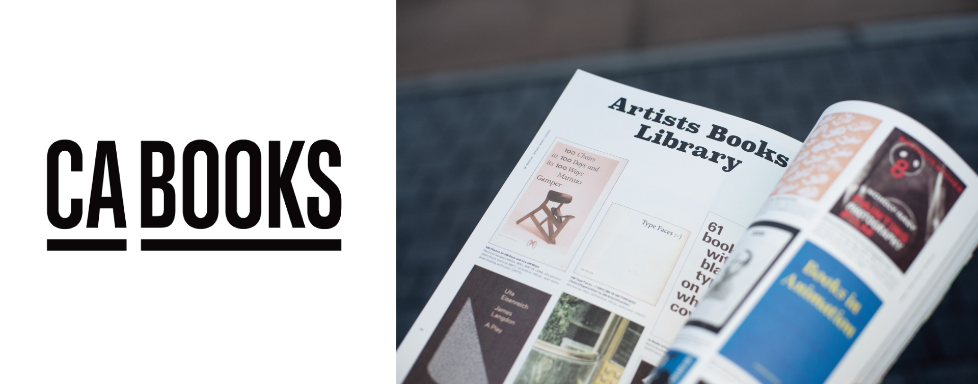
Hyunho Choi Editor in Chief, CA BOOKS
Has print reached its limits—or has it grown deeper? We sat down with Hyunho Choi, Editor in Chief of CA BOOKS, to ask about the value and philosophy of a paper magazine that aims to be “kept,” not just “read.” Choi frames CA not as a mere information outlet but as a Creative Archive that records and proposes good design. From cover experiments to interior layouts, from the cadence between image and text to attempts at translating moving images onto the page—why does CA still choose paper, and how is it designing tomorrow’s archive today? In this interview, we trace the posture a magazine should hold within a changing design ecosystem, the editorial strategies that reweave its relationship with readers, and the point where documentation meets proposition. To remain on paper while proposing what is next—that is the language of CA, and here we listen to it in CA’s own way.
To begin, please introduce yourself and share the core vision you aim to communicate through CA Magazine.
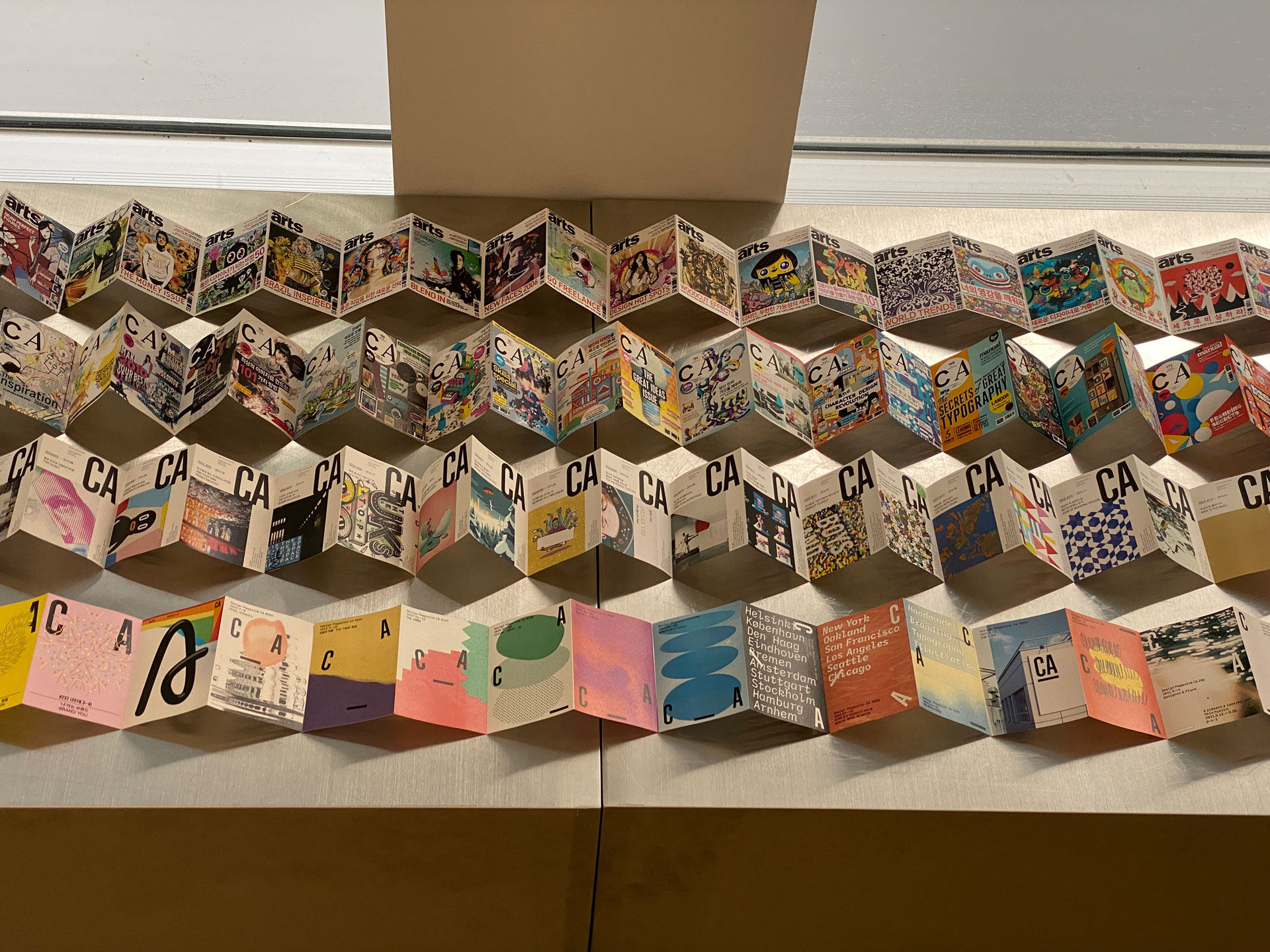
Hello, I am the editor responsible for making CA Magazine. Over the years, our visuals and editorial directions have evolved, but CA’s core vision remains unchanged: to record and propose good design. Beyond documentation, we want to guide readers toward enjoying art and design as part of everyday life. Even now, designers and creators around the world are producing outstanding work. We seek them out, introduce their practice, connect them with the public, and make a lasting record. The name “CA” has been interpreted in many ways across its history. We began as Computer Arts, expanded through Communication Arts, Creative Arts, and Creative Artworks, and today we embrace Creative Archive. A print magazine must move differently from fast-vanishing online media; it should carry forward what deserves to be kept. Our hope is that strong work continues to be recorded in print and rediscovered again—far into the future.
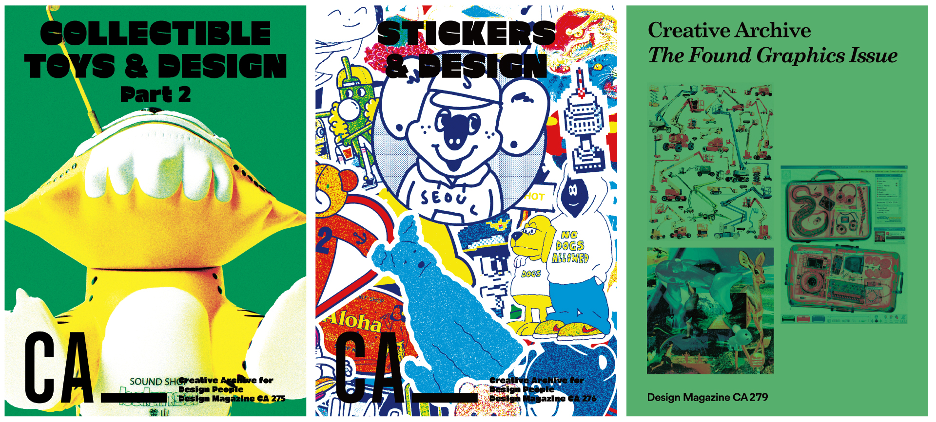
CA’s cover design has been changing. Early covers were image-led regardless of theme; more recently you have subtly adapted works from featured contributors. What prompted this shift, and where is it headed?
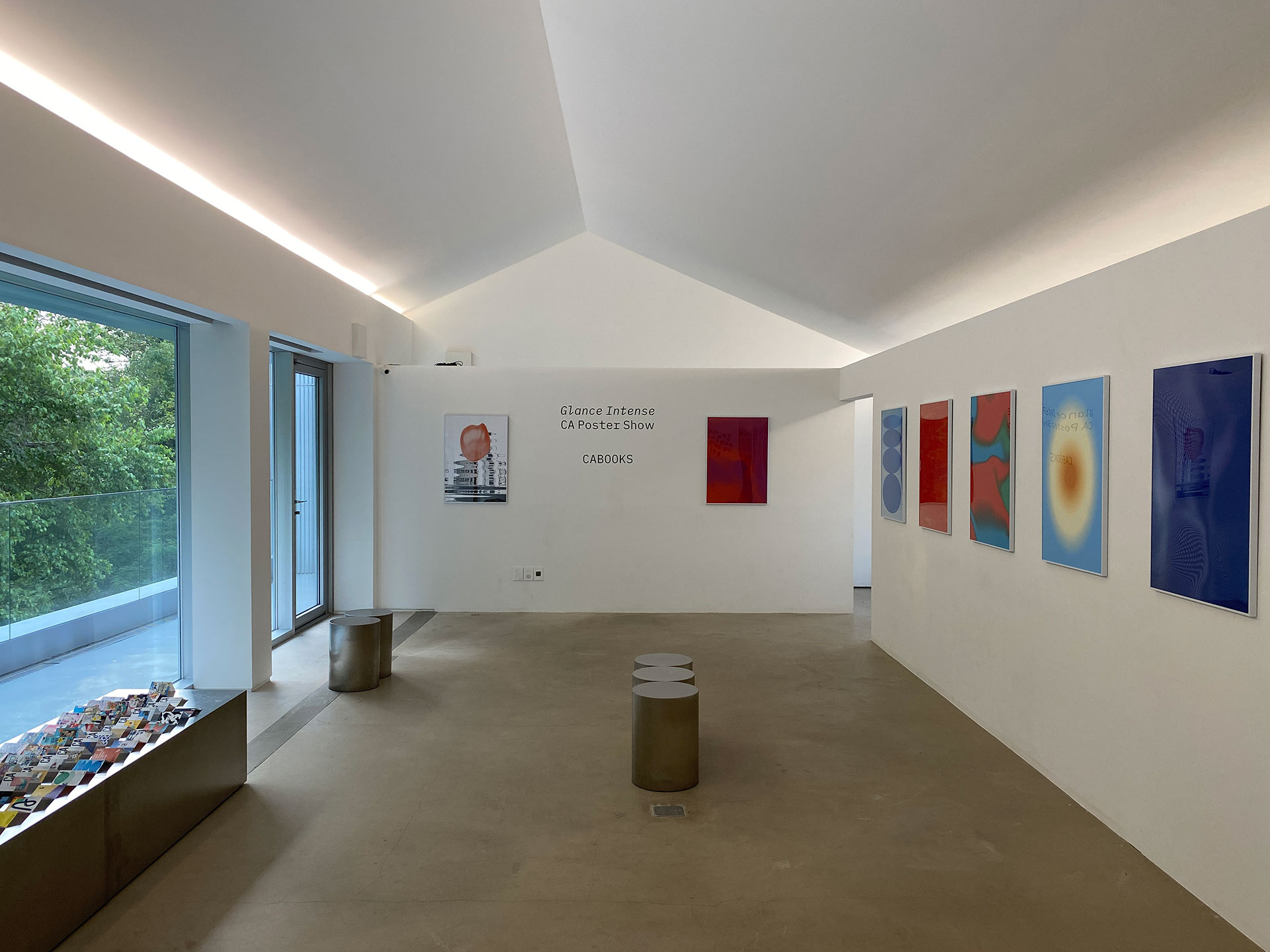
Our covers have always aimed for an immediate visual impact—even when not tied directly to the theme—by placing a designer’s intuitive, theme-inspired image across the front and back. We minimized text, built the composition around strong visuals, and created new graphic images each issue so the cover could function like a framed artwork. We wanted print—so often discarded with time—to feel collectible. In fact, readers often share photos of CA covers displayed as objects in their spaces. That direction culminated in our “GLANCE INTENSE – CA Poster Show” at Sikmulkwan PH Gallery in June 2022. The current covers keep that intent. What has changed is the addition of small “clues” from key stories onto the front cover, offering a hint of what is inside. Looking ahead, CA’s covers will continue to evolve and experiment—always balancing clarity with surprise.
You’ve said CA should be more than reading material—an object worth keeping. How does that perspective shape design and planning?
If our only goal were to deliver information, we would not invest in printing a book. Because we want CA to endure as an archive, the content is designed to be read and also to be looked at, held, and kept. Interviews are paired with a substantial body of images, and we pay close attention to the size, sequence, and color fidelity of printed visuals. In layout, we check that color prints cleanly, scale feels right, and pacing avoids monotony. We also weave in moments that step outside the grid—small shifts embedded in the page flow. They are not showy, but they invite readers to discover something new on a second or third viewing. The aim is a magazine that rewards re-reading, and over time, belongs on a shelf rather than in a recycling bin.
Although CA is a design magazine, you often explore popular and experimental topics—toy design, stickers, moving image, found graphics. Why go “beyond design,” and how do you define the magazine’s role?
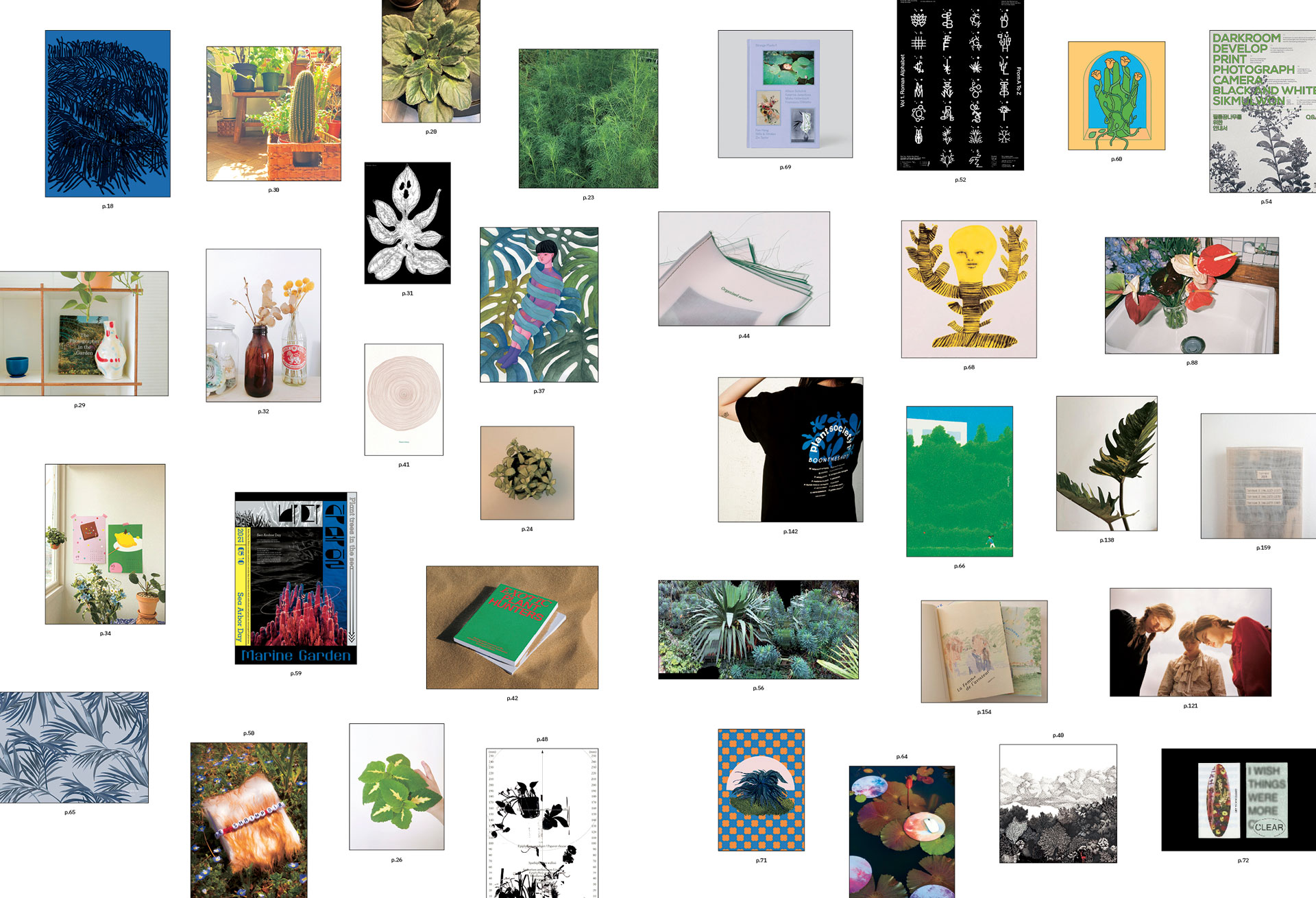
CA is well known among design majors, students, and practicing designers. Still, we do not aim to be a textbook or a how-to guide. We curate so that anyone curious can find visual delight and creative stimulus. At times the entry point may feel high, yet we try to situate ourselves between public culture and professional practice. Designers draw deeply from everyday life, and everyday things are ultimately someone’s design outcome. We believe a magazine should remain light and free enough to capture experiments at the border of everyday and non-everyday. That is why CA continues to weigh topics that are both popular and exploratory—and share them with readers and a broader audience.
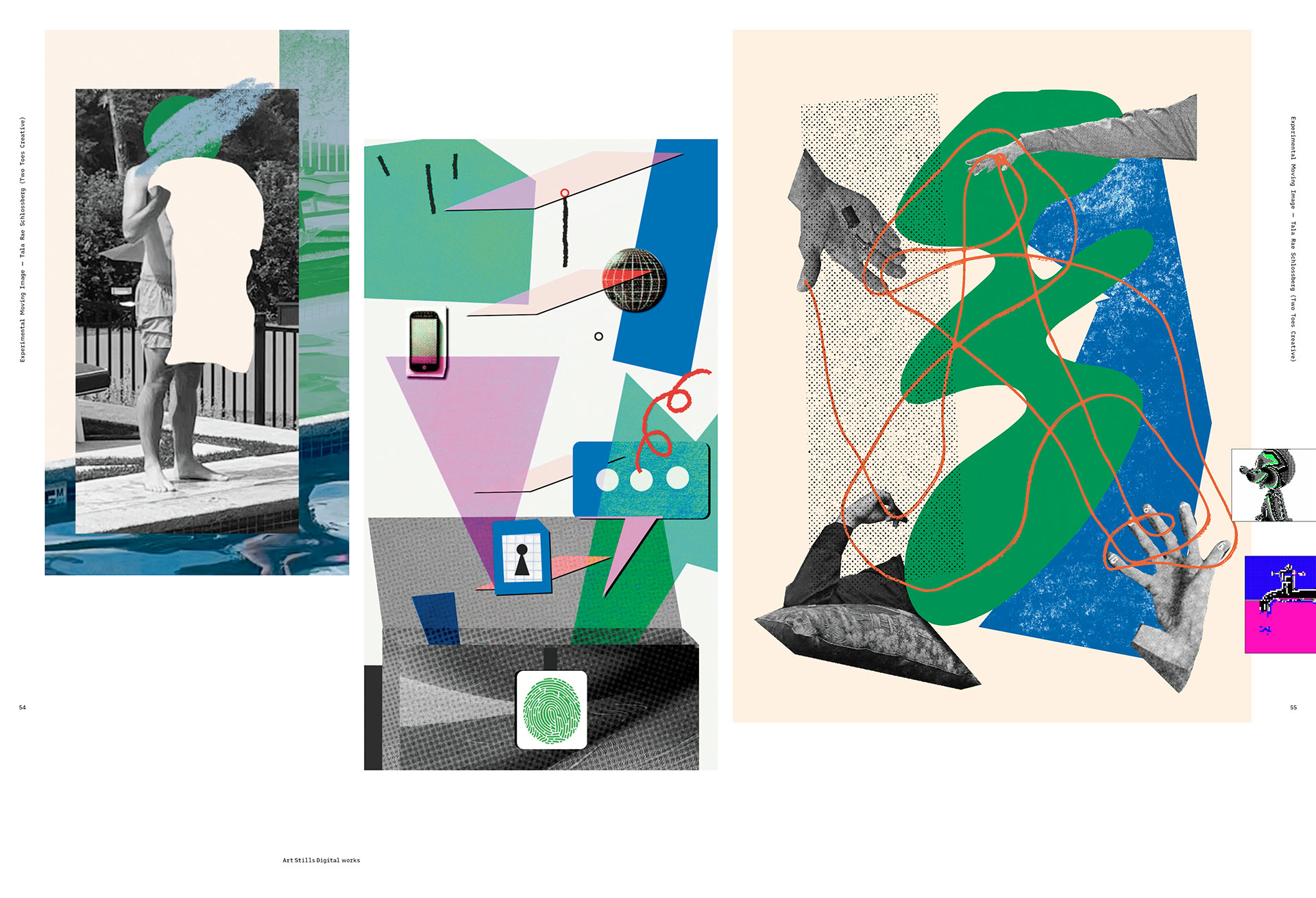
Moving image is not an easy fit for print. How have you translated such content within the constraints of a printed magazine?
In Issue 273, we covered Experimental Moving Image. Keeping the original trim size, a full flipbook was not physically feasible, so we converted a limitation into a print-specific strength. We designed part of the margin as a sequence strip—an Easter egg of sorts—so readers could flip the page corners and experience a mini video related to the featured works. This produced a layered reading flow in a single issue: encounter the work as images, read interviews and project notes as text, then feel the rhythm of a mini moving image through page-turning. Our goal was to position print not merely as a reading medium, but as a platform for experiment—translating motion into the grammar of paper through materiality and time.
What new topics would you like CA to explore next, and what question would you pose to readers?
At some point, we would like to approach design through the lens of fashion. From materials and production to distribution, sustainability, community, and style—fashion condenses the whole field of design. CA will keep bringing design close to everyday life while proposing what feels genuinely new. We would also like to ask readers a simple question: What do you keep for a long time, and why do you continue to look at it? The search for that answer—together—is the direction of the archive we aim to build.
editor@asiadesignprize.com


#14057, 905 49, Beolmal-ro 102beon-gil,
Dongan-gu, Anyang-si, Gyeonggi-do, Korea
Business Registration Number: 454-86-01044
Online Sales License No.: 2021-Anyang Dongan-1081
Copyright © DESIGNSORI Co., Ltd.
