TAFALONG Visual Design
Communication
Area
Taiwan
Year
2024
Award
GRAND PRIZE
Client
Hualien County Cultural Affairs Bureau
Affiliation
ATELIER YENAN Co., Ltd.
Designer
Yen An Chen, Ting Hsuan Chang, Dan Zhang
https://youtu.be/QPeXCp_E5DI
English
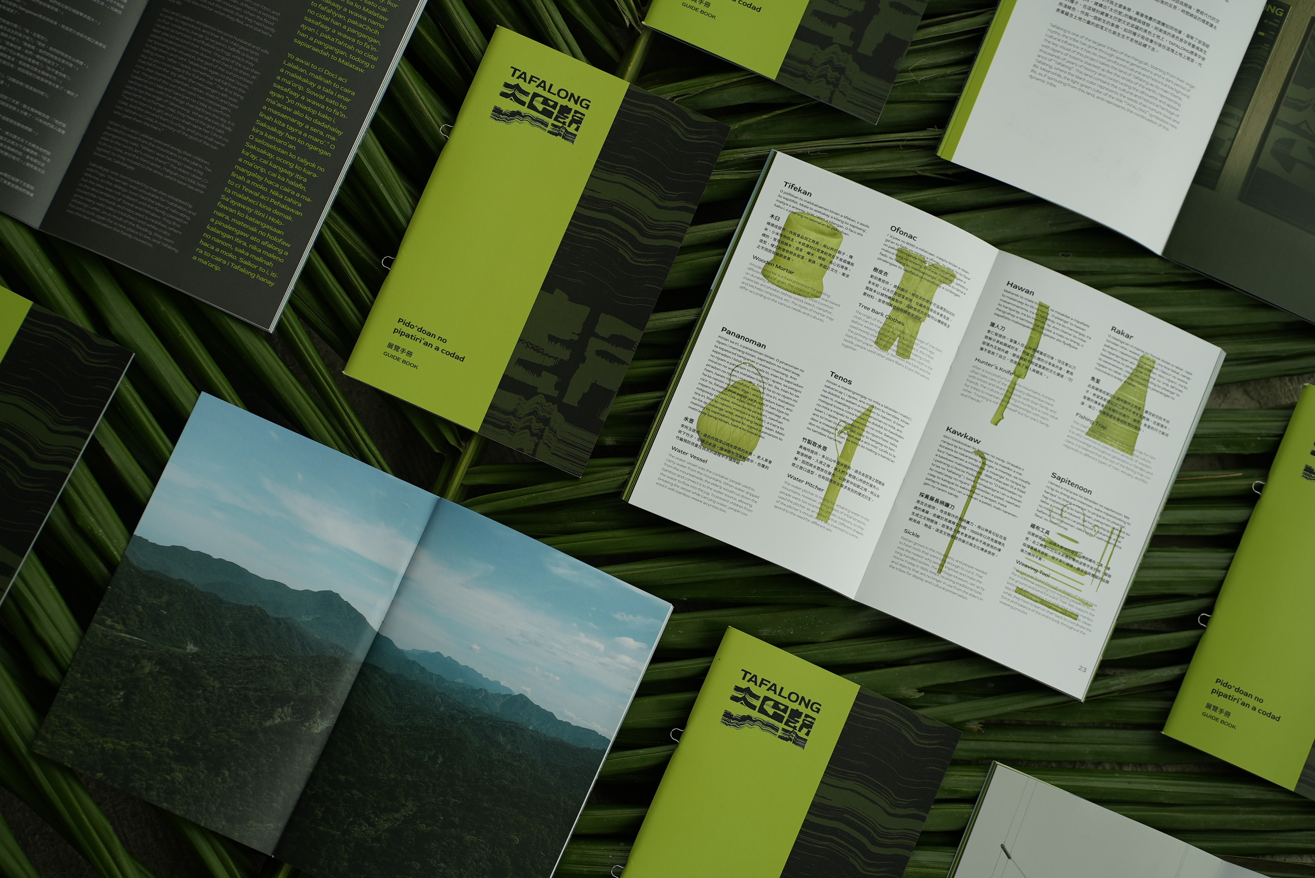
Tafalong is one of the largest and oldest Pangcah tribes in Taiwan's indigenous community. This exhibition presents its culture through the interweaving of artifacts and myths.
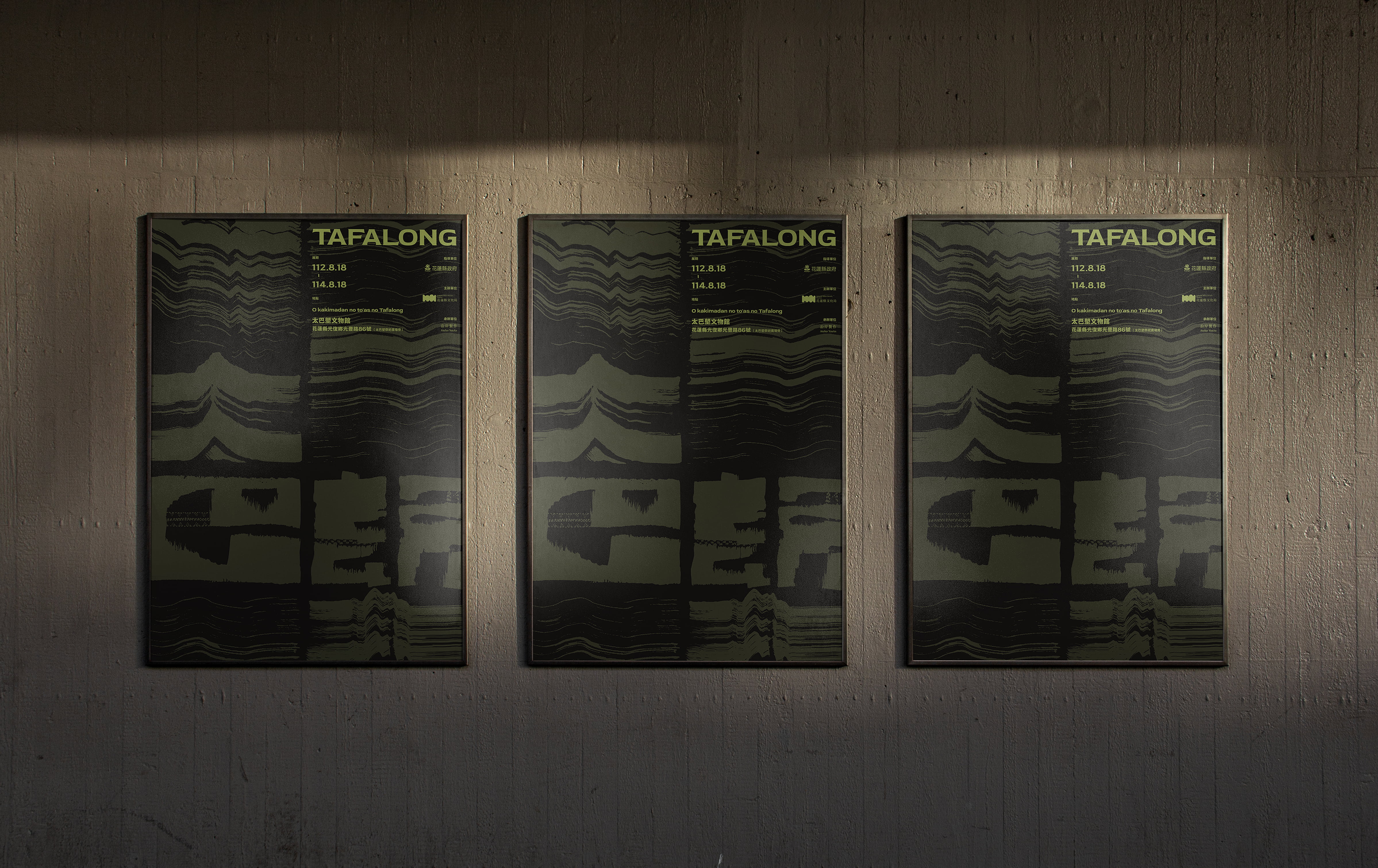
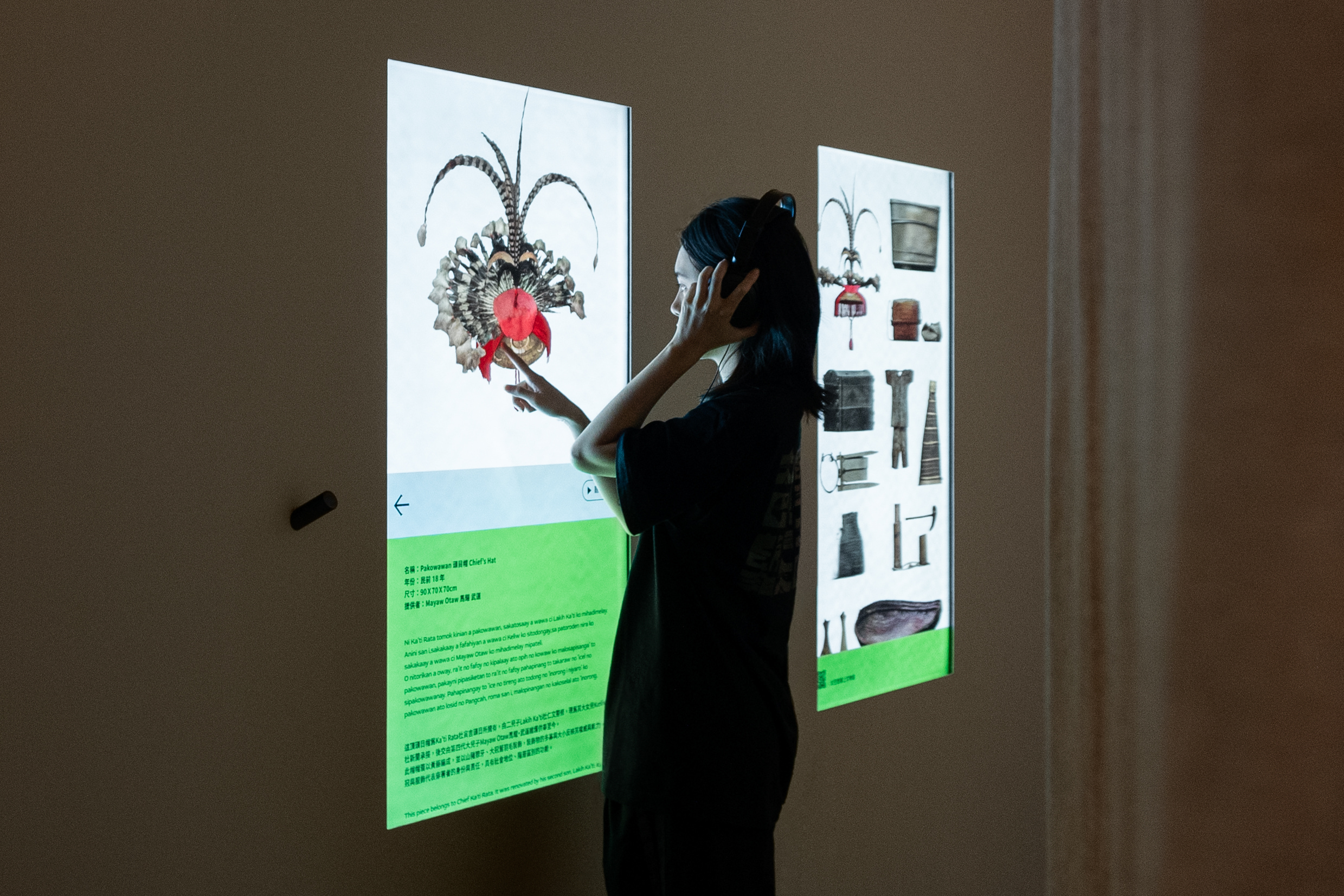
The key visual concept uses the land as a primary symbol; the layered TAFALONG Chinese characters resemble the geological strata encapsulating thousands of years of tribal history. This visual is extended to various physical and digital applications, including posters, brochures, merchandise, and social media. The incorporation of motion design enhances communication effectiveness, offering visitors diverse ways to engage with the exhibition.
Native
太巴塱是台灣原住民阿美族中最大且最古老的部落之一,本展覽 「TAFALONG 太巴塱」 透過文物及神話的交織展示呈現了部落的文史內涵,同時規劃多場展覽工作坊,也藉由社群經營與文物的數位化,使訪客能以更多元化的方式深入理解展覽。
主視覺概念以土地作為主要象徵,層層堆疊的 「太巴塱」 漢字圖騰如同地層,凝聚了部落經歷的萬千歲月。顏色選用上也富有含義,在阿美族的傳統裡,黑色是靈魂與孕育生命的顏色,而綠色作為一個新生(農作、新芽)的象徵,兩者的結合代表著蘊含土地力量的部落文化能生生不息地延續下去。
視覺的系列感透過顏色與字體的整合達到識別的一致性,而標準字延展出的圖騰可發展至多樣的實體應用,包含展覽海報、展覽手冊、展覽周邊商品、開幕儀式等。在數位介面的應用上,比如宣傳影片、社群版面、濾鏡設計、網站製作等,結合了動態設計使視覺與概念更有效的被傳達。
Website
Judging Comments
The TAFALONG Visual Design by ATELIER YENAN stands out as the 'Grand Prize' winner at the Asia Design Prize 2024, exemplifying a masterful blend of indigenous cultural heritage with cutting-edge design innovation. Utilizing the land as a core symbol and emulating geological layers with the stylized presentation of TAFALONG in Chinese characters, this work not only encapsulates the rich history of one of the oldest and largest Pangcah tribes but also adapts it into a dynamic visual language applicable across various media. The strategic use of motion design further amplifies the narrative's impact, offering an engaging and immersive experience that transcends traditional boundaries, making it an outstanding representation of how tradition can be seamlessly integrated into modern design narratives.
Positive Comments


VOYEUR EXHIBITION Uncomfortable Gaze
Sejong University
Korea
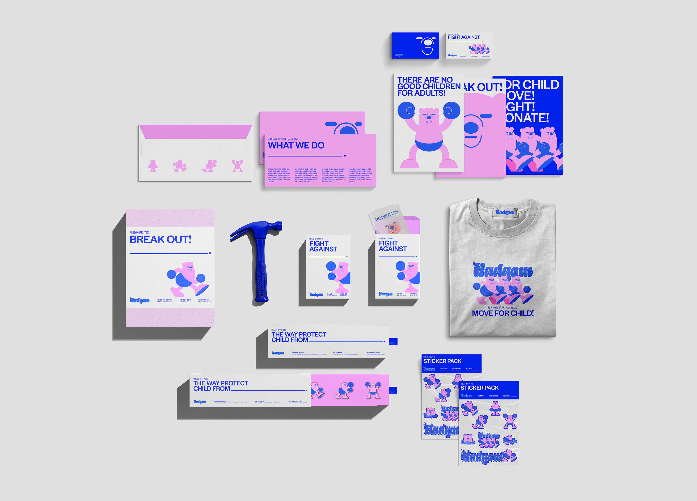
BADGOM Sponsorship Branding
Sejong University
Korea
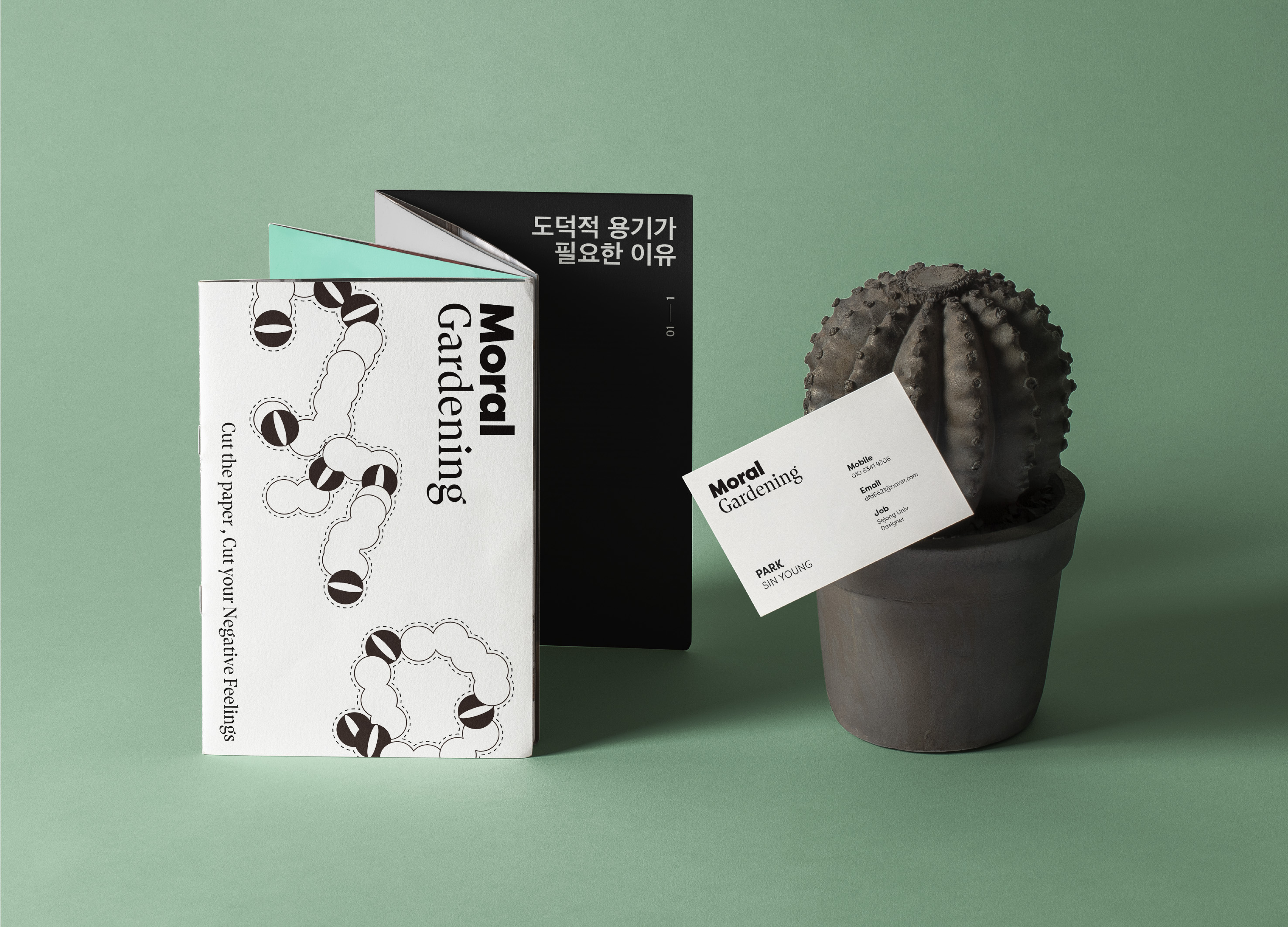
MORAL GARDENING
Sejong University
Korea
Suburb
Samsung Design Membership
Korea
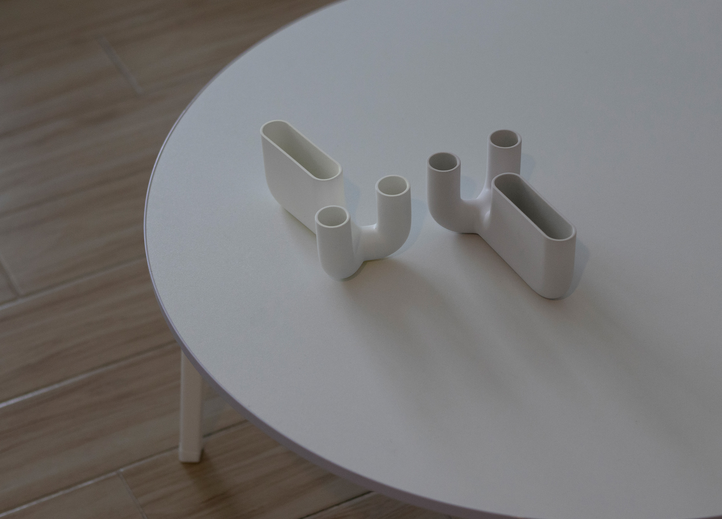
Symbiotic Candlesticks
BNU School of Future Design
China

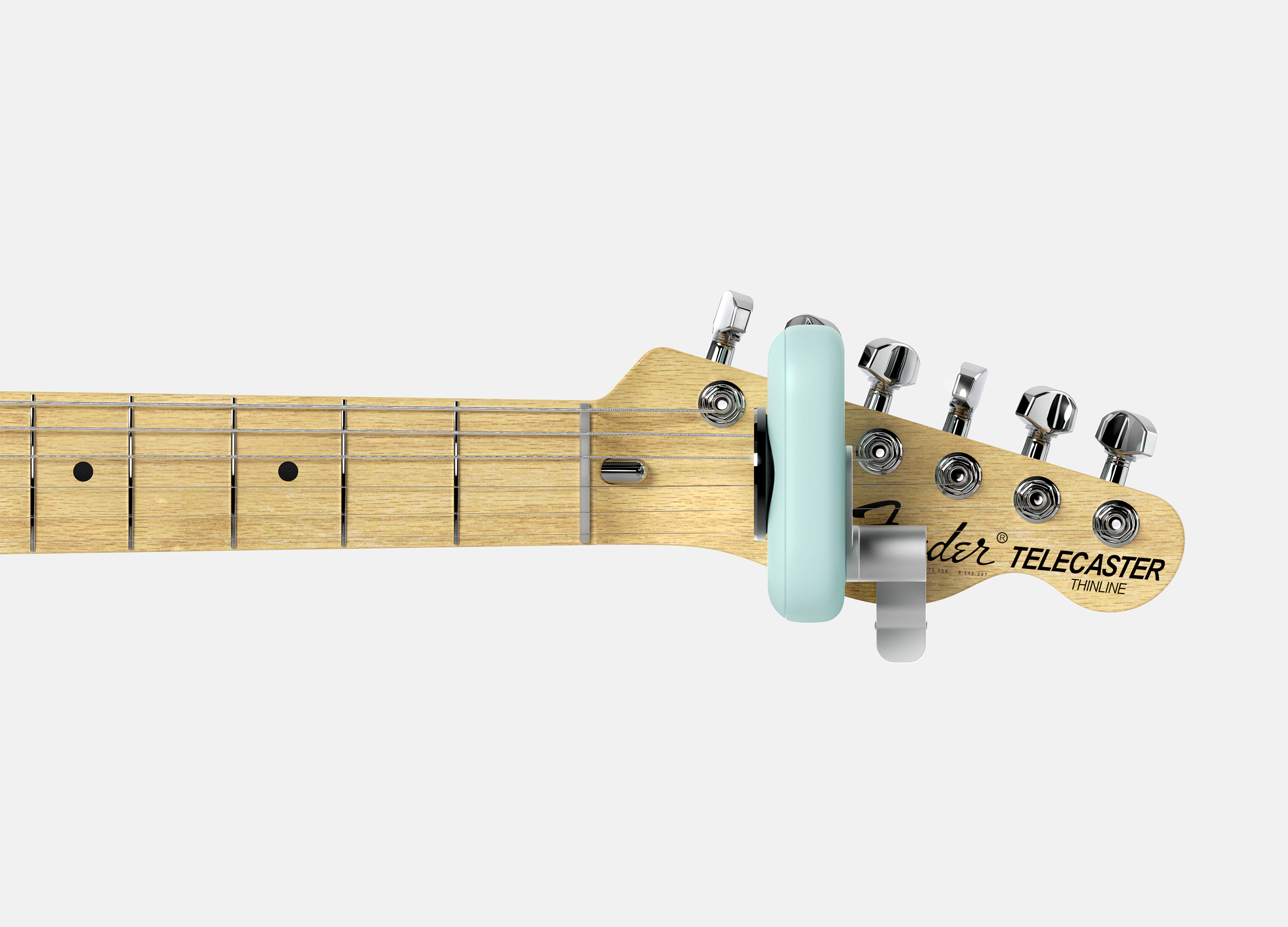
LEGIT
Hongik university
Korea
Knock Knock
Samsung Design Membership
Korea

Petrichor
Morecho Design
China
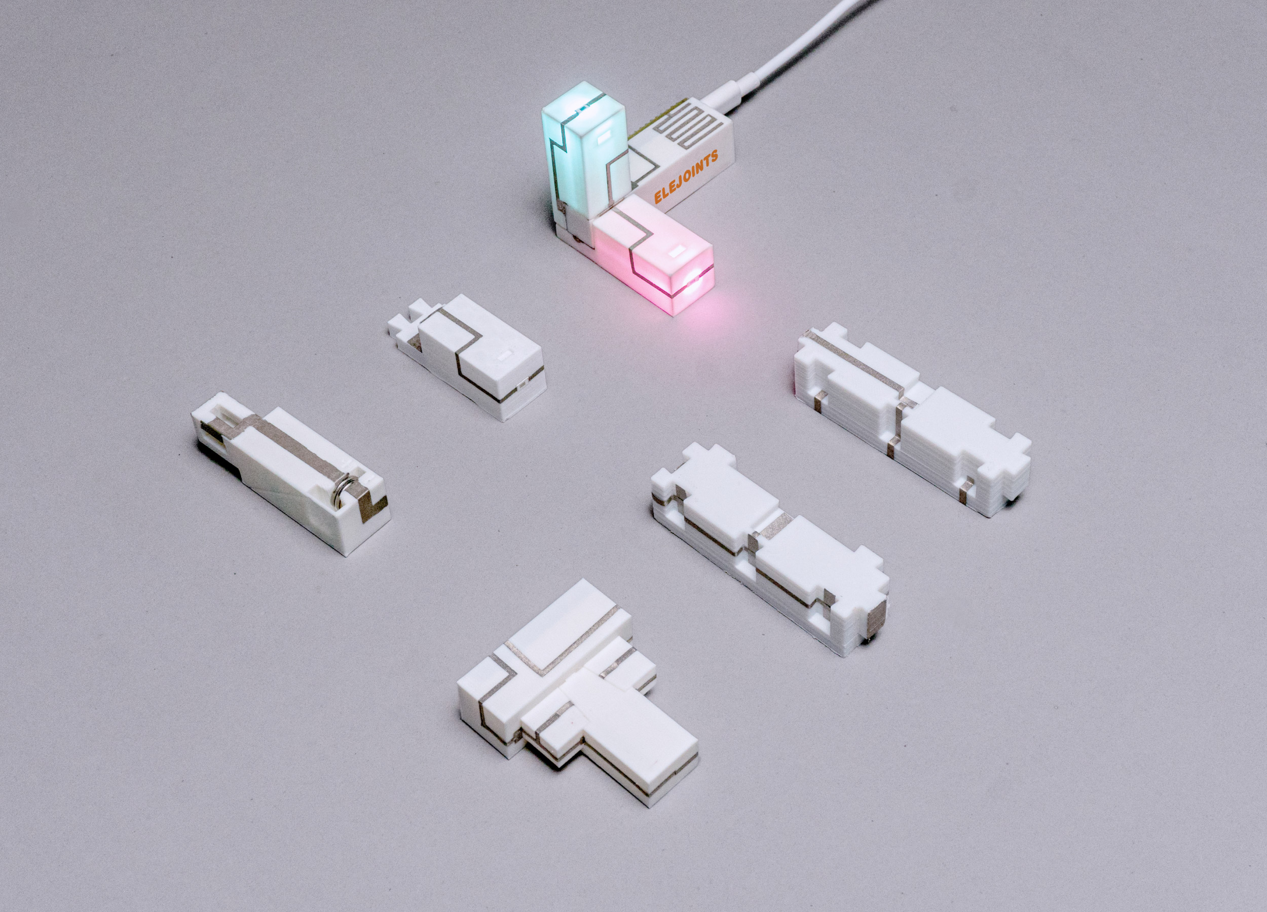
ELEJOINTS Electronic mortise and tenon toys
Zhejiang University
China
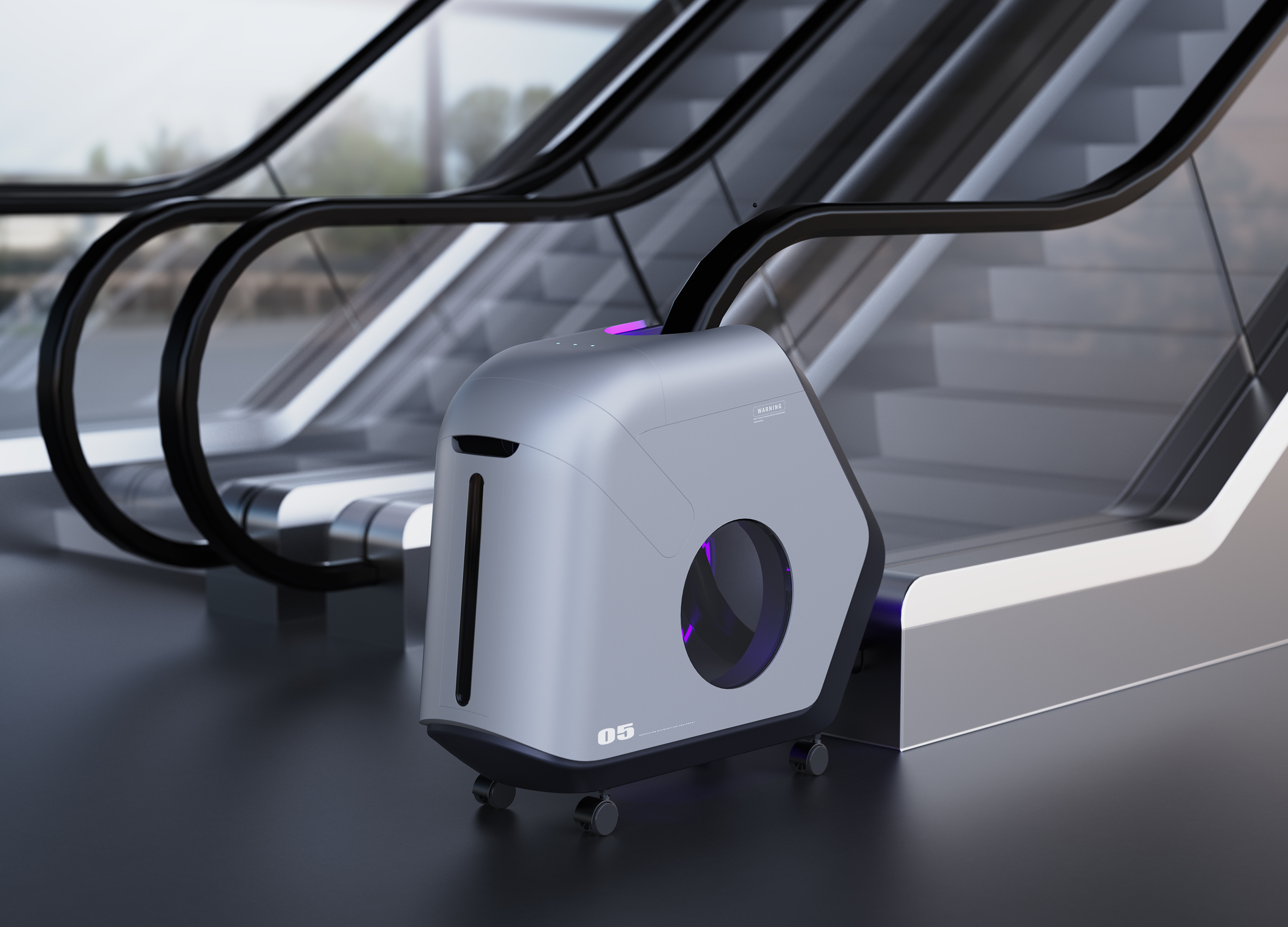
Escalator Sterilizer
Hubei University of Technology
China
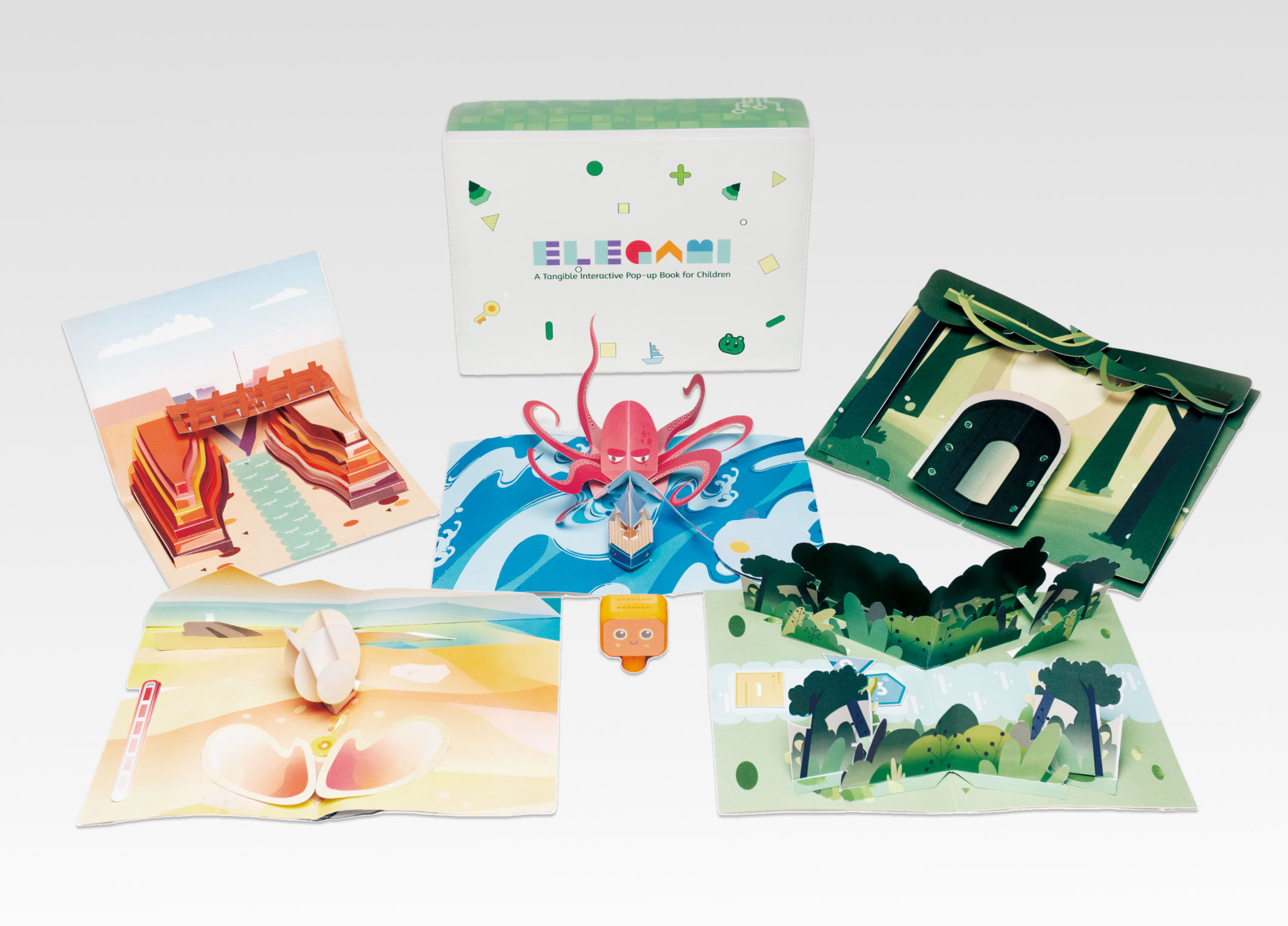
Elegami
Zhejiang University
China
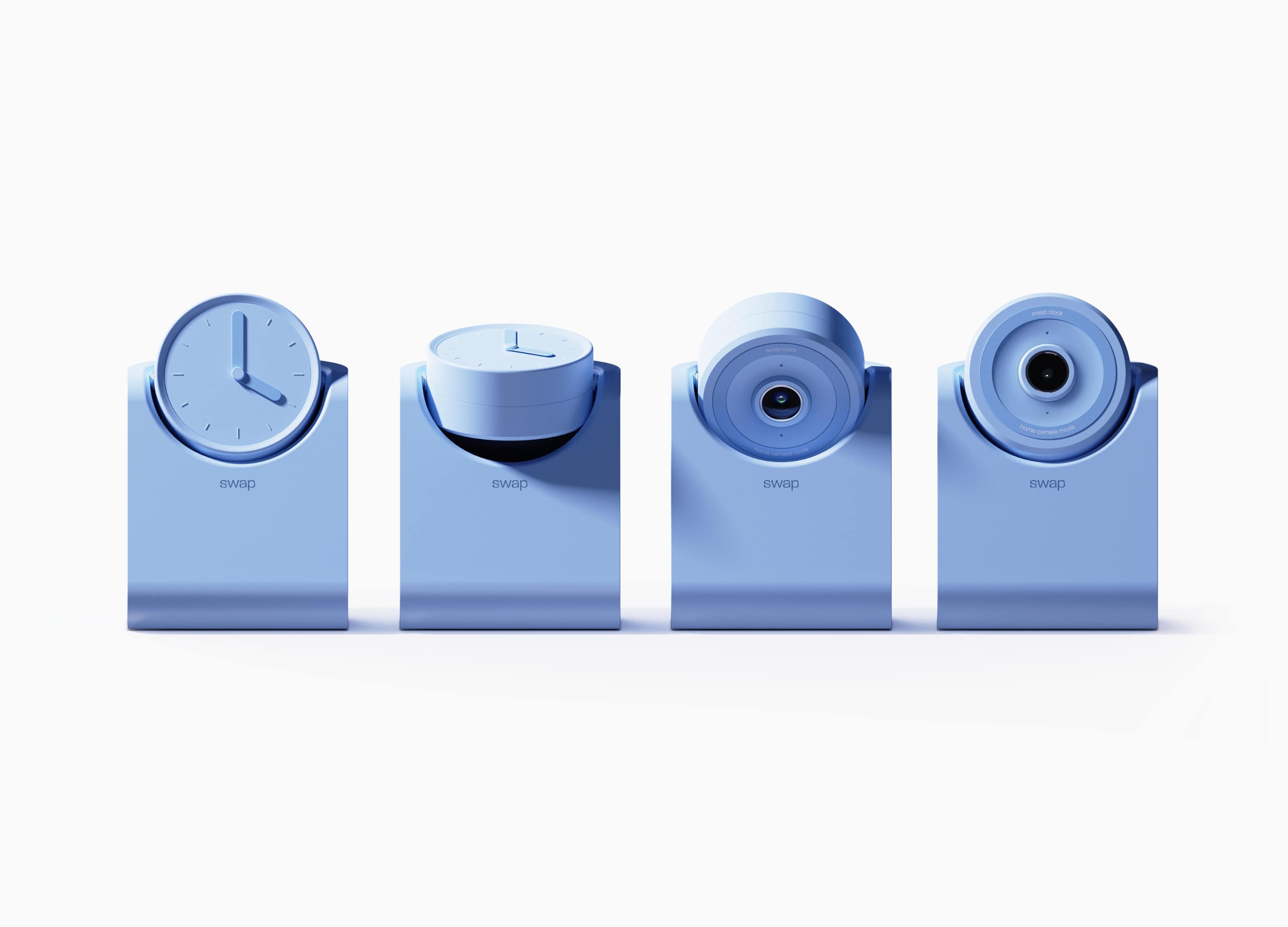
swap
Hongik University
Korea


Partner & Sponsor
More


info@asiadesignprize.com
#14057, 905 49, Beolmal-ro 102beon-gil,
Dongan-gu, Anyang-si, Gyeonggi-do, Korea
#14057, 905 49, Beolmal-ro 102beon-gil,
Dongan-gu, Anyang-si, Gyeonggi-do, Korea
Founder: Doyoung Kim
Business Registration Number: 454-86-01044
Online Sales License No.: 2021-Anyang Dongan-1081
Copyright © DESIGNSORI Co., Ltd.
Business Registration Number: 454-86-01044
Online Sales License No.: 2021-Anyang Dongan-1081
Copyright © DESIGNSORI Co., Ltd.
