HIM TEA Branding
Communication
Area
Korea
Year
2025
Award
WINNER
Client
Working Shcool Corp.
Affiliation
deblur Corp.
Designer
Choi eun bin
https://youtu.be/d4hWfCYTiDQ
English
Young people in Korea are suffering psychologically due to extreme employment difficulties and competition. This drink, developed by young people who have overcome social difficulties delivers ‘a message of support to tired young people.’
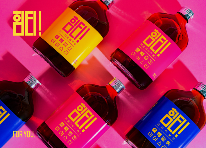
we focused on intuitive expressions to make them feel energized. The simple message of 'Him-tea' is derived from 'ice tea gives you power ('Him') when you drink it'
The word 'Him(力)' links the name to each of the three flavors: Vitality(活力), Attractiveness(魅力) and Skilled(實力). We designed typography can be intuitively readable by adopting strong color contrast, and deliver our key messages.
Native
한국의 청년들은 극심한 취업난과 경쟁으로 인해 정신적 고통을 받고 있습니다.
사회적 어려움을 딛고 자립에 성공한 청년들이 개발한 이 음료는 ‘지친 청년들에게 응원의 메시지’를 전합니다.
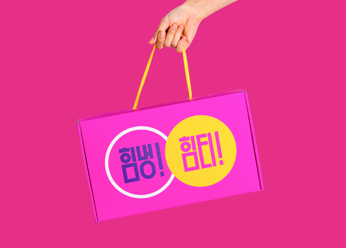
당당하고 자신감 넘치는 브랜드 페르소나를 설정해, 이들이 가진 긍정적인 에너지가 현대 사회의 청년들에게 닿을 수 있도록 열정적인 표현에 집중했습니다.
‘마시면 힘이 나는 아이스티’를 줄여 ‘힘티’, 명확한 브랜드 메시지를 전달합니다.
힘(力)을 확장해 1) 활력(活力): 에너지 충전 2) 매력(魅力): 비타민 보충 3) 실력(實力): 카페인 보충 세가지 맛에 각각 이름을 연결 지었고,
이를 통해 각 음료별 효능를 포지셔닝 하였습니다. 우리는 강한 색상 대비를 적용하여 직관적으로 읽을 수 있고,
우리의 핵심 메세지를 전달할 수 있는 타이포그래피를 개발했습니다.
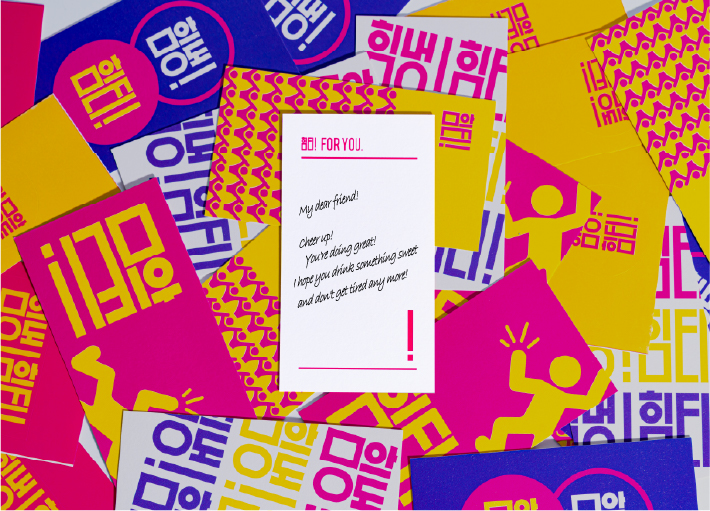
이는 긍정적인 감정을 직관적으로 전합니다. 또한 힘티 카드는 미처 전하지 못한 응원의 메시지를 담아
지친 청년들에게 전하기 위한 매개체입니다.
Website
Judging Comments
Him-tea has been praised for its strong visual identity and meaningful concept, offering encouragement to young people facing social and employment challenges. The bold typography and high-contrast color scheme ensure instant recognition and effective communication of the product’s empowering message. This thoughtful approach, combining emotional connection with clear branding, successfully positions Him-tea as both a refreshing beverage and a source of motivation.
Positive Comments


Hallucinogenic Mushrooms
Sejong University
Korea
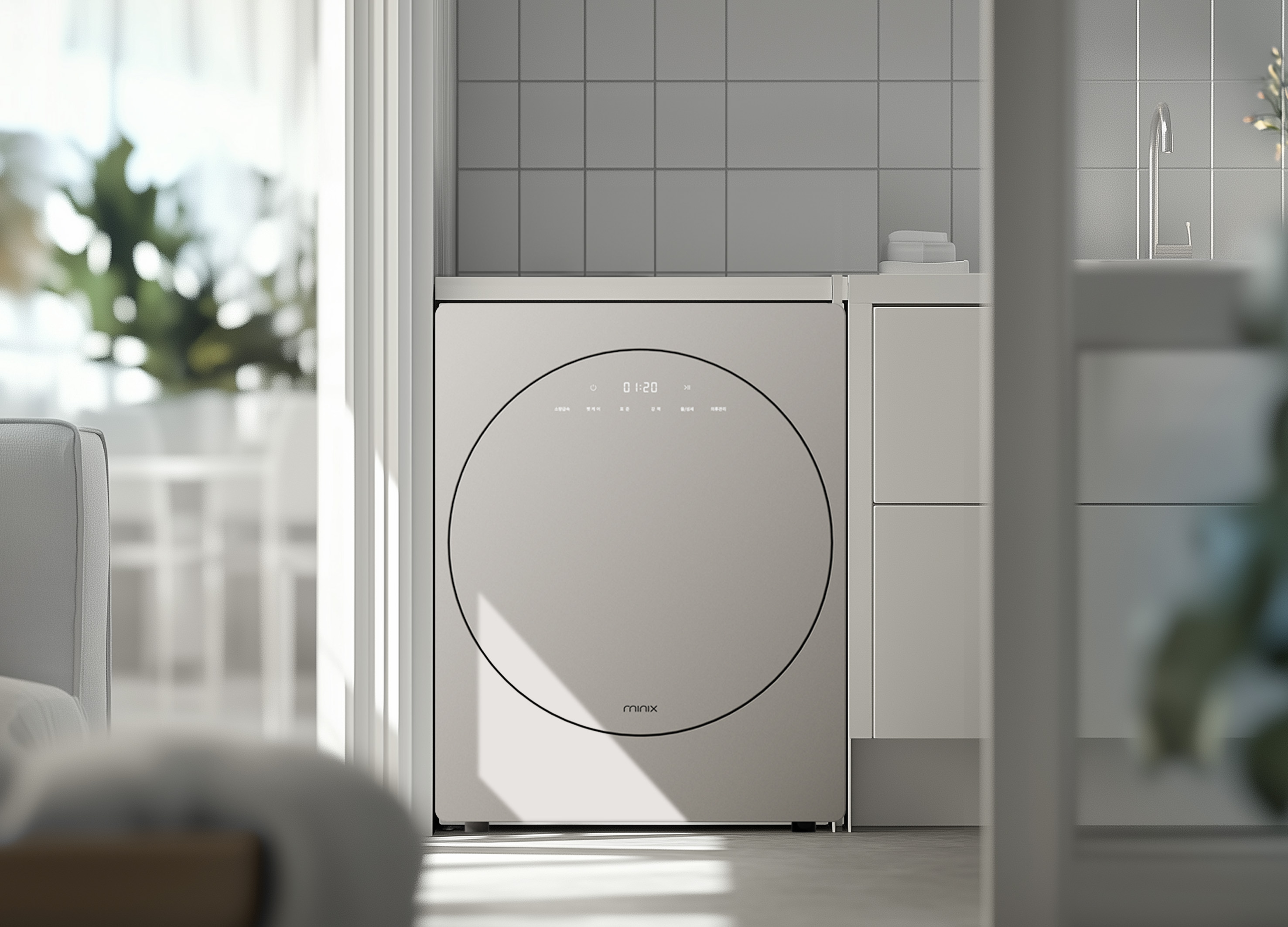
minix clothes dryer
Athome Corp.
Korea
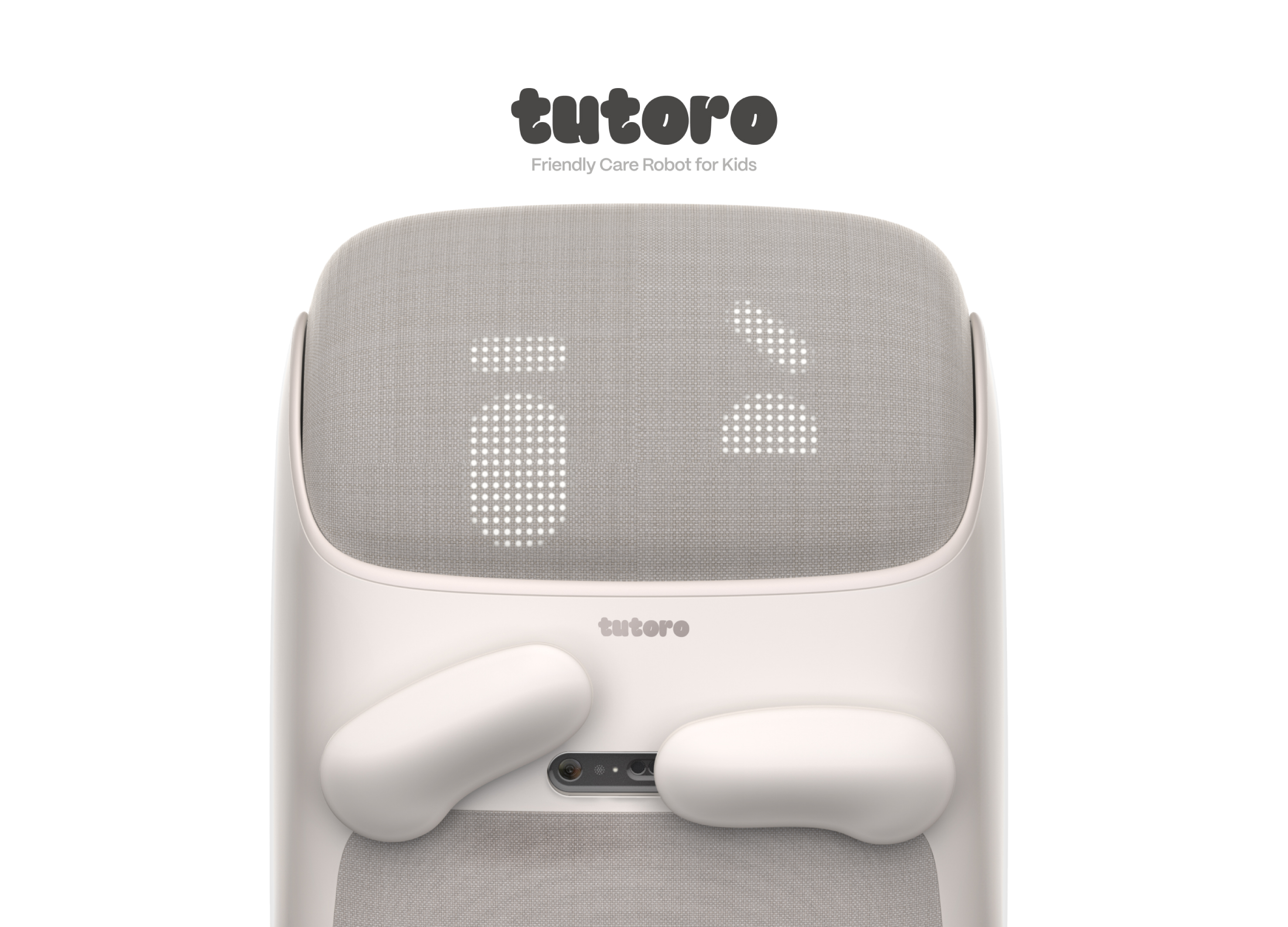
Tutoro
Hongik University
Korea
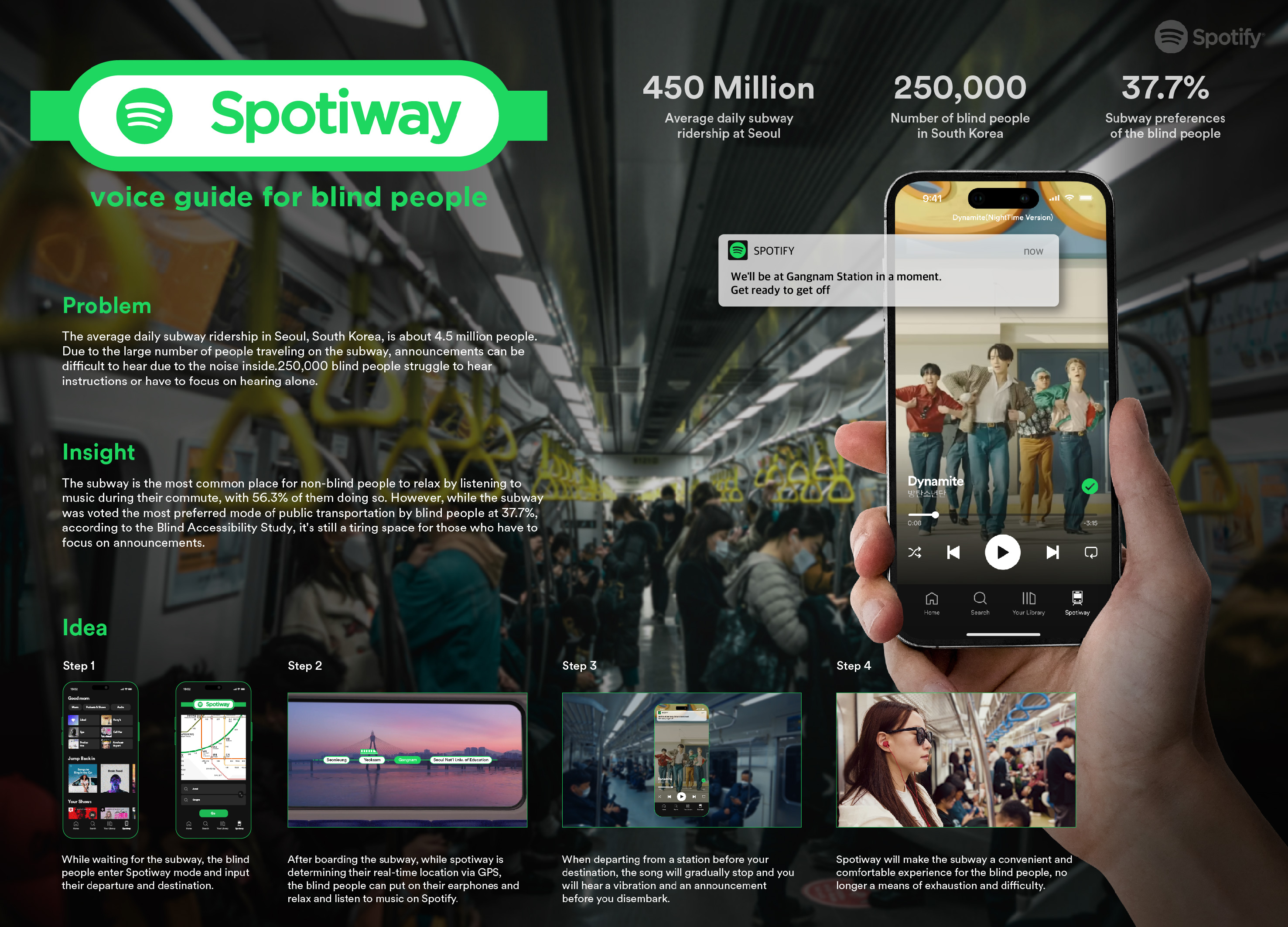
Spotiway.voice guide for blind people
Dongseo University
Korea
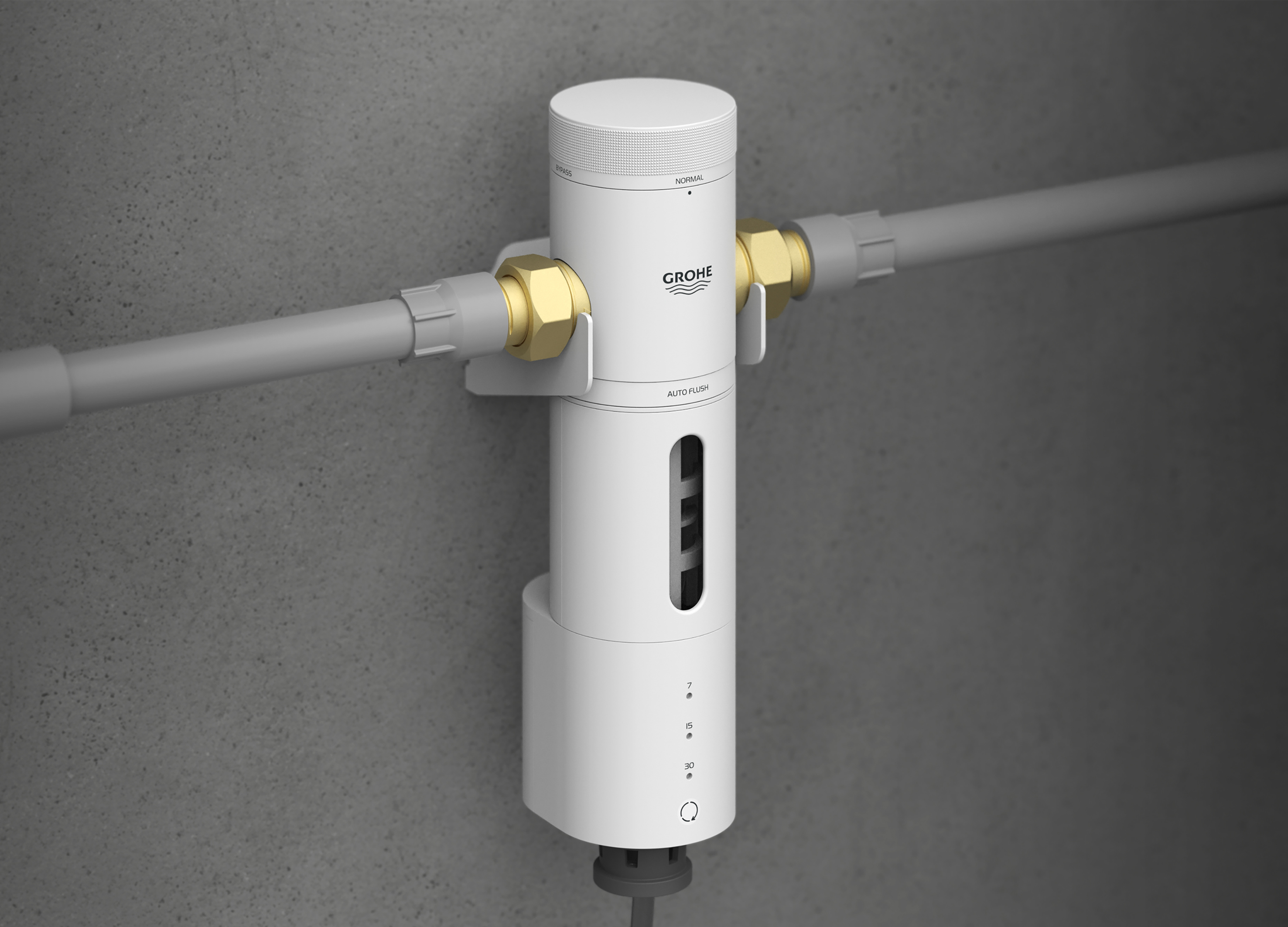
Grohe PreFilter
GROHE
Singapore
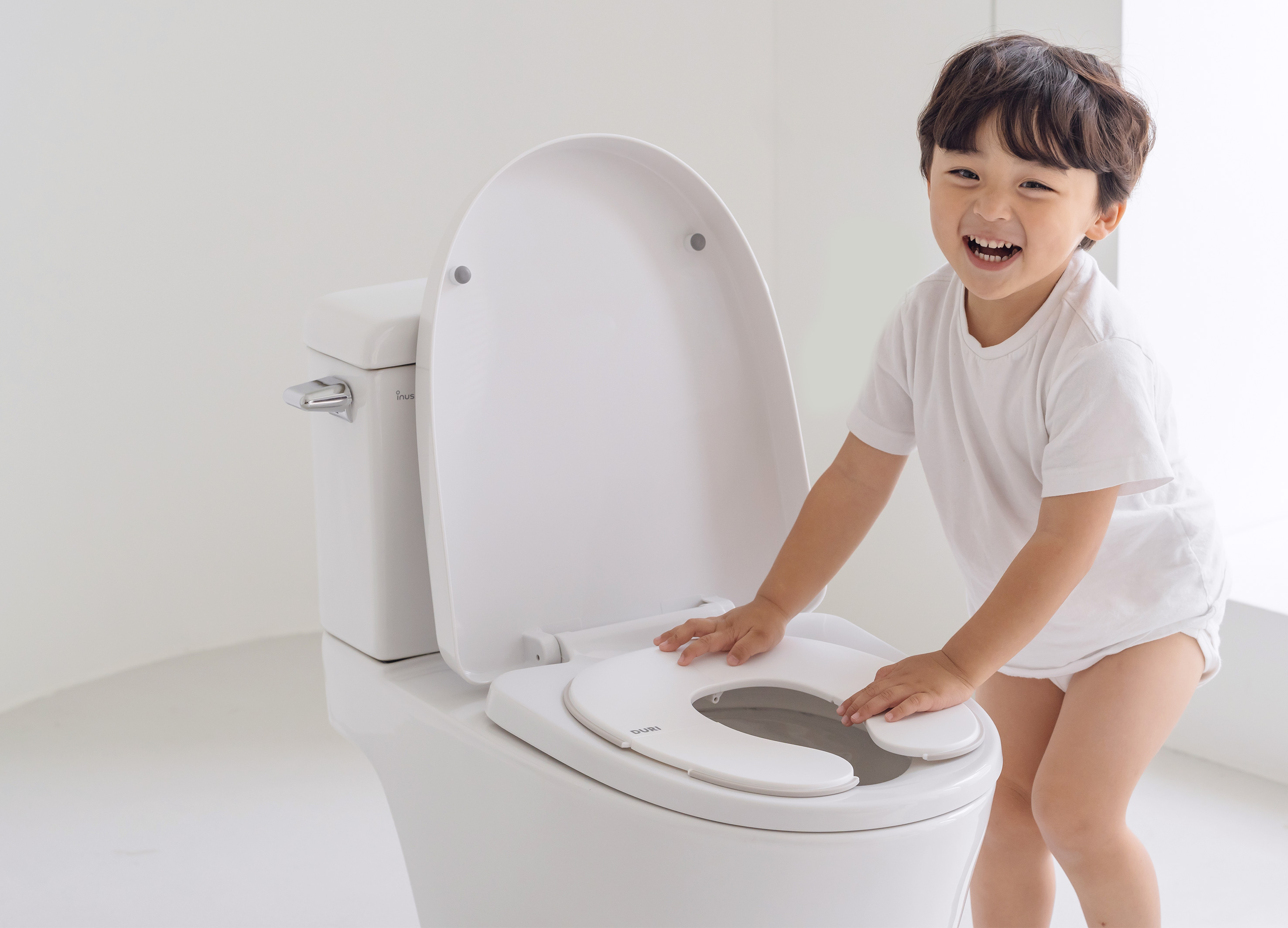
DURI portable folding potty
PRESENT
Korea
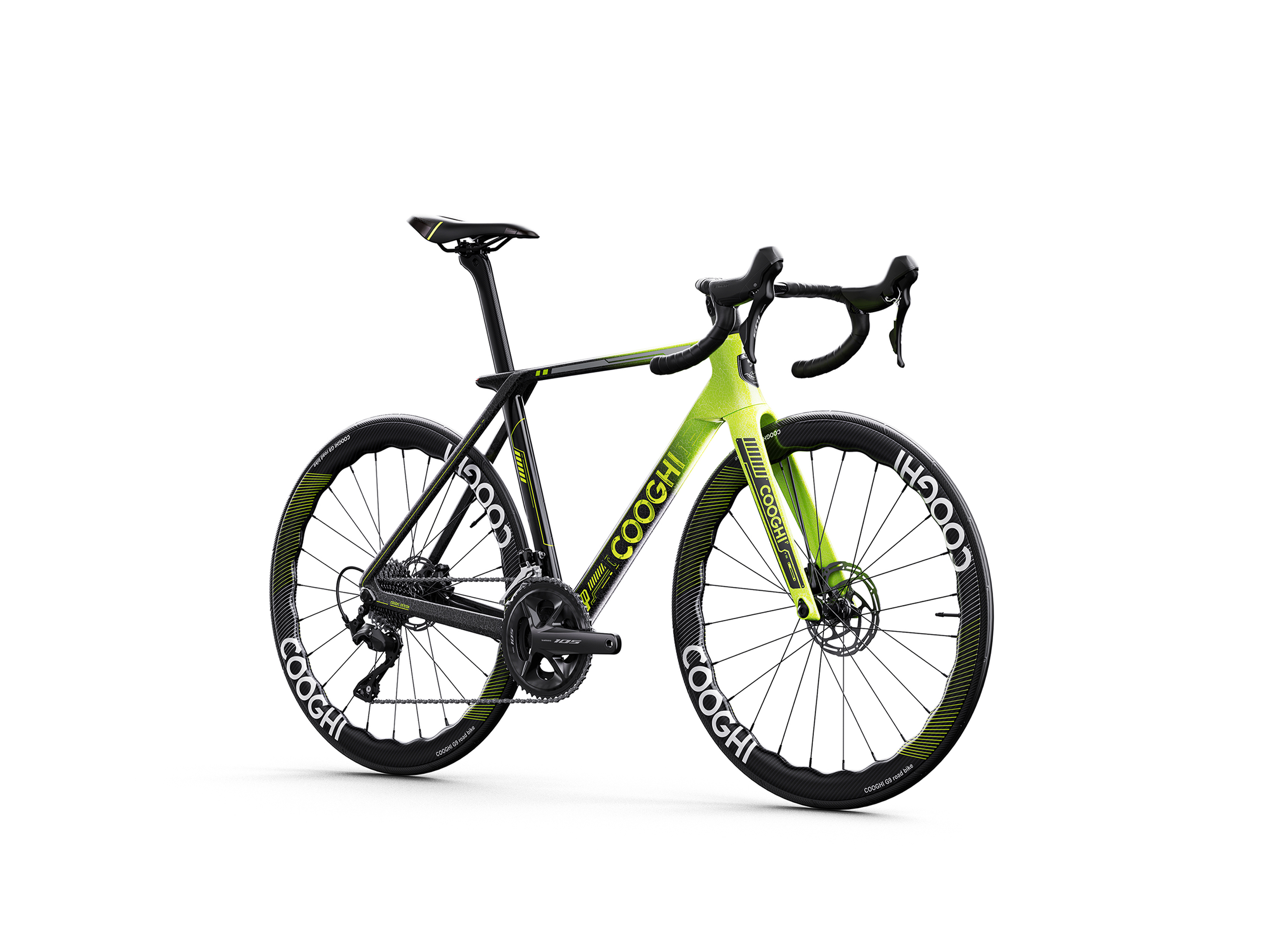
COOGHI G9 Green Mamba road bike
Shenzhen COOGHI Funkids Technology Co., Ltd.
China
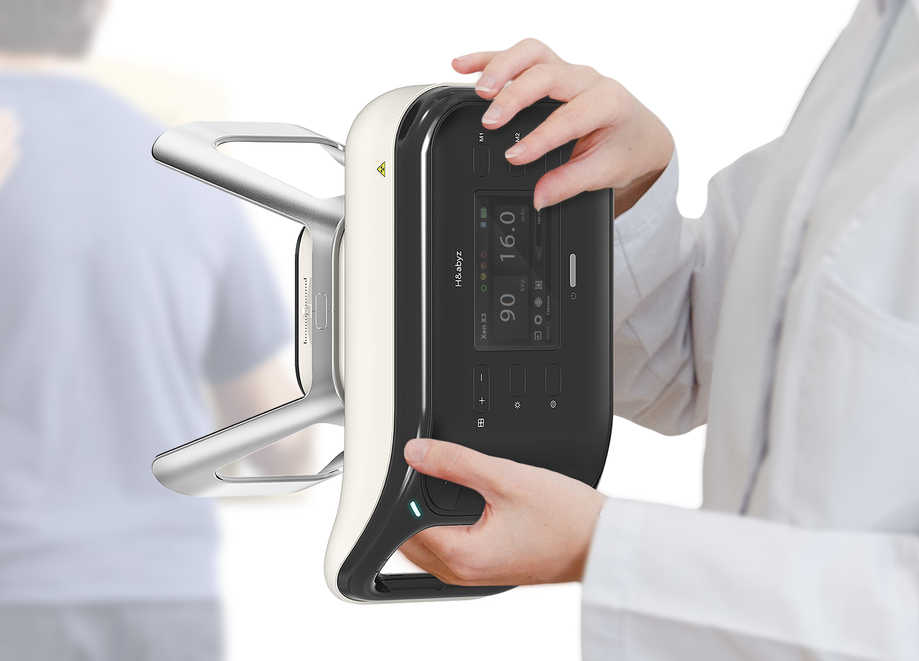
H n abyz HnX 1 Portable X Ray
GODESIGN
Korea
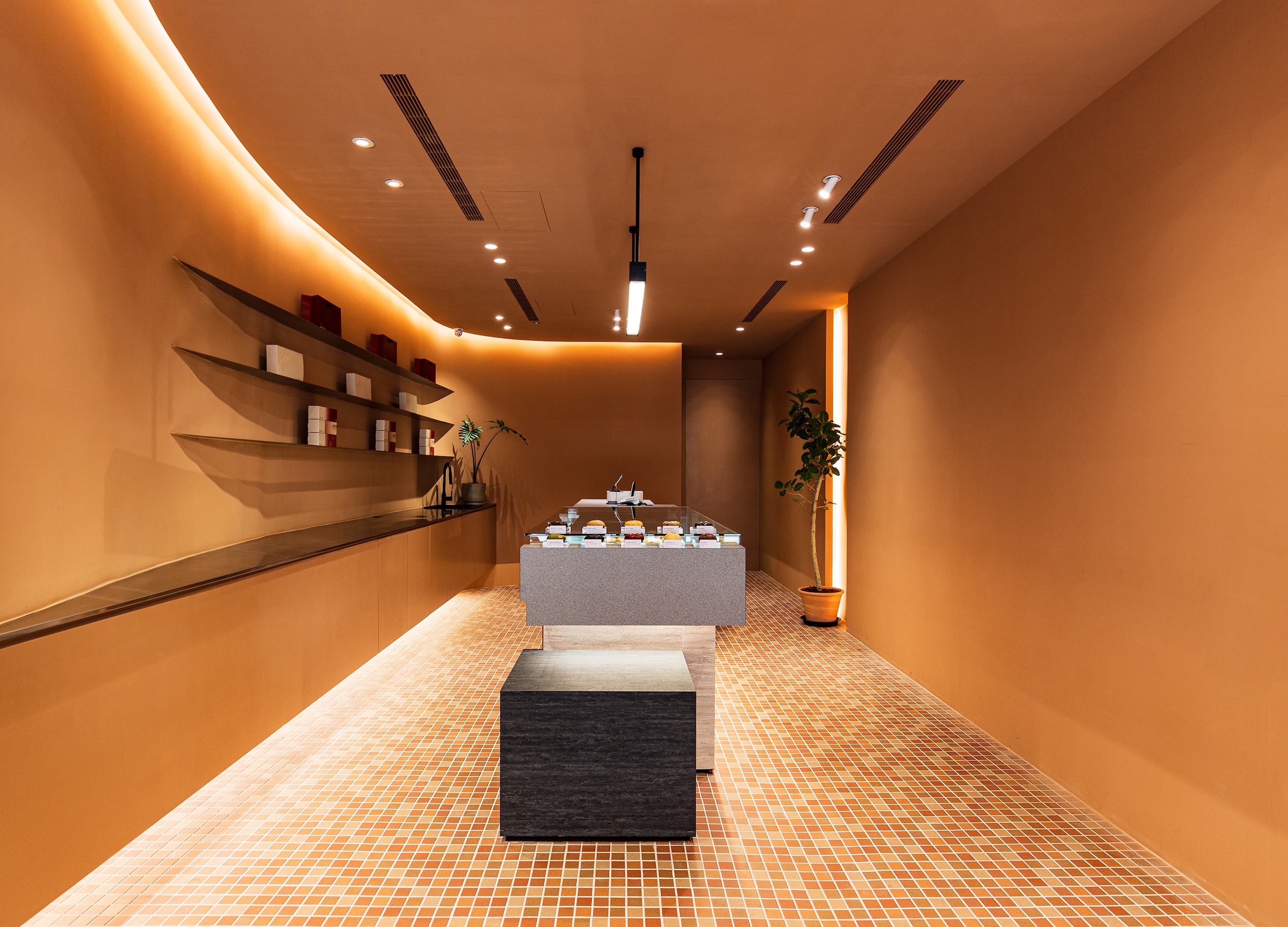
SWEETFULL
Union Atelier
Chinese Taipei
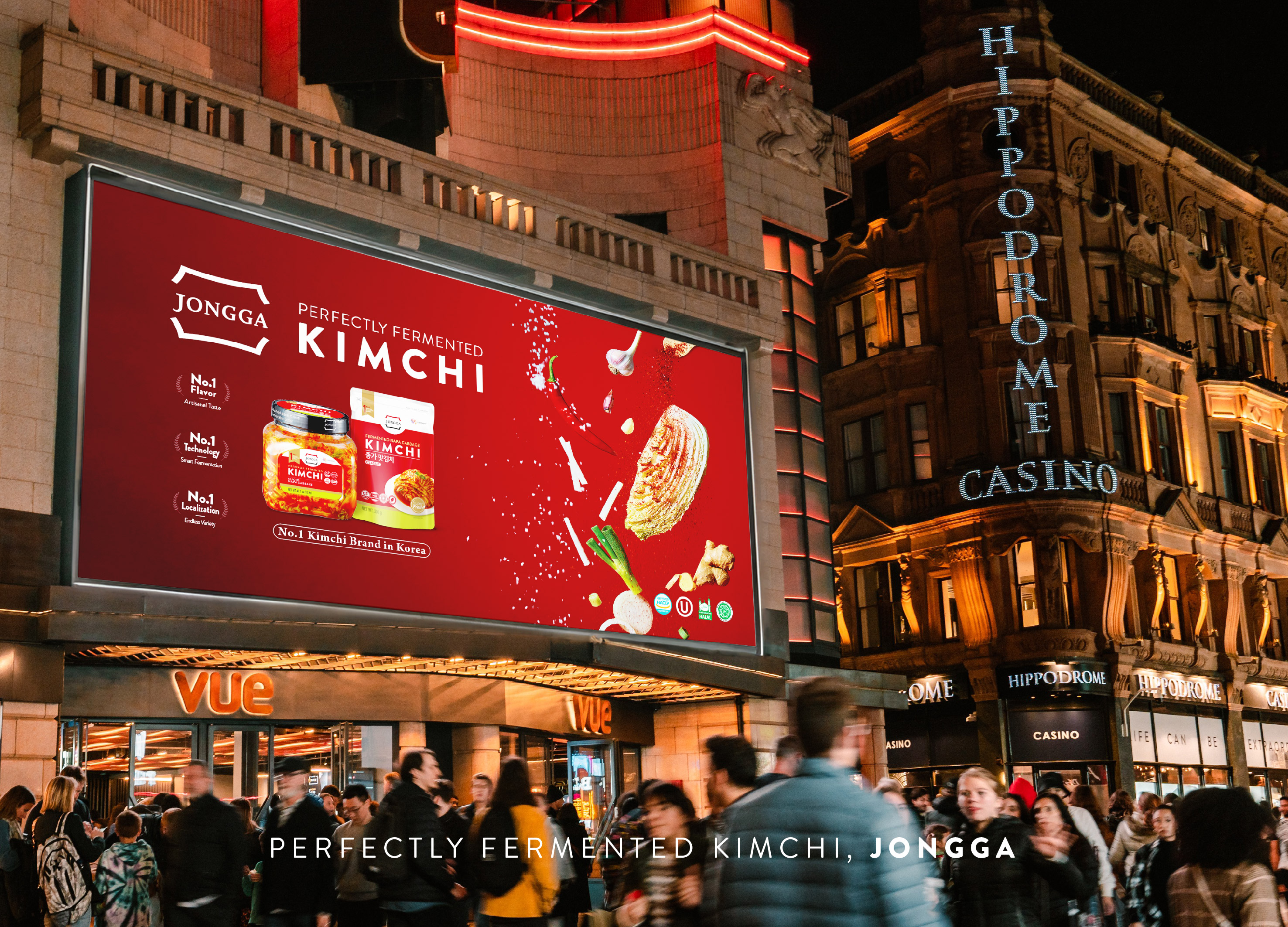
Global JONGGA Kimchi Design
Daesang Corporation Co., Ltd.
Korea
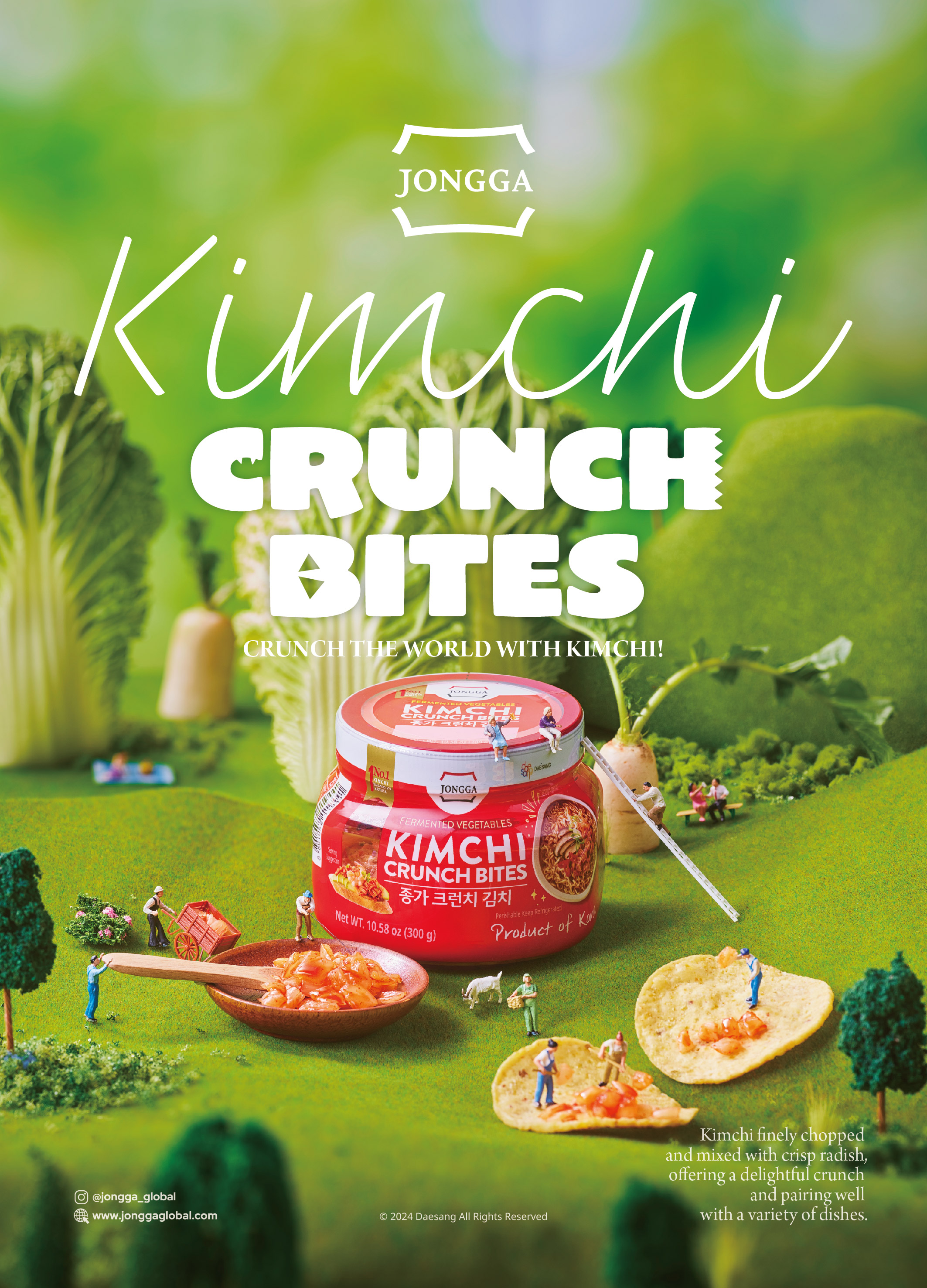
KIMCHI CRUNCH BITES CRUNCH THE WORLD
Daesang Corporation Co., Ltd.
Korea
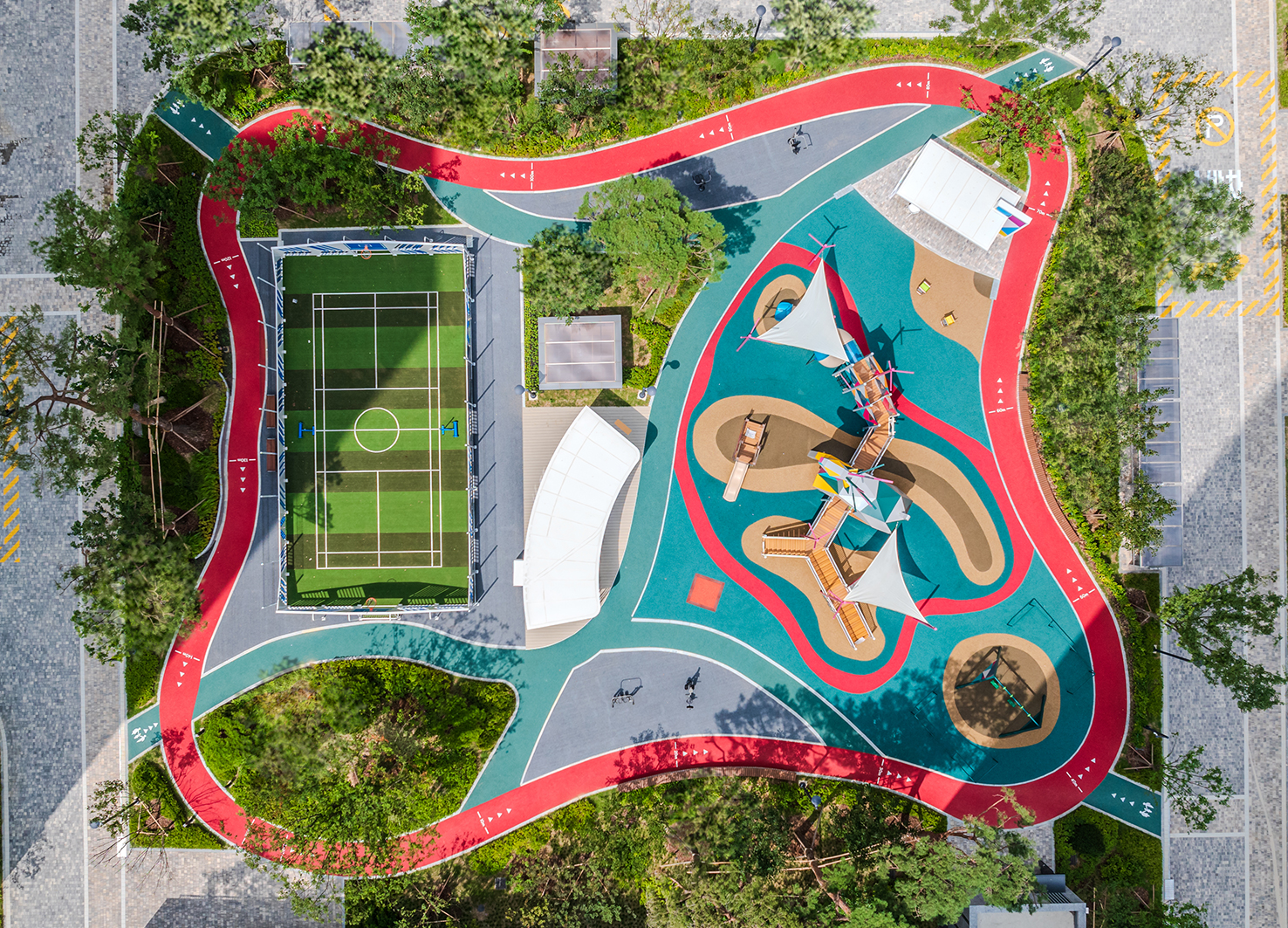
Healthy Pleasure Park
HYNUDAI ENGINEERING Co., Ltd.
Korea


Partner & Sponsor
More


info@asiadesignprize.com
#14057, 905 49, Beolmal-ro 102beon-gil,
Dongan-gu, Anyang-si, Gyeonggi-do, Korea
#14057, 905 49, Beolmal-ro 102beon-gil,
Dongan-gu, Anyang-si, Gyeonggi-do, Korea
Founder: Doyoung Kim
Business Registration Number: 454-86-01044
Online Sales License No.: 2021-Anyang Dongan-1081
Copyright © DESIGNSORI Co., Ltd.
Business Registration Number: 454-86-01044
Online Sales License No.: 2021-Anyang Dongan-1081
Copyright © DESIGNSORI Co., Ltd.
